I had two user testings with my figma prototype in the last design and research class. Both of the testers had realy helpful feedback and knowledge I will use to improve my project.
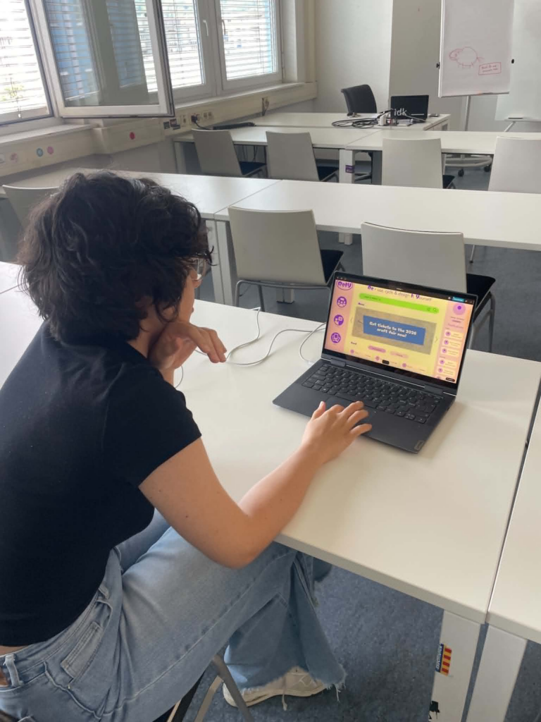
First user test:
Comments:
- “would like to have a filter style / esthetic eks. Cottage core etc for the gallery”
- Should add a way to easily access your saved content
- “Don’t really understand the headline in the home page, feels like a title when it’s actually an explanation”
- Found the tutorial intuitive
Second user test:
Comments:
- the forum page is not very intuitive, it does not make sense to have the comment displayed two times, and the one with more content being smaller. Maybe pop down or entering the comments in a new page would be better.
- Maybe add more visualization to the tutorial
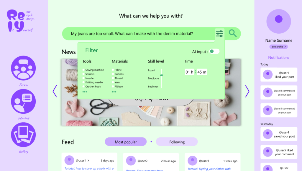
- It can be smart to change the selection buttons in the filter from round to square, as the universal rule is that round means that you can only choose one and square means you can choose multiple.
- For the time filter the clock interface feels unnecessary
- Gallery and feed feels similar, maybe combine them?
- Maybe stylize the headline in the home page more would make it more intuitive
Key takeaways from the testings:
- changing bullet points from round to square when you can slect more than one
- fixing the layout of the forum page
- Try to make the headline more intuitive
Based on the feedback, I will prioritize making the prototype overall higher fidelity, redesigning the forum page to create a more intuitive user flow, improving the homepage headline to better communicate the platform’s purpose, and updating the filter components to follow established UI conventions. If I have time I will also try to add visual elememts to the tutorials, making saved content easier to find, and add aesthetic filters in the gallery to make inspiration easier to browse.
Updated wireframes:
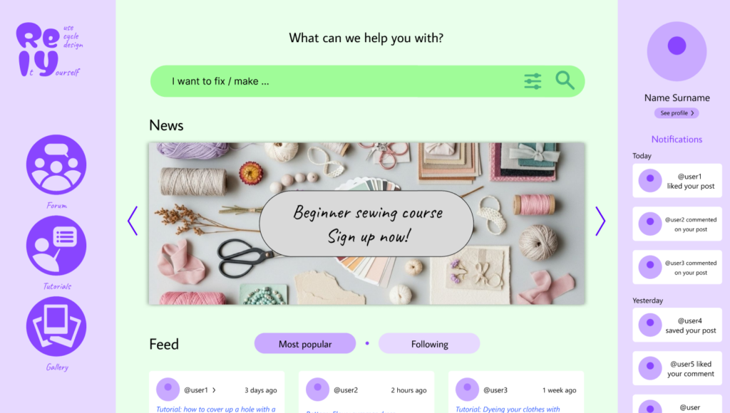
I updated the logo and the header on the homepage. I removed the description from the header and replaced it with “What can we help you with?” to make it clearer what the website is for. I also made the logo more descriptive by adding the “Re-use, Cycle and Design It Yourself” in the logo in the upper-left corner.
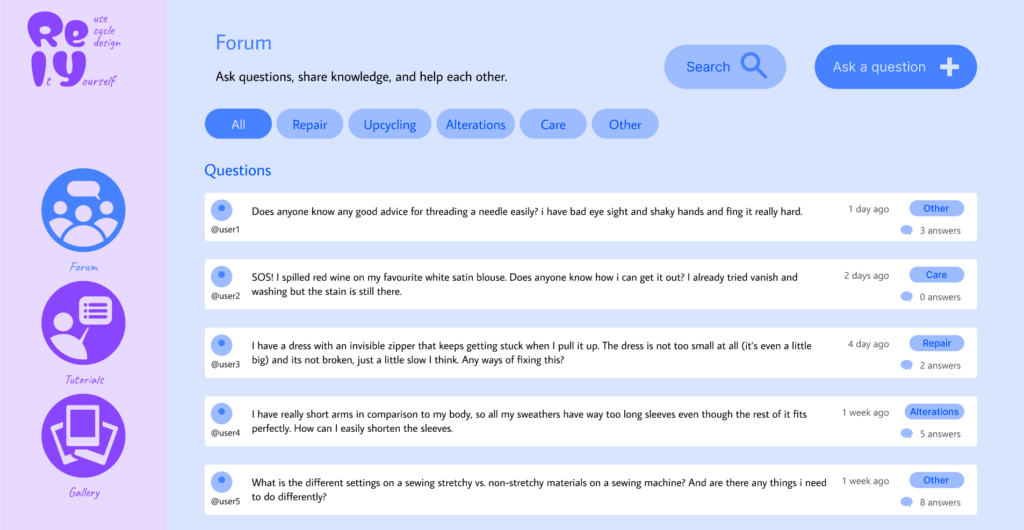
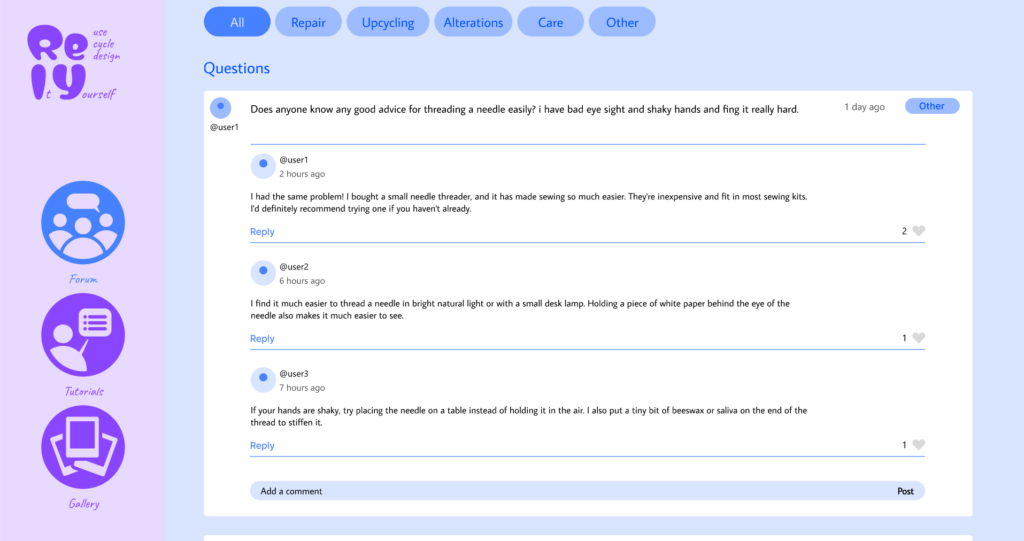
I updated the forum layout to at first display only the question, only showing the replies dropping down when clicked. This simplifies interface, making it easier for users to browse questions and access the information they are looking for.
I added a “saved” option in the header of both the Tutorials and Gallery pages to make it easier to acces.

