Following my prototypes, I am now looking at how my project fits into the bigger world. I have broken this down into three parts: the system, the change it creates, and who can actually use it.
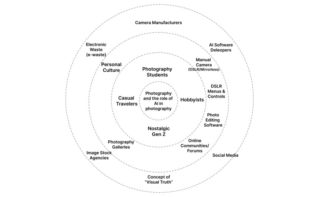
1/3: System Map
This diagram illustrates the broader ecosystem surrounding my camera-AI guidance system. I have mapped it from the core outwards to show how the project connects to the world.
The Core: The interaction between the Photographer and the Manual Camera. Direct User Context: Students, hobbyists, and “Nostalgic Gen Z” looking for a creative rhythm. External Ecology: The heavy hitters—Nikon/Sony (Hardware), Adobe/Midjourney (AI), and Instagram (Social). I also included E-waste, as the sustainability of our gear is part of the system.
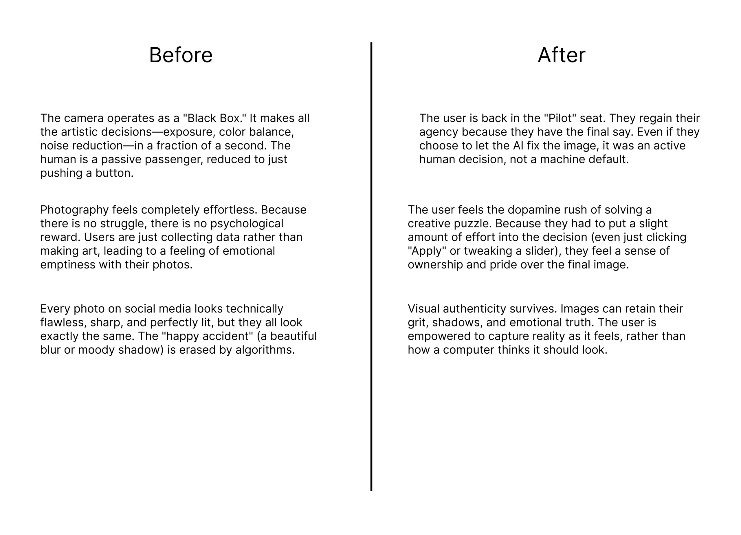
2/3: Change and Impact (Before vs. After)
This comparison highlights the shift from automation-first snapping to learning-aware photography.
The Goal: The goal is to move the user from being a passive passenger of an automated process to an active “Pilot” who understands their tools.
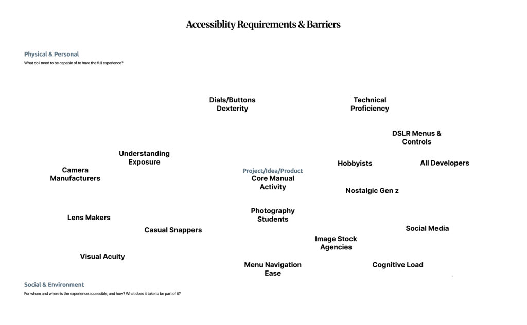
3/3: Inclusion and Accessibility
Accessibility in photography is not just about “talent”; it is a systemic issue. Using the floating barrier map, I identified the physical and cognitive hurdles that stop people from mastering manual photography.
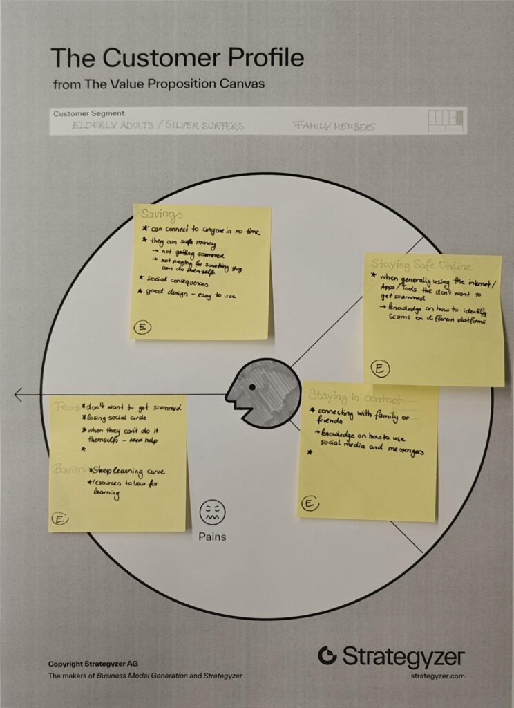
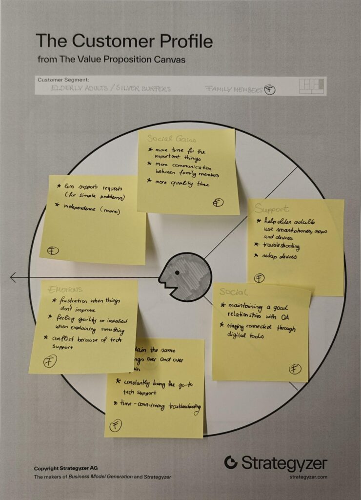
I chose two customer profiles that complement each other well, as they are closely connected in everyday life. Many younger people share the experience of being the “family tech support,” where interactions with older relatives often revolve around fixing devices or explaining the same things repeatedly. This dynamic can become frustrating over time and often takes away from the opportunity to spend more quality time together.
By looking at both older adults and their family members, it becomes clear that the problem is not one-sided but affects both groups.
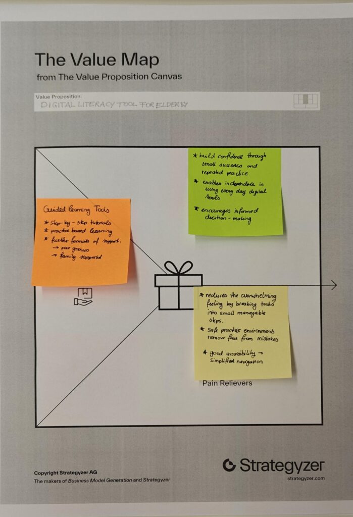
Value Proposition
Product/Business Ideas
Which Problem are you solving?
Problem of digital literacy in elderly people.
Many older adults struggle to use digital technologies, which makes it difficult for them to participate in everyday online life. This can lead to social isolation, limited access to information, and increased vulnerability to scams or misinformation.
Why is it important to care about it?
Because there will be more and more elderly people in the future.
People are going to work until a later age.
Older Adults should be able to be independent as long as possible.
What is the solution you are offering? How does it work?
The solution is a tool or method that helps older adults learn how to use technology in a simple, structured and accessible way.
Who is the target audience? Who is the customer?
The primary target audience is older adults (silver surfers) who are not digital natives and need support in understanding and using technology. Secondary users include their family members, who benefit from reduced support burden and improved quality time.
What is going to happen? (Change & Impact)
The tool or method aims to increase confidence and independence among older adults, enabling them to actively participate in digital life. This can lead to stronger social connections, better access to information and safer online behavior.
How are you securing accessibilty and inclusion, and for whom?
Accessibility is a core part of the concept. The tool should to accommodate different needs, including visual, auditory and motor limitations.
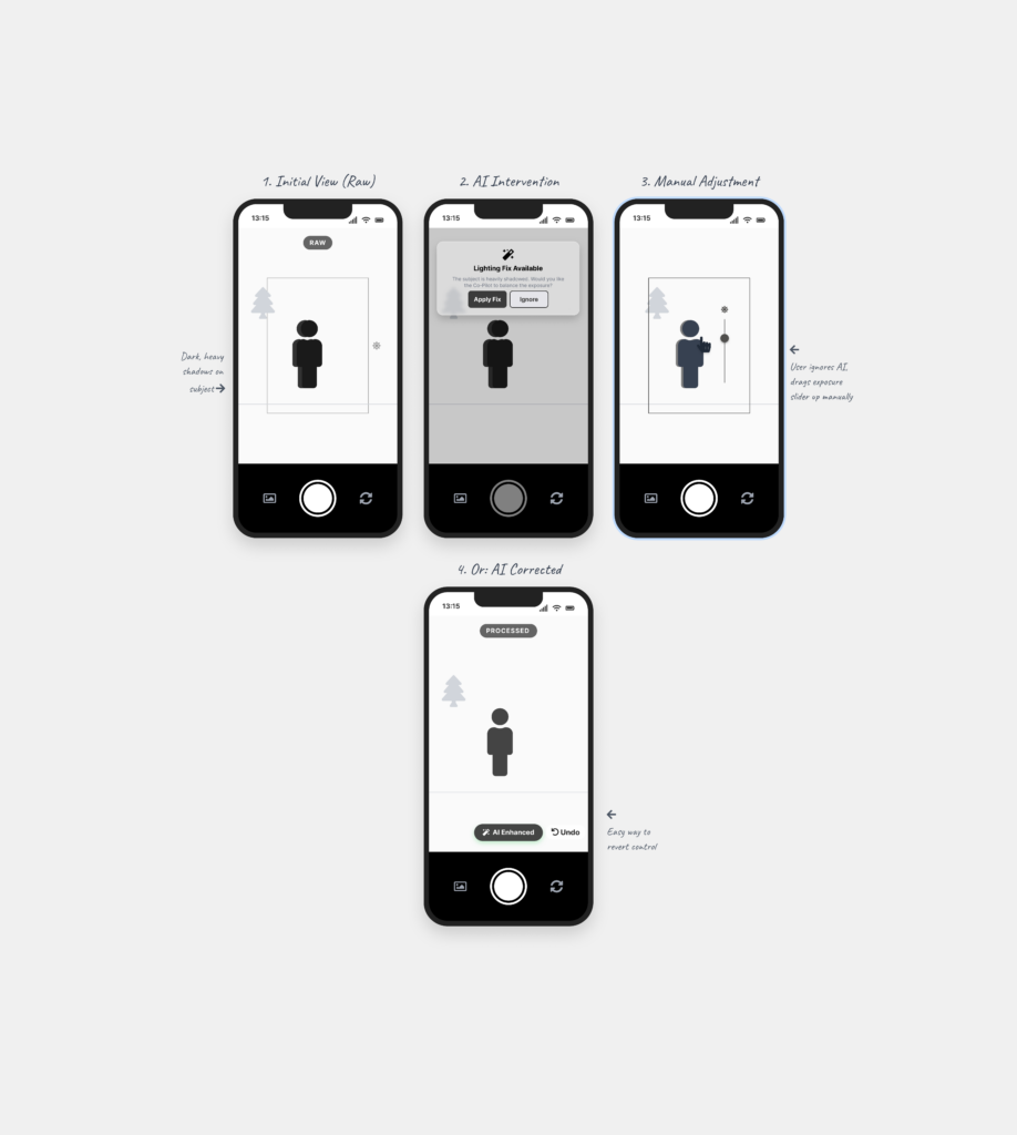
Following my research on “Automation in Photography,” I have spent this week diving deeper into my project by creating three different prototype scenarios. Even though I haven’t tested these with real users yet, the act of making them helped me see points I was missing and gave me a better direction for my Master’s thesis.
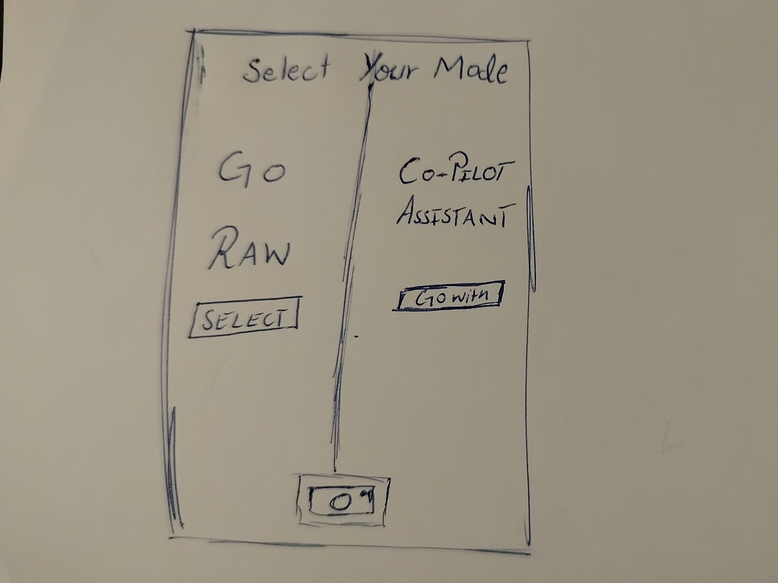
Prototype 1: The Mode Toggle
In this one, when the user opens the camera, they have to choose between two options. One is a Raw Mode where the user has all the control, and the other is an AI Automation mode.
The Goal: To see if forcing the user to pick a mode at the start makes them more intentional about how they want to take the photo.
Prototype 2: The AI Assistant
This is a digital assistant that pops up on the screen while you are shooting. It explains what is happening based on the scene. For example, it might say “increase shutter speed because you are shooting action” or “reduce ISO because there is too much light.”
The Goal: To see if giving the user a “why” helps them stay in control instead of the camera just fixing the settings automatically.
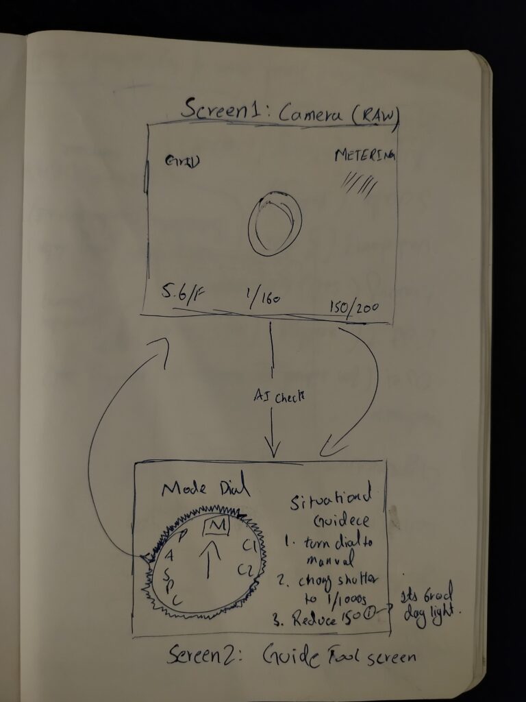
Prototype 3: The External Guidance Tool
This is for professional cameras. A separate device (like a phone) is attached to the camera to guide the user. It shows suggestions on which physical dials to turn to get the right settings.
The Goal: To see if the AI can act as a teacher that helps the user learn how to use the manual settings on their professional camera.
Personal Reflection: Why Prototype Now?
Creating these scenarios helped me see which directions I might follow, but it also left me with a big question about the design process. I understand that if you have a clear vision, prototyping early can save a lot of time. But when you are still in the early stages of defining and understanding the problem, I found it extremely difficult.
To be honest, it doesn’t make total sense to me to build a solution when I haven’t even fully decided what the actual problem is yet. While I know it is supposed to be beneficial, I personally didn’t find it that helpful at this stage. It felt a bit like guessing. However, the exercise did at least show me which side of the camera-AI idea has the most potential, even if the final direction is still a bit blurry.
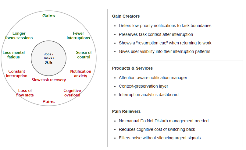
A knowledge worker or student who needs extended periods of uninterrupted focus to do their best work. They are productive in flow states but regularly pulled out of them by notifications, messages, and contextual switches. They need a system that protects their attention without requiring constant manual management.
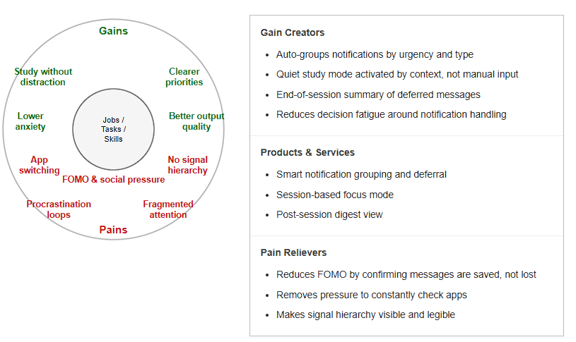
Persona II – The Overloaded Student
A university student juggling coursework, communication apps, and social media across the same device. They struggle to distinguish between urgent and non-urgent signals, and often spend more time managing notifications than doing the actual work. They need a system that reduces the noise without them having to think about it.
Business Idea
What problem are you solving?
Digital interfaces are built to deliver information as fast as possible: but human attention does not work that way. Every interruption carries a cognitive recovery cost that current systems completely ignore. The result is a generation of users who are constantly reactive, chronically distracted, and unable to reach the deep focus states where their best thinking happens. There is no mainstream product that treats attention as a resource worth protecting at the system level.
Why should we care about it?
Attention is not just a productivity concern, it is a mental health issue. Sustained notification overload is linked to higher cortisol levels, reduced working memory performance, and increased anxiety. At the same time, the economic cost of fragmented attention in knowledge work is measurable: studies estimate billions in lost productive hours annually due to interruption-driven task switching. The problem affects every person who works or studies with a digital device which is effectively everyone.
What is the solution? How does it work?
An attention-aware notification layer that sits between the operating system and the user’s apps. It uses behavioral signals: typing rhythm, app dwell time, task duration, time of day, to infer whether the user is in a focused state. When focus is detected, non-urgent notifications are held and batched for delivery at a natural task boundary. When an interruption does occur, the system provides a resumption cue, a lightweight context snapshot that helps the user return to their previous task faster. No manual configuration required; the system learns the user’s patterns over time.
Who is the target audience / customer?
The primary users are knowledge workers and students: anyone whose productivity depends on sustained focus. The paying customers are organizations: companies that want to reduce burnout and increase deep work capacity among employees, educational institutions looking to support student focus, and productivity software companies that want to integrate attention-awareness into their existing tools as a premium feature.
What is going to happen? (Change & Impact)
We move from a model where every moment is equally interruptible to one where digital systems respect the rhythm of human cognition. Interruptions do not disappear, they are timed better. Users reclaim extended focus periods without having to fight their devices to do it. Over time, this reduces the normalization of fragmented attention and establishes a new expectation: that technology should protect focus, not just compete for it.
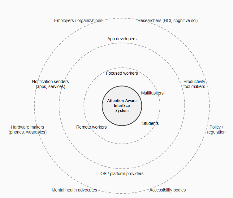
At the center is the Attention-Aware Interface System, a framework designed to make digital environments sensitive to a user’s attentional state before delivering interruptions, rather than eliminating them entirely. The inner ring holds the direct users: knowledge workers, students, remote workers, and multitaskers, each experiencing interruptions differently based on task type and cognitive load. Surrounding them are the groups that shape interruption conditions: app developers, OS providers, and notification senders and at the outer edge, the institutional forces of employers, researchers, hardware makers, and policy bodies. Together, these layers show that attention is not just a personal resource, it is a systemic one.
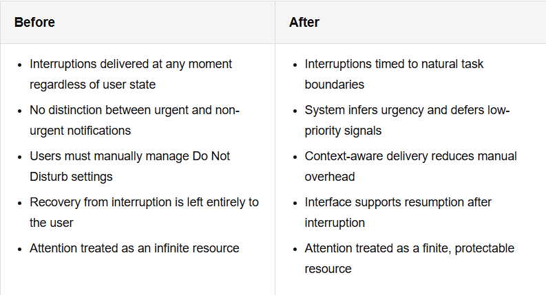
Change and Impact
This comparison highlights the shift from interruption-blind digital systems to attention-aware design. Current notification architectures are built around the sender’s intent, not the receiver’s cognitive state. A message is delivered the moment it is sent, regardless of whether the recipient is mid-task, in a flow state, or already cognitively overloaded. The result is a system optimized for immediacy at the cost of sustained focus. Inclusion & Accessibility
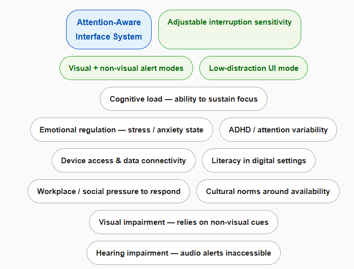
Access to an attention-aware system is not uniform. The ability to benefit from interruption management depends on a range of cognitive, physical, and social factors that are unevenly distributed across users. Some barriers are internal: a person with ADHD may experience interruption recovery very differently from a neurotypical user: for them, even a brief disruption can cascade into a much longer loss of focus. Users in high-stress or high-anxiety states are more vulnerable to the compounding effects of notification overload. Inclusion here is about cognitive and emotional accessibility, not just physical or perceptual access.
New semester, new researches and new problems…Moving from theoretical research into lo-fi prototyping forced me to confront something I had been putting off: my topic is hard to make it physical. Research on attention, interruption and cognitive recovery does not translate naturally into a clickable mockup or a paper sketch. The phenomenon I am studying is internal and time-dependent. You cannot see it on a screen.
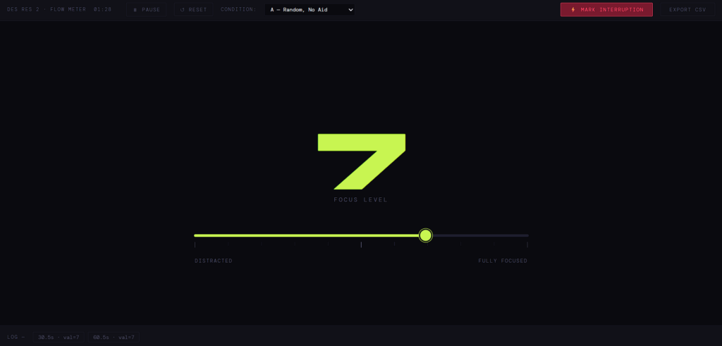
The approach I took was a simple behavioural task. A participant reads a short text and corrects errors in it while thinking aloud. I interrupt them once with a spoken question, then observe how they return to the task. To capture focus levels over time, I built a small browser tool; a slider the participant adjusts continuously, which logs their self-reported focus every thirty seconds and marks the exact moment of the interruption. At the end of the session it exports a CSV, so it is easier to track the data. It is low-tech, but it produces real data grounded directly in the literature.
The first test format was a speed dating exercise: five-minute exchanges rotating between participants. The idea is to get fast, varied feedback, and it works well for many types of prototypes. For mine, it was harder to make useful. Five minutes is not long enough for a person to actually get into the task before the interruption happens. Most of the time was spent explaining the setup rather than experiencing it, so the feedback reflected how clearly I could describe the concept more than how the prototype itself worked.
The most consistent piece of feedback was about the setup: having the task on one device and the focus slider on another felt fragmented. Several people pointed out that if I am studying attention, adding friction between two separate tools is counterproductive. It is a fair observation and one I plan to address, consolidating everything into a single interface makes more sense both practically and conceptually.
The session was useful in a different way than I expected. It did not tell me much about interruption and recovery, but it did clarify the limits of the current prototype as a communication tool. My research sits closer to the theoretical end of the spectrum for now, and that makes it genuinely difficult to prototype in a format that works for quick explanation to someone unfamiliar with the underlying psychology.
The plan is to run the full session individually, without the time pressure, in a setting where the participant can actually reach a state of focus before the interruption lands. I also want to think about whether a behavioural experiment alone is the right form, or whether the research needs a more designed artefact alongside it, something that makes the concept visible rather than just measurable.
Designing for complex public environments requires more than addressing isolated user interactions. It demands an understanding of the broader system in which these interactions occur. Therefore, I decided to conduct further research in relation with the help of a university lecture and five different strategic methods, that aim to provide further clarity and a more structured insight into the different parts of this project.
System Mapping
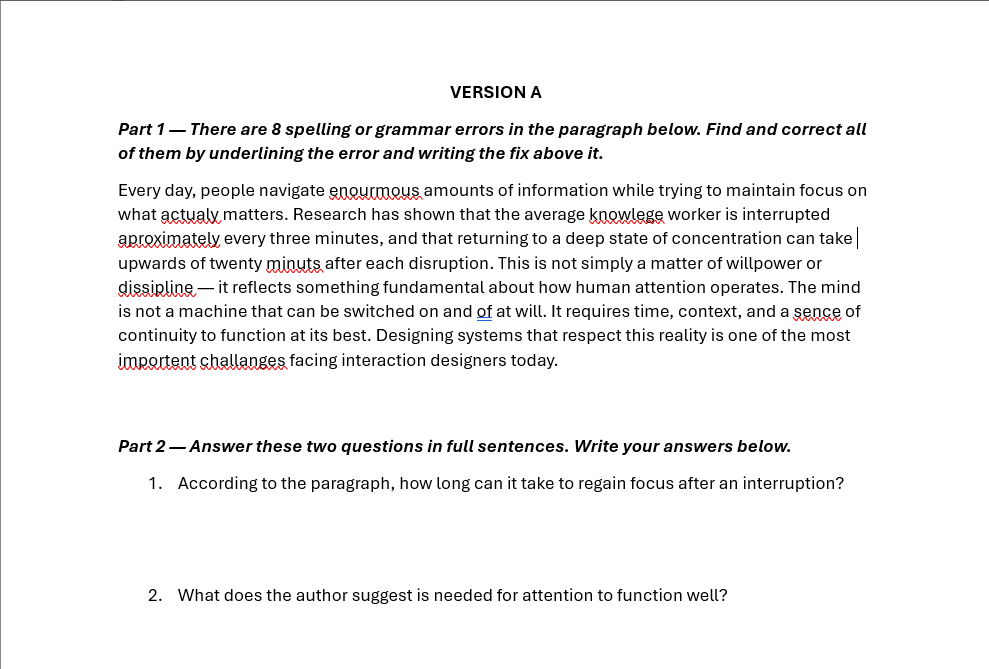
The first of those approaches is system mapping. It is used within design research to visualize relationships between actors, infrastructures, and external influences. Rather than focusing on single touchpoints, system maps enable designers to identify interdependencies, power structures, and flows of information, and uncover opportunities for more systemic and sustainable interventions (zero360., 2026). In this project, system mapping serves as the starting point for investigating the experience of German train platforms. These environments are characterized by high density, time pressure, and diverse user groups, making them inherently complex.
At the center of the system map lies the proposed design intervention: a physical guidance system intended to improve orientation and interaction on platforms. Placing this concept at the core allows for a structured analysis of how it connects to and influences the surrounding system. The layer around the focal point consists of direct stakeholders, including passengers, train staff, and Deutsche Bahn (DB). Passengers represent the primary user group, yet they are far from homogeneous. Commuters prioritize efficiency and speed, tourists require clarity and guidance, while elderly users or individuals with disabilities depend on accessibility and physical support. Train staff and conductors, on the other hand, are concerned with operational efficiency and safety. By mapping these different perspectives, it becomes clear that improving the platform experience requires balancing multiple, and sometimes competing, needs. Expanding outward, the system includes indirect stakeholders such as station personnel, UX designers, engineers, and production teams. These actors are responsible for implementing, maintaining, and iterating the proposed solution. Their inclusion highlights that design outcomes are not only shaped by user needs but also by technical feasibility, organizational structures, and economic constraints. On an even broader level, societal actors, such as the general public and environmental stakeholders, introduce additional layers of influence, shaping long-term priorities such as sustainability and public acceptance.
The relationships between these actors are visualized through a network of connections, illustrating flows of communication, influence, and dependency. The density of these connections reveals a highly dynamic system in which changes to one element can have cascading effects across others. This insight directly informs the next step of the design process: evaluating how an intervention might alter the system.
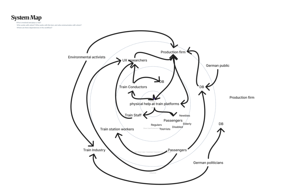
Discovered Change & Impact
To address this, a Change and Impact map was developed. Building directly on the system map, it introduces a temporal dimension by comparing the current state (“Before”) with a projected future scenario (“After”). The “Before” perspective synthesizes the key issues identified in the system analysis, including disorientation, overcrowding, inefficient boarding processes, and limited accessibility. These challenges are not isolated but interconnected, reinforcing one another and contributing to an overall stressful experience (Mural, 2025).
The “After” perspective explores how the proposed physical guidance system could transform these conditions. For example, improved orientation may reduce passenger uncertainty, which in turn can streamline movement flows and support more efficient boarding. However, the map also critically considers potential trade-offs, such as increased reliance on technological systems, maintenance requirements, or unintended behavioral changes among users. This step is crucial, as it ensures that the design is not evaluated in isolation but as an active component within a complex system. The logical progression from system mapping to impact evaluation demonstrates how insights are translated into informed design decisions.
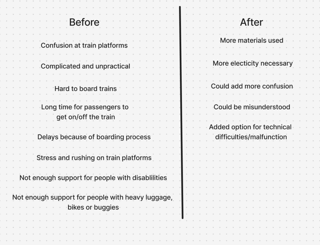
Inclusion & Accessibility
In parallel, the project integrates inclusion and accessibility as fundamental design principles. Inclusive design research emphasizes that accessibility should be embedded from the beginning, rather than later along the design process (Figma, 2026). To operationalize this, two additional mapping approaches were used. The first identifies the physical, cognitive, and social requirements necessary for users to fully experience the product. The second focuses on barriers, analyzing which user groups may be excluded and why.
This analysis revealed that physical guidance systems, while potentially beneficial, can also introduce new barriers, particularly for individuals with visual, auditory, or cognitive impairments. As a result, the design strategy prioritizes multimodal interaction, ensuring that information is communicated through multiple sensory channels. At the same time, a minimal and clear design language is emphasized to avoid adding complexity to already dense environments. These considerations are directly linked back to the system map, reinforcing the idea that inclusive design is not a separate concern, but an integral part of the overall system.
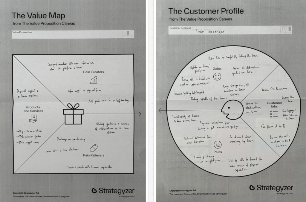
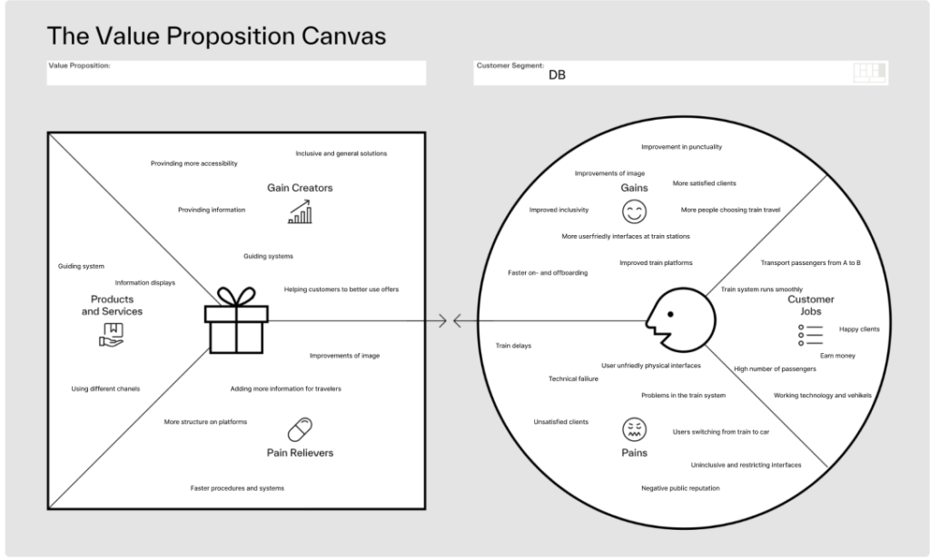
Value Proposition Canvas
To further refine the concept, the Value Proposition Canvas (Strategyzer, 2026) was applied. This tool builds on previous analyzes by explicitly linking user needs to design solutions. The Customer Profile identifies key user goals, such as navigating efficiently and reducing stress, alongside pains like confusion and overcrowding.
The Value Map translates these insights into concrete design features, including intuitive guidance systems and improved information structures. To get a second view point, the canvas was also applied to Deutsche Bahn as an organizational stakeholder, highlighting goals such as operational efficiency and customer satisfaction. This dual perspective ensures that the proposed solution aligns both with user expectations and institutional objectives.
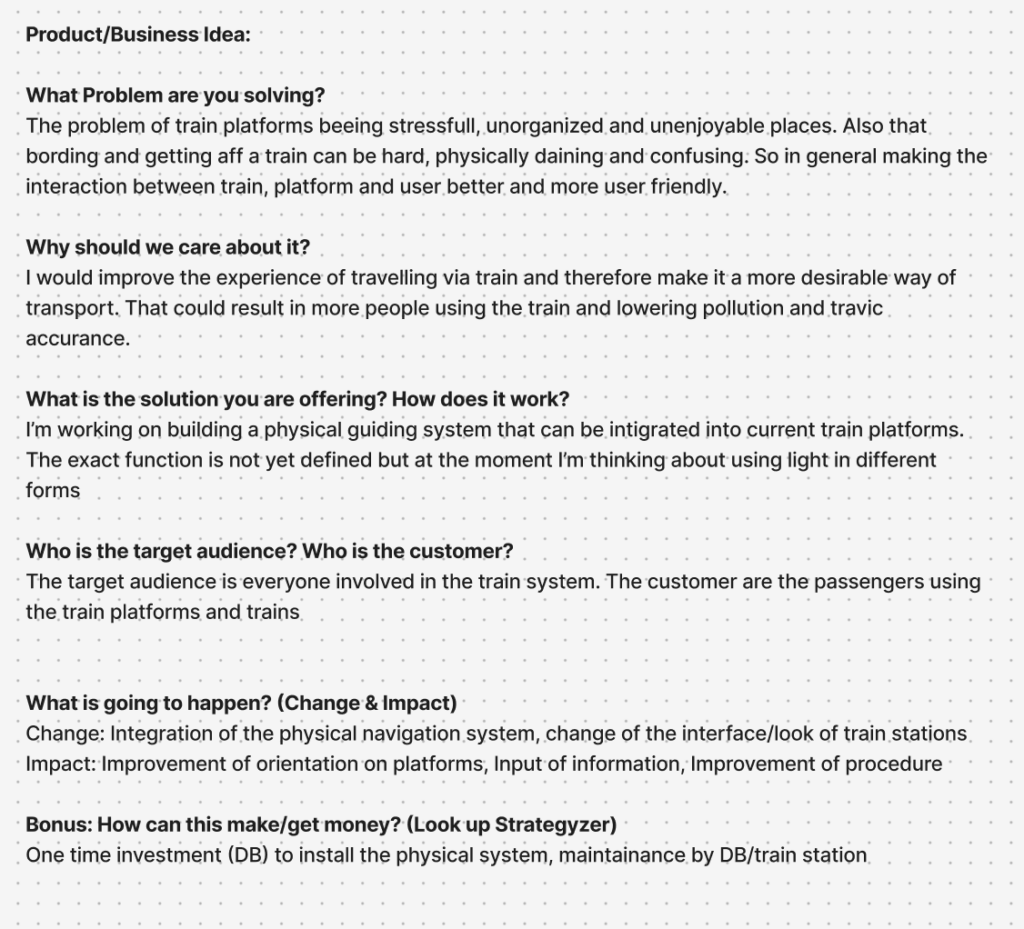
Product Idea
The outcome of this interconnected process is a product concept for a physical guidance system integrated into train platforms. While still in the brain-storm phase, the current direction explores the use of light-based elements, such as illuminated pathways or dynamic signals, to guide passengers intuitively. The concept directly responds to the insights generated through the system mapping, the impact analysis, and the user-centered frameworks.
Information Gathered
In conclusion, the use of system mapping, Change and Impact analysis, inclusive design methods, and value-driven frameworks were valuable methods to create valid connections and help get a clearer picture of the problem at hand and what factors have to be considered, when designing for a complex and challenging physical space. Each method builds upon the previous one, creating a logical progression from understanding complexity to proposing targeted interventions. This showed me how important it is to view design not as isolated problem-solving, but as a practice to deeply understand complex interactions and interconnected systems.
Next Steps
With the added insights and findings, the prototypes that were already developed can be refined and tested. After that I want to work on defining the end product narrower through more in-depth research and prototyping with higher fidelity.
Literaturverzeichnis
Figma. (2026). Accessibility and inclusion in design. Von Figma: https://www.figma.com/resource-library/creating-accessible-and-inclusive-design/ abgerufen
Mural. (2025). Change impact assessment template. Von Mural: https://www.mural.co/templates/change-impact-assessment abgerufen
Strategyzer. (28. January 2026). The Value Proposition Canvas. Von Strategyzer: https://www.strategyzer.com/library/the-value-proposition-canvas abgerufen
zero360. (2026). Was ist: System Mapping. Von zero360.: https://zero360.de/glossar/system-mapping/ abgerufen
Grundsätzlich gibt es zwei Hauptfunktionen, mit denen sich der Grease Pencil in Blender verwenden lässt. Zum einen kann man direkt im 3D‑Raum zeichnen und damit reine 2D‑Animationen erstellen, die zwar flach sind, sich aber trotzdem räumlich betrachten lassen. Zum anderen kann man mit dem Grease Pencil 3D‑Objekten einen cartoonartigen oder malerischen Look verleihen, indem man Linien und Texturen hinzufügt. Dadurch entsteht ein künstlerischer 2D‑Touch, während das Objekt seine räumliche Tiefe behält.
Auf diesen beiden Hauptfunktionen lässt sich natürlich weiter aufbauen. Mithilfe von Effekten oder Geometry Nodes kann man sich kreativ austoben und vielfältige neue Stile entwickeln. Für diesen Blogeintrag möchte ich mich aber auf die grundlegenden Funktionen konzentrieren und zeigen, wie man den Grease Pencil überhaupt benutzt.
Um den Grease Pencil in Blender zu nutzen, öffnet man per Shift + A das Menü und wählt dort Grease Pencil aus. Anschließend stehen mehrere Optionen zur Verfügung. Meist entscheidet man sich zwischen Blank oder Stroke. Bei Stroke erscheint zunächst eine Linie, die bereits mit einem vorgefertigten Material versehen ist – praktisch, wenn man direkt loslegen möchte. Wer aber lieber von Grund auf anfängt, wählt Blank. Wie der Name schon sagt, startet man hier in einem leeren Raum. Danach kann man in den Draw Mode wechseln.
Im Draw Mode stehen verschiedene Werkzeuge zur Verfügung, die klassischen Brush‑Tools ähneln. Man kann unterschiedliche Pinsel auswählen oder neue importieren. Im Material Tab lässt sich festlegen, ob der Strich nur aus einer Linie, einer Füllung oder beidem bestehen soll, ebenso wie Farbe und andere Eigenschaften. Rechts oben befinden sich die Reiter Advanced, Stroke und Cursor, mit denen man seinen Brush individuell anpassen kann.
In der Mitte findet man die Reiter Origin, View und Layer. Unter Origin gibt es vier Optionen: Origin, 3D Cursor, Surface und Stroke. Mit Origin platzierst du deinen Strich am Ursprung deines Grease Pencil. 3D Cursor richtet ihn am Cursor im Raum aus. Surface „heftet“ den Strich an die Oberfläche eines Objekts. Über Offset lässt sich bestimmen, wie weit der Strich von der Oberfläche entfernt sein soll. Die Option Project onto selected sorgt dafür, dass der Strich nur auf ausgewählte Objekte projiziert wird. Mit Stroke kannst du neue Linien an bestehende anheften – entweder vollständig (All Points), nur an Start‑ und Endpunkten (Endpoints) oder nur am ersten Punkt (First Point).
Origin3D Cursor
SurfaceStroke
Das sind die grundlegenden Funktionen, um erfolgreich mit dem Grease Pencil zu starten.
For many years now I have loved using old materials and creating new things with it. I use old materials from things like clothes, beddings or curtains, and I create stuff I need/want like purses, bags, new clothing items, wallets, or even shoes. The picture is a collage of some of my creations from a denim recyceling project i am doing.
Last year, I wrote a research paper about the fashion industrys impact on the environment and explored different approaches to addressing overconsumption. One of my key findings was that being involved in making, customizing, or personalizing clothing makes it much more likely that people will keep and care for their garments over a longer period of time. I also found that while buying second hand or thrifted clothing is better than purchasing new items, it is not necessarily as sustainable as it may seem. If people switch to second hand shopping but continue to consume at the same high rate, they still contribute to the ongoing demand for fast fashion on a larger scale. Ultimately, the most effective way to reduce the fashion industrys environmental impact is to lower overall consumption. This can be achieved by keeping clothes for longer and taking better care of them.
I love how sustainable this practice is, and how the things I make are customized perfectly to me and my needs. I also feel more grateful and attached to the things I make myself because I put time and effort into it. For me, doing these crafts give me some time off from real life, where I can sit and sew for example and suddenly 5 hours have gone by without me even noticing or checking my phone once. I would like to be able to find a way to influence and share this feeling with others.
In design and research 1 I worked with the topic doomscrolling. Researching how social media platforms draw you in and keep you trapped consuming content. I realized that what helps me most of all to stay offline and enjoy the real world are these kinds of physical projects. Therefore, I think a natural continuation into design and research 2 is to explore how i can try to share this hobby with others it might be able to have the same effect on.
My friends and family often ask me if I can please make them something too or teach them how I did it after I show my projects. Maybe there is a way to show, help, and teach this to everyone?
My current idea is to create a website people can use to get help on how they can recycle their own old materials into something new.
Possible features of the website:
Patterns for upgrades and remakes
Sewing tutorials
AI that generates patterns customized to your measurements. (maybe a paid subscription?)
Search filters for things like : tools, skill level, time, fabric available
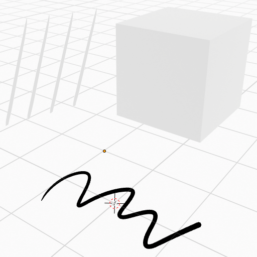
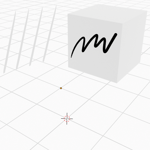
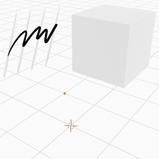
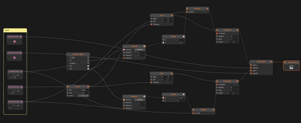
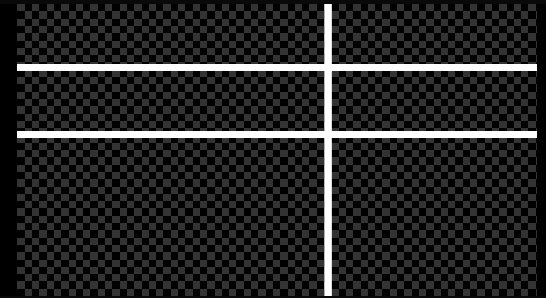
This project explores a more intentional and sustainable way of creating visual sources for VJing by working with the node-based software “Resolume Wire” in combination with “Resolume Arena”. Instead of relying solely on downloaded or self-made pre-rendered clips or effect chains, the goal is to build adaptable systems that can evolve, just as the VJ evolves.
At its current stage (see node patch above), the project consists of two lines, a vertical and a horizontal line that behave like dancing entities by giving it specific parameters like minimum and maximum size, line thickness and random position appearances, which creates the dancing look (see below).
By mapping parameters in Wire to Midi controls in Arena, the lines can be manipulated in real time, shifting rhythm, shape and interaction dynamically during a set. This turns a simple visual into a responsive instrument rather than a static asset. What makes this approach particularly compelling is its openness. The system is not a finished or fixed file. It is procedural and expandable. Additional parameters can be introduced in Wire at any point, allowing for more complex behaviors or nuanced control if required. Of course, that is as long as one has a Wire and Arena licence.
For example, arrays of color profiles could be implemented to either randomize colors or trigger specific palettes via MIDI or by making this effect sound reactive. This creates a balance between unpredictability and control, depending on how the performer chooses to engage with it. This ongoing, system-based workflow differs significantly from more common approaches. Creating visuals directly in Arena often encourages experimentation through layering and applying effects in the moment. This can lead to surprising and playful results, driven by intuition rather than planning. On the other hand, producing pre-rendered content in tools like Adobe After Effects offers precision and high visual fidelity, making it ideal for detailed compositions that need to remain consistent. I do not position myself against any of these methods. Both approaches have their place and I will likely try out all the mentioned workflows. However, integrating Wire into the mix introduces a different layer. Independence as a VJ and longevity of visual sources. Instead of solely building a collection of fixed clips, this method contributes to a growing and reusable visual system. A personal databank of generative tools. Ironically, I will mix the content that I am writing about live at the “Generate” event in Graz. As I said, intentional design is the keyword here. In that sense, this project is less about producing a finished visual and more about establishing a process, similar to a DJ set. The two dancing lines are just a starting point: One of the simplest structures that demonstrates how even minimal elements can become expressive when they are designed to be performed.
If you’re curious, here is a snippet of me testing and practicing. Or should i say I am cooking in my kitchen?
The color shift from white to, e.g., green is actually just an iPhone camera fault, but this inspired me to try and add a color randomizer for a certain number of frames, similar to how the lines appear in different positions on the screen. Once again, testing has proven its worth beyond VJing being incredibly fun.
It is also rewarding to see how I presented last semester that I want to get into VJing and now I am already deep into the matter and have gone back to where it started – simple lines, as seen in my old presentation slide below.