In a context marked by profound instability and continuous change, the future takes shape as a fundamental tool for expanding the horizon of design. Not as something to be predicted, but as a reflective dimension that stimulates the imagination, opening the way to the construction of possible scenarios and to the definition of visions capable of guiding action in the present.
According to the writer H. P. Lovecraft, the unknown generates fear in human beings, an emotion that has played a crucial evolutionary role in survival, protecting us from potential dangers. However, the unknown does not represent only a threat, but also a generative resource: it is from what we do not know that new narratives, visions, and civilizations emerge.
As the anthropologist David Graeber states, it is precisely imagination that distinguishes humans from other animals: «…it differentiates humans from animals, a bee from an architect».
Even the simple question “What if?” becomes fundamental in shifting design toward the realm of hypothesis and the exploration of what could happen (Anthony Dunne & Fiona Raby, 2013).
The future, therefore, is not a fixed or abstract entity, but a complex human process that emerges from the interaction of multiple presents and generates just as many possibilities.
Month: June 2026
One-Shot-Sport-Dokumentation: Die Post-Production
Nach der erfolgreichen Produktion meines Werkstücks ging es nun in die Post-Production, die einen entscheidenden Einfluss auf die Wirkung und Qualität des Endprodukts hat. Im Rahmen dieser Blogbeiträge wurde ein etwa zweiminütiges Video über einen professionellen Rennfahrer eines Porsche Sixt Carrera Cup Deutschland Teams (Proton Competition) erstellt. Das Werkstück orientiert sich stilistisch an Sportdokumentationen bzw. -serien, während es so konzipiert wurde, dass es eine One-Shot-Production war. Das Ziel war es, eine kurze Doku zu erstellen, die den Rennsport näher an das Publikum bringt und die Erkennungsmerkmale einer Sportdokumentation beinhaltet, während sie gleichzeitig die Identifikation des Publikums mit dem Fahrer bzw. dem Sport durch die One-Shot-Einstellung noch zusätzlich verstärkt. Außerdem war die Frage, ob es möglich ist, diese beiden Genres zu kombinieren und eine in nur einer Einstellung gefilmte Sportdokumentation spannend und immersiv zu gestalten. Dazu hat die Post-Production einen entscheidenden Beitrag geleistet.
Sichtung des Materials
Der erste Schritt der Post-Production bestand in der Sichtung des Materials. Durch Zeitstress und eine Verschiebung der Qualifying-Session war bei dem Dreh des Werkstücks nur Zeit für zwei Durchläufe und einen Probeversuch. Dadurch gab es dementsprechend nicht so viel Material, das gesichtet werden musste, und dieser Schritt war nicht so zeitintensiv. Was allerdings schon mehr Zeit in Anspruch genommen hat, war die Sichtung des Interview- bzw. Audiomaterials. Da das fertige Werkstück nur ca. zwei Minuten lang sein sollte und das Interview aber knappe zehn Minuten dauerte, musste dies schon vorab gekürt und aussortiert werden.
Thematischer Fokus des Werkstücks
Bei dem Drehen des Interviews wurde Fragen zu vielen bzw. breiteren Themengebieten gestellt, um einen großen Interessensbereich abzudecken. Wie bereits im Konzept-Blogbeitrag beschrieben, war der Fokus des Werkstücks darauf, was einem Fahrer durch den Kopf geht, bevor er in sein Auto steigt. Somit sollte sich der Inhalt um Emotionalität bzw. Mentalität drehen und so einen Identifikationsfaktor für das Publikum darstellen.
Durch das Sichten des Interviewmaterials hat sich dabei ein thematischer Fokus herauskristallisiert. Es geht dabei um etwas, das im Motorsport Gang und Gebe ist und sich – Gott sei Dank – über die Jahre immer mehr (ins Positive) verändert: Crashes. Rennunfälle passieren zwar immer noch häufig, aber die Fahrzeuge haben sich so verändert, dass Motorsport über die Jahre von einem der gefährlichsten zu einem der sichersten Sportarten geworden ist. Durch Sicherheitsmaßnahmen im Bau der Rennautos wurde bereits zahlreiche Tode und Verletzungen verhindert. Trotzdem gibt es immer noch gefährliche Unfälle, aus denen Verletzungen und Tode entstehen. Beispielsweise verunglückte erst im Mai ein Fahrer, Juha Miettinen, tödlich bei dem Qualifying Rennen der 24 Stunden vom Nürburgring. Der Crash entstand durch eine Ölspur und es waren sieben Fahrzeuge darin verwickelt. Miettinen starb, die sechs anderen wurden verletzt. Er prallte seitlich mit der Fahrertür in das Heck des vor ihm stehende Fahrzeug. Solche „T-Bone“-Unfälle sind die eine der wenigen, die immer noch sehr gefährlich sein können, da nur wenig Knautschzone zur Verfügung steht. Vor einiger Zeit verunglückten ähnlich der Formel 2 Fahrer Anthoine Hubert und der Formula Regional Fahrer Dilano van’t Hoff beide in Spa-Francorchamps, Belgien.
Solche Unfälle sind auch für die Fahrer:innen anderer Rennklassen schlimm und bleibt allen im Kopf. Sie sind Erinnerungen daran, dass es doch schneller vorbei sein kann, als man glaubt.
Trotzdem war es auch dem Fahrer dieses Werkstücks wichtig zu betonen, dass alles dafür getan wird, das Fahren bzw. die Fahrzeuge so sicher wie möglich zu bauen. Um eine erhöhte Emotionalität zu erreichen, wurde dieses Thema jedoch für das Video ausgewählt.
Schnitt und Postproduktion
Der Schnittprozess des Werkstücks war, ähnlich wie die Sichtung des Materials, eher ein kürzerer Prozess, da bei dieser One-Shot-Production nicht mit seamless cuts gearbeitet wurde. Allerdings wurde das Interview geschnitten und passende Ausschnitte gefunden, um diese anzuordnen.
Durch das Sichten des Materials haben sich zwei kleine Filmfehler gezeigt. Der Erste war ein etwas ungeschickter Kameraschwenk im Vorbeigehen aus Platzproblemen. Der Zweite war ein kurzer Fokusfehler. Durch die Interviewausschnitte entstand aber eine sehr bildliche Vorstellung von Crashes und was passieren kann. Da allerdings kein Material von Unfällen oder ähnlichem vorhanden war, das ohne Urheberrechtsverletzungen verwendbar war, konnte dies nicht overlayed werden. Deshalb wurden Zeitungsartikel-Headlines verwendet, die einige Beispiele von schweren Unfällen aufzeigen. Diese wurden von KI (ElevenLabs) in einer Nachrichtensprecher-Stimme nachgesprochen und ebenfalls unterlegt. Die Headlines wurden über die Kamerabilder, an der ersten fehlerhaften Stelle, mit 50%-iger Deckkraft gelegt. Allerdings wird dafür noch eine eventuell bessere Lösung gesucht, weshalb das Werkstück noch nicht in diesem Beitrag zu sehen sein wird.
Ein weiteres Hindernis, dass sich zeigte, war die Stabilisierung des Materials. Trotz der Verwendung eines Gimbals hat das Video sehr viel von dem Charakter einer Handheld-Kamera. Nach einigen Überlegungen wurde sich dazu entschieden, das Material in diesem Stil zu lassen, da es zu der Erzählweise und dem Gesamteindruck passt. Allerdings kristallisierte sich damit ein weiteres spannendes Thema heraus: Die Stabilisierung von One-Shot-Productions bzw. Filmen und Videos generell. Deshalb wird sich einer der nächsten Blogbeiträge diesem Thema widmen.
Das Werkstück wurde vollständig in Premiere Pro geschnitten und bearbeitet. So erfolgte auch das Color Grading hier. Allerdings war dies nicht der Hauptfokus des Werkstücks. Trotzdem sollten die Farben natürlich mit einem leichten kühlen Touch sein. Der Hintergrund war durch das Weiß des Zelts und der hellen Sonne sehr überbelichtet, was durch das Color Grading etwas behoben wurde.
Für die musikalische Untermalung wurde durch die hohe Emotionalität ebenfalls eine dazu passende Musik ausgewählt. Die Piano-Musik ist relativ ruhig und unterstreicht die Gravität des Themas. Der Sound begleitet das Werkstück leise im Hintergrund durch die gesamte Länge.
Außerdem wurden die natürlichen Sounds einer Boxengasse im Video gelassen, um mehr Immersion zu generieren. In den Sprechpausen sind diese auch lauter, um das Publikum wirklich in die Situation zu versetzen. Allerdings war es durch die laufenden Motoren teilweise sehr laut. Gegebenenfalls werden noch mehr Sound Effekte eingefügt.
Um das Werkstück etwas einzurahmen, gibt es am Anfang eine Art Intro, in der die Zuschauer:innen etwas in die Szene versetzt werden. Dabei werden nur der Ort, die Zeit und das Setting kurz benannt. Außerdem beginnt das Interview schon bevor das Bild zu sehen ist, um das Publikum neugierig zu machen.
Das gesamte Video hat Untertitel im Stil einer Serie, um diesen Aspekt einer One-Shot-Sportdokumentationsserie noch stärker einzubringen und (unterbwusst) das Gefühl zu verleihen, dass es auf einer Streamingplattform oder ähnlichem gesehen wird.
Fazit
Zusammenfassend kann man sagen, dass die Postproduktion auf jeden Fall einen entscheidenden Beitrag zur Gesamtwirkung des Werkstücks beigetragen hat. Auch wenn sich einige Schritte kürzer gestaltet haben, war die Nachbearbeitung trotzdem lehrreich und hat eine deutlich qualitative Aufbereitung des Materials gebracht. Insbesondere der Sound – sowohl Interview als auch Musik – haben viel dazu beigetragen.
Ebenfalls wird in einem der nächsten Blogposts analysiert werden, wie sich die Merkmale und Besonderheiten von beiden Genres – Sportdokumentationen und One-Shot-Productions – in dem Werkstück vereint bzw. wiedergefunden haben.
Quellen:
Boatman, C. (2013, April). Motor sports: Safer than ever. RGA. https://www.rgare.com/knowledge-center/article/motor-sports-safer-than-ever
Stritzke, H. (2026, 24. April). Juha Miettinen: So kam es zum Unfall auf dem Nürburgring. Motorsport-Total.com. https://www.motorsport-total.com/24-stunden-vom-nuerburgring/news/juha-miettinen-so-kam-es-zum-unfall-auf-dem-nuerburgring-26042401
Dieser Text wurde von ChatGPT korrigiert. Alle Inhalte wurden von mir selbst auf Richtigkeit und Relevanz überprüft und der Text selbst wurde von mir erstellt. Das Literaturverzeichnis wurde von ChatGPT erstellt.
SS26_#02_How Can We Test Whether People Recognize AI Images?
In my previous blog post, I introduced the topic I will be exploring this semester and discussed the growing difficulty of distinguishing between authentic and AI-generated images. One question kept coming up during my research: are people really able to tell the difference?
Many people seem confident that they can spot an AI-generated image immediately. Common clues that are often mentioned include unrealistic hands, strange facial features, or unusual details in the background. However, image generation technology is improving rapidly, and many of these obvious signs are becoming less common. This made me wonder whether people are actually as good at identifying AI-generated images as they think they are.
To explore this question, I am planning a small experiment.
The experiment will consist of two different parts. The first part focuses on fully AI-generated images and authentic photographs. Participants will be shown a collection of images from different contexts, including everyday situations, animals, scientific topics, and news-related content. For each image, they will be asked to decide whether they believe it is authentic or generated by artificial intelligence.
I deliberately want to include different types of content because context may influence how people judge an image. A portrait of a person might be evaluated differently than an image of a rare animal or a news event. By using a variety of subjects, I hope to gain a broader understanding of how people make these decisions.
The second part of the experiment is the one I find particularly interesting. Instead of showing completely different images, participants will be presented with two almost identical versions of the same image. One will be the original photograph, while the other will contain a modification created with AI. This modification could involve adding an object, removing a person, or changing certain elements within the scene.
Participants will then be asked a simple question: Which image is the authentic one?
This part of the experiment is designed to investigate whether people find it easier to identify AI when they can directly compare an original image with a manipulated version. While fully generated images receive a lot of attention, AI is increasingly being used to alter existing photographs rather than create entirely new ones. Because of this, understanding how people perceive manipulated images may be just as important as understanding how they perceive generated ones.
Another aspect I would like to explore is the role of age. In addition to their answers, participants will be asked to indicate their age group. This will allow me to compare the results of different generations and examine whether younger participants are better at recognizing AI-generated or AI-manipulated content.
A common assumption is that younger people may perform better because they are more familiar with digital technologies and encounter AI-generated content more frequently. However, it is also possible that the differences between age groups are smaller than expected. The experiment may reveal whether this assumption is actually true.
Of course, this will only be a small-scale experiment and cannot provide definitive answers. Nevertheless, I hope it will offer an interesting insight into how people currently interact with AI-generated imagery and whether our confidence in recognizing artificial content matches reality.
The next step will be selecting and preparing the images that will be used in the survey. Only then will it become clear how difficult this challenge really is.
SS26_#01_Can We Still Trust Images?
This semester, I’ll be focusing on a different topic than I did last semester. At the time, I wasn’t completely sure where my research interests would lead me, so we were given the opportunity to adjust our topics later on if needed. Over the past few months, however, I found myself becoming increasingly interested in the way we perceive images and why we trust them. That curiosity eventually led me to change my focus and explore this topic in more depth.
Every day, we are surrounded by images. Whether we are scrolling through social media, reading the news, or simply browsing the internet, images are everywhere. Most of the time, we accept them without giving them much thought. We rarely stop to ask whether an image actually shows what it claims to show.
At the same time, the tools used to create images are becoming more powerful. The rapid development of artificial intelligence has made it possible to generate images that look surprisingly realistic. In many cases, it has become difficult to tell whether an image is a real photograph or something that was created entirely by AI.
Over the past few months, I have come across more and more examples of AI-generated images appearing outside of technology-related discussions. They show up on social media, in advertisements, and sometimes even alongside news stories. Seeing this made me wonder how much we can really trust what we see online.
For a long time, photographs were seen as evidence. Even though image manipulation has existed for decades, photographs still carried a certain sense of authenticity. A photo was often considered proof that something had actually happened. Today, that assumption feels less certain. With only a few prompts, AI can create convincing images of people, places, and events that never existed.
What I find particularly interesting is that many people believe they can easily spot AI-generated images. Common signs that are often mentioned include strange-looking hands, unusual facial features, or unrealistic lighting. However, image generation tools are improving at a remarkable pace, and many of these obvious clues are becoming less common.
During my initial research, I found several examples where people confidently identified AI-generated images as real photographs. At the same time, genuine photographs were sometimes accused of being fake. This suggests that distinguishing between real and artificial images may be much more difficult than we think.
What fascinates me most is not only whether people can correctly identify an image, but also why they trust it. Does the context matter more than the image itself? Are we influenced by familiar faces, personal experiences, or our own expectations? And what actually makes an image feel believable?
To explore these questions further, I plan to conduct a small experiment in one of my upcoming blog posts. I want to find out whether people are really as good at recognizing AI-generated images as they often claim to be. Before that, however, the next post will focus on explaining the methodology behind the experiment and how it will be carried out.
#2 Sketching ideas and Lo-Fi prototypes
Imagining what could be prototyped for such highly conceptual and unexplored subject was initially challenging, as it required translating something abstract into tangible. Nevertheless, I was able to find two possible directions for further developments of the research, each exploring a different aspect of the topic. As a precautionary measure to ensure a deliverable outcome, I then also considered a separate (maybe more practical) direction as a reliable backup plan and idea 3.
Here follows a description of each idea in detail.
1. Building a tool to conduct research on user behaviour and AI usage
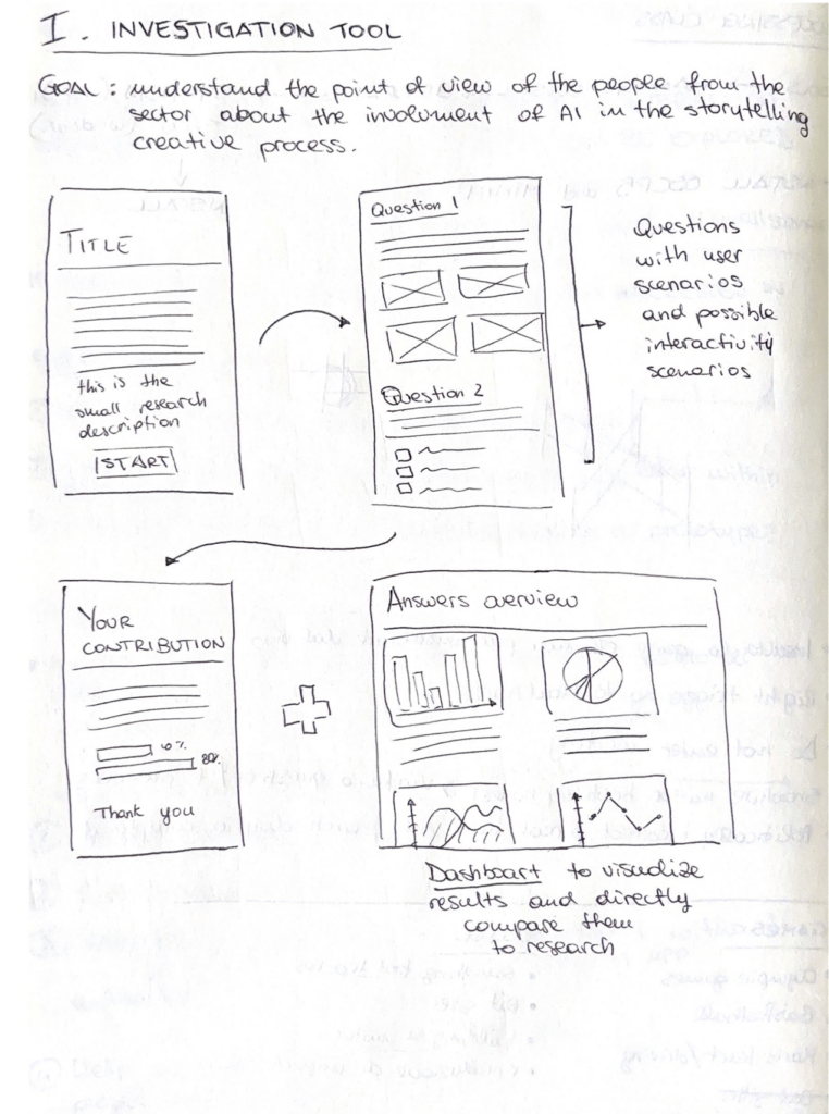
The concept sketched above stems from the need of conducting a survey for the thesis research, which should investigate the behaviour and habits in AI usage in the creative process of people in the field. Instead of relying on common survey tools, the idea here is to build/prototype a tool based on my needs, which could then show in a dashboard the data collected in the survey part. Why a dashboard? Because I would like the results to be always available and accessible to other researchers and designers, even without completing the assessment). This to ensure more open data in real time, that can illustrate our current usage trend ans possibly the environmental impact based on the numbers.
2. Developing a new framework/workflow for the involvement of AI in the data-driven storytelling creative process
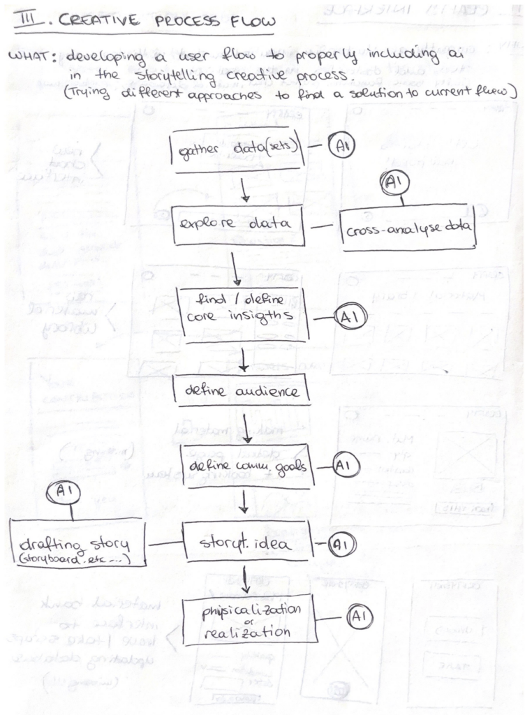
This second, more ambitious, idea is to study and develop myself a new (or just different) workflow framework for the community into data-driven storytelling. This would work as a step by step guide to follow for a conscious employment of AI in the creative process, highlighting the steps in which it can actually be helpful and how to properly write our prompts to have answers and outcomes that respect our needs in less requests. The scheme right now shows how our currently AI usage, yet the goal is to offer clearer steps with less involvement of generative models to ensure more human-centered design.
3. Implementing the interface of the website CRAFTY (the plan B)
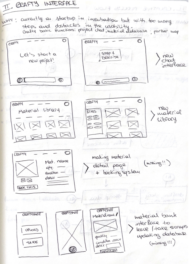
This concept focuses on a project developed with other students one year ago and currently undergoing a startup competition at Politecnico di Milano. Its name is CRAFTY and it is an AI enhanced website dedicated to creatives, which should help with project development relying on (and suggesting) recycled resources and waste materials collected in storage spaces in universities and Fablabs. The idea drafted in this sketch aim to rethink the whole interface and interaction for the website, to make the usage smoother and more intuitive. In addition, it was considered to develop the missing interfaces for an autonomous warehouse management.
Pitching the project
Here you can watch the pitch for the final idea of the project!
Audio transcription:
I have a question for you, be honest.
How many times you felt lost in your creative process and wished to had a proper framework to help you?
Okay, so we can agree that we surely have issues with that and that we are missing a huge step and also a guide in our daily workflow.
I have another question for you.
How many of you struggle because of AI not doing what you are actually asking for?
Well, what started as a research is now an accessible framework you can follow step-by-step every time you feel lost in your creative process, or just when you feel (ready) to try something new.
But why does this matter?
Because it started from the actual needs of someone who is involved in this field and is also actually experiencing the same frustrations as you, as you.
Because we don’t need to make our work more stressful in parts that could actually be lighter and faster.
Just check this tool and try yourself. Thank you!
#3 The “Futures Cone” and the “Scenario Planning”
One of the most effective tools for visualizing different ways the future can unfold is the Futures Cone, also known as the 3P Model. It was developed by Anthony Dunne and Fiona Raby (2013), building on earlier work by Stuart Candy (2009) and introduced within the Design Interactions program at the Royal College of Art in London.
The model is structured as a series of cones that branch out from a shared starting point, the present, each representing a different category of future. The probable refers to what is most likely to happen, and it is the space where most designers typically operate. The plausible moves beyond simple prediction, exploring scenarios that are believable, even if not certain, an approach often used by companies preparing for unexpected developments. Then there is the possible, which includes everything that may seem unattainable today due to technological, cultural, or social limits, but could become achievable in the future, as suggested by Michio Kaku in Physics of the Impossible (2008).
Alongside these, we can also consider the preferable future, located at the intersection between the probable and the plausible. While it inevitably reflects subjective values, it also aligns with broader societal and market needs.
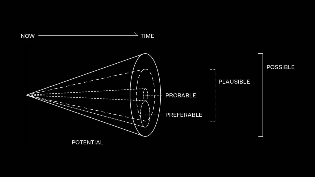
For this reason, it becomes a key area for Speculative Design, which aims to guide change by proposing alternative, inclusive, and sustainable scenarios.
To better understand how these scenarios are actually constructed, it is useful to look more closely at what is known as Scenario Building, or Scenario Planning.
Scenario Planning originated in the pioneering work of Pierre Wack, a French strategist at Royal Dutch Shell, one of the world’s leading oil companies. His task was to monitor global events that might influence oil prices. Until the Second World War, prices had remained relatively stable and affordable, but from the 1970s onward the situation began to shift dramatically: U.S. oil reserves were declining, global demand was rising, and exporting countries, particularly Arab nations, were gaining increasing negotiating power. This combination of factors posed a serious risk to the company’s economic stability.
In response, Wack and his team developed a new planning approach that moved beyond linear forecasting. Rather than searching for a single “correct” prediction, they constructed multiple possible scenarios, each based on different political, economic and social variables. Two main scenarios stood out: a more optimistic one, in which oil prices would remain low and stable, and a more challenging but realistic one, which anticipated a sharp increase in costs.
The effectiveness of this approach became clear during the 1973–1974 oil crisis. Shell was the only major company that found itself prepared, as its leadership had already adjusted their strategies according to the most plausible scenario identified by Wack. This foresight allowed the company to navigate the crisis from a position of strength, further consolidating its role in the global market.
Building on this legacy, Peter Schwartz, who later succeeded Wack at Shell, defines a scenario in his book The Art of the Long View (1991) as «a tool for ordering one’s perceptions about alternative future environments in which one’s decisions might play out». He goes on to explain that «Scenario Planning is about making choices today with an understanding of how they might turn out». In this sense, Scenario Planning is fundamentally about making informed decisions in the present, with an awareness of their potential future consequences.
Within this framework, the role of the designer becomes central. It is no longer just about introducing new products to the market, but about contributing to the creation of more just and sustainable futures. Design can therefore take two different directions: a traditional approach, focused on problem solving, responding to concrete needs through efficiency, aesthetics, and ergonomics and a more critical and speculative one, focused on problem finding, which brings questions to the surface and opens up space for reflection on ethical, environmental and social issues.
Figure 2. Early Royal Dutch Shell scenario planning reports.
#1 Speculative Design: What if?
In the collective imagination, design is almost always seen as a problem-solving process. Even in its most artistic and expressive forms, it ultimately remains tied to the idea of fixing something, of providing an answer, whether aesthetic or functional. But what if design could instead become a tool for questioning the present, or even for imagining the kinds of futures we would actually want to live in?
This question lies at the core of Speculative Design, an approach that began to take shape in the early 2000s as a way of exploring alternative future scenarios, rather than simply addressing problems through rational or functional solutions.
In other words, Speculative Design presents itself as a practice that does not seek definitive answers, but new questions. It is a form of design that opens up scenarios, sparks dialogue, encourages exchange, invites critique, and fuels the imagination.
What truly matters here, however, is not so much predicting the future as using the idea of possible futures as a lens through which to better understand the present. These alternative futures, as mentioned earlier, do not provide solutions, they raise questions. One above all: “What if…?”
It is precisely within this suspended space that the possibility emerges to think the unthinkable, to explore alternatives that would otherwise remain invisible or unexpressed.
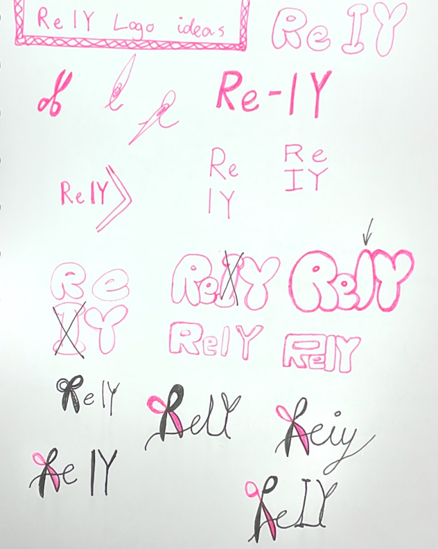
#3 D&R2 Building my idea
Since the last blog post, I have been working on the branding of my concept. I came up with a name for my website: ReIY. My focus has been on redesigning, reusing, and recycling materials, kind of “re-loving” your old clothes, so I wanted to include “Re” as part of the name.
The point of the website is also that you can use it as a tool to help yourself fix your problem, doing it yourself. Therefore, I thought about using the common phrase DIY (Do It Yourself). That’s how I came up with ReIY: redesign, reuse, and recycle it yourself.
I have been trying to develope the concept for ReIY and figure out what features would actually make sense for the website. And I also had the one-to-one feedback session with Birgit, which helped me think about the project from some new perspectives.
AI or not?
One of the biggest things we talked about was AI. Earlier in the project, I was thinking a lot about having AI as the main feature. being used for things like generateing custom sewing patterns based on measurements etc. While I still think that could be interesting, I started questioning whether AI really needs to be such a big part of the website.
My project is mainly about helping people redesign, reuse, and repair things they already own, and promotes sustainability. It is also about encouraging people to spend less time passively consuming content online and instead spend more time creating things themselves. Because of that, I don’t want AI to become the focus of the platform.
At the same time, AI is something people expect from digital products today, and without it I feel like the website can quickly be outcompeted by other websites. My current idea is therefore to make it an optional feature rather than the main attraction. Instead of generating lots of new content, AI could help users find relevant tutorials, patterns, and projects based on their skill level, available tools, materials, and what they are trying to make or repair.
Sources
Another thing I have been thinking about is where the content on the website should come from. At first, I imagined creating most of the tutorials myself, but after the feedback session I started exploring the idea of making the platform more community-driven.
One comparison that came up was Stack Exchange, where people can ask questions and share knowledge. I like the idea of users being able to post their own solutions, tutorials, and project results. If this were implemented, there would probably need to be some kind of review system to make sure the information is useful and trustworthy.
I have also been trying to narrow down what kinds of problems the website should help people solve. Right now, I am leaning towards focusing on common situations, such as repairing ripped pants, fixing holes in socks, altering clothes, or finding creative ways to reuse old textiles. These are things many people encounter, but often don’t know how to fix themselves.
At the moment, some features I am considering include:
- Search filters for skill level, available tools, materials, and time needed
- Sewing tutorials and repair guides
- Community posts and project sharing
- Reviews and ratings of tutorials
- Tips and tricks for making clothes last longer
- An optional AI assistant that helps users find relevant content
One thing I am still trying to figure out is how to make the website engaging without turning it into another platform that keeps people endlessly scrolling. Since my previous project focused on doomscrolling, I want ReIY to encourage people to get inspired and then actually leave the screen to start making something. Finding that balance is something I want to keep exploring as I continue developing the concept.
Overall, I feel like the project is becoming more focused. Instead of being a website about AI and sewing, it is starting to feel more like a platform that helps people care for their clothes, learn practical skills, and build a stronger connection to the things they own.
Blog Post 3: Prototype & User Testing
At the beginning of this research phase, a low-fidelity prototype was developed to evaluate whether users could understand the project’s context and purpose based on a very simple visual representation. Initial testing showed promising results, as all participants correctly identified the scenario as a train station environment. Based on these findings, I decided to continue working with the existing low-fidelity prototype while conducting further research and user testing.
Goal and approach
The primary objective of this study was to identify what additional information, guidance, and support users consider helpful when traveling by train and navigating railway platforms in Germany. The prototype was intentionally kept at an early stage of development to encourage creativity and open-ended feedback from participants. Rather than directing users toward predefined solutions, I aimed to provide a flexible testing environment that would allow for unexpected ideas and alternative approaches to emerge. Since the final form of the intended product had not yet been defined, maintaining openness to new insights and potential changes in direction was considered essential. The overall goal of the testing process was to gain a deeper understanding of user needs and to explore how these needs could be addressed through an effective design solution.
Prototype
As this represented both the first prototype and the first round of user testing, the prototype remained in a low-fidelity state. The prototype was created and tested using Miro. The interface consisted of simple lines and geometric shapes forming the outline of a train platform with two tracks. A simplified train shape was positioned on the right side of the platform to represent an approaching train. To increase realism and improve orientation, platform sections labeled A, B, and C were included, reflecting common signage found on German railway platforms. Additional rectangles and squares were used to indicate stairways and elevators. Furthermore, a set of design elements was provided for participants to use during the testing session. These elements included icons, shapes, and lines that could be freely placed, modified, or expanded upon.
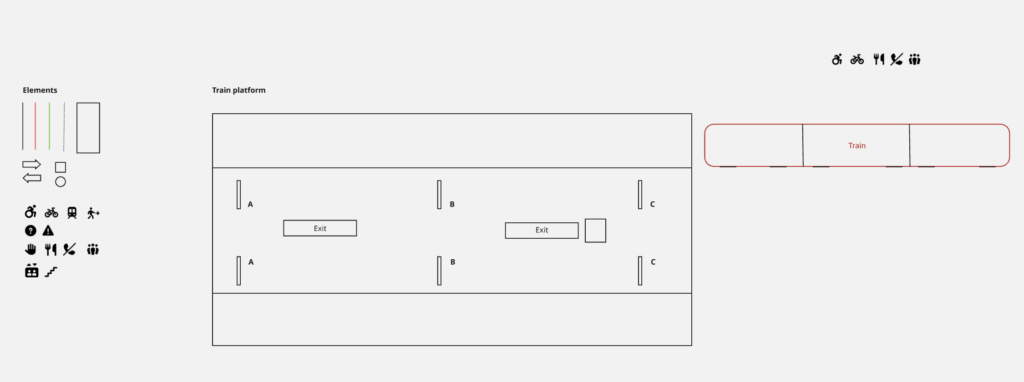
Prior to the testing sessions, I also created an example interface based on my own assumptions regarding what information might be useful for travelers. This served as a visual record of my initial design ideas and later enabled a comparison between my assumptions and the solutions proposed by participants.
Testing
To gather insights and evaluate initial design assumptions, the prototype was tested with five participants from my personal network. All participants were experienced train travelers in Germany. The testing sessions were conducted individually on a laptop, and each participant received the same initial prototype setup.
The first task required participants to position themselves on the platform by placing their cursor at the location where they would wait if they intended to board the arriving train. Most participants selected a position near the center of the platform. When asked about their reasoning, they explained that without knowing the exact stopping position of the train, standing in the middle would allow them to move efficiently toward either end of the platform if necessary.
The second task asked participants to use the provided elements to add information, guidance, or explanatory features to the train platform environment. Participants were informed that they could freely modify existing elements, create new ones, and place information either on the platform or on the approaching train itself. While participants could ask for clarification regarding the task, no further restrictions or guidance were provided. The resulting designs differed considerably in terms of creativity, visual language, use of elements, time invested, and overall outcomes.
Participant 1
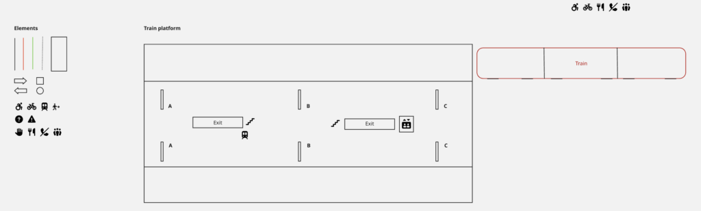
The first participant adopted a highly minimalist approach. Their primary focus was on platform exits and onward connections. Icons were added to indicate stairs, elevators, and transfer options such as subway and tram connections. No colors, shapes, or additional lines were used.
Participant 2
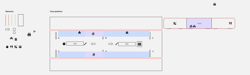
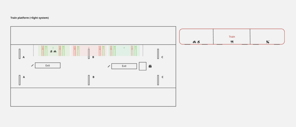
The second participant focused initially on differentiating train sections and communicating this information on both the train and the platform. Colored areas and icons were used for this purpose. Additional platform information, including stairs, elevators, walking directions, and information points, was also incorporated. Finally, safety markings were added along the platform edge to increase awareness of approaching trains. This participant made use of all provided design elements.
Participant 3
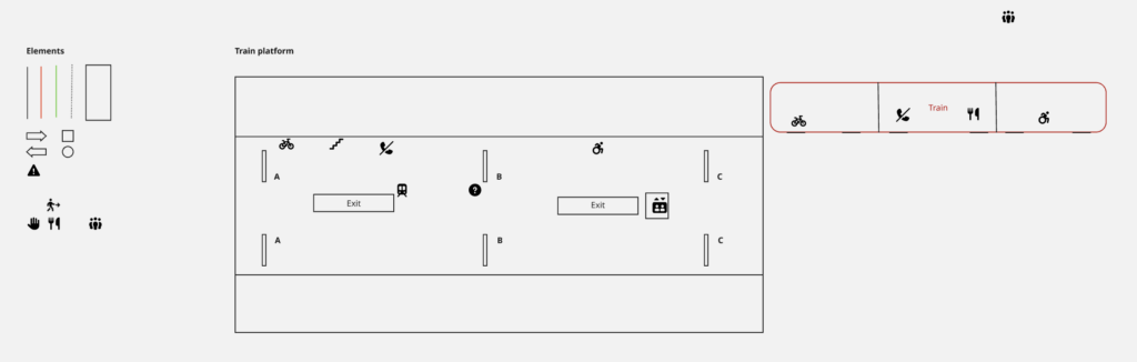
The third participant began by enriching the platform with informational icons. Particular attention was given to identifying different train entrances. Matching icons were then placed on both the train and the platform to establish a clear relationship between the two. This participant exclusively relied on icons and did not use colors or additional shapes.
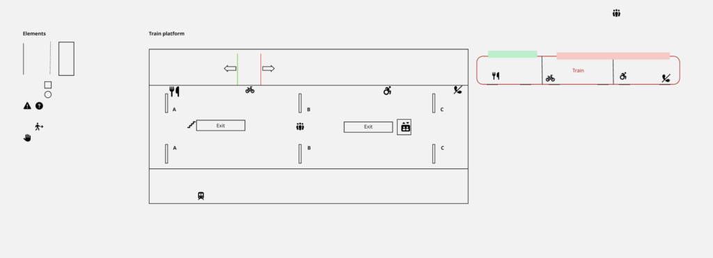
Participant 4
The fourth participant also started by adding icons to communicate information about sections, exits, and designated areas. To improve differentiation between information categories, colors were introduced. One icon was added to the train, although not all platform icons were mirrored on the train itself. This participant made use of all available element types.
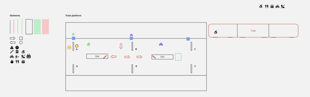
Participant 5
The final participant added icons to indicate exits, meeting points, and train sections. Corresponding icons were then placed on the train. Additionally, this participant considered the distinction between first-class and second-class compartments and represented these areas through color coding, arrows, and platform markings. Similar to Participants 2 and 4, all available design elements were utilized.
Results and consideration
A comparison of the resulting interfaces reveals significant differences in design approaches. In particular, the use of colors and shapes varied substantially among participants, ranging from no use at all to extensive integration throughout the interface. Despite these differences, one design element remained remarkably consistent: the use of icons. All participants relied on icons to communicate important information and to establish connections between platform locations and train sections. Comparing the participant-generated designs with the initial concept created prior to testing also provided valuable insights. Interestingly, none of the participants considered indicating the train’s exact stopping position or its start and end locations on the platform. Similarly, no participant suggested dedicated boarding and alighting guidance systems. Some similarities emerged regarding the use of colored areas to distinguish train sections. Furthermore, the use of corresponding icons on both the platform and the train appeared consistently across several solutions.
These findings provide valuable indications of user priorities, reveal which design ideas appear intuitive to users, and identify areas where further validation is required.
Information Gathered
Overall, this testing phase contributed significantly to my understanding of how experienced train travelers perceive navigation and information systems within railway environments. The study demonstrated that users approach the same problem in diverse ways and often propose solutions that differ considerably from the designer’s initial assumptions. At the same time, recurring patterns emerged, particularly regarding the importance of clear visual information and the use of icons as navigational aids. These insights provide a strong foundation for future design decisions and further development of the concept.
Next Steps
Based on the findings of this study, the next phase will focus on refining the product vision and defining the intended solution more precisely. Additional research into the technical feasibility of the identified concepts will be conducted, followed by the development of a higher-fidelity prototype that incorporates the most promising findings from this testing phase.