With the fundamentals out of the way in the first session, the second one was where things got noticeably more technical. I opened with three concepts that tend to trip people up if they’re never explained properly: vector versus pixel-based graphics, the differences between color spaces, and bit depth. None of these are exotic ideas, but they’re the kind of thing people absorb by osmosis rather than by being taught directly, which usually means there are gaps, and those gaps tend to surface at the worst possible moment, like when someone exports a file and can’t figure out why it looks wrong on a different screen.
I made a point of explaining these concepts with real consequences attached rather than as abstract theory. Vector versus pixel matters the moment you try to scale a logo without it turning to mush. Color space matters the moment a print comes back looking nothing like what was on screen. Bit depth matters the moment a gradient starts banding instead of looking smooth.
The Task: Fish, Bottle, Logo
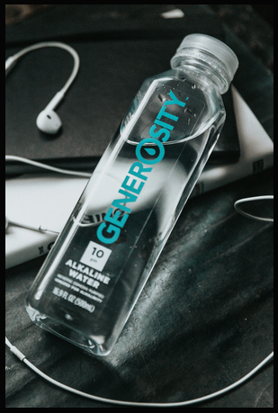
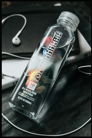
The exercise for this session was to insert an image of a fish into a water bottle and replace the bottle’s existing logo with something new. It’s a deceptively dense task for something that sounds simple. To pull it off convincingly, students had to work through smart objects and smart filters, layer masks, clipping masks, blend modes, warp transforms, Gaussian and lens blur, adjustment layers, and color and tone matching between the fish and the bottle’s existing lighting. On top of that, replacing the logo meant bringing SVG import and handling into the mix, since the original branding needed to be swapped out cleanly rather than just painted over.
Each piece of that list earns its place for a specific reason. Smart objects and smart filters keep the whole composite editable, so a filter applied early on can still be tweaked after the fact instead of forcing a redo. Clipping masks are what let the fish’s texture sit believably inside the bottle’s silhouette rather than floating on top of it. Warp transforms handle the fact that a bottle is curved and a flat logo image is not, so the replacement graphic needs to bend along the same contour the original packaging does. And the blur work – Gaussian for general softness, lens blur for anything that needed to respect depth – is what keeps the inserted elements from looking pasted in at full sharpness against a photo that has its own natural softness.
That’s a lot of separate skills stacked into one exercise, but that was intentional. Session one was about isolated fundamentals; session two was about combining them into something that actually resembles real client work, where you rarely get to use just one technique at a time.
How It Went
Unlike the first session, this one used almost the entire two-hour slot to get through the task. That wasn’t a bad sign – it meant people were engaged enough to work through problems rather than rushing past them. I wasn’t just standing at the front demonstrating either; there were real questions coming from the room, people getting stuck on specific steps and asking for help rather than silently falling behind. That’s honestly the moment teaching starts feeling worthwhile – not when people follow along smoothly, but when they get stuck on something specific enough to ask about it.
One thing caught me off guard: a handful of new faces showed up who hadn’t been at the first session. I’d assumed the intro material – the DPI/PPI, RGB/CMYK, file format rundown -would only be relevant once, but that assumption didn’t hold. As a result, I decided to bring a short version of the introductory slides back for the third session, just to make sure nobody starting fresh would be missing context the rest of the group already had.
The other realization from this session was smaller but stuck with me: switching Photoshop’s interface language to English matters more than it seems. Most tutorials, forum posts, and search results default to English menu names, and trying to follow along or troubleshoot with a German interface actively works against you – you end up hunting through translated menu labels that don’t match what any guide online is telling you to click. It’s a five-second setting change that saves people real frustration down the line, so it became something I started mentioning explicitly rather than assuming people would figure it out on their own. It’s a small piece of advice, but it’s the kind of thing that only becomes obvious once you’ve watched someone struggle to find a menu item that’s been renamed in translation. By the end of session two, the shape of the course was becoming clearer – not just as three isolated lessons, but as a progression where each session built directly on the muscle memory from the last one. Students weren’t relearning selections from scratch in session two; they were applying them without thinking, which freed up mental space for the new material layered on top. That compounding effect is exactly what I’d hoped for when planning the sequence, and it set up the third and final session to be more ambitious than either of the first two, since I could now assume a baseline of comfort that didn’t exist going into session one.