Session 3: Retouching, Mockups, and Finally Getting Feedback That Works
The third and final session was the most content-dense of the three, both in terms of theory and in terms of what students actually had to produce. On the concept side, I covered RAW versus JPEG, frequency separation, and the distinction between color correction and color grading – three topics that are easy to gesture at vaguely but genuinely useful once explained properly, especially frequency separation, which tends to look like magic until you understand what it’s actually doing to the image.
RAW versus JPEG is one of those topics that sounds like a footnote until you actually walk through what a camera throws away the moment it compresses an image into a JPEG. Explaining that a RAW file preserves the full range of data the sensor captured, while a JPEG has already made permanent decisions about exposure and color that can’t be undone, reframes why professional retouching work almost always starts from RAW where possible. Color correction versus color grading was the other distinction worth slowing down for – correction being the technical fix to make an image look natural and accurate, grading being the creative decision layered on top to give it a mood or style. Students conflate the two constantly, and separating them clarifies why you’d reach for one tool over another depending on which problem you’re actually solving.
Frequency separation, meanwhile, is the concept that tends to get the most raised eyebrows the first time it’s explained. Splitting an image into a low-frequency layer that holds color and tone, and a high-frequency layer that holds fine texture and detail, sounds abstract right up until you see it demonstrated – retouching skin texture on one layer without disturbing the underlying tone on the other suddenly makes visible sense once you’ve seen the split happen in front of you.
Two Tasks Instead of One
Unlike the first two sessions, which each centered on a single exercise, the third session split into two separate tasks. The first was portrait retouching – cleaning up skin blemishes using the stamp and patch tools, with an emphasis on doing it in a way that still looked natural rather than airbrushed. This is where the frequency separation concept from earlier in the session actually got put to use: students worked the low-frequency layer to even out tone without touching pore detail, then addressed blemishes on the high-frequency layer without flattening the skin’s natural texture in the process. Watching people go from “this looks like a smudge tool disaster” to a clean, natural-looking retouch once they understood which layer to work on was one of the more satisfying moments of the whole course.
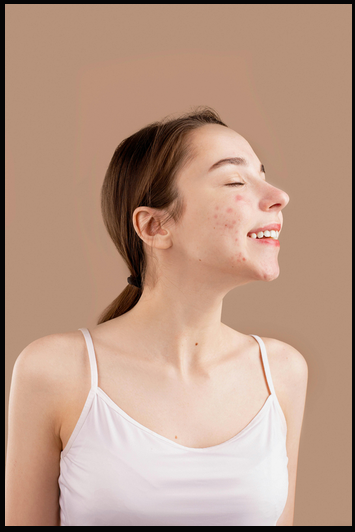
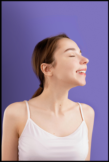
The second task was building a mockup template, which brought displacement maps into play along with, once again, matching color and lighting between source elements so the final composite didn’t look pasted together. Displacement maps solve a specific problem – making a flat design wrap convincingly around a folded or textured surface, like fabric or crumpled paper – and it’s a technique students hadn’t encountered in either of the first two sessions, so it functioned as a genuinely new tool added to their kit rather than a variation on something already covered.
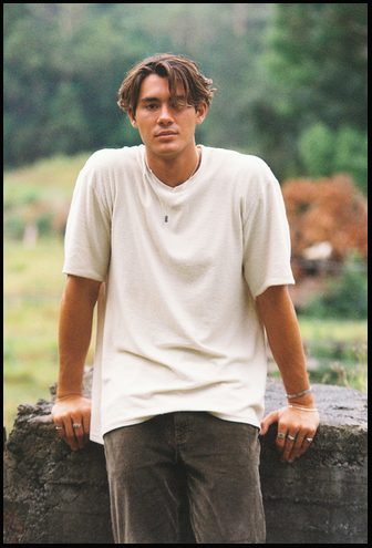
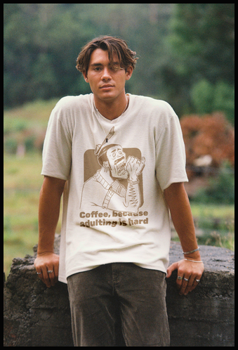
Splitting the session this way meant less depth on any single technique compared to session two’s fish-in-a-bottle exercise, but it exposed students to two genuinely different corners of Photoshop – retouching work and template/mockup construction – which are common enough real-world tasks that I wanted both represented before the course ended. Given this was the last session, it felt more valuable to send people off with breadth across two practical use cases than to go deeper on just one.
The QR Code Fix
The other meaningful change in this session had nothing to do with Photoshop itself. Instead of asking for feedback by email – which, across two sessions, had produced exactly zero responses – I put together a feedback QR code that students could scan and fill out on the spot, right there in the room while the session was still fresh in their minds. The difference was immediate: I actually got responses this time. It’s a small logistical change, but the lesson is bigger than Photoshop – if you want feedback, you need to make giving it take ten seconds, not require someone to remember to open their email later once they’ve already moved on to the rest of their day. That QR code approach is going into every session I run from here on out, no exceptions. With the third session wrapped, the course as a whole was done: three two-hour sessions, three tasks of increasing complexity, and – for the first time – actual usable feedback to look back on. Sitting down afterward to actually read through those responses turned out to be its own useful exercise, separate from just having run the sessions. That feedback, and what it revealed about how the sessions landed, is worth its own look.
