User Interfaces in Video Games – The quest for genre-appropriate and usable game UI
To start off with my research I decided to research the history of video games and, by extension, their user interfaces. I’m interested in how people interacted with early interfaces with technical limitations.
Early Game Interfaces
What is actually the first video game?
My first thought was Pong, a game that many people consider the first game, but upon research I found out that this wasn’t the case and that there’s no clear consensus.
Source: [1]
Source: [2]
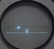
1958 – Tennis for Two
Released 14 years before Pong, Tennis for Two was developed by William Higinbotham and it was made using an analogue computer with a oscilloscope screen and two separate controllers [3]. I found a recreation of it you can play in your browser here, which shows well how limited the interaction elements were, namely a pair of dials/control knobs and buttons.
Tennis for Two shows that the way people interact with video games has always involved input devices. These input devices provide the point of interaction between the human and machine. However, some sources argue that it isn’t the first video game because it wasn’t displayed on a video screen, which is a technicality [3]. Other sources argue that “While this appears to be the first interactive game, it is an isolated instance” [4], claiming that the creator of the upcoming game I will mention didn’t know of it’s existence.
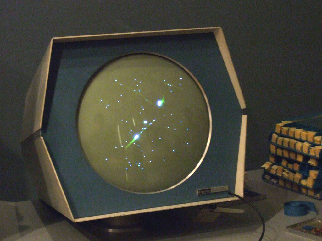
1962 – Spacewar!
Released a few years after Tennis for Two, Spacewar! was developed by Steve Russel and it was made using a PDP-1 computer [4]. This made it the first computer game, originally using toggle switches built into the computer, but eventually getting dedicated remote controllers developed. Spacewar! is widely considered the first video game, showing a very similar interaction principle albeit with more complex controls.
While Tennis for Two had one adjustable knob and one button for aiming and throwing, Spacewar! had much more complex controls with the objective was for each player to maneuver a spaceship and score by firing missiles at their opponent [5].
Whats interesting in observing these interfaces is that they have no traditional visual UI elements, such as high scores or menu screens. The game itself doesn’t guide the player intrinsically, but the aspect of two identical controllers suggests that two players can somehow interact with the game.
References
- [1] Madplanet, “Tennis for Two – 1958,” Madplanet’s Gameroom. Accessed: Dec. 15, 2025. [Online.] Available: http://madplanetsgameroom.blogspot.com/2010/08/tennis-for-two-1958.html
- [2] K. Lu, “Spacewar!,” Flickr. Accessed: Dec. 15, 2025. [Online.] Available: https://www.flickr.com/photos/24226200@N00/364960084/
- [3] Brookhaven National Laboratory, “The First Video Game?,” Brookhaven National Laboratory. Accessed: Dec. 15, 2025. [Online.] Available: https://www.bnl.gov/about/history/firstvideo.php
- [4] S. L. Kent, “Forgotten Fathers,” in The Ultimate History of Video Games: From Pong to Pokemon–the Story behind the Craze That Touched Our Lives and Changed the World”, New York, New York, USA: Three Rivers Press, 2001, ch. 2, pp. 18-20.
- [5] M. Bellis, “The History of Spacewar: The First Computer Game,” ThoughtCo. Accessed: Dec. 15, 2025. [Online.] Available: https://www.thoughtco.com/history-of-spacewar-1992412