D&R2 – Lo-Fi Prototypes 1/6

Continuing on with my theme of User Interfaces in Video Games, I developed 3 quick and dirty prototypes for the Design & Research 2 course kick-off.

This prototype that I will most likely bring to class is the sticky UI kit. I want to see how people who might not have preconceptions (but also those that do) would naturally arrange different UI elements when put on the spot. User expectations are pretty important when it comes to interfaces so that’s why I decided to play around with that idea, where people could tangibly display their expectations and intuitions in a setting where I could also document it.

It consists of:

  • piece of paper with a background
  • 10 pieces of paper with UI elements with tape on the back

This prototype is based on diving in and out of menus and the information hierarchies associated with them. It’s made with folded papers which would be flipped up depending on which button is clicked. The task would, for example, be finding how to change subtitle sizes, as they are often in video settings under accessibility. The confusing part is also that its also sometimes under audio settings so this could serve as sort of cart sorting test as well. Traversing complex tree menus that just keep going in and in can be frustrating.

It consists of:

  • 3 folded pieces of paper with 6 different menus

This prototype is about my biggest pet peeve with games, which is subtitles. It’s uses a piece of paper with scribbles to simulate complex backgrounds that acts as the background and a strip with different subtitle styles. I would simulate different situations (e.g. placing the paper further away) and slide the subtitle styles and ask what was written. This could open a discussion about what is necessary and what works in situations like a game where a lot of mental power could be being used.

It consists of:

  • piece of paper that acts as a background with a cutout
  • strip of paper with different subtitles

✿1 Design & Research 2

Step 0 – 1st March 2026

The next two weeks will be focused on developing three different prototypes. My main goal is to explore how interfaces can be designed to better support older adults, especially those who didn’t grow up with digital technology. But before diving into design, I need to ask myself some questions: what is the real problem here? What do older users struggle with the most? Is it that apps and websites are simply too complex, with too many steps and features? Or is it that digital interfaces don’t match the way they expect things to work? Or perhaps it’s not the design at all, but a broader question of digital literacy, understanding how devices, apps and online systems actually function.

Step 1 – 8th March 2026

At the beginning I thought the main challenge would be designing intuitive, accessible interfaces. But as I began talking to people, I realized the picture is much bigger. Many of the people I asked weren’t just struggling with specific apps, they were struggling with digital literacy itself.

This opened my eyes to an important distinction: while good design can make apps easier to use, it can’t replace the need to teach fundamental digital skills. Tasks like navigating menus, understanding security warnings, or even recognizing phishing emails require guidance and practice.

I focused on brainstorming what the digital learning platform should actually teach and how it should support older adults in learning digital skills. Instead of starting directly with the design, I tried to map out the most important areas of digital literacy that the platform could cover. These include basic device skills such as navigating smartphones or adjusting settings, understanding common apps and websites, learning fundamental digital concepts like cloud storage or files, as well as topics related to online security, communication and everyday digital tasks.

While collecting these topics, it also became clear that the platform should not only provide information but guide users through learning in a structured way. One idea that was to create a “Today’s Lesson” feature. Instead of presenting users with many options at once, the platform could suggest one small learning session per day. This approach could help reduce decision fatigue.

Prototype 1

Prototype 2

Prototype 3 – Final Prototype

With the last prototype I tried to move away from the “dashboard” layout a bit and instead focus on something much clearer. Rather than showing lots of different options right away, the interface tries to guide the user through what to do next.

The “Today’s Lesson” feature became the main focus of the layout. It’s the first full-width card right after the hero section and noticeably larger than everything else on the page. The idea is that the most important action of the day should require zero searching. Many older users don’t scan pages the same way younger users do. Instead, they read from top to bottom.

Another element I tried out is a progress tracker with color-coded topics. Each topic has its own color instead of everything looking the same. The idea behind this is that color can become a kind of memory anchor. Over time users might remember something like “orange was the security lessons” without needing to read every label again.

For the lesson library I created video cards that show the duration and difficulty level right away.

Another thing I want to add is an accessibility toolbar directly in the Navigationbar. Instead of hiding text size or contrast settings somewhere deep in a settings menu, the controls (A / A+ / A++ and a contrast toggle) are always visible. My thought here was: if someone needs larger text, they probably need it immediately, not after navigating through several menus they might already struggle to read.

Lo-fi Prototypes: Exploring Ways to Include Children in Playground Design (D&R2)

As my research focuses on how interaction design can help include children in the playground design process, I created three low-fidelity prototypes that explore different ways children might express their ideas, feelings, and experiences related to playgrounds.

Rather than designing a playground itself, the goal of these prototypes was to design methods of participation. Each prototype approaches the design process from a slightly different perspective: materials and elements of play, emotional experiences, and spatial interactions within playground environments.

Prototype 1: Playground Idea Cards

The first prototype is a simple card-based toolkit designed to help children communicate their playground ideas through categories. The cards are grouped into three themes: materials and elements, types of play, and feelings. For example, materials might include elements such as wood, sand, or water, while play cards might refer to activities like climbing, sliding, or jumping.

Children can select and combine cards to describe what kind of playground they imagine. This format allows them to build ideas visually rather than relying only on verbal explanations. The simplicity of the cards makes them flexible and easy to use in workshops, where children can rearrange, group, or expand the combinations while discussing their ideas.

Prototype 2: Playground Reflection Sheet

The second prototype takes a more reflective approach. It consists of a large sheet that asks children three questions about playground experiences. The first question asks how children feel on playgrounds, which they can answer by choosing emotion stickers. The following questions invite children to describe how they usually play and how they would like to play, using drawings or written responses.

This structure allows children to express themselves through multiple modes of communication. Some children may prefer stickers, while others may choose drawing or storytelling. By combining emotional responses with descriptive answers, this prototype helps reveal not only what children do in playgrounds but also how they experience those spaces.

Prototype 3: Mapping the Playground

The third prototype focuses on spatial interaction. In this activity, children are given a simple drawing of a playground that includes common elements such as slides, swings, or climbing structures. Children are then invited to place stickers on different parts of the playground to indicate how they feel about those elements.

Through this mapping activity, children can visually communicate which areas they enjoy, which spaces they find exciting, or which ones they might avoid. This approach transforms the playground into a map of experiences rather than just a collection of equipment.

ID1 – NIME Article Review

Paper Review – Concerts of the Future: Designing an Interactive Musical Experience in VR

Ciaran Frame. 2024. Concerts of the Future: Designing an interactive musical experience in VR. Proceedings of the International Conference on New Interfaces for Musical Expression. DOI: 10.5281/zenodo.13904880


For this semester’s assignment we were asked to review a paper from the NIME (New Interfaces for Musical Expression) conference. This topic sits somewhat outside the research direction I explored last semester, which focused more on interruption, attention and interaction design. However, I think stepping outside of that research boundary could offer me an interesting opportunity to look at how immersive technologies are being used in other creative fields.

The paper “Concerts of the Future: Designing an Interactive Musical Experience in VR” by Ciaran Frame presents a virtual reality system that attempts to bridge the gap between passive music listening and active musical participation. The project allows participants to enter a VR concert environment and perform alongside a chamber ensemble using a gestural digital instrument called the AirStick. Importantly, the system is designed for people without any musical training, meaning that the experience focuses more on accessibility and participation rather than musical expertise.

The motivation behind the project comes from an interesting observation: while the majority of people regularly listen to music, only a small portion actively create or perform it. Traditional concert formats reinforce a strict separation between composer, performer and audience. The project therefore explores whether VR could blur these boundaries by placing audience members directly into the performance environment.

The experience itself combines several technological and design components. Participants first enter a physical “green room” where they are introduced to the AirStick and given time to experiment with it. After this preparation phase, they put on a VR headset and are transported to a virtual concert stage where recorded musicians appear around them in a 360-degree environment. Movement of the AirStick is translated into musical output through MIDI mapping, allowing participants to generate sound by performing gestures in the air.

From a design perspective, one of the most interesting aspect of the project for me is how the creators intentionally limit the possible musical outcomes. Early tests showes that participants were often anxious about “playing the wrong note” or disrupting the performance. To address this, the system constrains the musical input so that participants always remain harmonically aligned with the ensemble. This design choice effectively creates “musical guardrails,” ensuring that users feel safe experimenting within the system.

Another notable design decision is the use of extra-VR elements, such as the green room and staged performance environment. These elements extend the experience beyond the headset and I believe it helps to construct a narrative context around the interaction. Instead of VR functioning as an isolated digital space, the project integrates physical staging to strengthen immersion.

From my perspective as someone with a background in game design and interactive media, the use of VR here is interesting primarily in terms of embodied interaction. Similar to many VR games, the experience relies on physical movement and spatial presence to create engagement. However, unlike most game environments, the participant’s agency is intentionally constrained to maintain musical coherence. This highlights a tension between creative freedom and system control, which is a recurring design challenge in interactive systems.

Overall, the paper demonstrates how VR can be used not only as a visual medium but also as a participatory performance platform. While the project is rooted in experimental music practice, it also raises broader questions about how immersive technologies can reshape the relationship between audiences and creative content. Even though my own interests lie more in interaction design than in musical interfaces, the project offers an interesting example of how immersive systems can transform traditionally passive cultural experiences.

ID1 – NIME Article

Authors: Hugh Aynsley, Pete Bennett, Dave Meckin, Sven Hollowell, and Thomas J. Mitchell

For this NIME research task, I chose a paper that sits exactly at the intersection of my Master’s research and the future of interaction design. While many NIME papers focus on sensors or sound synthesis, this 2025 study explores the psychology of the design process when using Generative AI.

The authors conducted workshops to see how Text-to-Image (TTI) tools like Midjourney change how we brainstorm. Instead of the traditional “slow” process of sketching by hand, designers used AI to “materialize” their thoughts instantly.

Visualizing the Abstract: Turning vague feelings (like “granular” or “metallic” sounds) into concrete visual shapes.

The Power of the Pivot: Using AI “hallucinations” or mistakes as a spark for a new, unplanned design direction.

High-Speed Variation: Generating dozens of different “vibes” for a controller in seconds to see what sticks.

Style Mapping: Forcing the AI to blend two unrelated worlds—like a “violin” and a “space station”—to find a new aesthetic.

Boundary Objects: Using the AI images as a bridge to help team members understand a complex concept without long explanations.

As someone who has spent the last semester investigating whether automation “steals the joy” of creativity, this paper gave me a new perspective. I’ve often seen AI as a “thief of the mistake,” but Aynsley et al. argue that the AI’s mistakes are actually its biggest strength in the ideation phase. It provides a “surprise” factor that a human designer might never think of on their own.

What I find missing in this research, however, is the tactile reality. It’s easy to generate a beautiful, “instant” image of a musical instrument, but the paper doesn’t address the massive gap between a 2D AI dream and a functional, ergonomic 3D interface. As interaction designers, we know that how something looks is only half the battle; how it feels in the hand is where the real design happens.

Overall, I think “Instant Design” is a powerful look at how our tools are evolving. It confirms my belief that the future isn’t about the machine replacing the artist, but about the designer becoming a “Curator of Possibilities.” We are still the pilots; the AI is just helping us navigate the “Fog” of the early design phase much faster.

References:
[1] H. Aynsley, P. Bennett, D. Meckin, S. Hollowell, and T. J. Mitchell, “’Instant Design’: Five Strategies for the use of Generative AI in NIME Ideation Workshops,” in Proc. Int. Conf. on New Interfaces for Musical Expression (NIME), 2025.

ID1 – NIME Article

The paper I chose to read on the NIME archive was:

Bubble Drum-agog-ing: Polyrhythm Games & Other Inter Activities by Jay Alan Jackson

The reason I chose this paper is because it had something to do with games, which was my very open research topic so far. The whole thing is about using big exercise balls as drum kits.

As seen on the picture, this project wanted to re-imagine drum kits capable of input. Regular drums are loud and can damage hearing, but provide a steady exercise value. Rubber drum kits for practicing with input also exist in the form of Guitar Hero or Rock Band.

What the author wanted to achieve was to eliminate the feeling of no feedback and thus no feeling when it comes to hard rubber kits. The data is captured using an accelerometer, microphone and camera inputs, to make it possible to play rhythm games. There are microphones placed closely to the bubble drum and they use Drumagog to replace the drum samples, while replicating the original performance responsively and accurately.

The paper also mentions that both aural and visual feedback are provided, but this is within the games themselves. The game that was developed by the author was a simple flash game “Polynome”. The objective and challenge is for the player to perform polyrhythmic patterns to existing songs, using the drums as controllers. The drum samples are using different elements depending on the song, in order to create unique remixes of rhythm and sound.

Figure 2: Polynome Screenshot

What’s interesting to me is the UI shown, the circles with the lines inside them are a reoccurring motif that is, I assume, meant to be the main indicator of what to do within this game. I’m not very well versed with music theory, but I am well versed with rhythm games, so I would have to wonder what these symbols mean and how this game actually makes things clear to the player. Unfortunately, these aspects aren’t described or analysed in this paper.

Overall, I find the idea fun because I like rhythm games and unique interaction methods acting as controllers. However, I find the paper to be a bit shallow and lacking more technical information. I can’t fully imagine the interaction, how the game would work, or how this entire thing would provide a “rigorous workout” (as stated many times in the text).

  • [1] J. A. Jackson, “Bubble Drum-agog-ing: Polyrhythm Games & Other Inter Activities,” in Proc. 12th Int. Conf. on New Interfaces for Musical Expression (NIME), Ann Arbor, MI, USA, May 22, 2012, exhibit.

Interaction in Sounddesign

For this first blog post, I had to step a bit outside my comfort zone because we’ve started collaborating with sound designers on a music interface. That alone is already an interesting project. For the first blog post we had to research on nime.com and I came across a study about agency and creativity in musical interaction for people living with dementia and cognitive decline. I find this topic really interesting, especially since it connects in some ways to what I’m considering exploring in my master’s thesis.

Bild von jotoya auf Pixabay

Agency and Creativity in Musical Interaction for those living with Dementia and Cognitive Decline

Dementia is an umbrella term for a range of progressive conditions that affect the brain. These conditions can cause challenges with memory, problem solving, cognitive function and decision making. For people living with dementia, musical interventions have been shown to support important aspects of life, such as the sense of self. Sustained engagement with music can have a positive impact despite these challenges.

In this context, agency refers to the sense of control or ownership an individual feels over their actions and the resulting consequences. It describes the experience of being the initiator of one’s actions rather than just responding to external direction.

For people living with dementia, agency is often considered to be diminished. In research, dementia is frequently approached through a biomedical deficit model that focuses primarily on the skills and memories a person has lost. This perspective can lead to the assumption that because language and memory are impaired, agency must also be lost. However, this connection is often taken for granted rather than critically examined.

As a consequence, people living with dementia are frequently viewed as passive participants in therapeutic activities and are often expected to engage only in relatively basic tasks. In the study referenced, for example, participants were limited to playing simple instruments such as percussion while following the lead of experts. This setup reflects and reinforces the assumption that their role is primarily responsive rather than self-directed.

Biomedical deficit model

The biomedical deficit model is a framework commonly used in dementia research that focuses primarily on the skills lost by individuals and the tasks they are no longer able to achieve. This model prioritizes the identification of cognitive impairments, such as challenges with memory, language and problem-solving.

This paper proposed and tested a procedural music platform called the “SliderBox”, which was specifically created for people living with dementia. The goal of the project was to allow people with dementia to go beyond basic interactions to create sound and provide tools that facilitate unguided musical experiences and enabling them to actively participate music activities.

Source: J. Pigrem, J. Christensen, A. McPherson, R. Timmers, L. de Witte, and J. MacRitchie

The Hardware: The SliderBox is an accessible MIDI controller made of wood, with eight analogue sliders and eight push-buttons. It provides multi-modal feedback through LED light strips and buttons to help guide the user.

Conclusion

Some participants were struggling when there were more then two possible actions. This also directly related to the engagement, whereas less people would engage with the prototype, when it had to many possible actions.

The researchers also observed that the SliderBox had a high engagement and lack of negative behaviors, showing the potential for those platforms.

In this experiment concludes that it is absolutely possible to facilitate engaging musical interactions that also foster agency and creativity for those with cognitive decline.

Sources

[1] J. Pigrem, J. Christensen, A. McPherson, R. Timmers, L. de Witte, and J. MacRitchie, ‘Agency and Creativity in Musical Interaction for those living with Dementia and Cognitive Decline’, in Proceedings of the International Conference on New Interfaces for Musical Expression, 2024, pp. 315–323.

Calm UX in Healthcare

What Designing for Vulnerability Teaches Us About UX Everywhere

In the previous article, I explored how Calm UX becomes essential when digital products start predicting, recommending, and acting on users’ behalf. As systems grow more intelligent and autonomous, clarity, control, and psychological safety are no longer optional—they are prerequisites for trust.

Healthcare takes this one step further.

Healthcare is often treated as a special category in UX design—a domain with its own rules, constraints, and sensitivities. But it is not defined by different principles. It is defined by a different context of use. Healthcare doesn’t require new UX fundamentals; it requires existing ones to perform under pressure.

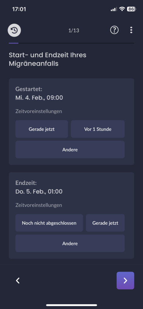
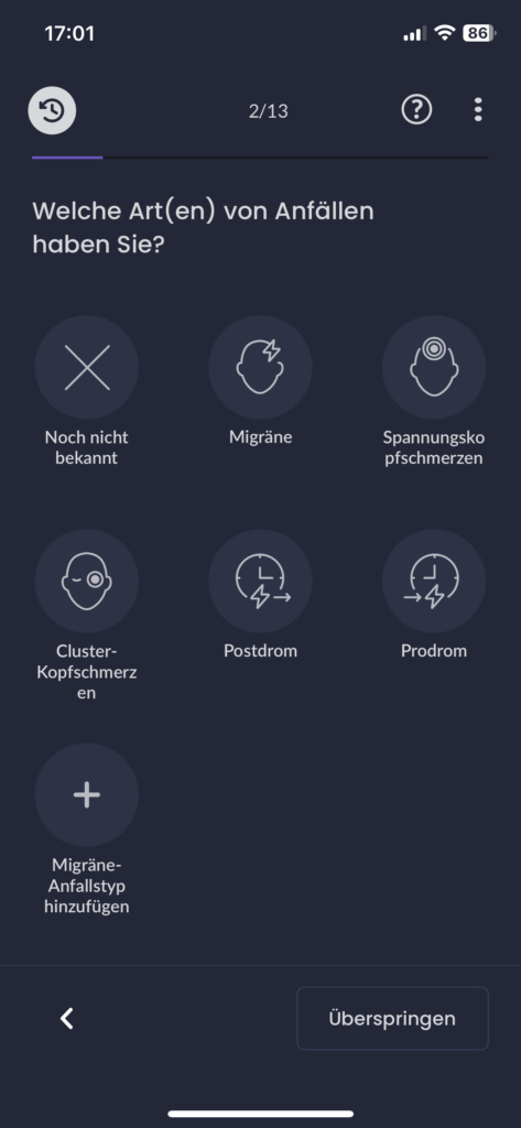
In healthcare contexts, users are rarely relaxed, curious, or exploratory. They interact with products while anxious, cognitively overloaded, emotionally vulnerable, or afraid of making mistakes. That makes healthcare products a powerful stress test for UX as a discipline.

If an interface fails under these conditions, it doesn’t fail because healthcare is “special.” It fails because the design was never truly calm, clear, or human-centered to begin with.

Healthcare as an Extreme UX Environment

Much of mainstream UX quietly assumes ideal conditions:

  • stable attention
  • emotional neutrality
  • tolerance for exploration
  • low cost of errors

Healthcare strips these assumptions away.

Users engage with health products while processing emotionally charged information, navigating uncertainty and risk, experiencing cognitive fatigue or distress, and fearing irreversible consequences. Under these conditions, even small ambiguities or unnecessary decisions can escalate into anxiety. This reveals a crucial insight:

Many interfaces rely on idealized users. Healthcare reveals real ones.

Calm UX becomes critical here not because healthcare is unique, but because it removes the safety buffer that often hides poor UX elsewhere. When attention is scarce and emotional stakes are high, only designs that genuinely reduce cognitive load and uncertainty can hold up.


Where Healthcare Reveals Broken UX Assumptions

Healthcare UX tends to fail in the same places where mainstream UX quietly struggles—but the consequences are far more visible. Designing for healthcare also means designing for neurodivergence and mental health, which exposes fundamental truths about how people actually interact with systems under strain.

Users with ADHD, anxiety, autism, or depression are more sensitive to cognitive load, less tolerant of ambiguity, more affected by interruptions, and more easily disoriented. These are often treated as edge cases, but they are not. They represent states that all users enter under stress—and healthcare places everyone in that state.

This is where many interfaces break down:

  • alarmist language that escalates uncertainty instead of explaining it
  • silent systems that leave users unsure whether an action succeeded
  • dense information displays that prioritize completeness over comprehension
  • binary outcomes presented without context or confidence framing

Outside healthcare, these issues cause frustration. Inside healthcare, they lead to anxiety, mistrust, and hesitation.

Calm UX reframes these moments by separating information from urgency, acknowledging uncertainty rather than hiding it, layering complexity instead of front-loading it, and reinforcing user agency at every step.

Calm UX as an Opportunity in Healthcare

In healthcare, Calm or Mindful UX is not about “being nice”—it’s about designing with a clear understanding of human limits. This means explicitly considering the user’s emotional and cognitive state: how much attention they can realistically give, how much information they can process, and how uncertainty might amplify fear or hesitation. It also means designing systems that reassure without misleading, guiding users without overwhelming them.

Focusing on Calm UX in healthcare doesn’t just improve health products. Much like accessibility features, it advances UX practice as a whole by grounding design decisions in real human constraints—and by bringing those improvements into everyday products where everyone can benefit.

My Conclusion to Calm UX and Calm Technology

The principles of Calm Technology are not a new discipline, but are already deeply embedded in established UX approaches—across digital and physical product design, and in domains such as healthcare and AI. UX has reached a level of maturity where the focus is no longer only on efficiency or fixing major usability issues, but on consciously considering people and their emotional experience throughout the process. Calm Technology makes this focus explicit, much like accessibility does, reminding us that user-centered design cannot meaningfully exist without these principles.

References:

AI Assistance Disclaimer:

AI tools were used to improve grammar and phrasing. The ideas, examples, and content remain entirely the author’s own.

Next steps – migraine solutions

This is the final blog post about my research. The next steps would be to

  • conduct interviews with medical experts (neurologists and also psychologists spezialized in migraine)
  • develop a first prototype
  • evaluate the prototype by doing interviews with migraine patients to make sure this solution is truly tailored to their needs

The interviews with migraine patients are something I would really be interested in since the survey already revealed some new information to me. And in this case talking to different migraineurs is essential since the user group is diverse and so is their experience with their disease.

Dawn Buse, a clinical professor of neurology, shares, “Unlike visible illnesses that tend to elicit empathy, support, and help from people around [them], the invisible nature of migraine places the burden on the individual to advocate for themselves continually, which can be exhausting and emotionally taxing.” Living with migraine is both physically and mentally challenging which is why I decided to choose it as the topic for my investagation in the first place.

My goal was to gain a deeper understanding of this complex neurological disease and although it was frustrating to realize that many aspects of it are are still not investigated enough or unclear I was able to find helpful explanations of the current state of medicine.

Lastly I would like to share a website I stumbled across while researching about migraine apps. It is called www.migraineagain.com and I do believe it is one of the most helpful informative mediums I have found so far.

Migraine Again Landing Page

The articles are up-to-date (most of them from 2025) which ensures recent research is included and new findings e.g. about latest treatments are elaborated. From explanations about the disease, prevention methods, treatment the website also provides topics such as self care, work and life and community. This psychological part about the disease tends to be left out in apps and what I criticised about Migraine Buddy app.

I can recommend this page to everyone struggling with migraine as I found some articles to be really informative but also in easy language unlike research papers about the disorder. It also includes lots of illustrations or info images about migraine and the difference between triggers and the causes e.g. the images below.

Image from Migraine Again 1

Image from Migraine Again 2

In an article about migraine devices and treatments I learned about devices I had never heard of. The community of Migraine Again was asked in a poll to share their favorite medical devices for migraine. Since everything is briefly explained and the experience/ effectiveness is discussed an overview over rather “niche” devices is created.

I want to give you one example:

Earplugs by WeatherX are designed to prevent migraine attack symptoms triggered by weather changes. They work by slowing down the shift in barometric pressure. They can be used with their app, which offers customizable alerts to incoming barometric pressure changes.


I haven’t heard about these earplugs before and would be interested to test them out. But more important is the access to already reviewed methods or devices by other migraineurs to me. Educating the community and offering a newsletter to keep it updated seems like a great idea!

Sources:

Analysis of migraine tracking Apps Pt.2 – Migraine Buddy

This week’s blog post topic will be another migraine App called Migraine Buddy. It is one of the first results in the App Store of this category and rated with 4.8 Stars from 5.

I chose this app since I had never used it before and due to my curiosity because of the high rating.

The first entry screen asks the user to add an entry for their last migraine attack.

Home screen

dashboard focuses on the positive painfree days but I fear it could be hard to read for migraineurs with a high frequency rate to see a number that is just very small and therefore not positive for them.

Benefits

This app offers a great variety of features:

One feature that I noticed was the adaptility for indivual preferences due to the “adapt homescreen button”. This button ensures that users can adapt the screen to their liking and show the information that is useful to them.

Home screen

I believe that from a user experience point of view this is a great feature to help migraineurs decide what aspect they want to focus on since the app provides a lot of information which could be overwhelming or uninteresting for some users.

Migraine also offers a sleep track feature which caught my attention as well. Since a good sleep quality is an important part of migraine prevention it seems plausible as why users could also track their sleep with the app. They need to give the app access to their notifications and gps.

Sleep screen

The options screen below shows more helpful features

  • export feature of data
  • questionnaires to receive more tips
  • a personal migraine impact Report
  • survey about migraine treatment to participate voluntarily
Options screen

I noticed an error since the migraine impact error is displayed twice (one in spanish since it was my system’s default language before and one in german). This seems to be a bug that needs to be fixed.

Besides, users can also add more data concerning their health such as menstruation, other diseases and treatments, etc.

Health screen

As I have mentioned before in previous blog posts, migraine is considered a complex neurological disorder that is difficult to generalize since every experience is different for each migraineur. Therefore adding more entry options in an organized way can be helpful to get a better understanding of one’s disease.

Cons

One feature I came across made me question if it is suitable for migraineurs. It is the report feature which is meant to give users helpful insights into their attacks, support and medication (see image below)

Report screen

But the insights are not visible yet and it says “track 9 more attacks to see more”. My immediate impression was negative and that the wording seems insensitive to the target group’s suffering. Migraineurs that suffer from migraine attacks once or twice a month (aka episodic migraine) would have to wait several months to receive helpful information and I can only imagine how frustrating that must feel. Personally, if i would have to wait 9 months to track 9 migraine attacks to finally receive more information I wouldn’t use this app anymore. If you downloaded an app to track your migraine you are probably doing it to proactively get help or find solutions for your chronic neurological disorder.

Therefore, an option where users could still receive general information and education about lifestyle or sleep changes could be an idea to avoid the negative thought of “I have to suffer first to unlock more insights”. The information provided then could change once the user has tracked their triggers and attacks consistently and adapt to the individual person.

Conclusion

All in all, migraine buddy also offers entry options for migraine attacks and calendar overview and export option for appointments with neurologists like the Migräne App by the pain clinic Kiel from the previous blog post.

However, migraine buddy offers a more appealing design and visuals. The dark mode design probably was selected to consider light sensibility of the users and therefore more suitable.

It offers a great variety of interesting features but I see a lack of communciation of one important aspect of tracking. The consequence of tracking everything and using an app to enter data consistently about every single detail of your day could be negative for users. What are the downsides of tracking everything? Could it have a negative impact on the mental health of migraineurs to focus so much on stress and lifestyle management?

Personally, I have made the experience of trying to optimize my lifestyle by analyzing everything using an app and focusing on

  • exercise – but not too much as it could cause an attack due to exhaustion. But also not too less since exercise is reported to help to reduce the frequency of attacks
  • weather – seeing weather changes in an app that you know are likely to cause an attack can cause internal stress days before the day even starts
  • sleep – you are supposed to sleep well and consistently but also not too much as some people experience migraine when they relax as well
  • diet – don’t skip meals, eat regularily but what if you travel and you didn’t get to prepare a meal beforehand? Yes, even then you stress about it

These are just examples of my thoughts were taken over by overanalyzing thoughts due to apps I used. Since I suffer from episodic migraine I can tell you how awful it feels to live a “perfect” routine but still get a heavy attack at the end of the day. I ended up asking myself “what have I done wrong? Is it my fault?”. The answer is no. The cause for migraine lies in the genetics of a person and their brain and since there still is no cure migraineurs can only aim to live a balanced live to reduce attacks but getting rid of the attacks is not possible yet.

Need for scientific proof as a next step

Although I would interview more migraineurs about their opinions to prove if they have had a similar experience I still believe that an important information should be given to users during the use of the app. The app is meant to help identify patterns but it should be done carerfully with reminders of taking care of their mental health regurarily or seek professional help from a therapist if needed.