✿4 Design Research 2 – Prototyping

Since my last update, I’ve been trying to pay more attention to how older adults actually use their phones. One thing that I found interesting was that many of them were actually very comfortable using WhatsApp. They understood what was happening, could explain different functions and generally navigated the app without too many problems.

While observing these interactions, I started thinking about whether some of the actions older adults struggle with could be simplified. Instead of trying to redesign entire interfaces, what if I could take specific tasks or frequently used functions and break them down into a much simpler interaction?

This led me to explore more tangible interactions, specifically NFC technology. Most smartphones already support NFC and I got some inspiration by some already existing products like the ENA Care, which use physical objects to trigger digital actions. The idea of replacing complex digital interactions with simple physical actions seemed actually interesting.

It actually took me some time to figure out what I wanted to focus on more. To get there, I started experimenting and creating some small prototypes.

My first step was to try out an NFC-based tangible interaction system myself. Luckily, I already had some NFC tags and cards lying around at home.. Before getting started, I did some research and found that there are already many tutorials explaining how to set up NFC routines on smartphones. One resource I found particularly helpful was: https://www.wakdev.com/en/apps/nfc-tools-android.html

Setting everything up was actually much easier than I expected because most smartphones already support reading and writing NFC tags. Using some old NFC cards I had at home, I created my first simple prototype based on existing NFC automation. This initial experiment helped me understand possible ways of interaction for digital tasks for older adults.

Prototyping

The first thing I had to figure out was which tools I could use for working with NFC tags. After some research, I decided to use NFC Tools by Wakdev writing the tags. Additionally, I had to install another app called NFC Tasks, also by Wakdev, to create automated actions.

However, while setting everything up, I already started thinking about older and less experienced users. Even though the process was easy for me, I don’t think many older adults would be able to configure such a system on their own. This made me think that there might be a need for an all-in-one application that simplifies the setup and guides users through it.

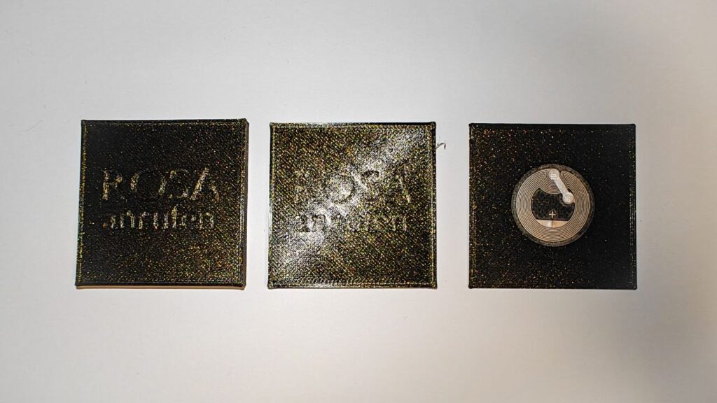
After getting the technical side working, I started experimenting with the interaciton. Since the NFC tags I had at home were just small stickers, I wanted to create a more tangible and easier way to interact with them. In my case I thought of basically two ways of using NFC: either bringing the NFC tag to the phone or bringing the phone to the NFC object. To try this, I designed and 3D printed several different variants that I would like to test further.

While prototyping, I ran into a few problems. One thing I noticed was that the distance between the NFC tag and the smartphone can’t be very large, meaning the tag has to be placed almost directly on the surface of the object. The more I thought about it, the more I realized that small physical objects might not be ideal for older adults. They can be difficult to pick up, especially for elderly people and they also need to be stored somewhere. On top of that, they could easily get lost.

First draft of the NFC Object

While experimenting with these prototypes, I came up with an idea: creating a physical phone book based on NFC interactions. Instead of navigating through contacts and menus, users could simply hold their phone to a physical card or object and immediately call them. In addition, this phonebook could also contain other tasks.

D&R2 05 – Experimenting With Neuroadaptive Interfaces

After the UX Graz talk, I was left with a useful tension. The research had developed into a broad field of connected questions, but the next step needed to be more concrete. My professor encouraged me to experiment rather than force the work into a final thesis topic too early. This semester is a chance to build something, test one direction and learn from what does not work.

What I want to experiment with is neuroadaptive interaction.

This does not mean that neuroadaptive interfaces have become my final thesis direction. Adaptive interaction design is still the larger area I am exploring. My interests include interruption, recovery, cognitive workload and the changing relationship between people and increasingly proactive systems. Neuroadaptive interaction gives me one way to bring these interests together in a form that can be experienced rather than only described.

I have been especially drawn to experimental HCI research from the 1990s and early 2000s. Before current discussions about AI agents and intelligent assistants, researchers were already asking how systems might respond to changing human capacity. Work on mixed-initiative interfaces, adaptive automation and physiological computing treated interaction as a continuing feedback loop. The system observed something about the user or task, adjusted its behaviour and then observed the consequences.

Pope, Bogart and Bartolome’s (1995) biocybernetic research is a good example. Their system used an EEG-derived engagement index to change the balance between manual and automated work in a flight-deck task. The experiment belongs to a specialised context and its measurements should not be treated as a direct model for everyday interfaces. Still, the interaction question remains valuable. If a system changes its level of support according to an estimate of the user, how should that change be communicated and how can the user remain in control?

Horvitz’s (1999) work on mixed-initiative interfaces approaches a similar problem without making physiological sensing the centre. A system may be able to suggest an action or offer help, but that does not mean every moment is suitable for intervention. It has to decide when to act, when to ask and when to remain quiet. These choices distribute initiative between the person and the system.

The historical work interests me because it is experimental in a direct way. It does not only propose that interfaces could become more responsive. It constructs situations where the relationship between user state, task demand and system behaviour can be observed. This is the kind of step I want to take now.

The experiment is not about proving that a computer can read somebody’s mind. Neuroadaptive systems work with indicators and inferences. EEG, gaze, behaviour and task performance can suggest that something may be changing, but they do not provide uncomplicated access to attention or mental workload. Fairclough (2009) describes a biocybernetic loop as a process of sensing, inference, adaptation and feedback. The inference stage is where uncertainty enters. One physiological change can have several possible causes, and the same cognitive state can appear differently across people.

Treacy Solovey et al. (2015) make the design gap explicit when they write that “the interaction techniques and design decisions for their effective use are not well defined” (p. 1). Their work suggests that physiological signals may be more appropriate as implicit context than as direct commands. Adaptations should be modest, confidence should matter and changes should remain reversible.

This shifts my attention from the accuracy of a single sensor toward the behaviour of the interface. What should a system do when it estimates that workload may be rising? Should it reduce information, delay a low-priority interruption or increase automation? How much should it explain? What should happen when its estimate is wrong?

To examine these questions, I need a setting where task demand and adaptation can both become visible. A simple interface would not create enough pressure to make the experiment meaningful. If a person is only watching one value or completing one predictable action, there is little reason for the system to adapt. The context needs several competing demands without becoming impossible to understand.

This is why I became interested in complex interfaces as an experimental environment. Control rooms, monitoring systems and operational dashboards require people to maintain awareness across several sources of information. Some events are urgent while others can wait. The interface may need to guide attention without hiding information or taking control away from the operator.

Complex interfaces also make cognitive load a design issue rather than an abstract score. Information density, competing priorities and time pressure can all affect what the user is able to process. An adaptive system could respond by foregrounding the most relevant event, reducing noncritical detail or temporarily taking over a routine action. Each of these adaptations can help, but each can also create new problems. Removing information may reduce visual load while weakening situation awareness. More automation may lower immediate demand while making it harder for the user to understand what the system has done.

The experiment therefore needs to be about control negotiation, not automatic optimisation. The user should be able to inspect why the system changed, reject the change or disable adaptation. An uncertain estimate should never give the system unquestionable authority. If the prototype adapts, it should do so in a way that keeps its reasoning and limitations visible.

Interruption and recovery remain part of this experiment. In a complex interface, the system has to decide whether a new event deserves immediate attention. Adamczyk and Bailey (2004) showed that interruption timing affects performance and emotional response. Chen et al. (2025) demonstrate that recovery cues can support users after an interruption by directing them toward previous or upcoming task information. These findings suggest several interactions that can be tested without pretending to solve cognitive workload as a whole.

The first version can begin with simulated signals. This allows me to test what the interface does before depending on hardware. Later, a Tobii eye tracker and a Muse headset may provide live inputs, but they should not define the project. A real sensor cannot rescue an adaptation that is confusing, intrusive or impossible to challenge.

For a concrete implementation, I am using a drone-triage scenario. The user monitors several semi-autonomous drones while managing interruptions and changing priorities. This setting provides a complex interface where workload, timing, assistance and recovery can be represented clearly. The system can defer a lower-priority alert, foreground a risk or provide a cue after the operator returns to the main task.

The drone scenario is not the research decision. It is a practical container for the experiment. Another operational context might eventually work better. What matters is that the interface gives me a way to test neuroadaptive behaviour under visible task pressure while preserving explanation and human override.The aim is to make one part of the research concrete enough to question, observe and revise.

References

Adamczyk, P. D., & Bailey, B. P. (2004). If not now, when?: The effects of interruption at different moments within task execution. In Proceedings of the SIGCHI Conference on Human Factors in Computing Systems (pp. 271-278). ACM. https://doi.org/10.1145/985692.985727

Chen, Y., Zhang, C., Fang, W., & Ma, J. (2025). The effects of cues on task interruption recovery in a concurrent multitasking environment. Scientific Reports, 15, 25992. https://doi.org/10.1038/s41598-025-09358-4

Fairclough, S. H. (2009). Fundamentals of physiological computing. Interacting with Computers, 21(1-2), 133-145. https://doi.org/10.1016/j.intcom.2008.10.011

Horvitz, E. (1999). Principles of mixed-initiative user interfaces. In Proceedings of the SIGCHI Conference on Human Factors in Computing Systems (pp. 159-166). ACM. https://doi.org/10.1145/302979.303030

Pope, A. T., Bogart, E. H., & Bartolome, D. S. (1995). Biocybernetic system evaluates indices of operator engagement in automated task. Biological Psychology, 40(1-2), 187-195. https://doi.org/10.1016/0301-0511(95)05116-3

Treacy Solovey, E., Afergan, D., Peck, E. M., Hincks, S. W., & Jacob, R. J. K. (2015). Designing implicit interfaces for physiological computing: Guidelines and lessons learned using fNIRS. ACM Transactions on Computer-Human Interaction, 21(6), Article 35, 1-27. https://doi.org/10.1145/2687926


Design & Research II – 5/6

Design & Research 2 | For: Birgit Bachler

In my last post I mentioned that I created a prototype for an online portal to help with the residence permit process. Recently I brought this concept into class and tested it with my classmates to see what they actually thought.

Putting my wireframes in front of real people was incredibly helpful. Since my prototype was mainly focused on the initial application process from your home country, the overall reaction was very positive. Everyone agreed that just having a clear list of required documents and knowing exactly how the whole process is going to happen takes away so much of the anxiety.

They also gave me some really solid suggestions for improvement. One big request was having clear language options and translation features so students can actually understand the complex legal terms instead of just guessing. Another major piece of feedback from people was to simply reduce the amount of steps in the portal. We discussed how to track serious deadlines and manage supporting documents, plus some other features I will explain during my final video.

DESIGN SHOULD BE APPROPRIATE

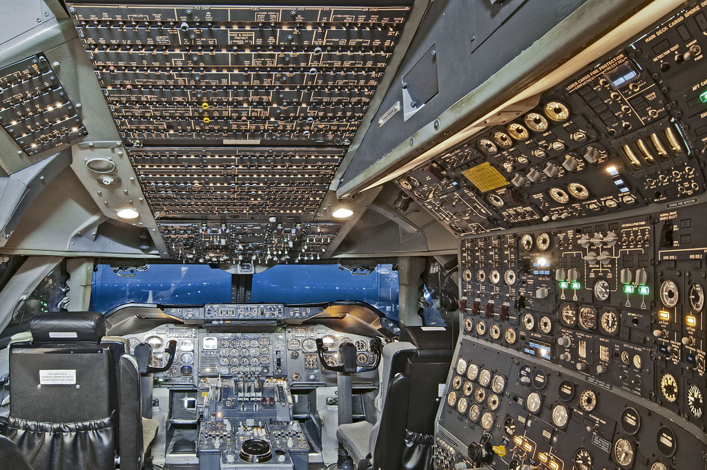
Image source: “Why was Concorde’s cockpit so complex?”, Aviation Stack Exchange (https://aviation.stackexchange.com/questions/16808/why-was-concordes-cockpit-so-complex)

I want to talk more about that feedback regarding reducing the steps. It makes sense because people always say design should be easy to understand, quick, and have fewer steps. But the thing is, something I learned during my bachelors was that design should be appropriate.

Sometimes stuff is actually supposed to be complex and detailed, especially when lives or major life events depend on it. Look at the cockpit of an airplane. It is incredibly complicated and full of buttons, but it has to be that way because flying a plane is a serious, high stakes task. The residence permit journey is similar. It is a major life event. We cannot just delete steps to make it look cleaner if those steps are legally required. The goal is not to hide the complexity, but to make that complexity transparent and manageable for the user.

One thing I want to make clear is that this current prototype is solely focused on the user side. It is designed to help the students and ease their emotional load. But a real working service design cannot just exist in a vacuum. To actually make a system like this work, we would need to keep everyone in the loop. That means eventually understanding the other side of the screen too, like the magistrate, the MA35, and the embassy staff, to see what their constraints actually are.

This whole testing phase opened up so many bigger questions for me to follow up on in the future. As I dig deeper into this, I cannot help but wonder why this problem is even there in the first place. What is actually causing all these massive delays? Is this friction intentional, or is it just a byproduct of a really old and overwhelmed bureaucratic system?

I will definitely take a look into those questions down the road. But for now, my focus is on polishing this user facing prototype based on the feedback and getting my final video ready.

D&R2 04 – Designing for the Interrupted: Giving a Talk at UX Graz

During this research process, I was invited to give a talk at UX Graz. The invitation came at an interesting point in my work. I had spent months reading, I had a lot of material, many connections and a growing sense about the topic. At the same time, I was still exploring rather than defending one narrow thesis topic.

The talk became an opportunity to test whether the research could make sense outside my own notes and Zotero library.

I titled it Designing for the Interrupted: Notes on Attention and Adaptive Interfaces. I did not want to present it as a finished argument or a final solution. The aim was to share the direction of the research with a UX audience and to ask what we lose when digital systems treat every moment as equally interruptible.

The central thought behind the talk was simple: interruptions are not small interface events. They affect task continuity, emotional state, workload and the ability to return to something afterwards. A notification may only take a few seconds to read, but the cognitive work of resuming a task can last much longer. This is why the design question cannot only be whether an alert is visually clear or technically delivered. It also has to be whether it arrived at a moment when the user could reasonably deal with it.

To build this argument, I began with attention and flow. Flow is often used loosely in design conversations, sometimes as another word for engagement. What interested me in Csikszentmihalyi’s work was the structure behind it: clear goals, feedback, a relationship between challenge and skill and a sense of control over the activity. These conditions are easy to disrupt. An interface that repeatedly changes the user’s context can make concentration feel fragile even when every individual interruption appears minor.

From there, the talk moved through a series of research areas that had shaped my work. Interruption studies show that timing changes the cost of disruption. Cognitive-load research shows that people are not equally interruptible in every situation. Emotional-design research shows that interruptions can communicate pressure, urgency and social obligation rather than merely information. Memory and resumption research show that the real problem often begins after the interruption, when people have to reconstruct what they were doing.

I also wanted to avoid the common idea that this is a “short attention span” problem. Attention is not a fixed amount of time that every person has before they stop listening or working. It is contextual. It changes with task structure, motivation, environment, cognitive control and the behaviour of the system itself. The problem is not that users have become incapable of focusing. The problem is that many interfaces are built to claim attention whenever they can.

Notifications were the most recognisable example in the talk, but I tried not to make them the whole subject. They are only one visible form of interruption. A system can interrupt through sound, vibration, visual prompts, a change in automation, a request for approval or a recommendation that appears at the wrong time. This becomes even more important as interaction moves beyond a laptop screen into wearables, mixed reality and AI-agent systems.

The talk also gave me a way to discuss neuroadaptive interfaces without treating them as magic. Physiological computing and workload-aware interfaces offer an interesting interaction logic: a system can use signals from the body, behaviour or task performance to adjust its own behaviour. But this only makes sense if the system acknowledges uncertainty. It should not pretend that gaze data or EEG can reveal a person’s complete mental state. It should use partial signals carefully, explain what it has changed and let the user override it.

The final part of the talk connected this to current AI systems. AI agents create a new version of an old design problem. If an agent constantly asks the user for confirmation, it can become another source of interruption. If it acts independently for too long, it can create errors that are difficult to discover and correct. The human role cannot be reduced to pressing approve or reject. It has to include understanding what the system is doing and deciding when to step in.

Preparing the talk was valuable because it forced me to see the research as one larger landscape. It also made the limits of that landscape visible. The live presentation was research-rich, but it covered too much for a twenty-minute setting. The feedback afterwards was fair and consistent. People found the topic interesting, but they needed one concrete example or object to hold onto. The talk felt like several connected research directions compressed into one argument.

I do not see that feedback as a failure. It was a scope diagnosis. The research was not empty, but it was still too broad to communicate through one presentation alone. That distinction matters. A broad research map can be useful in the early stages of a project, yet it eventually has to lead to a specific situation where its ideas can be tested.

The strongest phrase I used near the end of the talk was “from capturing attention to caring for it.” I still believe that this is the right design direction. It does not mean that interfaces should never interrupt, automate or ask for something. It means they should recognise that attention has a cost and that the user should remain part of the decision about when that cost is worth paying.

The UX Graz talk gave me a public moment to articulate that position. More importantly, it gave me a reason to move forward differently. Instead of trying to make the next step another broad explanation of the field, I want to experiment with one concrete adaptive interaction loop. That is where the prototype begins.

Also linking the presentation here in case someone is interested: https://www.figma.com/deck/knB8wTii1xOntnhMrQMYgN

References

Adamczyk, P. D., & Bailey, B. P. (2004). If not now, when?: The effects of interruption at different moments within task execution. In Proceedings of the SIGCHI Conference on Human Factors in Computing Systems (pp. 271-278). ACM. https://doi.org/10.1145/985692.985727

Altmann, E. M., & Trafton, J. G. (2002). Memory for goals: An activation-based model. Cognitive Science, 26(1), 39-83. https://doi.org/10.1207/S15516709COG2601_2

Csikszentmihalyi, M. (1990). Flow: The psychology of optimal experience. Harper & Row.

Fairclough, S. H. (2009). Fundamentals of physiological computing. Interacting with Computers, 21(1-2), 133-145. https://doi.org/10.1016/j.intcom.2008.10.011

Iqbal, S. T., & Horvitz, E. (2007). Disruption and recovery of computing tasks: Field study, analysis, and directions. In Proceedings of the SIGCHI Conference on Human Factors in Computing Systems (pp. 677-686). ACM. https://doi.org/10.1145/1240624.1240730

Lavie, N. (2010). Attention, distraction, and cognitive control under load. Current Directions in Psychological Science, 19(3), 143-148. https://doi.org/10.1177/0963721410370295

✿3 Design Research 2 – Interview

When I started looking into digital literacy among older adults, I thought the easiest way to find out where the problems are would be to simply ask people. So, taking some previous feedback into account, I spoke to around ten older people and asked questions like: What do you struggle with when using technology? What was easier back in the day? Is there anything you’d like to get better at?

(Not) to my surprise, I didn’t get many useful answers.

Most people either said they didn’t really have any problems or found it difficult to explain what exactly they struggled with. Thinking about it afterwards, that actually makes a lot of sense. Many issues only appear while someone is actively using a device or trying to complete a task. Once the moment has passed, it can be hard to remember what happened.

Because of that, I started wondering if directly asking people about their problems is even the best approach. Maybe observing people while they use technology would show much more than interviews alone. Since I didn’t get many concrete insights from those conversations, I started asking colleagues and friends about their experiences with parents, grandparents and other older relatives. Almost everyone had some kind of story. It became clear that many younger people end up being the unofficial tech support person in their family.

Interview Results

One thing that stood out was how important familiarity seems to be. One colleague told me that their mother shops online all the time and actually prefers doing it on her phone rather than on a computer. For me that sounded a little backwards, since a larger screen and analoge input usually feels easier to navigate. But because she’s used to her phone, that’s simply the device she feels most comfortable with.

Another interesting example was someone working as a secretary. They use digital tools all day long at work, manage documents, handle bookings and deal with various systems without any issues. But when it comes to doing similar things in their private life, like booking a flight for themselves, they would rather avoid it. At work there is always a process, a colleague or someone responsible for helping. At home, that safety net isn’t there. It made me think that confidence might also sometimes be a bigger factor than actual technical skills.

Some observations weren’t really about technology itself but about how people communicate online. Multiple colleagues mentioned that their parents or grandparents completely ignore grammar, punctuation and spelling when sending text messages. As some young people do as well. The goal seems to be getting the message across rather than worrying about how it looks.

Trust was another topic that appeared again and again. Several people mentioned that their parents or grandparents still prefer traditional banking methods. Instead of making a transfer online, they would rather fill out a paper form at the bank. Whether that’s actually safer isn’t really the point. The important thing is that it feels safer and more understandable to them.

Communication preferences also seem to differ quite a bit. According to several people, older adults often prefer calling someone instead of sending an email or a message. A phone call gives immediate feedback. You know the other person received the information and understood it. With emails or messages, there’s always a bit more uncertainty.

One thing I found particularly interesting was the role curiosity seems to play. People who are naturally curious often continue exploring technology regardless of their age. They click around, try things out and aren’t afraid of making mistakes. Others seem much less interested in learning something new, not necessarily because it’s difficult, but because they don’t see enough value in putting in the effort.

At this point, these are still just observations rather than real conclusions. But they already change some of my assumptions. Maybe the issue isn’t simply that digital products are too complicated. Familiarity, confidence, trust, habits, motivation and curiosity all seem to have a huge influence on how people interact with technology.

For the next step, I think it would be much more useful to actually observe people while they perform digital tasks instead of only asking them about their experiences afterwards. I also already have a direction I would like to go to.

✿2 Design Reserach 2

Unsere Mission - enna
In my last blog post I was already thinking about a final product, but since then I came to realize that I might need to do some more research.

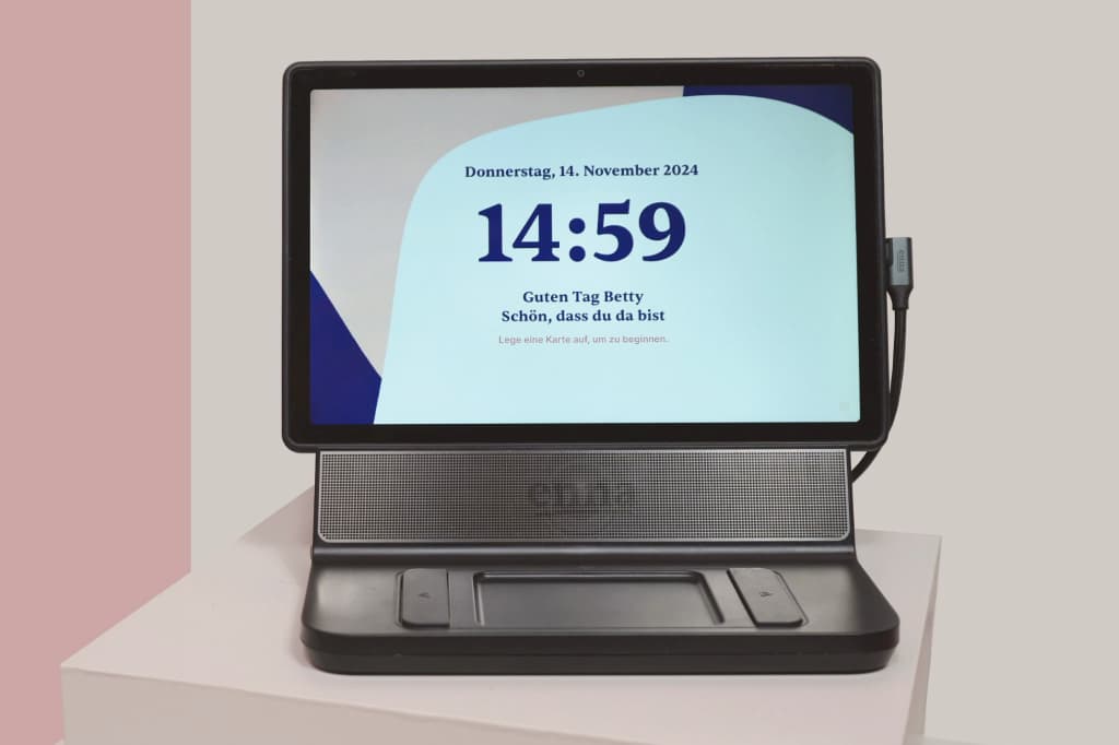
This week, I came across a tablet-based system called Enna Care, a product created in Germany that uses NFC cards as a “physical” way of interacting with digital content. Instead of navigating a touchscreen interface, users simply place a card on the device to trigger a specific action.

When I first looked at the system, it raised an interesting question: Should the challenges elderly people face with digital technology be solved entirely through digital solutions or should designers also consider combining digital and analog interaction?

From the research I reviewed, it became clear that many seniors experience difficulties when using touchscreen interfaces. Age-related changes in motor and cognitive abilities, such as reduced dexterity, attention and memory, can make digital interaction more challenging. [1]

This is where tangible user interfaces become particularly interesting. Instead of relying solely on abstract digital elements, they connect digital functions to physical objects that users can touch. Research shows that NFC-based systems seem to be well accepted by seniors and can encourage greater engagement with digital technology. Because the interaction is linked to familiar physical actions, users can rely on existing knowledge and experiences rather than learning entirely new interaction patterns. [2]

What I found particularly interesting about Enna Care is that it does not try to force users to adapt to technology. Instead, it adapts the technology to the users. By using NFC cards as physical objects that relate to digital functions, the system reduces complexity and makes interaction feel more familiar.

When designing for elderly people, the goal might not always be to simplify existing digital interfaces. In some cases, it may be more effective to rethink the interaction itself and build on users’ existing mental models. Maybe also a hybrid interface that combines analog and digital interaction could be a solution.

Sources

[1] G. A. Wildenbos, L. Peute, and M. Jaspers, “Aging barriers influencing mobile health usability for older adults: A literature based framework (MOLD-US),” International Journal of Medical Informatics, vol. 114, pp. 66–75, Jun. 2018, doi: https://doi.org/10.1016/j.ijmedinf.2018.03.012.

[2] E. de la Guía, M. D. Lozano, and V. M. R. Penichet, ‘Increasing engagement in elderly people through tangible and distributed user interfaces’, in Proceedings of the 8th International Conference on Pervasive Computing Technologies for Healthcare, Oldenburg, Germany, 2014, pp. 390–393.

D&R2 03 – Reading Toward Adaptive Interaction Design

In the previous post, I arrived at a direction that feels more specific than the topic cluster I carried through last semester: adaptive interaction design. I am not treating it as a finished thesis definition. It is a working direction that gives my reading and prototyping somewhere to go.

That shift changes how I look at the literature. Before, I was reading broadly in order to understand interruption, flow, cognitive load, memory, emotion and neuroadaptive interfaces. The breadth was necessary. It helped me see that interruptions are not isolated design failures but events that affect attention, task continuity and a person’s ability to return to what they were doing. Now I need to ask a different question. If an interface is going to adapt to the user, what should it pay attention to, what should it be allowed to change and how should the user remain involved?

The older work on adaptive and mixed-initiative systems has become especially useful here. It is easy to speak about adaptive interfaces as if they are a recent consequence of AI, but many of the central interaction questions are older. Horvitz (1999) wrote about mixed-initiative user interfaces at a time when the examples looked very different from current AI agents. Yet the core problem is familiar: a system may have enough information to make a suggestion or take an action, but it still has to decide whether this is the right moment to involve the user.

That matters because a useful system can also become a badly timed system. It may offer a recommendation while somebody is already working through a difficult task. It may ask for confirmation when the person has no real capacity to evaluate the decision. It may quietly act on the person’s behalf, then leave them to reconstruct what happened later. The design problem is not simply how to make the system more proactive. It is how to distribute initiative without turning the user into a passive observer of their own work.

This connects directly to the research I had already done on interruption. Adamczyk and Bailey (2004) showed that the timing of an interruption changes its effects on performance, emotion and the way people perceive the interrupting system. Their basic point remains important: “user attention is a scarce resource” (p. 271). An interface cannot assume that a message, recommendation or request for approval has the same cost at every point in a task.

Iqbal and Horvitz (2007) make the picture more realistic by looking at interruption and recovery in everyday computing work. Their work shows that disruption is not just the moment somebody looks away from a task. There is a longer process of reorientation afterwards. People need to recover their goal, remember the current state of the work and decide what comes next. This is why I am interested in adaptation not only as a way to prevent badly timed interruptions, but also as a way to support the return after they happen.

The return is where memory becomes a design concern. Altmann and Trafton (2002) describe pending goals in terms of activation and retrieval. In simple terms, an interrupted goal does not wait untouched until a person comes back to it. It has to compete with everything else that happened in the meantime. The task may still be open on the screen, but the reasoning behind it may have faded. A system that changes information, makes suggestions or completes work while the user is away has a responsibility to make the return understandable.

This becomes particularly relevant in AI-assisted work. Recent research on agentic systems is often framed around how much work an agent can perform autonomously. I find the moment of human re-entry more interesting. Zhou et al. (2026) examine when people should check multi-step agentic tasks. Their findings suggest that constant confirmation becomes costly, while waiting until the end can make correction much more expensive. The issue is not whether the human should supervise every action. It is how the system can involve the human at moments that protect both control and continuity.

The same question appears in workload-aware systems. The literature does not support a simple idea of a system knowing exactly when someone is busy. Workload overlaps with attention, task difficulty, stress, effort and fatigue, but it is not interchangeable with any of them. Kosch et al. (2023) show that HCI researchers use self-report, performance, behaviour and physiological measures, each with different strengths and limits. There is no single number that can tell an interface everything it needs to know about a person.

That uncertainty is not a reason to abandon adaptive design. It is a reason to design it carefully. Fairclough’s (2009) work on physiological computing describes a loop in which a system senses something about the user, infers a state, adapts and then observes the result. The word infers is important. Signals from gaze, EEG, typing or task performance are not direct access to a person’s internal life. They are partial evidence that may or may not be useful in context.

I find the interaction logic of this early experimental work more compelling than the promise of any individual sensor. The system does not need to claim that it has discovered a person’s true mental state. It can respond modestly to patterns that suggest a change in task pressure, then let the user inspect or reject that response. Treacy Solovey et al. (2015) argue that physiological input is often better suited to implicit and supportive adaptation than direct control. Their point is not that systems should become invisible. It is that they should not behave with more certainty than their input allows.

This is starting to give my research a clearer shape. I am not looking for the perfect way to measure attention. I am looking at what happens when an interface has incomplete information about the user’s situation and still needs to make decisions about timing, assistance and interruption. What would it mean for that interface to be helpful without becoming intrusive? How could it support recovery without taking ownership away from the person?

The answers will depend on the context. A work tool, a wearable device, a spatial interface and an AI agent all create different conditions. For now, I do not want to lock the research into one medium too early. I want to keep reading across these contexts while holding onto the same underlying question: how can systems adapt to human capacity without asking humans to adapt to the system first?

This post is a research checkpoint rather than a conclusion. The previous post helped me name a direction. This one is helping me understand the problems inside that direction.

References

Adamczyk, P. D., & Bailey, B. P. (2004). If not now, when?: The effects of interruption at different moments within task execution. In Proceedings of the SIGCHI Conference on Human Factors in Computing Systems (pp. 271-278). ACM. https://doi.org/10.1145/985692.985727

Altmann, E. M., & Trafton, J. G. (2002). Memory for goals: An activation-based model. Cognitive Science, 26(1), 39-83. https://doi.org/10.1207/S15516709COG2601_2

Fairclough, S. H. (2009). Fundamentals of physiological computing. Interacting with Computers, 21(1-2), 133-145. https://doi.org/10.1016/j.intcom.2008.10.011

Horvitz, E. (1999). Principles of mixed-initiative user interfaces. In Proceedings of the SIGCHI Conference on Human Factors in Computing Systems (pp. 159-166). ACM. https://doi.org/10.1145/302979.303030

Iqbal, S. T., & Horvitz, E. (2007). Disruption and recovery of computing tasks: Field study, analysis, and directions. In Proceedings of the SIGCHI Conference on Human Factors in Computing Systems (pp. 677-686). ACM. https://doi.org/10.1145/1240624.1240730

Kosch, T., Karolus, J., Zagermann, J., Reiterer, H., & Schmidt, A. (2023). A survey on measuring cognitive workload in human-computer interaction. ACM Computing Surveys, 55(13s), Article 286, 1-39. https://doi.org/10.1145/3582272

Treacy Solovey, E., Afergan, D., Peck, E. M., Hincks, S. W., & Jacob, R. J. K. (2015). Designing implicit interfaces for physiological computing: Guidelines and lessons learned using fNIRS. ACM Transactions on Computer-Human Interaction, 21(6), Article 35, 1-27. https://doi.org/10.1145/2687926
Zhou, Y., et al. (2026). When should users check? Modeling confirmation frequency in multi-step agentic AI tasks. In Proceedings of the CHI Conference on Human Factors in Computing Systems. ACM.

Design & Research II – 4/6

Design & Research 2 | For: Birgit Bachler

Let’s suppose you just graduated from your Bachelor’s program and you are planning to go outside of your country for higher studies. You look around on the internet, figure out exactly what you want to do, and find a university that teaches exactly what you want to study. You decide to apply, you get your admission, and you get ready to move to a new country and meet new people. Sounds incredibly smooth right?

Well there is a catch. If you want to study in Europe as a non EU student, and especially if you are from a third world country, I really wish it was that smooth.

A Year of Paperwork

Let me take you through my personal journey. After doing my Exchange Semster here, I saw exactly what I wanted to pursue. I decided to apply for my Master’s in Interaction Design at FH JOANNEUM because I believed it was the right decision. But just coming to Austria meant going through a year long process. For some people it takes even longer than a year.

First I had to get all my documents attested by local courts in Pakistan. Then I had to get them attested again by every single authority that originally issued them. Then they had to be stamped by the Ministry of Foreign Affairs. After waiting four to five months, you finally get an appointment at VFS Global just to have the Austrian embassy legalize your documents to prove they are not fake. Once that is done, you try to get an appointment at the embassy to actually apply for your permit. That part is a total nightmare in itself.

After you finally submit your application, you have absolutely no clue what is happening or what is going on behind the scenes. Then suddenly, I got an email from the Magistrate in Graz. They told me I needed to submit my police clearance certificate, fully legalized by the Austrian embassy, because they suspected my current one was fake. And they gave me exactly 14 days to do it.

I wish I had known this beforehand so I could have legalized that document early. But I did not know because there is no proper channel or guide available to tell you these things. It was physically impossible to make it happen in 14 days. I emailed the embassy four times and could not get a response. I even showed the Magistrate my emails, asking for more time and showing that I was trying my absolute best to cooperate.

Their response? The Magistrate rejected my residence application. In their official rejection document, they literally used the term that I was a “security threat to Austria.”

Going to Court to Study Design

I had to file an appeal in court in Graz against this decision. According to Austrian law, they cannot reject your application for being unwilling to cooperate or call you a security threat just because things are out of your hands when you are trying your best. The case went to court, and thank god I won. They granted me my residence permit.

Because of all this chaos, I was a month and a half late to start my studies. I was so stressed that I almost emailed the university to ask for a refund on my fee because I thought I might not be able to make it anymore even after that much effort.

And just so you know, this was my experience as someone who actually has an Austrian embassy in their home country. Just imagine what happens to students from Bangladesh. They do not even have an embassy in their country and have to travel to a completely different country like India just to get their documents checked.

How Do We Fix This Broken System? This whole experience is exactly why I moved to this topic. The system is fundamentally broken. It places a massive emotional weight and cognitive load on students before they even step foot in a classroom.

I want to see if there is any way to fix this problem and figure out what the best way to do it would be. For my next steps, I am exploring the world of service design to see how we can make this journey more humane and transparent. I tried making a prototyping idea of an online portal and a digital status tracker that might actually solve this issue. I recently tested it with my class fellows and colleagues, and I will tell you all about their feedback in my next post.

#4 D&R2 Wireframes

Before I started experimenting in Figma, I sketched a few ideas on paper to find a basic layout for my website. At first, I came up with a layout that closely resembled a typical AI interface.

First Figma wireframes:

I tried to translate my sketches into a digital design while exploring which colors to use. I wanted the website to feel vibrant and playful because it’s meant to support a hobby that people enjoy for fun. I wanted to avoid giving it a serious or overly formal look. I really wanted to incorporate green because I feel like it symbolizes sustainability and a focus on the environment. I also really like how purple and green look together, so those are the two main colors I decided to go with.

Final Figma Wireframes:

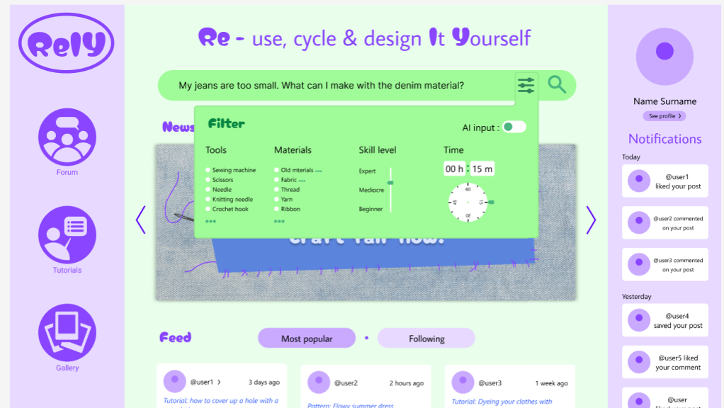
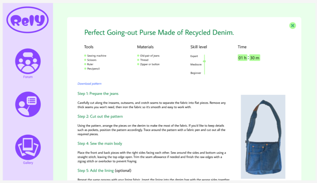
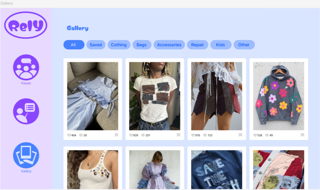
I decided to place less emphasis on AI on the website and instead focus more on the community, so I wanted the design to reflect that. I decided to go for an almost social media style layout, where you can access your profile on the right. I also placed the notifications on the right to emphasize the focus on community and helping each other. The search function is placed at the top center of the website to highlight its importance. I also added a news widget where updates about events and other community activities can be displayed to strengthen the community both online and in real life. Below that, as you scroll down, you’ll find a feed of posts from users you follow as well as popular posts. On the right, you can access the forum, tutorials, and gallery.

The filter function is designed to help users find more relevant results. I wanted to make it as easy as possible for people to describe their situation and find exactly what they’re looking for.

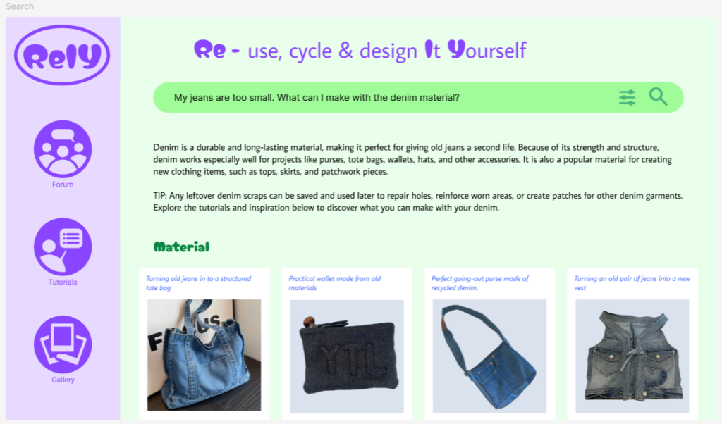
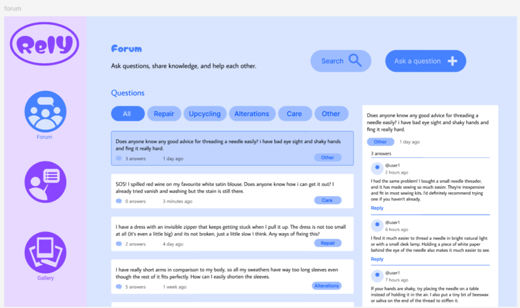
I used a blue color palette for the Forum, Tutorials, and Gallery pages to introduce more color and clearly distinguish them from the search function. While the search feature is designed for finding answers quickly, these pages serve as resources that users can browse and explore at their own pace.

I designed the forum to be simple and intuitive to use. Users can filter posts by category, easily read and comment on other users’ posts, and create their own questions when they need help.

#2 Sketching ideas and Lo-Fi prototypes

Imagining what could be prototyped for such highly conceptual and unexplored subject was initially challenging, as it required translating something abstract into tangible. Nevertheless, I was able to find two possible directions for further developments of the research, each exploring a different aspect of the topic. As a precautionary measure to ensure a deliverable outcome, I then also considered a separate (maybe more practical) direction as a reliable backup plan and idea 3.
Here follows a description of each idea in detail.

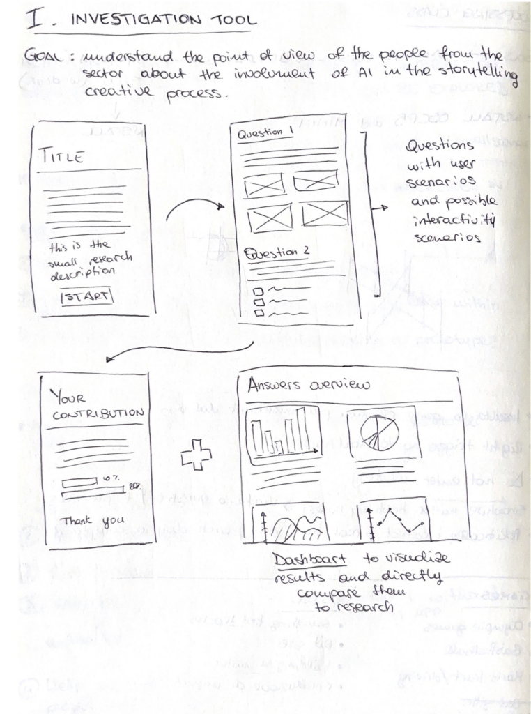
1. Building a tool to conduct research on user behaviour and AI usage

The concept sketched above stems from the need of conducting a survey for the thesis research, which should investigate the behaviour and habits in AI usage in the creative process of people in the field. Instead of relying on common survey tools, the idea here is to build/prototype a tool based on my needs, which could then show in a dashboard the data collected in the survey part. Why a dashboard? Because I would like the results to be always available and accessible to other researchers and designers, even without completing the assessment). This to ensure more open data in real time, that can illustrate our current usage trend ans possibly the environmental impact based on the numbers.

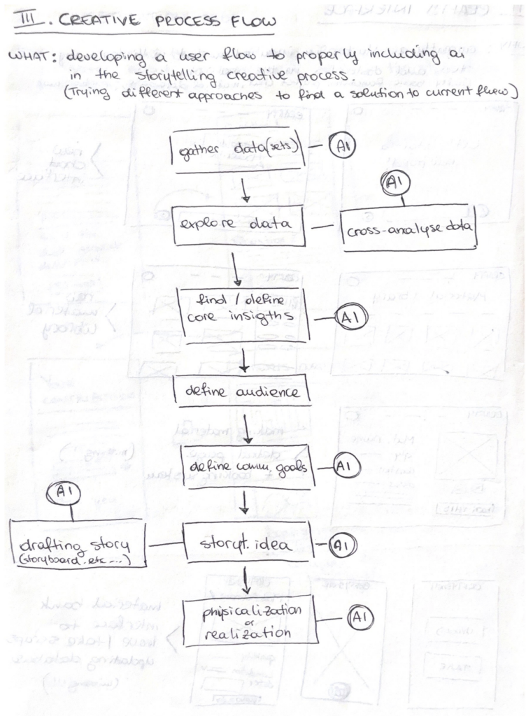
2. Developing a new framework/workflow for the involvement of AI in the data-driven storytelling creative process

This second, more ambitious, idea is to study and develop myself a new (or just different) workflow framework for the community into data-driven storytelling. This would work as a step by step guide to follow for a conscious employment of AI in the creative process, highlighting the steps in which it can actually be helpful and how to properly write our prompts to have answers and outcomes that respect our needs in less requests. The scheme right now shows how our currently AI usage, yet the goal is to offer clearer steps with less involvement of generative models to ensure more human-centered design.

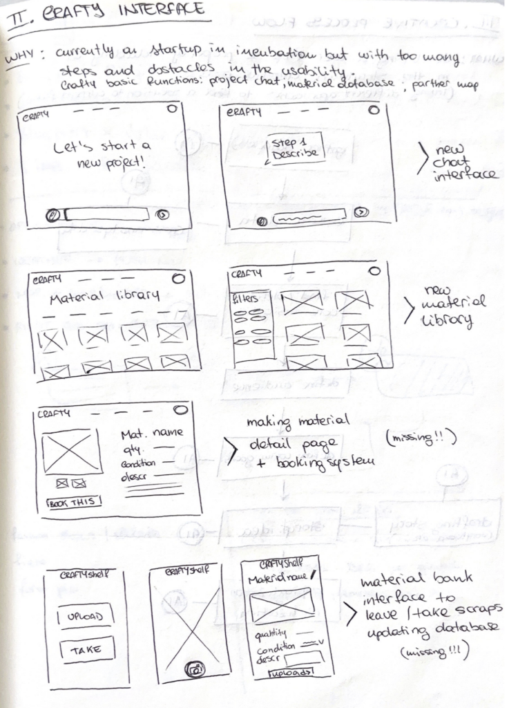
3. Implementing the interface of the website CRAFTY (the plan B)

This concept focuses on a project developed with other students one year ago and currently undergoing a startup competition at Politecnico di Milano. Its name is CRAFTY and it is an AI enhanced website dedicated to creatives, which should help with project development relying on (and suggesting) recycled resources and waste materials collected in storage spaces in universities and Fablabs. The idea drafted in this sketch aim to rethink the whole interface and interaction for the website, to make the usage smoother and more intuitive. In addition, it was considered to develop the missing interfaces for an autonomous warehouse management.