For this post I wanted to sit down and do some good old fashioned literature and resource research. I want to understand what I’m talking about, start with building a bibliography and also research into resources I hadn’t thought of before as a junior designer because I didn’t have the time to sit down and research about my profession in such a way. I find research fun!
AI in the workplace
The World Economic Forum reports that UX/UI designers are among the fastest-growing professions globally, with a 45% projected growth by 2030, while Graphic Designers are on the decline . When it comes to generative AI, they state that it “enables users to interact with it as though they were conversing with a human, considerably reducing barriers to usage and the need for specialized technical knowledge”. It also states however, that “without appropriate decision-making frameworks, economic incentive structures and, possibly, government regulations, there remains a risk that technological development will be focused on replacing human work, which could increase inequality and unemployment.” [1].
What I took out of this is that AI isn’t something I can just ignore, especially as someone who works in close proximity of developers. But it also validates my feelings of uncertainty, especially with the lack of government regulations. I’m also conflicted about the ethics of it all as well considering the replacing human work part. This isn’t something I’m alone in.
I found another paper on this topic where the authors state that while AI helps new employees, when it comes to high-skill employees, they tend to see small gains in speed and small declines in quality [2]. This all the more proves that for good quality results, there has to be extra care taken when working with it.
DesignOps + Resources
As I’ve already worked for a while and am currently in my masters, I found it important to take my workflow more seriously and evolve. After some research into streamlined workflows I came across the term Design Ops (short for Design Operations). Kate Kaplan of the Nielsen Norman Group describes it as “the orchestration and optimization of people, processes, and craft in order to amplify design’s value and impact at scale.” [3].
The way I understood this is that it’s the “behind the scenes” teamwork organisation that helps designers do their best work. This means organising files, design systems and taking care of handovers between designers and developers. I only recently noticed just how messy and hard to navigate my file is now to developers, because it grew in size exponentially.
C. R. A. Nisslmüller provided this useful checklist [4] in his article about design system mastery which goes into the organisational value of Design Ops:
Are all scalable values defined as variables (no hardcoded values left)?
Are variable names systematic, semantic, and globally unique?
Are all variables type-correct (Number, Color, String, etc.)?
Is there a String variant for every variable that needs direct CSS or output?
Are composite/array variables grouped and documented?
Is accessibility covered (contrast, motion, focus, scaling)?
Are tokens versioned and audit logs maintained?
Is there a governance structure and regular review cycle?
Are APIs/automation in place for handoff and code sync?
Is AI/automation used for linting, doc generation, and compliance?
I also researched for Figma resources for easier implementation. I found this workbook on Figma’s community page which I’d like to try implementing at an appropriate time: https://www.figma.com/community/file/1246508925181507765
[2] E. Brynjolfsson, D. Li, and L. R. Raymond, “Generative AI at Work,” arXiv preprint, Apr. 2023. [Online]. Available: https://arxiv.org/abs/2304.11771
[3] K. Kaplan, “Design Operations 101,” Nielsen Norman Group, Jul. 21, 2019. [Online]. Available: https://www.nngroup.com/articles/design-operations-101/. [Accessed: Jul. 3, 2026].
I’d like to take this opportunity to do a reintroduction into the direction I’d like to take my masters topic after much deliberation. My bachelors topic had a lot to do with how it actually is to do a job as an UX/UI designer, since all the confusion around our profession was overwhelming even at the time.
Recently, something happened at my workplace where I had to take a step back ask myself that question all over again. The lead programmer fed my Figma design file into Claude Design, without asking me or even consulting with me. The design that came out wasn’t even bad! To be frank, I was quite shocked and I asked myself the question: “If AI can generate UI instantly, what even is my job anymore?
The Human Element: AI and the Evolving UX/UI Designer
The relationship between generative AI and product design is moving and changing constantly at a scary pace. Teams are adopting these tools fast in the name of efficiency and results. While these technologies really do make a difference in time spent, they often don’t take corporate design consistency and human experience into account. This thesis would explore how this would change the responsibilities, workflows and attitudes of the human designer within a team.
Research questions
How can AI-generated design outputs be responsibly reviewed and refined within a professional UX/UI workflow?
How can generative AI be integrated into professional UX/UI design workflows while maintaining human-centered design principles?
What does a healthy co-creation workflow look like between a designer, a developer and an AI agent?
How can UX/UI designers maintain a human-centered approach in AI-assisted design workflows?
How do we navigate the ethics of feeding proprietary design assets into models for quick corporate efficiency?
Design Relevance
This topic is very relevant to the design field, as it’s becoming a core part of most workplaces. In workplaces where UX efforts aren’t supported already, UI designers have essentially switched gears from tinkering in Figma and looking at every pixel for perfection, to kind of auditors or reviewers of AI-generated designs. This change is new and deserves addressing in the academic field, where we were taught that manual work that is now seems to be becoming obsolete (or is it?).
This isn’t just my own personal crisis, it’s an important moment for the entire design field. If we let non-designers or developers blindly push out pure AI outputs just because it’s faster, we’re gonna to end up with an internet full of broken, generic and not human-centered websites and interfaces. I actually really like the internet so I’d like to research and navigate this newfound blunder somehow.
Challenges
I see a lot of challenges with this topic, but the most obvious one to me is navigating questions of ethics. What’s ethical within design and workplaces, does it matter? Those theoretical or philosophical questions pique my interest, but are hard to visualise scientifically. Another challenge is finding a fair perspective myself with developers and business owners. Developers love AI because it helps with tedious manual coding tasks and bosses love it because of the efficiency and features going online faster and faster. I want to make sure that my point is helpful to future designers, because I do believe we’re still needed and not replaceable.
Upcoming Research Steps
My upcoming research steps are as follows:
guerrilla testing and/or interviews with my peers to gather primary data
keeping an “AI interaction diary“, where I write down my experiences with AI in the workplace and if they help me save or lose time in different contexts
researching papers and facts to help me out when writing the thesis in the future by building a bibliography already
developing the idea of the “governance framework” or something which acts as my work piece in the end
Personal Motivation
My personal motivation was briefly touched upon in the first two paragraphs of this blog and it’s all about my reality as a designer shifting. This topic would also compliment my bachelor’s thesis nicely, given it was all about the hard skills of from-scratch, manual UI design. It was focused on UI design and making a pretty prototype, but totally missed out on the UX part thanks to workplace constrains. This time I want to use my workplace experience and do it properly (with UX methods too) while ensuring that the human empathy doesn’t become “automated away”.
Relevant Institutions
The Interaction Design Foundation: This academic website is something I’ve used before, but now has a big “Get the skills that employers want most: Combine AI skills with timeless design expertise that AI can’t replace.” tagline.
This post takes a step back and puts together everything written so far about my idea of the app to report and learn about light pollution, to review the context the project sits in and start to think about the materials it involves.
Context review
What is the core concept
Light pollution has a big effect on biodiversity and human health, but it stays mostly invisible as an issue. Most people living in cities have lost contact with the night sky, and this leads to energy waste and to disrupted biological rhythms in humans and wildlife. Compared to other, more visible forms of pollution, light pollution does not have the public awareness, the monitoring tools or the advocacy structures that would let people understand it or act on it.
The core concept of my project is a mobile app that merges reporting and instruction. Users can fill out a simple form about the condition of the sky they see, look at a light pollution map, discover the sky through augmented reality, sign petitions and connect with others through a social media function. The app is meant to make light pollution reporting and research easy and accessible, both for normal citizens and for scientists, in order to raise awareness on the issue and inform people, so the problem can be fought collectively.
Finding the gap
Light pollution is an issue that has been growing invisibly, without the monitoring tools or advocacy infrastructure that more visible pollution types already have.
Last semester I analysed the Globe at Night Project during a usability test. It is a light pollution awareness campaign, where anyone can submit measurements of the night sky brightness. I focused on discoverability and usability and concluded that people generally do not know where and how to report light pollution when they notice it and that the reporting form of Globe at Night is difficult to understand for people with limited knowledge about astronomy.
I suppose that reporting platforms like the Globe at Night Project are usually used by people with a shared mindset: environmental consciousness, curiosity about science and value placed on outdoor experience. But a lot of people are unaware of the issue, due to their social and geopolitical background.
Patterns and missing areas
Light pollution is not talked about a lot, and there is no central platform to report it. The platforms that do exist are described as difficult to use. This is really the starting gap the whole project is trying to answer: not enough public awareness, not enough easy to use reporting tools, and not enough of a bridge between citizen reporters and the scientists and institutions who could act on the data.
The project positions itself as trying to close this gap now, giving people a central platform in an accessible form.The goals of the project can be summed up in these points:
Reaching a broad audience, evenpeople who are not environmentally educated or conscious.
Educate and map: closing the gap between abstract data and real life experience by presenting information and measurements in a way people understand, free of complex language
Citizen advocacy: letting users report light pollution in their community, sign and circulate petitions directly, routing community backed concerns to local institutions
Engagement through gamification, social features and education
Behavioral change: motivating people to reduce light pollution in their daily lives
User-friendly interface for researchers: possibility to verify reports for data quality, compare them and organise them and export data in standard formats
Material studies
These are the smartphone sensors that the project might include:
Phone light sensors, compared to a dedicated hardware like a Sky Quality Meter for measuring sky brightness
GPS and compass/gyroscope, for an AR sky view
Camera sensor and its performance in low light, to check if it is a valid measurement tool
Continuing my research on the topic of “Slowness”from last semester, I will be doing further work on this topic as part of the Design & Research II course with Birgit Bachler PhD.
For the final assignment, I will need to record a 2-minute video of the final prototype — in my case, I plan to use prototyping in Figma, which each of you will be able to test. The research will again focus more on contextual analysis, as well as user testing, bibliography, and heuristic evaluation.
Social geography and who the city is for 🤼🏻
The next important question for my project is: who is “slow navigation” actually designed for? At first glance, it might seem that “slow routes” are suitable for everyone: tourists, locals, people who love to walk, or those who want to explore the city. But if we look deeper, the city isn’t the same for everyone. Different people move through it in different ways, and this falls under the umbrella of social geography.
Social geography helps us think of the city not only as a physical space but also as a social experience. The same route can be pleasant for one person and inconvenient or even unsafe for another. For example, a tourist might be looking for beautiful streets and cafes, a local resident might be looking for a peaceful route after work, someone walking a dog might be looking for green spaces, and a person with limited mobility might be looking for a flat route without steep inclines or stairs.
Social geography is a subfield of human geography that examines the relationship between society and space. While there is no universally accepted definition, it is generally understood as the study of societal dynamics from a spatial perspective, exploring how people interact with their environment across time and place. This area of study encompasses various topics, including the differences between locations and their residents, the transformations of places, and the ways individuals perceive and alter landscapes. [1]
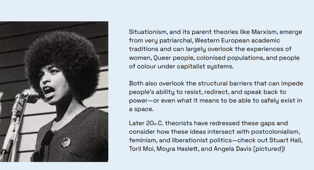
The PDF [2] includes an important note that Situationism and similar theories often stemmed from a Western, male, and academic tradition and may not have taken into account the experiences of women, queer people, colonized populations, and people of color. It also states that it is important to consider structural barriers and the fact that not everyone can “wander” through the city with the same degree of freedom.
This is a very important point for my app. If I use the ideas of dérive and free exploration of the city, I can’t simply say, “Let people go wherever they want.” For some, this truly represents freedom, while for others, it means stress, risk, or physical limitations. Therefore, slow navigation must take into account not only mood and interests, but also safety, accessibility, physical exertion, lighting, proximity to public transportation, and the user’s personal boundaries.
Here, I also find the idea from data feminism useful. Authors Catherine D’Ignazio and Lauren Klein [3] suggest thinking about data through the lens of power, context, and inequality. For my project, this means that a map shouldn’t pretend to be neutral. If an app shows the “best route,” we need to ask: best for whom? For a young tourist? For an older person? For someone with anxiety? For someone who doesn’t speak the language? For a young woman walking alone at night?
That’s why, in the future prototype, I want to focus more on modes and settings – not just “fast/slow,” but more specifically: quiet, safe, green, accessible, dog-friendly, low-stairs, familiar, and exploratory. This makes the app not just a pretty alternative to Google Maps[4], but a more human-centered system that acknowledges the different ways of experiencing the city.
For me, the main takeaway from this phase is this: slow navigation shouldn’t romanticize walking. It should take into account that a city can be inspiring, but also challenging, noisy, inaccessible, or unsafe. If the app wants to create higher-quality routes, it must consider not only the beauty of the path but also the user’s social context.
Continuing my research on the topic of “Slowness”from last semester, I will be doing further work on this topic as part of the Design & Research II course with Birgit Bachler PhD.
For the final assignment, I will need to record a 2-minute video of the final prototype — in my case, I plan to use prototyping in Figma, which each of you will be able to test. The research will again focus more on contextual analysis, as well as user testing, bibliography, and heuristic evaluation.
Psychogeography and Dérive 🧠
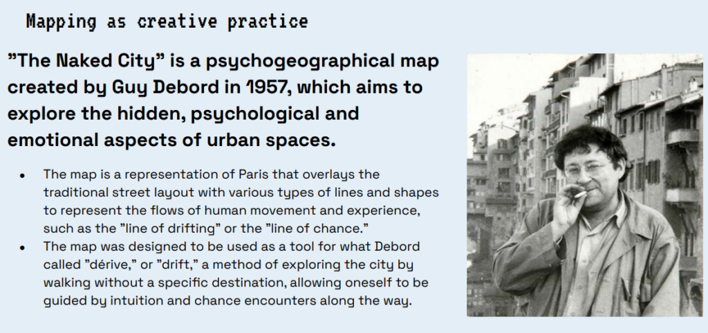
One of the ideas that fits my project particularly well is psychogeography. Simply put, psychogeography explores how a city influences our emotions, moods, and behavior. It’s not just about streets and buildings, but about how we experience space as we move through it. In the PDF [1], this topic is introduced through Guy Debord and his work “The Naked City“[2]. It is described as a psychogeographic map that reveals not a conventional map of Paris, but the hidden psychological and emotional connections between urban fragments.
This is a very important shift for my project. Conventional navigation revolves around point A and point B. The user enters an address, the app calculates the route, and that’s it. But psychogeography offers a different way of looking at the city: not as a problem to be solved, but as an environment to be explored.
This is closer to my question: can navigation be not only efficient, but also more mindful, personal, and slow?
This is related to the concept of dérive, or drift [3]. In the presentation, dérive is explained as a method of exploring the city through unplanned, almost aimless wandering. A person does not follow a strictly predetermined route, but instead allows themselves to respond to the atmosphere of the place, random turns, their mood, and unexpected encounters. Debord described dérive as a practice distinct from an ordinary walk because it involves paying attention to the city’s psychogeographical effects and atmospheres.
I don’t want to literally turn the app into a chaotic, aimless wander. But I’m interested in adopting the very principle of dérive: a route can be not only functional but also open-ended. For example, the app could offer not just one “correct” path, but several options: a calm route, a curious route, a green route, or a social route. The user is still moving toward a destination, but the path becomes more flexible and dynamic.
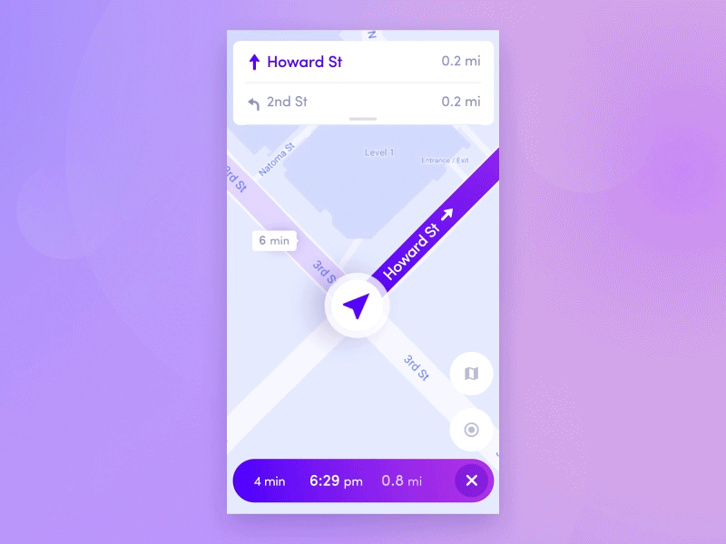
It also helps me take a critical look at modern maps. Many apps try to eliminate uncertainty: turn right, walk 200 meters, and you’ll arrive in 6 minutes. On the one hand, this is convenient. On the other hand, people stop noticing the city around them. They look at the screen instead of their surroundings. In my project, I want to try to bring some of that attention back to the user.
For the prototype, this could take the form of a specific feature. For example, “Explore Mode” might occasionally suggest a slight detour from the route: walking through a park, taking a quieter street, choosing a route with interesting architecture, or making a short stop. It’s important that this isn’t forced, but feels like an invitation.
In this way, psychogeography and dérive help me formulate the foundation of the project: slow navigation isn’t just about “walking longer.” It’s a way to design a route so that a person not only reaches their destination, but also feels, notices, and remembers something along the way.
Sources 🛈
[1] Bachler, B. Intro to Information Design – Session 5: Commuting Cartographies. FH JOANNEUM, 2025.
After creating the three prototypes which I described in the last article, I reflected on which direction I wanted to go. The app about light pollution reporting is what interests me the most because I believe that it is the solution that could reach a broader audience out of the three.
My colleague Ahmed Turk and I started working on the light pollution reporting app for our App Design course. In the research phase, I realised that this app would fall under a niche. The risk that comes with it is low popularity and engagement. I decided to research gamification because I see it as a possible solution to this issue.
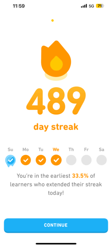
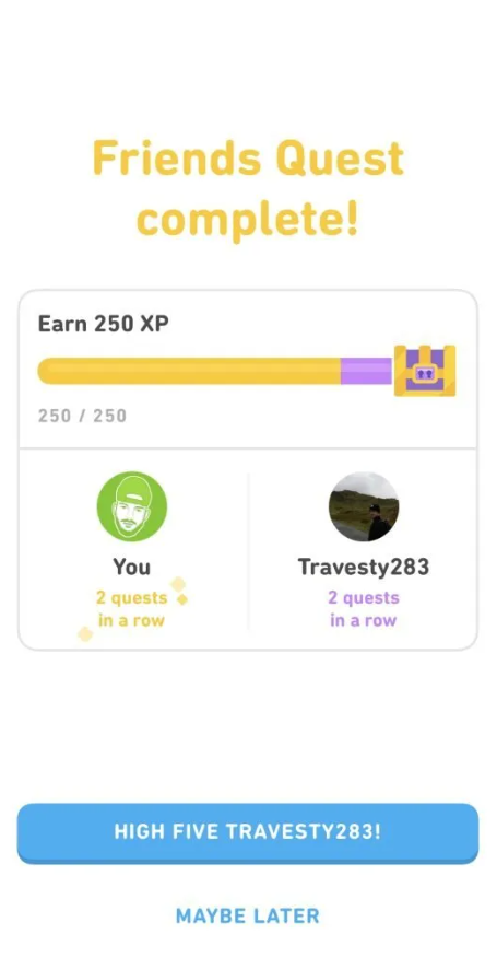
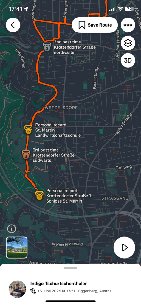
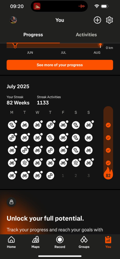
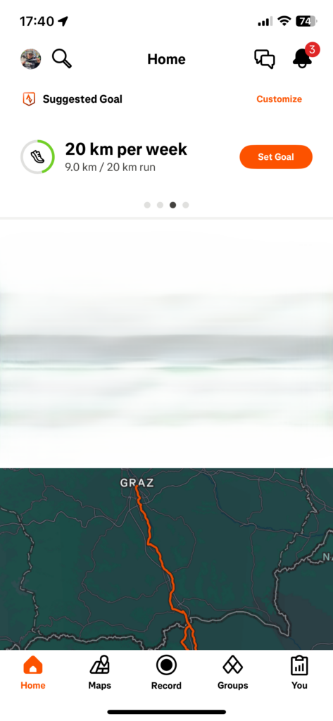
My research was based on three applications I have installed on my phone and that I used as a reference when designing: iNaturalist, Duolingo and Strava. iNaturalist is a citizen science application for reporting animal and plant species, while Duolingo is for language learning and Strava for fitness tracking. I decided to include the last two in my research because I believe that they have strong gamified features that I could use as an example.
In the following annotated bibliography you can see a summary and my review of the papers.
Howard, L., van Rees, C. B., Dahlquist, Z., Luikart, G., & Hand, B. K. (2022). A review of invasive species reporting apps for citizen science and opportunities for innovation. NeoBiota, 71, 165-188. https://neobiota.pensoft.net/article/79597/
The authors analysed the efficacy of existing apps to report invasive species.
These apps are based on citizen science, meaning that they rely on users to report data about the environment they are in. Although smartphones have largely enhanced the capability to monitor invasive species, existing apps do not make use of all known functionalities that could maximise their efficacy. User engagement is limited due to the lack of gamification and social media sharing options, which would encourage frequent and prolonged usage.
The introduction of a leaderboard would be a competitive element that encourages users to send data about a specific area that needs more coverage. Leaderboards, reward systems, Badges and ranks could motivate users to send reports regularly.
There are some other features that would improve engagement. Apps are not taking advantage of modern smartphone sensors such as thermometer, altimeter and barometer. Also, they are often not using machine learning and AI to verify or flag reports, which would save time and human resources. Moreover, in many cases offline saving of reports is not possible, making it hard for users to cover certain areas.
The reason why these features are not implemented is the lack of funding for design and development. The authors suggest the creation of open-source code or templates to spread quality and innovation and reduce costs.
This paper was crucial in understanding that citizen science apps struggle to keep their users motivated and engaged in the long-term. It made me realise that my project should feature a gamified design and social media sharing options to improve engagement. The exact gamified features are yet to be explored.
This paper explores the impact of Duolingo’s gamified design on user engagement and motivation, focusing on emotional responses.
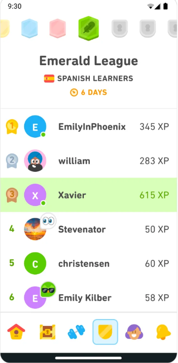
The encouragement mechanisms analysed were the streak, the leaderboard, the achievement system, the friend system, treasure boxes, daily tasks and double XP. While streaks are an effective method to keep users on the app daily, they can cause psychological stress. The “streak freeze” can relieve these feelings. The leaderboard causes mixed feelings: on one side, the competition motivates people to learn more and increase their points, on the other side a drop in rankings can cause loss of motivation and even an interruption in the daily usage of the app. The achievement system fails in its intention to motivate users because it is not seen or understood by most of them. The friend system succeeds in motivating users, creating a feeling of social responsibility. The treasure boxes also have a good impact because they spark curiosity. Daily tasks give users the positive feeling of making progress, but they can turn into stress factors when the tasks are not completed. Double XP (experience points) also generates mixed feelings: users can make progress more quickly, but the time limit causes stress.
The penalty mechanisms analysed were the life point limitation and the forced repetition. While the heart system made users more focused and careful, it also caused anxiety and finally frustration when it came to gaining hearts back by watching ads. While repetition helps with memory retention, the fact that it is forced feels like a punishment, therefore users should have the freedom to avoid it.
In conclusion, while Duolingo’s encouragement mechanisms successfully motivate users to learn regularly, they can cause feelings of stress and anxiety. Especially penalty mechanisms can reduce motivation.
The paper is outdated, in fact some issues such as the hearts have already been fixed. As a user of the app, I can confirm that the encouragement mechanisms cause me stress and even lead me to avoid opening the app. This happens especially when I receive notifications with a negative tone after skipping a day.
While Duolingo focuses on learning and often uses pushy and passive aggressive tones, I can still draw inspiration from its gamified design to keep the users of my application engaged. The paper could serve me as a guide to create more user-centered learning mechanisms that take emotions into account.
This paper analyses how gamification elements on the fitness app Strava influence runners’ behaviour, focusing on motivation, perceived social pressure, engagement, continued use and the activation of premium features.
The gamification elements Strava uses are challenges, leaderboards, segment rankings and progress visualisations. It was found that gamification elements increase user motivation, leading to higher engagement on the platform. Features like optional challenges and individual goal setting are customisable, do not force participation and therefore promote autonomy. Visible progress indicators, performance feedback and personal achievements create a positive feeling of competence, while social interactions like kudos or comments are associated with higher perceived social connectedness. It can be said that the app supportings intrinsic motivational processes rather than relying on external pressure.
Higher engagements translate to an increased willingness to use premium features. The reason for this is that users perceive physical activity as self-determined and meaningful. Therefore, gamification is not directly linked to the adoption of premium features, but by encouraging users to regularly log their activity on Strava, the app becomes a part of one’s training routine.
Competitive elements and social comparison features did not have a negative impact on users and did not affect their engagement through perceived social pressure. This happens because social pressure is a highly individual experience. Feelings associated with comparison are usually temporary and are not sufficient to reduce engagement over time.
MedalsStreaksWeekly goals
In conclusion, Strava operates primarily through motivational mechanisms rather than social pressure and comparison.
In my opinion, Strava represents a healthier way to integrate gamification and increase engagement, because it relies on personal motivation rather than external pressure. I believe that pressure-free motivation and customisable goals are positive examples of gamification that I could include in my app.
Kuure, O., Kähkönen, K., & Hekkala, R. (2026). The Impact of Social Features and Application Design on User Behavior and Long-Term Engagement of Strava Users. Proceedings of the 59th Hawaii International Conference on System Sciences, Article 453, 1-10. https://scholarspace.manoa.hawaii.edu/items/c9eea53a-eddb-4a62-9429-16c8b005c1ac
This paper explores how Strava users interact with its social features and how its design and functionalities affect user engagement.
It was found that sharing activities with peers motivates users to exercise and engage more with the application. At the same time, some users feel insecure and curate their feed by selecting which activities to display, in order to maintain a positive social image.
Strava users downloaded the app or switched to it from other platforms because they value the sense of community it gives them. Group features are highly appreciated. Yet, a big network results in a cluttered feed. This makes some users feel stressed out, reducing their motivation to post activities.
Everyone stays on Strava because they appreciate a different feature. A large amount of features may cater to everyone’s needs, but some users feel overwhelmed by them and prefer quality over quantity.
All in all, users look forward to logging activities because they feel motivated when their peers interact with their logs. All this engagement creates a sense of loyalty that makes it so that the app becomes a part of the users’ fitness routine.
It was mentioned in this paper that the surveyed population may not represent the total of Strava users and I agree with it. The interviewed persons already use Strava various times a week. I think the results would be different if people new to fitness had participated. In my opinion this difference is relevant when studying how to cater to a new target group. Nevertheless, the paper helped me understand the role social media features can have in apps and I think my project should include this functionality.
After finding these papers, we did another research activity with Dr. Ursula Lagger. The session with her helped me to improve my research strategy and I was able to find more interesting papers.
I first described my topic to Gemini and asked it for keywords for my research. It recommended these:
Citizen Science Data Quality: To study how apps like iNaturalist structure data so scientists can trust and verify it.
Gamification for Behavior Change: To find frameworks for keeping users engaged in environmental apps over time.
Mobile AR Science Education: To research how to design effective augmented reality tools for teaching astronomy and light pollution.
Civic Tech & E-Participation: To understand how apps can successfully connect citizens to local government and petitions.
Artificial Light at Night (ALAN): The standard scientific term used in research papers for light pollution.
Kyba, C. C. M., Wagner, J. M., Kuechly, H. U., Cavazzani, S., Zamorano, J., Hänel, A., … & Hölker, F. (2013). Citizen science provides valuable data for monitoring global sky glow change. Scientific Reports, 3(1), 1835. https://doi.org/10.1038/srep01835
Kyba, C. C. M., & Hölker, F. (2013).Loss of the night: A citizen science project for monitoring skyglow. GFZ German Research Centre for Geosciences. https://doi.org/10.2312/GFZ.b103-13054
Bauer, B. (2020).Exploring the impact of artificial light at night (ALAN) through citizen science initiatives. University of Vienna.
B. Citizen Science Data Quality & Structure
Kosmala, M., Wiggins, A., Swanson, A., & Simmons, B. (2016). Assessing data quality in citizen science. Frontiers in Ecology and the Environment, 14(10), 551-560. https://doi.org/10.1002/fee.1436
Balázs, B., Mooney, P., & Novak, J. (2021). Data quality and validation protocols in crowdsourced environmental monitoring. In Citizen Science: Innovation in Open Science, Society and Policy (pp. 139-157). UCL Press. https://doi.org/10.1007/978-3-030-58278-4_8
C. Gamification & Civic Engagement
Thiel, S.-K. (2016). A review of introducing game elements to e-participation. Proceedings of the Innovation Systems Conference (AIT), 1-9.
Sailer, M., Hense, J. U., Mayr, S. K., & Mandl, H. (2017). How gamification motivates: An experimental study of the effects of specific game design elements on psychological need satisfaction. Computers in Human Behavior, 69, 371-380. https://doi.org/10.1016/j.chb.2016.12.033
Bowser, A., Hansen, D., & Preece, J. (2025). Gamifying citizen science: Long-term engagement and behavior change in biodiversity apps. Biological Conservation, 301, 111001. https://doi.org/10.1016/j.biocon.2025.111001
Sirakaya, M., & Alsancak Sirakaya, D. (2022). Augmented reality in science education: An analysis of design features and learning outcomes. Journal of Science Education and Technology, 31(1), 45-61.
Continuing my research on the topic of “Slowness”from last semester, I will be doing further work on this topic as part of the Design & Research II course with Birgit Bachler PhD.
For the final assignment, I will need to record a 2-minute video of the final prototype — in my case, I plan to use prototyping in Figma, which each of you will be able to test. The research will again focus more on contextual analysis, as well as user testing, bibliography, and heuristic evaluation.
Information design, maps and my app 🗺️
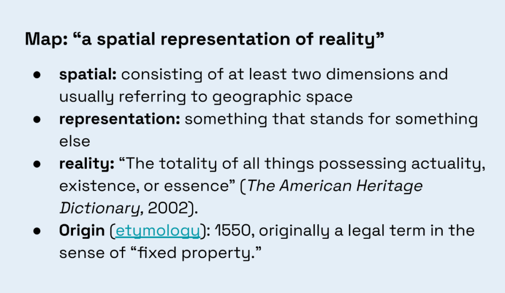
In this post, I want to connect my project to the topic of information design and to material from the “Commuting Cartographies” class. I found this PDF [1] very useful because it shows maps not just as a tool for finding your way, but as a way to understand, interpret, and even change our perception of the city. In the presentation, a map is defined as “a spatial representation of reality.” But another idea is particularly important for my project: maps don’t just show the world- they shape it.
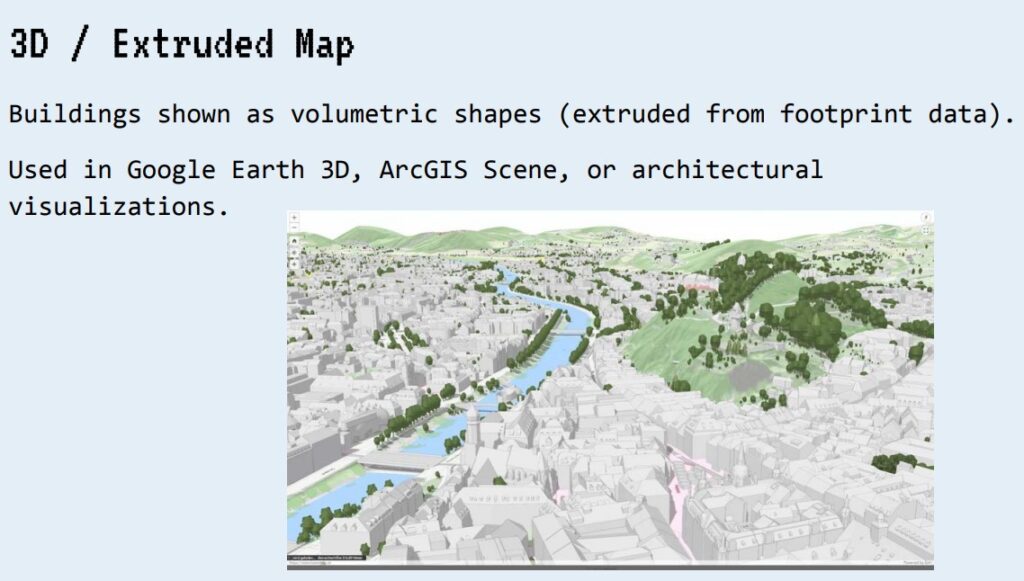
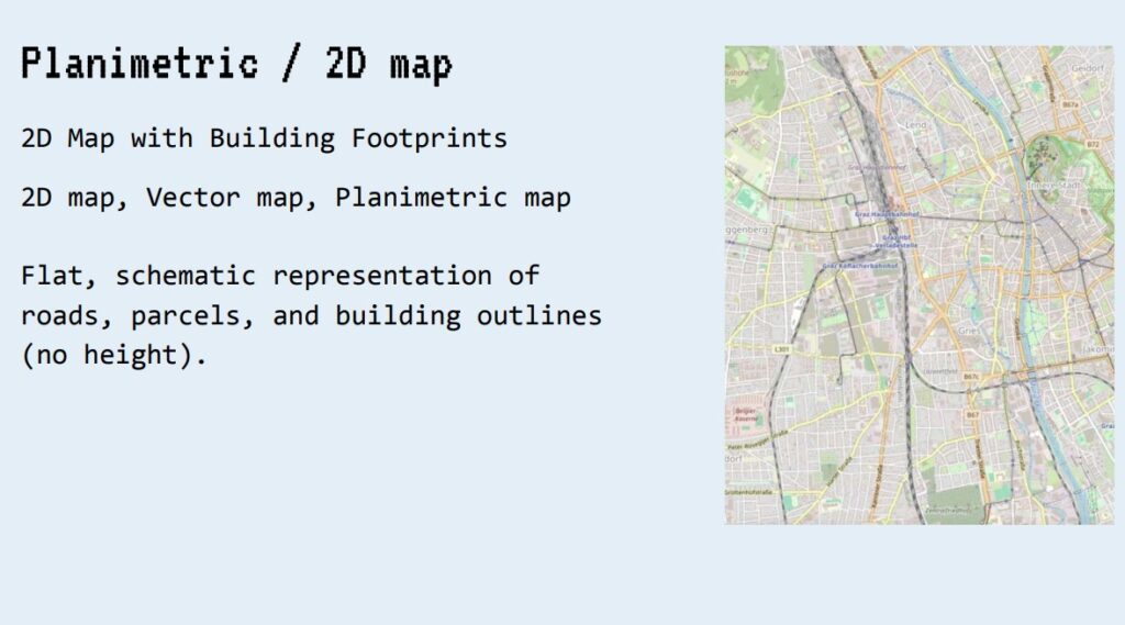
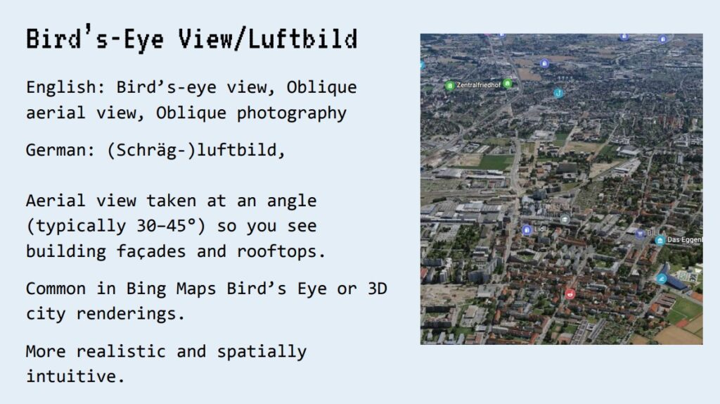
This is directly related to my idea for a “slow navigation app.” Usually, a map is perceived as a neutral tool: it shows where we are, where to go, and which route is the fastest. But in reality, a map always chooses what to show and what to hide. For example, a standard 2D map shows streets, buildings, and names. A 3D map adds a sense of scale and space. A bird’s-eye view helps you get a better visual feel for the city. Psychogeographic maps, on the other hand, may not show roads at all, but rather emotions, smells, sounds, or personal impressions of a place. This is clearly illustrated in the PDF using examples of different map types: top-down view, bird’s-eye view, 2D map, and 3D/extruded map.
For my app, this means I don’t have to design the map exactly like Google Maps [3]. I can think of the map as a system of layers. For example, one layer could show the most peaceful route, another could show green spaces, a third could show places to stop, and a fourth could show the emotional or sensory characteristics of the route. This helps shift the focus from “getting there faster” to “experiencing the journey better.”
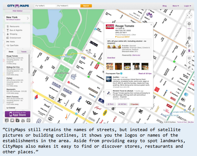
I also liked the CityMaps [4] example, where logos and place names are used instead of satellite images and building outlines. This shows that a map can be not only geographical but also social: people often navigate not by coordinates, but by cafes, stores, familiar landmarks, parks, or visual cues. This is important for my app because slow navigation should be closer to how people actually experience the city.
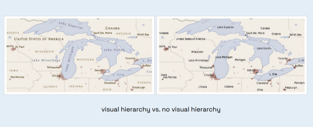
Another useful takeaway from the PDF is the importance of visual hierarchy. If everything on a map is equally important, it’s hard for a person to know where to look. In my interface, this means I need to carefully manage text, icons, colors, and layers of information. If I want to create a calm app, it shouldn’t overwhelm the user. On the contrary, it should gently guide their attention.
Thus, this material helped me realize that my project isn’t just a “map with pretty routes.” It’s an attempt to design a different kind of information system for the city. The map in my app should not only guide people but also help them notice, choose, stop, and build a more personal connection with the space.
Sources 🛈
[1] Bachler, B. Intro to Information Design – Session 5: Commuting Cartographies. FH JOANNEUM, 2025.
[2] Wood, D. Rethinking the Power of Maps. Guilford Press, 2010.
In the last post I argued that the research had to stop being a broad map and become one concrete thing I could build and test. This is that thing.
I built a neuroadaptive supervision console. On screen, the operator keeps a small fleet of semi-autonomous drones alive: each one occasionally needs attention and timed emergencies appear that must be resolved before a countdown runs out. The drones are not the point for me, they are a stand-in for any complex, information-dense interface, the kind of control-room or monitoring setting where alerts compete for attention and overload is a constant risk. That is where badly-timed interruptions do the most damage, so that is the situation I wanted to recreate.
Underneath the task, the system builds a live estimate of how loaded the operator is, by combining three real signals: EEG engagement from a Muse headband, a webcam-based attention proxy (for blink rate and head movement – unfortunately I could not extract data from Tobii) and the demand of the task itself. I then compared two versions of the same interface. In the adaptive version, when the estimate crosses into “overload,” the system quietly defers low-urgency alerts until there is room for them and steps in for the drones most at risk. In the control version it does none of that. Every participant played both.
The clearest result, shown in the video, is reaction time. On the working build, people answered emergencies far faster in the adaptive version – around four seconds, against seventeen in the control. The mechanism is simple: when alerts are not deferred, they pile up during busy moments and get answered at the last second. Deferring them spreads the load out.
What the video does not point out on is that this was not a clean win and I think that matters more than the headline. Faster answers came with lower accuracy, and people did not report feeling less loaded. With only four participants, and a build that changed between the early and late sessions, this is a proof-of-concept, not proof. The fuller per-person picture, including a resumption-lag result that went the “wrong” way, sits in my written results rather than the video.
For me the takeaway is not the number but the shape of the problem. A real adaptive loop is buildable with modest, honest signals, and once it works the interesting questions are not about better sensors. They are about timing, trust and giving the person a way to overrule the system when its guess is wrong. That is the thread I want to keep pulling: from interfaces that capture attention toward interfaces that look after it.
Looking back at this semester, I think the biggest challenge for me was figuring out what I actually wanted to focus on for my master’s thesis. At the beginning, I only knew that I wanted to work with older adults and that I was interested in topics like digital literacy, education and tangible interaction. It took a lot of reading, observing and prototyping before these pieces slowly started to come together.
Even though I only really found my direction during the last couple of weeks, I don’t see that as wasted time anymore. Exploring different ideas helped me understand what actually interests me and, just as importantly, what doesn’t.
One thing I definitely discovered this semester is how much I enjoy working with tangible interfaces. Designing something physical that interacts with the digital side feels like a really exciting topic to explore, especially in the context of accessibility and older adults. At the same time, I still enjoy the technical side of interaction design and would love to combine both in my master’s thesis.
The NFC book is only an early prototype, but I think it has shown me a direction that I want to continue exploring. Over the next semester, I would like to test this concept with older adults.
Since I came up with the idea of creating a physical phone book in my last blog post, I decided to ask ten older adults, all around the age of 65, what they actually like to use their phones for. This time, the conversations went much better than my previous ones. Everyone was able to tell me quite clearly what they regularly use their phones for.
What I found even more interesting was that many participants started talking about their frustrations with smartphones on their own. While answering questions about their everyday phone use, they often mentioned situations where they felt confused.
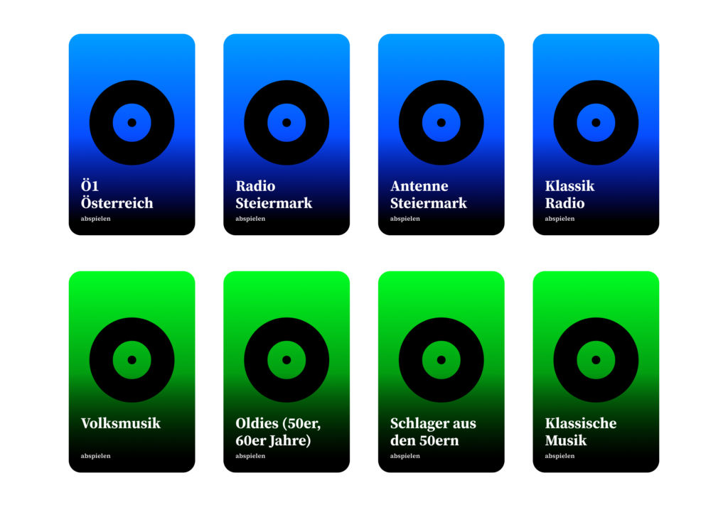
For this very short interview, which was more of a questionnaire, I simply asked participants what they use their phones for most often. The most common answers were: making phone calls and using WhatsApp, either for texting or sending voice messages. Other frequently mentioned activities included looking at photos, checking the weather and reading the news. Some participants also said that they regularly listen to music, radio stations or playlists using apps on their phones.
These results were somewhat interesting for me because they support my idea that older adults often use a relatively small set of functions very frequently. This made me think that focusing on simplifying these tasks, rather than trying to simplify the entire smartphone experience, could be a direction for my research.
Activity
Participants (n = 10)
Percentage
Calling (normal)
10
100%
Watching Photos and Videos
10
100%
Taking Photos
10
100%
Calling (video)
8
80%
Sending Messages (WhatsApp)
7
70%
Listening to Music
6
60%
Checking the Weather
5
50%
Reading News
4
40%
Listening to Radio
3
30%
Since many of the people I interviewed mentioned that they mainly use their phones to stay in touch with family and friends, it became clear that social connection plays a very important role for them.
Importance
Access to digital technology plays an important role in the lives of many older adults, as it can significantly influence their quality of life, social participation and ability to manage their health and well-being. Social isolation is a significant concern for the elderly population which is often caused by shrinking social circles either because of retirement, illness or death. [1]
As a result, maintaining social connections becomes increasingly important in older age. One of the most important benefits of digital technologies is that they can help reduce social isolation and loneliness. Through video calls and social media, older adults can stay connected with family and friends and continue to participate in social life. [1] Regular social interaction through digital technologies is also associated with better subjective health and overall well-being. [2]
Beyond supporting social connections, digital technologies can also help older adults maintain their independence and quality of life. They can support everyday tasks, promote cognitive engagement and enable older adults to remain active and participate in society longer. [3]
These findings are also in line with the interview results, where participants mentioned that they mainly use technologies such as smartphones to stay in contact with family and friends.
Prototyping – The PhoneBook
After trying out different ideas, I ended up focusing on the NFC phone book. The idea came from my observations and the short interviews I did. Most of them told me that they only use a handful of functions on their phones regularly, mainly calling family and friends, looking at photos, listening to music or checking the weather. That made me think: instead of trying to simplify the whole smartphone, why not just make these everyday tasks easier to access?
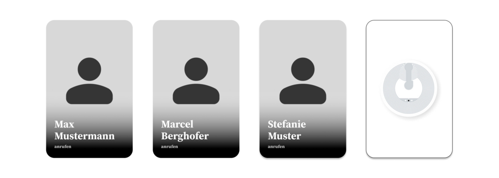
The book is divided into different sections based on most used functionalities, like calling family, listening to music or viewing photos. Every page contains pictures or symbols with NFC tags hidden inside. To perform an action, users simply open the page they need and hold their phone over the corresponding picture. For example, holding the phone over a picture of their daughter would automatically start a phone call.
I decided to go with a book because it feels familiar. Earlier, I experimented with individual NFC objects, but I realized that they could easily get lost and would need to be stored somewhere. A book keeps everything in one place and also gives clear instructions.
At this stage, the prototype is mainly meant to explore whether a familiar object like a phone book can make smartphone interactions feel simpler. Instead of navigating through apps and menus, users interact with pictures and pages, which hopefully reduces some of the barriers that older adults experience when using smartphones.
Update from 6.7.2026
I already tested it with my grandmother. Her comment: “It feels like magic!”
Sources
[1] P. Bhowmick and E. Stolterman Bergqvist, ‘Exploring Tangible User Interface Design for Social Connection Among Older Adults: A Preliminary Review’, in Extended Abstracts of the 2023 CHI Conference on Human Factors in Computing Systems, Hamburg, Germany, 2023.
[2] Y. Liu and R. Tamura, ‘How can smart home help “New elders” aging in place and building connectivity’, 07 2020, pp. 100–107.
[3] P. Bhowmick and E. Stolterman Bergqvist, ‘Exploring Tangible User Interface Design for Social Connection Among Older Adults: A Preliminary Review’, in Extended Abstracts of the 2023 CHI Conference on Human Factors in Computing Systems, Hamburg, Germany, 2023.