Continuing my research on the topic of “Slowness”from last semester, I will be doing further work on this topic as part of the Design & Research II course with Birgit Bachler PhD.
For the final assignment, I will need to record a 2-minute video of the final prototype — in my case, I plan to use prototyping in Figma, which each of you will be able to test. The research will again focus more on contextual analysis, as well as user testing, bibliography, and heuristic evaluation.
During our last session with Birgit Bachler we performed some usability tests of our prototypes.
My aim was to find out if the reporting game was understandable and engaging. The reporting minigame does not have a VR function yet and I supposed that this could have created a difference between how I imagined the prototype and how it was perceived by others. Since the testing happened during broad daylight in a classroom, I suspected that users would not have understood that the minigame is meant to be used at night to send a useful report. For this reason I prepared some pictures of the sky to simulate different observations.
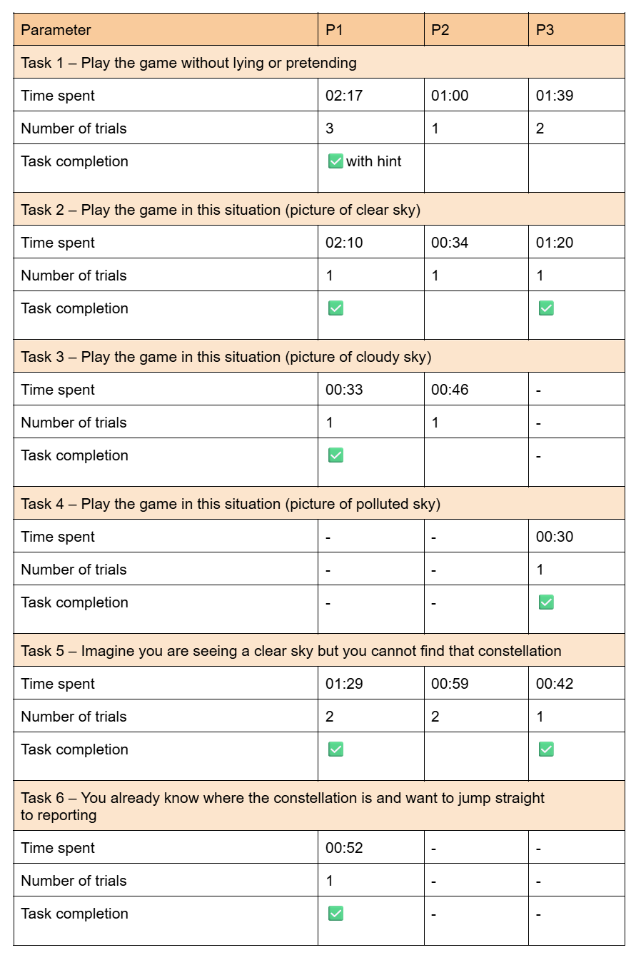
I measured these parameters:
Time spent on tasks
Number of trials until the participants succeeded in completing the task (if they did)
Task completion — whether the task was completed in way I intended it
The method used was the “thinking aloud” one. Users should speak while they perform the test and tell the interviewer their thoughts and feelings.
These were the tasks that I gave my participants:
Play the game without lying or pretending
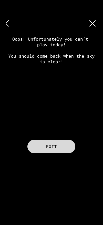
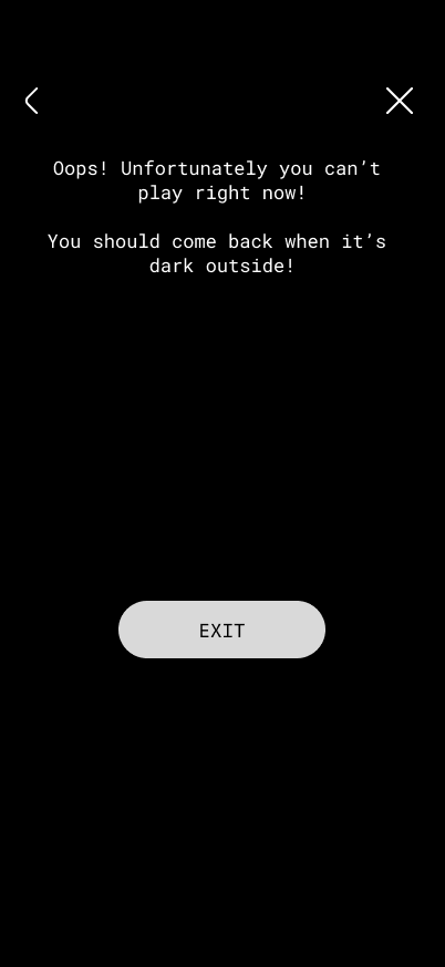
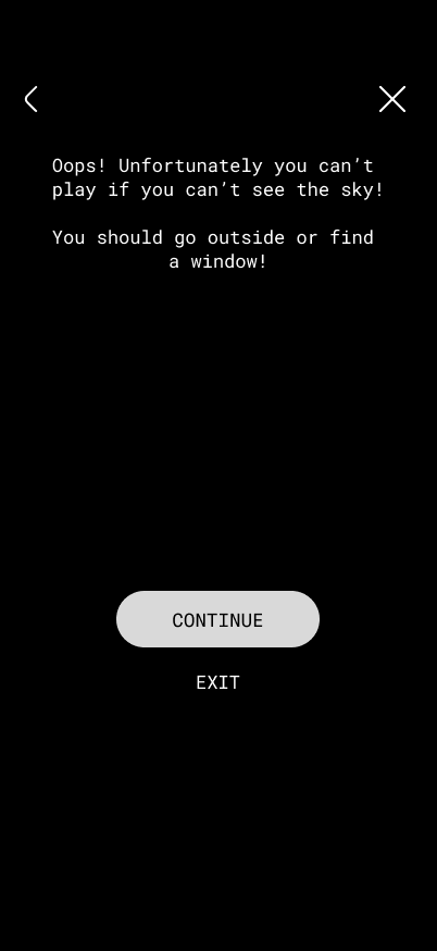
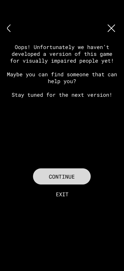
Play the game in this situation (picture of clear sky)
Play the game in this situation (picture of cloudy sky)
Play the game in this situation (picture of polluted sky)
Imagine you are seeing a clear sky but you cannot find that constellation
You already know where the constellation is and want to jump straight to reporting
The questions I asked them at the end were the following:
Did anything create frustration or confusion (text, icon, something in the flow)?
How would you explain the main goal of the game to a friend?
What was your favourite part?
If you could add a feature, what would it be?
What do you think about the visual style and aesthetics?
Three people participated in the test, including two students and one professor. I called them P1, P2 and P3. I did not ask them all of the questions, instead I selected different ones every time to keep the test shorter.
The results of the tests are summed up in this table:
These are the pictures I showed my participants for task 2, 3 and 4:
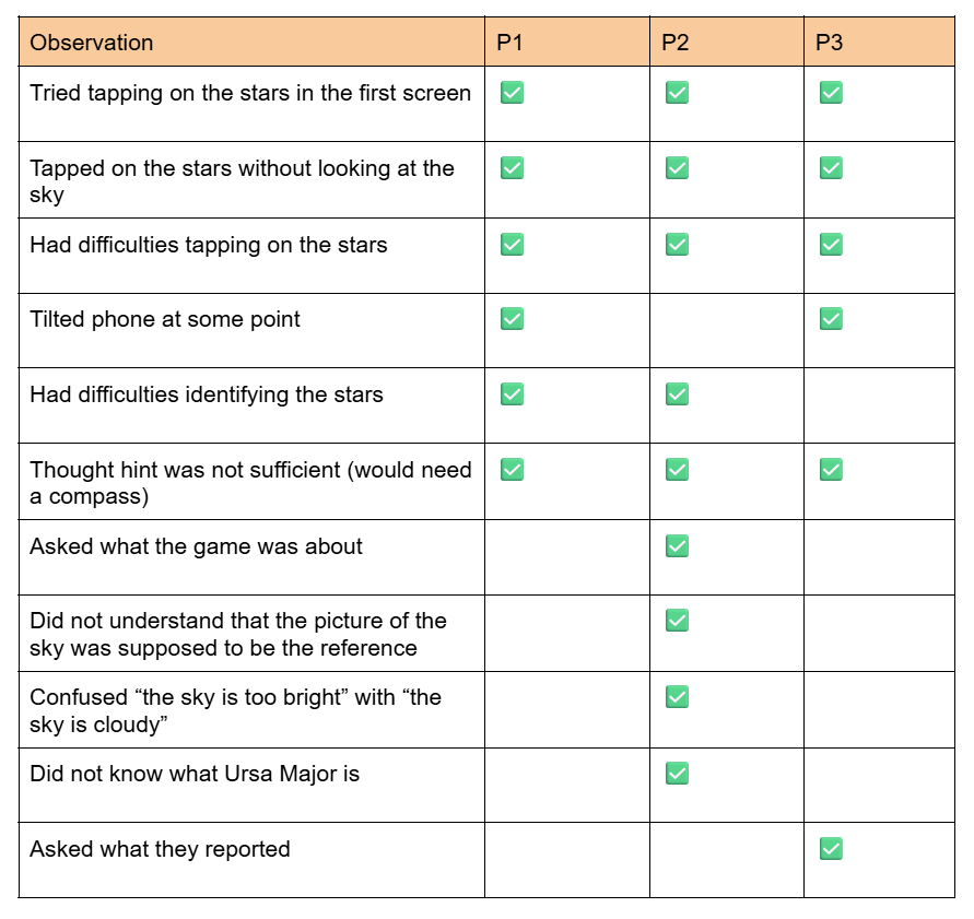
Some other observations are summed up in the following table:
This is how the participants answered the questions:
Did anything create frustration or confusion (text, icon, something in the flow)?
P1: I would say that in the beginning I wasn’t quite sure what I’m supposed to do, but maybe also because I did not read the text fully in the beginning, so I wasn’t quite sure whether you can only report when it’s night. I didn’t quite get that at the moment and was confused because I could not see anything, but I should have seen something. Yeah, then maybe the hint, but I already said that about the northern hemisphere, when you give a hint that something is supposed to be there, that there’s some sort of hint about which direction to look and maybe also how high or maybe if there’s another star that you would recognise that you can take as a reference point or something. Then I think you can make it quicker. Also, in the beginning I didn’t know what this button meant, I would have had to test it out to see what it does and also the exit button didn’t go to the start, but it went back to the star constellation, so maybe from exit I would expect that it would let me exit. I think maybe in the beginning it could be a little more clear what to do and more help, and maybe that the stars could be a little bigger or further apart. The smaller ones are a challenge to click.
P2: A lot of stuff generates confusion, like when I started I didn’t even know how to report. It said “locate this star” and I don’t even know what that is, so it was really frustrating, like what exactly I have to find? So I just randomly tapped here and there and found out. The most frustrating part was that everything is designed for a person who knows about this.
P3: The finger (the tapping on stars feature) – didn’t realise that at the start.
How would you explain the main goal of the game to a friend?
P1: I would say: identify constellations and also report about light pollution in different areas based on what stars are visible with the eye in the sky.
P2: The main goal of this game is to locate the stars and report them.
P3: Reporting to what extent a constellation is visible from a certain location, and perhaps including metadata as well – or did that come later? Yeah, that would be cool, because you’d say, ‘I can’ ’t see it, and then you can say, ‘Why not?’ I reckon one reason is that I’m too daft to find the star, and the other is that it’s too light-polluted, so I think you have to… But since it’s just a game, you can simply track light pollution and constellations.
What was your favourite part?
P1: I think clicking the constellations, like the selection of the stars I could see.
P2: When I can see the clear sky and I’m like “yeah maybe I am doing something” and also I really like that there’s a hint option, it gave me a little bit of information.
P3: I think the writing is a good start, ‘Help me’ and so on.
If you could add a feature, what would it be?
P1: Maybe more constellations? And also I had an app on my phone when I was stargazing and it showed the entire night sky. Every star is supposed to be there. Maybe it could also be nice to have an overview of all the constellations that should be in the sky and if you could kind of see on the phone and then compare it to what you actually see. I think it might also be easier to find a constellation. Like, okay, I found this constellation and if I turn a little more up then I can find more constellations and get a better understanding of what is where in the sky.
P2: I would really like the feature to be really using the current sky, like having a region of it. That could be really cool.
P3: Maybe the step where you have to look for the constellation in the sky or check if it’s visible. It’d also be cool to have a location, just like with those apps, so you know that’d be the next feature – and at the same time you’d be learning about the constellations, so you could pick up on that sort of mythological stuff on the side as well – that mix of astronomy and astrology.
What do you think about the visual style and aesthetics?
P1: It is very nice, very clean, very easy. Also it’s like the theme of the stars, black-and-white. Also, I think the constellation with the outline of the animal and then the stars inside is good because then you also learn a little more about the constellations, because sometimes in the sky if you only have the stars it’s hard to see the animal or whatever that’s supposed to depict. I think the style was very nice.
P2: The night vision, I really liked it. I think it’s a good direction.
P3: Simple and neat.
After analysing the recordings of the tests, I concluded that:
It was not clear to the participants that you are supposed to play the game at night and tell the game if it is daytime; I could have specified that in the introduction (“this game should be played at night”)
Sometimes when the stars are not visible, participants would still send a report; I could make a first screen that asks a yes/no question to filter out reports that are not valid
Constellations are not always a concept known by everyone; I should explain what they are at the beginning
There were issues with orientation and localisation of the constellation; the VR feature with compass sensor and GPS that other applications use would help with that
Users tried to tap on the stars on the first screen; it should be clear that they are not tappable or they should be tappable right from the start
Exit buttons were not working properly; I should check them
The stars were a challenge to tap on; maybe the tappable area could be bigger or there should be a zoom/swipe feature
The option to tap on the stars was appreciated; I can keep working with that
There was some confusion about what was reported at the end; I should specify it
The black and white theme with the constellation illustrations was appreciated
For the next testing, I need to remind myself to:
explain the product and what we are doing with it
ask some introductory questions to understand the participant’s knowledge of the topic
ask everyone the same questions to compare results better
In the previous post I sketched three possible directions for the prototyping phase of the research, with the promise of developing one of them further. This one will start from openings left by the literature review draft of my ongoing thesis and it will explain its possible applicative idea.
Summarising gaps
Reviewing the literature made one absence particularly clear. A considerable amount has been written about how artificial intelligence could, or should, be integrated into the creative process and into data-driven storytelling. Yet, much less has been written about how practitioners actually behave when they sit down and use these tools in their everyday work. The theory on good integration of AI in our work is a lot, but the empirical picture of real habits in the storytelling and data-driven design practices field is almost inexistent.
Sierra Shell makes a related observation in The Human Touch(point), where she notes that understanding the current state of how people use AI features and how they give feedback on them is still an open area for research, rather than settled knowledge. Additionally, the recent surveys on data-driven storytelling and visualization point in a similar direction, treating a human-centred account of the process as an unresolved question rather than as an established one. In other words, before proposing how designers should work with AI, it would be much more useful to document how they are already doing.
Building the idea
To effectively address this empirical gap, there is the need to collect firsthand data. The thesis, therefore, opens up to the need of a survey aimed at students, workers, and experts across communication design, storytelling, and data visualization, with the aim of collecting data and make them later available for further studies and fellow researchers as open source.
The instinctive move would be to reach for a common survey platform. Yet, I would rather build a different tool for ensuring having open data together with the possibility of taking the survey, with also the opportunity of having always updated data in real time. A generic form provider tends to lock results away in a private account, whereas the aim here is the opposite, making the collected evidence a shared and accessible resource.
For the survey section, the priority is currently to define how the tool works and which steps it moves through, not to finalize every question. What remains fixed is the intent: to capture habits of AI usage together with a basic professional profile of who is answering. As for the open data hub, once results begin to accumulate, they will be presented in an aggregated and anonymized form that anyone can consult, without having to complete the survey first and keeping sensitive data out of this public layer.
Encouraging personal reflection
Both parts in this idea, in the end, serve the same purpose, which is to encourage reflection on our behaviours. For the respondent, answering the survey is already a small prompt to consider one’s own reliance on these tools. For a visitor to the open hub, seeing collective patterns laid out invites a comparison with their own practice. The intention is not to lecture nor to attach a score of guilt to anyone’s choices, but to make current habits visible enough to become the source for discussion.
The full bibliography of the thesis will be attached to this documentation, for anyone who wishes to follow the sources behind the literature review.
Continuing my research on the topic of “Slowness”from last semester, I will be doing further work on this topic as part of the Design & Research II course with Birgit Bachler PhD.
For the final assignment, I will need to record a 2-minute video of the final prototype — in my case, I plan to use prototyping in Figma, which each of you will be able to test. The research will again focus more on contextual analysis, as well as user testing, bibliography, and heuristic evaluation.
Comparing default routes and experience-based routes 🛣️
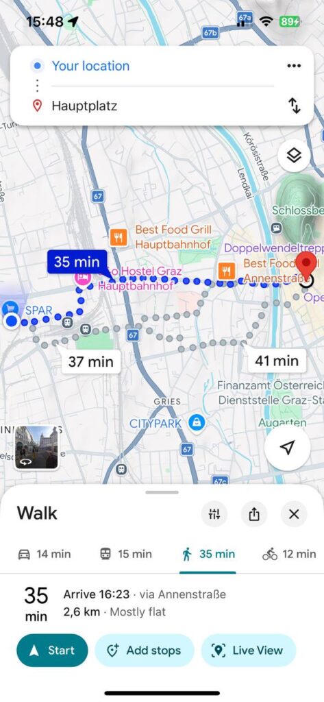
For this post, I decided to conduct a small practical experiment and compare a standard navigation route with one that more closely resembles the concept behind my future app. I chose the same route: from my current location to Hauptplatz in Graz. It was important to me to look not only at the time and distance, but also at how the walking experience itself changes.
On Google Maps [1], the standard route looks very straightforward and functional. The app suggests the fastest option: 35 minutes, 2.6 km, mostly along Annenstraße. This is convenient if the goal is simply to get to your destination. But with this option, the walk feels more like a task: follow the line, don’t get distracted, and reach your destination.
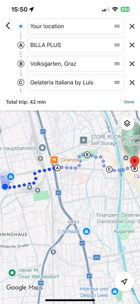
Then I manually created a second route in Google Maps and added stops: BILLA PLUS, Volksgarten, and Gelateria Italiana by Luis, and only then—Hauptplatz. The time increased to 42 minutes, but the route itself became completely different. It’s no longer just a path from point A to point B, but a little walking itinerary: pop into a store, walk through the park, buy some ice cream, and only then head to the center.
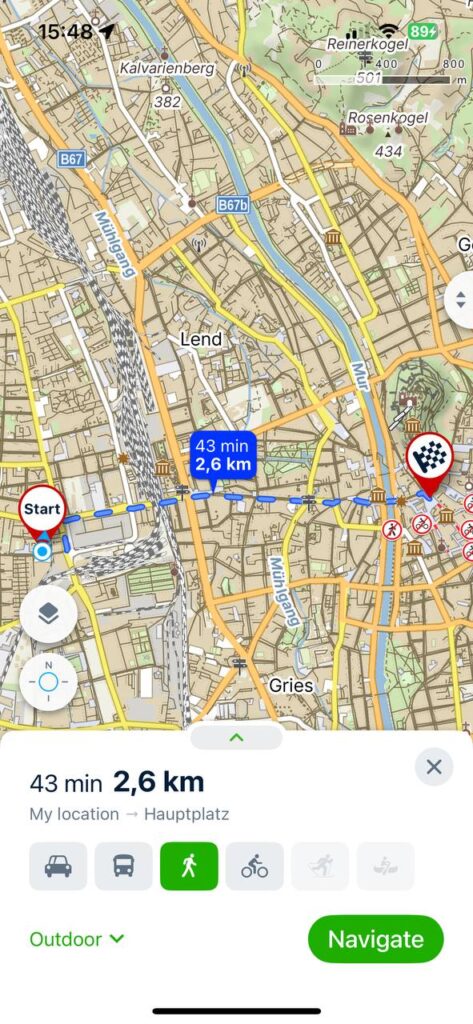
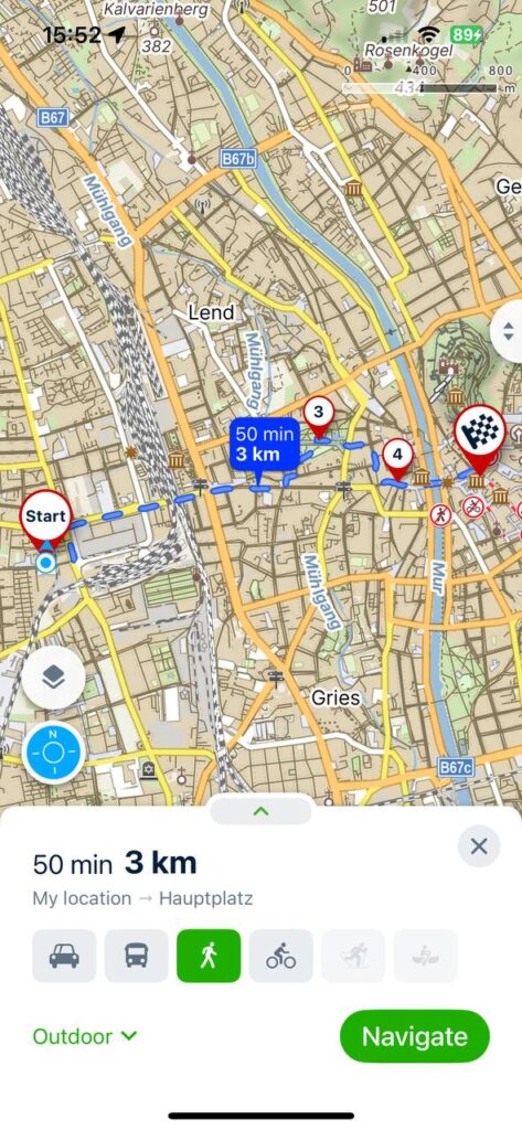
I also ran the comparison on Mapy.cz [2]. The direct route is shown there as 43 minutes, 2.6 km, while the route with additional stops is about 50 minutes, 3 km. What I especially liked about Mapy.cz is that the urban environment itself is much easier to make out. You can see parks, green spaces, paths, the terrain, the river, and the neighborhood’s layout. The map looks more detailed and “outdoor-oriented.” Visually, it’s not as minimalist as Google Maps, but for my purposes, that’s actually a plus because it helps me not just walk, but understand the space around me.
This experiment helped me better understand the concept behind my app. I don’t just want to make routes longer. The idea is for users to be able to choose not only their destination but also the type of route: fast, leisurely, green, adventurous, social, or with short stops.
In the next prototype, I want to develop this logic further. For example, if a user selects a “slow route,” the app could automatically suggest a path through a park, a quiet street, a café, or a spot for a short stop. In other words, the map becomes not just a navigation tool, but also a tool for planning a walk.
This test showed me one simple thing: navigation doesn’t have to be just about the shortest route. Sometimes an extra 5–10 minutes can make a route much more enjoyable, personal, and memorable.
After doing the context review and the material studies, I decided to work on my prototype again. I focused on our lecturer’s question “what is the smallest prototype you can create that still touches the issue?”. A specific issue came to my mind: according to A review of invasive species reporting apps for citizen science and opportunities for innovation by Howard, van Rees, Dahlquist, Luikart, and Hand, gamification is not sufficiently used in citizen science apps. With the intention of creating something quick, fun, and gamified, I looked at my initial analogue prototype and the app prototype I created with Ahmed Turk for our app design course. I decided I wanted to focus only on the reporting flow of the app and create a minigame. By focusing on its core feature, I wanted to make it as interesting and seamless as possible. This way, the reporting platform could benefit from a higher engagement.
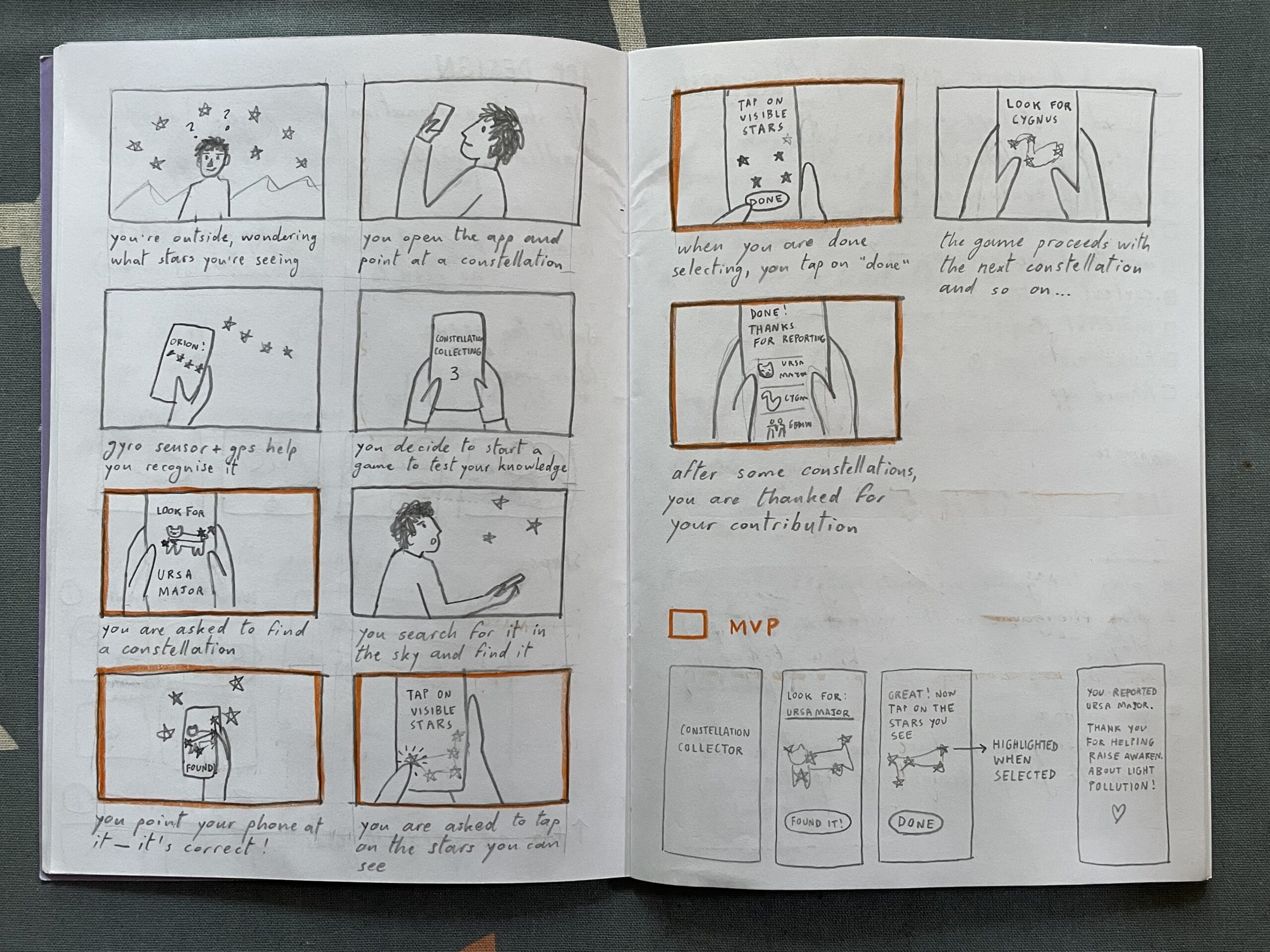
I started my second version of the prototype by sketching a storyboard. Then, I highlighted some scenes that in my opinion are the foundation for the MVP. After that, I sketched some screens and created them on Figma.
Heuristic evaluation
I then went through Jacob Nielsen’s 10 Usability Heuristics for User Interface Design to further refine the prototype. Here you can read my evaluation:
Visibility of system status. At the top of the screen, you can see the progress through the game (0/2); I do not know if it should start with 0/2 or with 1/2.
Match between System and the Real World. The constellation has the same shape and proportions as the one in the sky. The brightness of the stars also mirrors reality. As the app does not use GPS and the gyro sensor yet, the constellation is not rotated in the same direction as it appears in the sky. This could also be a challenge factor that makes the game a little harder. No technical jargon is used, only commonly used words.
User Control and Freedom. There is an emergency exit (X) to exit the game and a back arrow to return to the previous step
Consistency and Standards. The back arrow is located at the top left corner (iOS standard), while the X is at the top right. The latter should ideally also be positioned in the top left corner, but that space was already occupied. The main action is in the white button, while secondary actions are in all-caps. All clickable text is in all-caps.
Error Prevention. If the sky is not visible, there are various options that can be selected, which open tips for better observation. This prevents false reports. In the future, once sensors are incorporated, the app should recognise whether you are pointing your phone at the right constellation, to prevent mistakes.
Recognition Rather Than Recall. The name of the constellation is repeated on every screen of the reporting game.
Flexibility and Efficiency of Use. For expert users that already know constellations, there is an option to jump straight to the report and skip the constellation hunting part.
Aesthetic and Minimalist Design. I tried to keep everything minimal; the only thing that could be simplified is the bear illustration and maybe the copy, but in my defense it is intended to have a relatable tone that brings the audience a little closer to a complex topic.
Recognize, Diagnose and Recover from Errors. Error messages are written in a simple language and suggest a solution for a wide variety of issues.
Help and Documentation. If the constellation cannot be located, there is the option to receive a hint.
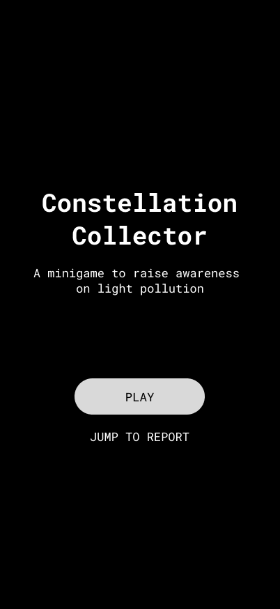
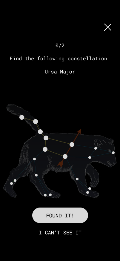
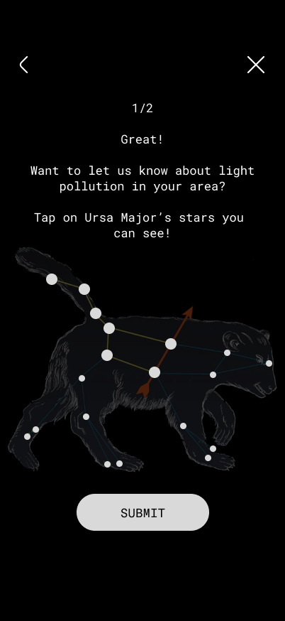
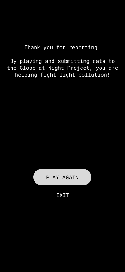
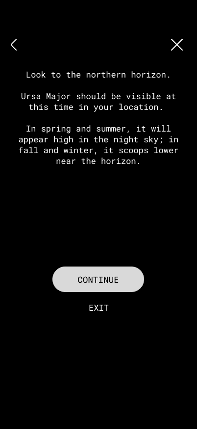
Here are some screens of the minigame. After hitting “play”, the user needs to find a certain constellation in the night sky. Then, they can report the visibility of its stars by tapping on them.
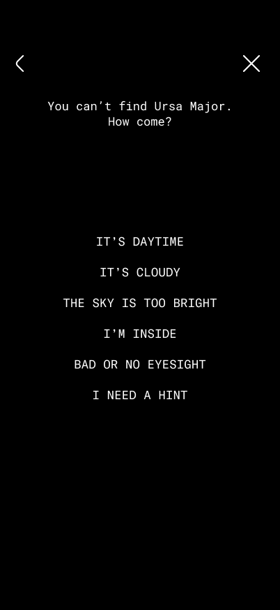
If the user cannot see the app, they can tap on “I can’t see it” and select why. This leads to different tips based on the answer.
These videos illustrate two possible flows:
Possible improvements
Fun facts about the constellation at the end of reporting
For my final post I’d like to talk about the preparation for the guerrilla testing session, as well as the results.
The prime target for this was a dedicated webpage for Resellers on the sprinters.at website. My story from the introductory post was actually based on this outcome. I was already working on some complex interfaces behind the scenes that would be utilised for this feature, such as a completely new address system for multiple recipients. However, when it comes to the informational webpage that serves as the sign-up hub for this feature, a completely AI-generated design was used without my knowledge.
Prototyping
Since my topic is all about how workflows change with the advent of AI, I decided to actually work with the situation instead of wallowing in it. The primary focus of this redesign was to simply use the existing design system and corporate design.
What was a new experience to me about this prototyping session was that I worked with the AI-generated design, keeping the overall structure and content as inspiration but rewording what I thought was necessary as well as keeping the design philosophy in mind. I still made everything from scratch, but used the design as heavy inspiration.
Guerrilla Testing
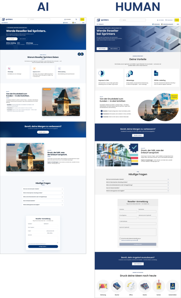
To test this, I took both the AI-generated and the human-redesigned version and presented them. The test happened with two participants and consisted of simple questions about brand context, visual consistency and a more personal “is this ready to ship?” question.
1. The Brand Context & Transition Feel
When going from the landing page to the reseller page, Participant 1 noted that the AI version felt “cramped and crowded” in the hero section, while the human-redesigned version felt more “clean and organised”. Participant 2 agreed with this, saying that the AI version had “no personality” and was “more business”, while the human one felt “more similar and personal”.
2. Visual Consistency
This question was aimed more at looking more closely at individual components and elements (such as icons, buttons and images). Jakob Nielsen fourth heuristic, Consistency and Standards, describes the need for recurring elements in a user interface like language, icons, symbolism to be consistent across different tasks [1]. This was the biggest blunder of the AI design.
When talking about the AI version, both participants pointed out that “the icons don’t go with it“, “the images don’t look intentional“ and that “spacing was different from the homepageand cramped to the border“. One participant also noticed that the “buttons are rounded, when they’re more square on the main page“. This participant also mentioned that the icons in the human version are “great, because the colours are the same as the brand“.
One thing Participant 1 also mentioned on the machine-translated version of the AI version, was that the texts “tell you to do it, but not what it is“, while Participant 2 said that the text feels generic.
3. Ready to ship?
When the participants were asked if they would consider this as ready to ship as part of the same product (if they were the UX/UI designer responsible), they gave dividing responses. Participant 1 gave a hard “NO!”, pointing to the inconsistent spacing and icons, and added: “Why put something bad online when could can give me some time to improve it?”
Participant 2 gave a more nuanced answer, stating that “if the priority is to ship, then yes, its functional and still intuitive, but not the same brand”. They said they would “feel bad as a designer”, because the first impact of the brand is the most important.
Conclusion/Reflection
In conclusion, I gathered some data on what stands out to designers from two other designers. I particularly found the comments about the “texts telling you what to do, but not what it is” interesting, and for further testing I’m definitely going to take care to provide English versions of my prototype as well so this could be compared. I worked on the Reseller feature for weeks, so I had to understand it myself by asking multiple people within the company. AI didn’t have this simple human advantage, and thus the end result was what it was.
However, this isn’t about “AI being bad”, and I’d like to wrap up my research journey for this semester with this quote from IDEO (the design agency which developed design thinking):
How many things were meant to be great big breakthroughs, but they just don’t work because they don’t take into account what humans want from the technology? […] AI is far too important to leave just to the technologists—human-centered design is a crucial part of it. [2]
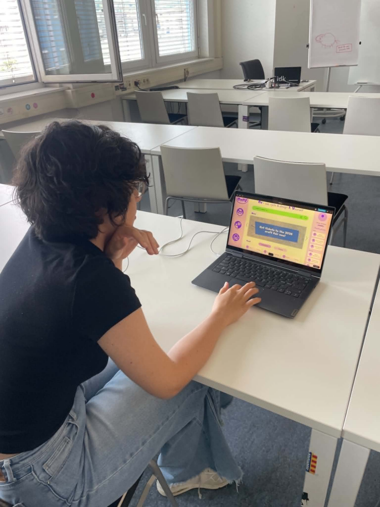
I had two user testings with my figma prototype in the last design and research class. Both of the testers had realy helpful feedback and knowledge I will use to improve my project.
First user test:
Comments:
“would like to have a filter style / esthetic eks. Cottage core etc for the gallery”
Should add a way to easily access your saved content
“Don’t really understand the headline in the home page, feels like a title when it’s actually an explanation”
Found the tutorial intuitive
Second user test:
Comments:
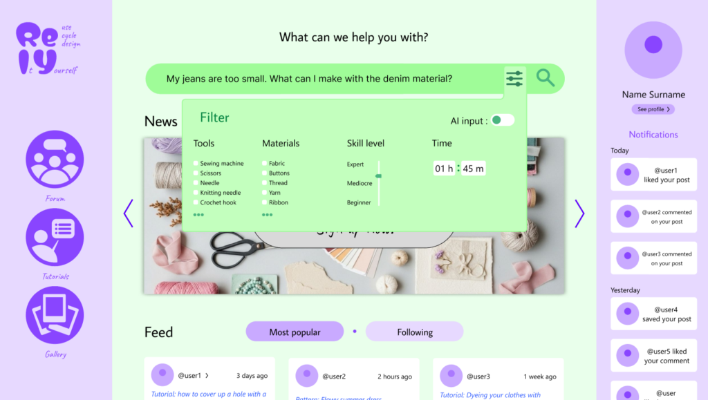
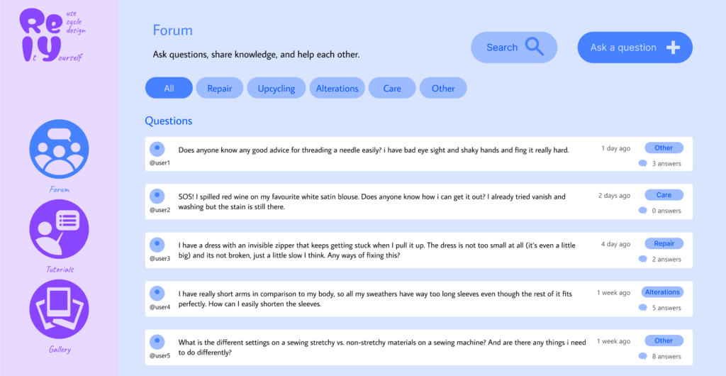
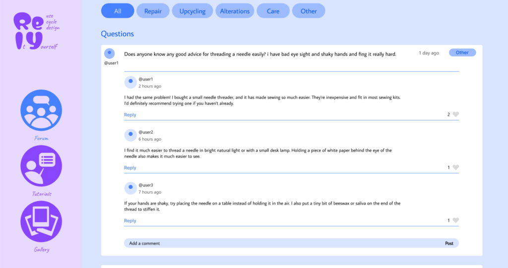
the forum page is not very intuitive, it does not make sense to have the comment displayed two times, and the one with more content being smaller. Maybe pop down or entering the comments in a new page would be better.
Maybe add more visualization to the tutorial
It can be smart to change the selection buttons in the filter from round to square, as the universal rule is that round means that you can only choose one and square means you can choose multiple.
For the time filter the clock interface feels unnecessary
Gallery and feed feels similar, maybe combine them?
Maybe stylize the headline in the home page more would make it more intuitive
Key takeaways from the testings:
changing bullet points from round to square when you can slect more than one
fixing the layout of the forum page
Try to make the headline more intuitive
Based on the feedback, I will prioritize making the prototype overall higher fidelity, redesigning the forum page to create a more intuitive user flow, improving the homepage headline to better communicate the platform’s purpose, and updating the filter components to follow established UI conventions. If I have time I will also try to add visual elememts to the tutorials, making saved content easier to find, and add aesthetic filters in the gallery to make inspiration easier to browse.
Updated wireframes:
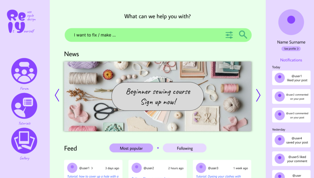
I updated the logo and the header on the homepage. I removed the description from the header and replaced it with “What can we help you with?” to make it clearer what the website is for. I also made the logo more descriptive by adding the “Re-use, Cycle and Design It Yourself” in the logo in the upper-left corner.
I updated the forum layout to at first display only the question, only showing the replies dropping down when clicked. This simplifies interface, making it easier for users to browse questions and access the information they are looking for.
I added a “saved” option in the header of both the Tutorials and Gallery pages to make it easier to acces.
S. E. Thomas [1] states that “interviews with experienced people are useful in UX research because they provide nuanced insight, reveal blind spots, and reduce assumptions when making design decisions.” Since I didn’t want to be in a vacuum I decided to do a short interview with a fellow UX/UI designer who is also currently studying Interaction Design while working in an AI startup.
Interviewee
The interviewee is a 28-year-old UX/UI designer working in a small startup here in Graz. Their role includes the full process from early research and structuring user flows to final UI design and prototyping for development handoff. This already shows how blurred the boundaries of UX roles are, where “designing screens” is only a small part of the expected responsibilities.
Do you use AI in your workflow?
When talking about AI in their workflow, they described it as something that increases productivity rather than replacing their actual design thinking. They use AI mostly for UX writing and for exploring variations when they feel less confident with wording. In that situation AI becomes a kind of assistant, but not something they would rely on for final decisions. They also mentioned that AI-generated interfaces (like from Figma Make) are “not to great” at the moment and therefore not ready to immediately go online.
From this answer it seemed that the final judgment still lies with the designer.
What is the future of UX/UI design?
When confronted with their feelings about the future of UX/UI design, the interview said that real creativity may actually become more valuable and that designers will still be needed for high quality and original interfaces but AI might take over more standardised or repetitive design tasks and typical products. This makes it clear that there’s a tension between efficiency and originality as well.
So when talking about the role of designers she believes that we won’t become “approval machines” or get replaced. Rather than becoming obsolete, the role seems to be shifting toward refining, filtering or curating AI-generated interfaces.
Designers vs Developers using AI
One of the more interesting points came up when comparing designers and developers using AI tools. The interviewee said that it’s okay for developers to use AI for user interface design but only if they are also trained in it. One can very easily spot when a design is made by a developer and it’s very obvious. It’s always functional but not always usable. This emphasised how usability isn’t the same as functionality and that disconnect comes from lack of knowledge. However, this goes both ways, as they mentioned that understanding both the tech and design side is a big advantage for designers.
They also mentioned that they haven’t had an experience like mine (with AI being used to replace her), because “the developers want to keep their jobs too”.
Conclusion/Reflection
The interview made the main tension in my research feel more tangible. AI can definitely speed up parts of the design process, but it doesn’t replace the kind of contextual thinking that human-centered design is built upon. At the same time, it didn’t feel like a simple story of replacement. It felt more like things are still changing and designers are figuring out how to work with these tools in practice, especially within a team. I found the “we want to keep our jobs” comment really interesting as well, because it also points to a sort of on-purpose reduced usage for the sake of job security.