Accessibility Requirements & Barriers
Going into this prototyping session, I was a little unsure if I wanted to continue with my theme from Des&Res1, so I created prototypes in three different areas.
Scroll prevetion:
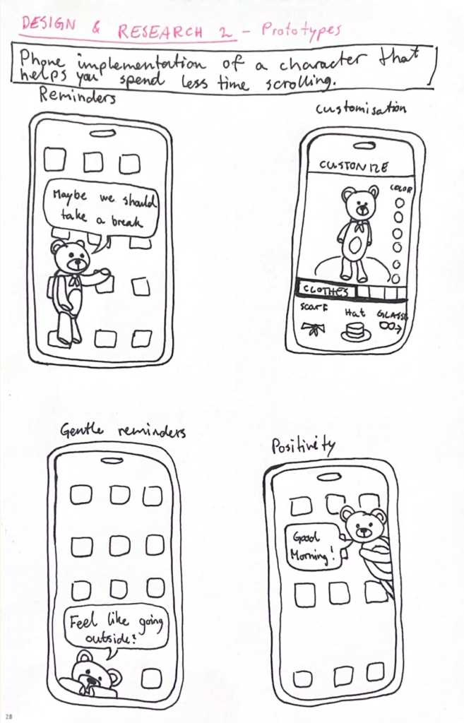
The first one was a continuation of my work with doomscrolling prevention from last semester. The idea is to implement a customizable character into your phone that pops up on your screen from time to time to remind you to take breaks from scrolling and encourage you to do other things. The character’s appearance and personality would be fully customizable so that it feels personal and gives you a sense of care for it. During the peer feedback session in class, I received feedback expressing concern that the character might become annoying over time, and that users could grow to dislike it if it keeps appearing at inconvenient moments. I agree with this, so I think it would be a good idea to make the frequency and persistence customizable as well, giving the user full control over how pushy the implementation is. The idea received a lot of positive feedback, and several people said they would consider using it.
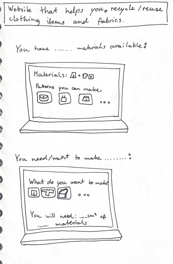
Reuse website:
My second prototype is not as well developed yet, but I think it is my favorite so far. I am passionate about recycling and reusing old clothes and fabrics, so I wanted to create something within that theme. I made a rough prototype of wireframes for a website that helps users reuse their old materials. It can be used to input the materials you have available and then generate ideas for what you can make from them, including patterns you can use. It could also be used the other way around: you specify what you want to make, and it provides suitable patterns along with information about which materials are needed and how much is required. The feedback I received on this prototype was also very positive. I got a recommendation to include different filters to make it more manageable—for example, filters for which tools you have available, or how skilled and experienced you are in sewing and crafting.
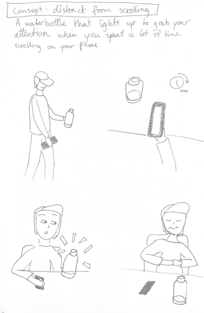
Scroll distraction:
My third and final prototype returns to the idea of preventing doomscrolling. It is a water bottle that connects to your phone and lights up to distract you when you have spent a lot of time scrolling. I thought it could be interesting to have the preventative element exist as a physical object rather than within the device itself. Sometimes, a reminder of the outside world can help break the scrolling cycle and bring you back to “real life.”The water bottle distracts you by lighting up or even making a sound to make you aware of your scrolling behavior. One downside to this product is that you would have to keep the bottle with you at all times, but for people who already do that, it could be an effective tool.
The paper introduces an interactive system that transforms an umbrella from a normal everyday object into a musical and spatial interface. A spatial audio image is created by representing the raindrops hitting the interface and the movements of the raindrops across it. It is supposed to allow the user to perceive and interact with their surrounding space through sound rather than vision.
The soundscape is created by not only using the impact of raindrops, but also the continuous flow of water, which they track by using a dense network of capacitive sensors embedded in the umbrella. The data is processed in real time and is sent to a virtual unity model where each drop of water triggers sounds. As a result, the user hears the movement of the raindrops as they move down the umbrella, drawing a spatial image of the space and external environment.
This study caught my interest because it stands out within the NIME research by combining interaction with both a natural phenomenon and spatial audio. Instead of creating artificial sound environments, it generates real rain into a musical expression.
The authors/designers conducted a pilot study that suggested that the system can enhance users awareness of spatial boundaries and create a sense of personal space. The testers experienced emotion responses to the product such as relaxation and curiosity, many actively exploring the interface by moving the umbrella around.
The article presents some practical limitations to the project, such as the weight of the umbrella with the finished interface, latency in the sound feedback, and limited variety of sounds. These challenges show the difficulty of trying to balance complex technicality with usability in a interactive musical device.
In conclusion, the paper presents an innovative approach to interface design by reimagining a common familiar product, creating a instrument for spatial perception and musical expression. The concept is compelling and opens interesting directions for future projects in interactive sound development.
MetaBow: Gesture Mapping in Immersive Sonic Environments
The MetaBow project investigates how an augmented violin bow equipped with Inertial Measurement Units can link traditional performance techniques with digital sound processing in immersive speaker setups. The authors address the challenge of mapping complex motion data to audio without overwhelming the musician by opting for a hybrid strategy that pairs direct mappings for predictability with machine learning for more nuanced spatial control. From a design perspective, the value lies in leveraging the deeply ingrained muscle memory of the performer instead of forcing them to adopt a completely foreign interface. This approach aims for a high level of transparency where the bow remains a familiar tool even as its capabilities expand. The use of machine learning introduces a specific tension regarding control; the system must feel responsive rather than autonomous to maintain the performer’s trust. By using the bow to direct sound within a three dimensional array, the interaction moves beyond the physical instrument to treat the entire performance space as a manipulable environment. The performer essentially uses the bow to paint sound across the room. The success of such a system hinges on managing the cognitive demands placed on the artist, ensuring that the added digital layers enhance expression rather than creating a distraction. This integration suggests a future where digital and acoustic elements are woven together through the physical gestures of the performer and the specific acoustics of the environment.
Continuing on with my theme of User Interfaces in Video Games, I developed 3 quick and dirty prototypes for the Design & Research 2 course kick-off.

This prototype that I will most likely bring to class is the sticky UI kit. I want to see how people who might not have preconceptions (but also those that do) would naturally arrange different UI elements when put on the spot. User expectations are pretty important when it comes to interfaces so that’s why I decided to play around with that idea, where people could tangibly display their expectations and intuitions in a setting where I could also document it.
It consists of:
This prototype is based on diving in and out of menus and the information hierarchies associated with them. It’s made with folded papers which would be flipped up depending on which button is clicked. The task would, for example, be finding how to change subtitle sizes, as they are often in video settings under accessibility. The confusing part is also that its also sometimes under audio settings so this could serve as sort of cart sorting test as well. Traversing complex tree menus that just keep going in and in can be frustrating.


It consists of:
This prototype is about my biggest pet peeve with games, which is subtitles. It’s uses a piece of paper with scribbles to simulate complex backgrounds that acts as the background and a strip with different subtitle styles. I would simulate different situations (e.g. placing the paper further away) and slide the subtitle styles and ask what was written. This could open a discussion about what is necessary and what works in situations like a game where a lot of mental power could be being used.


It consists of:
The next two weeks will be focused on developing three different prototypes. My main goal is to explore how interfaces can be designed to better support older adults, especially those who didn’t grow up with digital technology. But before diving into design, I need to ask myself some questions: What is the real problem here? What do older users struggle with the most? Is it that apps and websites are simply too complex, with too many steps and features? Or is it that digital interfaces don’t match the way they expect things to work? Or perhaps it’s not the design at all, but a broader question of digital literacy, understanding how devices, apps and online systems actually function.
At the beginning, I thought the main challenge would be designing intuitive and accessible interfaces. However, after talking to different people, I realized that the issue is much broader. Many of the people I spoke with were not only struggling with specific apps or websites, but with digital literacy itself.
This made me realize there was an important difference. While good design can make digital products easier to use, it cannot replace the need for basic digital education. Tasks such as navigating menus, understanding security warnings or recognizing phishing emails require knowledge and practice that go beyond interface design.
Because of this, I started thinking less about the visual design of a platform and more about what it should actually teach. Before creating concepts or features, I wanted to identify the most important areas of digital literacy that could be covered. These include basic device skills, such as using a smartphone or changing settings, understanding common apps and websites, learning fundamental concepts like files and cloud storage, as well as topics related to online communication and security.
While collecting these topics, it also became clear that the platform should not simply provide information. Instead, it should support users throughout the learning process and guide them step by step. One idea that came to mind was a “Today’s Lesson” feature. Rather than presenting users with many different options at once, the platform could recommend one short learning session each day.


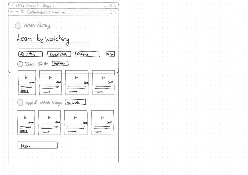
With the last prototype I tried to move away from the “dashboard” layout a bit and instead focus on something much clearer. Rather than showing lots of different options right away, the interface tries to guide the user through what to do next.
The “Today’s Lesson” feature became the main focus of the layout. It’s the first full-width card right after the hero section and noticeably larger than everything else on the page. The idea is that the most important action of the day should require zero searching. Many older users don’t scan pages the same way younger users do. Instead, they read from top to bottom.
Another element I tried out is a progress tracker with color-coded topics. Each topic has its own color instead of everything looking the same. The idea behind this is that color can become a kind of memory anchor. Over time users might remember something like “orange was the security lessons” without needing to read every label again.
For the lesson library I created video cards that show the duration and difficulty level right away.
Another thing I want to add is an accessibility toolbar directly in the Navigationbar. Instead of hiding text size or contrast settings somewhere deep in a settings menu, the controls (A / A+ / A++ and a contrast toggle) are always visible. My thought here was: if someone needs larger text, they probably need it immediately, not after navigating through several menus they might already struggle to read.

As my research focuses on how interaction design can help include children in the playground design process, I created three low-fidelity prototypes that explore different ways children might express their ideas, feelings, and experiences related to playgrounds.
Rather than designing a playground itself, the goal of these prototypes was to design methods of participation. Each prototype approaches the design process from a slightly different perspective: materials and elements of play, emotional experiences, and spatial interactions within playground environments.
The first prototype is a simple card-based toolkit designed to help children communicate their playground ideas through categories. The cards are grouped into three themes: materials and elements, types of play, and feelings. For example, materials might include elements such as wood, sand, or water, while play cards might refer to activities like climbing, sliding, or jumping.
Children can select and combine cards to describe what kind of playground they imagine. This format allows them to build ideas visually rather than relying only on verbal explanations. The simplicity of the cards makes them flexible and easy to use in workshops, where children can rearrange, group, or expand the combinations while discussing their ideas.

The second prototype takes a more reflective approach. It consists of a large sheet that asks children three questions about playground experiences. The first question asks how children feel on playgrounds, which they can answer by choosing emotion stickers. The following questions invite children to describe how they usually play and how they would like to play, using drawings or written responses.
This structure allows children to express themselves through multiple modes of communication. Some children may prefer stickers, while others may choose drawing or storytelling. By combining emotional responses with descriptive answers, this prototype helps reveal not only what children do in playgrounds but also how they experience those spaces.

The third prototype focuses on spatial interaction. In this activity, children are given a simple drawing of a playground that includes common elements such as slides, swings, or climbing structures. Children are then invited to place stickers on different parts of the playground to indicate how they feel about those elements.
Through this mapping activity, children can visually communicate which areas they enjoy, which spaces they find exciting, or which ones they might avoid. This approach transforms the playground into a map of experiences rather than just a collection of equipment.

Paper Review – Concerts of the Future: Designing an Interactive Musical Experience in VR
| Ciaran Frame. 2024. Concerts of the Future: Designing an interactive musical experience in VR. Proceedings of the International Conference on New Interfaces for Musical Expression. DOI: 10.5281/zenodo.13904880 |
For this semester’s assignment we were asked to review a paper from the NIME (New Interfaces for Musical Expression) conference. This topic sits somewhat outside the research direction I explored last semester, which focused more on interruption, attention and interaction design. However, I think stepping outside of that research boundary could offer me an interesting opportunity to look at how immersive technologies are being used in other creative fields.
The paper “Concerts of the Future: Designing an Interactive Musical Experience in VR” by Ciaran Frame presents a virtual reality system that attempts to bridge the gap between passive music listening and active musical participation. The project allows participants to enter a VR concert environment and perform alongside a chamber ensemble using a gestural digital instrument called the AirStick. Importantly, the system is designed for people without any musical training, meaning that the experience focuses more on accessibility and participation rather than musical expertise.
The motivation behind the project comes from an interesting observation: while the majority of people regularly listen to music, only a small portion actively create or perform it. Traditional concert formats reinforce a strict separation between composer, performer and audience. The project therefore explores whether VR could blur these boundaries by placing audience members directly into the performance environment.
The experience itself combines several technological and design components. Participants first enter a physical “green room” where they are introduced to the AirStick and given time to experiment with it. After this preparation phase, they put on a VR headset and are transported to a virtual concert stage where recorded musicians appear around them in a 360-degree environment. Movement of the AirStick is translated into musical output through MIDI mapping, allowing participants to generate sound by performing gestures in the air.
From a design perspective, one of the most interesting aspect of the project for me is how the creators intentionally limit the possible musical outcomes. Early tests showes that participants were often anxious about “playing the wrong note” or disrupting the performance. To address this, the system constrains the musical input so that participants always remain harmonically aligned with the ensemble. This design choice effectively creates “musical guardrails,” ensuring that users feel safe experimenting within the system.
Another notable design decision is the use of extra-VR elements, such as the green room and staged performance environment. These elements extend the experience beyond the headset and I believe it helps to construct a narrative context around the interaction. Instead of VR functioning as an isolated digital space, the project integrates physical staging to strengthen immersion.
From my perspective as someone with a background in game design and interactive media, the use of VR here is interesting primarily in terms of embodied interaction. Similar to many VR games, the experience relies on physical movement and spatial presence to create engagement. However, unlike most game environments, the participant’s agency is intentionally constrained to maintain musical coherence. This highlights a tension between creative freedom and system control, which is a recurring design challenge in interactive systems.
Overall, the paper demonstrates how VR can be used not only as a visual medium but also as a participatory performance platform. While the project is rooted in experimental music practice, it also raises broader questions about how immersive technologies can reshape the relationship between audiences and creative content. Even though my own interests lie more in interaction design than in musical interfaces, the project offers an interesting example of how immersive systems can transform traditionally passive cultural experiences.