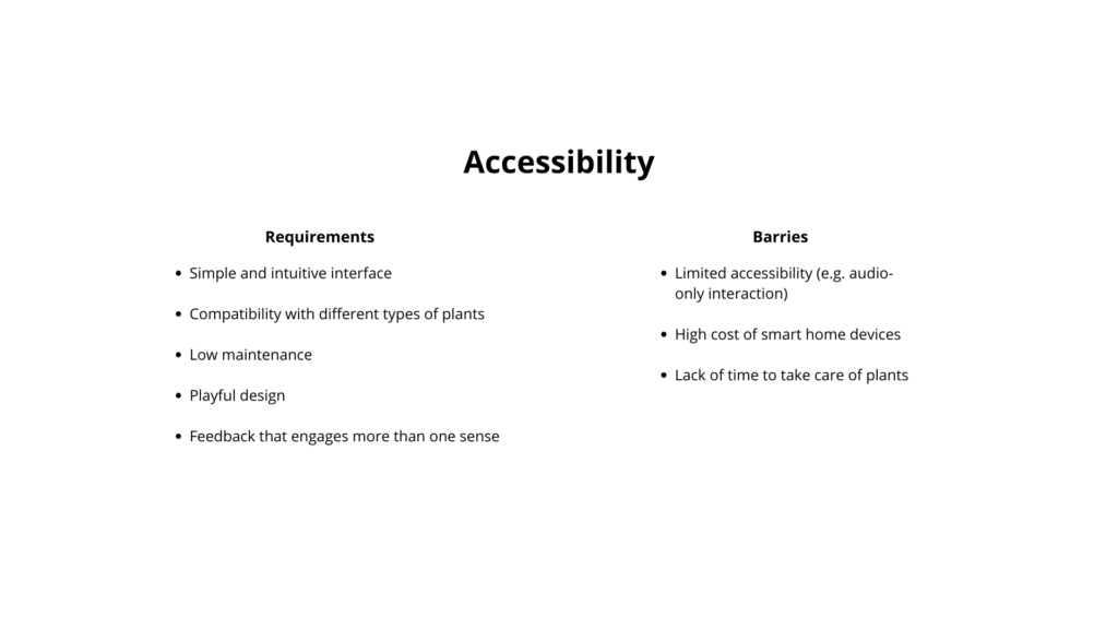
The accessibility analysis focuses on both requirements and possible barriers.
The main requirements include a simple and intuitive interface, so that the product can be used without instructions. It should be compatible with different types of plants and require low maintenance, so it does not add extra effort for the user. A playful design is also important, especially to engage children and make the experience enjoyable. Finally, the feedback should involve more than one sense, combining light and sound to create a clearer and more inclusive interaction.
At the same time, some barriers need to be considered. For example, if the interaction relies too much on sound, it may limit accessibility for some users. Smart home devices can also be expensive, which may reduce accessibility for a wider audience. Another common issue is the lack of time people have to take care of plants.
In coclusion, the product should find a balance between these different needs.
Next, I started thinking about what my method or tool would actually improve. I believe that many family members get frustrated because they are always the first point of support when it comes to technology, constantly having to explain or fix things for older relatives.
With my method or tool, elderly users would be encouraged to first try and find a solution on their own instead of immediately relying on someone else. This could really improve family dynamics, as it allows people to spend more quality time together instead of using that time to troubleshoot devices.
I also thought about how many older adults lack the means to independently access and explore information. This can lead to an incomplete or sometimes biased understanding of current events.
With my tool or method, elderly users would be able to access information more confidently and see a bigger picture, helping them form their own opinions and make more informed decisions about current topics.
Another point is that many older adults have limited ways to stay connected with family or peers beyond phone calls. They often struggle to access or use tools like group chats, which makes it harder to stay involved in everyday communication.
With my tool or method, older adults would be able to understand and use digital tools more easily, allowing them to stay connected, take part in conversations and feel more included in their social circles.
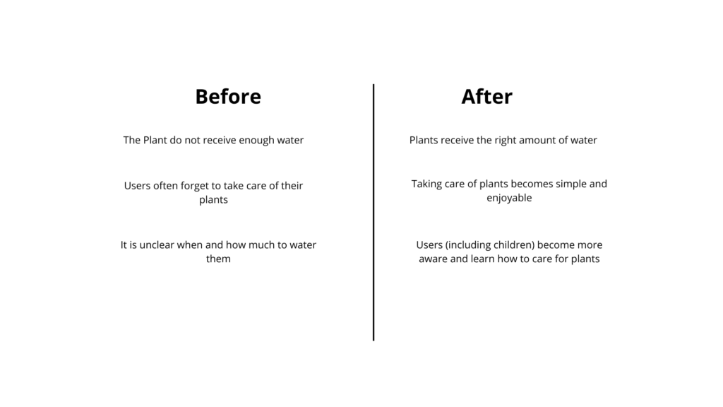
This phase explores the impact of the product by comparing situations before and after its use.
Before using the device, plants often do not receive enough water. After using it, plants receive the right amount of water. Another issue is that users frequently forget to take care of their plants, while with the device, plant care becomes simpler and more enjoyable. Finally, it is often unclear when and how much to water plants, but with the device, users — including children — become more aware and learn how to take care of them.
However, some important considerations emerge. There are many different types of plants, and not all of them need the same amount of water. In some cases, the soil may appear dry, but the plant does not need to be watered yet. For this reason, the system should not give overly simplified feedback, but should consider different plant needs.
It is also important to understand what really motivates people. Users often struggle with consistency and knowledge rather than intention. They may want to take care of plants, but forget or feel unsure about what to do.
The device should therefore not only inform, but also support and encourage users, making plant care feel easy, clear, and rewarding.
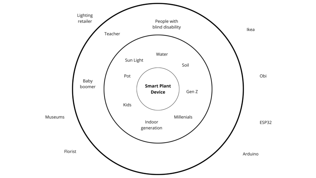
The system map places the product at the center, but expands the perspective to a wider ecosystem. Instead of defining it as a single object, such as a lantern, the project considers a broader category: a smart plant care device. This allows more flexibility in form and use.
Around the product, the first layer includes direct users and elements directly involved in plant care. These are not only people, but also natural agents such as sunlight, soil, and water, which all influence how plants grow. Human users include generations such as Gen Z, millennials, kids, and the “indoor generation,” meaning people who spend most of their time inside and may have less direct contact with nature.
The second layer includes indirect users. These are people who may not use the device directly but are still connected to it. For example, teachers could use it in educational contexts, especially with children. Kids can interact with the device in a playful and learning-oriented way. People with visual impairments are also considered, since the use of sound can support accessibility. Baby boomers, such as parents, might not be the main users but could be interested in the product through their children.
The outer layer includes providers and institutions. These can be stores like IKEA or OBI, which are related to home products, or suppliers of electronic components such as Arduino and ESP32. Florists are also relevant, as well as museums, if the product is used in installations or educational workshops. Shops that sell lighting products are important too, since the device can function both as a practical tool and as a decorative object.
What if plants could communicate their needs in a simple and intuitive way?
This project explores how design can make plant care easier and more engaging through light and sound. Instead of checking apps or guessing, the idea is to create a product that gives immediate feedback, helping users understand their plants at a glance.
In the next blog posts, the different steps of prototyping and developing this plant care product will be presented.
Concept
The concept is a design product for plant care. When the product is brought close to a plant, it detects the soil moisture and responds by changing color to indicate the hydration level. At the same time, each plant can trigger a specific sound.
Technology and Interaction Exploration
An important part of the project is exploring how to design sensory feedback.
The idea is to combine sound and light to communicate information. Different technologies are considered and tested to find the most effective solution.
These include:
ESP32 and Arduino for system control
Infrared sensors or magnets for proximity detection
Soil moisture sensors to detect hydration levels
LED lights to display feedback through color
This phase focuses on understanding which components work best together and how they can create a smooth interaction.
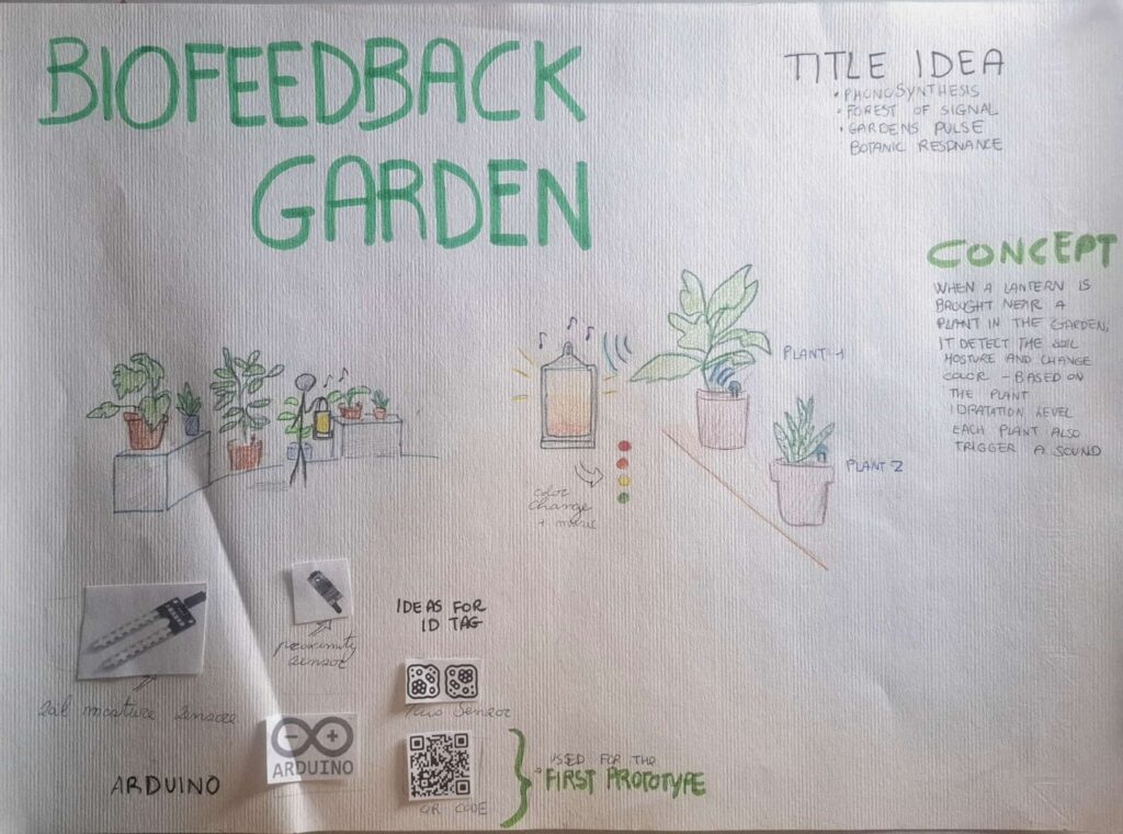
LO-FI Prototyping
The project developed through different low-fidelity prototypes.
First prototype:
A schematic was created to illustrate how the system works, and a visual will be included to support it. In the poster, the provisional title “Biofeedback Garden” was introduced, together with alternative name ideas and sketches that show how the interaction takes place.
Second prototype:
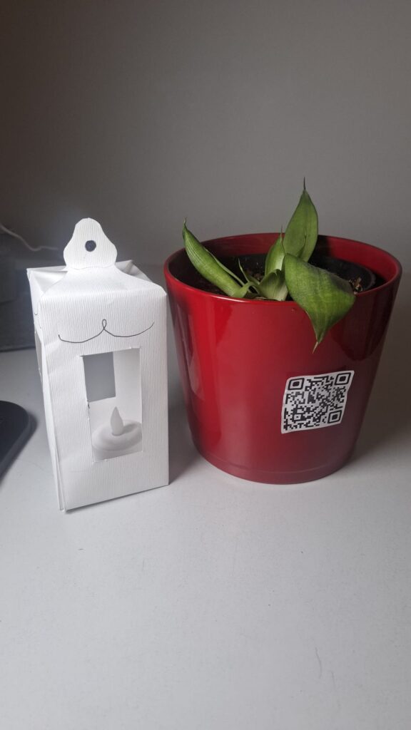
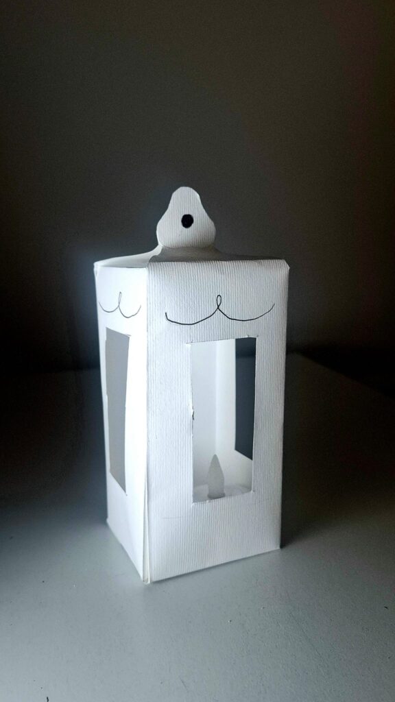
The design of the product was explored. The idea is to give it the shape of a lantern, with LED lights inside that can change color. The form should feel soft and suitable for an indoor environment.
Third prototype:
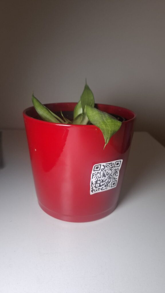
A digital simulation was created using a QR code placed on a plant. When the QR code is scanned, a website opens showing the hydration level as a percentage. The background color changes to simulate the light of the product. This prototype also simulates the action of bringing a device close to the plant and the color change of the lantern.
Insights from User Testing
Some important insights emerged from a class test.
The website should not only show a percentage value, but also explain what the value means. The interface needs to be clearer and more direct.
It also became clear that using a phone is not the best solution. At home, people often want a break from technology. A physical, non-digital object is more appropriate for this context.
Finally, the color system needs improvement. The initial idea was:
Green = well hydrated
Yellow = medium
Red = needs water
However, this feels too similar to a traffic light. For indoor use, a softer and more “cozy” color palette would be more suitable. One possible solution is to allow users to choose their preferred colors.
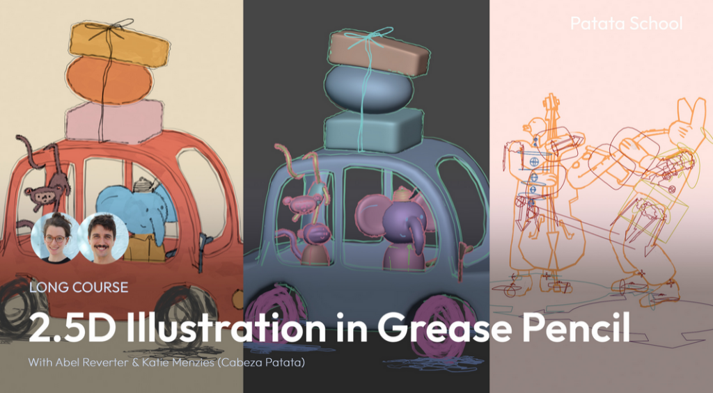
For these semesters blog entries, I wanted to join some kind of course about either Grease Pencil, Shader creation or Sculpting. I researched a lot which course would be the best for me, considering price, topic and the way it gets thought. I stumbled upon Patata School, which is a membership-based program with different courses mainly about Blender. Some of which are about Grease Pencil and Shaders, both in a very stylized way which is perfect for me!
In this first blog post I wanted to set goals I want to achieve this semester.
The main course I will follow is “2.5D Illustration in Grease Pencil”. It has 4 Lessons, after which I want to create a 2.5D illustration based on the topic I did last semester. This project will let me translate those themes into visual art, using Grease Pencil’s dynamic tools to animate Death as both a mythic figure and a cultural mirror. For this, I will probably design a character, place it in one or more fitting environments and animate it.
As a small reminder what I wrote about last semester:
Fear and anxiety are fundamental psychological responses that connect perceived threats to subsequent behaviours. The brain’s amygdala initiates these reactions, while the prefrontal cortex regulates them. Culturally, death is rarely seen as a mere end but rather as a transition, reflected in global rituals. Mexico’s Día de los Muertos uses vibrant marigolds, sugar skulls, and altars to celebrate life’s continuity, while East Asian traditions employ white to symbolize purity and spiritual release. In the West, black attire codifies grief as a performative, socially structured process. These rituals demonstrate how colour semiotics and symbolic objects embody cultural attitudes – whether death is feared, embraced, or ritualized. For example, Madagascar’s Famadihana ceremony emphasizes kinship through the rewrapping of ancestors, while Guatemala’s giant kites during Día de los Difuntos blend art, politics, and ancestral communication.
Storytelling and media further explore these themes. Films like The Book of Life (2014) contrast the vibrant Land of the Remembered with the desolate Land of the Forgotten, reinforcing the idea that memory keeps the dead “alive.” The Halloween Tree (1993) reframes Halloween as an educational journey through global death traditions, linking seasonal colours to humanity’s ongoing dialogue with mortality.
Ultimately, fear and death are not just biological or emotional experiences but cultural constructs, expressed through colour, ritual, and narrative. Transforming terror into meaning, grief into celebration, and the unknown into a shared human story.
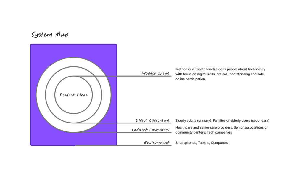
Today we had an intro to Project to Product and really started digging into the background and key info for our Master’s projects. First, we put together a system map that looked at our ideas, direct and indirect customers and the environment. We also thought about who might influence our product, tool or method.
For the system map, my product idea is a tool or method to teach elderly people how to use technology. I see this as particularly important because many older adults today are unable to fully take part in online life, which can lead to social isolation and limit their access to family and friends. Beyond that, many struggle to find the information they need or fall victim to online scams.
Direct customers (Primary Users) are elderly or older adults who are not digital natives and need guidance to understand and use technology. Secondary users are their families, since many younger family members often end up constantly helping their elders with tech. This can be exhausting and frustrating, as visits become focused on troubleshooting devices instead of enjoying quality time together.
Indirect customers could include retirement homes, healthcare providers, senior associations or community groups and even tech companies. These groups might support, implement, or benefit from the tool by helping elderly users engage with technology more safely and confidently.
The environment includes devices, apps and platforms that older adults interact with, as well as the social and cultural side, like how people think about aging, technology and communication between generations. Rules and safety issues, such as accessibility laws, data privacy and online security.