Introduction
What if plants could communicate their needs in a simple and intuitive way?
This project explores how design can make plant care easier and more engaging through interactive sesnsors. Instead of checking apps or guessing, the idea is to create a product that gives immediate feedback, helping users understand their plants at a glance.
In the next blog posts, the different steps of prototyping and developing this plant care product will be presented.
Concept
The aim is to transform sensor data into an intuitive visual feedback that could easily communicate the health condition of a plant within a domestic environment.
Technology and Interaction Exploration
The core of the concept is the use of moisture sensors to continuously monitor the soil’s hydration level. The collected data Different technologies are considered and tested to find the most effective solution. The collected data is then transmitted to an LED indicator, which changes color according to the soil moisture level. These include:
- Arduino for system control
- Soil moisture sensors
- LED lights to display feedback through color
LO-FI Prototyping
To visualize and explore the concept, three different low-fidelity prototypes were initially developed.
First prototype:
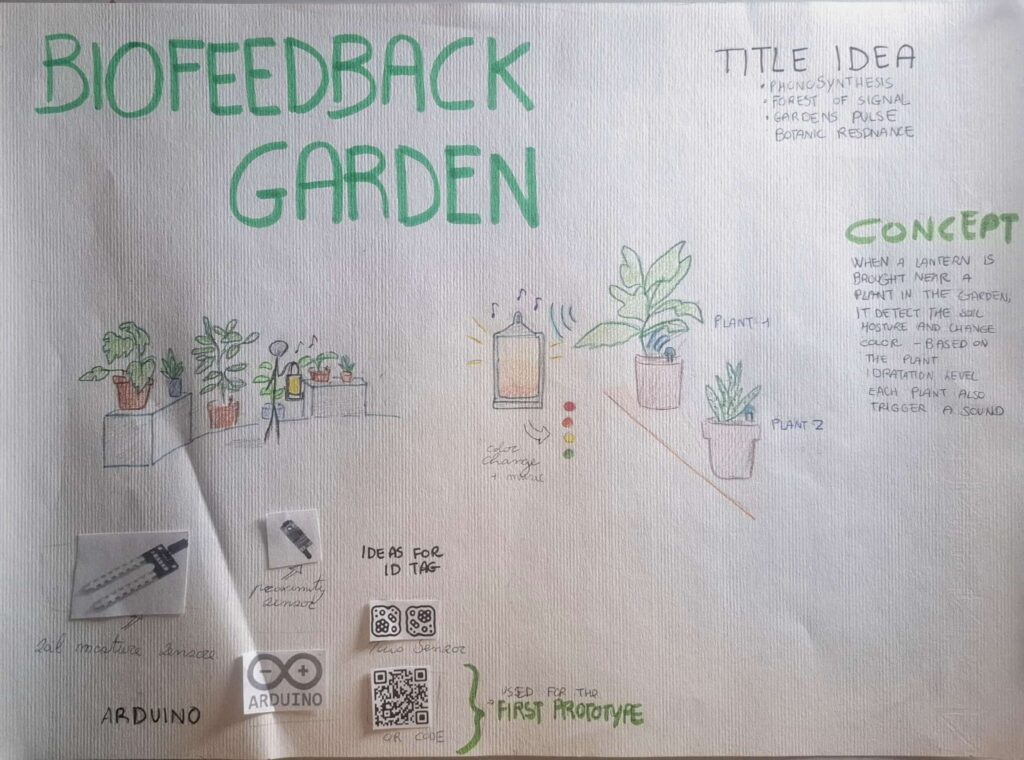
The first prototype consisted of an infographic that illustrated how the system works, and a visual will be included to support it. In the poster, the provisional title “Biofeedback Garden” was introduced, together with alternative name ideas and sketches that show how the interaction takes place.
Figure 1: Overview of the project
Second prototype:
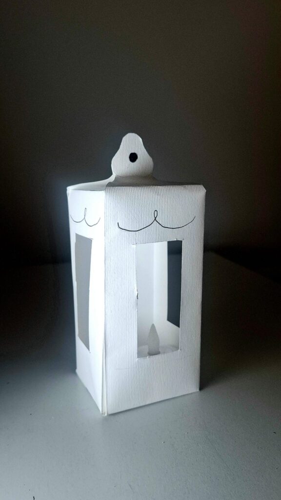
The design of the product was explored.
The idea is to give it the shape of a lantern, with LED lights inside that can change color. The form should feel soft and suitable for an indoor environment.
Figure 2 First product design prototype.
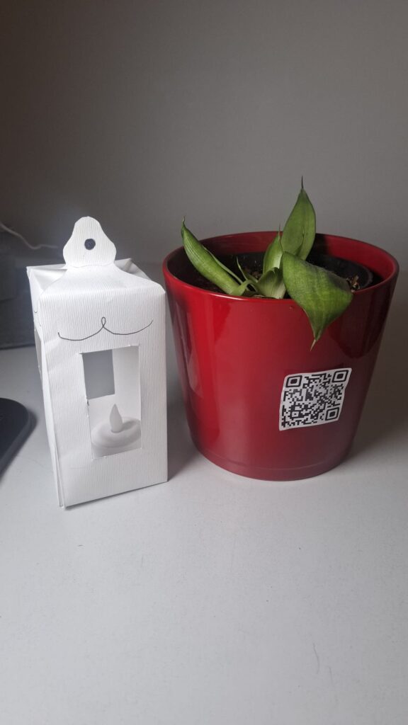
Figure 3. A paper lantern is paired with a plant pot featuring a QR code that displays the plant’s current health status.
Third prototype:
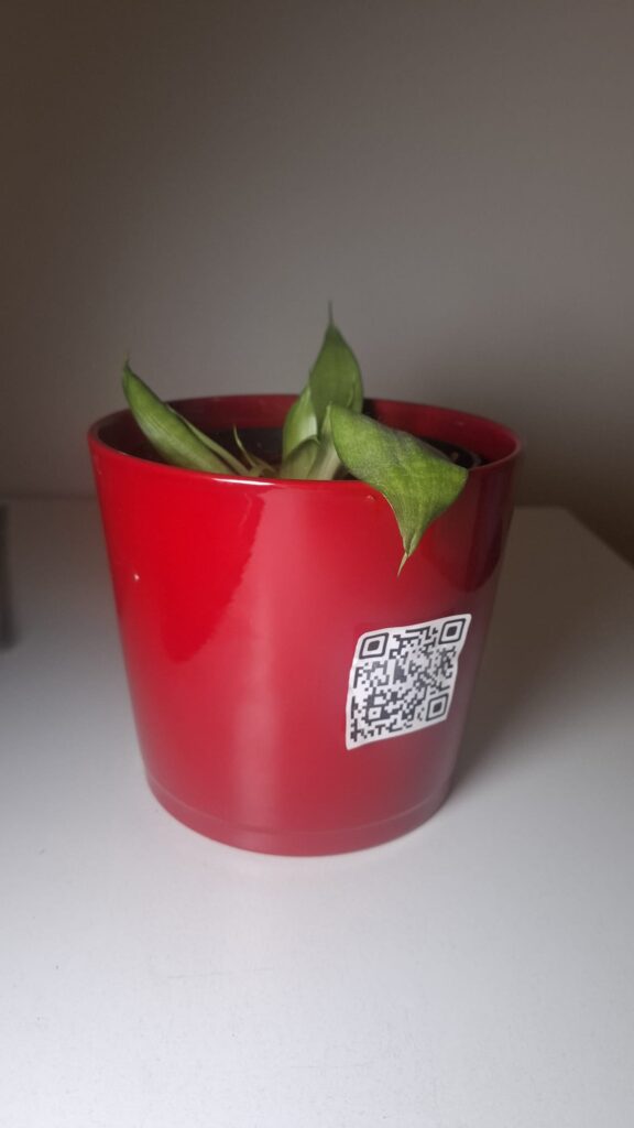
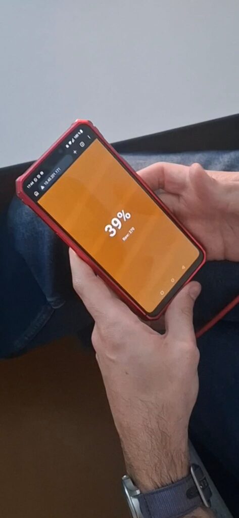
A digital simulation was created using a QR code placed on a plant.
When the QR code is scanned, a website opens showing the hydration level as a percentage. The background color changes to simulate the light of the product.
Figure 4. A QR code on the pot provides real-time information about the plant’s health. – Figure 5. First version of the digital interface, which displays the percentage of soil moisture.
Insights from User Testing
Some important insights emerged from a class test.
- The website should not only show a percentage value, but also explain what the value means. The interface needs to be clearer and more direct.
- It also became clear that using a phone is not the best solution. At home, people often want a break from technology. A physical, non-digital object is more appropriate for this context.
Finally, the color system needs improvement.
The initial idea was:
- Green = well hydrated
- Yellow = medium
- Red = needs water
However, this feels too similar to a traffic light. For indoor use, a softer and more “cozy” color palette would be more suitable. One possible solution is to allow users to choose their preferred colors.
