SS26_#10_What I Learned from the Pilot Study

To the survey: https://docs.google.com/forms/d/e/1FAIpQLSfujaTdkiyrwagGO4Cv_JjGQ_IIWt9v4tO54aVBSiF7J6a_pw/viewform?usp=header

When I started my pilot study, I mainly wanted to find out whether my survey worked well. I expected to make a few small changes before starting the main study, but I didn’t expect the pilot study to change the way I think about my research. But if I am honest, I feel that it did much more than test my questionnaire. It gave me new ideas, new questions and a much clearer direction for the next step of my project.

One thing I learned very quickly is that research rarely gives you simple answers. Instead, every answer seems to lead to another question. At the beginning, I only wanted to find out whether people can recognise authentic, AI-edited and fully AI-generated images. Now I find myself asking something different: Why do people trust some images but not others? I think this has become one of the most interesting questions in my research.

The pilot study also helped me develop a few assumptions that I would like to investigate in the main study.

  • I expect that highly photorealistic AI-generated images will continue to be much harder to recognise than authentic photographs.
  • I believe that people’s confidence does not always match their actual performance.
  • I think that our judgement is influenced less by whether an image is objectively real or fake and more by specific visual details that make an image appear trustworthy.
  • I now suspect that AI-generated images may have a second effect that I had not considered before: they might slowly reduce our trust in authentic photographs as well.

This last assumption is probably the most interesting outcome of the pilot study for me. When I started this project I wanted to understand whether people can recognise AI-generated images. But after analysing the pilot study, I began wondering if the real issue is something bigger. Could AI-generated images slowly make us trust authentic photographs less? If people start doubting real images because they look “too perfect”, then AI is not only changing how images are created. It may also be changing how we decide what we believe.

The pilot study also made me rethink the design of my main study. For the pilot survey, I intentionally selected mostly very realistic AI-generated images because I wanted to create a situation that reflects how AI could actually be used in the real world. Several participants told me afterwards that the images were “too good” and that people would normally not see such difficult examples online. I understand this opinion, but I personally see it differently. If someone wanted to spread misinformation using AI-generated images, they would most likely choose the most convincing image available, not one with obvious mistakes. For this reason, I still believe that the image selection represents a realistic scenario.

However, the feedback also gave me an idea for improving the main study. Instead of using only highly realistic AI-generated images, I now want to include images with different levels of difficulty. Some images will contain obvious AI artefacts, while others will be almost impossible to distinguish from real photographs. I hope this will make it easier to compare different age groups. My current assumption is that younger participants, especially those between 25 and 34 years old, may recognise the more obvious AI-generated images more easily than older participants because they are generally more familiar with AI tools and digital media.

Looking back, I feel that the pilot study has given me much more than I expected. It helped me improve my survey, but it also changed how I think about my research question. I now have a clearer idea of what I want to investigate and which questions I find most interesting. At the same time, I know that there is still a lot to discover. I am excited to continue this project and see whether these first ideas are confirmed when I conduct the main study with a larger and more diverse group of participants.
OBJECTS TELL STORIES

Everything started with a chair.

“There are more chairs than asses,” said Bruno Munari. An ironic, almost provocative sentence that accompanied me throughout my whole research…

One chair, many stories.

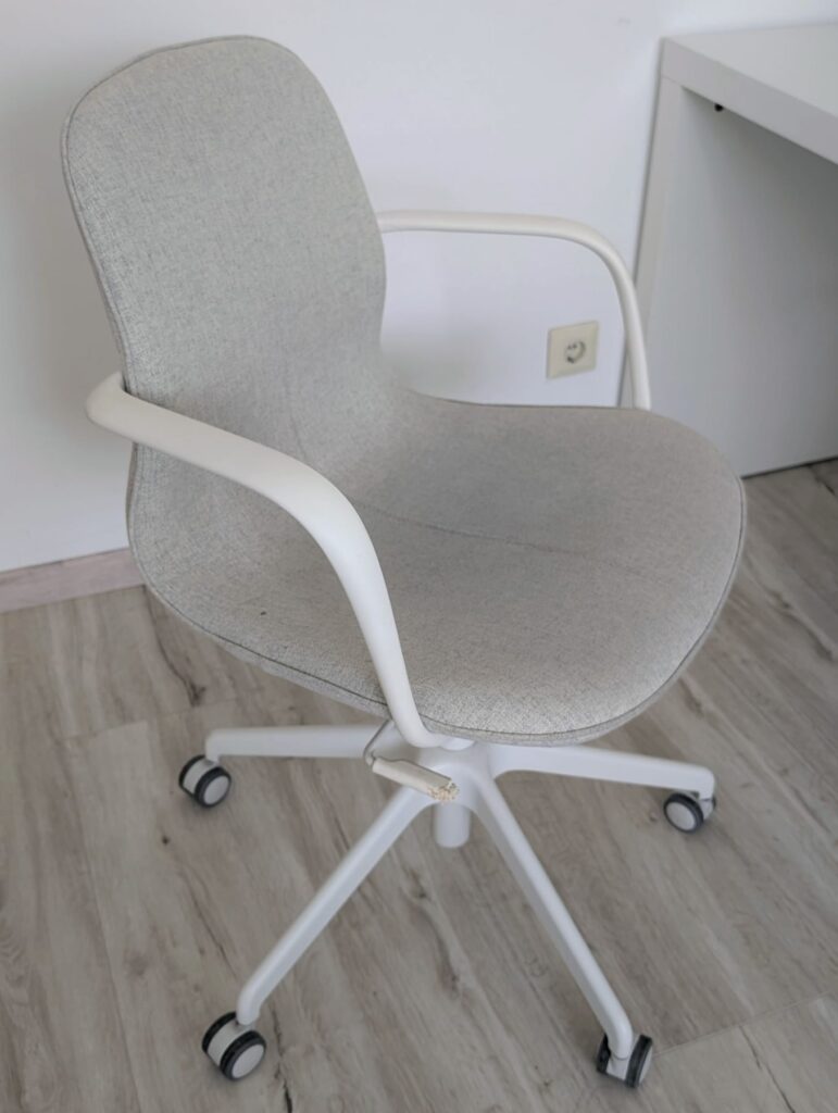
The chair I am sitting on right now is a simple IKEA office chair, bought second-hand on Willhaben. At first glance, it is just a functional object, but looking closer, it tells much more. Its shape suggests concentration, the colour and materials speak of a simple and minimalist aesthetic, while the marks left by time tell something about the people who used it before me.

Even a small detail can become a story: the lever to raise and lower the seat, for example, has been chewed by a pet. Probably a curious cat that did not see this object only as a chair, but as something to explore. A place to rest, play or attract the attention of the person who spent hours sitting there.

During the first semester, I explored the communication of objects through perception, semiotics and design. I discovered that objects are never neutral: even before using them, we interpret them through what we see. Shape, materials, colours, proportions and signs of use suggest meanings and ways of relating to them.

A handle suggests how it should be grabbed, a chair suggests a posture, a worn object tells a story. But meaning never completely belongs to the object itself: it is created through the encounter between what has been designed and the person who observes, uses and experiences it.

From here comes a new question: if objects communicate, what happens when they meet people?

I want to understand how people interpret objects and how, through their experiences, they create new meanings.

Because maybe it is not only the object that tells something. We also create a story around it through the way we look at it and use it. The same chair can become a workplace, a place for a break or simply the spot where we leave something at the end of the day. The object stays the same, but the story changes.

In this second semester, I want to observe these encounters: through stories, observations and experiments, I will try to understand how objects are perceived, interpreted and reinvented in everyday life.

Because maybe objects do not communicate fixed meanings.
They communicate possibilities.

SS26_#09_What the Pilot Study Revealed

To the survey: https://docs.google.com/forms/d/e/1FAIpQLSfujaTdkiyrwagGO4Cv_JjGQ_IIWt9v4tO54aVBSiF7J6a_pw/viewform?usp=header

Once I had analysed the overall results, I became curious about the individual images. The average recognition rate already showed that identifying AI-generated images is difficult, but I wanted to understand what was behind those numbers. Which images confused people the most? Which ones were recognised more easily? Looking at each image one by one turned out to be one of the most interesting parts of the whole project.

As I mentioned in my previous blog post, authentic photographs were generally easier to recognise than AI-generated images. But once I started looking at the individual images, I realised that the averages only told part of the story.

Some authentic photographs were recognised by more than 70% of the participants, and one image was even recognised by almost 80%. At the same time, several fully AI-generated images were correctly identified by only around 20% of participants.
One result immediately caught my attention. Image 13 was an authentic photograph, but only 14.3% of participants identified it correctly. Image 20, which was fully AI-generated, reached exactly the same recognition rate. I found it fascinating that two completely different image types produced almost identical results. So, looking at each image individually revealed details that would otherwise have been easy to miss.

Another interesting part of the analysis was the confidence ratings (1 = not confident at all, 5 = very confident). Before analysing the data, I expected participants to feel much more confident when they answered correctly. Instead, the difference was surprisingly small.

On average, participants rated their confidence as 3.13 when they answered correctly and 2.99 when they answered incorrectly. Both values are very close to the middle of the scale, meaning that participants generally felt only moderately confident about their decisions. What surprised me most was how similar these two values were. Whether participants were right or wrong, their confidence hardly changed.

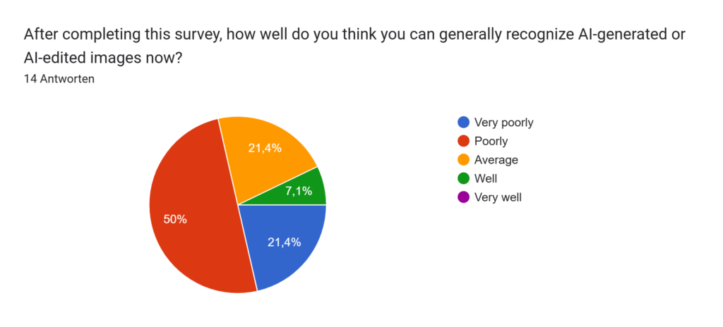
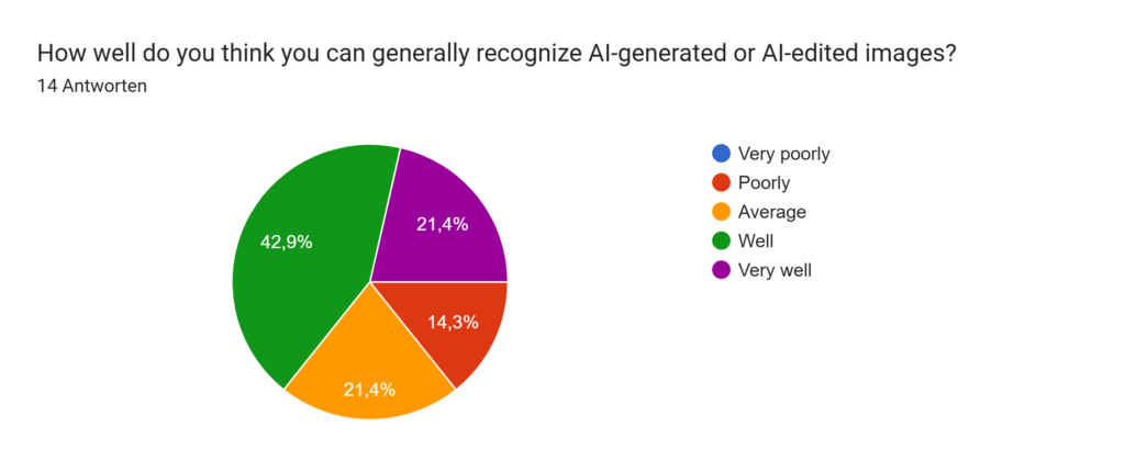
I also noticed a change in how participants viewed their own ability to recognise AI-generated images. Since participants rated their own ability before and after the survey, I was able to compare both answers. At the beginning of the survey, many participants rated themselves as being quite good at identifying AI-generated content. After completing the survey, several participants rated themselves as less confident than before. Although this pilot study is too small to draw firm conclusions, it seems that taking part in the survey made some people realise that distinguishing between authentic and AI-generated images is more challenging than they had expected.

The second part of my pilot study was a little different. This time, participants did not have to classify a single image. Instead, they saw two similar images and had to decide which one they thought was authentic. I was curious to find out if comparing two images directly would make the task easier.

The average recognition rate was 55.4%, which is slightly higher than in the first part of the survey. Even so, I was surprised that the results were still so close to chance. Some image pairs were much easier than others. Pair 3 was recognised correctly by 71.4% of the participants, while Pair 4 was the most difficult, with only 42.9% choosing the authentic image. Most of the other image pairs were recognised correctly by about half of the participants.

For me, this part of the study added another interesting perspective. It showed that even when participants could compare two images directly, deciding which one was authentic was often still difficult.

Analysing the results in this level of detail helped me understand much more than the overall recognition rate alone. It showed me which images were particularly successful for the study and which ones challenged participants the most. These observations will surely help me improve the image selection for my main study.

!!Attention!!

!!Please only look at the documents if you have already completed the study or if you do not intend to participate in it!!

Design Activism Experiments Final Thoughts

For this semester, I wanted to show a different side of design activism, namely, design activism through analogue experiments. I did that by first researching what kinds of experiments I was going to focus on and deciding on a certain topic that I wanted to focus on, since the whole area of design activism would’ve just been too vast. I thought about doing something on sustainability, but this would’ve asked different questions and it would’ve been tough to show sustainability in different ways than it is already shown. I also thought about doing something on fashion, since that is one of the main fields that I have knowledge in, but this was actually a field that I have already researched so many times and I wanted to get out of doing the same thing in all aspects of my life over and over again.

Therefore, I decided on the topic of food. Specifically the phrase: “Food is political” and the aspects of showing certain cultures or talking about problems certain cultures are facing today through fruits or vegetables as symbols. This turned out to be the right topic for these experiments, since I love working with food or showing different kinds of foods. However, it also turned out to be quite difficult to work with this, because it is such a political topic on many different layers. Food politics have been with us throughout the history of mankind. There was always some sort of dependence of people that put their livelihood on producing and cultivating different kinds of foods for other people that had more power than them. Wars were fought over food and some of the biggest panics that arised were, when food was scarce and there was not enough there for everyone. That is all still the case nowadays, even if we privileged people like to forget these aspects usually.

I may not have made the most of my experiments, but what I can say is that even though my life is currently really difficult and I didn’t have the time to do all of this, which is why all of my posts are now coming at once. I really did some experiments and I also did everything myself and put all of my own thoughts into these blog posts without using AI for any of it. I hope that it is still appreciated, because I just want to keep the skills that I have of writing texts. In times of AI writing is something that happens so fast and so easily, so it is easy to forget that it is a process that takes time, but it is also a process that gets the brain going and enriches us. So, in times of complicated AI texts writing in ways that people would never write themselves and everything becoming much more similar and much more artificial by the second, I hope there’s still people out there that appreciate people for trying and for being authentic with their own experiences. Thank you for the opportunity of doing these experiments, even though it was much more stressful for me than it should’ve been. Thank you for coming on this journey with me. Looking forward for the directions that I really will go in the future with this thesis.

Design Activism Play-Doh

I have already done quite many experiments for my research, this time I decided to activate another childhood memory and do something with play-doh. I had many ideas on how to approach this topic, since it makes certain playing aspects possible, so I’m sure that it would’ve been nice to also use some other tools than just plain play-doh. In the future, I would definitely try to also include using some stencils to make the whole object more patterned in the end. To add to that, it would’ve worked well to combine some of the colours and really mix them so that the different colours mix at some points and some others show up in streaks in the patterns, of course this method can only be done once, since the colours will then be mixed together and cannot fully be taken apart anymore. However, I think that in this case it would work out well to just form some abstract shapes with it and then use this type of structure for future projects.

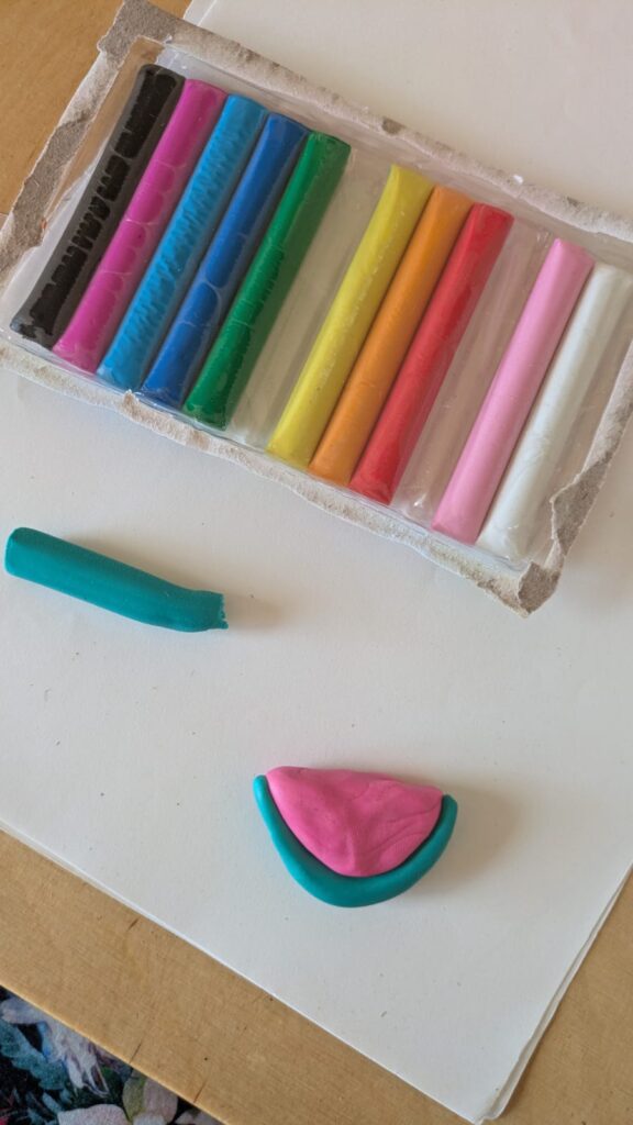
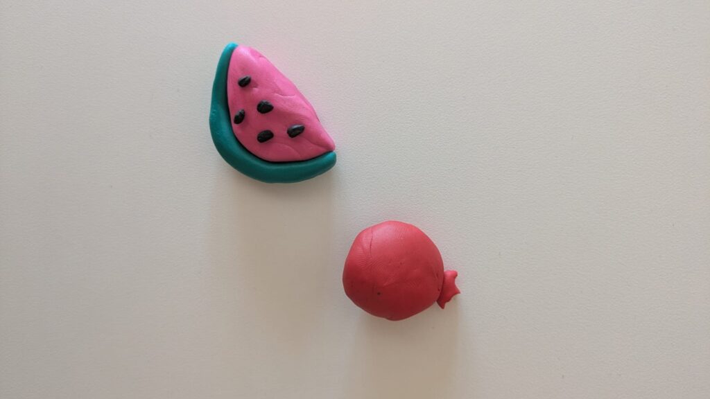
The play-doh I used was of lesser quality, therefore it tended to stick to the hands more than it did other things. It was really hard to form and I think it would’ve also been harder to mix. When I started the process I already wanted to get it off my hands, because it was really uncomfortable to work with. Since this was still my experiment and I had to make at least something out of it, I decided to work on two simpler shapes that I had done before in some of my other experiments. The watermelon and the pomegranate. I only had little play-doh, so I had to make them quite small, which was fine, since this experiment was just supposed to get me started and help me try out different materials. To start, I chose the colours that matched best with the result I was going for, started to make the play-doh smoother by rolling it in my hands for a bit and then decided on doing simple shapes to just show the fruits for what they are. The pomegranate was just made out of red play-doh in two pieces, a ‘crown-like’ piece for the top and the round body of the fruit. The watermelon was done by using, emerald, black and pink play-doh and creating a watermelon slice, by making its distinct shape in a pink moon-like shape, the outer part in a similar shape but much thinner in emerald and the seeds in black. First I wanted to add just three seeds, but I decided it would look better with five seeds.

In the following pictures you can see my final outcome. Again I chose to stay with the same topic as all of my other blogposts, so the pomegranate stands for Iranian culture, while the watermelon stands for Palestinian culture.

Design Activism Fabric Collage

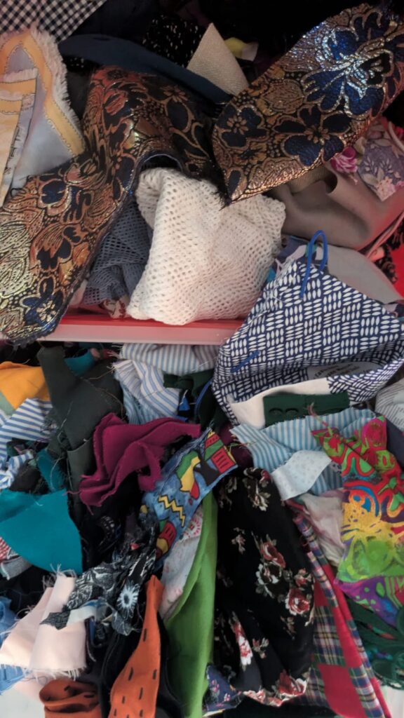
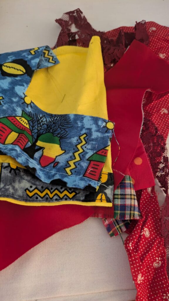
One of my earlier experiments was making a collage out of paper scraps, so this time I decided to try it out with fabrics. Since I have been working a lot with fabrics in fashion school and I have so many leftover fabric scraps, I decided that I could at least give this a try. My plan was to be much more detailed than I was in the end, also because I found out that I didn’t have too much of the colours that I wanted to have and I didn’t want to use new fabrics, because this was supposed to be a project that uses up some of my fabric scraps. It started out with chaos. The chaos of rummaging through all of the fabric scraps that I still have at home. Then I chose some that fit the colour and topic scheme that I was focusing on for this part of the experiment.

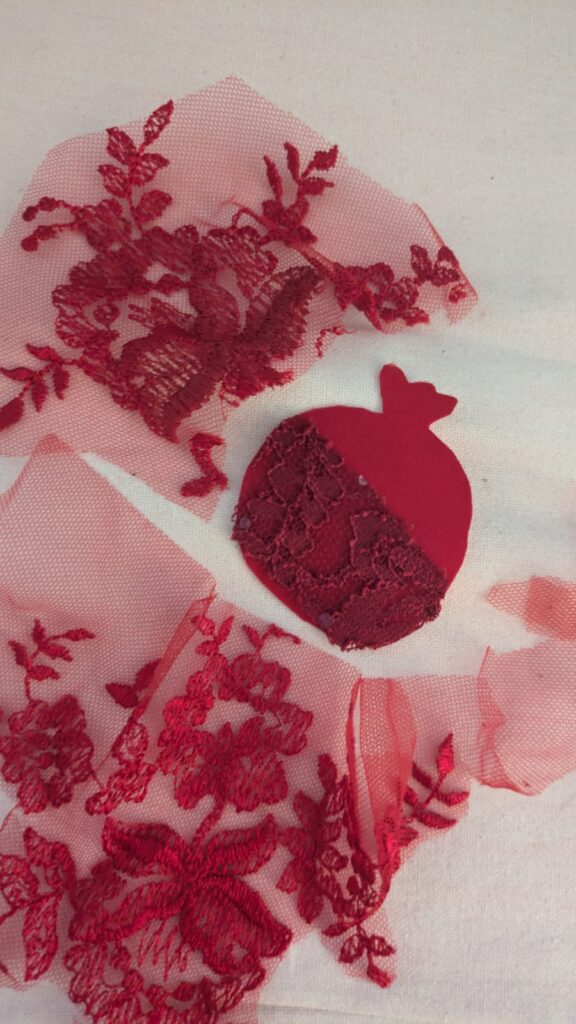
The next step was to try to choose which of the coloured fabrics to use for which motive and cut it out, while trying to focus on which kind of fabric to use for what part of the project and what structures to combine for the right outcome. For the first part I worked solely with red fabrics and decided to just use the fancier ones, since the others just didn’t seem to work for this pattern-wise. I ended up choosing an old fabric of a ballgown and some lace to cut out a pomegranate, again standing for Iran, as well as some lace detail, to make it more interesting structure-wise. We are still on the same topic of using food as a political symbol for a certain culture.

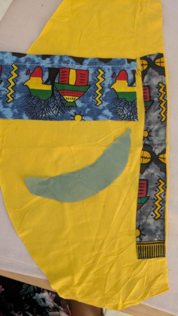
The second idea was to use more yellow and light green colours, as well as, other Ghanaian fabrics that were leftover of some t-shirts to create a plantain and some colourful background representing Ghanaian culture a little bit. Luckily I still had a few fabrics left that made this composition work, otherwise it would’ve been harder to achieve.

In general I tried to find some more fabrics for other compositions, but since I didn’t find the right colours, for instance for another watermelon or for some other fruits or vegetables that algined to my chosen topics, I decided to just stick with the ones that I could make more easily. In the following pictures you can see my end-results for these types of experiments. I recommend you to give this technique a go as well, since it is a more crafty approach and includes some materials that some people tend to not work with that often. The goal of this process would be to then also really put it on a different kind of fabric and make a full collage out of it by sewing everything onto the base fabric. But I just wanted to try out the main idea for this experiment.

SS26_#08_Analysing the Pilot Study

To the survey: https://docs.google.com/forms/d/e/1FAIpQLSfujaTdkiyrwagGO4Cv_JjGQ_IIWt9v4tO54aVBSiF7J6a_pw/viewform?usp=header

Seeing the first responses come in was a really exciting moment. After spending so much time planning the survey, choosing the images and creating the questionnaire, I was finally able to look at the data. I was curious to find out whether people could actually tell the difference between authentic, AI-edited and fully AI-generated images. Even more importantly, I wanted to understand where people struggled and whether any interesting patterns would appear.

In total, 14 people completed my pilot study. They came from different age groups, although most participants were between 25 and 34 years old. Each participant looked at 24 images and decided whether each one was authentic, AI-edited or fully AI-generated. Altogether, this gave me 336 individual answers to analyse.

The first thing I looked at was the overall recognition rate. After comparing every answer with the correct solution, I found that participants classified only 42.3% of the images correctly. I honestly expected the result to be higher. At first, this seemed surprisingly low, but the more I thought about it, the more it made sense. AI-generated images have become incredibly realistic, and even manipulated images are often very difficult to recognise.

I also wanted to see whether some image categories were easier than others. Authentic photographs achieved the highest recognition rate, with 57.1% of participants identifying them correctly. AI-edited images were recognised correctly in 42.9% of the cases, while fully AI-generated images were the most difficult, with only 26.8% correct answers. This immediately caught my attention because it showed that participants struggled most with images that were created entirely by AI.

While these numbers already gave me a good overview, I quickly realised that there is more to it. Some images performed much better than others, so I decided to analyse every image individually. Looking at the results in more detail helped me understand which images confused participants and which visual characteristics might have influenced their decisions. This became one of my favourite parts of the analysis.

Besides the recognition rates, I also collected confidence ratings. After every image, participants indicated how confident they felt about their answer. I included this question because I wanted to know whether people were aware when they were uncertain. It is one thing to answer correctly, but it is another thing to know how reliable your own judgement actually is. I will analyse this in more detail in the next blog post.

One thing that became clear after analysing the pilot study is that recognising AI-generated images is more difficult than many people might expect. Before starting the study, I already assumed that people tend to overestimate their ability to recognise AI-generated images. Although this pilot study is too small to confirm that assumption, the results encourage me to explore this question further in the main study by comparing participants’ self-assessment with their actual performance.

!!Attention!!

!!Please only look at the documents if you have already completed the study or if you do not intend to participate in it!!

Design Activism Origami

Last time, I did an experiment with sun printing or cyanotype. I also decided to do a similar thing through origami and focus again on political symbols or sometimes also possible political symbols for certain cultures. This time I tried to find some origami patterns that matched the ideas of the symbols I had and tried them out. I even inspired my mom to join me and also try out origami again, which was a really nice activity to do together. So I hope that something similar also happened for all of you with your experiments, because activities like this can bring people together, similarly as activism can bring people together.

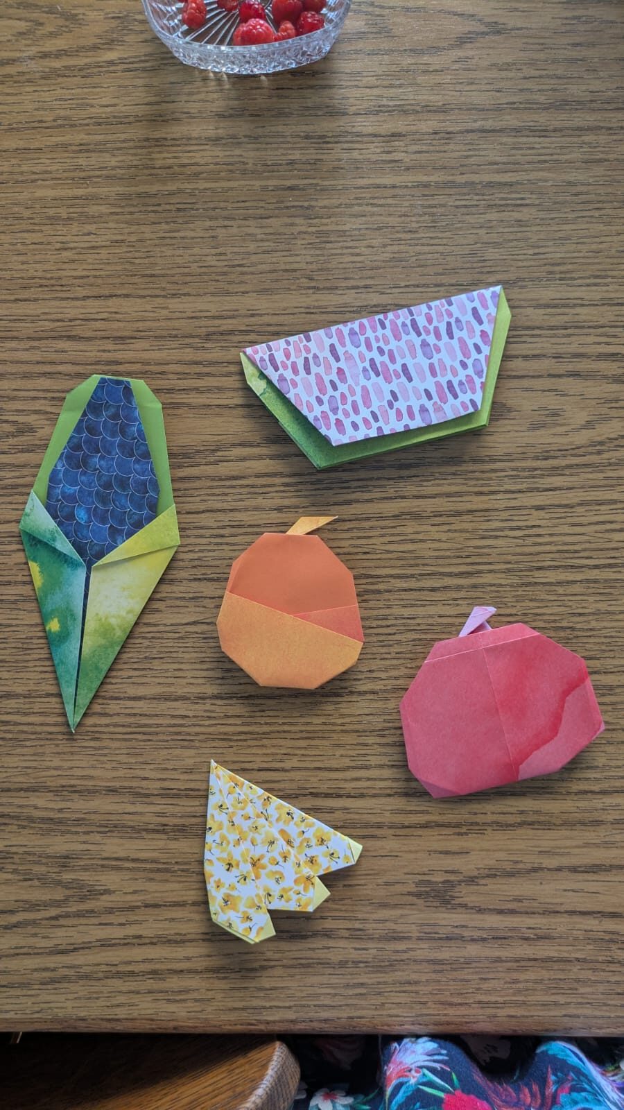
Firstly, I focused on doing a few different foods that came to mind and in the end most of them turned out to be fruit. The only different one was again the corn, in this case blue corn, since this type of corn is supposed to refer to Native Americans again (similar to my last post) that faced and are still facing a lot of injustice. I like that the scale pattern of the origami paper that I chose perfectly matches the structure of corn and makes it look even better through this.

Secondly, I did a watermelon, or tried to do one anyways, for this project it was much harder to find the right paper, since I didn’t have the right pinkish colour in my repertoire, so I chose a more purple one that at least had the structure of some of the kernels. Again, as already mentioned a few times the watermelon stands for Palestine.

Thirdly, I decided to do an orange, again as a symbol for Palestine, because I remembered that there is a book called “Oranges from Jaffa”, which discusses the issues that Palestine had and still has with Israel.

Fourthly, I made something that is difficult to distinguish, it should be three plantains, but they look more like bananas, if one can even identify them. I think those are more difficult to put to a certain country or culture, since many African countries and cultures use them a lot and identify with them. I only really have experiences with Ghanaian culture, so, therefore, I would attribute it to them, at least for the moment. I’m always also happy to change my mind and learn something new and better about them.

Fifthly, my mom made an apple. I actually wanted a pomegranate, but apparently there are not really any patterns that are not 3D. The pomegranate would’ve stood for Iran, but I didn’t manage to make one in the end. I don’t know if the apple can work as a symbol for a certain culture, since many cultures cultivated the apple, so at the moment I don’t have an answer for that. In the following picture you can see how it went. I forgot to take process pictures, so I can just show you my final result.

Design Activism Sun Printing

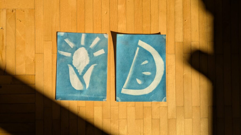
Last time, I did an experiment with ironing beads or ‘Bügelperlen/Steckperlen’, this brought me right back to my childhood. But since I have been doing many things for my Print Production submission, I thought that trying out a printing technique would nicely fit my experiments, since I’m trying to do more different analogue work. I decided on doing sun printing, because this was shown as a technique that is also a fun experiment for children, so I thought if they can do it then surely I can do it too. Since I had never done this technique before I thought that I would do it in a fairly simple way, but of course for future experiments I might be able to try out a few more complex things in this direction.

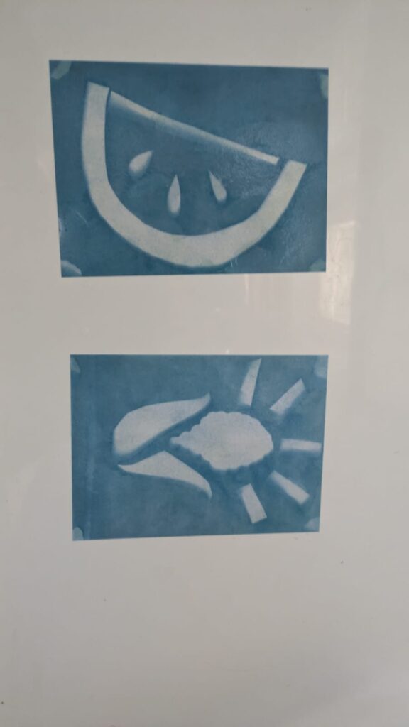
So, without further ado, I will explain how sun printing works, what the challenges were and show you how my own process went. Basically the kind of sun printing that I chose (there are several different types and options to choose from) is cyanotype. However, as I already mentioned, I did the simple version of it and just bought some pieces of paper that were already chemically treated. I had to take the piece of paper out of its light-proof packaging, there is one side that is slightly blue, this is the side that you’re supposed to work with, since this is the side with the chemicals. Then you take some bits and pieces, it can be natural materials like plants or any other material that you can think of. The important thing is to tape the pieces in place so they don’t move too much, when you put the piece of paper outside. Then you leave it there for a while around 30 mins, you take all of the pieces off and wash the paper. The colour turns into a darker blue and the part where the pieces were turns into a negative image due to the UV-rays. Then the paper dries and you have your final print.

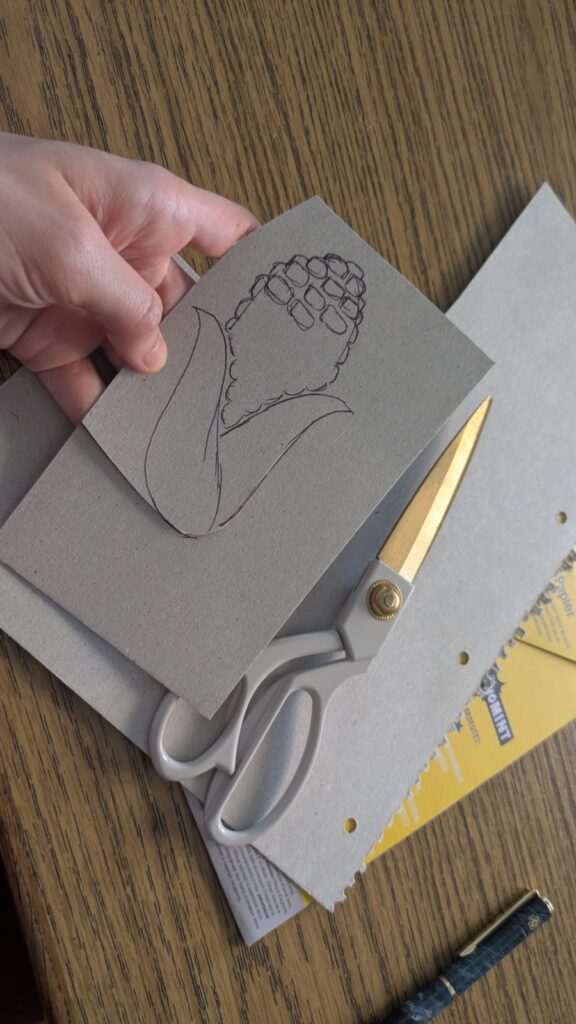
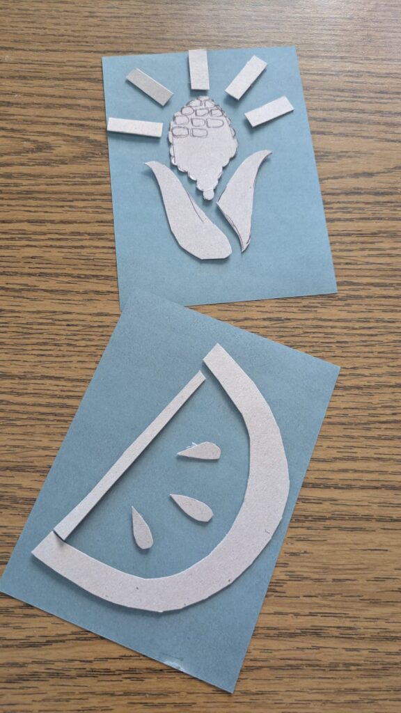
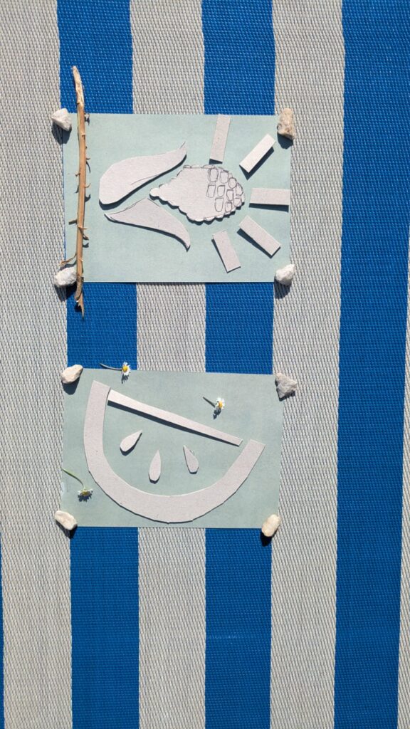
This was a very fun process for me and I also learned a few things on what to really do ideally. I chose to just work with cutting out pieces from a piece of cardboard and then stick it to the paper with tape. When I put it outside I decided to put some stones in the corners of the paper, even though it would show up on the print, because otherwise my project would have been blown away by the wind. Then I decided to spontaneously try out putting some small natural materials on top, like a stick and some daisies, for instance. However, I was too lazy to also tape them to the paper, therefore they moved and they don’t really show up on my print, even though, some of them were still on the paper in the end. It was a nice process, I will definitely do it again and try out some more things. I again decided to stick with the topic of food as a political symbol for certain cultures. This time I chose some corn as a symbol for native americans that were and still are brutally driven out of their own lands and I chose the watermelon as a symbol for palestine again.

Death: The character design…wait what?

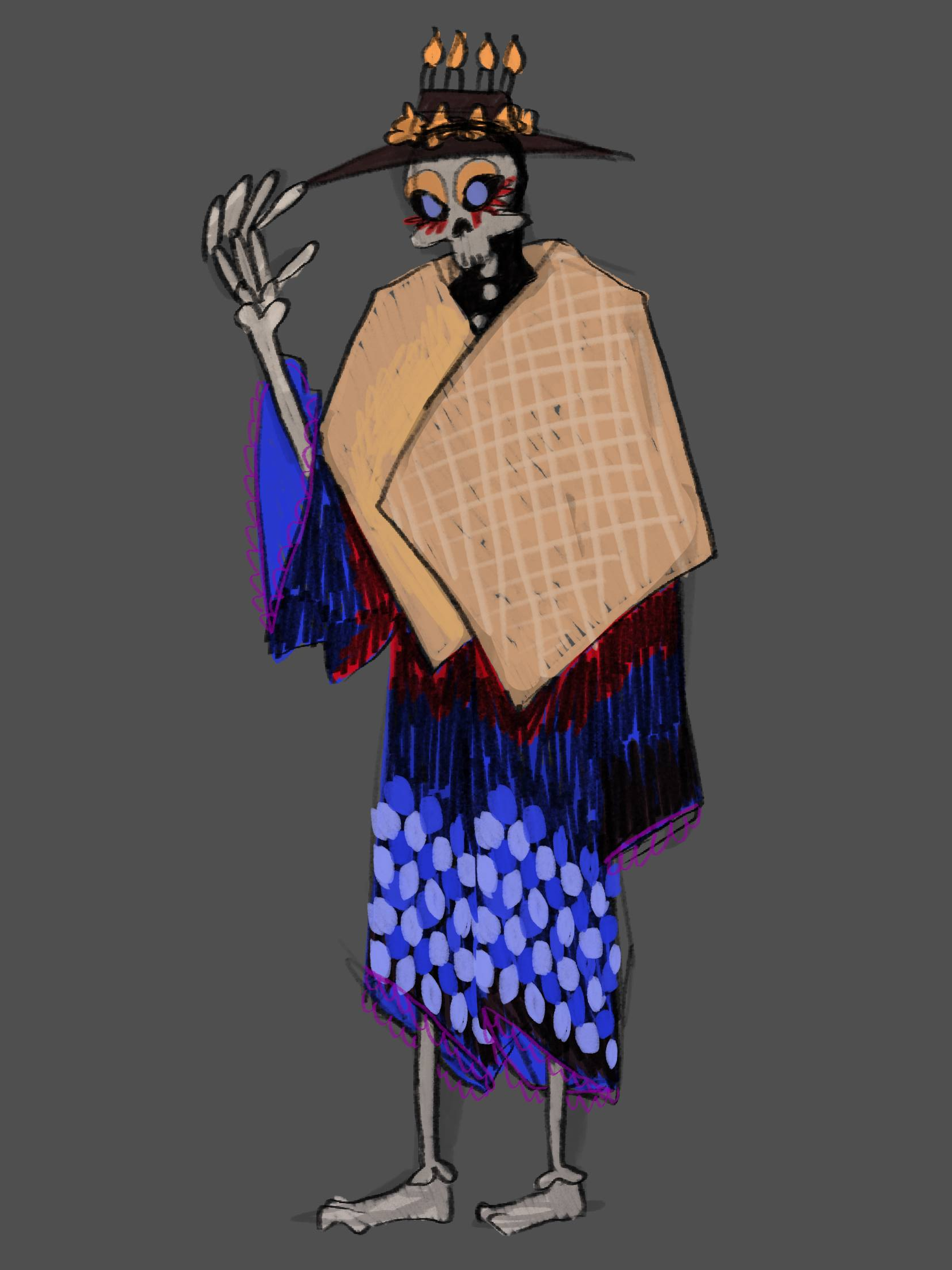
So…this chaper has been a struggle start to end. I need a character design to model it in 3D. But I can’t affort to put all the time to create a perfect design. So I want to be okay with a “mediocre” design, but I don’t want to be insensitive to different culture and fall into bad stereotypes. The first design I did was exactly that thogh.

The beige cloth represents Famadihana. It’s the plain cotton cloth the corpse gets wrapped in.

The skeleton and shape of the clothes are from the grim reaper. However the make-up and colors are inspired by Día de los Muertos and Día de los Difuntos.

The hat is also inspired by Día de los Muertos and All Saints day, as it has Cempasúchil (marigold) and candles on it.

I got input from Elizabeth Treviño as a “representative” for Día de los Muertos (thanks again!) and she said that this design feels a bit uncanny, because there is aspects from it but not really. Her feedback was that it would be better that I design a character for each culture and put my own spin to it because the designs are never the same anyway. I’m just worried about the fact, that those things already exist, so why do I even do it. However as for the time constrains I’ll put that thought on ice and design my character for Día de los Muertos (as I have someone from this culture on hand).

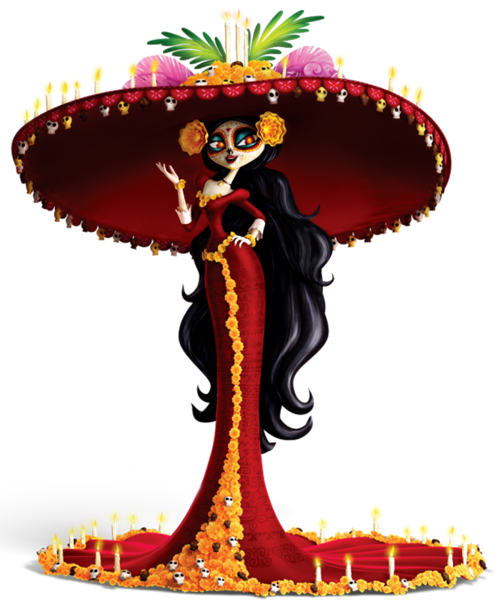
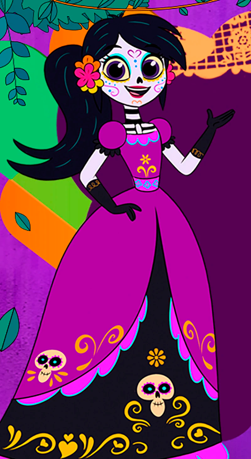
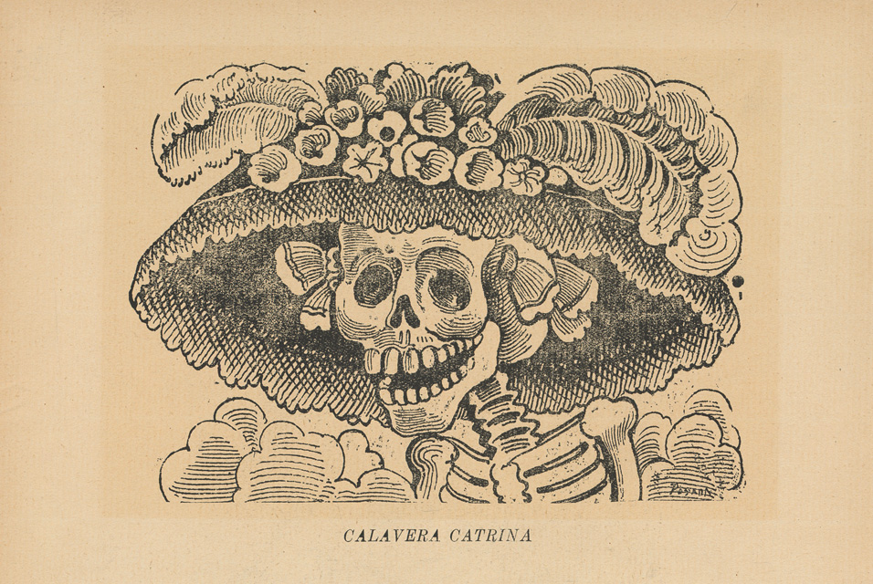
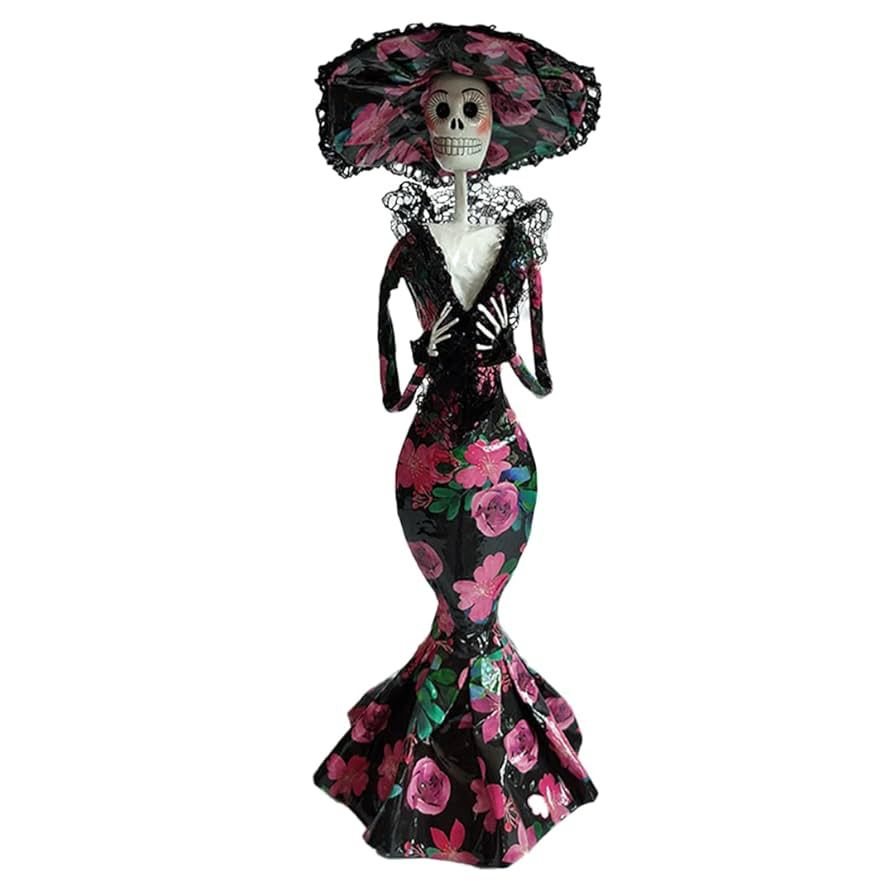
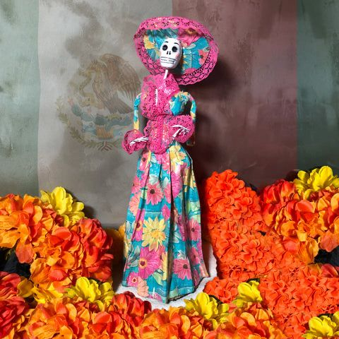
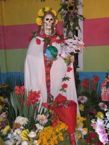
So I looked more into Día de los Muertos and especially La Catrina. Here are some inspo photos I found from other representations.

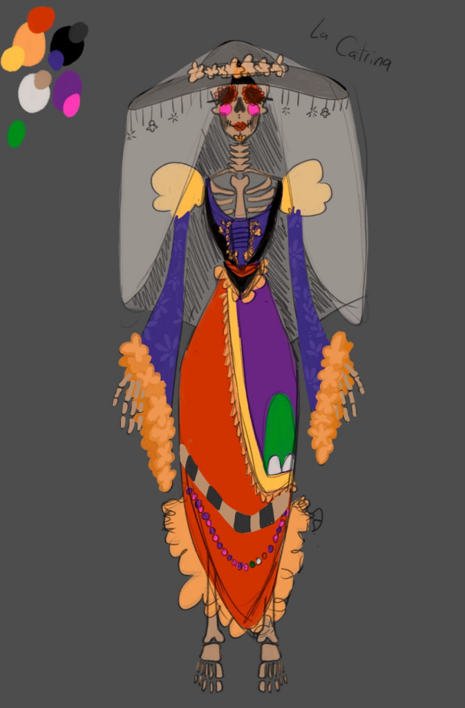
I then came up with this design and sent it to Eli again.

Combined with the questions I asked her she confronted me with the question “Do you even researched Día de los Muertos?”, which made me (embarassingly) realise that I didn’t do that enough.

So here is my (still too little but I ) research on specifically La Catrina.

Día de los Muertos and La Catrina…wait what?

Día de los Muertos has its roots in Pre-Columbian cultures and beliefs. Before the Spanish arrived in what is today Mexico, the Aztec gave offerings to their deceased ancestors as part of their death rituals. After the Spanish came, the celebration morphed to incorporate Catholic beliefs and practices, creating this deeply religious, syncretic tradition. The tradition has been largely associated with the Mexican working class, but the country’s middle class has rediscovered it in recent years for two major reasons: The celebration’s appearance in pop culture, and it’s popularity in the U.S.”

Dobrin, I. (2017, November 2). Día de los Muertos comes to life across the mexican diaspora. NPR. https://www.npr.org/2017/11/02/561527322/mexicos-celebrated-d-a-de-los-muertos-evolves-in-the-u-s

“Santa Muerte is generally portrayed as a skeleton wearing a Fanciscan monk’s cape, in a standing posture, or sometimes seated at a throne, with a scythe in her right hand and the earth or the scale in her left. She can also carry a candle, a book, or a spade, and is often accompanied by an owl, by seeds, and by coins. Variations to her outfit include a Virgin Mary-like robe and veil, a girl’s first communion dress, or bride’s gown, an “Aztec” Santa Muerte, and a seven- colored one, among others, depending on the occasion and petition. On some images, her scythe is portrayed in the form of a human spine. Offerings to Santa Muerte include veladoras (votive candles), statuettes, flowers, incense, fruits, sweets, smoking cigars and cigarettes, as well as alcohol. he colors are red for love, passion, and relationships, white–for purification, black—for and against black magic, the elimination of negativity and total protection, violet—for health and transmutation, gold or yellow—for money and prosperity, blue—for spiritual concentration and studies, and green—for legal problems and justice.”

Oleszkiewicz-Peralba, M. (2013). Representations of Death in Mexico: La Santa Muerte. The University of Houston Libraries, 1(1). https://uh-ir.tdl.org/handle/10657/3007

“Included in these fall festivals are two familiar faces whose skeletal visages afford them special attention during the season, despite the fact that neither one is historically connected to these holidays. Santa Muerte is a Mexican folk saint who personifies death in the form of a female skeleton. Whether as a gold medallion, or statuette, or votive candle she is typically depicted as a Grim Reapress, wielding the same scythe and wearing a shroud similar to that of the Grim Reaper, her male forebear. Unlike canonized Catholics, folk saints are believed to be spirits of deceased Latin American women and men considered holy for their miracle working powers. What really distinguishes the White Girl (another popular sobriquet), however, from other regional folk saints is that for most devotees she is the personification of death itself and not of a real woman that lived and died on Mexican soil. La Catrina, the Skeleton Dame, is often confused by the unfamiliar with the Skeleton Saint, Santa Muerte, but they are very different figures. While the former issued from a satirical drawing, the latter is a figure of spiritual reverence. La Catrina originated in 1910, from the pen of José Guadalupe Posada who is considered the father of Mexican print-making. La Catrina was one of thousands of sketches of skeletons garbed in European finery that derided the vanity and opulent lifestyles of the upper classes whose extravagances were at the expense of the suffering lower classes. The message Posada was conveying was that no matter one’s wealth or status, no one escapes death and indeed the phrase “todos somos calaveras” (we are all skeletons) is often attributed to the illustrator. In this manner, la Catrina resembles Santa Muerte in that she serves as a reminder of the inevitability of death, however beyond this there are no further similarities apart from that both are female skeletons.”

Chesnut, A. (2021, October). Representations of Death in Mexico: La Santa MuerteMeet the Mexican Death Trinity – Day of the Dead, Catrina Calavera and Santa Muerte [Online forum post]. The Global Catholic Review. Retrieved June 27, 2026, from https://www.patheos.com/blogs/theglobalcatholicreview/2021/10/meet-the-mexican-death-trinity-day-of-the-dead-catrina-calavera-and-santa-muerte/

My learnings

I learned that Santa Muerte…exists and is more the character I’d like to design. So in my next blog post I will design Santa Muerte, not La Catrina or any mixture of characters. I found lots of input about what colors to use and how it should look like in general.

I hope the fact that I was so unknowledgable at first and haven’t offended anyone. If I did or got anything wrong – please do contact me.