Final thoughts and next steps | R&D 2 | Blog 8

Overall I must say, it was quite a journey. Navigating my way through the various errors and setbacks I faced was truly soul crushing at times. I often didn’t know how to proceed and felt completely frozen and helpless. However, I always received assistance from my mentor, Mr. Sontacchi, who motivated me to push through till the end. He has guided me through many obstacles I faced and helped me re-establish interest in the project when I thought I couldn’t make it happen. I would like to personally thank him for all the effort he has put in and the support he’s given me throughout this semester.

One thing I wish I had was more time to focus specifically on this project. There were various scenarios where I was caught between multiple deadlines, which restricted me from focusing on what I wanted to achieve. It was frustrating as I wanted to progress and move forward with the work but was held back due to the workload from the other courses. Balancing the time for this research project alongside the other project felt difficult. I felt this project could have been even more expansive if I had more time to contribute to it. 

One of the things that I had to change was the model of the waveform for the visualizer. I initially intended to work on a 3D waveform, with more particle clouds and points, but it turned out to be more complicated than I had initially expected. Through my mentor’s guidance, I built the existing model, which varies in pitch based on its position on the y-axis. I really like the current model, but would like to rework it and build an alternative for the final installation. 

Additionally, I wish to integrate the pitch to colour mapping in some form. I am planning to map harmonics and timbre to the properties of the newly designed visualizer. I also need to implement a surround sound system for the audio response to recreate an immersive environment, as well as offer additional control parameters such as playback loudness, directional panning and wet/dry mix of the output. There is a lot of testing that needs to be done to ensure we don’t suffer from latency issues.

In the end I am happy with the output and super glad to have a functioning prototype to present. That being said, I still believe there is a lot of work to be done in the upcoming semester for me to completely realize the installation that I had envisioned. I am looking forward to continuing work on this research project.


✿4 Design Research 2 – Prototyping

Since my last update, I’ve been trying to pay more attention to how older adults actually use their phones. One thing that I found interesting was that many of them were actually very comfortable using WhatsApp. They understood what was happening, could explain different functions and generally navigated the app without too many problems.

While observing these interactions, I started thinking about whether some of the actions older adults struggle with could be simplified. Instead of trying to redesign entire interfaces, what if I could take specific tasks or frequently used functions and break them down into a much simpler interaction?

This led me to explore more tangible interactions, specifically NFC technology. Most smartphones already support NFC and I got some inspiration by some already existing products like the ENA Care, which use physical objects to trigger digital actions. The idea of replacing complex digital interactions with simple physical actions seemed actually interesting.

It actually took me some time to figure out what I wanted to focus on more. To get there, I started experimenting and creating some small prototypes.

My first step was to try out an NFC-based tangible interaction system myself. Luckily, I already had some NFC tags and cards lying around at home.. Before getting started, I did some research and found that there are already many tutorials explaining how to set up NFC routines on smartphones. One resource I found particularly helpful was: https://www.wakdev.com/en/apps/nfc-tools-android.html

Setting everything up was actually much easier than I expected because most smartphones already support reading and writing NFC tags. Using some old NFC cards I had at home, I created my first simple prototype based on existing NFC automation. This initial experiment helped me understand possible ways of interaction for digital tasks for older adults.

Prototyping

The first thing I had to figure out was which tools I could use for working with NFC tags. After some research, I decided to use NFC Tools by Wakdev writing the tags. Additionally, I had to install another app called NFC Tasks, also by Wakdev, to create automated actions.

However, while setting everything up, I already started thinking about older and less experienced users. Even though the process was easy for me, I don’t think many older adults would be able to configure such a system on their own. This made me think that there might be a need for an all-in-one application that simplifies the setup and guides users through it.

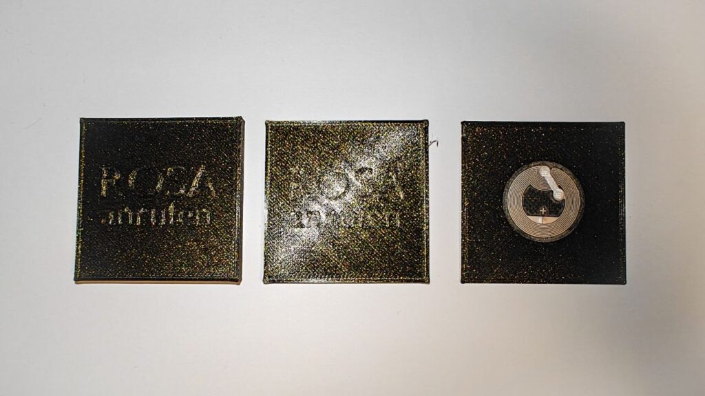
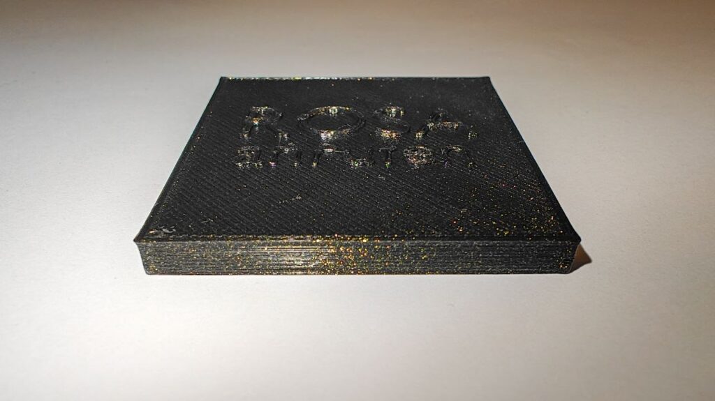
After getting the technical side working, I started experimenting with the interaciton. Since the NFC tags I had at home were just small stickers, I wanted to create a more tangible and easier way to interact with them. In my case I thought of basically two ways of using NFC: either bringing the NFC tag to the phone or bringing the phone to the NFC object. To try this, I designed and 3D printed several different variants that I would like to test further.

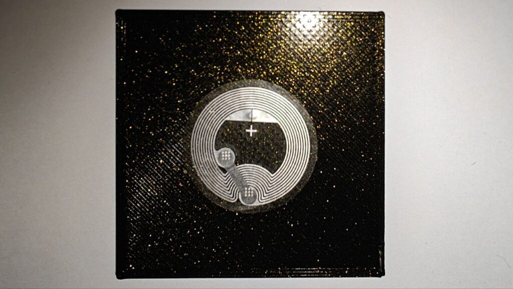
While prototyping, I ran into a few problems. One thing I noticed was that the distance between the NFC tag and the smartphone can’t be very large, meaning the tag has to be placed almost directly on the surface of the object. The more I thought about it, the more I realized that small physical objects might not be ideal for older adults. They can be difficult to pick up, especially for elderly people and they also need to be stored somewhere. On top of that, they could easily get lost.

First draft of the NFC Object

While experimenting with these prototypes, I came up with an idea: creating a physical phone book based on NFC interactions. Instead of navigating through contacts and menus, users could simply hold their phone to a physical card or object and immediately call them. In addition, this phonebook could also contain other tasks.

D&R2 05 – Experimenting With Neuroadaptive Interfaces

After the UX Graz talk, I was left with a useful tension. The research had developed into a broad field of connected questions, but the next step needed to be more concrete. My professor encouraged me to experiment rather than force the work into a final thesis topic too early. This semester is a chance to build something, test one direction and learn from what does not work.

What I want to experiment with is neuroadaptive interaction.

This does not mean that neuroadaptive interfaces have become my final thesis direction. Adaptive interaction design is still the larger area I am exploring. My interests include interruption, recovery, cognitive workload and the changing relationship between people and increasingly proactive systems. Neuroadaptive interaction gives me one way to bring these interests together in a form that can be experienced rather than only described.

I have been especially drawn to experimental HCI research from the 1990s and early 2000s. Before current discussions about AI agents and intelligent assistants, researchers were already asking how systems might respond to changing human capacity. Work on mixed-initiative interfaces, adaptive automation and physiological computing treated interaction as a continuing feedback loop. The system observed something about the user or task, adjusted its behaviour and then observed the consequences.

Pope, Bogart and Bartolome’s (1995) biocybernetic research is a good example. Their system used an EEG-derived engagement index to change the balance between manual and automated work in a flight-deck task. The experiment belongs to a specialised context and its measurements should not be treated as a direct model for everyday interfaces. Still, the interaction question remains valuable. If a system changes its level of support according to an estimate of the user, how should that change be communicated and how can the user remain in control?

Horvitz’s (1999) work on mixed-initiative interfaces approaches a similar problem without making physiological sensing the centre. A system may be able to suggest an action or offer help, but that does not mean every moment is suitable for intervention. It has to decide when to act, when to ask and when to remain quiet. These choices distribute initiative between the person and the system.

The historical work interests me because it is experimental in a direct way. It does not only propose that interfaces could become more responsive. It constructs situations where the relationship between user state, task demand and system behaviour can be observed. This is the kind of step I want to take now.

The experiment is not about proving that a computer can read somebody’s mind. Neuroadaptive systems work with indicators and inferences. EEG, gaze, behaviour and task performance can suggest that something may be changing, but they do not provide uncomplicated access to attention or mental workload. Fairclough (2009) describes a biocybernetic loop as a process of sensing, inference, adaptation and feedback. The inference stage is where uncertainty enters. One physiological change can have several possible causes, and the same cognitive state can appear differently across people.

Treacy Solovey et al. (2015) make the design gap explicit when they write that “the interaction techniques and design decisions for their effective use are not well defined” (p. 1). Their work suggests that physiological signals may be more appropriate as implicit context than as direct commands. Adaptations should be modest, confidence should matter and changes should remain reversible.

This shifts my attention from the accuracy of a single sensor toward the behaviour of the interface. What should a system do when it estimates that workload may be rising? Should it reduce information, delay a low-priority interruption or increase automation? How much should it explain? What should happen when its estimate is wrong?

To examine these questions, I need a setting where task demand and adaptation can both become visible. A simple interface would not create enough pressure to make the experiment meaningful. If a person is only watching one value or completing one predictable action, there is little reason for the system to adapt. The context needs several competing demands without becoming impossible to understand.

This is why I became interested in complex interfaces as an experimental environment. Control rooms, monitoring systems and operational dashboards require people to maintain awareness across several sources of information. Some events are urgent while others can wait. The interface may need to guide attention without hiding information or taking control away from the operator.

Complex interfaces also make cognitive load a design issue rather than an abstract score. Information density, competing priorities and time pressure can all affect what the user is able to process. An adaptive system could respond by foregrounding the most relevant event, reducing noncritical detail or temporarily taking over a routine action. Each of these adaptations can help, but each can also create new problems. Removing information may reduce visual load while weakening situation awareness. More automation may lower immediate demand while making it harder for the user to understand what the system has done.

The experiment therefore needs to be about control negotiation, not automatic optimisation. The user should be able to inspect why the system changed, reject the change or disable adaptation. An uncertain estimate should never give the system unquestionable authority. If the prototype adapts, it should do so in a way that keeps its reasoning and limitations visible.

Interruption and recovery remain part of this experiment. In a complex interface, the system has to decide whether a new event deserves immediate attention. Adamczyk and Bailey (2004) showed that interruption timing affects performance and emotional response. Chen et al. (2025) demonstrate that recovery cues can support users after an interruption by directing them toward previous or upcoming task information. These findings suggest several interactions that can be tested without pretending to solve cognitive workload as a whole.

The first version can begin with simulated signals. This allows me to test what the interface does before depending on hardware. Later, a Tobii eye tracker and a Muse headset may provide live inputs, but they should not define the project. A real sensor cannot rescue an adaptation that is confusing, intrusive or impossible to challenge.

For a concrete implementation, I am using a drone-triage scenario. The user monitors several semi-autonomous drones while managing interruptions and changing priorities. This setting provides a complex interface where workload, timing, assistance and recovery can be represented clearly. The system can defer a lower-priority alert, foreground a risk or provide a cue after the operator returns to the main task.

The drone scenario is not the research decision. It is a practical container for the experiment. Another operational context might eventually work better. What matters is that the interface gives me a way to test neuroadaptive behaviour under visible task pressure while preserving explanation and human override.The aim is to make one part of the research concrete enough to question, observe and revise.

References

Adamczyk, P. D., & Bailey, B. P. (2004). If not now, when?: The effects of interruption at different moments within task execution. In Proceedings of the SIGCHI Conference on Human Factors in Computing Systems (pp. 271-278). ACM. https://doi.org/10.1145/985692.985727

Chen, Y., Zhang, C., Fang, W., & Ma, J. (2025). The effects of cues on task interruption recovery in a concurrent multitasking environment. Scientific Reports, 15, 25992. https://doi.org/10.1038/s41598-025-09358-4

Fairclough, S. H. (2009). Fundamentals of physiological computing. Interacting with Computers, 21(1-2), 133-145. https://doi.org/10.1016/j.intcom.2008.10.011

Horvitz, E. (1999). Principles of mixed-initiative user interfaces. In Proceedings of the SIGCHI Conference on Human Factors in Computing Systems (pp. 159-166). ACM. https://doi.org/10.1145/302979.303030

Pope, A. T., Bogart, E. H., & Bartolome, D. S. (1995). Biocybernetic system evaluates indices of operator engagement in automated task. Biological Psychology, 40(1-2), 187-195. https://doi.org/10.1016/0301-0511(95)05116-3

Treacy Solovey, E., Afergan, D., Peck, E. M., Hincks, S. W., & Jacob, R. J. K. (2015). Designing implicit interfaces for physiological computing: Guidelines and lessons learned using fNIRS. ACM Transactions on Computer-Human Interaction, 21(6), Article 35, 1-27. https://doi.org/10.1145/2687926
SS26_#07_What I Learned as an Interviewer

To the survey: https://docs.google.com/forms/d/e/1FAIpQLSfujaTdkiyrwagGO4Cv_JjGQ_IIWt9v4tO54aVBSiF7J6a_pw/viewform?usp=header

Conducting my first interview was a valuable experience. Not only because of the participant’s answers, but also because it taught me a lot about my own interviewing skills.

Before the interview, I was mainly focused on asking the right questions. I prepared an interview guide and thought about the order of the questions, but I quickly realised that asking questions is only one part of the process. Listening carefully is just as important.

One challenge I faced during the interview was taking notes while also paying full attention to the participant. Sometimes I found myself looking down to write something instead of maintaining eye contact or thinking about a good follow-up question. Although I still managed to collect all the important information, I noticed that my attention was divided.

Despite this challenge, I felt that the atmosphere during the interview was very relaxed. The participant seemed comfortable and answered all questions openly. I think creating a friendly and comfortable environment made it easier for them to share their thoughts honestly. This was also reflected in the observation sheet completed by another student, who described the interview as friendly, respectful and professional. The observer also noted that the participant appeared comfortable throughout the conversation.

Another thing I learned was how valuable follow-up questions can be. Some of the most interesting answers were not the direct responses to my prepared questions but came from asking participants to explain their thoughts in more detail. This helped me understand not only what they think but also why they think that way.

Looking back, there are also a few things I would improve next time. Instead of writing detailed notes during the interview, I would like to record the conversation first, with the participant’s permission, and transcribe it afterwards. This would allow me to focus completely on the conversation, maintain better eye contact and react more naturally to what the participant is saying. It would also reduce the risk of missing interesting details while writing.

Overall, I learned that conducting an interview is a skill that improves with practice. Preparing good questions is important, but creating a comfortable atmosphere and actively listening are just as essential. This interview was a great learning experience for me and gave me more confidence for future qualitative research. I am looking forward to using these experiences in the next interviews I conduct.

SS26_#06_My First Interview

To the survey: https://docs.google.com/forms/d/e/1FAIpQLSfujaTdkiyrwagGO4Cv_JjGQ_IIWt9v4tO54aVBSiF7J6a_pw/viewform?usp=header

After spending a lot of time designing my survey, I wanted to include another research method in my project: an interview. While the survey focuses on collecting data from many people, the interview gave me the opportunity to explore one person’s thoughts in much more detail.

Before the interview, I prepared a list of open questions. I wanted to understand how the participant thinks about AI-generated images, whether they trust images online and which clues they use to decide if an image is authentic.

The participant told me that they use AI quite often and spend a lot of time online. Because of this, they felt quite confident in recognising AI-generated images. At the same time, they also said that it is becoming more and more difficult to tell real and AI-generated images apart. I found this interesting because even someone with a lot of experience with AI feels uncertain sometimes.

Another topic we discussed was what people actually look for when judging an image. The participant explained that they usually pay attention to unrealistic content, strange details or common AI mistakes such as unusual hands or facial features. They also mentioned that images with very “perfect” skies or unrealistic scenes immediately make them suspicious. These answers were similar to what I had already read in some of the literature, which made me feel that my research is moving in the right direction.

One answer surprised me the most. When I asked how much they trust images online, the participant explained that they are generally careful. Not only because of AI, but also because authentic images are often taken out of context or edited to support a certain story. This reminded me that image authenticity is about much more than AI. The context in which an image is shared also plays an important role.

We also talked about the importance of the source. The participant said that trustworthy sources can increase confidence, but they still prefer to verify information instead of believing it immediately. I think this is an interesting point because it shows that people do not only judge the image itself but also where it comes from.

Overall, I really enjoyed conducting this interview. It helped me look beyond simple survey answers and better understand the thoughts behind people’s decisions. Even though it was only one interview, it gave me useful ideas that I can keep in mind when analysing my survey results later. I am curious to see whether other participants think in a similar way or whether completely different patterns will appear.

SS26_#05_Choosing the Right Images

To the survey: https://docs.google.com/forms/d/e/1FAIpQLSfujaTdkiyrwagGO4Cv_JjGQ_IIWt9v4tO54aVBSiF7J6a_pw/viewform?usp=header

After finishing the questionnaire, I thought the hardest part was behind me. I was wrong. The next step, choosing the images for the survey, turned out to be just as challenging.

At first, I simply started collecting images that I thought would fit my study. But after a while, I realised that this approach would not work. Every image I included could influence the results, so I needed to think much more carefully about my selection.

*Klick here* (!!Only open this if you have already completed the survey or do not intend to take it!!)

My survey is not only about telling real and fake images apart. I want to know whether people can distinguish between authentic photographs, AI-edited photographs and fully AI-generated images. Because of this, I wanted all three categories to be represented equally. In the end, I decided to include eight images from each category, resulting in a total of 24 images.

I also wanted to avoid focusing on only one type of subject. If all images showed people, the results might only tell me how well participants recognise AI-generated faces. To get a broader picture, I chose images from different categories, including people, animals, landscapes and everyday scenes. This will hopefully help me see whether some types of images are easier to judge than others.

One category was especially important to me: AI-edited photographs.

Many studies and online discussions focus on images that have been created completely by AI. However, I think AI-edited images are just as interesting, if not even more interesting. In many cases, these images look almost identical to a real photograph because only a small part of the image has been changed. An object might have been added, removed or replaced, while everything else remains authentic. These small changes are often much harder to notice than a completely AI-generated image.

Besides the individual images, I also added a second part to my survey. In this section, participants compare two very similar images. One image is authentic, while the other has been edited using AI. Instead of deciding between four answer options, they simply have to choose which image they believe is the real one.

I included this second task because I am curious whether people perform differently when they can directly compare two images. Maybe small AI edits become easier to recognise when there is an authentic version right next to them, or maybe they are still difficult to spot. I am looking forward to finding out.

One final challenge was the survey platform itself. Google Forms reduces the image quality slightly, so very small details are not always visible. Because of this, I avoided choosing images where the answer depends on tiny artefacts or imperfections. Instead, I selected images that can still be judged even at a lower resolution.

Looking back, choosing the images took much longer than I expected, but it also made me think more deeply about my research question. Every image is now part of my experiment and plays an important role in helping me understand how people perceive authenticity in a world where AI-generated content is becoming more and more common.

SS26_#04_Inside My Questionnaire

To the survey: https://docs.google.com/forms/d/e/1FAIpQLSfujaTdkiyrwagGO4Cv_JjGQ_IIWt9v4tO54aVBSiF7J6a_pw/viewform?usp=header

In my last blog post, I wrote about the process of designing my survey and how a small pre-test helped me improve the instructions. After making these changes, I finally felt ready to share the questionnaire with participants.

The survey starts with a short introduction. I explain the purpose of my research and introduce the three image categories that participants will see during the study: authentic photographs, AI-edited photographs and fully AI-generated images. Since the pre-test showed that the term AI-edited could be misunderstood, I also explain that normal photo editing, such as changing the brightness or colours of an image, is not considered AI editing in my study. Only changes to the actual content of an image count as AI editing.

Before participants start looking at the images, I ask them three short questions.

The first question asks for their age group. Since I want people of different ages to take part in my survey, this information will help me compare the results later. I am curious to see whether younger participants, who may have grown up with AI tools and social media, perform differently from older participants.

The second question asks how familiar participants are with AI-generated images. Today, many people have already seen AI-generated content online, but others may have very little experience with it. I think this could have an influence on how people judge the images in my study.

The third question is one of my favourites because it asks participants to rate themselves before the experiment even begins. I ask them how well they think they can recognise AI-generated or AI-edited images. Later, I can compare their self-assessment with their actual results. It will be interesting to see if people who feel confident are really better at recognising AI images, or if confidence and performance are not always connected.

After these introductory questions, the main part of the survey begins.

Participants see one image at a time and answer the same two questions for every image.

First, they decide how they think the image was created. They can choose between an authentic photograph, an AI-edited photograph, a fully AI-generated image or Not sure.

After that, they rate how confident they are in their decision on a scale from one to five.

I decided to include the Not sure option because I did not want to force participants to guess if they were genuinely unsure. I also think that the confidence rating adds another interesting layer to the results. Someone might choose the correct answer but still feel very uncertain, while someone else could confidently choose the wrong category. Looking at both the answers and the confidence ratings might reveal interesting patterns later.

While the survey itself is quite simple, every question has a purpose. My goal was to create a questionnaire that is easy to complete but still provides enough information to answer my research question.

In my next blog post, I will explain how I selected the images for the survey and why this turned out to be one of the most difficult parts of the whole project.

Design & Research II – 5/6

Design & Research 2 | For: Birgit Bachler

In my last post I mentioned that I created a prototype for an online portal to help with the residence permit process. Recently I brought this concept into class and tested it with my classmates to see what they actually thought.

Putting my wireframes in front of real people was incredibly helpful. Since my prototype was mainly focused on the initial application process from your home country, the overall reaction was very positive. Everyone agreed that just having a clear list of required documents and knowing exactly how the whole process is going to happen takes away so much of the anxiety.

They also gave me some really solid suggestions for improvement. One big request was having clear language options and translation features so students can actually understand the complex legal terms instead of just guessing. Another major piece of feedback from people was to simply reduce the amount of steps in the portal. We discussed how to track serious deadlines and manage supporting documents, plus some other features I will explain during my final video.

DESIGN SHOULD BE APPROPRIATE

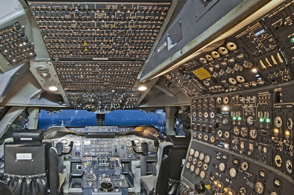
Image source: “Why was Concorde’s cockpit so complex?”, Aviation Stack Exchange (https://aviation.stackexchange.com/questions/16808/why-was-concordes-cockpit-so-complex)

I want to talk more about that feedback regarding reducing the steps. It makes sense because people always say design should be easy to understand, quick, and have fewer steps. But the thing is, something I learned during my bachelors was that design should be appropriate.

Sometimes stuff is actually supposed to be complex and detailed, especially when lives or major life events depend on it. Look at the cockpit of an airplane. It is incredibly complicated and full of buttons, but it has to be that way because flying a plane is a serious, high stakes task. The residence permit journey is similar. It is a major life event. We cannot just delete steps to make it look cleaner if those steps are legally required. The goal is not to hide the complexity, but to make that complexity transparent and manageable for the user.

One thing I want to make clear is that this current prototype is solely focused on the user side. It is designed to help the students and ease their emotional load. But a real working service design cannot just exist in a vacuum. To actually make a system like this work, we would need to keep everyone in the loop. That means eventually understanding the other side of the screen too, like the magistrate, the MA35, and the embassy staff, to see what their constraints actually are.

This whole testing phase opened up so many bigger questions for me to follow up on in the future. As I dig deeper into this, I cannot help but wonder why this problem is even there in the first place. What is actually causing all these massive delays? Is this friction intentional, or is it just a byproduct of a really old and overwhelmed bureaucratic system?

I will definitely take a look into those questions down the road. But for now, my focus is on polishing this user facing prototype based on the feedback and getting my final video ready.

SS26_#03_Designing My Survey

To the survey: https://docs.google.com/forms/d/e/1FAIpQLSfujaTdkiyrwagGO4Cv_JjGQ_IIWt9v4tO54aVBSiF7J6a_pw/viewform?usp=header

Over the past few weeks, I have been working on the survey for my master’s project. At first, I thought creating the questionnaire would be one of the easier parts of my research. I already knew what I wanted to investigate, so I assumed I only had to write a few questions and choose some images. However, I quickly realised that designing a good survey is much more complicated than it seems.

My research is about whether people can tell the difference between authentic photographs, AI-edited photographs and fully AI-generated images. Because of this, I wanted the survey to be easy to understand while still collecting useful data. Every participant should understand the questions in the same way, otherwise the results could become misleading.

I decided to create an online survey because it allows many different people to participate. Everyone sees the same images and answers the same questions, which makes it easier to compare the results later. I also wanted the survey to feel similar to how people normally look at images online. Usually, we don’t spend several minutes analysing a picture, we scroll through social media, see an image for a few seconds and immediately decide whether we think it looks real or not. That is why I ask participants to trust their first impression instead of thinking too long about every image.

One challenge appeared while I was writing the introduction. I had to explain the difference between authentic and AI-edited images. At first, I thought my explanation was clear enough, but before sharing the survey publicly, I asked three people to test it for me.

The purpose of this small pre-test was not to collect data. Instead, I wanted to find out if there were any questions that were confusing or difficult to understand. This turned out to be a very good decision.

The three participants gave me valuable feedback. One thing became clear very quickly: the term AI-edited was not as obvious as I had expected. Some people thought that every edited photograph should be classified as AI-edited, even if it had only been adjusted using brightness, contrast or colour correction.

Because of this feedback, I changed the introduction of my survey. I now explain more clearly that normal photo editing does not count as AI editing. Small adjustments like brightness, contrast, saturation, sharpness or colour grading are very common in photography and do not change the content of an image. In my study, an image is only considered AI-edited when artificial intelligence has been used to add, remove, replace or change objects or other elements within the picture.

This small change made me realise how important clear instructions are. Even if a survey is carefully designed, people may still understand questions differently than intended. Testing the questionnaire before starting the actual study helped me identify these problems early and improve the survey.

Looking back, creating the survey was much more than writing questions. It became an important part of my research process and taught me that small details can have a big impact on the quality of the results. In my next blog post, I will introduce the structure of the questionnaire and explain why I chose these specific questions.

*20 Auswertung + Fazit

Jetzt ist der Test durchgeführt und auch der Papa hat alle Fragen im Fragebogen beantwortet. Ich habe während dem Test auch einiges notiert und das haben die Antwort im Fragebogen größtenteils bestätigt, jedoch gab es auch ein paar Dinge die mich überrascht haben. Die Texturenseite mit dem Igel war eindeutig das Element was am meisten Begeisterung ausgelöst hat. Der Bub hat sie am längsten in der Hand gehalten, ist mehrfach über die verschiedenen Texture gefahren und hat sich die Seite am Ende des Test nochmals genommen. Der Papa hat im Fragebogen ebenso bestätigt, dass dieses Element, seinem Sohn am meisten begeistert hat. Dieses Ergebnis habe ich nicht erwartet, da ich dachte, dass dieses Element nicht mehr ansprechend für die Altersgruppe ist. Das hat mich persönlich am meisten überrascht. 

Der Papa hat ebenfalls angegeben, dass sein Kind zu keinem Zeitpunkt überfordert wirkte. Ich hatte beim dritten Element, der Entscheidungsseite, den Eindruck, dass der Bub nicht wirklich wusste, was er mit der Seite jetzt machen soll. Erst habe ich gedacht er wäre etwas überfordert aber genau da ist der Blickwinkel von Eltern besonders wertvoll, da die ihre Kinder kennen und besser abschätzen können wie ihr Kind darauf reagiert. Der Papa meinte dann, es wirkte so als hätte sein Sohn in diesem Moment einfach auf was anderes gehofft. Die Entscheidungsseite hat der Papa im Fragebogen auch nur mit 2 von 5 Sternen bewertet also eher unbeliebt. Das deckt sich aber auch mit meiner Beobachtung, denn der Bub hat mit dieser Seite am wenigsten interagiert. Ich denke, dass das Konzept in dieser Altersgruppe noch einen zusätzlichen Anker braucht, irgendwas Physisches, das die Entscheidung greifbarerer macht. Eine reine Illustration mit einer Frage reicht hier nicht aus um Interaktion auszulösen. Im Nachhinein habe ich auch das Gefühl, dass diese Seite sehr schwer gestaltet war beziehungsweise bei Entscheidungsfragen mehr Kontext da sein sollte.  

Nach dem Test hat der Bub auch gesagt, dass der Igel lustig war. Kein großes Designfeedback einfach eine ehrliche Antwort wie er es empfunden hat. Daraus kann ich schließen, dass das Element Emotionen ausgelöst hat. Der Papa hat am Ende des Fragebogens noch einen Wunsch geäußert, denn er meinte, dass mehr interaktive Elemente für die Altersgruppe passender wären, also zum Beispiel nicht nur eine Klappkarte sonder drei, vier. Das ist ein Hinweis, dass das Konzept zwar gut ankommt aber definitiv noch verbessert werden muss. Eine Erkenntnis die ich mir für die weitere Entwicklung des Projekts im Hinterkopf behalten werde. 

Durch die Blogeinträge habe ich dieses Semester einiges mitnehmen können, und haben mir auch den Raum gegeben, Dinge auszuprobieren die mir später bei meiner Masterarbeit wirklich helfen können und ich auch so Fehler vermeiden kann. Vor allem die Umfragen und auch das kleine Interview haben mir dabei geholfen mein Thema noch mehr zu konkretisieren und auch ein Verständnis zu bekommen, was wirklich gewünscht wird. In einigen Punkten wurde ich auch bestärkt, dass mein Gedankenzug schon gut passt und ich dort noch weiter arbeiten kann. In anderen Punkten hat mich das Semester auch in eine Richtung gelenkt, die ich gar nicht im Kopf hatte mit den interaktiven Elementen. Auch der Test hat mir wirklich spannende Erkenntnisse gegeben und mich auch sehr überrascht, was dieser Altersgruppe denn eigentlich so gefällt. 

Das Semester hat mir einige Antworteten gegeben aber auch sehr viele weitere Fragen fürs nächste Semester beziehungsweise meine Masterarbeit geliefert, wie „Wie viel interaktive Elemente braucht ein Buch wirklich, damit es fesselnd ist?“, „Wie kann ich Diversität und Inklusion in der Vordergrund bringen ohne es tatsächlich in den Vordergrund zu stellen?“ Oder „wie kann die Geschichte ausschauen“ Da werde ich definitiv noch viel weitere Recherchen und Tests machen können.

Das wars, schönen Sommer! :))