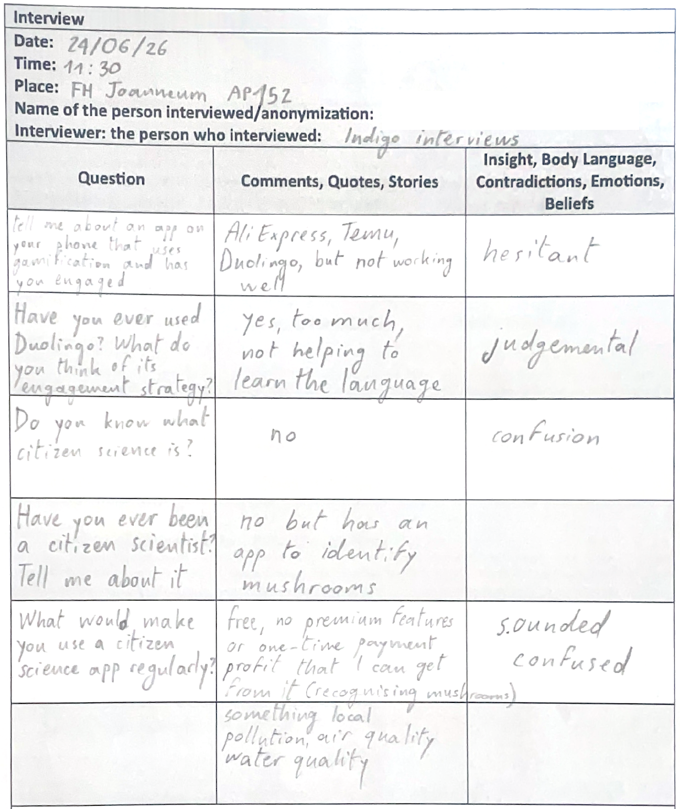
I interviewed one of my colleagues about gamified apps and their feelings about it. I wanted to share the interview and my thoughts because I reckon that it is relevant to my topic.
Notes
Transcript
Thank you for letting me interview you.
What is this about?
It’s about apps, engagement and gamification. Please tell me about an app you have on your phone that uses gamification and has you super engaged.
Let me check. What do I have? I mean, totally Duolingo, like the best example ever and also the features that we were doing for our financial app (App Design course) that was also for engagement and I think you can do any app engaging and funny but honestly like it shouldn’t be a good example.
It’s fine if you tell me about Duolingo.
I think for instance sometimes I use AliExpress and they use this like “oh you want this?” or “try to use this” with coins or something, that always pisses me off when when I open the app and I see like “oh, you want €10? Let’s buy something” or something like this. I never check and it just an example but honestly, I don’t really have any. Like, it is not working.
Is Duolingo working for you?
Yes, I don’t really use it because I think it does not really complete the goal of learning a language. It’s not for this sense of like learning something, you get it? But you don’t really learn so they give me vacation and that helps I guess.
What do you think about Duolingo‘s engagement strategy with the notifications and the passive aggressiveness?
I mean, this is probably why I’m not using it because I’m too tired of this and like I think generally just learning the language in this way it’s not helping. I was always quitting the Duolingo, but I know people who are on it every day and they see these notifications, they set it up. They put a big widget on their menu so they see the streak and like the announcement. I don’t know. I think not inappropriate for that or maybe they’re just bad levels. I think that it could be better too, so you actually go to a level and don’t see a random sentence.
Let’s switch this up a little bit. Do you know what citizen science is?
Citizen science… a person who lives in certain place and I don’t even know what? Maybe it’s some like studies that are local and like you can actually study the community somehow.
I’m gonna explain what it is. So citizen science is a project where normal people just like you, citizens, they can participate in science and become a scientist and they can for example report a plant species they see on their hike and submit it to this application and this data gets forwarded to scientists who can track where this plant is spreading but it can be done with many different things. It usually involves reporting because there’s a lot more citizens than scientists, so it makes sense that the population also helps with science.
Have you ever been a citizen scientist?
I don’t think I have ever had the opportunity.
It’s usually also done on applications, for example I have one. It’s called iNaturalist, where you take photos of plants and animals and identify them and it sends the data.
Why do you say it’s like you’re becoming a scientist?
Not an actual scientist, but contributing to science. You’re just sending data.You take a picture of a mushroom and then you see it on a map.
I didn’t know that, because I also have a mushroom app but I didn’t know that picture is actually being sent, like I don’t remember.
It depends on the app like some projects are just to help you identify the species, other are sending data and are citizen science projects.
What would make you use a citizen science app regularly?
I’ll describe it to you: something free, not using this kind of effect and then in two weeks you need to pay for it, to get use certain properties you should have a subscription. Or make a one time payment so you would be contributing some money and then you have it for you. What else? What in the app would keep you engaged to use it regularly?
Maybe you can think of some communication features. Other features that you like in apps that make you use them regularly is make some profit that I can get from it. I don’t know. I honestly don’t really get this concept very well. Is there any other example? Except recognising plants?
For example, there is another project that you use during the night and you report the light pollution, so you say “I can’t see any stars in the sky tonight” although there are no clouds, you send it and then they know that in that area there’s a lot of light pollution going on.
for example something else except It’s possible to put it should be more limited locally. I think maybe it should be about climate pollution, about the air quality or plants like vegetation, or water quality.
Alright, thank you!
Postscript
I forgot to make an introduction about the topic, but the questions slowly lead into it. I tried to actively listen and find some key concepts in my interviewee’s answers, while also improvising some questions (follow-up questions) based on their answers. Next time I would try to explain less and learn more from my interviewee.
Summary
To make my citizen science platform more engaging, I want to research how people perceive gamification and if it affects their usage of an app. I first asked questions about gamified apps the interviewee has used. Then I shifted to citizen science, in order to find out how I could make a reporting app more engaging.
Reflection
The interview made me realise that a concept I am already familiar with due to my research might not be so clear for other people, so it is important to always briefly explain key concepts. I also think that some questions caused confusion or were not answered, so I could have formulated them differently or broken them down into easier concepts. For instance, instead of saying “ tell me about an app that uses gamification and has you engaged” I could have said “how do you feel about streaks?” or “What emotions do you feel when using Duolingo?”.
The last answer was the one that gave me the most important information. The interviewee mentioned that they like when they get something from an app, like information about mushrooms. In my app I definitely need to add some educational content so users can learn about the stars. The interviewee also likes it when an app is free without any locked features, which is also important to me. They finally said that they appreciate it when something feels “local”. In my case, this could be tips on where to stargaze in your area, tasks to go explore a certain area that needs more reports and the option to read reports that were submitted close to you.
During our last session with Birgit Bachler we performed some usability tests of our prototypes.
My aim was to find out if the reporting game was understandable and engaging. The reporting minigame does not have a VR function yet and I supposed that this could have created a difference between how I imagined the prototype and how it was perceived by others. Since the testing happened during broad daylight in a classroom, I suspected that users would not have understood that the minigame is meant to be used at night to send a useful report. For this reason I prepared some pictures of the sky to simulate different observations.
I measured these parameters:
Time spent on tasks
Number of trials until the participants succeeded in completing the task (if they did)
Task completion — whether the task was completed in way I intended it
The method used was the “thinking aloud” one. Users should speak while they perform the test and tell the interviewer their thoughts and feelings.
These were the tasks that I gave my participants:
Play the game without lying or pretending
Play the game in this situation (picture of clear sky)
Play the game in this situation (picture of cloudy sky)
Play the game in this situation (picture of polluted sky)
Imagine you are seeing a clear sky but you cannot find that constellation
You already know where the constellation is and want to jump straight to reporting
The questions I asked them at the end were the following:
Did anything create frustration or confusion (text, icon, something in the flow)?
How would you explain the main goal of the game to a friend?
What was your favourite part?
If you could add a feature, what would it be?
What do you think about the visual style and aesthetics?
Three people participated in the test, including two students and one professor. I called them P1, P2 and P3. I did not ask them all of the questions, instead I selected different ones every time to keep the test shorter.
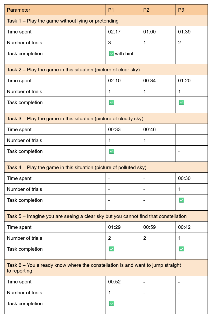
The results of the tests are summed up in this table:
These are the pictures I showed my participants for task 2, 3 and 4:
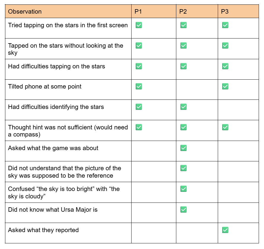
Some other observations are summed up in the following table:
This is how the participants answered the questions:
Did anything create frustration or confusion (text, icon, something in the flow)?
P1: I would say that in the beginning I wasn’t quite sure what I’m supposed to do, but maybe also because I did not read the text fully in the beginning, so I wasn’t quite sure whether you can only report when it’s night. I didn’t quite get that at the moment and was confused because I could not see anything, but I should have seen something. Yeah, then maybe the hint, but I already said that about the northern hemisphere, when you give a hint that something is supposed to be there, that there’s some sort of hint about which direction to look and maybe also how high or maybe if there’s another star that you would recognise that you can take as a reference point or something. Then I think you can make it quicker. Also, in the beginning I didn’t know what this button meant, I would have had to test it out to see what it does and also the exit button didn’t go to the start, but it went back to the star constellation, so maybe from exit I would expect that it would let me exit. I think maybe in the beginning it could be a little more clear what to do and more help, and maybe that the stars could be a little bigger or further apart. The smaller ones are a challenge to click.
P2: A lot of stuff generates confusion, like when I started I didn’t even know how to report. It said “locate this star” and I don’t even know what that is, so it was really frustrating, like what exactly I have to find? So I just randomly tapped here and there and found out. The most frustrating part was that everything is designed for a person who knows about this.
P3: The finger (the tapping on stars feature) – didn’t realise that at the start.
How would you explain the main goal of the game to a friend?
P1: I would say: identify constellations and also report about light pollution in different areas based on what stars are visible with the eye in the sky.
P2: The main goal of this game is to locate the stars and report them.
P3: Reporting to what extent a constellation is visible from a certain location, and perhaps including metadata as well – or did that come later? Yeah, that would be cool, because you’d say, ‘I can’ ’t see it, and then you can say, ‘Why not?’ I reckon one reason is that I’m too daft to find the star, and the other is that it’s too light-polluted, so I think you have to… But since it’s just a game, you can simply track light pollution and constellations.
What was your favourite part?
P1: I think clicking the constellations, like the selection of the stars I could see.
P2: When I can see the clear sky and I’m like “yeah maybe I am doing something” and also I really like that there’s a hint option, it gave me a little bit of information.
P3: I think the writing is a good start, ‘Help me’ and so on.
If you could add a feature, what would it be?
P1: Maybe more constellations? And also I had an app on my phone when I was stargazing and it showed the entire night sky. Every star is supposed to be there. Maybe it could also be nice to have an overview of all the constellations that should be in the sky and if you could kind of see on the phone and then compare it to what you actually see. I think it might also be easier to find a constellation. Like, okay, I found this constellation and if I turn a little more up then I can find more constellations and get a better understanding of what is where in the sky.
P2: I would really like the feature to be really using the current sky, like having a region of it. That could be really cool.
P3: Maybe the step where you have to look for the constellation in the sky or check if it’s visible. It’d also be cool to have a location, just like with those apps, so you know that’d be the next feature – and at the same time you’d be learning about the constellations, so you could pick up on that sort of mythological stuff on the side as well – that mix of astronomy and astrology.
What do you think about the visual style and aesthetics?
P1: It is very nice, very clean, very easy. Also it’s like the theme of the stars, black-and-white. Also, I think the constellation with the outline of the animal and then the stars inside is good because then you also learn a little more about the constellations, because sometimes in the sky if you only have the stars it’s hard to see the animal or whatever that’s supposed to depict. I think the style was very nice.
P2: The night vision, I really liked it. I think it’s a good direction.
P3: Simple and neat.
After analysing the recordings of the tests, I concluded that:
It was not clear to the participants that you are supposed to play the game at night and tell the game if it is daytime; I could have specified that in the introduction (“this game should be played at night”)
Sometimes when the stars are not visible, participants would still send a report; I could make a first screen that asks a yes/no question to filter out reports that are not valid
Constellations are not always a concept known by everyone; I should explain what they are at the beginning
There were issues with orientation and localisation of the constellation; the VR feature with compass sensor and GPS that other applications use would help with that
Users tried to tap on the stars on the first screen; it should be clear that they are not tappable or they should be tappable right from the start
Exit buttons were not working properly; I should check them
The stars were a challenge to tap on; maybe the tappable area could be bigger or there should be a zoom/swipe feature
The option to tap on the stars was appreciated; I can keep working with that
There was some confusion about what was reported at the end; I should specify it
The black and white theme with the constellation illustrations was appreciated
For the next testing, I need to remind myself to:
explain the product and what we are doing with it
ask some introductory questions to understand the participant’s knowledge of the topic
ask everyone the same questions to compare results better
After doing the context review and the material studies, I decided to work on my prototype again. I focused on our lecturer’s question “what is the smallest prototype you can create that still touches the issue?”. A specific issue came to my mind: according to A review of invasive species reporting apps for citizen science and opportunities for innovation by Howard, van Rees, Dahlquist, Luikart, and Hand, gamification is not sufficiently used in citizen science apps. With the intention of creating something quick, fun, and gamified, I looked at my initial analogue prototype and the app prototype I created with Ahmed Turk for our app design course. I decided I wanted to focus only on the reporting flow of the app and create a minigame. By focusing on its core feature, I wanted to make it as interesting and seamless as possible. This way, the reporting platform could benefit from a higher engagement.
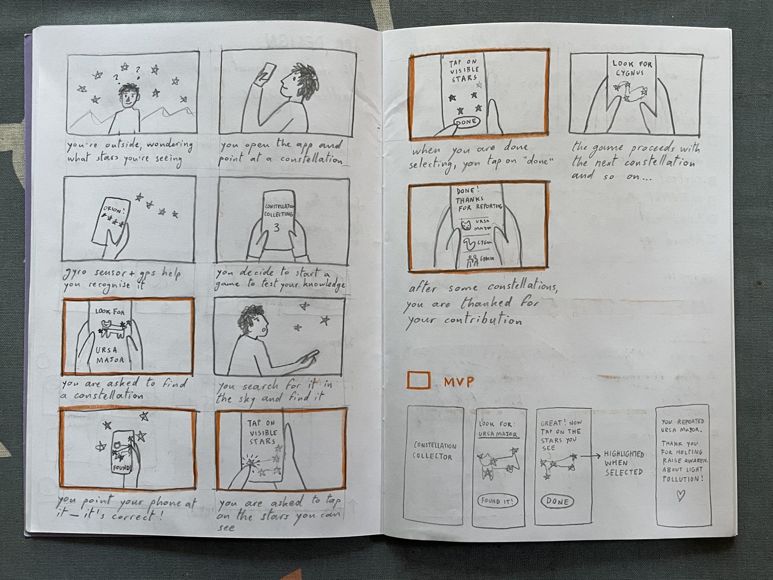
I started my second version of the prototype by sketching a storyboard. Then, I highlighted some scenes that in my opinion are the foundation for the MVP. After that, I sketched some screens and created them on Figma.
Heuristic evaluation
I then went through Jacob Nielsen’s 10 Usability Heuristics for User Interface Design to further refine the prototype. Here you can read my evaluation:
Visibility of system status. At the top of the screen, you can see the progress through the game (0/2); I do not know if it should start with 0/2 or with 1/2.
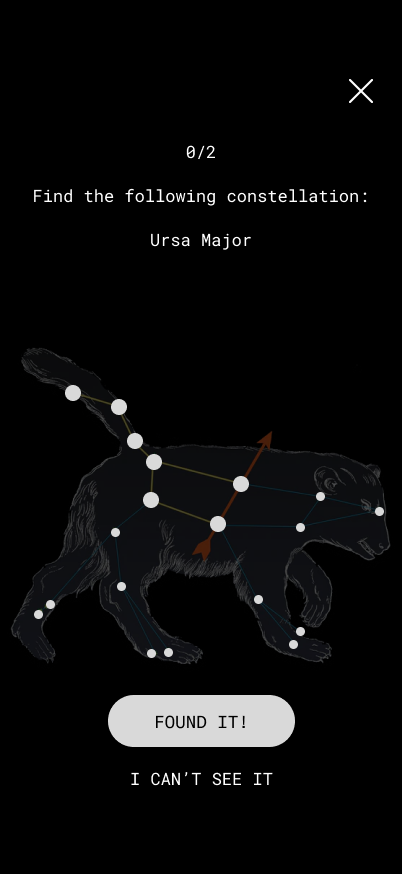
Match between System and the Real World. The constellation has the same shape and proportions as the one in the sky. The brightness of the stars also mirrors reality. As the app does not use GPS and the gyro sensor yet, the constellation is not rotated in the same direction as it appears in the sky. This could also be a challenge factor that makes the game a little harder. No technical jargon is used, only commonly used words.
User Control and Freedom. There is an emergency exit (X) to exit the game and a back arrow to return to the previous step
Consistency and Standards. The back arrow is located at the top left corner (iOS standard), while the X is at the top right. The latter should ideally also be positioned in the top left corner, but that space was already occupied. The main action is in the white button, while secondary actions are in all-caps. All clickable text is in all-caps.
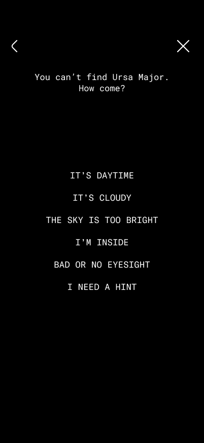
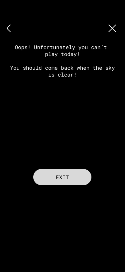
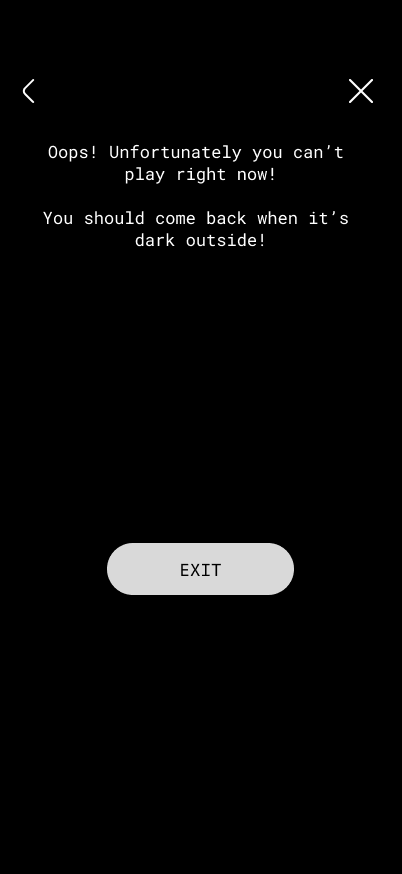
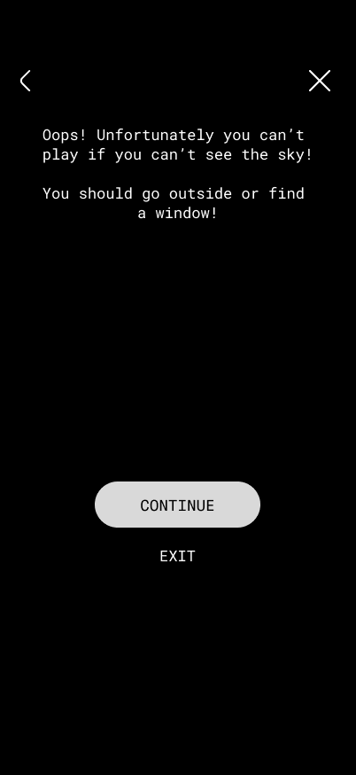
Error Prevention. If the sky is not visible, there are various options that can be selected, which open tips for better observation. This prevents false reports. In the future, once sensors are incorporated, the app should recognise whether you are pointing your phone at the right constellation, to prevent mistakes.
Recognition Rather Than Recall. The name of the constellation is repeated on every screen of the reporting game.
Flexibility and Efficiency of Use. For expert users that already know constellations, there is an option to jump straight to the report and skip the constellation hunting part.
Aesthetic and Minimalist Design. I tried to keep everything minimal; the only thing that could be simplified is the bear illustration and maybe the copy, but in my defense it is intended to have a relatable tone that brings the audience a little closer to a complex topic.
Recognize, Diagnose and Recover from Errors. Error messages are written in a simple language and suggest a solution for a wide variety of issues.
Help and Documentation. If the constellation cannot be located, there is the option to receive a hint.
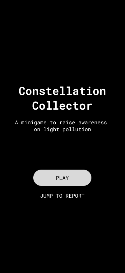
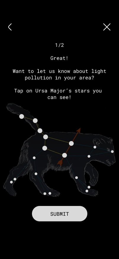
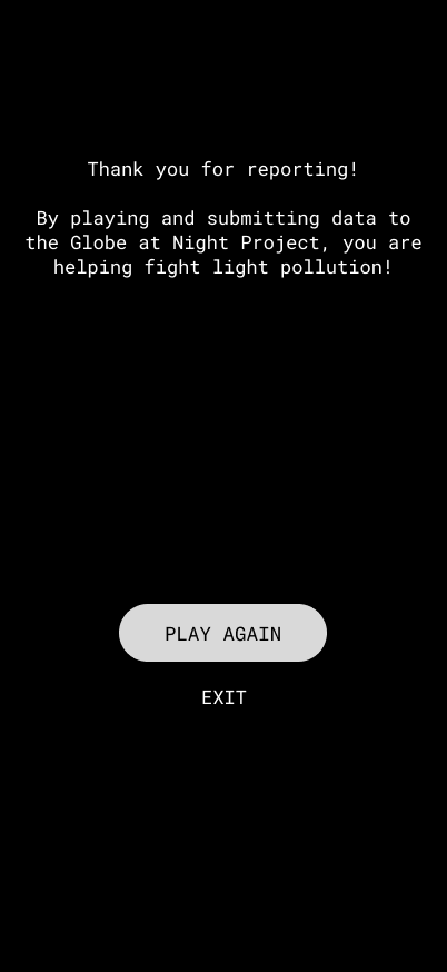
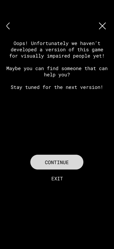
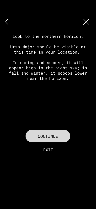
Here are some screens of the minigame. After hitting “play”, the user needs to find a certain constellation in the night sky. Then, they can report the visibility of its stars by tapping on them.
If the user cannot see the app, they can tap on “I can’t see it” and select why. This leads to different tips based on the answer.
These videos illustrate two possible flows:
Possible improvements
Fun facts about the constellation at the end of reporting
After creating the three prototypes which I described in the last article, I reflected on which direction I wanted to go. The app about light pollution reporting is what interests me the most because I believe that it is the solution that could reach a broader audience out of the three.
My colleague Ahmed Turk and I started working on the light pollution reporting app for our App Design course. In the research phase, I realised that this app would fall under a niche. The risk that comes with it is low popularity and engagement. I decided to research gamification because I see it as a possible solution to this issue.
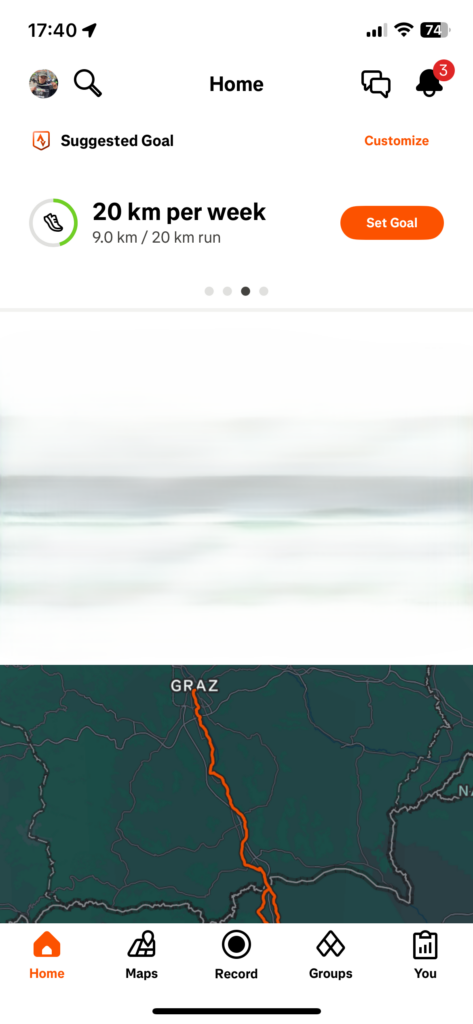
My research was based on three applications I have installed on my phone and that I used as a reference when designing: iNaturalist, Duolingo and Strava. iNaturalist is a citizen science application for reporting animal and plant species, while Duolingo is for language learning and Strava for fitness tracking. I decided to include the last two in my research because I believe that they have strong gamified features that I could use as an example.
In the following annotated bibliography you can see a summary and my review of the papers.
Howard, L., van Rees, C. B., Dahlquist, Z., Luikart, G., & Hand, B. K. (2022). A review of invasive species reporting apps for citizen science and opportunities for innovation. NeoBiota, 71, 165-188. https://neobiota.pensoft.net/article/79597/
The authors analysed the efficacy of existing apps to report invasive species.
These apps are based on citizen science, meaning that they rely on users to report data about the environment they are in. Although smartphones have largely enhanced the capability to monitor invasive species, existing apps do not make use of all known functionalities that could maximise their efficacy. User engagement is limited due to the lack of gamification and social media sharing options, which would encourage frequent and prolonged usage.
The introduction of a leaderboard would be a competitive element that encourages users to send data about a specific area that needs more coverage. Leaderboards, reward systems, Badges and ranks could motivate users to send reports regularly.
There are some other features that would improve engagement. Apps are not taking advantage of modern smartphone sensors such as thermometer, altimeter and barometer. Also, they are often not using machine learning and AI to verify or flag reports, which would save time and human resources. Moreover, in many cases offline saving of reports is not possible, making it hard for users to cover certain areas.
The reason why these features are not implemented is the lack of funding for design and development. The authors suggest the creation of open-source code or templates to spread quality and innovation and reduce costs.
This paper was crucial in understanding that citizen science apps struggle to keep their users motivated and engaged in the long-term. It made me realise that my project should feature a gamified design and social media sharing options to improve engagement. The exact gamified features are yet to be explored.
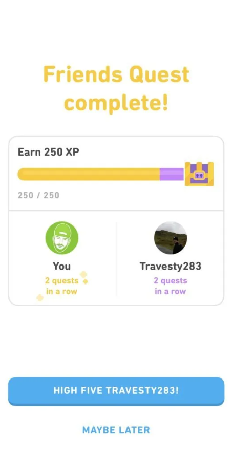
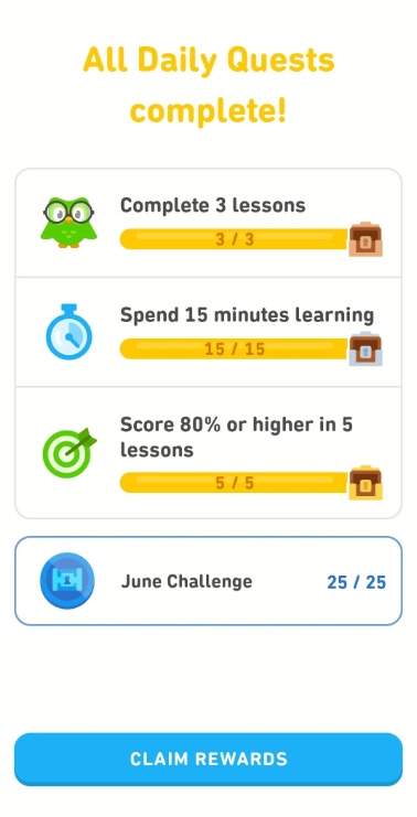
This paper explores the impact of Duolingo’s gamified design on user engagement and motivation, focusing on emotional responses.
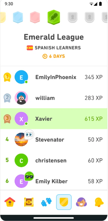
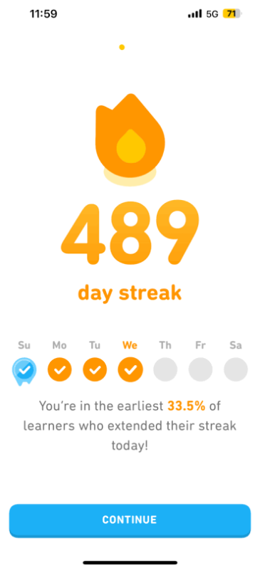
The encouragement mechanisms analysed were the streak, the leaderboard, the achievement system, the friend system, treasure boxes, daily tasks and double XP. While streaks are an effective method to keep users on the app daily, they can cause psychological stress. The “streak freeze” can relieve these feelings. The leaderboard causes mixed feelings: on one side, the competition motivates people to learn more and increase their points, on the other side a drop in rankings can cause loss of motivation and even an interruption in the daily usage of the app. The achievement system fails in its intention to motivate users because it is not seen or understood by most of them. The friend system succeeds in motivating users, creating a feeling of social responsibility. The treasure boxes also have a good impact because they spark curiosity. Daily tasks give users the positive feeling of making progress, but they can turn into stress factors when the tasks are not completed. Double XP (experience points) also generates mixed feelings: users can make progress more quickly, but the time limit causes stress.
The penalty mechanisms analysed were the life point limitation and the forced repetition. While the heart system made users more focused and careful, it also caused anxiety and finally frustration when it came to gaining hearts back by watching ads. While repetition helps with memory retention, the fact that it is forced feels like a punishment, therefore users should have the freedom to avoid it.
In conclusion, while Duolingo’s encouragement mechanisms successfully motivate users to learn regularly, they can cause feelings of stress and anxiety. Especially penalty mechanisms can reduce motivation.
The paper is outdated, in fact some issues such as the hearts have already been fixed. As a user of the app, I can confirm that the encouragement mechanisms cause me stress and even lead me to avoid opening the app. This happens especially when I receive notifications with a negative tone after skipping a day.
While Duolingo focuses on learning and often uses pushy and passive aggressive tones, I can still draw inspiration from its gamified design to keep the users of my application engaged. The paper could serve me as a guide to create more user-centered learning mechanisms that take emotions into account.
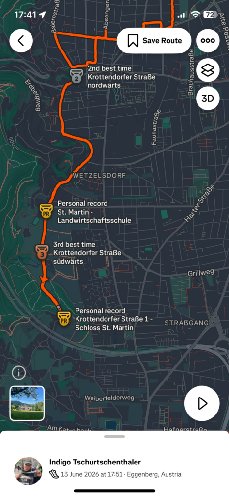
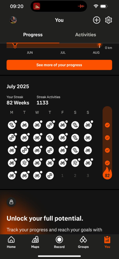
This paper analyses how gamification elements on the fitness app Strava influence runners’ behaviour, focusing on motivation, perceived social pressure, engagement, continued use and the activation of premium features.
The gamification elements Strava uses are challenges, leaderboards, segment rankings and progress visualisations. It was found that gamification elements increase user motivation, leading to higher engagement on the platform. Features like optional challenges and individual goal setting are customisable, do not force participation and therefore promote autonomy. Visible progress indicators, performance feedback and personal achievements create a positive feeling of competence, while social interactions like kudos or comments are associated with higher perceived social connectedness. It can be said that the app supportings intrinsic motivational processes rather than relying on external pressure.
Higher engagements translate to an increased willingness to use premium features. The reason for this is that users perceive physical activity as self-determined and meaningful. Therefore, gamification is not directly linked to the adoption of premium features, but by encouraging users to regularly log their activity on Strava, the app becomes a part of one’s training routine.
Competitive elements and social comparison features did not have a negative impact on users and did not affect their engagement through perceived social pressure. This happens because social pressure is a highly individual experience. Feelings associated with comparison are usually temporary and are not sufficient to reduce engagement over time.
MedalsStreaksWeekly goals
In conclusion, Strava operates primarily through motivational mechanisms rather than social pressure and comparison.
In my opinion, Strava represents a healthier way to integrate gamification and increase engagement, because it relies on personal motivation rather than external pressure. I believe that pressure-free motivation and customisable goals are positive examples of gamification that I could include in my app.
Kuure, O., Kähkönen, K., & Hekkala, R. (2026). The Impact of Social Features and Application Design on User Behavior and Long-Term Engagement of Strava Users. Proceedings of the 59th Hawaii International Conference on System Sciences, Article 453, 1-10. https://scholarspace.manoa.hawaii.edu/items/c9eea53a-eddb-4a62-9429-16c8b005c1ac
This paper explores how Strava users interact with its social features and how its design and functionalities affect user engagement.
It was found that sharing activities with peers motivates users to exercise and engage more with the application. At the same time, some users feel insecure and curate their feed by selecting which activities to display, in order to maintain a positive social image.
Strava users downloaded the app or switched to it from other platforms because they value the sense of community it gives them. Group features are highly appreciated. Yet, a big network results in a cluttered feed. This makes some users feel stressed out, reducing their motivation to post activities.
Everyone stays on Strava because they appreciate a different feature. A large amount of features may cater to everyone’s needs, but some users feel overwhelmed by them and prefer quality over quantity.
All in all, users look forward to logging activities because they feel motivated when their peers interact with their logs. All this engagement creates a sense of loyalty that makes it so that the app becomes a part of the users’ fitness routine.
It was mentioned in this paper that the surveyed population may not represent the total of Strava users and I agree with it. The interviewed persons already use Strava various times a week. I think the results would be different if people new to fitness had participated. In my opinion this difference is relevant when studying how to cater to a new target group. Nevertheless, the paper helped me understand the role social media features can have in apps and I think my project should include this functionality.
After finding these papers, we did another research activity with Dr. Ursula Lagger. The session with her helped me to improve my research strategy and I was able to find more interesting papers.
I first described my topic to Gemini and asked it for keywords for my research. It recommended these:
Citizen Science Data Quality: To study how apps like iNaturalist structure data so scientists can trust and verify it.
Gamification for Behavior Change: To find frameworks for keeping users engaged in environmental apps over time.
Mobile AR Science Education: To research how to design effective augmented reality tools for teaching astronomy and light pollution.
Civic Tech & E-Participation: To understand how apps can successfully connect citizens to local government and petitions.
Artificial Light at Night (ALAN): The standard scientific term used in research papers for light pollution.
Kyba, C. C. M., Wagner, J. M., Kuechly, H. U., Cavazzani, S., Zamorano, J., Hänel, A., … & Hölker, F. (2013). Citizen science provides valuable data for monitoring global sky glow change. Scientific Reports, 3(1), 1835. https://doi.org/10.1038/srep01835
Kyba, C. C. M., & Hölker, F. (2013).Loss of the night: A citizen science project for monitoring skyglow. GFZ German Research Centre for Geosciences. https://doi.org/10.2312/GFZ.b103-13054
Bauer, B. (2020).Exploring the impact of artificial light at night (ALAN) through citizen science initiatives. University of Vienna.
B. Citizen Science Data Quality & Structure
Kosmala, M., Wiggins, A., Swanson, A., & Simmons, B. (2016). Assessing data quality in citizen science. Frontiers in Ecology and the Environment, 14(10), 551-560. https://doi.org/10.1002/fee.1436
Balázs, B., Mooney, P., & Novak, J. (2021). Data quality and validation protocols in crowdsourced environmental monitoring. In Citizen Science: Innovation in Open Science, Society and Policy (pp. 139-157). UCL Press. https://doi.org/10.1007/978-3-030-58278-4_8
C. Gamification & Civic Engagement
Thiel, S.-K. (2016). A review of introducing game elements to e-participation. Proceedings of the Innovation Systems Conference (AIT), 1-9.
Sailer, M., Hense, J. U., Mayr, S. K., & Mandl, H. (2017). How gamification motivates: An experimental study of the effects of specific game design elements on psychological need satisfaction. Computers in Human Behavior, 69, 371-380. https://doi.org/10.1016/j.chb.2016.12.033
Bowser, A., Hansen, D., & Preece, J. (2025). Gamifying citizen science: Long-term engagement and behavior change in biodiversity apps. Biological Conservation, 301, 111001. https://doi.org/10.1016/j.biocon.2025.111001
Sirakaya, M., & Alsancak Sirakaya, D. (2022). Augmented reality in science education: An analysis of design features and learning outcomes. Journal of Science Education and Technology, 31(1), 45-61.