After the first working version, the next important feedback was about control and usability. My professor suggested that instead of playing sound files from REAPER tracks, it would be better to use plug-ins that generate the sound directly. This made sense for the project because the sound sources are sine tones. If the tones are generated inside the plug-in chain, the system becomes cleaner and more repeatable.
He also asked for more detailed and semi-controllable parameters in the GUI. This led to the second GUI version. I think this version is much stronger than the first one. It has room selection, source layouts, custom source count, editable source positions, presets, and listener movement. It feels more like a small research tool than only a technical test.
In the setup screen, the user can choose between different room scales and source layouts such as mono, stereo, quad and octagon. There is also a custom mode where the number of sources can be changed. This is important because the system should not only demonstrate one fixed setup. It should allow repeatable variations.
The GUI also includes a physical direct-sound mode. This is the mode used for the project results. It follows the free-field pressure relationship where each doubling of distance gives about minus 6.02 dB. Earlier versions had an exaggerated mode for demonstration, but after feedback it became clear that this should not be presented as scientifically valid. The scientific part of the project should remain with the physical direct-sound calculation.
This second interface version also made the system easier to explain. The user first configures the room and sources, then enters the listening mode. That structure matches the project logic: define the experiment, then listen by moving. It also makes the system more useful for future comparisons, because a setup can be repeated instead of improvised each time.
The GUI was a big part of the project for me personally. It was where the technical system became something visible and usable. It also gave me a reason to learn more Python and PyGame. I started with only basic Python knowledge, and the project pushed me to build something I would not have built otherwise.
At this stage, the project became much more coherent. It had a clear interface, a calculation model, a REAPER chain, and a future research direction.
The first version that really worked was made with PyGame. It was still simple, but it was the first time the system became interactive in the way I wanted. The GUI sent x and y values for the listener position. These values went into the calculation script, where the relation between source and listener was calculated. Then the resulting parameters were sent to REAPER and the IEM plug-ins.
This was an important moment because the project stopped being only a plan. I could move something in the interface and hear a change in the audio system. Even if the first version was rough, that connection was exciting. It showed that the basic chain was possible: GUI movement, Python calculation, OSC messages, REAPER processing, and spatial output.
At this stage, the interface was not yet the final one. It was more like a proof of concept. But it already contained the essential idea. The listener position mattered. Source distance could be calculated. Direction could be calculated. Values could leave Python and arrive inside the audio engine. That was the first working skeleton of the project.
Technically, this also helped me understand the different roles of the scripts. The GUI was not the model. It was the interface. The calculation part was the direct-sound model or direct-sound calculation script. The OSC sender was the communication layer. REAPER was the audio engine. This separation later became important for explaining the project clearly.
The first PyGame version also made me think more seriously about movement. I did not want the listener to just drag a dot and read numbers. I wanted the interaction to feel a little more embodied. Even though the system is headphone-based, movement is still central to the experience. The listener moves through a virtual source layout and hears changes that relate to position.
This is also where the project started touching game-like thinking. The controller, the movement, and the view direction reminded me of old first-person games. That connection was not planned, but it became part of the development story. It helped me think about how spatial audio tools could feel less like lab software and more like something you can inhabit.
The first PyGame prototype was not polished, but it was the first real success. It proved the system could exist.
3. First Interface Attempts: Pure Data and Max/MSP
My first instinct was to try Pure Data. It felt natural because it is close to sound-design workflows and patch-based thinking. I thought it might be a good place to create a simple interface that sends position values to the audio system. In theory, that made sense. But in practice, I quickly ran into a limitation: I wanted a visual and movement-based interface, and Pure Data did not feel comfortable enough for that.
The problem was not that Pure Data cannot send values or control sound. It can. The problem was the kind of experience I wanted. I wanted the listener to move, see sources, understand room geometry, and feel the relation between position and sound. The visual and animation side became important very early. My Pure Data attempts did not give me that feeling, so I stopped trying to force the GUI into a tool that did not suit the direction anymore.
After that, I tried Max/MSP. Max felt better for visual work and interaction. It gave me more control and felt more flexible than Pure Data for this particular task. I could imagine a more useful interface there. But even with Max, the result did not quite match what I wanted personally. It still felt like I was fighting the environment a little bit. I wanted something that behaved more like a small interactive application than a patch.
This part of the process was a bit frustrating, but it was useful. It showed me what the interface needed to do. It was not enough to have sliders or number boxes. The interface needed to show a room, show sources, allow movement, and later allow custom layouts and presets. It had to be a small spatial tool, not only a control panel.
In my second meeting with my professor, Python came up as a better option. I already had some basic Python knowledge, and the project became a good reason to build on it. This was slightly intimidating, because I had not used Python in this way before. But it also felt like the right challenge. If I could build the interface myself, I could make it behave exactly the way the project needed.
So Pure Data and Max were not failures in the end. They were part of the filtering process. They helped me understand that the core of this prototype needed to be a custom interface and calculation system, not just an audio patch.
2. Learning the Auralisation Idea Through Drawings and Discussion
One of the important turning points was a meeting where my professor explained the auralisation approach in a very practical way. He drew things on paper: source positions, listener position, signal flow, and how the values should move from a visual interface into audio processing. That was educational for me because it turned the project from a vague spatial-audio idea into a system I could actually build.
Before that, I understood the general concept, but not yet the full chain. I knew that I wanted sound to react to movement. I knew that source distance should affect level. I knew that direction should matter. But the system was still blurry. The drawings helped me understand that the project needed clear stages: an interface, a calculation part, OSC communication, REAPER, spatial audio plug-ins, and finally binaural playback.
This also helped me understand why the word “simulation” is dangerous. A full simulation would mean modelling the complete acoustic behaviour of a room. That includes reflections, reverberation, diffraction, occlusion, source directivity and probably much more. My system does not do that. It calculates the direct path between a source and a listener. That is already useful, but it is not the whole room.
So I started to think of the project as a controlled direct-sound auralisation. This means the prototype gives an audible version of a simple physical relationship: where is the source, where is the listener, how far apart are they, what direction is the source, how much should the level decrease, and how late should the sound arrive?
That framing made the project less grand but much stronger. It also made the next semester clearer. If the prototype represents an ideal direct-sound condition, then the real room can later be understood as the thing that adds complexity. The CUBE will add reflections, room response, interference, loudspeaker behaviour and real perception.
In that sense, the drawings were not just technical notes. They changed how I thought about the thesis. Instead of trying to make a huge system that claims too much, I could build something smaller but testable. That was probably one of the most important lessons in the process.
It also changed my confidence. I had something concrete to implement. The project became a set of solvable problems instead of one giant abstract spatial-audio dream.
1. From Physical Sound Superposition to a New Direction
At the beginning, the project had a different shape in my mind. Last semester I was mainly interested in physical sound superposition: real loudspeakers in a room, sine tones playing at close frequencies, and the listener walking through zones where the sound changes. I liked the idea that the room itself could become a kind of instrument. The piece was not only about listening to tones, but about moving through them and discovering how interference, beating and phase relationships appear in space.
That first idea was more installation-based. I imagined loudspeakers placed in a room and the listener moving physically between them. The focus was on the direct experience of sound in space, not on a screen or an interface. This still feels important to me. Even now, after the project has changed, the original interest is still there: movement, sine tones, spatial relationships, and the strange physical feeling that happens when simple sounds interact.
But as the semester continued, the project moved away from being only a physical loudspeaker installation. In meetings with my professor, it became clear that I needed a more controlled research step before going into the real room. If I directly built a physical installation, many things would happen at once: reflections, room modes, loudspeaker differences, directivity, occlusion, and the listener’s own perception. That can be interesting artistically, but it is difficult to study clearly.
This is where the idea of auralisation entered the project. Instead of trying to simulate the full room, the new direction became: build a controlled direct-sound reference first. In this version, I can define source positions, listener position, distance, direction, level and delay. Then later I can compare that controlled version with the physical room.
So the project did not completely abandon the first idea. It changed its method. The original project was about sound interaction in a real space. The current project builds a headphone-based interactive prototype that can later be tested against a real multi-loudspeaker room. I think this change made the project more realistic as a thesis. It still comes from the same curiosity, but it now has a clearer technical and research structure.
The main question also became more careful. I am no longer asking whether I can completely simulate a room. That would be too large and too easy to overclaim. Instead, the current question is closer to this: how can an interactive binaural auralisation help compare ideal direct-sound behaviour with a real multi-loudspeaker room?
That change in wording matters. It gives the project a better foundation. I can say what the system does, but also what it does not do yet.
Over the last months, this project focused on researching the user experience at German train stations and identifying opportunities for improvement. The process combined research, design, prototyping, and user testing in order to better understand the needs, frustrations, and expectations of travelers.
A major part of the project were two prototypes, that were developed to explore possible solutions for improving the train station experience. They helped translate theoretical insights into practical concepts and allowed ideas to be tested in a more tangible way. Through the design process, it became clear how important accessibility, clarity, and intuitive navigation are within busy public transport environments. The prototypes were both tested with users to validate them. These sessions provided valuable feedback and revealed both strengths and weaknesses of the project vision. Observing users interact with the concepts helped identify usability issues and highlighted areas that required further refinement. The testing phase showed how essential direct user involvement is when designing for public spaces and services.
The final task of this research phase was the creation of a video documenting the progress made throughout the project. The video brought together the different stages of the process, from early research and observations to prototype development and user testing. It served not only as a summary of the work completed, but also as a reflection on the learning experience and the development of the project over time.
Overall, this part of the project provided valuable insights into user-centered design and the complexity of improving public transport experiences. It demonstrated the importance of continuous research, iteration, and testing in creating meaningful and practical design solutions.
In the last post I argued that the research had to stop being a broad map and become one concrete thing I could build and test. This is that thing.
I built a neuroadaptive supervision console. On screen, the operator keeps a small fleet of semi-autonomous drones alive: each one occasionally needs attention and timed emergencies appear that must be resolved before a countdown runs out. The drones are not the point for me, they are a stand-in for any complex, information-dense interface, the kind of control-room or monitoring setting where alerts compete for attention and overload is a constant risk. That is where badly-timed interruptions do the most damage, so that is the situation I wanted to recreate.
Underneath the task, the system builds a live estimate of how loaded the operator is, by combining three real signals: EEG engagement from a Muse headband, a webcam-based attention proxy (for blink rate and head movement – unfortunately I could not extract data from Tobii) and the demand of the task itself. I then compared two versions of the same interface. In the adaptive version, when the estimate crosses into “overload,” the system quietly defers low-urgency alerts until there is room for them and steps in for the drones most at risk. In the control version it does none of that. Every participant played both.
The clearest result, shown in the video, is reaction time. On the working build, people answered emergencies far faster in the adaptive version – around four seconds, against seventeen in the control. The mechanism is simple: when alerts are not deferred, they pile up during busy moments and get answered at the last second. Deferring them spreads the load out.
What the video does not point out on is that this was not a clean win and I think that matters more than the headline. Faster answers came with lower accuracy, and people did not report feeling less loaded. With only four participants, and a build that changed between the early and late sessions, this is a proof-of-concept, not proof. The fuller per-person picture, including a resumption-lag result that went the “wrong” way, sits in my written results rather than the video.
For me the takeaway is not the number but the shape of the problem. A real adaptive loop is buildable with modest, honest signals, and once it works the interesting questions are not about better sensors. They are about timing, trust and giving the person a way to overrule the system when its guess is wrong. That is the thread I want to keep pulling: from interfaces that capture attention toward interfaces that look after it.
Looking back at this semester, I think the biggest challenge for me was figuring out what I actually wanted to focus on for my master’s thesis. At the beginning, I only knew that I wanted to work with older adults and that I was interested in topics like digital literacy, education and tangible interaction. It took a lot of reading, observing and prototyping before these pieces slowly started to come together.
Even though I only really found my direction during the last couple of weeks, I don’t see that as wasted time anymore. Exploring different ideas helped me understand what actually interests me and, just as importantly, what doesn’t.
One thing I definitely discovered this semester is how much I enjoy working with tangible interfaces. Designing something physical that interacts with the digital side feels like a really exciting topic to explore, especially in the context of accessibility and older adults. At the same time, I still enjoy the technical side of interaction design and would love to combine both in my master’s thesis.
The NFC book is only an early prototype, but I think it has shown me a direction that I want to continue exploring. Over the next semester, I would like to test this concept with older adults.
Since I came up with the idea of creating a physical phone book in my last blog post, I decided to ask ten older adults, all around the age of 65, what they actually like to use their phones for. This time, the conversations went much better than my previous ones. Everyone was able to tell me quite clearly what they regularly use their phones for.
What I found even more interesting was that many participants started talking about their frustrations with smartphones on their own. While answering questions about their everyday phone use, they often mentioned situations where they felt confused.
For this very short interview, which was more of a questionnaire, I simply asked participants what they use their phones for most often. The most common answers were: making phone calls and using WhatsApp, either for texting or sending voice messages. Other frequently mentioned activities included looking at photos, checking the weather and reading the news. Some participants also said that they regularly listen to music, radio stations or playlists using apps on their phones.
These results were somewhat interesting for me because they support my idea that older adults often use a relatively small set of functions very frequently. This made me think that focusing on simplifying these tasks, rather than trying to simplify the entire smartphone experience, could be a direction for my research.
Activity
Participants (n = 10)
Percentage
Calling (normal)
10
100%
Watching Photos and Videos
10
100%
Taking Photos
10
100%
Calling (video)
8
80%
Sending Messages (WhatsApp)
7
70%
Listening to Music
6
60%
Checking the Weather
5
50%
Reading News
4
40%
Listening to Radio
3
30%
Since many of the people I interviewed mentioned that they mainly use their phones to stay in touch with family and friends, it became clear that social connection plays a very important role for them.
Importance
Access to digital technology plays an important role in the lives of many older adults, as it can significantly influence their quality of life, social participation and ability to manage their health and well-being. Social isolation is a significant concern for the elderly population which is often caused by shrinking social circles either because of retirement, illness or death. [1]
As a result, maintaining social connections becomes increasingly important in older age. One of the most important benefits of digital technologies is that they can help reduce social isolation and loneliness. Through video calls and social media, older adults can stay connected with family and friends and continue to participate in social life. [1] Regular social interaction through digital technologies is also associated with better subjective health and overall well-being. [2]
Beyond supporting social connections, digital technologies can also help older adults maintain their independence and quality of life. They can support everyday tasks, promote cognitive engagement and enable older adults to remain active and participate in society longer. [3]
These findings are also in line with the interview results, where participants mentioned that they mainly use technologies such as smartphones to stay in contact with family and friends.
Prototyping – The PhoneBook
After trying out different ideas, I ended up focusing on the NFC phone book. The idea came from my observations and the short interviews I did. Most of them told me that they only use a handful of functions on their phones regularly, mainly calling family and friends, looking at photos, listening to music or checking the weather. That made me think: instead of trying to simplify the whole smartphone, why not just make these everyday tasks easier to access?
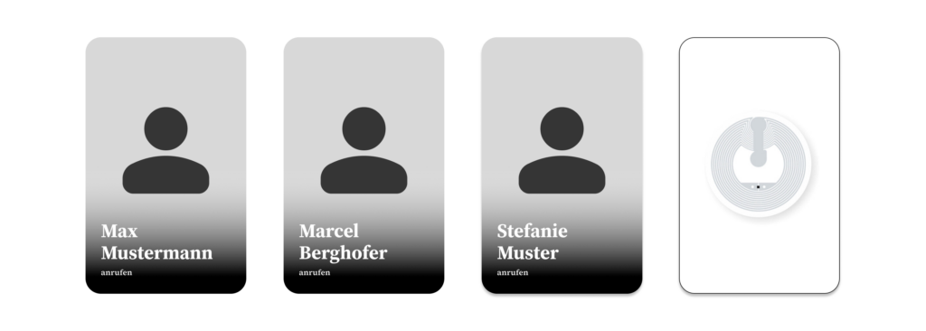
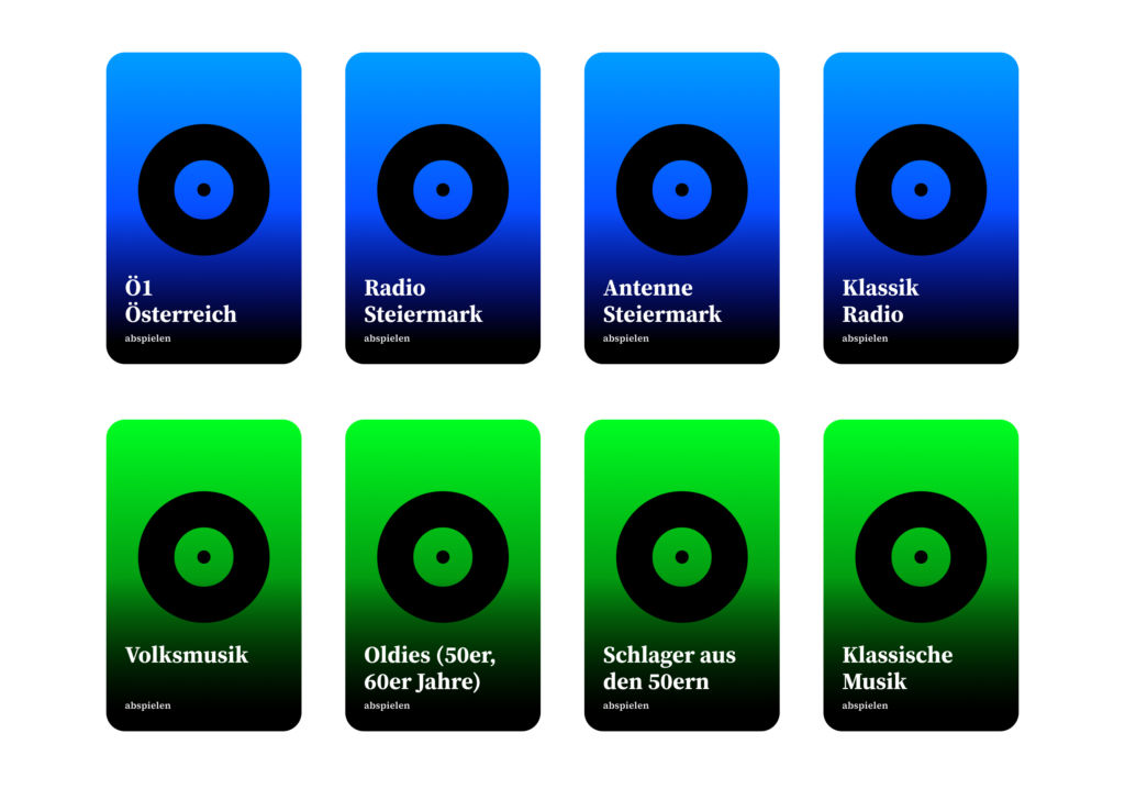
The book is divided into different sections based on most used functionalities, like calling family, listening to music or viewing photos. Every page contains pictures or symbols with NFC tags hidden inside. To perform an action, users simply open the page they need and hold their phone over the corresponding picture. For example, holding the phone over a picture of their daughter would automatically start a phone call.
I decided to go with a book because it feels familiar. Earlier, I experimented with individual NFC objects, but I realized that they could easily get lost and would need to be stored somewhere. A book keeps everything in one place and also gives clear instructions.
At this stage, the prototype is mainly meant to explore whether a familiar object like a phone book can make smartphone interactions feel simpler. Instead of navigating through apps and menus, users interact with pictures and pages, which hopefully reduces some of the barriers that older adults experience when using smartphones.
Update from 6.7.2026
I already tested it with my grandmother. Her comment: “It feels like magic!”
Sources
[1] P. Bhowmick and E. Stolterman Bergqvist, ‘Exploring Tangible User Interface Design for Social Connection Among Older Adults: A Preliminary Review’, in Extended Abstracts of the 2023 CHI Conference on Human Factors in Computing Systems, Hamburg, Germany, 2023.
[2] Y. Liu and R. Tamura, ‘How can smart home help “New elders” aging in place and building connectivity’, 07 2020, pp. 100–107.
[3] P. Bhowmick and E. Stolterman Bergqvist, ‘Exploring Tangible User Interface Design for Social Connection Among Older Adults: A Preliminary Review’, in Extended Abstracts of the 2023 CHI Conference on Human Factors in Computing Systems, Hamburg, Germany, 2023.
Not a hypothesis in the formal academic sense, necessarily. More of a feeling. A hunch that something you have noticed repeatedly in the world around you is worth examining more carefully. For this semester’s blog series, that suspicion was relatively straightforward: that analogue political media is not simply a leftover from a pre-digital era, but an active, meaningful and ideologically loaded form of communication that continues to shape how people understand politics in public space.
Nineteen blog posts later, that suspicion has largely held up.
But the process of testing it – through design theory, cultural criticism, printing, and finally a small survey conducted on the streets of Graz – turned out to be considerably more layered than the original hunch suggested.
The semester began with questions about why physical political media still matters at all. In a media environment dominated by algorithmic feeds, disappearing content and endlessly optimised digital branding, the persistence of posters, stickers, banners and printed pamphlets seemed worth accounting for. The answer that emerged across the early posts was not simply nostalgic. Physical political media occupies space in a way digital communication cannot replicate. It confronts rather than competes. It persists. It deteriorates. It leaves traces – on walls, and in memory – in ways that a sponsored post optimised for a six-second attention window simply does not.
From there, the series moved into the mechanics of political visual language: how colour, typography and composition function as ideological shorthand, communicating political orientation before a single word is consciously processed. This was perhaps the most theoretically dense section of the semester, drawing on design theorists, political communication scholars and cultural critics to build an argument that visual literacy is not a specialist skill but a widely shared cultural competence, absorbed through years of repeated exposure to political environments.
The argument about analogue authenticity followed naturally from this. Imperfection, it turns out, is itself a form of communication. Rough textures, visible print processes and DIY aesthetics signal human involvement, collective effort and resistance to institutional polish in ways that highly produced digital branding cannot easily replicate – even when it tries to imitate them.
Then came the practical work.
Designing the survey sheets forced every theoretical argument back into lived decision-making. Choosing colours meant navigating real cultural associations. Selecting typefaces meant working within – and sometimes deliberately against – the visual conventions that Austrian political culture has built up over decades. The design process confirmed, from the inside, what the theoretical posts had argued from the outside: there is no neutral visual choice in political communication. Every decision encodes something.
Printing confirmed it further, and added a complication. The colour divergence between the digital and risograph versions of the survey was not ideal from a methodological standpoint. It was, however, honest. Real analogue political communication does not exist in controlled conditions either. It is produced under time pressure, with available materials, in imperfect environments. The imprecision of the riso output felt, in retrospect, less like a research flaw and more like an accidental confirmation of the series’ central argument about the material nature of analogue media.
The survey results themselves were, broadly, what the theoretical framework predicted. Colour associations mapped closely onto local Austrian political conventions. Typography produced consistent ideological readings along the lines that design theory would anticipate. And the risograph format was reliably perceived as more liberal or radical than its digitally printed equivalent – a finding that felt almost too clean, and yet was grounded in the very real cultural associations that riso printing carries within contemporary visual and political culture.
The results mostly matched expectations. But matching expectations is not the same as being unsurprising.
There is a difference between believing something theoretically and watching it confirmed by a stranger on a street in Graz who glances at a printed sheet and immediately, without hesitation, places it politically. That moment – repeated across participants, across design variations, across printing formats – was genuinely striking. It made the abstract arguments feel suddenly very concrete. Visual political literacy is not a theoretical construct. It is something people actually do, quickly and confidently, without being asked to think about it.
That is the detail that will stay with me from this semester.
Not a particular survey result. But the speed of recognition. The automaticity of it. The way a person looks at a slightly misregistered riso print of three generic political words and immediately, instinctively, knows what kind of politics it is supposed to feel like.
There is a great deal more to understand about how that process works. How it differs across demographics and political contexts. How it changes over time as visual conventions shift. How it interacts with the circulation of political media in specific urban environments. How it might be deliberately disrupted or subverted by designers working against established ideological codes.
These are questions for a master’s thesis.
And after a semester spent moving from theory to design to printing to streets and back again, I cannot wait to keep asking them!
See you next semester!
Sources:
Anderson, B. (1983). Imagined Communities. Verso.
Lefebvre, H. (1991). The Production of Space. Blackwell.
McLuhan, M. (1964). Understanding Media. McGraw-Hill.
Benjamin, W. (1935). The Work of Art in the Age of Mechanical Reproduction.
Lupton, E. (2010). Thinking with Type. Princeton Architectural Press.
Lakoff, G. (2004). Don’t Think of an Elephant! Chelsea Green Publishing.
Hearn, A. (2008). “Meat, Mask, Burden”: Probing the Contours of the Branded Self. Journal of Consumer Culture.