Carrying out this small project was actually quite challenging, yet it really helped me find an excellent practical application to build on for my actual thesis, which had previously remained purely theoretical. I really enjoyed being able to work on something entirely my own and putting myself to the test with time management and all the stages of the design process. Although I could still improve when it comes to time management!
As for the prototype itself, I was able to have it tested once it was complete. In fact, even though I missed the last lecture, I didn’t want to skip the user testing phase. This was carried out with the help of design students, and the improvements outlined below are ones I’ll be working on over the coming months.
The usability could certainly be improved in several respects, but what everyone agreed on was that the same button to take the survey appears too many times on the home page, given the limited space available. It almost seems as though it is insistently pushing users towards the same action. The need for more information about the research in the pre-survey section was also raised, as users do not necessarily visit the ‘About’ section and the information is not clear in that section. Another small comment was in regards to the survey for not being fully developed, drafting also the third question would have been useful to fully comprehend the user flow and overall effort required.
In general, however, based on the feedback gathered, it can be said that the project’s communication objectives were achieved and that the opportunity to access this kind of data was a well-received idea. The biggest challenge for this type of data collection in the future would certainly be to reach enough people and find ways to keep the responses as unambiguous as possible.
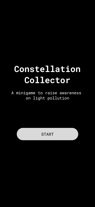
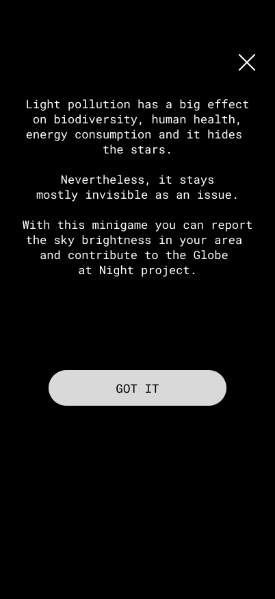
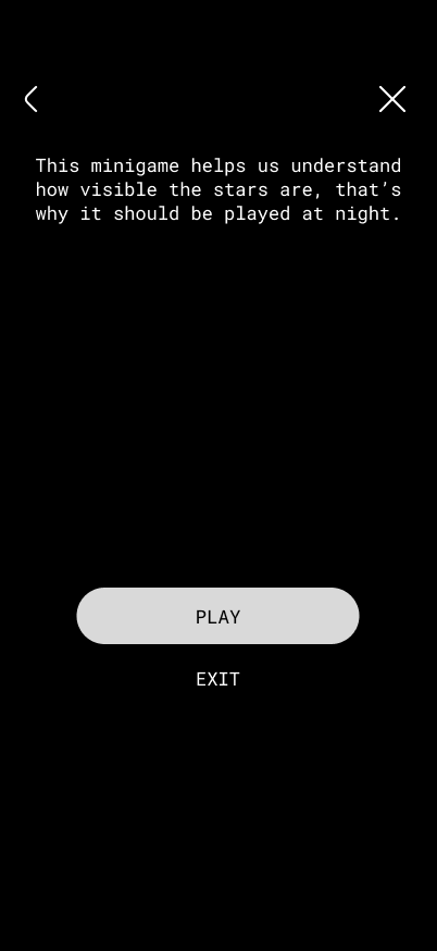
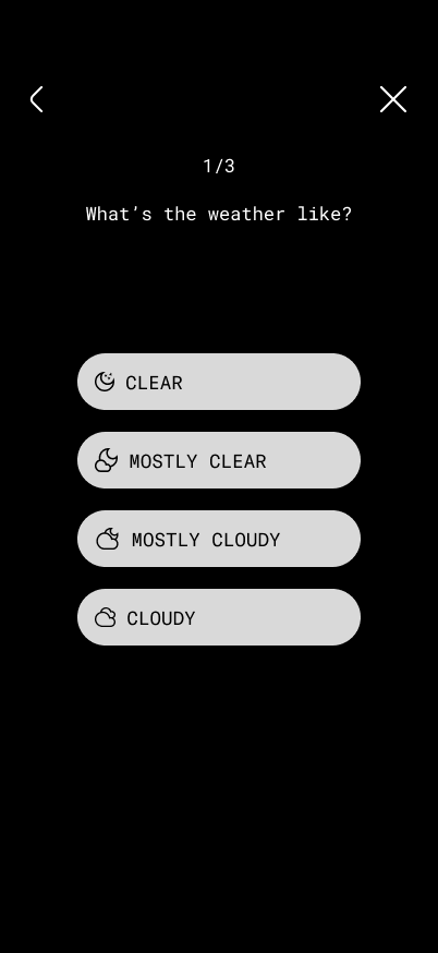
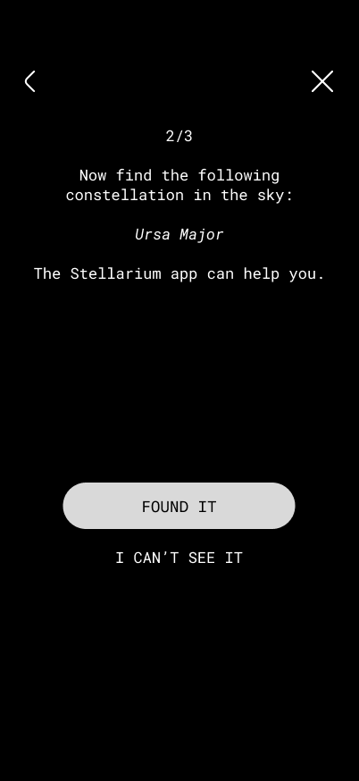
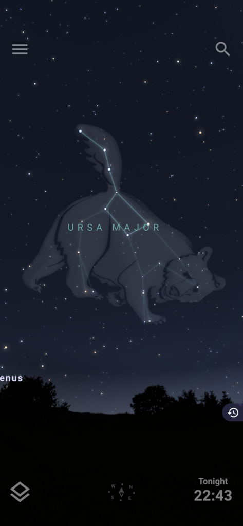
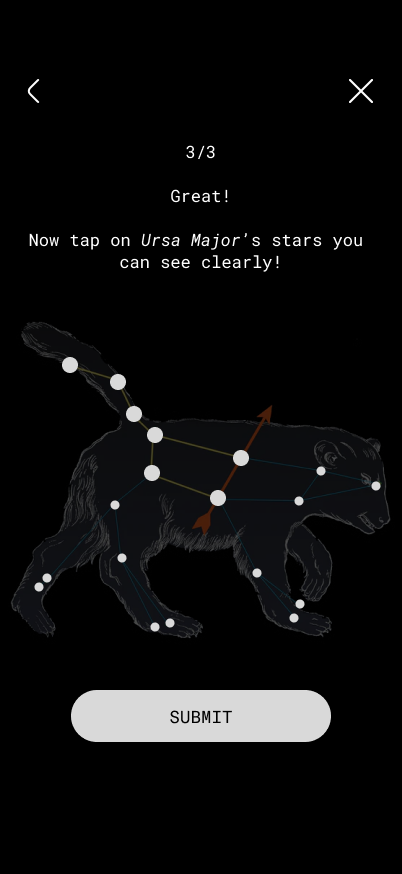
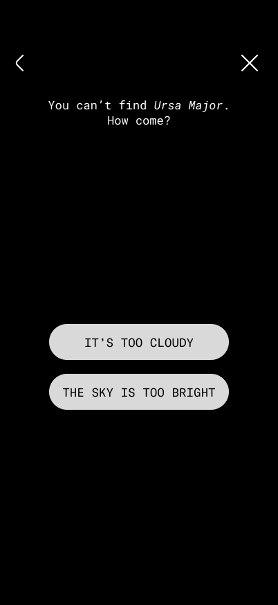
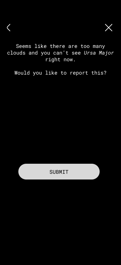
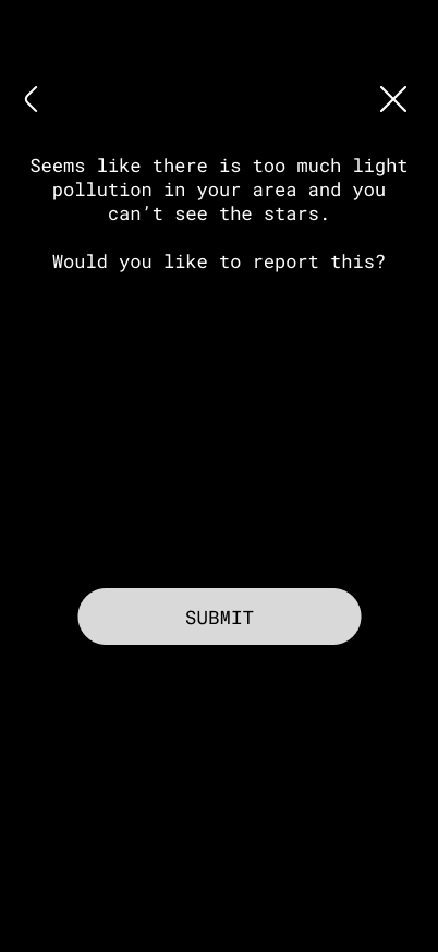
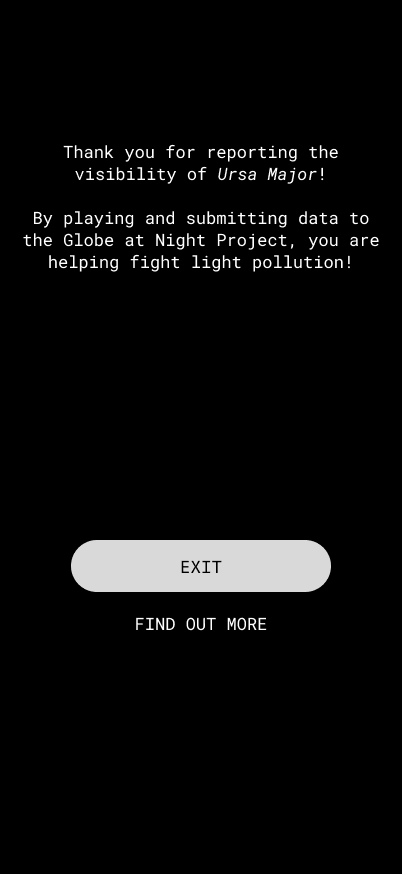
After testing my minigame, I created another version of it with the following improvements:
There is a short introduction about light pollution
Before starting the game, there is a disclaimer that explains that the game should be played at night
It is explicitly mentioned that Ursa Major is a constellation and that the user is supposed to look for it in the sky
Since my app does not feature the VR vision of the sky yet, the use of the app Stellarium is recommended to localise the constellation (so the first screen where users tried to tap on the stars is removed)
I added padding to the stars so that it is easier to select them
Before sending a report, users are asked if they want to submit their data (so no surprises)
There is an explanation of what was reported
All exit and back buttons are working
Here you can see the most important screens:
This is only a small gamified feature and I am excited to try out more to make citizen science more engaging.
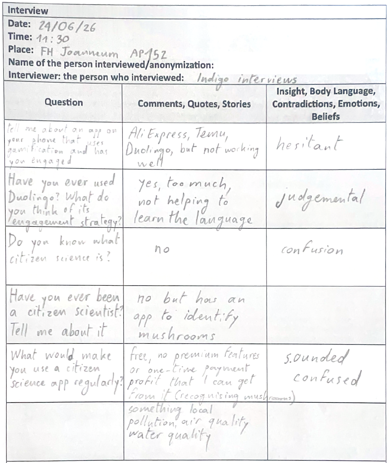
I interviewed one of my colleagues about gamified apps and their feelings about it. I wanted to share the interview and my thoughts because I reckon that it is relevant to my topic.
Notes
Transcript
Thank you for letting me interview you.
What is this about?
It’s about apps, engagement and gamification. Please tell me about an app you have on your phone that uses gamification and has you super engaged.
Let me check. What do I have? I mean, totally Duolingo, like the best example ever and also the features that we were doing for our financial app (App Design course) that was also for engagement and I think you can do any app engaging and funny but honestly like it shouldn’t be a good example.
It’s fine if you tell me about Duolingo.
I think for instance sometimes I use AliExpress and they use this like “oh you want this?” or “try to use this” with coins or something, that always pisses me off when when I open the app and I see like “oh, you want €10? Let’s buy something” or something like this. I never check and it just an example but honestly, I don’t really have any. Like, it is not working.
Is Duolingo working for you?
Yes, I don’t really use it because I think it does not really complete the goal of learning a language. It’s not for this sense of like learning something, you get it? But you don’t really learn so they give me vacation and that helps I guess.
What do you think about Duolingo‘s engagement strategy with the notifications and the passive aggressiveness?
I mean, this is probably why I’m not using it because I’m too tired of this and like I think generally just learning the language in this way it’s not helping. I was always quitting the Duolingo, but I know people who are on it every day and they see these notifications, they set it up. They put a big widget on their menu so they see the streak and like the announcement. I don’t know. I think not inappropriate for that or maybe they’re just bad levels. I think that it could be better too, so you actually go to a level and don’t see a random sentence.
Let’s switch this up a little bit. Do you know what citizen science is?
Citizen science… a person who lives in certain place and I don’t even know what? Maybe it’s some like studies that are local and like you can actually study the community somehow.
I’m gonna explain what it is. So citizen science is a project where normal people just like you, citizens, they can participate in science and become a scientist and they can for example report a plant species they see on their hike and submit it to this application and this data gets forwarded to scientists who can track where this plant is spreading but it can be done with many different things. It usually involves reporting because there’s a lot more citizens than scientists, so it makes sense that the population also helps with science.
Have you ever been a citizen scientist?
I don’t think I have ever had the opportunity.
It’s usually also done on applications, for example I have one. It’s called iNaturalist, where you take photos of plants and animals and identify them and it sends the data.
Why do you say it’s like you’re becoming a scientist?
Not an actual scientist, but contributing to science. You’re just sending data.You take a picture of a mushroom and then you see it on a map.
I didn’t know that, because I also have a mushroom app but I didn’t know that picture is actually being sent, like I don’t remember.
It depends on the app like some projects are just to help you identify the species, other are sending data and are citizen science projects.
What would make you use a citizen science app regularly?
I’ll describe it to you: something free, not using this kind of effect and then in two weeks you need to pay for it, to get use certain properties you should have a subscription. Or make a one time payment so you would be contributing some money and then you have it for you. What else? What in the app would keep you engaged to use it regularly?
Maybe you can think of some communication features. Other features that you like in apps that make you use them regularly is make some profit that I can get from it. I don’t know. I honestly don’t really get this concept very well. Is there any other example? Except recognising plants?
For example, there is another project that you use during the night and you report the light pollution, so you say “I can’t see any stars in the sky tonight” although there are no clouds, you send it and then they know that in that area there’s a lot of light pollution going on.
for example something else except It’s possible to put it should be more limited locally. I think maybe it should be about climate pollution, about the air quality or plants like vegetation, or water quality.
Alright, thank you!
Postscript
I forgot to make an introduction about the topic, but the questions slowly lead into it. I tried to actively listen and find some key concepts in my interviewee’s answers, while also improvising some questions (follow-up questions) based on their answers. Next time I would try to explain less and learn more from my interviewee.
Summary
To make my citizen science platform more engaging, I want to research how people perceive gamification and if it affects their usage of an app. I first asked questions about gamified apps the interviewee has used. Then I shifted to citizen science, in order to find out how I could make a reporting app more engaging.
Reflection
The interview made me realise that a concept I am already familiar with due to my research might not be so clear for other people, so it is important to always briefly explain key concepts. I also think that some questions caused confusion or were not answered, so I could have formulated them differently or broken them down into easier concepts. For instance, instead of saying “ tell me about an app that uses gamification and has you engaged” I could have said “how do you feel about streaks?” or “What emotions do you feel when using Duolingo?”.
The last answer was the one that gave me the most important information. The interviewee mentioned that they like when they get something from an app, like information about mushrooms. In my app I definitely need to add some educational content so users can learn about the stars. The interviewee also likes it when an app is free without any locked features, which is also important to me. They finally said that they appreciate it when something feels “local”. In my case, this could be tips on where to stargaze in your area, tasks to go explore a certain area that needs more reports and the option to read reports that were submitted close to you.
Here is a trailer of the developed prototype. It is post #5 and not #6 because I had the chance to test it with actual users after it was realised and interesting comments and doubts have raised, which are going to be addressed and reflected upon in the final blogpost.
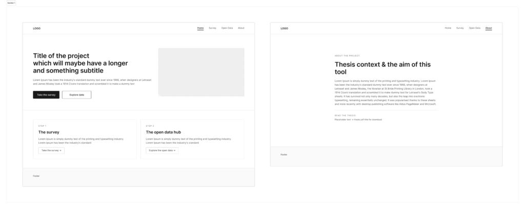
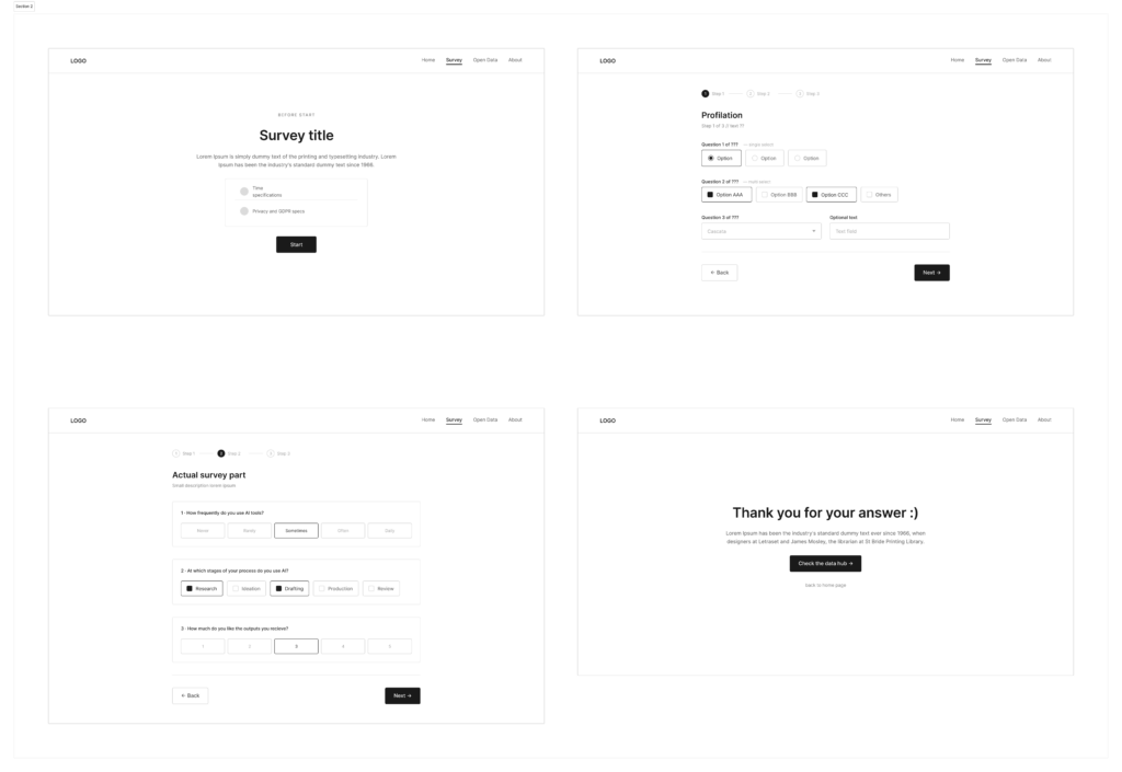
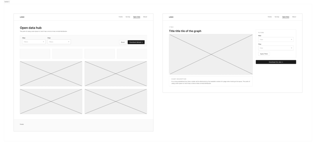
After redefining and adjusting the idea, it was time to give shape to all these thoughts. Before thinking of colours, typefaces or any kind of identity, the first step was to create a base layout for the following designing phase. The wireframes have been made in Figma and kept as basic as possible, with placeholder texts, simple shapes and an overall idea of its web architecture. In this way, the attention remains on what the tool actually does and how the user moves through it, rather than how it looks.
The tool/website is still based on the two main sections mentioned in the previous post: a survey part to gather quantitative data and a page with open access to them. The open data hub was imagined as dashboard where people can browse the results, which visualization will be particularly curated to ensure clarity.
The result I reached was a fine basis for its further development, even if it could have been more detailed in some sections (e.g. downloading process, better about page, more questions typologies) and texts. Indeed, trying to keep the actual copy in the areas I designated in the wireframes was an actual challenge. Maybe in the future would be better to already have texts, or at least the most similar version to the official one.
he heuristic evaluation in the last post named five UX patterns and grounded each one in a mechanism and a source. But naming a pattern in a research document and getting someone to actually recognize it while scrolling are two different problems. To close that gap, I built something more concrete than a catalogue: a wireframed prototype that simulates the experience of being algorithmically escalated, and then tests whether people can spot what just happened to them.
The prototype is a fictional social media feed, structured in two phases.
Phase one is a straight scroll through five posts(in a more refined version probably more), with no annotation or warning. The content itself escalates in a deliberate sequence: it opens with something completely mundane (a weekend BBQ post), moves through generic economic frustration (a rising energy bill, “does this ever stop?”), into nostalgic in-group framing (“our grandparents built this country… share if you see it too”), into outrage-framed conspiracy (“the media won’t cover this, ask yourself why”), and ends on an explicit call to join a named movement. Two things escalate in parallel with the content itself: the engagement numbers (from 235 likes and 15 comments on the first post to over 74,000 likes and 8,400 comments on the last) and the comment threads underneath each post, which shift from neutral to increasingly validating (“finally someone saying this,” “I knew it,” “count me in”).
After the scroll, users hit a short reflection screen: “What did you just notice?”, with three answer options. It’s there to test whether the escalation registers consciously at all, or whether it just works on people the way it’s designed to.
Phase two replays the identical feed, but now the posts carry annotation boxes naming the specific mechanism, for example, labeling the energy-bill post as an “Emotional Trigger” (frustration without a named target, which the algorithm treats as highly relevant because it drives comment activity), the grandparents post as “Social Validation + Frictionless Sharing” (the like count signaling consensus, the oversized share button removing any pause before spreading it further), and the media-conspiracy post as “False Credibility + Outrage Architecture” (borrowing the visual language of legitimate news to make a vague accusation feel credible). This second pass is the direct, hands-on version of the heuristic evaluation from the previous post, the same three mechanisms (amplification, validation, frictionlessness) made visible on the exact content that used them.
At this moment, this prototype has only been walked through informally with three fellow design students, not yet with any of the young people the tool is actually meant for.
Still I gained valuable feedback from my peers:
The engagement-number escalation is probably the easiest thing to miss. Peers who read UX interfaces daily are likely to focus on the text of the posts rather than the like/share/comment counts sitting quietly to the side, meaning even a design-literate tester might land on “the content got more extreme” while missing “the posts had more and more likes,” even though both are true and both are the point.
The “Join the Group” call-to-action is probably the moment that lands hardest. Everything before it is observational; that button asks for an action. It’s a reasonable guess that this is where testers would say the discomfort became concrete.
The annotated second pass likely produces a genuine “oh” reaction, precisely because pass one deliberately withholds any framing. The value of the two-pass structure is exactly this contrast. But it also means the specific wording of the annotations (how technical vs. plain the labels are) probably deserves the most iteration.
Peers may find the labels (“Emotional Trigger,” “Outrage Architecture”) a bit academic for a tool aimed at teenagers. As they are now, they are very technical and too complex for my actual target group.
Outlook: Testing With Actual Young People
In my next steps I would refine my current prototype and start testings with my actual target group. This could look like the following:
Small workshop groups (4–6 participants, ages roughly 14–17) rather than one-on-one sessions, since group discussion after the reflection question is likely to surface disagreement about what counted as “extreme” or “unusual”.
Co-facilitation with a media-literacy or extremism-prevention professional, given that even a fictional simulation of this content needs someone in the room who can handle a participant reacting more strongly than expected, and a clear opt-out built into the session, not just offered at the start and forgotten.
Interviews with people that are part of the extremist movement. This is one part of which I am very unsure of, but I believe I could gain valuable insight from people that are on the political right. Understanding how they got there could help me create a tool for prevention. This part requires the most preparation, as I would need to find a way for people to talk to me in the first place.
The context review in the last post mapped out where and when algorithmic radicalization has been documented across YouTube, TikTok, and X. This post does the actual evaluation: taking Gray et al.’s (2018) dark pattern taxonomy, nagging, obstruction, sneaking, interface interference, and forced action, and adapting it into a working heuristic grid, then applying that grid to five specific interface elements drawn from the platforms reviewed above.
Rather than asking the standard usability question (“does this help the user complete their task efficiently?”), each element below is evaluated against three project-specific criteria derived from LaCroix and Berkovits’ (2026) pipeline model (see Post 2):
Amplification: Does the element systematically increase exposure to escalating content?
Validation: Does the element convert exposure into a social signal of identity or belonging?
Frictionlessness: Does the element remove the pause a user would need to reconsider before acting?
Autoplay Chaining (YouTube)
Autoplay queues the next video automatically, based on the recommendation model, without requiring any user action. Against the grid: high amplification, low validation (it’s not a social action), high frictionlessness (zero taps required to keep watching). In Gray et al.’s taxonomy, this most closely resembles forced action combined with a passive form of nagging, the system continues the experience on the user’s behalf unless they actively intervene.
The “For You” Feed Reset (TikTok)
Unlike a subscription feed, TikTok’s FYP has no stable “unsubscribe”. Every swipe is a fresh optimization pass. Baumann et al. (2025) found strong content amplification setting in within roughly 200 videos. Against the grid: very high amplification, low validation, very high frictionlessness (a swipe requires less effort than a click). This is closer to interface interference, the feed’s ranking logic is invisible to the user, so there’s no way to see, let alone interrupt, the drift while it’s happening.
Engagement Counters and Like Badges (cross-platform)
Visible like/share/comment counts turn viewing into a public scoreboard. This is the element LaCroix and Berkovits identify as converting resentment into performative identity. Against the grid: low direct amplification, very high validation (the entire function of the element is social signaling), moderate frictionlessness (liking is one tap, but the effect persists after the tap). This overlaps with social proof exploitation, a pattern documented across e-commerce dark pattern research (Mathur et al., 2019) that maps cleanly onto political content: a high counter tells a new viewer “many people already validated this,” which lowers their own threshold for engaging further.
One-Tap Resharing
The mechanical simplicity of turning a private reaction into a public post. Moderate amplification (it multiplies existing content rather than generating new exposure), high validation (sharing is itself an identity act), maximal frictionlessness, this is the exact mechanism LaCroix and Berkovits single out as removing “cognitive friction” between private conviction and public propagation. In dark pattern terms, this is the near-total absence of what Gray et al. would call a deliberate obstruction, most dark pattern research studies obstruction added to slow users down (e.g., making cancellation hard); here the notable design choice is the deliberate removal of a step that would ordinarily exist.
“Trending” and “Recommended for You” Badges
A badge asserting that content is popular or personally relevant, regardless of how that judgment was computed. Against the grid: moderate-to-high amplification (badges are themselves a ranking signal shown back to the user), high validation (trending implies social consensus), high frictionlessness (the badge pre-empts the user’s own evaluation of the content). The actual basis for “trending” (engagement velocity, not necessarily quality or accuracy) is concealed behind a label that implies broad, neutral endorsement.
It was tempting, once I’ve decided to study radicalizing UX patterns, to jump straight into cataloguing dark patterns. Screenshot a manipulative feed, label it, move on to the next one. But before any pattern can be named responsibly, I needed to understand the context, and that’s where a context review comes in.
Before naming any concrete UX pattern, this project ran a context review across three platforms, YouTube, TikTok, and X (formerly Twitter), to understand when, how, and under what conditions these dynamics were actually documented. Patterns don’t mean the same thing in every era; a review has to establish what changed, and when.
YouTube
The earliest and still most cited empirical anchor here is Ribeiro et al.’s 2020 audit of YouTube’s recommendation system. The researchers tracked user migration across three overlapping communities, the Intellectual Dark Web (I.D.W.), the Alt-lite, and the Alt-right, using more than 72 million comments and over 2 million video and channel recommendations collected between May and July 2019. The context matters: this was the period when “algorithmic rabbit hole” had already become a popular metaphor (helped along by public testimony from former YouTube viewer Caleb Cain about his own radicalization), but there was no large-scale empirical confirmation of how the pathway actually worked mechanically. Ribeiro et al. supplied that: users measurably migrated from milder I.D.W. content toward more extreme Alt-right content over time, and channel recommendations, more than video recommendations, were the specific mechanism connecting Alt-lite audiences to Alt-right channels.
Later audits (e.g. Hosseinmardi et al., 2021; Ledwich & Zaitsev, 2020) complicated this picture, finding smaller or more contested effects depending on methodology. For a context review, that disagreement is itself useful information: it tells us the “pipeline” isn’t a fixed, permanent feature of YouTube’s algorithm, but something that varies with the specific recommendation model in place at a given time, and with how the audit itself is designed.
TikTok
TikTok’s context is different in almost every respect: newer platform, shorter content, faster iteration cycles. Media Matters’ 2021 investigation seeded a fresh account with exclusively transphobic content and, within a few hundred recommended videos, found the “For You” page surfacing extremist and far-right material, including content referencing violent figures. That single-account case study was followed by more rigorous quantitative work: Baumann et al. (2025) ran a sock-puppet audit and found that TikTok’s algorithm produces strong content amplification along a bot’s expressed interests within the first 200 videos watched, with content diversity declining sharply after that point. Shin and Jitkajornwanich (2024) reverse-engineered TikTok’s recommendation logic specifically for far-right content and found multiple distinct pathways feeding it, largely traceable to platform recommendations rather than active user searching.
The context here, a platform built entirely around a single, extremely responsive short-video feed, optimized almost exclusively for watch time, helps explain why the numbers look faster and starker than YouTube’s: 200 videos on TikTok is an afternoon, not months of viewing history.
X
X’s context is the most politically visible of the three, partly because ownership and moderation policy changed dramatically after the platform’s 2022 acquisition. Huszár et al.’s 2022 study (discussed in Post 1) predates that change and already found algorithmic amplification of right-leaning content in six of seven countries studied. More recent investigative work, including a 2026 cross-platform audit by People vs. Big Tech comparing X and TikTok in the French political context, found continued asymmetric visibility for far-right and radical-left accounts relative to moderate parties, independent of follower counts. The context review here has to hold two things at once: the underlying amplification dynamic Huszár et al. identified pre-dates the platform’s ownership change, and post-change investigations suggest it has, if anything, become more visible rather than less.
Running this review rules out treating “algorithmic radicalization” as one uniform phenomenon with one uniform UX signature. YouTube’s pattern is slow and comment-thread-mediated; TikTok’s is fast and almost entirely feed-driven; X’s is amplification-plus-visibility in a much more overtly contested political environment. Any pattern catalogue this project produces needs to specify which platform context it was observed in, and roughly when, otherwise a pattern documented on 2019 YouTube gets silently treated as if it still describes 2026 TikTok, which the context review shows is simply not a safe assumption.
In the first post of this series, we established that UX design is never politically neutral. But amplification is only half the story. The more unsettling question is what happens after someone starts seeing more of this content: how do they go from scrolling to sharing, from watching to believing, from believing to spreading?
LaCroix and Berkovits (2026) offer a useful concept for this: the Digital Radical, an individual who has made the transition from passive consumer of extremist content to active propagator of it. Their argument is that this transition isn’t purely psychological or ideological. It is actively encouraged by the architecture of social platforms.
They break this process down into a kind of pipeline, each stage powered by a specific design feature:
Recommendation engines move users from generic, everyday frustration toward ideologically charged resentment. The frustration was already there, the algorithm gives it a direction and a villain.
Like and share systems convert that resentment into performative identity. Engaging with extreme content becomes a public signal of who you are.
One-click sharing removes the last barrier. What used to be a private conviction becomes public propagation, instantly, without any cognitive friction to slow the person down and make them reconsider.
The conclusion LaCroix and Berkovits draw is blunt: the interface itself is the medium of radicalization. Not the ideology alone. Not the individual alone. The interface.
This is arguably the most design-relevant insight in the whole framework. Radicalization researchers have long focused on content and community. But LaCroix and Berkovits point to something UX designers understand intuitively: friction, or its absence, determines behavior. Every “are you sure?” prompt, every extra tap, every moment of pause is a design decision. Removing friction isn’t inherently sinister; it’s usually done to boost engagement metrics. But when the content being frictionlessly shared is extremist, the design choice that was meant to drive growth ends up driving radicalization instead.
It would be a mistake, and an oversimplification this project wants to explicitly avoid, to conclude that platform design causes right-wing extremism. It doesn’t, at least not on its own. Radicalization emerges from an interplay of individual vulnerabilities, social context, and political crises (Youngblood, 2020; Banywana, 2026). Digital infrastructure is an increasingly important factor in that interplay, not a standalone explanation for it.
But “not the sole cause” doesn’t mean “not worth studying.” Digital platforms are, for a growing share of the population, the primary place where political information is absorbed, social identity is formed, and civic participation happens. Whoever doesn’t understand the design logic behind that space is simply at its mercy. Whoever does understand it can start to question it as a user, as a designer, or as a policymaker.
This is the communicative and educational ambition behind the project: building awareness of how platform design encourages radicalization, as a precondition for pushing back against it, individually, and at the level of policy and platform design itself. Concretely, this means identifying and classifying radicalization patterns in interface design, and eventually building a tool that strengthens users’ digital media literacy, aimed especially at young people, whose critical awareness of digital media still needs active support.