When we talk about right-wing radicalization online, the conversation usually centers on content: which videos, which posts, which influencers. What gets less attention is interface itself. This blog series starts from a simple but often overlooked claim: UX design is not politically neutral.
Every digital platform is built on thousands of small design decisions. How a feed is ordered, what gets a notification, how easy it is to share something with one tap, none of these choices are accidents, and none of them are ideologically empty. They are the product of algorithmic personalization, social validation mechanisms, and platform architecture. Together, these design layers quietly shape what we see, how we react to it, and who we become as users.
The most extensive study on algorithmic amplification of political content comes from Huszár et al. (2022), who analyzed how Twitter’s recommendation algorithm treated political content across seven countries. Their findings showed, that in six of the seven countries studied, right-leaning and conservative accounts were amplified more strongly by the algorithm than their left-leaning counterparts. The differences in reach were statistically significant and consistent across contexts.
What’s important here is why this matters for design research specifically. The study doesn’t tell us definitively why this asymmetry exists, the underlying mechanism is still debated. But it tells us something arguably more important: the design of the algorithm produces this inequality, regardless of what its engineers intended. Nobody needs to sit down and decide “let’s amplify right-wing content” for a system to end up doing exactly that. The outcome emerges from the architecture itself.
This is the core problem with treating UX design as a purely technical, apolitical discipline. A recommendation engine has to rank content somehow. A feed has to be ordered somehow. There is no version of these systems that makes zero choices, “neutrality” isn’t actually real nor feasible in this context. Every design decision has political consequences, whether the designers intended them or not, and whether they’re even aware of them or not.
For a master’s project sitting at the intersection of design and political radicalization, this reframing matters. It shifts the question away from “did designers mean to help radicalize people?” (usually no) and toward “what does this specific interface structure do, mechanically, to the people using it?” That’s a question we can actually study, pattern by pattern.
If design decisions produce measurable political effects, regardless of intent, then understanding which decisions produce which effects becomes a genuinely urgent task. That’s the gap this project is trying to fill: not just showing that platforms behave asymmetrically, but building a vocabulary that names exactly which design choices drive which radicalization dynamics.
I went to the library of the University Ulm yesterday to get my hands on the book “Überwachen und Strafen” by Michel Foucault, but I wasn’t able to find it, When asking for it at the front desk I was told that I have to order it first, because it’s not accessible in the public shelves there. Luckily, my sister studies at the university of Ulm, so she will order it for me and also borrow it so I can read it at home. But it will take a while until I get it, so I won’t be able to read it before the deadline for these blogposts. I will have enough time to read through it though during the summer break.
The Trainship Book
Unfortunately, I was sick during both “Bring Your Prototype” sessions this semester, and in the days leading up to them as well, so I didn’t sit down to develop my first 30-minute prototype until Friday. For this, I went back to the long-distance train ride setting, since I’d already had an idea for it some time ago.
The idea is to create a kind of “friendship book” that passengers can fill out during the train ride. It features questions that everyone might secretly ask themselves while observing their fellow passengers on the trip. Train passengers constantly construct stories about the people around them. They infer destinations, relationships or emotions based on clothing, luggage or behaviour. The friendship book shifts this process from imagination to voluntary self-disclosure. Instead of guessing, travellers can decide which parts of their story they want to reveal. It serves several purposes at once: On the one hand, the book is an interesting way to pass the time on long trips; on the other hand, it satisfies people’s natural curiosity without requiring direct interaction. The book can still serve as a conversation starter without forcing social interaction.
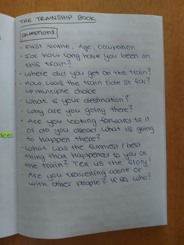
I’ve come up with the following questions for the book:
The Layout
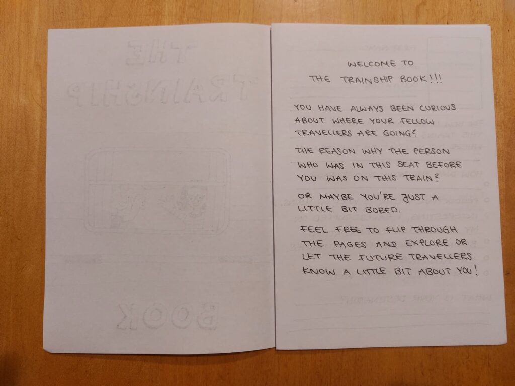
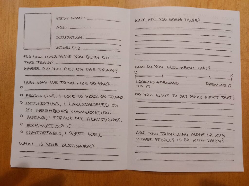
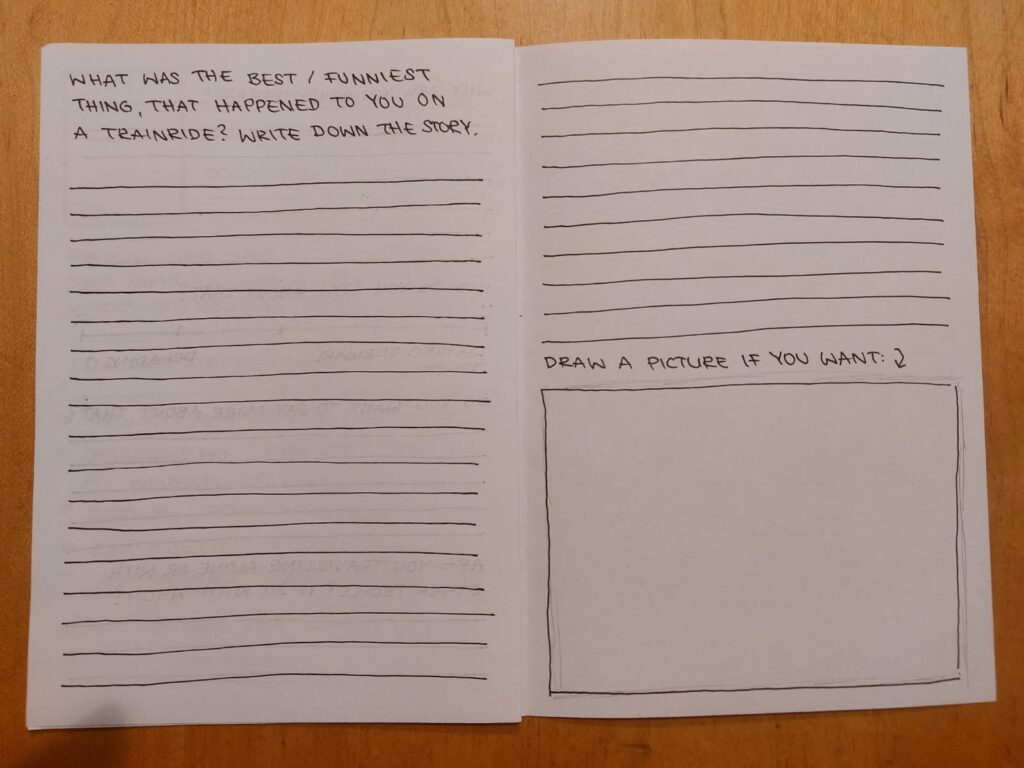
There will be a short introduction text on the first page, explaining the concept of the book and how it’s meant to be used. Then there will be double pages for the persons to fill out with questions related to their trip. The personal section on top will be very short, but I still decided to include it, so the readers would get a rough image about who that person is. After that it starts with some basic questions and goes more into detail when it comes to the reason why the person is travelling to this destination and how what is going to await them makes them feel. I think if the travellers feel comfortable to be honest here, it could create a sense of authenticity and connection, if other people find themselves in similar situations or struggeling with the same anxious thoughts, for example. Then there will also be some pages where people can tell stories about the best or funniest thing that happened to them on the train. This could as well be very entertaining to read. I also thought about including a spread where people can recommend songs to each other which they then can listen to while on the train. It might also be nice to sort the songs into different categories depending on the current mood, e.g. “Listen to this song when you are sad.” or “Listen to this song when it’s raining outside”.
The Prototype
I did a quick 30-minute prototype of the three spreads I described earlier. I tested it on the way back from Ulm, but I forgot the filled out version at my sister’s place, so I will have to ask her to send me a picture of it.
The Concept
There is different options when it comes to where the book is going to be placed / who owns it.
OPTION 1: The book belongs to an individual person and they can bring it on train rides whenever they feel like it and then just ask people to write in it. That way they “collect” friends on their journays over time. This might be a good option for more extrovert and outgoing people, but also for people who wish to engage more in conversations with strangers, as it causes active social interaction. This is also the option that I tested on my way to Ulm on the weekend.
OPTION 2: There is several books on the train that stay on fixed spots, so each person sitting in that specific seat would fill out the book. That way people would find out things about the people that were in the exact same place in the past, which could be also very interesting, since it causes asynchronous interaction.
OPTION 3: the books would be placed at the entrances for people to take and give to other people. These books would be more like booklets, only for this one trainride to keep as a memory afterwards. What is interesting about this option is that it connects more than two people on the same train ride.
My favourite would be option 2, since it’s the most appealing to me personally. I would enjoy to read about the people who were there before me. Apart from that I think one of the advantages is that after a while there is many filled out pages to read through, so it might be more interesting. Additionally, it serves as a temporary pastime for many people and is therefore more sustainable than individual books, which may eventually be forgotten or end up in the trash because they’re too much of a burden to carry while traveling.
The Testing
I found it easier to talk to someone on the train this time, because I had a “valid” reason for it. I realised that the prototype did not only test the book itself, but also gave me permission to approach a stranger as a way of “social excuse”, lowering the barrier that usually prevents conversations between passengers.
The journey from Augsburg to Ulm only takes around 45 minutes, which made the situation feel less intimidating, as I knew I would be leaving the train soon anyway if the interactionbecame awkward.
There was a girl around my age sitting next to me, so after briefly explaining my project, I asked if she would be willing to fill out the prototype pages I had prepared the evening before. Although I was a little nervous at first, but I soon realized that we were getting along quite well. While she was filling out the pages, we started talking about our experiences of travelling by train and realised that neither of us would usually start a conversation with a stranger unless we were approached first.
She told me that she found the questions interesting and enjoyed answering them. Nevertheless, I plan to conduct a small survey to evaluate which questions people find most interesting and whether some should be revised or replaced.
Overall, the prototype confirmed that the friendship book can work as an effective conversation starter. It provides a clear reason to approach someone while still making it easy for the other person to decline without feeling uncomfortable.
I wondered whether the book functions more as a social mediator than as the actual activity itself. In this particular situation, I think the physical object was probably more important than the questions it contained. Having a tangible artefact provided a natural reason to approach someone and made starting a conversation feel much less awkward. The questions mainly served as a gateway to further discussion about train journeys and interactions with strangers. However, I believe this would change if the books became a permanent feature on trains, as proposed in option two. In that case, the content of the questions would likely become much more important, since passengers would spend more time reading previous entries and contributing their own thoughts.
Would the same conversation have happened without the physical book? Probably not, or at least it would have been much more difficult to reach that point. Without the book, I would most likely have had to start with conventional small talk before changing the topic to how someone feels about talking to strangers.
Limitations
Of course, this was only a very small test, so I cannot draw any general conclusions from it yet. I only asked one person to participate, who also happened to be around my age. She was open to talking to me, so the situation was probably easier than it could have been with someone else. I also tested the prototype during the day on a relatively short train ride. I think the results could be different on a longer journey, in a crowded train, or with people who are in a hurry or simply do not want to interact. If I want to stick with the idea of the trainship book I will definitely have to test the concept with more people before I can properly evaluate it.
Continuing my research on the topic of “Slowness”from last semester, I will be doing further work on this topic as part of the Design & Research II course with Birgit Bachler PhD.
For the final assignment, I will need to record a 2-minute video of the final prototype — in my case, I plan to use prototyping in Figma, which each of you will be able to test. The research will again focus more on contextual analysis, as well as user testing, bibliography, and heuristic evaluation.
During the development of my prototypes, I realized that presenting separate activities was not enough. Each activity explored a different aspect of children’s experiences, but they did not naturally connect with one another.
Instead of treating them as individual prototypes, I started combining them into one participatory toolkit. The goal changed from asking isolated questions to guiding children through a simple design journey.
The toolkit now follows three connected steps;
First, children choose a material or playground element that they would like to include. They then select a feeling that best represents how this element should make them feel. Finally, they choose a type of play they associate with it. Rather than giving fixed answers, the activity encourages children to create their own combinations and explain their choices.
After completing these steps, children receive a blank sheet where they can use the selected cards as inspiration to draw or design their own playground.
Although the prototype is still low-fidelity, I think structuring the activities into one continuous process makes participation much more natural and easier for children.
Trigger Warnung: Ich habe meine Adobe Programme alle auf Deutsch eingestellt. Wer sich hierdurch getriggert fühlt sollte diesen Blogbeitrag nicht lesen.
Tu ich mir mit Tutorials schwer, weil die alle auf Englisch sind und ich beim Nachbauen dann erst mal Effekte übersetzen gehen kann, um sie anzufinden? Ja, sehr. Kann ich mich dazu überwinden die Programme nach all den Jahren endlich einmal umzustellen? Nein. Don`t judge me.
Auf meinem Weg hin mehr über Character Animation zu lernen lud ich mir den Adobe Character Animatior herunter. Wer das Programm nicht kennt: Es ist – wie der Name schon verrät – darauf ausgelegt Charaktere damit zu animieren. Was das Programm dabei aber von Animate oder After Effects abhebt: Der Character Animator kann mit deinem über z.B. Photoshop gebautem Charakter gefüttert werden und animiert diesen dann automatisch und in Echtzeit auf deine eigenen Bewegungen, die du mit der Computer-Cam aufnimmst. Dein digitaler Charakter ahmt dich sozusagen nach. Dies funktioniert besonders mit Facial Expressions.
Man kann sofort reinstarten, denn der Character Animator hat eine große Auswahl an bereits vorgefertigten Charakteren. Teils nur Gesichter, teils mit ganzem Körper.
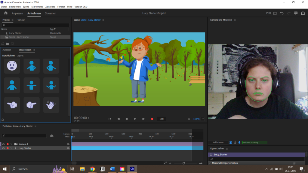
Hier im Screenshot zu sehen ist das Arbeitsfeld mit einem vorgefertigten Charakter. Rechts zu sehen ist meine Kameraaufnahme. Das Programm erkennt meine Gesichtszüge bei einigermaßen guten Lichtverhältnissen wirklich gut und wendet diese sofort auf den Charakter an. Selbiges funktioniert mit Mundbewegungen beim Sprechen. Rechts im Feld zu sehen sind voreingestellte Steuerungen – Posen, die ich den Charakter machen lassen kann. Möchte ich z.B. ein Erklärvideo mit dem Charakter machen, würde ich auf record drücken, den Erklärtext runtersprechen und wenn ich mich danach fühle auf die verschiedenen Posen zugreifen, die der Charakter mit nur einem Klick nachmacht.
Funktioniert alles super einfach – wenn der Charakter bereits da ist.
Möchte man einen eigenen Charakter in das Programm einschleusen schaut die Welt nicht mehr ganz so rosig aus. Denn jede Pose und jede Mundstellung muss einzeln gezeichnet und korrekt gelayert werden.
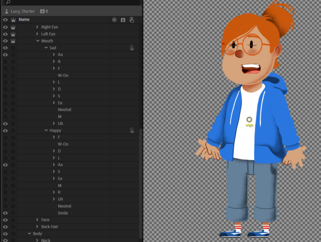
Hier als Screenshot zu sehen sind die verschiedenen Sprechlaute des Charakters – sogar in zwei Ausführungen: sad und happy. Fast jeder der Laute hat dann auch noch einmal Unter-Layer. Character „Lucy“ ist jedoch im Vergleich zu den anderen vorgebauten Charakteren eher auf der aufwendigen Seite. Dafür hat sie auch viele Animationsmöglichkeiten.
Was praktisch zum Erstellen des eigenen Charakters ist: Character Animator gibt einen klaren Überblick und Anweisungen bzw. Empfehlungen, welche Facial Expressions für eine nahtlose Sprech-Animation benötigt werden und listet diese mit kleinen Symbolen auf, die man dann mit eigenen Zeichnungen füttern kann. Natürlich ist es auch möglich, wenn man nicht so einen aufwendigen Charakter wie Lucy zeichnen will, nicht alle Laute zu verwenden. Kreiert man z.B. eine sprechende Ente (wer auch immer so etwas Verrücktes tu würde…), reicht vielleicht ein einfaches Mund (Schnabel) – auf und zu.
Neben der Aufzeichnung der Gesichtszüge und Sprache haben manche der voreingestellten Charaktere auch ein Body Rig. Jene Charaktere ahmen dann auch Arm- und Beinbewegungen nach. Wichtig: Immer zuerst in neutraler Pose kalibrieren! Das funktioniert auch sehr einfach: Unter der Kamera zuerst den Body-Tracker aktivieren, dann auf den Kalibrierungs-Button drücken. Man hat dann, anders als bei der Gesichts-Kalibrierung 5 Sekunden Zeit schnell an die andere Seite des Raumes zu rennen und sich in T-Pose hinzustellen.
Die Intensität sämtlichen Verhaltens des Charakters kann zudem auch bestimmt werden, sodass im Aufnahmeprozess keine Bewegung ungewollt erscheint.
Wer sich mehr mit der Materie auseinandersetzen will, kann in dieses Video reinschauen. Hier werden Schritt für Schritt sämtliche Funktionen des Programmes erklärt, natürlich viel detaillierter, als ich es in einem Blogpost machen kann.
In einem weiteren Blogpost werde ich versuchen meinen eigenen Charakter zu animieren – der muss hierfür aber erst einmal erstellt werden.
Mein vorläufiges Fazit von Adobe Character Animator:
Man kommt sehr leicht rein und hat nach kürzester Zeit schon ein Erfolgsgefühl, wenn man mit einem bereits vorhandenen Charakter animiert. Durch die vielen schon geriggten Puppen kann man sofort reinstarten und das Programm kennenlernen. Ich kann mir sehr gut vorstellen, dass Character Animator besonders für Erklärvideos exzellent geeignet ist – also für Videos, in denen man einen statisch auf dem Platz stehenden Character hat, der ab und an eine Hand bewegt und die meiste Bewegung im Gesicht beim Sprechen stattfindet. Aus dem oben verlinkten Video habe ich auch herausgefunden, dass dich diese Puppets in andere Adobe Programme, wie After Effects integrieren lassen. Bis jetzt bin ich von den Funktionen und der Flexibilität positiv überrascht. Mal sehen, wie es mir geht wenn ich versuche meinen eigenen Charakter zu riggen…
During our last session with Birgit Bachler we performed some usability tests of our prototypes.
My aim was to find out if the reporting game was understandable and engaging. The reporting minigame does not have a VR function yet and I supposed that this could have created a difference between how I imagined the prototype and how it was perceived by others. Since the testing happened during broad daylight in a classroom, I suspected that users would not have understood that the minigame is meant to be used at night to send a useful report. For this reason I prepared some pictures of the sky to simulate different observations.
I measured these parameters:
Time spent on tasks
Number of trials until the participants succeeded in completing the task (if they did)
Task completion — whether the task was completed in way I intended it
The method used was the “thinking aloud” one. Users should speak while they perform the test and tell the interviewer their thoughts and feelings.
These were the tasks that I gave my participants:
Play the game without lying or pretending
Play the game in this situation (picture of clear sky)
Play the game in this situation (picture of cloudy sky)
Play the game in this situation (picture of polluted sky)
Imagine you are seeing a clear sky but you cannot find that constellation
You already know where the constellation is and want to jump straight to reporting
The questions I asked them at the end were the following:
Did anything create frustration or confusion (text, icon, something in the flow)?
How would you explain the main goal of the game to a friend?
What was your favourite part?
If you could add a feature, what would it be?
What do you think about the visual style and aesthetics?
Three people participated in the test, including two students and one professor. I called them P1, P2 and P3. I did not ask them all of the questions, instead I selected different ones every time to keep the test shorter.
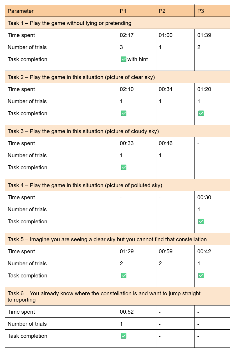
The results of the tests are summed up in this table:
These are the pictures I showed my participants for task 2, 3 and 4:
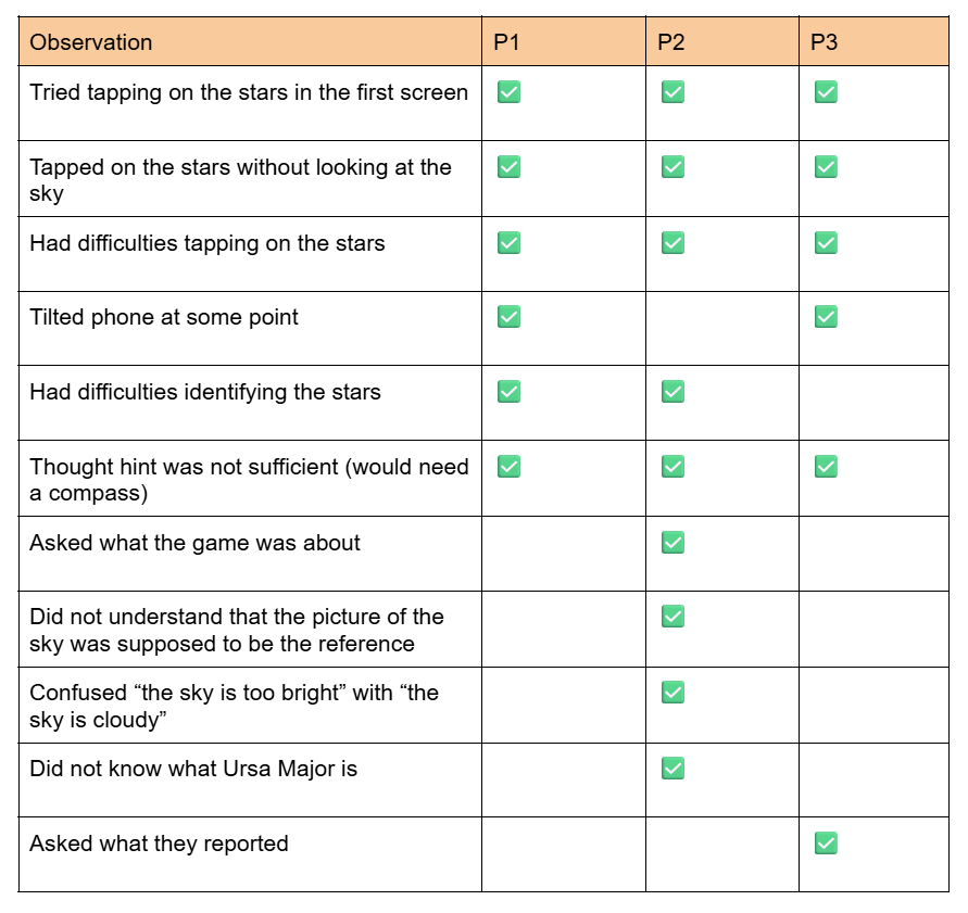
Some other observations are summed up in the following table:
This is how the participants answered the questions:
Did anything create frustration or confusion (text, icon, something in the flow)?
P1: I would say that in the beginning I wasn’t quite sure what I’m supposed to do, but maybe also because I did not read the text fully in the beginning, so I wasn’t quite sure whether you can only report when it’s night. I didn’t quite get that at the moment and was confused because I could not see anything, but I should have seen something. Yeah, then maybe the hint, but I already said that about the northern hemisphere, when you give a hint that something is supposed to be there, that there’s some sort of hint about which direction to look and maybe also how high or maybe if there’s another star that you would recognise that you can take as a reference point or something. Then I think you can make it quicker. Also, in the beginning I didn’t know what this button meant, I would have had to test it out to see what it does and also the exit button didn’t go to the start, but it went back to the star constellation, so maybe from exit I would expect that it would let me exit. I think maybe in the beginning it could be a little more clear what to do and more help, and maybe that the stars could be a little bigger or further apart. The smaller ones are a challenge to click.
P2: A lot of stuff generates confusion, like when I started I didn’t even know how to report. It said “locate this star” and I don’t even know what that is, so it was really frustrating, like what exactly I have to find? So I just randomly tapped here and there and found out. The most frustrating part was that everything is designed for a person who knows about this.
P3: The finger (the tapping on stars feature) – didn’t realise that at the start.
How would you explain the main goal of the game to a friend?
P1: I would say: identify constellations and also report about light pollution in different areas based on what stars are visible with the eye in the sky.
P2: The main goal of this game is to locate the stars and report them.
P3: Reporting to what extent a constellation is visible from a certain location, and perhaps including metadata as well – or did that come later? Yeah, that would be cool, because you’d say, ‘I can’ ’t see it, and then you can say, ‘Why not?’ I reckon one reason is that I’m too daft to find the star, and the other is that it’s too light-polluted, so I think you have to… But since it’s just a game, you can simply track light pollution and constellations.
What was your favourite part?
P1: I think clicking the constellations, like the selection of the stars I could see.
P2: When I can see the clear sky and I’m like “yeah maybe I am doing something” and also I really like that there’s a hint option, it gave me a little bit of information.
P3: I think the writing is a good start, ‘Help me’ and so on.
If you could add a feature, what would it be?
P1: Maybe more constellations? And also I had an app on my phone when I was stargazing and it showed the entire night sky. Every star is supposed to be there. Maybe it could also be nice to have an overview of all the constellations that should be in the sky and if you could kind of see on the phone and then compare it to what you actually see. I think it might also be easier to find a constellation. Like, okay, I found this constellation and if I turn a little more up then I can find more constellations and get a better understanding of what is where in the sky.
P2: I would really like the feature to be really using the current sky, like having a region of it. That could be really cool.
P3: Maybe the step where you have to look for the constellation in the sky or check if it’s visible. It’d also be cool to have a location, just like with those apps, so you know that’d be the next feature – and at the same time you’d be learning about the constellations, so you could pick up on that sort of mythological stuff on the side as well – that mix of astronomy and astrology.
What do you think about the visual style and aesthetics?
P1: It is very nice, very clean, very easy. Also it’s like the theme of the stars, black-and-white. Also, I think the constellation with the outline of the animal and then the stars inside is good because then you also learn a little more about the constellations, because sometimes in the sky if you only have the stars it’s hard to see the animal or whatever that’s supposed to depict. I think the style was very nice.
P2: The night vision, I really liked it. I think it’s a good direction.
P3: Simple and neat.
After analysing the recordings of the tests, I concluded that:
It was not clear to the participants that you are supposed to play the game at night and tell the game if it is daytime; I could have specified that in the introduction (“this game should be played at night”)
Sometimes when the stars are not visible, participants would still send a report; I could make a first screen that asks a yes/no question to filter out reports that are not valid
Constellations are not always a concept known by everyone; I should explain what they are at the beginning
There were issues with orientation and localisation of the constellation; the VR feature with compass sensor and GPS that other applications use would help with that
Users tried to tap on the stars on the first screen; it should be clear that they are not tappable or they should be tappable right from the start
Exit buttons were not working properly; I should check them
The stars were a challenge to tap on; maybe the tappable area could be bigger or there should be a zoom/swipe feature
The option to tap on the stars was appreciated; I can keep working with that
There was some confusion about what was reported at the end; I should specify it
The black and white theme with the constellation illustrations was appreciated
For the next testing, I need to remind myself to:
explain the product and what we are doing with it
ask some introductory questions to understand the participant’s knowledge of the topic
ask everyone the same questions to compare results better
Da ich nun den Entschluss gefasst habe mich in Character Animation auszuprobieren, stellte ich mir nun die Frage: Wo fange ich an?
Meine Kenntnisse in (Character-)Animation sind limitiert. So tat ich das, was jede Person tun würde, die mehr Wissen und Know-How zu einem Thema haben will: Ich leistete umfängliche Recherchearbeit in der Bibliothek.
Und mit Bibliothek meine ich YouTube. Und um spezifischer zu werden: Ich gab in die YouTube Suchleiste den Begriff „Character Animation After Effects“ ein und sah mir das erste Video an. „How to get started with Character Animation in After Effects 2023” schien mir ein zielführender Titel zu sein.
Der Hauptinhalt des Videos ist das Rigging von Charakteren. Kurzer Exkurs hierzu (für die 1%, die noch nie was von Rigging gehört haben):
Character Rigging ist der Prozess ein digitales Skelett an einen digital erstellten Charakter zu binden, um diesen so bewegen zu können. Dies funktioniert sowohl für 2D, als auch für 3D Animationen. Je nachdem wie aufwendig die Animationen am Ende sein sollen, wird entweder nur ein grobes Skelett für die Extremitäten, oder ein feines Skelett für z.B. Facial Rigging erstellt. Was der große Vorteil von Rigging gegenüber Frame by Frame Animation ist: Man wendet einmal Aufwand für das Bauen des Rigs auf und kann danach den Charakter wie eine Puppe steuern, ohne jede Bewegung einzeln animieren zu müssen. (1)
Da 3D Animation ein gruseliges Kapitel ist, bleibe ich also bei 2D und probiere mich in After Effects aus. Für das Character Rigging gibt es mehrere Tools, die man in After Effects verwenden kann. Ich habe mich hier (2) ein bisschen schlau gemacht:
Puppet Pin Tool: Dieses ist bereits in After Effects inkludiert. Das ist einmal ein großer Vorteil. Jedoch eignet sich dieses Tool nicht für komplexere und cleane Animationen. Es kann Deformierungen erzeugen und ist manchmal schwer zu kontrollieren. Für einfache Bewegungen kann es jedoch sehr nützlich sein. Ich habe es bereits mehrmals verwendet, wenn ein Objekt etwas bouncen soll oder leicht hin und her schwankt.
Duik Bassel: Dieses Tool steht zum Gratis-Download verfügbar. Es scheint auch das am weitesten verbreitete und meist genutzte zu sein. In einem Artikel finde ich sogar den Satz: „If you learn only one Character Rigging tool for After Effects, it should be Duik.” Das ist mal ne Ansage. Duik hat sehr viele features, darunter Auto-Rig, Icon-Based Controllers und Automatisiertes Parenting. Durch diese Vielfalt ist die Lernkurve aber auch etwas flach.
Duik Ángela: Dies ist die neuere Version von Duik Bassel und bietet erweiterte Rigging- und Animationsfunktionen.
Rubberhose 2: Dieses Tool macht Rigging super easy. Es wurde extra dafür entwickelt eine einfache und schnelle Alternative zu anderen Tools zu sein. Finde ich, hört sich sehr ansprechend an. Die 45$ Kosten sind eher weniger ansprechend…
Limber: Macht Rigging auch einfacher als mit Duik, kostet jedoch auch. Hier gibt es aber eine lite Version, die Gratis ist. Natürlich sind hier nicht alle Funktionen freigeschalten, jedoch ist es zum Erstellen einer einfachen Animation ausreichend. Wer noch nie gerigged hat (ich, lol) könnte hier beginnen. Stand heute (05.07.2026) ist die lite Version jedoch nicht mehr zum Download verfügbar. ☹
Joysticks’n Sliders: Hier inkludiert, was der Name Schon sagt: Joysticks und Sliders. Diese dienen bei dem Tool zum Steuern des Charakters. Vor allem wird es in der Charakter Animation zur Rotation z.B. von Kopf, Augen und Körper verwendet. Kostet 39$.
Adobe Charakter Animator: Dieses Programm fällt ein bisschen aus der Auflistung, da es ja kein Tool in After Effects ist, sondern eine eigene Applikation. Eine der Funktionen, die ich hier am spannendsten finde ist, dass Bewegungen und Mundpositionen automatisch animiert werden, basierend auf Videos. Man kann einen Charakter bauen, die Frontkamera des eigenen Computers anschalten und jene Bewegungen durchführen, die der Charakter nachmachen soll. Alles ganz automatisch.
Nach meiner mehr oder weniger umfassenden Recherche stechen für mich zwei Programme bzw. Tools hervor, die ich weiterverwenden möchte. Erstens Duik Ángela – ansprechend hierbei natürlich, dass es Gratis ist und so viele Funktionen verspricht. Außerdem möchte ich den Adobe Charakter Animator für Sprach-Animationen ausprobieren. Leider gibt es Limber lite nicht mehr zum Download, sonst hätte ich mir auch dieses Tool geholt.
An all jene, die sich diesen Blogpost durchlesen (also Roman): Mich würde sehr interessieren, mit welchen Programmen und Tools ihr die besten Erfahrungen in Character Rigging gemacht habt.
Nachdem ich einen unveröffentlichten Blogbeitrag über Ionenpumpen geschrieben habe, für den ich akribisch in meinen alten Biologie-Büchern recherchierte, habe ich mich nun dazu entschlossen das Konzept zu verwerfen. Monate sind vergangen seit der Veröffentlichung meines letzten Blogbeitrages und was soll ich sagen… Ich bin von meiner anfänglichen Idee abgewichen und verfolge nun ein anderes Konzept, das in eine andere Richtung geht. Nicht in die komplett andere Richtung aber sagen wir mal… ich mache eine seichte Kurve.
Mir ist – wie so oft – beim Fahrradfahren ein Licht aufgegangen. Ich weiß nicht, ob das eine gemeingefährliche Eigenschaft von mir ist mich mitten im Straßenverkehr in Gedanken zu vertiefen, doch ich schwöre: Während ich auf gefährlichen Bundesstraßen versuche nicht von großen LKWs überfahren zu werden, kommen mir die besten Ideen.
Nun, meine treue Leser:innenschaft (die whs eh nur aus Roman besteht; Hi Roman), nun möchte ich euch feierlich meine Idee für die Masterarbeit präsentieren und daran anlehnend was ich für DesRes machen möchte:
Im Wintersemester 25/26 schrieb ich einen Blogpost über den Bechdel-Test der Erklärvideos und nannte ihn den „Volckmar-Test“. Darin bewertete ich die Geschlechterdarstellung in geschlechterspezifischen Erklärvideos, wie etwa zum Thema „Aufbau des menschlichen Körpers“. Mit Erschrecken (naja, eigentlich habe ich es nicht anders erwartet) musste ich feststellen, dass gar im medizinisch-biologischem Umfeld, wo es doch um korrekte, naturgetreue Darstellung von Fakten geht, der, männliche Körper als Norm angesehen wird. Kam eine Frau in den Videos vor, dann meist nur zum Zwecke der Darstellung ihrer geschlechterspezifischen Körperregionen. Von intergeschlechtlichen oder transgeschlechtlichen Personen war zudem niemals die Rede.
Meine Masterarbeit soll sich diesem Thema widmen. Zudem entwerfe ich den Volckmar-Test und entwickle Parameter, für sensible, realistische und faire Geschlechterdarstellung in Erklärvideos. Mein Werkstück wird wahrscheinlich solch ein Erklärvideo.
Mein Plan für DesRes ist es nun einen Charakter zu erstellen und mich in Charakteranimation auszuprobieren. Das war eigentlich eh mein ursprünglicher Gedanke, doch nun zu einem anderen Thema.
Ich habe noch keine exakte Vorstellung, wie das Endprodukt aussehen wird, mein Ziel ist es einfach mich auszuprobieren mit Walk-Cycles, Lip Sync etc.
Zudem werde ich einen oder mehrere Charaktere entwerfen, die es dann vielleicht in meine Masterarbeit schaffen.
In the previous post I sketched three possible directions for the prototyping phase of the research, with the promise of developing one of them further. This one will start from openings left by the literature review draft of my ongoing thesis and it will explain its possible applicative idea.
Summarising gaps
Reviewing the literature made one absence particularly clear. A considerable amount has been written about how artificial intelligence could, or should, be integrated into the creative process and into data-driven storytelling. Yet, much less has been written about how practitioners actually behave when they sit down and use these tools in their everyday work. The theory on good integration of AI in our work is a lot, but the empirical picture of real habits in the storytelling and data-driven design practices field is almost inexistent.
Sierra Shell makes a related observation in The Human Touch(point), where she notes that understanding the current state of how people use AI features and how they give feedback on them is still an open area for research, rather than settled knowledge. Additionally, the recent surveys on data-driven storytelling and visualization point in a similar direction, treating a human-centred account of the process as an unresolved question rather than as an established one. In other words, before proposing how designers should work with AI, it would be much more useful to document how they are already doing.
Building the idea
To effectively address this empirical gap, there is the need to collect firsthand data. The thesis, therefore, opens up to the need of a survey aimed at students, workers, and experts across communication design, storytelling, and data visualization, with the aim of collecting data and make them later available for further studies and fellow researchers as open source.
The instinctive move would be to reach for a common survey platform. Yet, I would rather build a different tool for ensuring having open data together with the possibility of taking the survey, with also the opportunity of having always updated data in real time. A generic form provider tends to lock results away in a private account, whereas the aim here is the opposite, making the collected evidence a shared and accessible resource.
For the survey section, the priority is currently to define how the tool works and which steps it moves through, not to finalize every question. What remains fixed is the intent: to capture habits of AI usage together with a basic professional profile of who is answering. As for the open data hub, once results begin to accumulate, they will be presented in an aggregated and anonymized form that anyone can consult, without having to complete the survey first and keeping sensitive data out of this public layer.
Encouraging personal reflection
Both parts in this idea, in the end, serve the same purpose, which is to encourage reflection on our behaviours. For the respondent, answering the survey is already a small prompt to consider one’s own reliance on these tools. For a visitor to the open hub, seeing collective patterns laid out invites a comparison with their own practice. The intention is not to lecture nor to attach a score of guilt to anyone’s choices, but to make current habits visible enough to become the source for discussion.
The full bibliography of the thesis will be attached to this documentation, for anyone who wishes to follow the sources behind the literature review.
Continuing my research on the topic of “Slowness”from last semester, I will be doing further work on this topic as part of the Design & Research II course with Birgit Bachler PhD.
For the final assignment, I will need to record a 2-minute video of the final prototype — in my case, I plan to use prototyping in Figma, which each of you will be able to test. The research will again focus more on contextual analysis, as well as user testing, bibliography, and heuristic evaluation.
Comparing default routes and experience-based routes 🛣️
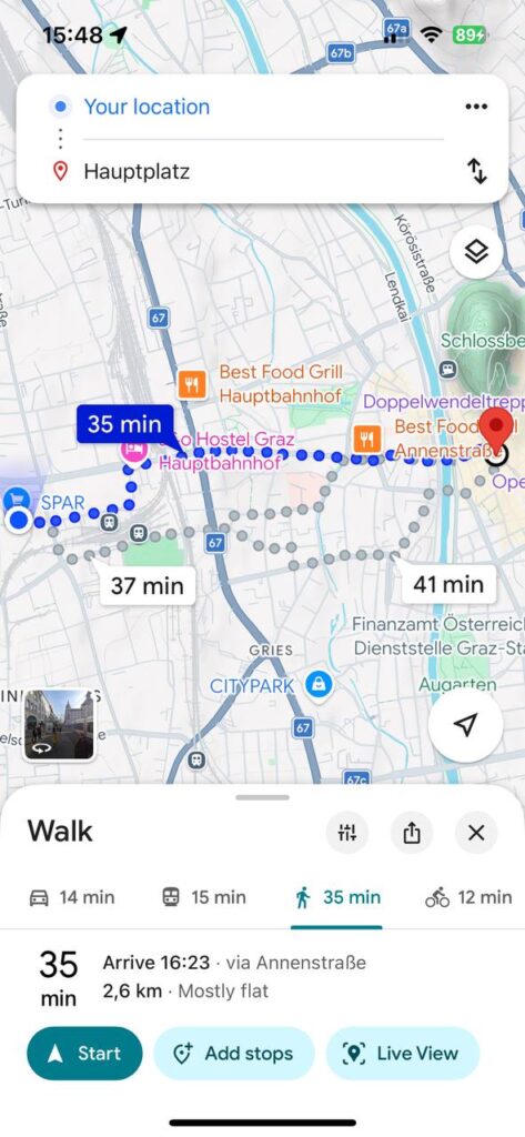
For this post, I decided to conduct a small practical experiment and compare a standard navigation route with one that more closely resembles the concept behind my future app. I chose the same route: from my current location to Hauptplatz in Graz. It was important to me to look not only at the time and distance, but also at how the walking experience itself changes.
On Google Maps [1], the standard route looks very straightforward and functional. The app suggests the fastest option: 35 minutes, 2.6 km, mostly along Annenstraße. This is convenient if the goal is simply to get to your destination. But with this option, the walk feels more like a task: follow the line, don’t get distracted, and reach your destination.
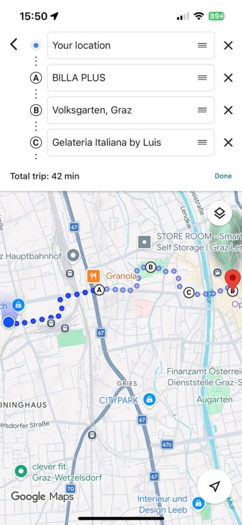
Then I manually created a second route in Google Maps and added stops: BILLA PLUS, Volksgarten, and Gelateria Italiana by Luis, and only then—Hauptplatz. The time increased to 42 minutes, but the route itself became completely different. It’s no longer just a path from point A to point B, but a little walking itinerary: pop into a store, walk through the park, buy some ice cream, and only then head to the center.
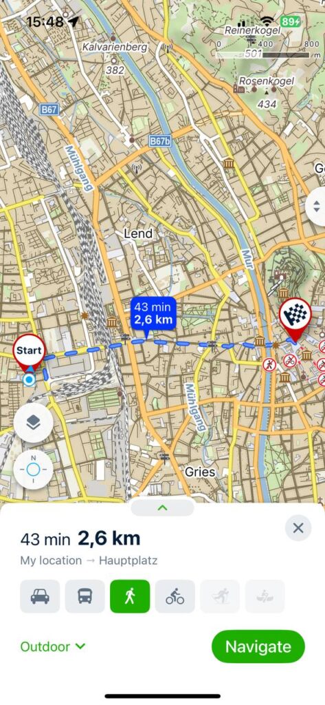
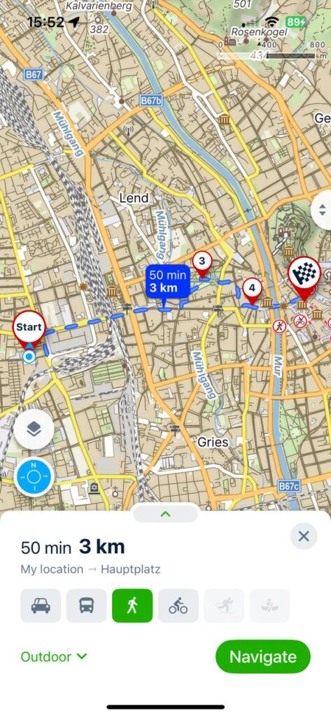
I also ran the comparison on Mapy.cz [2]. The direct route is shown there as 43 minutes, 2.6 km, while the route with additional stops is about 50 minutes, 3 km. What I especially liked about Mapy.cz is that the urban environment itself is much easier to make out. You can see parks, green spaces, paths, the terrain, the river, and the neighborhood’s layout. The map looks more detailed and “outdoor-oriented.” Visually, it’s not as minimalist as Google Maps, but for my purposes, that’s actually a plus because it helps me not just walk, but understand the space around me.
This experiment helped me better understand the concept behind my app. I don’t just want to make routes longer. The idea is for users to be able to choose not only their destination but also the type of route: fast, leisurely, green, adventurous, social, or with short stops.
In the next prototype, I want to develop this logic further. For example, if a user selects a “slow route,” the app could automatically suggest a path through a park, a quiet street, a café, or a spot for a short stop. In other words, the map becomes not just a navigation tool, but also a tool for planning a walk.
This test showed me one simple thing: navigation doesn’t have to be just about the shortest route. Sometimes an extra 5–10 minutes can make a route much more enjoyable, personal, and memorable.