Month: July 2026
Science Communication and Dissemination
While I am busy with creating further visual content that is related to science and have been starting to put out some of my creations, I still wanted to continue my research about the world of science communication. From an exercise in the design and research class, I came up with a number of relevant key words for my research which I wanted to explore further. And one term in particular has crossed my path in both the research process and in “real life”, which is why I would like to dedicate this blogpost to the topic of dissemination. In the world of science, dissemination is a term that one will frequently come across – and one that I would define as closely related to the field of science communication.
Dissemination in the context of science essentially means transferring knowledge to a targeted audience because that audience will either use it, be impacted by it or influence the use of the evidence. In short: dissemination is all about getting information to the right people so that they can make use of that knowledge. To name one example – knowledge that concerns health care could be communicated to policy makers, patients or healthcare practitioners. It is a core component in translating knowledge strategically in order to adopt and implement new practices.
There are various frameworks and translation models that include elements of dissemination, however, dissemination is often regarded as a single step at some point towards the end of a research project rather than spanning over its entire running time which in turn contributes to a translational gap between what is evidence is being generated and what actually impacts policies and practices. This furthermore has also the potential to represent poor return on investment to research funders.
Dissemination is a complex topic that demands strategic use and while many models exist, researchers struggle to select the fitting resources for their dissemination strategy and lack guidance in terms of which activities to implement at the subsequent steps of the dissemination process.
So, to sum up: while there are strategies and models, implementing them effectively poses a big challenge, which is why it would be important to develop a framework that is accessible and clear to everyone.
While my previous posts and my general approach was more on the non-scientific community as a target group for my topic and also the little projects I have been working on, it was quite interesting to see that proper science communication is a struggle that is not only related to (public) education but maybe even more relevant for the scientific community, incredibly important in order to translate scientific findings for decision makers or audiences that concretely benefit from certain knowledge.
While communication to the public and offering ways of easily accessible information that are intended to raise the overall knowledge within the population is a large part of what caught my interest in the matter and is also something I want to pursue further, the importance of that other side of science communication was not as evident to me before.
Therefore, I think it could be interesting to also follow the topic from this other side. To look at the ways scientists currently frame and communicate their work to respective target groups and then find the issues and new (design supported) approaches to make for better knowledge transfer.
The way of communication research has been changing, especially due to digital possibilities.
And while traditional formats such as scholarly journals and books can be found online, their functions and formats have remained similar throughout that time of change.
Therefore, online media such as blogs and social media platforms offer new possibilities for scientists to use. Blogs and wikis have risen to popularity with something called „open notebook science“, professional academic networks like ResearchGate or Academia.edu have millions of users, and for interaction with the wider public, online formats such as TED talks that are being streamed via YouTube have become very popular.
Digital technologies allow scientists to not only communicate with their primary dissemination targets (such as other scholars, policy makers or similar) but to actively involve people that otherwise would not have had access to this information.
The potential of adopting new methods is promising, as new cross-disciplinary collaborations could emerge which in turn could support publications, funding and new research opportunities.
Overall, there has been a noticeable push towards making science and research known to the greater public since the 1980s and the inclusion of non-scientific audiences which in turn has caused new forms of dissemination to emerge. Examples for this would be sciences shows or magazines and in more recent years, new event types such as science slams or open lab days. New participatory spaces such as science cafés or hackerspaces emerged which influence both research production and dissemination processes, and powerful trends that strive for the globalization of research, responsible research, and inclusion of previously excluded audiences are reshaping the scope and purposes of dissemination.
The issue here is, that while these new emerging approaches are viewed as fundamental constituents of open science, researchers tend to still focus on traditional outputs such as journal articles, speaking at conferences or publishing books.
Innovative dissemination would, in turn, mean dissemination that exceeds traditional academic publishing and meeting practices and aims to spread the research findings to a more widespread audience.
I feel like this is the part I would like to find out more about in the future because that is also where the power of (media) design can play a vital role.
For the next blogpost, I plan on diving a little bit deeper into (innovative) dissemination practices in order to find out more about the possibilities and challenges in that regard.
Sources used in this blogpost:
First part: Scott, Sion, Bethany Atkins, Thomas D’Costa, Claire Rendle, Katherine Murphy, David Taylor, Caroline Smith, Ian Kellar, Andrew Briggs, Alys Griffiths, Rebekah Hornak, Anne Spinewine, Wade Thompson, Ross Tsuyuki, and Debi Bhattacharya. “Development of the Guide to Disseminating Research (GuiDiR): A Consolidated Framework.” Research in Social and Administrative Pharmacy 20, no. 11 (2024): 1047–57. https://doi.org/10.1016/j.sapharm.2024.07.007.
Second part: Ross-Hellauer, Tony, Jonathan P. Tennant, Viltė Banelytė, Edit Gorogh, Daniela Luzi, Peter Kraker, Lucio Pisacane, Roberta Ruggieri, Electra Sifacaki, and Michela Vignoli. “Ten Simple Rules for Innovative Dissemination of Research.” PLOS Computational Biology 16, no. 4 (2020): e1007704. https://doi.org/10.1371/journal.pcbi.1007704.
Testing my second prototype
Design & Research 2 with Birgit Bachler
Sketching
After doing the context review and the material studies, I decided to work on my prototype again. I focused on our lecturer’s question “what is the smallest prototype you can create that still touches the issue?”. A specific issue came to my mind: according to A review of invasive species reporting apps for citizen science and opportunities for innovation by Howard, van Rees, Dahlquist, Luikart, and Hand, gamification is not sufficiently used in citizen science apps. With the intention of creating something quick, fun, and gamified, I looked at my initial analogue prototype and the app prototype I created with Ahmed Turk for our app design course. I decided I wanted to focus only on the reporting flow of the app and create a minigame. By focusing on its core feature, I wanted to make it as interesting and seamless as possible. This way, the reporting platform could benefit from a higher engagement.
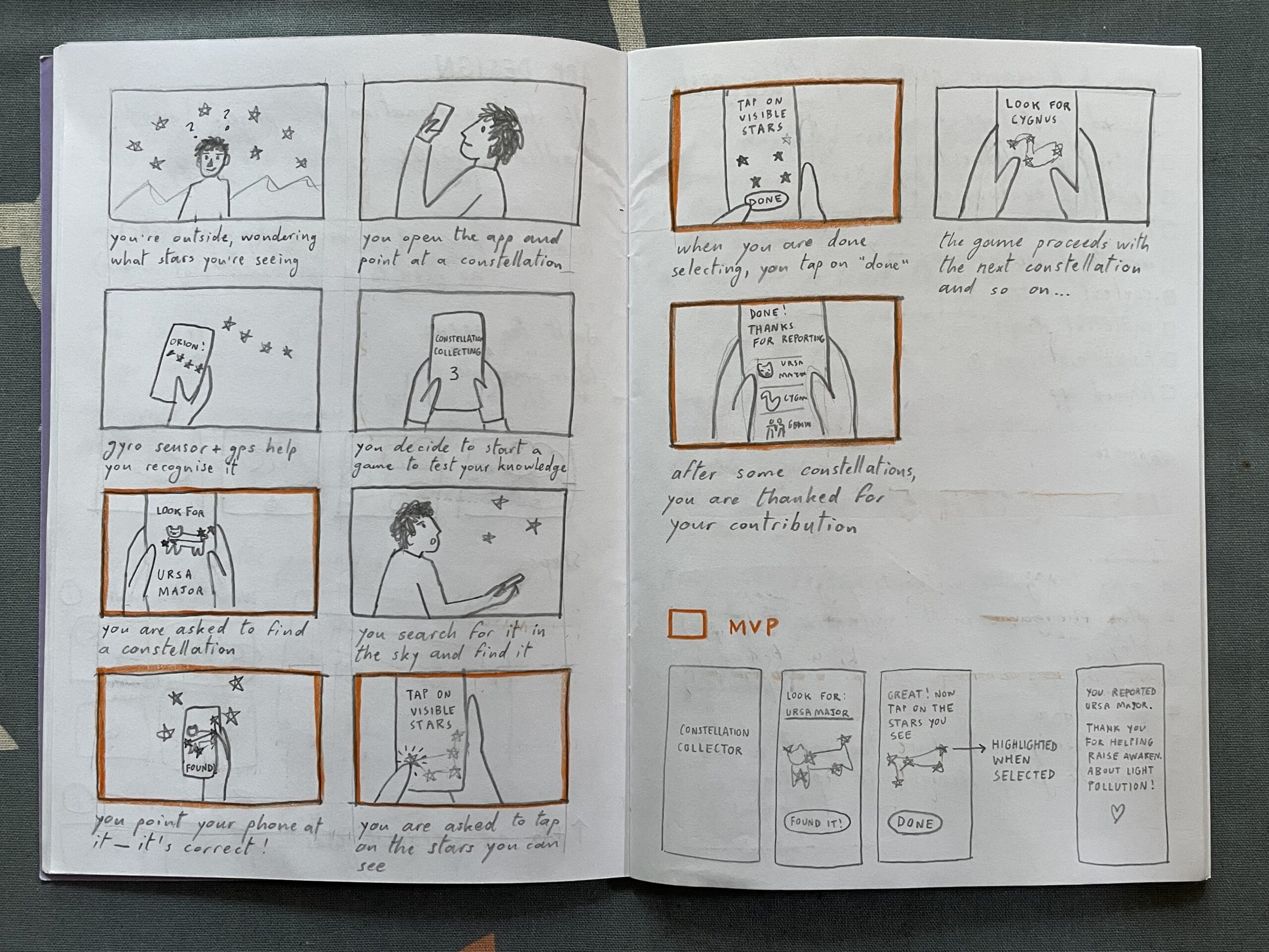
I started my second version of the prototype by sketching a storyboard. Then, I highlighted some scenes that in my opinion are the foundation for the MVP. After that, I sketched some screens and created them on Figma.
Heuristic evaluation
I then went through Jacob Nielsen’s 10 Usability Heuristics for User Interface Design to further refine the prototype. Here you can read my evaluation:
- Visibility of system status. At the top of the screen, you can see the progress through the game (0/2); I do not know if it should start with 0/2 or with 1/2.
- Match between System and the Real World. The constellation has the same shape and proportions as the one in the sky. The brightness of the stars also mirrors reality. As the app does not use GPS and the gyro sensor yet, the constellation is not rotated in the same direction as it appears in the sky. This could also be a challenge factor that makes the game a little harder. No technical jargon is used, only commonly used words.
- User Control and Freedom. There is an emergency exit (X) to exit the game and a back arrow to return to the previous step
- Consistency and Standards. The back arrow is located at the top left corner (iOS standard), while the X is at the top right. The latter should ideally also be positioned in the top left corner, but that space was already occupied. The main action is in the white button, while secondary actions are in all-caps. All clickable text is in all-caps.
- Error Prevention. If the sky is not visible, there are various options that can be selected, which open tips for better observation. This prevents false reports. In the future, once sensors are incorporated, the app should recognise whether you are pointing your phone at the right constellation, to prevent mistakes.
- Recognition Rather Than Recall. The name of the constellation is repeated on every screen of the reporting game.
- Flexibility and Efficiency of Use. For expert users that already know constellations, there is an option to jump straight to the report and skip the constellation hunting part.
- Aesthetic and Minimalist Design. I tried to keep everything minimal; the only thing that could be simplified is the bear illustration and maybe the copy, but in my defense it is intended to have a relatable tone that brings the audience a little closer to a complex topic.
- Recognize, Diagnose and Recover from Errors. Error messages are written in a simple language and suggest a solution for a wide variety of issues.
- Help and Documentation. If the constellation cannot be located, there is the option to receive a hint.
Here are some screens of the minigame. After hitting “play”, the user needs to find a certain constellation in the night sky. Then, they can report the visibility of its stars by tapping on them.
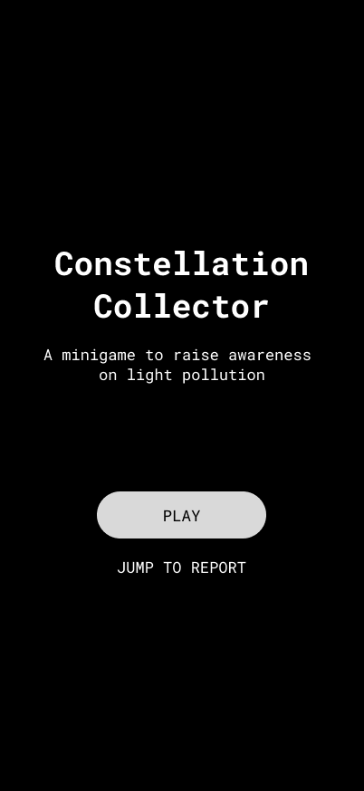
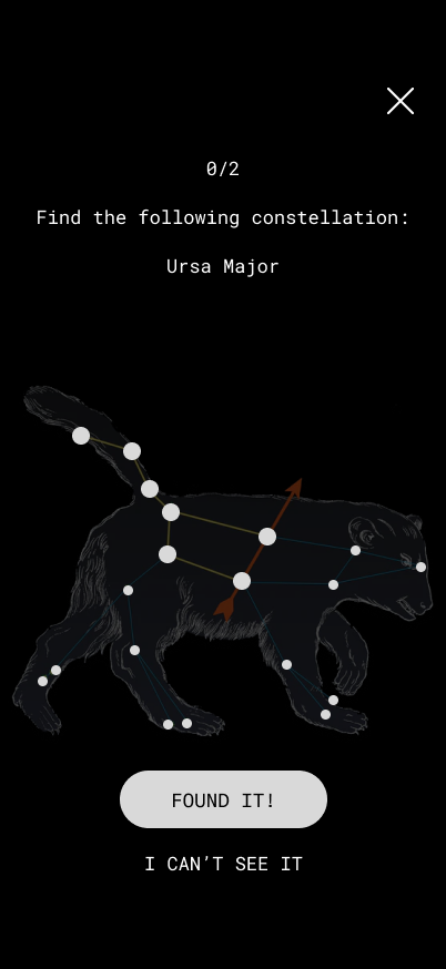
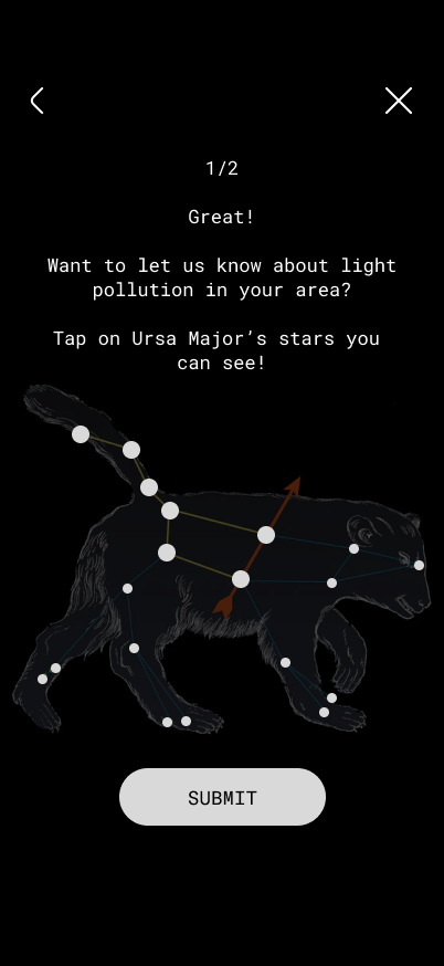
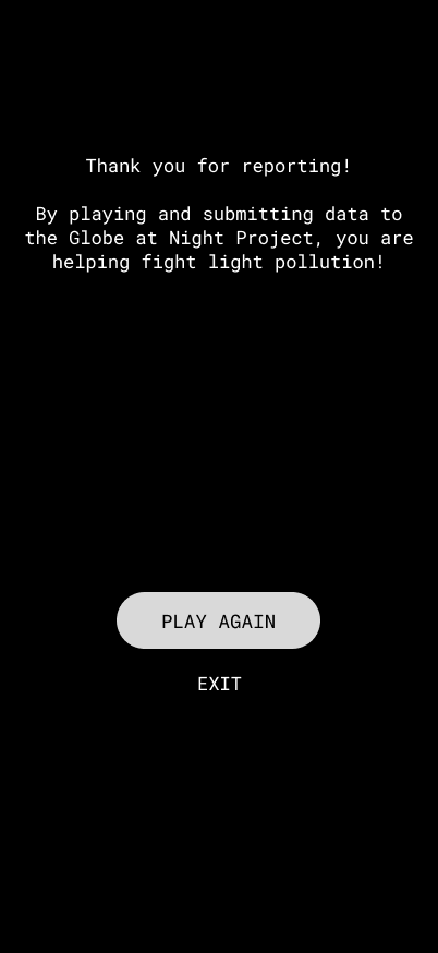
If the user cannot see the app, they can tap on “I can’t see it” and select why. This leads to different tips based on the answer.

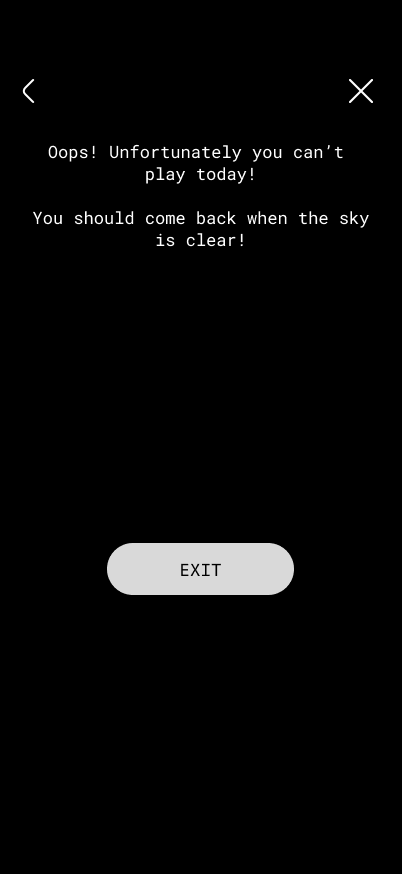
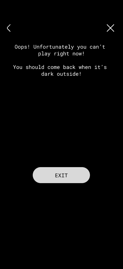
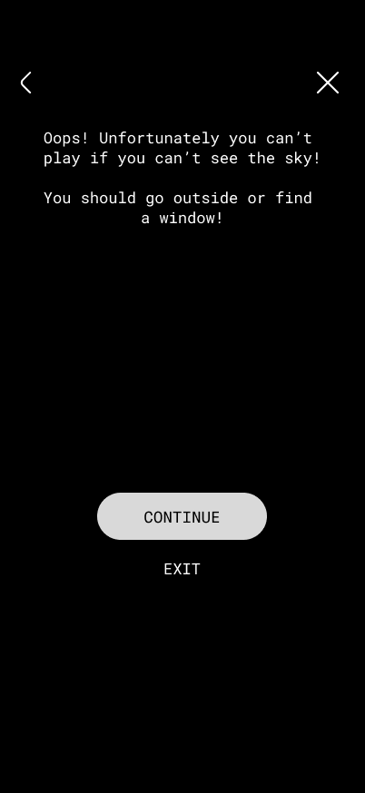
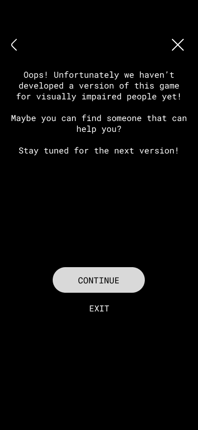
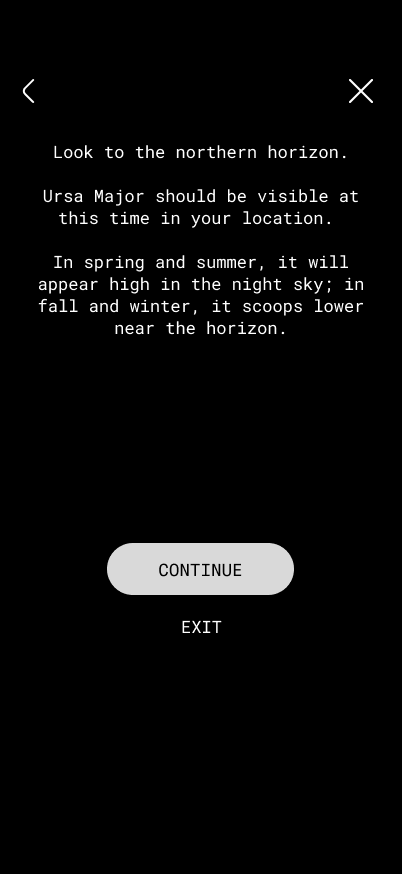
These videos illustrate two possible flows:
Possible improvements
- Fun facts about the constellation at the end of reporting
- Getting a badge on your profile
- Changing tasks
- Seeing what kind of report you submitted
D&R2 BIRGIT – The Human Element 5/6
For my final post I’d like to talk about the preparation for the guerrilla testing session, as well as the results.
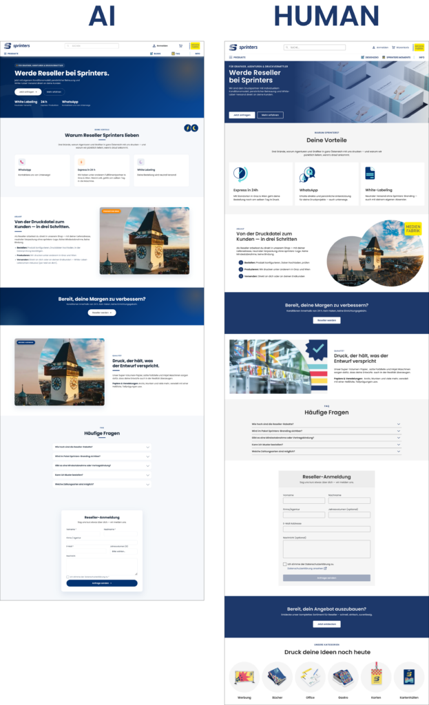
The prime target for this was a dedicated webpage for Resellers on the sprinters.at website. My story from the introductory post was actually based on this outcome. I was already working on some complex interfaces behind the scenes that would be utilised for this feature, such as a completely new address system for multiple recipients. However, when it comes to the informational webpage that serves as the sign-up hub for this feature, a completely AI-generated design was used without my knowledge.
Prototyping
Since my topic is all about how workflows change with the advent of AI, I decided to actually work with the situation instead of wallowing in it. The primary focus of this redesign was to simply use the existing design system and corporate design.
What was a new experience to me about this prototyping session was that I worked with the AI-generated design, keeping the overall structure and content as inspiration but rewording what I thought was necessary as well as keeping the design philosophy in mind. I still made everything from scratch, but used the design as heavy inspiration.
Guerrilla Testing
To test this, I took both the AI-generated and the human-redesigned version and presented them. The test happened with two participants and consisted of simple questions about brand context, visual consistency and a more personal “is this ready to ship?” question.
1. The Brand Context & Transition Feel
When going from the landing page to the reseller page, Participant 1 noted that the AI version felt “cramped and crowded” in the hero section, while the human-redesigned version felt more “clean and organised”. Participant 2 agreed with this, saying that the AI version had “no personality” and was “more business”, while the human one felt “more similar and personal”.
2. Visual Consistency
This question was aimed more at looking more closely at individual components and elements (such as icons, buttons and images). Jakob Nielsen fourth heuristic, Consistency and Standards, describes the need for recurring elements in a user interface like language, icons, symbolism to be consistent across different tasks [1]. This was the biggest blunder of the AI design.
When talking about the AI version, both participants pointed out that “the icons don’t go with it“, “the images don’t look intentional“ and that “spacing was different from the homepage and cramped to the border“. One participant also noticed that the “buttons are rounded, when they’re more square on the main page“. This participant also mentioned that the icons in the human version are “great, because the colours are the same as the brand“.
One thing Participant 1 also mentioned on the machine-translated version of the AI version, was that the texts “tell you to do it, but not what it is“, while Participant 2 said that the text feels generic.
3. Ready to ship?
When the participants were asked if they would consider this as ready to ship as part of the same product (if they were the UX/UI designer responsible), they gave dividing responses. Participant 1 gave a hard “NO!”, pointing to the inconsistent spacing and icons, and added: “Why put something bad online when could can give me some time to improve it?”
Participant 2 gave a more nuanced answer, stating that “if the priority is to ship, then yes, its functional and still intuitive, but not the same brand”. They said they would “feel bad as a designer”, because the first impact of the brand is the most important.
Conclusion/Reflection
In conclusion, I gathered some data on what stands out to designers from two other designers. I particularly found the comments about the “texts telling you what to do, but not what it is” interesting, and for further testing I’m definitely going to take care to provide English versions of my prototype as well so this could be compared. I worked on the Reseller feature for weeks, so I had to understand it myself by asking multiple people within the company. AI didn’t have this simple human advantage, and thus the end result was what it was.
However, this isn’t about “AI being bad”, and I’d like to wrap up my research journey for this semester with this quote from IDEO (the design agency which developed design thinking):
How many things were meant to be great big breakthroughs, but they just don’t work because they don’t take into account what humans want from the technology? […] AI is far too important to leave just to the technologists—human-centered design is a crucial part of it. [2]
References
- [1] Interaction Design Foundation, “What Is Heuristic Evaluation?,” Interaction Design Foundation. [Online]. Available: https://ixdf.org/literature/topics/heuristic-evaluation. [Accessed: Jul. 4, 2026].
- [2] D. Kelley and D. Robson, “In the Age of AI, Human-Centered Design Is More Crucial Than Ever,” IDEO, Feb. 20, 2025. [Online]. Available: https://www.ideo.com/journal/in-the-age-of-ai-human-centered-design-is-more-crucial-than-ever. [Accessed: Jul. 3, 2026].
Learning from Co-Design: When Children Become Playground Designers (D&R2)(4/6)
One of the most inspiring parts of my research has been discovering how many projects already involve children as active contributors to playground design
The article “Children as Co-Designers” from Playground Research presents several examples where children are invited into the design process long before construction begins. Instead of asking children whether they like a finished playground, designers involve them in workshops, drawing sessions, storytelling activities, model making, and discussions about how they imagine play. These activities allow children to express ideas that adults might never consider.
One thing that stood out to me is that children rarely describe playgrounds in terms of equipment. Adults often ask questions such as “Do you want a bigger slide?” or “Should we add another swing?” Children, however, often talk about experiences. They imagine places for adventure, hiding, climbing, discovering, building, making friends, or inventing stories. This difference shows why simply asking children what equipment they want may not be enough.
Another interesting idea comes from the Design Council’s systemic design approach. The report argues that design problems should not be viewed as isolated objects but as systems involving many stakeholders, relationships, and long-term effects. Playground design is a perfect example of this. Children, parents, municipalities, schools, designers, safety regulations, and local communities all influence the final outcome. If one stakeholder is missing—especially children—the system becomes incomplete.
Rather than interviewing children in a formal way, designers create playful activities that feel like games instead of research. This inspired many of the low-fidelity prototypes I have been developing, where children use cards, stickers, drawings, and playful prompts instead of long verbal explanations.
One important lesson I learned is that participation is not simply asking children for opinions. It is about designing methods that allow them to communicate in ways that feel natural, enjoyable, and appropriate for their age. Good co-design is less about collecting answers and more about creating opportunities for children to share their imagination.
References
Design Council. (2021). Beyond Net Zero: A Systemic Design Approach. https://www.designcouncil.org.uk/fileadmin/uploads/dc/Documents/Beyond%2520Net%2520Zero%2520-%2520A%2520Systemic%2520Design%2520Approach.pdf
Playground Research. (n.d.). Children as Co-Designers. https://playgroundresearch.org/children-as-co-designers/
Playground Research. (n.d.). Playground Research. https://playgroundresearch.org/
IDEO U. (2020). What is Co-Design? https://www.youtube.com/watch?v=-2_6ozX4G_M&t=40s
Participatory Design Foundation. (Video). Participatory Design Process. https://www.youtube.com/watch?v=9PDWzPtpCZ8
Designing a Language Children Already Speak (D&R2)(3/6)
As I continued developing the card prototype, I asked myself a simple question:
How do children naturally talk about playgrounds?
The answer is—they often don’t.
Children usually describe experiences rather than designs. They might say “I like climbing trees,” “I want somewhere to hide,” or “Water is fun.” They think through feelings, materials, and play, not through architectural plans.
This observation became the basis of my next prototype.
Instead of asking children to design a playground directly, I created three categories:
- Materials & Elements
- Feelings
- Play
Children can connect these categories in different ways. For example, they might associate water with freedom, or wood with climbing. There are no correct combinations.
This approach is inspired by participatory design, where the role of the designer is not to collect fixed answers but to create tools that support expression.
I also intentionally left empty cards in every category. Children should not be limited by my assumptions. If they think of something I did not include, they can simply create a new card.
In this sense, the cards become less like a survey and more like a shared design language between children and designers.
From Three Ideas to One Direction (D&R2)(2/6)
After creating my three first low-fidelity prototypes, I started comparing them instead of thinking about them as separate ideas. Each prototype focused on a different aspect of participation: materials, emotions, or spatial experiences. However, while reflecting on them, I realized that they all had something in common—they encouraged children to communicate visually instead of relying only on words.
The more I thought about my research question, the more I realized that my goal is not to design a better playground, but to design a better way for children to participate in the design process.
Looking at examples from Playground Research, I noticed that successful co-design projects rarely begin with asking children direct questions like “What playground do you want?” Instead, they provide children with playful tools that help ideas emerge naturally through making, arranging, discussing, and imagining.
This made me reconsider my own prototypes. The first prototype; the card system felt the most flexible. It could easily be expanded, adapted, or combined with other activities. Unlike a questionnaire, it allows children to explore different possibilities without feeling like there is a right or wrong answer.
Rather than designing one perfect activity, I decided to continue developing the card-based approach. It has the potential to become a playful design tool that encourages conversation, creativity, and collaboration.
Instead of collecting answers, I want to create opportunities for children to express ideas that adults might never think of.
References
- Playground Research. (2024). Children as Co-Designers. https://playgroundresearch.org/children-as-co-designers/
- Sanders, E. B.-N., & Stappers, P. J. (2008). Co-creation and the new landscapes of design. CoDesign, 4(1), 5–18.
Design & Research II – 6/6
Design & Research 2 | For: Birgit Bachler
Final Prototype Video
Building this really helped me see how much impact interaction design can actually have on a massive, real-world problem. Dealing with the Austrian visa system is usually just a nightmare of heavy cognitive load and confusing legal German, but working through this project showed me how we can systematically break that down.
The main goal of this prototype wasn’t to have a 100% finished product todayit was really just to see if it’s even possible to take a system this complex and push it in a totally new, human-centered direction. I wanted to prove that transparency and good design can exist in government tech.
Obviously, it’s still a work in progress. I’m going to keep polishing it, refining the UI, and making it a lot better moving forward. But for now, this video shows the core vision of what a stress-free Residence Portal could actually look like.
Check out the video below to see it in action
#6 D&R2 Video
Final video showing my prototype:
06. Smart Plant Care: Video Presentation
How many times have bought a plant for their house? How many times have you ended up killing it?
This research is about finding a simple way to help people take better care of their plants—using technology to support us where we usually fail
But the goal isn’t just to add more tech. We’re already surrounded by it.
My goal as an interaction designer is to create something a simple object like a lamp that naturally fits into your home. Something that can also create a cozy athosphere engaged the senses with lights and sounds., tracking the health of the plant.
Because in the future, we would have more technological device. So it’s important to start designing systems that are not only efficient, but also comforting. It’s been proven to indoors plants have a really postivie impact on our mental health.
So this project is not about using tehcnology to keep our plant alive but using it to built a better relationship with the nature itself