The Freedom of Animated Music Videos

Throughout the history of media, music has always been a driving force for innovation and inspiration. With the rise of music video production, the need to stand out from others became increasingly important. One of the main purposes of a music video is to capture attention. It should enhance the music and support its emotional tone and message. There is not necessarily a need for a clear storyline, although one can be present. Music videos can also be seen as a form of short film. Their production usually does not take as long as feature films, and therefore new ideas, experimental styles, and emerging technologies are more likely to be explored.

Animation offers a particularly high level of creative freedom in this context. It allows artists to visualize abstract concepts, emotions, and rhythms that would be difficult or impossible to portray through live-action footage alone. Because animated music videos are not bound by physical reality, they can push visual boundaries and create unique worlds that directly respond to the music.

The Lyric Video

A lyric video is often used as a placeholder until the official music video is released. Despite this, it still takes time and effort to animate the lyrics of a song in a visually appealing way. Creating an engaging lyric video can be considered an art form, as timing, typography, and motion must work together with the rhythm and mood of the music. Sometimes it is paired with simple animated characters. In recent years, AI-based tools have emerged that can automatically generate lyric videos. While these tools increase efficiency and accessibility, they often lack the intentional design decisions and artistic individuality of handcrafted lyric videos.

Mixed Media

Mixed media is a broad field that combines different techniques, materials, and styles. A well-known early example is Take On Me by a-ha, which blends live-action film footage with 2D animation to create a romantic storyline between a comic book character and a real girl. The creative possibilities of mixed media are virtually endless. Stop motion can be combined with photography, 2D animation can be layered over live-action footage, or text and graphic animations can be integrated into filmed scenes. This flexibility makes mixed media especially appealing for music videos.

Virtual Bands

Animation also enables the creation of virtual bands. One of the most well-known examples is Gorillaz, a band founded in 1998 that exists primarily through animated characters. Their music videos are animated, and the band has performed using holograms and large-scale digital projections. A similar but even more extreme case is the virtual singer Hatsune Miku. She was originally developed as a mascot and voicebank for the Vocaloid software. Since her release in 2007, Hatsune Miku has gained massive popularity and has become a worldwide pop icon, performing live as a projected hologram.

Music Visualizers

Music visualizers are usually generated using specialized software. Based on sound waves, frequencies, or beats, animated visuals are created in real time. Designers can influence color schemes, shapes, and movement styles, but certain aspects of the visuals depend directly on the music itself.

Animated Short Films

Just like live-action videos, animated music videos can tell stories. They may directly visualize the lyrics or present an entirely different narrative. The level of abstraction is entirely up to the designer and animator. In animation, there are few limitations, making it a powerful medium for musical storytelling.

Conclusion

Music videos are one of the least limiting forms of media. As long as it enhances the music, gains attention and fits to the image of the band, everything is possible. Especially animation is less limitation and more experimental.
Setting up for laughter

The style of an animation can strongly influence the expectations of its viewers. This effect is especially apparent in comedy and satire. Stylization prepares the audience not to take everything literally and signals that exaggeration and humour are part of the experience. Exaggerated facial features, distorted proportions and simplified character designs are commonly used, frequently resembling caricatures.

Caricatures are an old technique dating at least back to the Renaissance. Some of Leonardo DaVinci’s drawings showed exaggerated facial features. The impression of a face was more important than reality or beauty. Around the 18th century caricatures were an established art form, especially in England. The themes often depicted politics combined with satire. Around the 19th century cartoons were gaining popularity in print media. A cartoon usually consisted of a small sequence of images and often had humorous intent. While caricatures and cartoons are not identical, their themes and visual styles often overlap, and both rely heavily on exaggeration and simplification to convey meaning quickly and effectively.

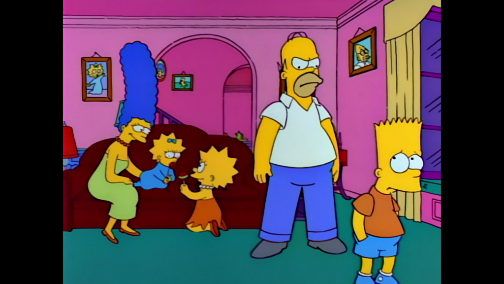
Many contemporary animated series maintain this longstanding tradition. Take shows like The Simpsons, South Park, Big Mouth, and Family Guy, for instance. The characters in The Simpsons don’t exactly mirror real humans. With their distinctive yellow skin, oversized googly eyes, and over-the-top hairstyles—like Marge’s towering blue beehive or Lisa’s star spikes, they clearly embrace a unique style. Even their four-fingered hands emphasize this departure from realism. Yet, paradoxically, these characters feel relatable. They encounter familiar challenges, family dynamics, and societal issues that viewers can easily recognize from their own experiences.

The visual disconnect makes the series’ tone clear right from the start. Audiences quickly understand they are in an exaggerated, whimsical world. While the topics tackled might be serious – corruption, inequality, or ethical dilemmas, they become more palatable thanks to humor. The stylized animation creates a buffer that allows viewers to engage with intense themes without feeling bogged down. This detachment also grants creators liberty to stretch conventions, critique society, and amplify flaws for laughs.

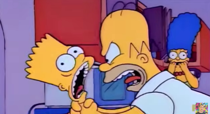
For example. Homer strangles his son Bart on various occasions. In the series it is done to show Homers short temper and for a quick laugh from the audience. In reality, it would be horrible and no one would enjoy watching a father abuse his child. Yet the distance created through the stylization and the over exaggerated cartoon violence as well as the lack of real consequences changes the context for the viewers from a horrible action to a joke.

Even though these shows provoke thought, their distinctive visual style acts as a cushion against the heavier subjects. The exaggerated character designs cue viewers to approach the content with irony and an open mind. Thus, animation isn’t just about aesthetics. It significantly influences the tone, mood, and audience expectations right from the opening scene.

https://en.wikipedia.org/wiki/Animated_sitcom

https://en.wikipedia.org/wiki/Cartoon

https://en.wikipedia.org/wiki/Caricature

Loving Vincent – how the style of an animated movie tells and supports the story

With movies such as “Spiderman: a new universe” a push towards a more hand painted style in the animation industry could be felt. Arcane pushed the combination of hand painted looks of 3D animation even further. However, these styles are always in combination with computer animation. What if a movie is not only hand drawn but hand painted?

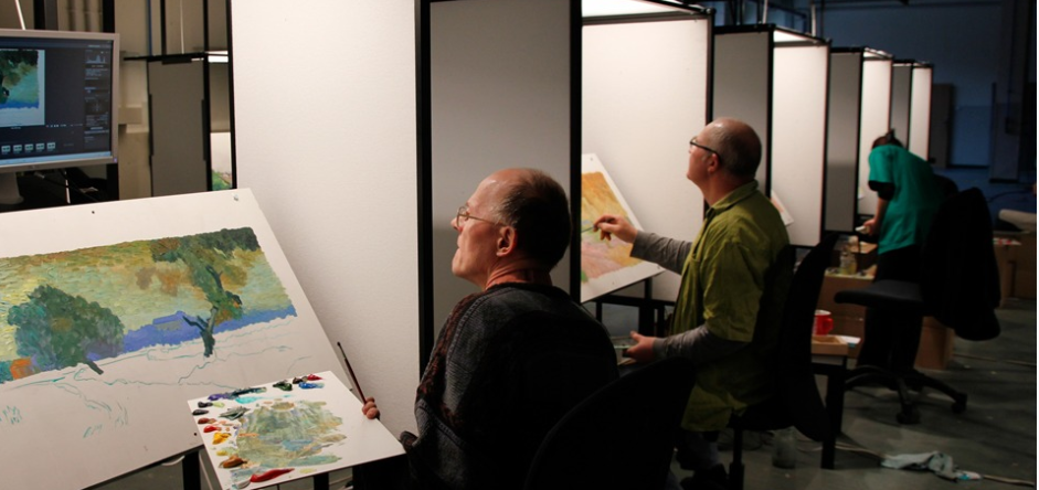
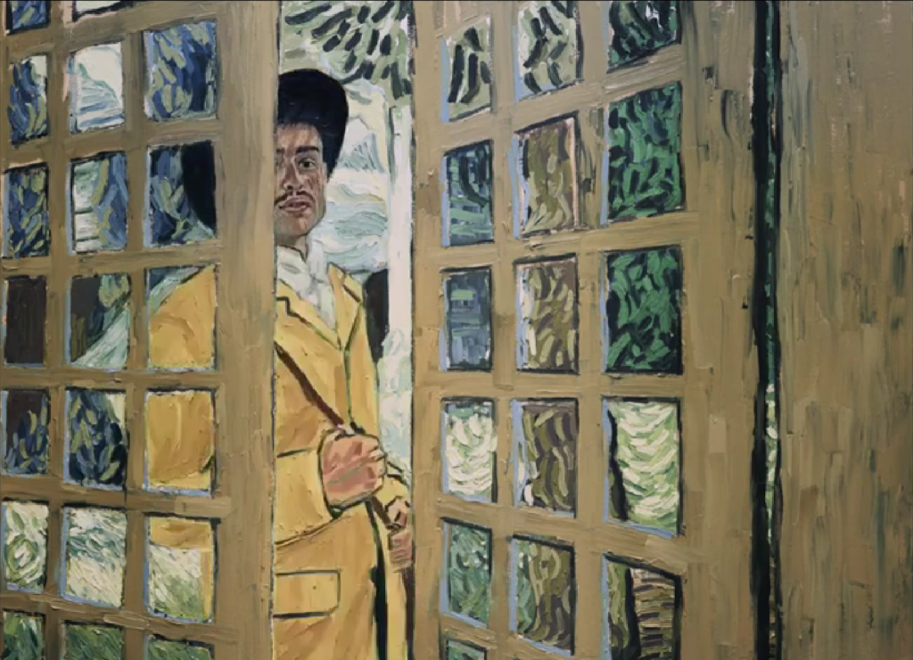
Loving Vincent is an animation film published 2017, written and directed by Dorota Kobiela & Hugh Welchman. It is the first feature length painted movie. In 1 hour and 35 minutes all of the 66 960 frames are hand painted oil paintings created by 125 professional oil painters. As reference real actors and actresses were filmed in front of a green screen or sets designed to look close to the paintings.

As a concept for the movie 94 paintings of Vincent can Gogh were reimagined, reframed and strung together to create a story. For flashbacks photos of the time and van Gogh were added in a black and white to create a contrast to the colorful painting world.

Following the death of Vincent van Gogh Armand gets the task to deliver van Goghs final letter to some worthy recipient. While searching for the recipient Armand finds himself in a village with many people close to van Gogh or people who modeled for his paintings. Questions about van Goghs life as well as death were asked but left open for interpretation just like his paintings.

Loving Vincent is a special case in many aspects. The animation style is woven into the concept of the movie itself. It doesn’t just enhance the narration. It takes over the narration. The goal is to be sucked into the paintings of van Gogh, and the movie succeeds in it. Sometimes the style can be confusing and overloading due to the many moving brush strokes, however, it doesn’t take away from the impressiveness. It is an ode to van Goghs works and completely driven by the style. With a different approach the movie would lose a big part of the story. While not all viewers may understand all the references and nods given to the paintings, they will recognize van Goghs painting style even if they only know one painting of his. In a different style this connection may be lost.

Loving Vincent is not a typical movie about a famous figure. It does not feature the painter as the main character. It shows what he left behind with a new perspective.

https://lovingvincent.com

The animation of infographics

Animation is a broad field with varying requirements depending on the medium in which it is used for. Whether it is 2D, 3D, or stop-motion animation, there are clear differences between animations created for television and those produced for film. Television series typically feature less expressive animation, and in 3D animation, shaders are kept simpler to reduce render times. Infographics represent a form of animation that is generally the simplest in terms of complexity.

Infographics are predominantly used to simplify complex or abstract themes. The core of infographics is often a presentation. It includes facts and data. Without any animation the information is skimmed over without much of an impact on the viewer. Meanwhile, adding animation while dissecting a theme into small portions as well as adding comparison and a storyline the information is more likely to be remembered. While animation is an important part of infographics, it should not overshadow the information itself. The animation should enhance the information rather than distract from it.

There are various ways to create an animated infographic. Due to budget limitations, many projects share a similar visual style. Often Stock vector graphics are used as a base for the animation In these cases, the designer or animator focuses mainly on animating pre-existing elements instead of designing each asset from scratch. This approach significantly reduces production time and cost. For higher-budget projects, vector graphics may be custom-designed specifically for the infographic, allowing for a more unique and tailored visual identity that closely matches the topic and target audience.

A different approach is the so-called white board animation. Here elements get pinned or stuck on a whiteboard according to the desired story. The elements are hand drawn figures and objects giving it a personal note. Sometimes elements are drawn in addition. The hand of the, in this case, animator is shown and interacts directly with the infographic. The desired outcome is the feeling of someone explaining the topic directly to the viewer.

Ultimately, the most important factor for infographic animation is efficiency. The goal is to convey information and tell a story in the quickest and clearest way possible For this reason, characters—if they are used at all—do not need to be complex or highly detailed. If a storyline only requires a character to perform a simple action, such as raising a hand, there is no need for an advanced or intricate animation rig in software like After Effects. Simplicity often leads to clarity, which is the true strength of effective infographic animation.

Infographics found their way into YouTube as well. Many explain videos use them to create content without having to create complicate animations or invest into expansive real-life footage. They reach a large audience for example a video about “Crazy Things Science Still Can’t Explain” has over 1.2 million views over just 4 months.

Overall, animated infographics demonstrate how simplicity, clarity, and purposeful motion can effectively communicate complex information to a wide audience while remaining efficient in both production and storytelling.

https://explainvisually.co/en/animated-infographics/

https://absolute.agency/articles/blogs/five-essential-items-for-an-animated-infographic

https://www.nobledesktop.com/blog/tips-for-creating-effective-animated-infographics

Documentaries and their usage of animation

Documentaries, especially ones about history, use often a combination of scenes with actors and actresses, interviews with experts and animation. The further back in time the historical topic of the documentary plays, the less actual footage of the time period will exist. For example, when portraying the life of dinosaurs or showing a depiction of the big bang there is no way around some form of animation. 3D animation of dinosaurs is necessary to portray a realistic interpretation of scientist findings about their life. These animations are expansive and time consuming which is why the same scenes may be played multiple times. As soon as the historical period includes humans scenes with actors or actresses are used more often. Animation becomes less important, however, it is still used.

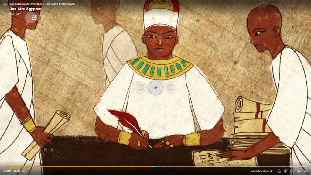
As an example in an TerraX episode called “Eine kurze Geschichte über … – mit Mirko Drotschmann – Das Alte Ägypten” produced by ZDF all three styles are combined. There is a section with actors and actresses, one with the reporter and experts as well as short animated sequences. The animated sequences are kept close to the style of the drawings of ancient Egypt if not used directly as reference. The animation is kept simple and does not have complicated movements or effects. It is in 2D and only a few elements are moved. The most important factor is the information they convey to the viewer in combination with the narration. In one scene some legends as well as gods are described with their powers shown. In this simple animation style this can be shown instead of simply told. While the usage of actors and actresses would be possible, using VFX or SFX would be more expansive and time consuming. Meanwhile getting the information from an interview section would be less impactful.

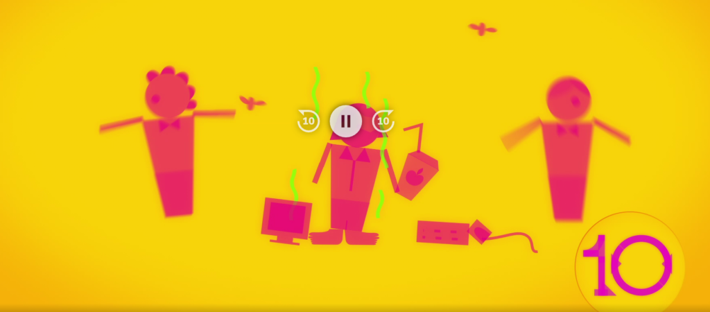
In another ZDF production “Die glorreichen 10“ 10 historical facts are put together in a top 10 video. They use footage from other ZDF productions in combination with their own animation. In this case characters of this animation consist of base shapes like circles and rectangles, resembling pictograms. With simple movements a humorous fact is being told to the viewer. The art style enhances comedy with help of exaggeration and fun sound effects. With these sections and the humorous approach to the story telling overall it catches a different target group, while still telling historical facts.

“Die Sendung mit der Maus“ is a TV show for children. They always have some sort of documentary included in the program between different animations. If it is a longer section about the production of for example ski, the documentary is interrupted by a short animation of their mascot the orange mouse. The mouse will often interact with something similar to the subject, for example skiing in a little skit. The theme therefore is not fully dropped, yet there is a pause from the fact and explanation.

Overall animation can enhance a documentary with a visual and tonal change. Dry facts can be broken down into digestible animated portions.

https://www.zdf.de/video/dokus/terra-x-eine-kurze-geschichte-ueber-mit-mirko-drotschmann-100/eine-kurze-geschichte-ueber-das-alte-aegypten-mit-mirko-drotschmann-100

https://www.zdf.de/play/dokus/die-glorreichen-10-260/die-glorreichsten-gruender-der-geschichte-100

To be Hero X – when art styles are part of the plotline

Through the blog posts there are already examples and reasons for an art style change mentioned. Usually not everything is applied at once. The creators and producers tend to only use an art style change on specially occasions. Reasons can be a flashback or past occurrences, to show the characters thoughts and feelings or to separate spaces and universes. What if all of these possibilities are combined? What if the art style changes themselves are a part of the story themselves?

Arguably in the animated Spiderman movies from Sony the art style changes are a part of the story as well. However, they are only used to show separate spaces or universes.

“To be hero X” is an animated series from bilibili and Aniplex. The premise of the world of “To be hero X” is that everyone can be a hero as long as people believe they can be. The more followers a hero has, the stronger their abilities. The abilities themselves are limited to what their believers think they can do or want them to do. Therefore, the life of a hero in this world is limited to their image. The series has 24 episodes. There is no clear main character, but multiple important characters. Some of them get multiple episodes for their stories others get less.

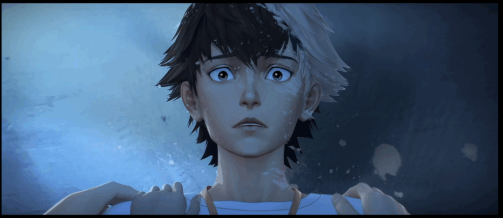
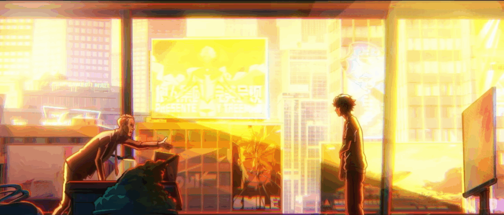
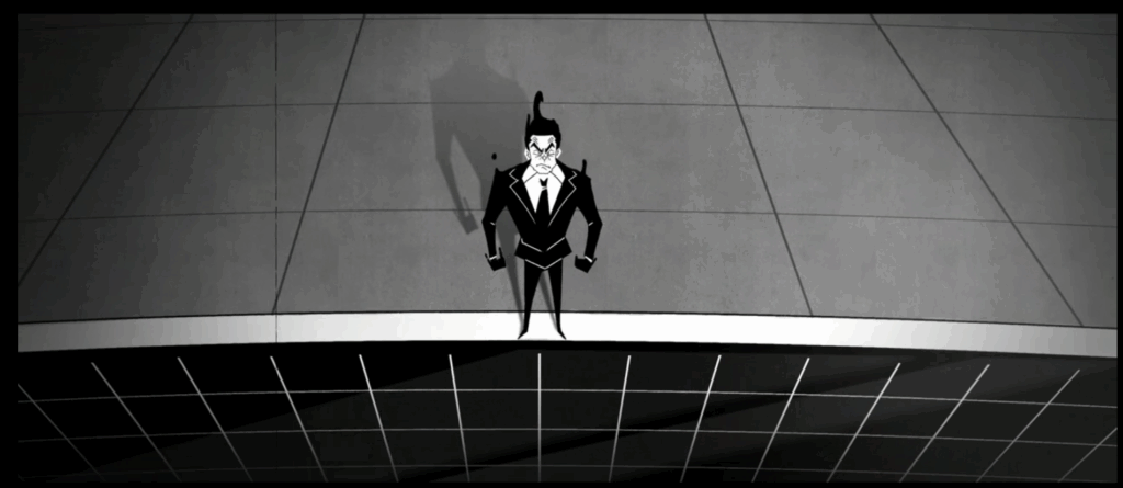
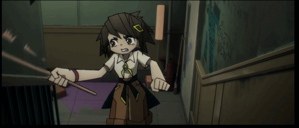
The first episode establishes 3D animation with 2D elements as it’s main art style. This art style remains the dominant one through all of Lin Lings story. Still even the first episode switches between three times between art styles. One switch is for a flashback, another one for a tragic background story of a villain and the last one happens somewhere between reality, a flashback and fantasy.

The second episode includes again multiple style changes. At this point it is clear that each character has a different art style when the viewer dives into their mind or background story, giving the characters another level of personality. All 4 episodes dedicated to Lin Ling stay in a similar fashion.

In episode 5 the main character gets switched to Yang Chen, which at a first watch was slightly confusing, since there was no indication that there would be a new main character now. The art style is in the same 3D animation as before and in flashbacks a change might occur.

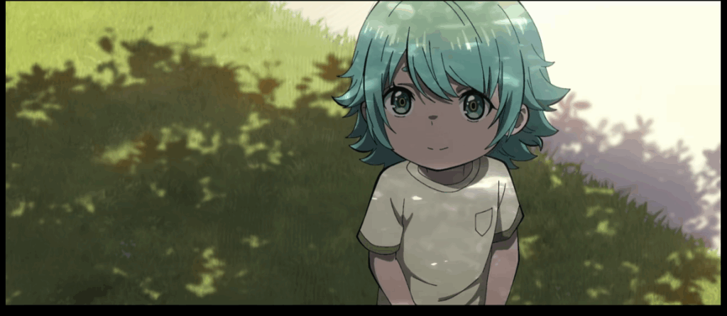
With episode 8 however the biggest switch happens. The whole animation style changes to 2D anime animation. During all 3 episodes of Lucky Cyans story there are no art style changes, but also no flashbacks since her whole life is shown. If you follow the story closely the viewers might realize that everything of Lucky Cyan is already playing in the past. In the two stories before Lucky Cyan was mentioned as an already established hero while in her story arc her beginnings were shown. With later episodes the style changes reemerge.

Up until episode 22 the same main 2D animation style is kept, which indicated that all of the stories play in the same timeline. The episode marks also the first real appearance of the mysterious hero X. Fitting to that it is the first time we briefly return to the 3D animation style only to switch in a short period of time between even more styles. It is indicated that X knows of these changes and that in his case they are linked to his powers.

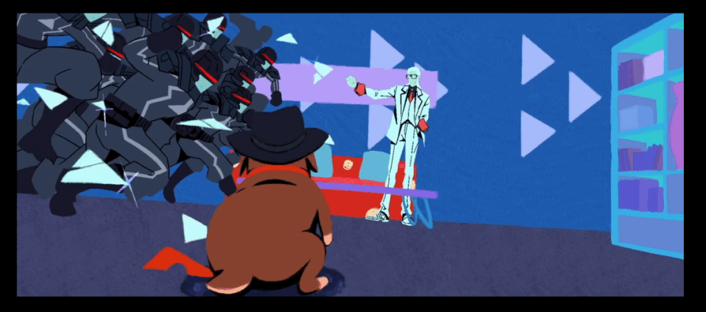
In episode 23 the main style changes again. This time it is still 2D but a lot blockier and less round than before. The reason for this could be the main character who is a dog.

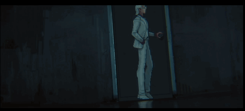
In the last episode X is the main focus, and the style is back to 3D. Since Xs powers are linked to changing art styles there are a lot of switches. Sometimes these switches are even combined. Once X transformed his art style to pixel art, where he can only run along the walls while everything else stays 3D. Whenever he snaps his fingers the art style changes, making the changes more than just a tool to create contrast.

In the case of “To be hero X” the style changes have multiple use cases. They show thoughts, personality, time and a narrative device. For now there is only one season available, which leaves many questions according to the art style and story open. But it is the first series I have seen, where style changes are used this heavily.

It is all in your head – How are thoughts of characters presented

In books it is a common occurrence to read about the thoughts of a character. They themselves describe from their perspective how they feel and how they experience the story. In movies and series, it is less common. For the most part thoughts and feelings are conveyed through the characters facial expression in combination with music, sound design and the overall cinematography.  What other ways are there to explore the inner world of a character?

Voiceover

The closest way to portray thoughts is a voiceover. Here the characters speak directly to the viewers and tell them in an inner monologue how they feel. There are two common ways this is used. One way is with the help of a narrator. For example, “How I met your mother” has the premise of Ted telling his kids about his past. He therefore plays two roles at the same time. The viewers don’t get the thoughts of the young Ted directly. They are being told the reflection of his past actions through his narrator self. Sometimes the narrator will contradict the young self and criticising his past actions.

A different approach is a live commentary. In “You” the viewer is following Joe, a book seller and as it turns out a stalker. The viewers hear all his justifications for his awful actions. One of the main female characters Beck is only really ever seen through his eyes and descriptions. There are a few scenes just following her, but the influence Joe’s description and portrayal of Beck is undeniable. Separating what he thinks, what is happening and what the actual story is, is challenging. Joe also feels more charming and charismatic as long as one hears his inner voice and thoughts. Meanwhile other characters react disturbed and confused towards him. After all he barley talks to people other than himself and the viewers. In this case the inner monologue is used to create some sympathy for an otherwise unlikable character.

Another series using inner monologue is for example “Scrubs”. They use it for the main character JD in a humorous way. In addition, the creators combined it with another way to show JDs inner thoughts.

Show don’t tell

A voiceover can sometimes be too much, especially if the narrator is unreliable like Joe. A different approach is to show the thoughts directly. While in Scrubs JD is sometimes narrating his thoughts, he tends to fantasise a lot. It is indicated with a white flash from reality to fantasy and back. In the fantasy itself the scenes are not narrated, rather everything is shown. With the white flashes between there is a clear cut between reality and thoughts. If there is no such visual aid, it is unclear whether something is supposed to be only in the head of the character. This can be used to shock viewers like in “Stranger Things” season 3 when Billy struggles to separate reality from thoughts. In his head he attacks Karen while he is spacing out. With a cut back to Karen save and unharmed the fantasy gets resolved and his instable mental state is shown.

Art style changes

For a clear cut between thoughts and reality a style change might be applied. In “Lizzie MCGuire” there are multiple techniques combined to show the main characters thoughts. With a cut to a cartoon Lizzie, she talks about everything going through her head. It is clear that no one else can see the cartoon character and only Lizzie imagines them.

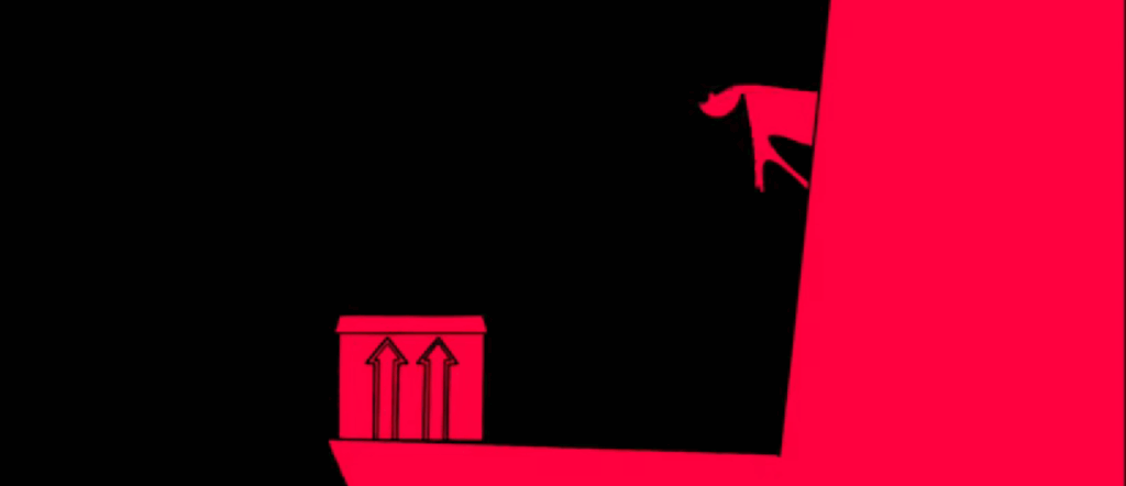
Another example for a style change can happen when the characters talk about their backstories and what happened to them. Rather then only letting them talk, the viewers get to see the story unfolding before their eyes. In “To be hero X” this happens multiple times in the first few episodes alone. Similar to thinking back, an art style change may be applied while talking about future plans. In “Emperor’s new groove” the art style switches to simplified red silhouettes while Ysma talks and imagines her evil plan.

Special Effects

A less harsh cut between fantasy or thoughts and reality can be achieved with special effects. Whenever Jinx from “Arcane” is in an unstable mental health state colourful sharp lines appear, blurring into her reality. In “Scott Pilgrim vs. the world” Scott imagines the world like a comic book.  Therefore, it is no surprise that special effects like from on of the books are shown.

A slight problematic example for the usage of special effects is the stereotypic depiction of an attractive woman appearing. She appears to glow, and her hair blows perfectly in the wind.

There is a wide range of possibilities to include the inner thoughts and feelings of a character. From subtle light changes to letting them talk directly to the audience.

Art styles across universes

Warning: There will be some spoilers for the animated Spider-Man movies, don’t read if you haven’t watched it

In a previous blog post the aspects of contrast were discussed. One of these aspects talked about the change of art styles. An art style change may occur to separate present and past of a character. A different subject to art style changes happens in combination with space. Specifically, if the narrative depicts different dimensions.

Spider-Man – across dimensions

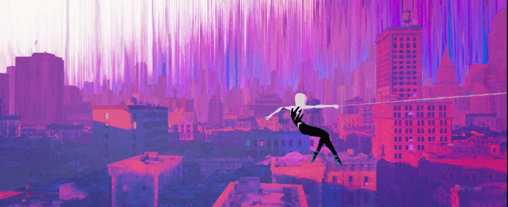
The most popular and well known example of different art styles for other dimensions are the Sony Spiderman movies. In the first movie Spider-People from other dimensions end up in Miles Morales’ world. Each one of them with their own art and animation style. A few characters such as Peter Parker and Gwen share a similar style. One plausible reason for this is that their worlds are similar, thus they themselves are. Another reason could be to surprise the viewer. Gwen is established as a character at the beginning of the movie before the plotline of different dimensions. Therefore, a too unique style would have either spoiled or confused the viewer. Later in the movie, when the other Spider-People are introduced, the viewer has had time to familiarize themselves with the concept of multiverses and other dimensions. Seeing a 2D animated character in a 3D movie is at this point less surprising and offers a visual contrast to the world around strengthening the concept of multiverses.

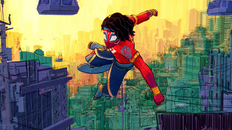
The first movie took place, for the most part, in Miles Morales’ dimension. Therefore, the art style changes were only present in the characters themselves. In the second movie, however, the narrative lead outside of the established dimension and dove into the multiverse. As a style concept the producers wanted the movies to look like a comic book, honouring the source material in the process. Now with new dimensions in mind, they decided to look at new art styles as well. The first dimension the viewer dives into is Gwen’s universe. The creators decided on a look like watercolour paintings. Gwen’s universe was not the only visited dimension. For the most part they all had their unique style. With this the viewers were provided with an aid to know where the movie was currently taking place. Now that the viewers have this confidence in their surroundings, the creators can use this as a story device. When the viewers see a dimension, which looks and feels like Miles’ world, they assume it is his. Therefore, at the end not being in Miles’ universe ends up being a surprising plot twist.

Other dimensions and their depictions

The theme of other dimensions or multiverses is not a new one. For example, in the movie “Pleasantville” from 1998 the main characters travel into their favourite TV-series. However, the contrast is limited to a switch from coloured to black and white. In “Tron” from 1982 the main characters land in a Computerworld. Fitting to that the scenes in the computer the creators are using a lot of CG, creating a contrast. In Marvel as well as DC Comics traveling through the multiverse is a common occurrence. In “Doctor Strange: Multiverse of Madness” shows traveling through many unique dimensions in a quick sequence, which span from close to ours to colour splashes or comic book styled worlds, just to name a few. The switches happen fast and are used to create disorientation because of the little time spent in each world. The viewers don’t have enough time to adjust. Another example of a rapid style changes, though not directly with dimensions is a scene from “Gravity Falls” were Dipper and Wendy travel through the bubbles of madness, which leads to various style changes. Similar to the Doctor Strange scene the goal is to confuse and overwhelm the viewers.

Conclusion

Changing styles can help viewers to orient themselves in movies with different dimensions or realities. It creates a clear cut between the familiar world and the new unknown. If the dimensions are very similar to the established one some confusion might occur, which can be used as a plot device like in “Spider-Man – Across the Spiderverse”. A very quick change of dimensions and art styles can have a disorientating result.

Die Darstellung der Vergewaltigung von Amo in Gachiakuta

Staffel 1 – Folge 13

Gachiakuta ist ein Anime aus dem Jahr 2025 basierend auf dem gleichnamigen Manga von Kei Urana. In der Welt von Gachiakuta ist die gesamte Erde mit Müll überhäuft. Die Luft ist in vielen Teilen der Welt giftig und kann nicht eingeatmet werden. Hoch über den Müllhalden der Erde, befindet sich eine Sphäre, eine letzte Bastion weit entfernt von dem vermüllten Untergrund und gleichzeitig der Verursacher des Müllproblems. Die Gesellschaft ist in mehrere sozialen Schichten geteilt, sowohl in der Sphäre als auch auf dem Untergrund. Gachiakuta ist trotz seiner typischen Anime Tropen ­­– magisch anmutende Kräfte, Monster zum Bekämpfen, junger weißhaariger Protagonist – gesellschaftskritisch. Zum einen beschäftig sich der Anime mit Umweltverschmutzung und deren Folgen, zum anderen mit dem Zyklus von Gewalt, Wut und Rache, sowie einer Gesellschaft durchwachsen mit Kriminalität.

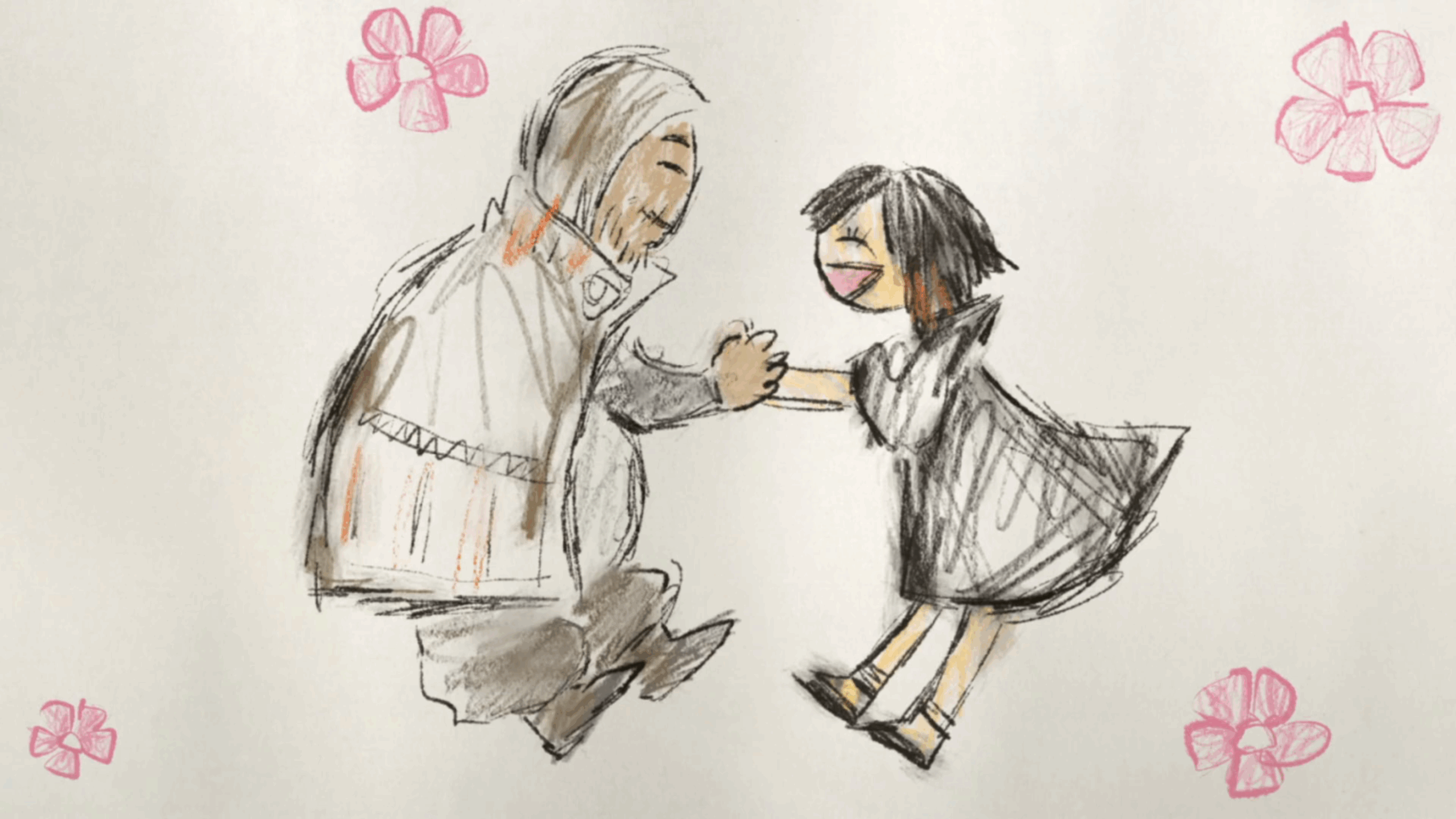
Besonders sticht hier die Geschichte des Charakters Amo hervor. Amo begegnet dem Zuseher, der Zuseherin zuerst als eine Antagonistin der Hauptcharaktere. Sie besitzt eine Fähigkeit, womit sie ihre Gegner für sich kämpfen lassen kann. Diese verzauberten Gegner agieren, als wären sie in Amo verliebt und wollen sie um jeden Preis beschützen. In Folge 13 wird dem Zuseher, der Zuseherin Amos Leben gezeigt. Amo wurde als Kind von ihrer Mutter an einen Mann verkauft. Es wurde im Anime angedeutet, dass dieser sie missbraucht und vergewaltigt hatte. Besonders ist hierbei die Darstellung, die hierfür gewählt wurde. Der Anime ist ab 18 Jahren freigegeben. Dementsprechend wäre eine direkte Darstellung nicht ausgeschlossen. Stattdessen wechselt die Animation zwischen dem normalen Animationsstil zu einem Stil, welcher an Kinderzeichnungen erinnert. Jedes Mal, wenn Amo etwas Traumatisches zustößt, wechselt es in den kindlichen Zeichenstil.

Der normale Animationsstil von Gachiakuta
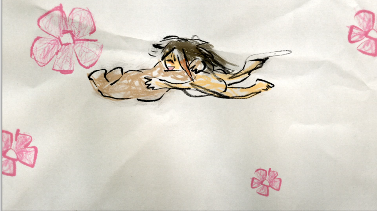
Amos Käufer mit rosa Blumen aus Amos Sicht

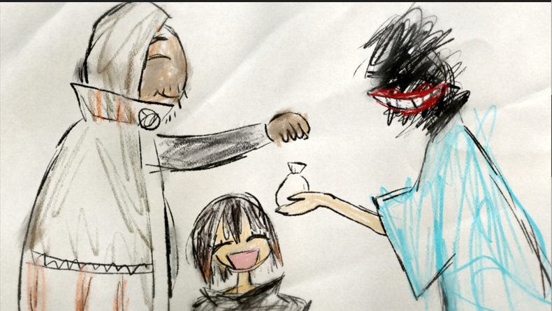
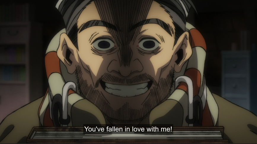
Dabei befindet sich der Zuseher, die Zuseherin im Kopf von Amo und wie sie die Situationen zu der Zeit interpretiert hatte. Als sie verkauft wurde, wusste sie nicht, was das hieß. Ihre Mutter sagt ihr, dass dieser Mann sie liebte und sich um sie kümmern würde, weshalb sie ihren Käufer als jemand positiven wahrnahm. Um Amos rosarote Brille darzustellen, wurden gezeichnete rosa Blumen eingefügt. Der Gesichtsausdruck ihres Käufers wirkt nicht vertrauenswürdig, weshalb die rosa Blumen einen umso stärkeren Kontrast zwischen Realität und kindlicher Vorstellung bilden. Der Verkauf selbst ist vollständig in dem kindlichen Animationsstil gehalten. Hierbei wird ihr Käufer als fröhlich und freundlich dargestellt, wohingegen das Gesicht ihre Mutter nur aus schwarzen Strichen und einem immer wieder aufblinkenden breiten lächelnden Mund besteht.

Die kindliche Sicht von Amo von der Kaufsituation
Amos Mutter bei dem Kauf

Ein möglicher Grund, warum die Mutter unkenntlich ist, wäre, dass sich Amo nicht mehr an ihre Mutter erinnern kann oder sich nicht mehr an sie erinnern will. Ebenfalls wäre es möglich, dass Amo unterbewusst negative Gefühle ihrer Mutter gegenüber hegt.

Nach dem Kauf wechselt der Animationsstil wieder zurück in den Anime Stil. Amo kommt in ihrem neuen Zuhause an und ein Zeitsprung findet statt. Wie alt genau Amo ist, wird nicht klargestellt. Es wird online spekuliert, dass sie zu diesem Zeitpunkt möglicherweise 15 Jahre alt wäre. In anderen Worten immer noch ein Kind in vielen Aspekten. Dabei wird, ohne es direkt auszusprechen, angedeutet, dass Amo von ihrem Käufer regelmäßig vergewaltigt wird. Als sie versucht Unbehagen auszudrücken, wird ihr eingeredet, dass was sie fühlt, Liebe ihres Vergewaltigers gegenüber wäre. In diesem Moment wechselt der Animationsstil wieder. Dieses Mal wird eine Vergewaltigung in Amos romantisierter Sicht gezeigt. Die Sequenz wird begleitet von verzerrtem Audio, was einen starken Kontrast zu den niedlichen Visualisierungen bildet und verdeutlicht, was gerade passiert ist keineswegs positiv. Der kindliche Animationsstil könnte zu dem andeuten, dass Amo in diesem Moment dissoziiert.

Amo wird eingeredet, dass sie verliebt sei
Amos Version der Geschehnisse

Durch das Gestaltungselement von diesem Stilwechsel können komplexe Themen und Gedanken sowie Gemütszustände angedeutet und erzählt werden. Da die Abgrenzung zur Realität klar erkennbar ist, entsteht auch keine Verwirrung zwischen Fantasie und echtem Geschehen. Wäre diese Sequenz ohne den Stilwechsel gezeigt worden, wäre es immer noch schwer anzusehen gewesen, allerdings würde Amos Sichtweise verloren gehen. Durch den Zeichenstil wird zudem dem Zuseher, der Zuseherin noch einmal klar gemacht, dass Amo noch ein Kind ist und auch so denkt, was diese Sequenz umso verstörender und schrecklicher macht.

Ein weiterer Faktor ist die Fantasie der Zuseher, der Zuseherinnen. Ähnlich wie bei Horrorfilmen ist das Unbekannte, das Nicht-Gezeigte unheimlicher. Ein Monster ist weniger unheimlich, wenn es offen gezeigt wird, als wenn darauf hingedeutet wird und der Zuseher, die Zuseherin seine/ihre eigenen Erfahrungen und Ängste mit hineininterpretiert.

Fazit

Durch einen Animationswechsel kann Realität und Fantasie klar abgegrenzt werden, was erlaubt tiefer in die Gefühls- und Gedankenwelt der Charaktere einzutauchen. Amos Vergewaltigung wird dadurch nicht verschönert. Das Gegenteil ist teils der Fall.

Mir ist diese Szene jedenfalls nicht wieder aus dem Kopf gegangen. Zum einen, weil das Thema schwer und etwas überraschend in dem Anime auftauchte, obwohl viele andere schwierige Themen schon davor vorkamen. Zum anderen, weil die kindlichen Bilder mich nicht losgelassen haben. Mit einfachen Mittlen wurde ein einprägendes Bild geschaffen, welches einen nicht so schnell wieder loslässt.

Kontrast als erzählerisches und gestalterisches Werkzeug in Filmen und Serien

Kontrast als erzählerisches und gestalterisches Werkzeug in Filmen und Serien

In vielen Bereichen spielen Kontraste eine wichtige Rolle. Zum Beispiel müssen Verkehrsschilder genug herausstechen, um wahrgenommen zu werden. Text muss sich vom Hintergrund abheben, um gelesen werden zu können. Musik hat schnelle und langsame, leise und laute Passagen, was Spannung bei den Zuhörerinnen und Zuhörern erzeugt. Deshalb ist es nicht verwunderlich, dass sich Kontraste ebenso in Filmen und Serien finden lassen.

Dabei lassen sich Kontraste in vielen Aspekten entdecken. Dabei lassen sich Kontraste in vielen Aspekten finden. Sie können visuell, auditiv, erzählerisch oder thematisch auftreten. Kontraste lenken Aufmerksamkeit, helfen Emotionen zu erzeugen oder Bedeutungen zu strukturieren. In Filmen und Serien kann es helfen Szenen voneinander abzugrenzen, Charaktere hervorzuheben oder symbolische Gegenstände zu betonen.

Hell-Dunkel

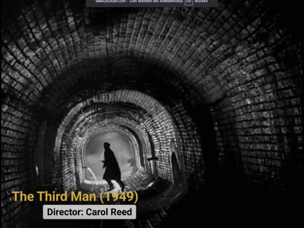
Ein Hell-Dunkel-Kontrast ist eine häufig eingesetzte Gestaltungstechnik. Der Fokuspunkt – oder in diesem Fall oft der Protagonist bzw. die Protagonistin – ist heller beleuchtet als der Hintergrund. Das Auge orientiert sich zuerst an den hellsten Punkten in einem Bild, bevor es zu weiteren Elementen springt.

Ein Filmgenre, das sich durch einen hohen Hell-Dunkel-Kontrast auszeichnet, ist Film Noir. Film Noir ist eine Filmrichtung, die ihren Ursprung um etwa 1940 in den USA hatte. Meistens sind diese Filme in Schwarz-Weiß gehalten, wobei es auch farbige Vertreter des Genres gibt. Film Noir Filme behandeln oft zwielichtige Moral. Dementsprechend können Hell und Dunkel innere Konflikte widerspiegeln.

Bei Schwarz-Weiß-Filmen ist ein Hell-Dunkel-Kontrast besonders wichtig, da Farbkontraste wegfallen. So können beispielsweise Grün und Rot im fertigen Filmmaterial die gleiche Graustufe besitzen.

Beispiel aus The Third Man ein Film Noir

Farbkontrast

Um Kontraste in einem Bild zu erzeugen, können durch die Anwendung der Farbenlehre ausdrucksstarke Effekte geschaffen werden. Für den stärksten Kontrast können Komplementärfarben eingesetzt werden, wie zum Beispiel Blau und Gelb. Auch bewusst gesetzte Akzentfarben können als Gestaltungselement dienen. Ebenfalls kann ein Warm-Kalt-Kontrast zum Einsatz kommen.

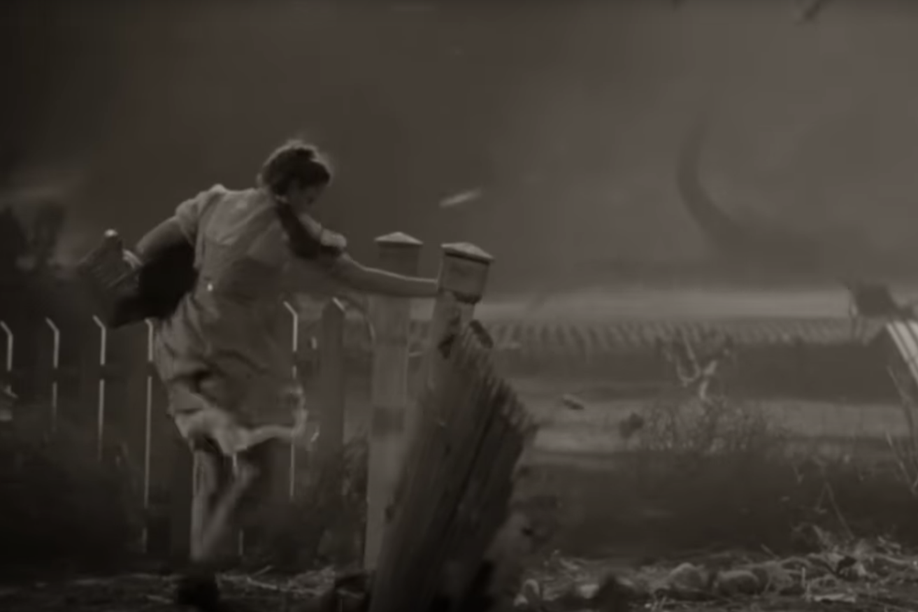
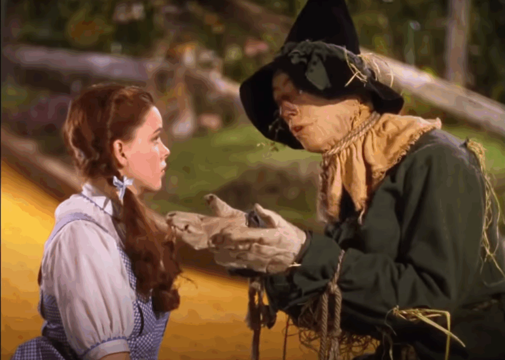
Bei Der Zauberer von Oz (1939) wird ein starker Farbkontrast eingesetzt, um die beiden Welten, in denen die Geschichte spielt, voneinander abzuheben. Zu Beginn, wenn sich Dorothy noch in ihrer Welt befindet, ist der Film schwarz-weiß. Mit Dorothys Ankunft in Oz wird die Welt um sie herum bunt und magisch.

Dorothy in Kansas – Film ist in schwarz-weiß
Dorothy in Oz – Film ist in Farbe

Fokus

Der Fokuspunkt selbst kann ebenfalls als Mittel zur Erzeugung von Kontrast genutzt werden. Ist das gesamte Bild durchgehend scharf, wird die Aufmerksamkeit der Betrachterin oder des Betrachters nicht gelenkt. Durch den gezielten Einsatz von Schärfe und Unschärfe kann beispielsweise Vorder- und Hintergrund voneinander getrennt werden. Ein Wechsel der Schärfe kann die Aufmerksamkeit innerhalb eines Bildes gezielt steuern.

Stilistisch

Ein Kontrast kann sich auch auf die Stilisierung beziehen. Besonders bei Animationswerken ist dies eine wirkungsvolle Möglichkeit, einen Kontrast zu erzeugen. Ein solcher optischer Kontrast kann aus verschiedenen Gründen gewählt werden.

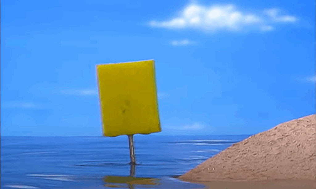
Bei SpongeBob Schwammkopf erfolgt die Stiländerung oft als optischer Witz, wenn ein Wechsel zwischen der Unterwasserwelt und der Oberfläche stattfindet – der Sprung zwischen den Welten wird also durch einen Stilwechsel unterstützt.

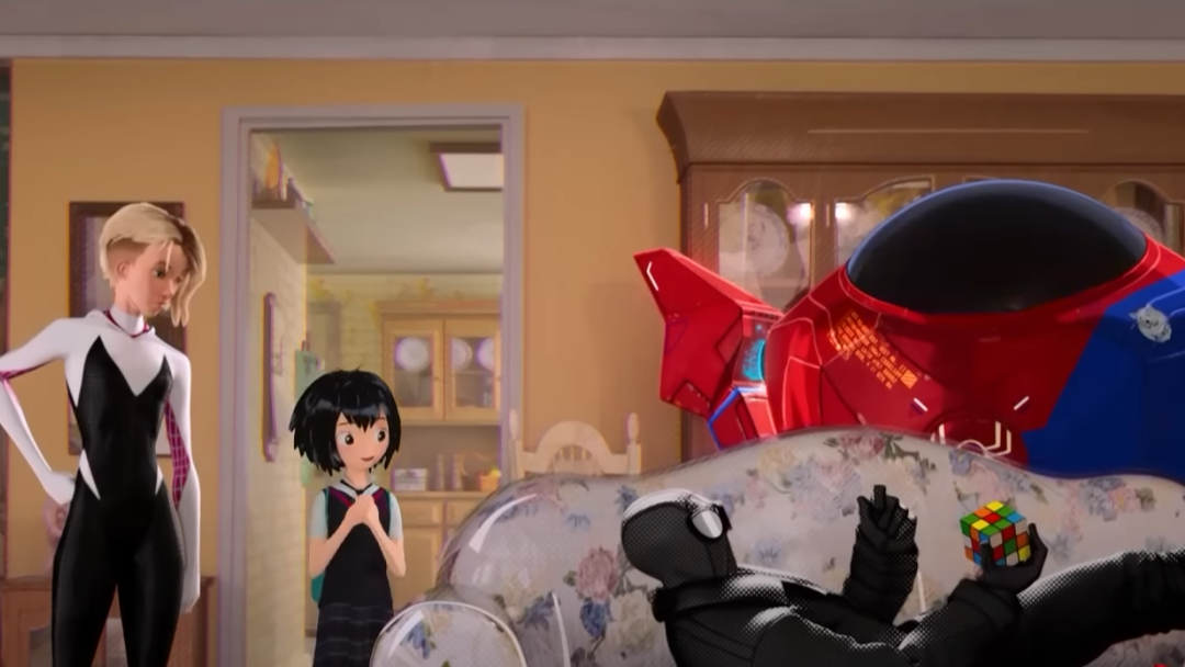
Ähnlich wird ein Stilwechsel bei Spider-Man: Into the Spider-Verse eingesetzt. In der Geschichte spielt das Zusammenkommen mehrerer Paralleluniversen eine zentrale Rolle. Die Charaktere aus diesen anderen Universen besitzen unterschiedliche Stile sowie Animationstechniken; selbst die Framerate, in der sie animiert sind, kann sich unterscheiden.

Solche Stilbrüche treten nicht nur bei Reisen in andere Welten auf. In Gatchiakuta wird eine Änderung des Animationsstils verwendet, wenn eine innere Gefühlswelt gezeigt oder wenn ein schwieriges Thema abstrahiert werden soll.

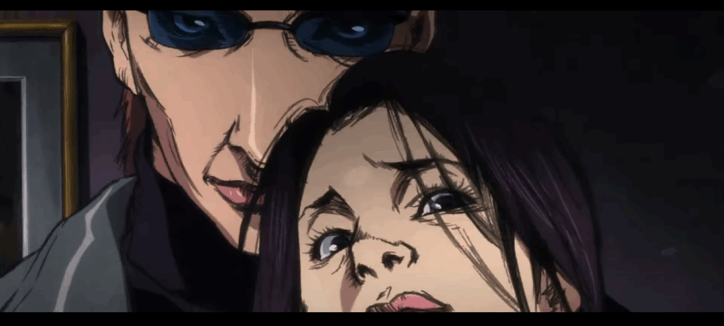
Bei Rückblenden kann ebenfalls ein Stilwechsel stattfinden. Bei Kill Bill: Vol. 1 wird zum Beispiel von Realfilm zu Anime gewechselt, um die Hintergrundgeschichte von O-Ren Ishii zu erzählen. Durch den Kontrast in den Stilen ist es für den Zuseher, die Zuseherin einfacher die aktuellen Geschehnisse von der Rückblende zu unterscheiden.

Auch abstrakte Themen wie Träume oder Halluzinationen können durch einen Stilwechsel unterstützt werden.

Rückblende in Kill Bill
SpongeBob auf Land
Verschiedene Animationsstile für unterschiedliche Charaktere

Narrative Kontraste

Innerhalb eines Films oder einer Serie können Kontraste auch in der Narration selbst eingesetzt werden. Ein typisches Beispiel ist der Kampf zwischen Gut und Böse oder Leben und Tod. Charaktere selbst können auch Kontraste bilden. Ein Beispiel ist der junge, unerfahrene, optimistische Held mit seinem älteren, weisen, zynischen Mentor. Gegensätzliche Ziele, Themen oder Charaktereigenschaften erzeugen Spannung innerhalb einer Geschichte.

Fazit

Kontraste sind in keiner Gestaltung unverzichtbar. Sie helfen, Inhalte zu strukturieren und zu gewichten, Emotionen zu transportieren und Geschichten visuell sowie erzählerisch greifbar zu machen. Ob durch Licht, Farbe, Stil oder Handlung – Kontraste sind das Werkzeug, mit dem sich Balance, Spannung und Bedeutung erschaffen lassen.

Quellen:
Film Noir:
https://www.youtube.com/watch?v=kriakwVrxs4
https://books.google.at/books?hl=de&lr=&id=WHzDEAAAQBAJ&oi=fnd&pg=PA70&dq=film+noir+style&ots=FigKCBNL1S&sig=Dmv19u2GhFrRtA5Qb49DE52VOQw&redir_esc=y#v=onepage&q=film%20noir%20style&f=false

Farbkontrast:
https://www.interaction-design.org/literature/topics/color-theory?srsltid=AfmBOorzN1PxkzZYGwr-mTRMFvdWnu14naOroRw-fxWK7LVHBftcwaGI