My rigging journey part 3 – hear me out: a ball but more complex

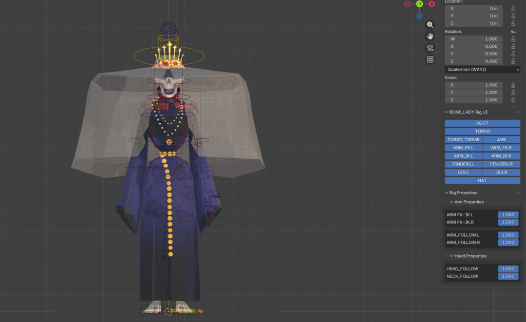
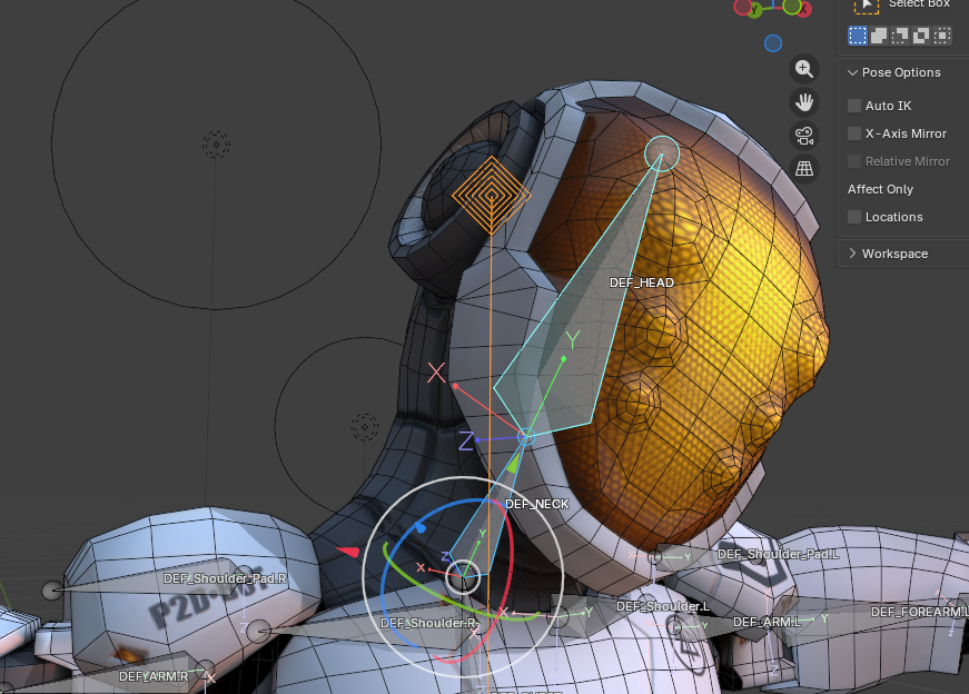
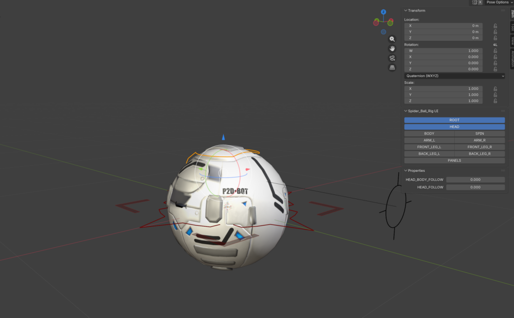
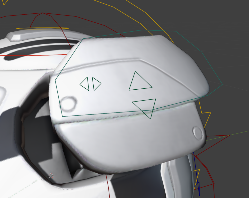
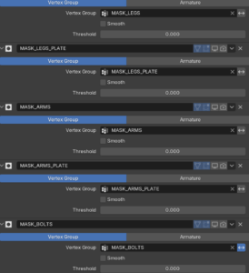
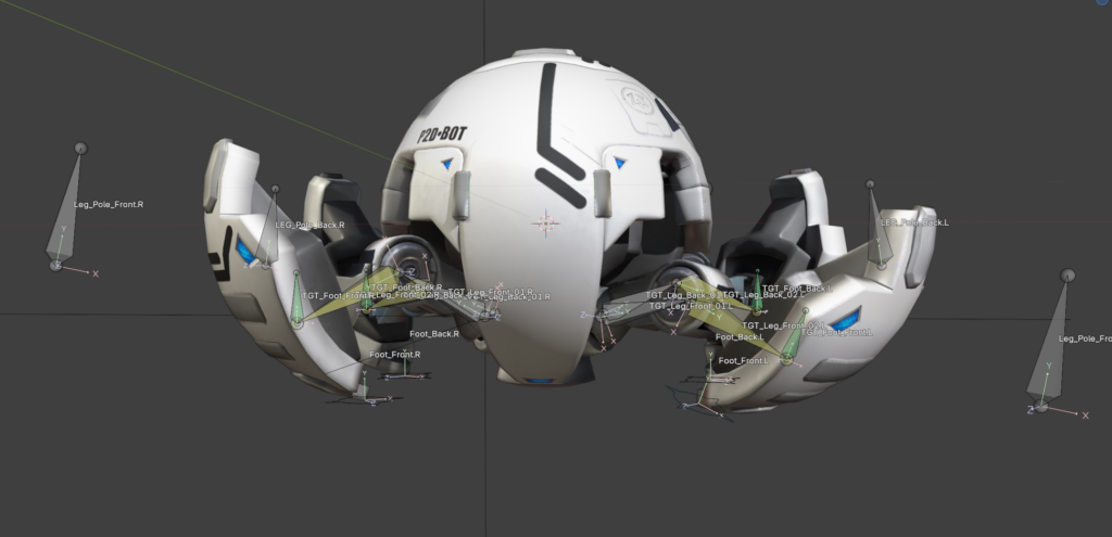
Back again with my rigging process. As already mentioned, the next project is the spider ball. The spider ball is a little robot. It is a ball that can extend its legs, head and guns. Since the model itself is quite complex the teacher provided it divided into different parts as Masks in the Modifier tab. I have never used it before, and it proofed very helpful. With it the different sections of the robot can be easily isolated.

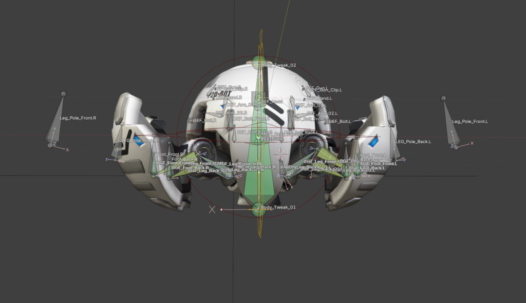
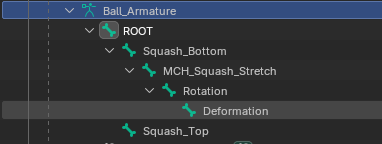
As usual at first every deformation bone needed was created. Then the process of the basic ball rig repeated. Root, Rotation, Body and squash and stretch work pretty much the same.

I really appreciated using my 3D cursor to snap bones onto vertices. I can slowly see the appeal of it. I still don’t like it that I use it accidently all the time. I will get used to it.

The skinning was quick; due to the mechanical function there is no need for soft edges. The skinning was done with empty groups. The parts were selected and assigned in the vertex groups. The explanation that every weight is listed on the right side in the transfom window was helpful. In case something is assigned into multiple groups they can be kicked with one klick.

One thing I found myself thinking about again and again is how much I have learned in this rigging course about modelling. There is so much thought about how something will later work in the rig and animation in the model itself. Of course this is also a byproduct of it being a robot. Every function needs to be thought about in the design process. Behind the parts which open needs to be a fleshed-out design and not just an empty hole. I have never modelled a robot myself, but I feel better prepared to do so from now on.  It is fun to work with a model that itself doesn’t have mistakes in it and is properly prepared for the rigging process. It makes the work a lot easier.

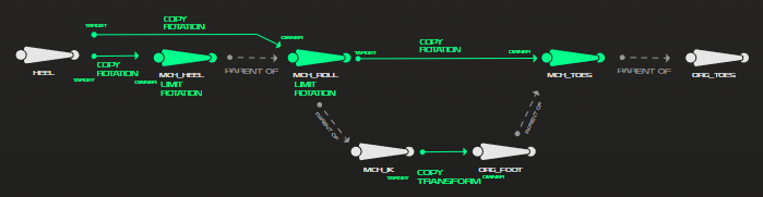
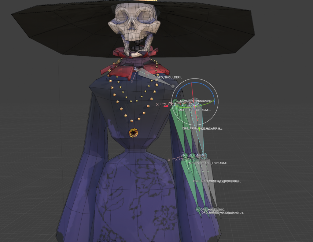
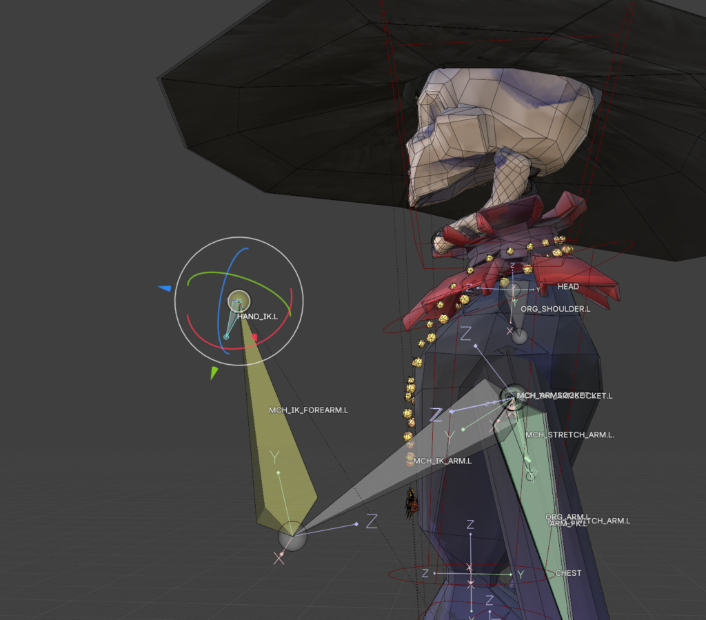
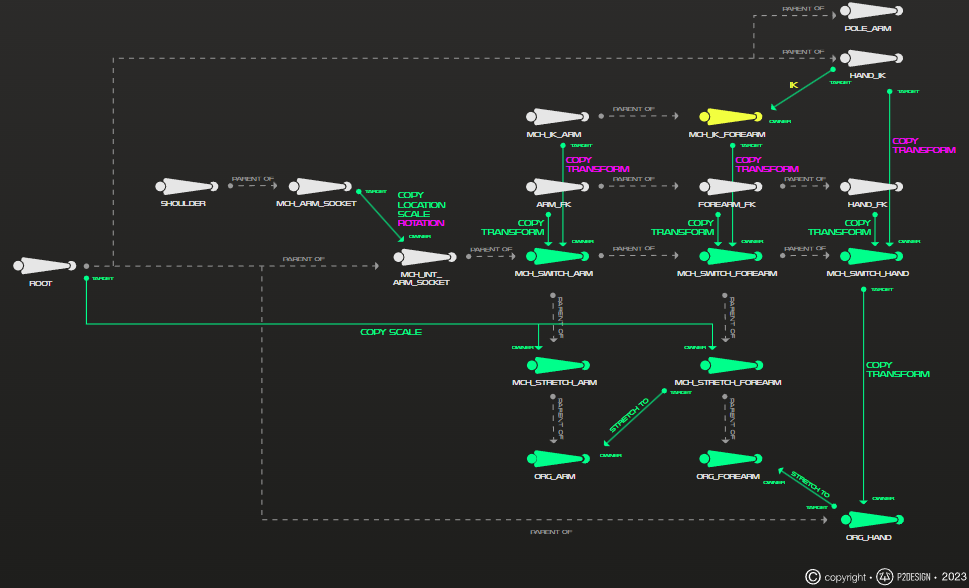
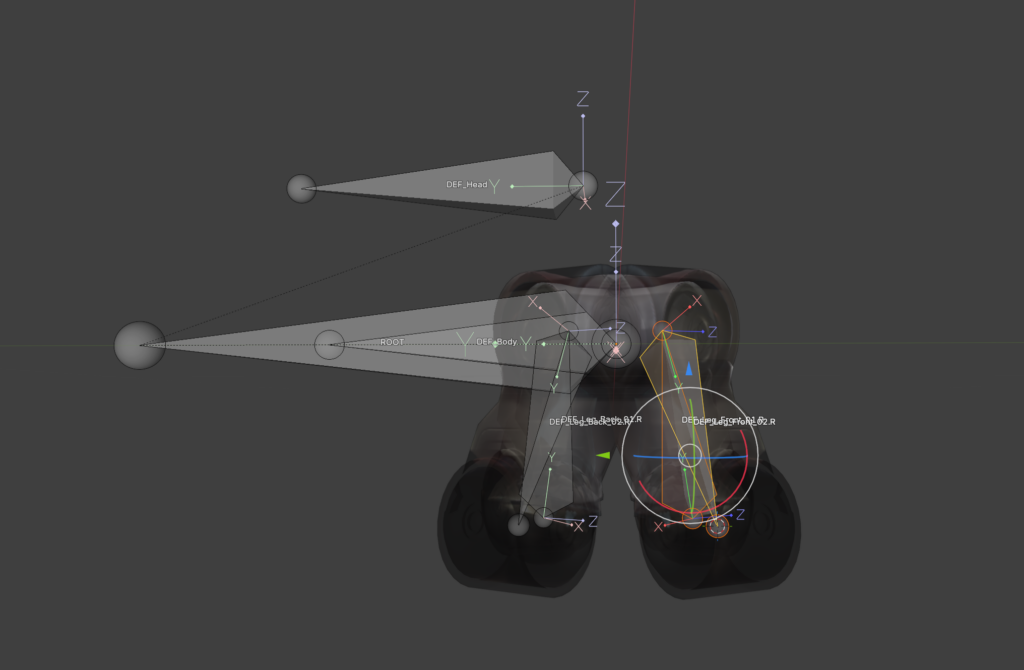
The longest part so far of the tutorial is the IK-leg rig. Number one rule for all bones is that you don’t use the deformation bones in the final rig. Just in case something goes wrong in the process it is easier to go back. Therefore, in the first step the leg bones were duplicated and as usual put into a separate Bone collection. All the deformation bones get the copy transformation constraint, and they follow our copied bones. Then the IK Constraint is used. To keep the leg in the correct angle a Pole bone was added. To get it correct it is important to switch to Normals instead of Global in the Viewport and move the bone via the X Aches.  To keep the knee from popping IK-stretch can be used with a very small value. Since a robot is not stretchy a new bone was added at the beginning of the leg bone chain. With a limit distance from this bone to the foot the stretching can be negated. To get the correct length the length of the two leg bones needs to be added together. Just copy them and paste them with a plus in the blender tab console. Tada! Blender has a little calculator too.

As a last step everything got its custom shape and color. To conclude, I worked through 13 out of 26 lessons. Another 13 and the ball is finished.

My rigging journey 2 – Once upon a ball

I spent around 3 hours of my tutorial with learning basic constraints. I have used quite a few of them in the past and therefore I only listened to it as a reminder. I also feel like I learn it better when I actually see them used in a real example.

Constraints such as: (sourse 250 page documentation of the course)

The clamp to constraints forces a bone location to stick to a selected curve.
The damped track axis makes the owner targeting (aiming) at a target.
The Locked track allows the owner to aim at a target but limits its rotation to only one axis.
The stretch to constraint allows the owner to aim at a target, and alsochanges its length and width based on the target distance.
The track to constraint is great for cameras.
The Copy location constraint forces its owner to have the same location as its target.
The Copy rotation constraint, as all the other transform constraints, uses world space to world space by default. The owner gets the same orientation as the target.

Then it was time for my first rig.

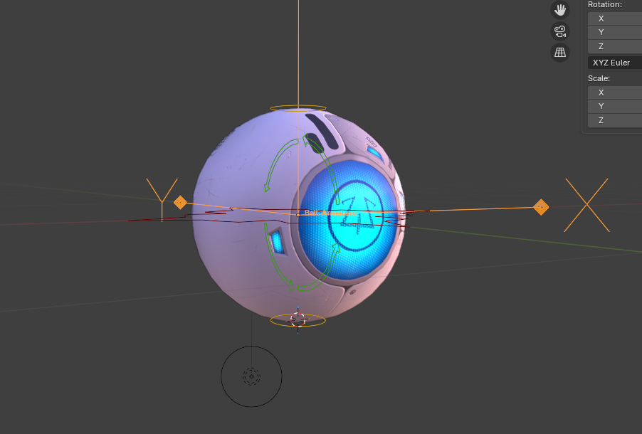
I began where everyone begins. With a basic ball. Everything was still quite simple, however I don’t think I ever did a good working squash and stretch. The main focus of this lecture was to get into good habits. As an example, renaming your bones as soon as you create them by pressing F2.

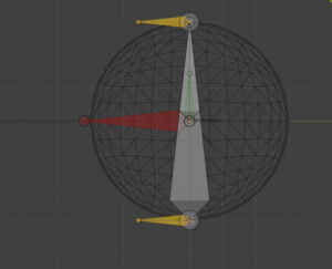
Generarally the ball needed a total of 5 bones. The rig consists of a root bone, a deformer bone, a rotation bone, a mechanical bone and two squash or stretch bones. The root bone is above all the other bones in the hierarchy and every other bone follows the root. The deformation bone is the only bone directly influencing the ball model However, the deformation is depending on the mechanical bone, which stretches from (a constraint) the base to the top squash.

I had a few brief moments of confusion due to the fact that I work in Blender 5.0 and the tutorials are in a 3 or 4 version of it. The general instructions were clear and easy to follow with a few pauses in between.

The finished rig is clear structured and read to be animated with.

Here is the rig in movement.

The next project in the tutorial is a spider ball. It is essentially a little robot which can hide its head and legs to look like a ball. It jumps from 5 lessons for the ball rig to 28 lessons for the spider ball rig. I assume I will have more to write about next time. Stay tuned!

My rigging journey – Part 1

For my design and research blog posts I chose to return to rigging. To start off what is rigging? Rigging is the process of creating a mechanism on how something should move. It is comparable to building a skeleton. This is also the reason why some of the used terms are joints and bones. As soon as one object moves or influences another it can be called rigging.

Rigging is a general term used for both 2D and 3D animation. It is the step between creating for example a character and the animation afterwards. In other words, it is the step most people would rather skip, as do I.  However, since it is one of the steps that keeps me from creating my own animations with my own models I want to get better at it. I have some experience in rigging for 3D programs. In my bachelor’s I learned some basics in maya. The lessons were very quick and hard to follow along. I learned the most in my internship at a tiny indie game studio where I got to model, rig and animate a grey heron as well as a badger. The most complex rig was a crow I made for bachelor project. However, half of it was with an auto rigging tool. I still had to do a lot of manual corrections and that bird had so many feathers I had to rig one by one.

Still, I feel like there was never a very solid base of knowledge for the rig and I only applied what I needed now. This caused some problems later with the rigs and I had to redo a lot. I want to change that. This is why I searched for an extensive course on rigging. I found “The Art of Effective Rigging 2” by Pierrick Picaut on his Website p2design academy. I have watched some of his free content on Youtube bevor and figured it would be a great fit. The lessons are detailed, files for every step are provided as well as a pdf document were everything is documented in written form. The course is spilt into 6 major parts, which get longer and more complex. The parts are: rigging fundamentals, my first rig, spider ball rig, simple character rig, advanced character rig and full character rig.

So far, I browsed through the first chapter of rigging fundamentals. For me most of it is just repetition of what I already know. I still listen to the lessons because the course is for Blender and I have less experience with Blender than Maya. The repetitions should also help with the basics I might have forgotten parts of it. So far, I enjoy the course, even though it is nothing new to me. Basics such as what is rigging, parenting, constraints, armature objects or bones where covered. I will not go too much into the detailed explanations.

As for my goal of the blog posts, I want to follow along the course as much as possible and make a short video of the rigs created. The result will probably not be looking very pretty. Rigging feels to me a little bit like coding. It is a lot of thinking work, which can be annoying but very rewarding when it finally works out.

The Freedom of Animated Music Videos

Throughout the history of media, music has always been a driving force for innovation and inspiration. With the rise of music video production, the need to stand out from others became increasingly important. One of the main purposes of a music video is to capture attention. It should enhance the music and support its emotional tone and message. There is not necessarily a need for a clear storyline, although one can be present. Music videos can also be seen as a form of short film. Their production usually does not take as long as feature films, and therefore new ideas, experimental styles, and emerging technologies are more likely to be explored.

Animation offers a particularly high level of creative freedom in this context. It allows artists to visualize abstract concepts, emotions, and rhythms that would be difficult or impossible to portray through live-action footage alone. Because animated music videos are not bound by physical reality, they can push visual boundaries and create unique worlds that directly respond to the music.

The Lyric Video

A lyric video is often used as a placeholder until the official music video is released. Despite this, it still takes time and effort to animate the lyrics of a song in a visually appealing way. Creating an engaging lyric video can be considered an art form, as timing, typography, and motion must work together with the rhythm and mood of the music. Sometimes it is paired with simple animated characters. In recent years, AI-based tools have emerged that can automatically generate lyric videos. While these tools increase efficiency and accessibility, they often lack the intentional design decisions and artistic individuality of handcrafted lyric videos.

Mixed Media

Mixed media is a broad field that combines different techniques, materials, and styles. A well-known early example is Take On Me by a-ha, which blends live-action film footage with 2D animation to create a romantic storyline between a comic book character and a real girl. The creative possibilities of mixed media are virtually endless. Stop motion can be combined with photography, 2D animation can be layered over live-action footage, or text and graphic animations can be integrated into filmed scenes. This flexibility makes mixed media especially appealing for music videos.

Virtual Bands

Animation also enables the creation of virtual bands. One of the most well-known examples is Gorillaz, a band founded in 1998 that exists primarily through animated characters. Their music videos are animated, and the band has performed using holograms and large-scale digital projections. A similar but even more extreme case is the virtual singer Hatsune Miku. She was originally developed as a mascot and voicebank for the Vocaloid software. Since her release in 2007, Hatsune Miku has gained massive popularity and has become a worldwide pop icon, performing live as a projected hologram.

Music Visualizers

Music visualizers are usually generated using specialized software. Based on sound waves, frequencies, or beats, animated visuals are created in real time. Designers can influence color schemes, shapes, and movement styles, but certain aspects of the visuals depend directly on the music itself.

Animated Short Films

Just like live-action videos, animated music videos can tell stories. They may directly visualize the lyrics or present an entirely different narrative. The level of abstraction is entirely up to the designer and animator. In animation, there are few limitations, making it a powerful medium for musical storytelling.

Conclusion

Music videos are one of the least limiting forms of media. As long as it enhances the music, gains attention and fits to the image of the band, everything is possible. Especially animation is less limitation and more experimental.

Setting up for laughter

The style of an animation can strongly influence the expectations of its viewers. This effect is especially apparent in comedy and satire. Stylization prepares the audience not to take everything literally and signals that exaggeration and humour are part of the experience. Exaggerated facial features, distorted proportions and simplified character designs are commonly used, frequently resembling caricatures.

Caricatures are an old technique dating at least back to the Renaissance. Some of Leonardo DaVinci’s drawings showed exaggerated facial features. The impression of a face was more important than reality or beauty. Around the 18th century caricatures were an established art form, especially in England. The themes often depicted politics combined with satire. Around the 19th century cartoons were gaining popularity in print media. A cartoon usually consisted of a small sequence of images and often had humorous intent. While caricatures and cartoons are not identical, their themes and visual styles often overlap, and both rely heavily on exaggeration and simplification to convey meaning quickly and effectively.

Many contemporary animated series maintain this longstanding tradition. Take shows like The Simpsons, South Park, Big Mouth, and Family Guy, for instance. The characters in The Simpsons don’t exactly mirror real humans. With their distinctive yellow skin, oversized googly eyes, and over-the-top hairstyles—like Marge’s towering blue beehive or Lisa’s star spikes, they clearly embrace a unique style. Even their four-fingered hands emphasize this departure from realism. Yet, paradoxically, these characters feel relatable. They encounter familiar challenges, family dynamics, and societal issues that viewers can easily recognize from their own experiences.

The visual disconnect makes the series’ tone clear right from the start. Audiences quickly understand they are in an exaggerated, whimsical world. While the topics tackled might be serious – corruption, inequality, or ethical dilemmas, they become more palatable thanks to humor. The stylized animation creates a buffer that allows viewers to engage with intense themes without feeling bogged down. This detachment also grants creators liberty to stretch conventions, critique society, and amplify flaws for laughs.

For example. Homer strangles his son Bart on various occasions. In the series it is done to show Homers short temper and for a quick laugh from the audience. In reality, it would be horrible and no one would enjoy watching a father abuse his child. Yet the distance created through the stylization and the over exaggerated cartoon violence as well as the lack of real consequences changes the context for the viewers from a horrible action to a joke.

Even though these shows provoke thought, their distinctive visual style acts as a cushion against the heavier subjects. The exaggerated character designs cue viewers to approach the content with irony and an open mind. Thus, animation isn’t just about aesthetics. It significantly influences the tone, mood, and audience expectations right from the opening scene.

https://en.wikipedia.org/wiki/Animated_sitcom

https://en.wikipedia.org/wiki/Cartoon

https://en.wikipedia.org/wiki/Caricature

Loving Vincent – how the style of an animated movie tells and supports the story

With movies such as “Spiderman: a new universe” a push towards a more hand painted style in the animation industry could be felt. Arcane pushed the combination of hand painted looks of 3D animation even further. However, these styles are always in combination with computer animation. What if a movie is not only hand drawn but hand painted?

Loving Vincent is an animation film published 2017, written and directed by Dorota Kobiela & Hugh Welchman. It is the first feature length painted movie. In 1 hour and 35 minutes all of the 66 960 frames are hand painted oil paintings created by 125 professional oil painters. As reference real actors and actresses were filmed in front of a green screen or sets designed to look close to the paintings.

As a concept for the movie 94 paintings of Vincent can Gogh were reimagined, reframed and strung together to create a story. For flashbacks photos of the time and van Gogh were added in a black and white to create a contrast to the colorful painting world.

Following the death of Vincent van Gogh Armand gets the task to deliver van Goghs final letter to some worthy recipient. While searching for the recipient Armand finds himself in a village with many people close to van Gogh or people who modeled for his paintings. Questions about van Goghs life as well as death were asked but left open for interpretation just like his paintings.

Loving Vincent is a special case in many aspects. The animation style is woven into the concept of the movie itself. It doesn’t just enhance the narration. It takes over the narration. The goal is to be sucked into the paintings of van Gogh, and the movie succeeds in it. Sometimes the style can be confusing and overloading due to the many moving brush strokes, however, it doesn’t take away from the impressiveness. It is an ode to van Goghs works and completely driven by the style. With a different approach the movie would lose a big part of the story. While not all viewers may understand all the references and nods given to the paintings, they will recognize van Goghs painting style even if they only know one painting of his. In a different style this connection may be lost.

Loving Vincent is not a typical movie about a famous figure. It does not feature the painter as the main character. It shows what he left behind with a new perspective.

https://lovingvincent.com

The animation of infographics

Animation is a broad field with varying requirements depending on the medium in which it is used for. Whether it is 2D, 3D, or stop-motion animation, there are clear differences between animations created for television and those produced for film. Television series typically feature less expressive animation, and in 3D animation, shaders are kept simpler to reduce render times. Infographics represent a form of animation that is generally the simplest in terms of complexity.

Infographics are predominantly used to simplify complex or abstract themes. The core of infographics is often a presentation. It includes facts and data. Without any animation the information is skimmed over without much of an impact on the viewer. Meanwhile, adding animation while dissecting a theme into small portions as well as adding comparison and a storyline the information is more likely to be remembered. While animation is an important part of infographics, it should not overshadow the information itself. The animation should enhance the information rather than distract from it.

There are various ways to create an animated infographic. Due to budget limitations, many projects share a similar visual style. Often Stock vector graphics are used as a base for the animation In these cases, the designer or animator focuses mainly on animating pre-existing elements instead of designing each asset from scratch. This approach significantly reduces production time and cost. For higher-budget projects, vector graphics may be custom-designed specifically for the infographic, allowing for a more unique and tailored visual identity that closely matches the topic and target audience.

A different approach is the so-called white board animation. Here elements get pinned or stuck on a whiteboard according to the desired story. The elements are hand drawn figures and objects giving it a personal note. Sometimes elements are drawn in addition. The hand of the, in this case, animator is shown and interacts directly with the infographic. The desired outcome is the feeling of someone explaining the topic directly to the viewer.

Ultimately, the most important factor for infographic animation is efficiency. The goal is to convey information and tell a story in the quickest and clearest way possible For this reason, characters—if they are used at all—do not need to be complex or highly detailed. If a storyline only requires a character to perform a simple action, such as raising a hand, there is no need for an advanced or intricate animation rig in software like After Effects. Simplicity often leads to clarity, which is the true strength of effective infographic animation.

Infographics found their way into YouTube as well. Many explain videos use them to create content without having to create complicate animations or invest into expansive real-life footage. They reach a large audience for example a video about “Crazy Things Science Still Can’t Explain” has over 1.2 million views over just 4 months.

Overall, animated infographics demonstrate how simplicity, clarity, and purposeful motion can effectively communicate complex information to a wide audience while remaining efficient in both production and storytelling.

https://explainvisually.co/en/animated-infographics/

https://absolute.agency/articles/blogs/five-essential-items-for-an-animated-infographic

https://www.nobledesktop.com/blog/tips-for-creating-effective-animated-infographics

Documentaries and their usage of animation

Documentaries, especially ones about history, use often a combination of scenes with actors and actresses, interviews with experts and animation. The further back in time the historical topic of the documentary plays, the less actual footage of the time period will exist. For example, when portraying the life of dinosaurs or showing a depiction of the big bang there is no way around some form of animation. 3D animation of dinosaurs is necessary to portray a realistic interpretation of scientist findings about their life. These animations are expansive and time consuming which is why the same scenes may be played multiple times. As soon as the historical period includes humans scenes with actors or actresses are used more often. Animation becomes less important, however, it is still used.

As an example in an TerraX episode called “Eine kurze Geschichte über … – mit Mirko Drotschmann – Das Alte Ägypten” produced by ZDF all three styles are combined. There is a section with actors and actresses, one with the reporter and experts as well as short animated sequences. The animated sequences are kept close to the style of the drawings of ancient Egypt if not used directly as reference. The animation is kept simple and does not have complicated movements or effects. It is in 2D and only a few elements are moved. The most important factor is the information they convey to the viewer in combination with the narration. In one scene some legends as well as gods are described with their powers shown. In this simple animation style this can be shown instead of simply told. While the usage of actors and actresses would be possible, using VFX or SFX would be more expansive and time consuming. Meanwhile getting the information from an interview section would be less impactful.

In another ZDF production “Die glorreichen 10“ 10 historical facts are put together in a top 10 video. They use footage from other ZDF productions in combination with their own animation. In this case characters of this animation consist of base shapes like circles and rectangles, resembling pictograms. With simple movements a humorous fact is being told to the viewer. The art style enhances comedy with help of exaggeration and fun sound effects. With these sections and the humorous approach to the story telling overall it catches a different target group, while still telling historical facts.

“Die Sendung mit der Maus“ is a TV show for children. They always have some sort of documentary included in the program between different animations. If it is a longer section about the production of for example ski, the documentary is interrupted by a short animation of their mascot the orange mouse. The mouse will often interact with something similar to the subject, for example skiing in a little skit. The theme therefore is not fully dropped, yet there is a pause from the fact and explanation.

Overall animation can enhance a documentary with a visual and tonal change. Dry facts can be broken down into digestible animated portions.

https://www.zdf.de/video/dokus/terra-x-eine-kurze-geschichte-ueber-mit-mirko-drotschmann-100/eine-kurze-geschichte-ueber-das-alte-aegypten-mit-mirko-drotschmann-100

https://www.zdf.de/play/dokus/die-glorreichen-10-260/die-glorreichsten-gruender-der-geschichte-100

To be Hero X – when art styles are part of the plotline

Through the blog posts there are already examples and reasons for an art style change mentioned. Usually not everything is applied at once. The creators and producers tend to only use an art style change on specially occasions. Reasons can be a flashback or past occurrences, to show the characters thoughts and feelings or to separate spaces and universes. What if all of these possibilities are combined? What if the art style changes themselves are a part of the story themselves?

Arguably in the animated Spiderman movies from Sony the art style changes are a part of the story as well. However, they are only used to show separate spaces or universes.

“To be hero X” is an animated series from bilibili and Aniplex. The premise of the world of “To be hero X” is that everyone can be a hero as long as people believe they can be. The more followers a hero has, the stronger their abilities. The abilities themselves are limited to what their believers think they can do or want them to do. Therefore, the life of a hero in this world is limited to their image. The series has 24 episodes. There is no clear main character, but multiple important characters. Some of them get multiple episodes for their stories others get less.

The first episode establishes 3D animation with 2D elements as it’s main art style. This art style remains the dominant one through all of Lin Lings story. Still even the first episode switches between three times between art styles. One switch is for a flashback, another one for a tragic background story of a villain and the last one happens somewhere between reality, a flashback and fantasy.

The second episode includes again multiple style changes. At this point it is clear that each character has a different art style when the viewer dives into their mind or background story, giving the characters another level of personality. All 4 episodes dedicated to Lin Ling stay in a similar fashion.

In episode 5 the main character gets switched to Yang Chen, which at a first watch was slightly confusing, since there was no indication that there would be a new main character now. The art style is in the same 3D animation as before and in flashbacks a change might occur.

With episode 8 however the biggest switch happens. The whole animation style changes to 2D anime animation. During all 3 episodes of Lucky Cyans story there are no art style changes, but also no flashbacks since her whole life is shown. If you follow the story closely the viewers might realize that everything of Lucky Cyan is already playing in the past. In the two stories before Lucky Cyan was mentioned as an already established hero while in her story arc her beginnings were shown. With later episodes the style changes reemerge.

Up until episode 22 the same main 2D animation style is kept, which indicated that all of the stories play in the same timeline. The episode marks also the first real appearance of the mysterious hero X. Fitting to that it is the first time we briefly return to the 3D animation style only to switch in a short period of time between even more styles. It is indicated that X knows of these changes and that in his case they are linked to his powers.

In episode 23 the main style changes again. This time it is still 2D but a lot blockier and less round than before. The reason for this could be the main character who is a dog.

In the last episode X is the main focus, and the style is back to 3D. Since Xs powers are linked to changing art styles there are a lot of switches. Sometimes these switches are even combined. Once X transformed his art style to pixel art, where he can only run along the walls while everything else stays 3D. Whenever he snaps his fingers the art style changes, making the changes more than just a tool to create contrast.

In the case of “To be hero X” the style changes have multiple use cases. They show thoughts, personality, time and a narrative device. For now there is only one season available, which leaves many questions according to the art style and story open. But it is the first series I have seen, where style changes are used this heavily.

It is all in your head – How are thoughts of characters presented

In books it is a common occurrence to read about the thoughts of a character. They themselves describe from their perspective how they feel and how they experience the story. In movies and series, it is less common. For the most part thoughts and feelings are conveyed through the characters facial expression in combination with music, sound design and the overall cinematography.  What other ways are there to explore the inner world of a character?

Voiceover

The closest way to portray thoughts is a voiceover. Here the characters speak directly to the viewers and tell them in an inner monologue how they feel. There are two common ways this is used. One way is with the help of a narrator. For example, “How I met your mother” has the premise of Ted telling his kids about his past. He therefore plays two roles at the same time. The viewers don’t get the thoughts of the young Ted directly. They are being told the reflection of his past actions through his narrator self. Sometimes the narrator will contradict the young self and criticising his past actions.

A different approach is a live commentary. In “You” the viewer is following Joe, a book seller and as it turns out a stalker. The viewers hear all his justifications for his awful actions. One of the main female characters Beck is only really ever seen through his eyes and descriptions. There are a few scenes just following her, but the influence Joe’s description and portrayal of Beck is undeniable. Separating what he thinks, what is happening and what the actual story is, is challenging. Joe also feels more charming and charismatic as long as one hears his inner voice and thoughts. Meanwhile other characters react disturbed and confused towards him. After all he barley talks to people other than himself and the viewers. In this case the inner monologue is used to create some sympathy for an otherwise unlikable character.

Another series using inner monologue is for example “Scrubs”. They use it for the main character JD in a humorous way. In addition, the creators combined it with another way to show JDs inner thoughts.

Show don’t tell

A voiceover can sometimes be too much, especially if the narrator is unreliable like Joe. A different approach is to show the thoughts directly. While in Scrubs JD is sometimes narrating his thoughts, he tends to fantasise a lot. It is indicated with a white flash from reality to fantasy and back. In the fantasy itself the scenes are not narrated, rather everything is shown. With the white flashes between there is a clear cut between reality and thoughts. If there is no such visual aid, it is unclear whether something is supposed to be only in the head of the character. This can be used to shock viewers like in “Stranger Things” season 3 when Billy struggles to separate reality from thoughts. In his head he attacks Karen while he is spacing out. With a cut back to Karen save and unharmed the fantasy gets resolved and his instable mental state is shown.

Art style changes

For a clear cut between thoughts and reality a style change might be applied. In “Lizzie MCGuire” there are multiple techniques combined to show the main characters thoughts. With a cut to a cartoon Lizzie, she talks about everything going through her head. It is clear that no one else can see the cartoon character and only Lizzie imagines them.

Another example for a style change can happen when the characters talk about their backstories and what happened to them. Rather then only letting them talk, the viewers get to see the story unfolding before their eyes. In “To be hero X” this happens multiple times in the first few episodes alone. Similar to thinking back, an art style change may be applied while talking about future plans. In “Emperor’s new groove” the art style switches to simplified red silhouettes while Ysma talks and imagines her evil plan.

Special Effects

A less harsh cut between fantasy or thoughts and reality can be achieved with special effects. Whenever Jinx from “Arcane” is in an unstable mental health state colourful sharp lines appear, blurring into her reality. In “Scott Pilgrim vs. the world” Scott imagines the world like a comic book.  Therefore, it is no surprise that special effects like from on of the books are shown.

A slight problematic example for the usage of special effects is the stereotypic depiction of an attractive woman appearing. She appears to glow, and her hair blows perfectly in the wind.

There is a wide range of possibilities to include the inner thoughts and feelings of a character. From subtle light changes to letting them talk directly to the audience.