[DesRes 1] Agile_x_SelfCheckout No. 10: Next Steps

No. 10: Next steps

After one semester I’m still happy with my chosen topic, or rather say topics (plural). I still believe that my thesis will make sense by combining the agile topic with the use case of cash registers. As one might already tell, simply by looking at blog entries, I had some struggle outlining and combining these two perspectives. Overall I think the working title Agile_x_SelfCheckout is a good approach to sum up what I’m working on.

Dividing the topics more clearly

For the future I have decided to cover each topic separately in my research. So for example in the first half of the next semester I will cover the “agile” perspective, and in the second half it will be all about the findings concerning the cash registers.

Collaboration with REWE Digital

I have started my student job at REWE Digital some weeks ago. I already have a better perspective now on my responsibilities at work. The biggest benefit of collaborating with this company is that I have the access to the test systems and could perform detailed user tests, even including pseudo payments.

Disclosure and sensitive information

As for the blog entries this means that I have to be really careful about what information I am allowed to include in each entry. I have to make sure not to expose disclosed information that is to be kept a secret within the company.

Self Checkout or Served Solutions

So far I have put a lot of focus on self checkout solutions. However, it depends on my specific tasks and goals as an employee of REWE digital, which prototypes I will get to work on.

One things remains: whatever artifact I will be working on, I know that I will have the possibility to cover something relevant to the whole service design process.

Accessibility?

The topic of accessibility remains my biggest concern. I would love to cover it, but once again, due to the possibilities within my employment, it still needs to be decided wether or not, this is a relevant topic or not.

Next Semester

I am looking forward to continuing working on this project and increase my expertise concerning agile project management, as well as getting a better understanding of the struggles users of both served as well as self checkout registers are exposed to.

I will kick off the next semester by adapting my research question to open more possibilities.

[DesRes 1] Agile_x_SelfCheckout No. 9: Mental Models & Informal User Research

Mental Models

Mental Models are a powerful way to describe what is going on inside user’s brains. It gives us more cues about how they perceive certain things so we can empathize with their experiences [1]. Viable cues concerning mental models can be identified via different methods. A popular one is card sorting, it is especially relevant for challenges concerning information architecture. Furthermore, we can get a better understanding of user’s processes by observing how they interact and act in their current environment. Specifically in the grocery and retail context so called “PLU-lists” are a major artifact.

PLU-List

Every customer of a supermarket has already been exposed to this code – wether they know it or not. A PLU number is an international code, that defines products like fruits and vegetables. The PLU code for a banana typically begins with the number 4. Additional information, like country of origin of the product can also be identified through this code. Sometimes employees know this number, or at least specific selected numbers, by heart. In case they have to look it up, they have to take a look at a list – this is also where the name stems from: PLU stands for price-look-up code. [2]

Possibilities for informal user research with high value and impact

I’m aware this might be a bold move, but I believe that a lot of online forums, especially via reddit, can be an interesting way to observe user’s and customer’s behaviour. This works for both – in a market research as well as a design related user research way. While this is obviously an informal way of researching something, I strongly believe it is of high value. It gives you first hand impressions of customers, and possibly even employees.

Subreddit “Target”

Down below I have found a picture, this is an example from Target that I found via Reddit. It was attached to a post, where an employee reached out to the forum in the r/Target subreddit, because they were curious about which codes are popular and commonly used.

Source: Reddit | r/Target | User: csrlrnz

Subreddit “schei**aufnbilla”

While this subreddit has a rather extrem title, it definitely opens a new horizon concerning honest opinions of angry customer’s.

Reviews

In contrast to reddit google reviews covers a larger range of customers. Clicking through various stores on google maps quickly gives you a good overview of different challenges customers and sometimes even employees face. This works efficiently via google maps, because they also give you options to filter the different reviews (e.g. by keywords)


Sources

[1]

M. Chan, “Mental Models and User Experience Design,” Nielsen Norman Group, Jan. 26, 2024. https://www.nngroup.com/articles/mental-models/

[2]

Bayerischer Rundfunk, “Lebensmittel Code entschlüsseln: Was bedeutet der PLU-Code auf Lebensmitteln?,” Www.br.de, Mar. 11, 2024. https://www.br.de/radio/bayern1/lebensmittel-code-entschluesseln-100.html (accessed Jan. 30, 2026).

[DesRes 1] Agile_x_SelfCheckout No. 8: Agile and User Stories

While fonts and color choices are important to take into account, service design puts process and problems into deeper perspectives. Requirements and processes are strategically challenged, to align with business values. Therefore, the problem definition in service design outlines the user experience as well as other perspectives and puts employees, customers and other counterparts into relation.

In a supermarket this means all things from the back office and warehouse to the retail space as well as the cash registers have to be considered.

A powerful tool within the practice of service design is the so called Service Blueprint. I personally would describe a service design map as an extension of a user journey map. The fronst stage processes (1) describe all the steps that the customers can directly observe (e.g. scanning of articles). Back stage actions (2) highlight how the fronst stage steps are interfering and how they relate to what’s happening out of the customer’s sight. The line of invisibility (3) visually divides these two perspectives. Another mentionable part of a service blueprints are so called artifacts (4), also known as physical evidences (e.g. a receipt).


[1]

M. Stickdorn, A. Lawrence, M. Hormess, and J. Schneider, This is service design doing, applying service design thinking in the real world: a practitioners’ handbook. Sebastopol Oreilly & Associates Inc, 2018.

Alles wird beworben. Warum nicht auch der Schulunterricht?

Werbung ist aus unserem Leben nicht mehr wegzudenken. Jede Firma, Institution und jedes Produkt, das etwas auf sich hält, bewirbt sich. Kein Medienkanal ist mehr vor Werbung sicher. Hinter Werbung steckt viel Strategie, geplante Mechanismen, um Aufmerksamkeit zu erhaschen und ganz genaue Recherchearbeit. Eine gute Werbung soll die Zielgruppe nicht bloß auf die Verfügbarkeit eines Produktes oder einer Dienstleistung hinweisen, sondern auch zum Kauf motivieren.

Ich, als Designerin/Lehrerin Hybridwesen, hatte einen Gedankenblitz: Warum setze ich diese aufmerksamkeitserhaschenden Werbestrategien nicht gezielt für den Schulunterricht ein. Nur anstatt zum Kauf, sollen Schüler:innen zum Lernen motiviert werden.

Aufmerksamkeit didaktisch nutzen

Werbung schafft es in Bruchteilen einer Sekunde Aufmerksamkeit zu ziehen, so entsteht auch die Wirkung der Werbung. Möchte man diese Wirkung auch für den Unterricht erzielen, sollte der Einstieg in ein Stoffgebiet so gestaltet werden, dass er aus der Routine heraussticht. Also kein „heute lernen wir über das Thema…“, sondern ein irritierender Impuls, eine provokante Frage, ein starkes Bild. [1]

Wie wäre es, den Unterricht mit einer überraschenden Anekdote zu starten, die scheinbar nicht zum Thema gehört, aber Neugierde auslöst. Oder eine offene Frage, ein Rätsel, ein Mysterium wird in den Raum gestellt und erst am Ende des Kapitels aufgelöst. Diese Form der inszenierten Irritation wird in der Werbung gezielt eingesetzt, um Aufmerksamkeit zu erlangen, bevor der eigentliche Stoffinhalt präsentiert wird. Im Unterricht wird hierdurch ein kurzer Zeitraum geschaffen, in dem alle Schüler:innen wirklich zuhören. Eine Basis für ein vertieftes Lernen wird geschaffen. [1]

AIDA (nicht das Kreuzfahrtschiff oder die Oper von Verdi)

Wer sich schon einmal mit Werbestrategien und Modellen auseinandergesetzt hat, kennt das AIDA-Modell (Attention – Interest – Desire – Action). Es beschreibt, wie Werbung vom ersten Betrachten zur Handlung führt. Das Modell lässt sich in den Unterricht und die Schulliteratur übertragen, in dem diese/r in die vier Phasen geteilt werden. Man fängt also mit einem aufmerksamkeitserhaschenden Start an (siehe oben), vertieft dann das Interesse der Schüler:innen, dann kommt die „Habend wollen“-Phase, und am Ende soll zur Aktivität angeregt werden. [2]

In der Praxis könnte das so aussehen: Ein Thema wird durch einen irritierenden Impuls eingeleitet, sei es nun eine Anekdote, ein Bild oder eine spannende Frage. Dann wird das Thema interessant gemacht, in dem es mit der Lebensrealität der Schüler:innen verknüpft wird. Praxisnahe Beispiele werden genannt, damit sich mit dem Thema identifiziert werden kann. Danach wird erklärt, warum das Thema wichtig ist. Entweder durch ein eigenes Projekt oder eine Debatte. Und am Ende wird zur Handlung aufgerufen. Eine Aufgabe soll erfüllt werden, die Schüler:innen sollen selbst zu Inhalten des Lernkapitels Videos, Poster, Präsentationen etc. gestalten. Die Schullekture bzw. der Unterricht orientiert sich so nicht nur an den Fachinhalten, sondern hat eine eigene Dramaturgie. In der Werbung nennt man das die Kampagnenplanung.

Dramaturgie ist ein guter Stichpunkt…

Wie bereits in meinen anderen Blogartikeln erwähnt, ist Storytelling ein wichtiges Tool, um Aufmerksamkeit der Rezipient:innen zu halten. Inhalte, die in Geschichten verpackt sind, können dadurch emotionale aufgeladen werden und bleiben besser im Gedächtnis hängen. Auch in der Werbung wurde dieses Prinzip bereits erkannt. [3]

Gamification zur Motivation

Ein häufig eingesetztes Element in der Werbung ist Gamification: (Rabatt)Punkte sammeln, Ranglisten, Challenges, Belohnungen. In bestimmten wirtschaftspädagogischen Studiengängen wurden diese spielerischen Elemente bereits verwendet und auf Eignung für den Unterricht geprüft. [4] Es zeigt sich, dass dadurch Motivation zum Lernen durchaus gefördert werden kann. Studien dazu [5] sagen aus, dass Lernende in Hochschulkurses durch Einbeziehung von Gamification erhöhtes Interesse aufweisen. Zudem steigt die Anwesenheitsquote, die Aufmerksamkeit und die Teilnahme an. [5]

Werbe-Mechaniken, wie das Sammeln von Punkten können im Unterricht eingesetzt werden, z.B. durch das fertigstellen von Aufgaben. Diese Spiel-Elemente bieten viele verschiedene Möglichkeiten die Lernenden zu fördern, bieten ihnen Herausforderungen und können vielfach eingesetzt werden. Dabei ist aber darauf zu achten, dass für Schüler:innen nicht der Wettbewerb im Fokus steht. Dieser könnte von den eigentlichen Lerninhalten ablenken. Ziel ist es die Motivation für das Lernen zu fördern, nicht für das Gewinnen. [4]

Aber Achtung: Immer kritisch bleiben!

Werbemechanismen zeigen also gute Strategien, die für die Aufbereitung vom Lernstoff verwendet werden können. Dabei sollten diese Mechanismen jedoch nicht unreflektiert bleiben. Dietrich Röder erklärt in seinem Artikel „Wie funktioniert Werbung im Unterricht“ [2], dass eine Analyse der Werbestrategien als effektive Lernmethode das analytische Denken, sowie die Teamarbeit und die Kommunikationsfähigkeit der Schüler:innen fördern kann. Zusätzlich bietet eine Auseinandersetzung mit dem Thema ganz viel Potential für neue Aufgabenstellungen. In kreativen Projekten könnten Schüler:innen die Werbetheorie in die Praxis umsetzen und Werbebanner, Videos oder Plakate erstellen. [2]

Quellen:

  1. Ad Alliance(2023): Aufmerksamkeit als zentraler Hebel für mehr Werbewirkung. In: Screen Force, https://www.screenforce.de/studie/aufmerksamkeit-als-zentraler-hebel-fuer-mehr-werbewirkung (zuletzt abgerufen am 28.01.2026)
  2. Röder, Dietrich(09.08.2025): Wie funktioniert Werbung im Unterricht? Effektive Methoden für Lehrer. In: matheblatt.de, https://matheblatt.de/wie-funktioniert-werbung-im-unterricht-effektive-methoden-fur-lehrer (zuletzt abgerufen am 28.01.2026)
  3. Lindsberger, Martina/Redaktion CONEDU(25.08.2022): Storytelling als Methode in der digitalen Erwachsenenbildung. In: erwachsenenbildung.at, https://erwachsenenbildung.at/digiprof/neuigkeiten/17215-storytelling-im-bildungskontext-foerdert-die-beteiligung.php (zuletzt abgerufen am 28.01.2026)
  4. Sailer, Sabrina (19.11.2021): Badges, Levels, Leaderboards: Gamification zur Motivation Studierender der Berufs- und Wirtschaftspädagogik in selbstgesteuerten und kollaborativen Lern-Settings. In: bwp@ Berufs- und Wirtschaftspädagogik – online, Ausgabe 40, S. 1-20. https://www.bwpat.de/ausgabe40/sailer_bwpat40.pdf (zuletzt abgerufen am 28.01.2026)
  5. Barata, G./Gama, S./Jorge, J. A. P./ Goncalves, D. (2015): Gamification for smarter learning: tales from the trenches. In: Smart Learning Environments, 2, H. 1, S. 1-23

Biophilia and Interaction Design. Final blog post considerations

In this latest article, we gather the key reflections that emerged on the relationship between nature, technology, and interaction design.

This research was born from a personal paradox.
I’ve always loved being immersed in nature, but in everyday life, I’ve often found it difficult to care for plants. Lack of time, space, and continuity. From here, a question arose: what if technology could help us reconnect with nature, instead of distancing us from it?

As the indoor generation, we spend approximately 90% of our time indoors: homes, offices, schools, and transportation. Although we often don’t realize it, our lives unfold almost entirely indoors.
Yet, humans have a profound connection with the natural world. For much of our evolution, we lived outdoors, following the rhythms of light, seasons, and ecosystems. This connection has been progressively neglected in recent centuries.
The concept of biophilia reminds us of this: we have a natural need to connect with life and vital processes, not just to live in efficient and comfortable environments.

Home automation systems today are highly advanced. They manage light, temperature, security, and energy efficiently. But they focus almost exclusively on physical comfort.
These technologies don’t take into account deeper needs: emotions, perception, and a connection with time and nature. Smart homes know when to turn on a light, but they don’t know how we feel. They don’t help us build a connection with living things.
This gap isn’t technical, it’s human. And this is precisely where interaction design can make a difference.

The research followed a qualitative and exploratory approach.
The goal is not to measure performance, but to understand experiences, perceptions, and behaviors.
The analysis focused on three key aspects:

  • engagement
  • feedback
  • emotional connection

Three main directions emerge from the research.

  • The first concerns emotional connection. Interdisciplinary approaches, such as the use of sound, can make plants’ vital parameters visible. Transforming biological data into sounds or musical outputs allows for a more sensitive and empathetic relationship.
  • The second concerns engagement. Mechanics inspired by video games and gamification can make plant care more engaging, encouraging continuity and attention over time.
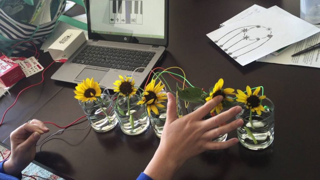
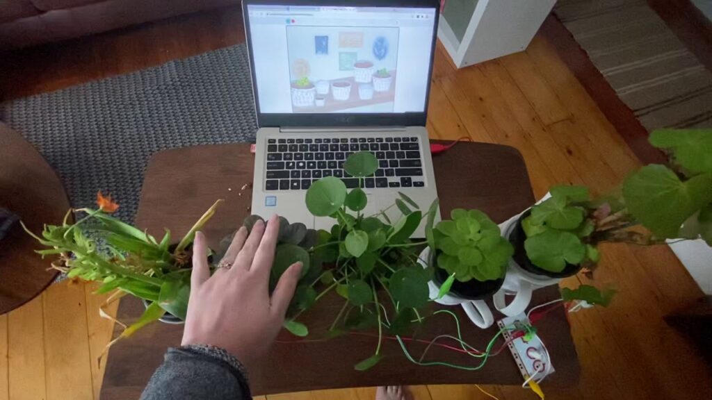
  • The third concerns nature-based user interfaces. Tools like Makey Makey show how natural elements can become an active part of the interaction. But above all, how it is possible to integrate biological inputs in a sensorial way.

What if technology could bring nature back into our daily lives?
This was the central question of the entire project. The current market certainly already offers several solutions capable of integrating some of the principles discussed, such as gamification.
The next step could be to make these technologies more accessible and even more interdisciplinary. Integrating different media, such as sound, is also important because many home automation systems today are primarily voice-based and therefore inaccessible to those who cannot use their voice.
But perhaps the most important question is not what technology can do for nature, but rather to continue asking what nature can teach us about how to design better interactions.

Feedback and Gamification in Plant Care: Learning Through Interaction

In recent years, a growing number of projects have sought to simplify complex everyday tasks by integrating new technologies into daily life.

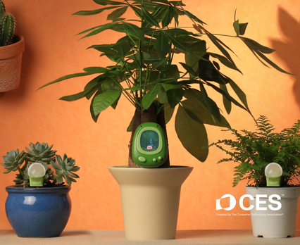
CES (Consumer Electronics Show) is one of the most important international conferences dedicated to technological innovation. CES 2026, held in Las Vegas, showcased numerous projects related to wellness, smart homes, and sustainability. Among these, one of the most interesting was LeafyPod, a smart vase that combines technology, design, and nature.

In this article, we’ll explore why LeafyPod is a good example of how feedback and gamification can improve the plant care experience, making it more intuitive, engaging, and learning-oriented.

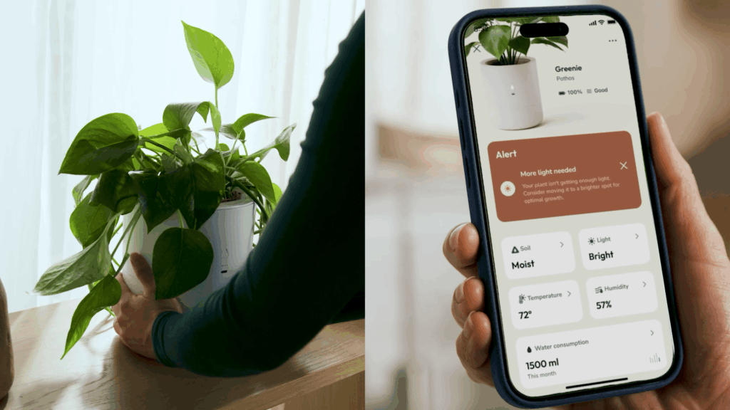
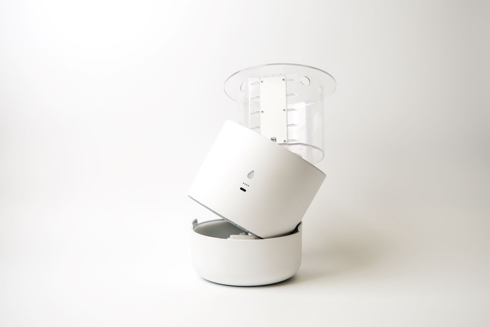
LeafyPod is a smart pot designed to support the care of indoor plants. Through sensors that detect soil moisture, light, temperature, and environmental conditions, the system provides clear guidance on when and how to intervene.
What’s unique about LeafyPod is that it doesn’t just collect data, but translates it into simple, user-friendly information. Through a dedicated app, users can identify a plant, receive personalized instructions, and track its health over time. The system uses an artificial intelligence engine that learns from the plants’ actual conditions and improves the guidance provided.

This year’s version features an expanded AI engine to support a much larger number of indoor plants. Users can search for any plant by name, explore an ever-expanding global catalog, or take a photo for instant plant identification along with personalized care instructions. [2]

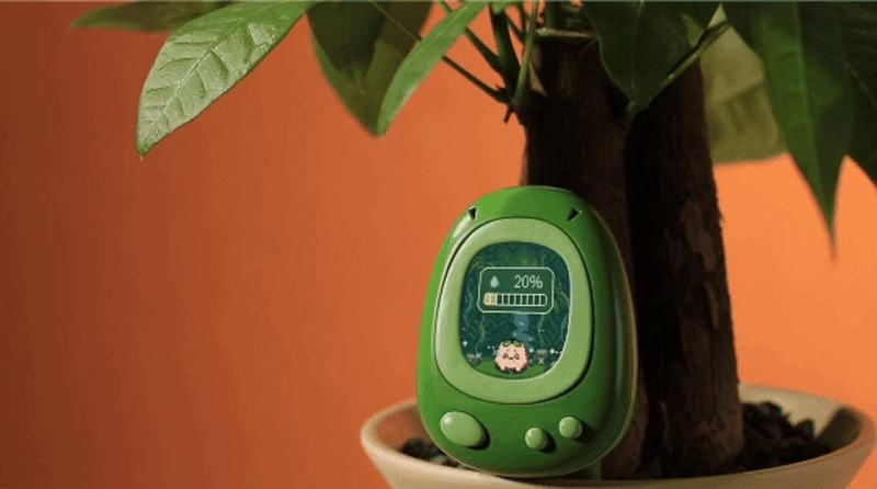
Image 1. App and pot design of LeafyPod from LeafyPod.com

One of the most interesting aspects of LeafyPod is the way it uses feedback to foster learning. The app’s notifications, alerts, and prompts transform plant care into a series of small daily goals.
Gamification isn’t present in the form of explicit games, but through positive micro-interactions: reassuring messages, visible progress, and clear suggestions. This approach helps build a routine and maintain motivation, transforming plant care into a gradual and rewarding experience.
In this way, LeafyPod uses feedback not only to inform, but to guide user behavior, creating continuous interaction.

Despite its innovative approach, LeafyPod also has some limitations to consider. LeafyPod isn’t cheap: individual planters cost tens of dollars, and to work properly with the app and Wi-Fi connection, you often need to purchase an additional Bridge. This can make the initial investment more expensive, especially for those with multiple plants.
According to the official specifications, LeafyPod doesn’t currently integrate directly with smart home systems like Alexa, Google Home, or Apple HomeKit. This limits the possibilities for automation and integration with other devices already present in the home, although such features may be introduced in the future.

Image 2. Structure of LeafyPod, AI powered smart planter

References

[1] LeafyPod, “LeafyPod – Smart planters for indoor plants,” [Online]. Available: https://www.theleafypod.com/. [Accessed: Jan. 2026].

[2] CES VPORoom, “LeafyPod advances indoor plant wellness at CES 2026 with universal AI plant engine and seamless smart care experience,” Jan. 6, 2026. [Online]. Available: https://ces.vporoom.com/2026-01-06-LeafyPod-Advances-Indoor-Plant-Wellness-at-CES-2026-with-Universal-AI-Plant-Engine-and-Seamless-Smart-Care-Experience. [Accessed: Jan. 2026].

[3] CES VPORoom, “LeafyPod advances indoor plant wellness at CES 2026 with universal AI plant engine and seamless smart care experience,” Jan. 6, 2026. [Online]. Available: https://ces.vporoom.com/2026-01-06-LeafyPod-Advances-Indoor-Plant-Wellness-at-CES-2026-with-Universal-AI-Plant-Engine-and-Seamless-Smart-Care-Experience. [Accessed: Jan. 2026].

[4] Consumer Technology Association, “CES – Consumer Electronics Show,” [Online]. Available: https://www.ces.tech/. [Accessed: Jan. 2026].

Gamification as a Tool for Engagement in Biophilic Design

In the era of digital transformation, game design and interaction design are increasingly being integrated. Game principles are used not only to entertain, but also to enhance the user experience of everyday applications and services. The goal is to make interactions clearer, more engaging, and easier to understand, helping users participate more actively and consciously.

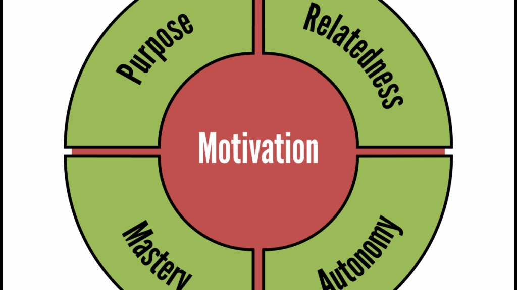
Gamification aims to make common activities more interesting and enjoyable. To work, an app must be able to maintain the user’s attention and motivate them to continue using it. This happens when the proposed challenges are balanced with the user’s abilities, creating a sense of continuous engagement, called flow. According to Rigby and Ryan, a good gamified experience is based on three main elements: autonomy, competence, and relevance. Autonomy concerns the ability to choose and feel in control, competence is linked to improvement and the feeling of succeeding in what one does, while relevance concerns the meaning of the activity and the connection with others. [1.

] Another fundamental aspect is progression: the user is guided step by step through increasingly complex objectives, receiving rewards and clear feedback. Feedback must be simple, immediate, and useful, so as to help the user understand the effect of their actions. Narration, understood as a coherent theme or purpose, also contributes to making the experience more memorable.

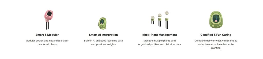
These principles can also be intertwined with the biophilic design field. One example of these principles is Senso, a smart, gamified sensor for plant care. Senso monitors data such as soil moisture, temperature, and sunlight in real time, using artificial intelligence to provide helpful suggestions to the user. The experience is made more engaging thanks to a small pixel-art-style digital character that communicates information and guides the user in caring for the plant. This way, everyday tasks such as watering or controlling the light become more intuitive and less repetitive. Senso transforms plant care into an interactive experience, demonstrating how gamification can improve usability and engagement even in non-gaming contexts.

Why Pothos Is the Ideal First Plant: a perfect Feedback Systems

Why is pothos the best plant for starting to care for plants?
And why is pothos a simple and natural example of how good interaction works?
In recent years, more and more people are becoming interested in the world of plants, often living in cities, in small apartments, and with little time to spare. However, caring for a plant isn’t just about adding a decorative element to the home; it’s also about starting to observe how something can change over time.

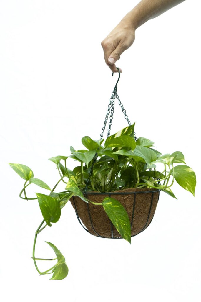
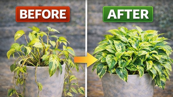
Pothos is a very simple plant to care for, making it ideal for learning. Its changes are easy to notice: the leaves become softer when thirsty, the color changes depending on the light, and growth slows or accelerates. By observing these signals, we begin to understand what the plant needs and how to respond.

This mechanism helps us understand a key principle of interaction design: feedback. Our actions produce a result that modifies a feature of the interface and allows us to understand the next steps to take. In the natural world, feedback arrives slowly, over time. It is not as immediate as a digital interface, but for this very reason it requires attention and observation skills.

Pothos (Epipremnum aureum) is often recommended as a first plant, and for good reason. It is a tropical climbing plant, capable of adapting to a wide range of conditions. It thrives in both bright light and partial shade, requires little watering, and survives even minor care mistakes. [1]

But its real strength is how easy it is to understand its needs.
When thirsty, the leaves lose vigor.
When too much light hits, the color changes.
When healthy, it grows rapidly.

Looking at pothos, we learn that good feedback doesn’t have to be complicated. It just needs to be visible and consistent. This form of slow, natural interaction helps us understand how, even in the design of digital interfaces, feedback is essential for building intuitive, accessible, and learning-oriented experiences.

In the field of interaction design, one of the fundamental principles is feedback. An interaction works when the system responds to the user’s actions in a legible and coherent way.
The pothos works exactly like this.
Humans act, the plant responds over time.
This relationship isn’t as immediate as the digital one, but for this very reason, it’s educational. It teaches us to recognize patterns and respect timing.

In recent years, interaction design has begun to explore nature-based user interfaces, or interfaces that use natural elements as inputs, outputs, or communication mediums. Among the various examples is Makey Makey—a sensor that, like a keyboard or mouse, can become an input for the computer.
It is a system designed to create tangible interfaces simply and immediately, without the need for programming or building complex circuits. Its unique feature is that it does not require specific technological materials. It can also work with natural elements such as plants, leaves, soil, fruit, or simply the human body. [2]
Sensors, digital models, or nature-based interface platforms can therefore amplify existing signals, without replacing them.

Loving Vincent – how the style of an animated movie tells and supports the story

With movies such as “Spiderman: a new universe” a push towards a more hand painted style in the animation industry could be felt. Arcane pushed the combination of hand painted looks of 3D animation even further. However, these styles are always in combination with computer animation. What if a movie is not only hand drawn but hand painted?

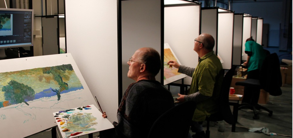
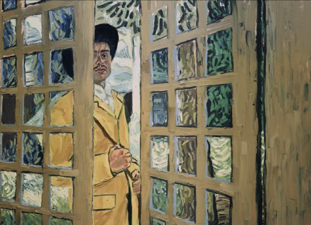
Loving Vincent is an animation film published 2017, written and directed by Dorota Kobiela & Hugh Welchman. It is the first feature length painted movie. In 1 hour and 35 minutes all of the 66 960 frames are hand painted oil paintings created by 125 professional oil painters. As reference real actors and actresses were filmed in front of a green screen or sets designed to look close to the paintings.

As a concept for the movie 94 paintings of Vincent can Gogh were reimagined, reframed and strung together to create a story. For flashbacks photos of the time and van Gogh were added in a black and white to create a contrast to the colorful painting world.

Following the death of Vincent van Gogh Armand gets the task to deliver van Goghs final letter to some worthy recipient. While searching for the recipient Armand finds himself in a village with many people close to van Gogh or people who modeled for his paintings. Questions about van Goghs life as well as death were asked but left open for interpretation just like his paintings.

Loving Vincent is a special case in many aspects. The animation style is woven into the concept of the movie itself. It doesn’t just enhance the narration. It takes over the narration. The goal is to be sucked into the paintings of van Gogh, and the movie succeeds in it. Sometimes the style can be confusing and overloading due to the many moving brush strokes, however, it doesn’t take away from the impressiveness. It is an ode to van Goghs works and completely driven by the style. With a different approach the movie would lose a big part of the story. While not all viewers may understand all the references and nods given to the paintings, they will recognize van Goghs painting style even if they only know one painting of his. In a different style this connection may be lost.

Loving Vincent is not a typical movie about a famous figure. It does not feature the painter as the main character. It shows what he left behind with a new perspective.

https://lovingvincent.com

The animation of infographics

Animation is a broad field with varying requirements depending on the medium in which it is used for. Whether it is 2D, 3D, or stop-motion animation, there are clear differences between animations created for television and those produced for film. Television series typically feature less expressive animation, and in 3D animation, shaders are kept simpler to reduce render times. Infographics represent a form of animation that is generally the simplest in terms of complexity.

Infographics are predominantly used to simplify complex or abstract themes. The core of infographics is often a presentation. It includes facts and data. Without any animation the information is skimmed over without much of an impact on the viewer. Meanwhile, adding animation while dissecting a theme into small portions as well as adding comparison and a storyline the information is more likely to be remembered. While animation is an important part of infographics, it should not overshadow the information itself. The animation should enhance the information rather than distract from it.

There are various ways to create an animated infographic. Due to budget limitations, many projects share a similar visual style. Often Stock vector graphics are used as a base for the animation In these cases, the designer or animator focuses mainly on animating pre-existing elements instead of designing each asset from scratch. This approach significantly reduces production time and cost. For higher-budget projects, vector graphics may be custom-designed specifically for the infographic, allowing for a more unique and tailored visual identity that closely matches the topic and target audience.

A different approach is the so-called white board animation. Here elements get pinned or stuck on a whiteboard according to the desired story. The elements are hand drawn figures and objects giving it a personal note. Sometimes elements are drawn in addition. The hand of the, in this case, animator is shown and interacts directly with the infographic. The desired outcome is the feeling of someone explaining the topic directly to the viewer.

Ultimately, the most important factor for infographic animation is efficiency. The goal is to convey information and tell a story in the quickest and clearest way possible For this reason, characters—if they are used at all—do not need to be complex or highly detailed. If a storyline only requires a character to perform a simple action, such as raising a hand, there is no need for an advanced or intricate animation rig in software like After Effects. Simplicity often leads to clarity, which is the true strength of effective infographic animation.

Infographics found their way into YouTube as well. Many explain videos use them to create content without having to create complicate animations or invest into expansive real-life footage. They reach a large audience for example a video about “Crazy Things Science Still Can’t Explain” has over 1.2 million views over just 4 months.

Overall, animated infographics demonstrate how simplicity, clarity, and purposeful motion can effectively communicate complex information to a wide audience while remaining efficient in both production and storytelling.

https://explainvisually.co/en/animated-infographics/

https://absolute.agency/articles/blogs/five-essential-items-for-an-animated-infographic

https://www.nobledesktop.com/blog/tips-for-creating-effective-animated-infographics