OCTANE: A New Way of Rendering (for me) (5)

If the material and lighting differences were things I could work through by trial and error, the next two problems were harder to solve simply because there was so little help available for them – and both cost me disproportionate amounts of time relative to how small the underlying issues actually were. Cycles has the benefit of years of accumulated community knowledge behind it; Octane’s Blender integration, being a much smaller and more niche corner of an already niche piece of software, doesn’t have that same depth of collective troubleshooting to draw on.

The Documentation Problem

For a renderer as respected as Octane, the documentation specific to its Blender integration is thin. As far as I can tell, there’s essentially one YouTube channel covering Octane-for-Blender specifically, and that’s also where I first learned the render engine was free and how to install it in the first place. The basic setup I could piece together myself from that channel and a handful of forum posts, but anything beyond that – actual troubleshooting, edge cases, workflow questions that weren’t already covered in an existing tutorial – mostly went unanswered wherever I looked. More often than not, I ended up solving problems myself through trial and error rather than finding an existing answer, which is a very different experience from working in Cycles, where nearly any problem you hit has already been asked and answered a dozen times over on some forum or Stack Exchange thread.

The clearest example of this was trying to render a single output image. Octane will happily give you a multilayer EXR file containing all five of its default outputs bundled into one file, which technically solves the “too many files” problem from earlier, but not the problem I actually had – I wanted one plain PNG, not a multilayer file I’d still have to unpack in another program before I could actually use it. I searched through what documentation exists and asked around, but never found a clean, direct answer for this, and eventually just accepted the workaround as good enough for the time being rather than losing more hours chasing a proper fix. It’s a small annoyance in isolation, but it’s representative of the broader experience of working with a tool that clearly works well once configured correctly, but offers very little help getting there.

The Nightmare that was Motion Blur
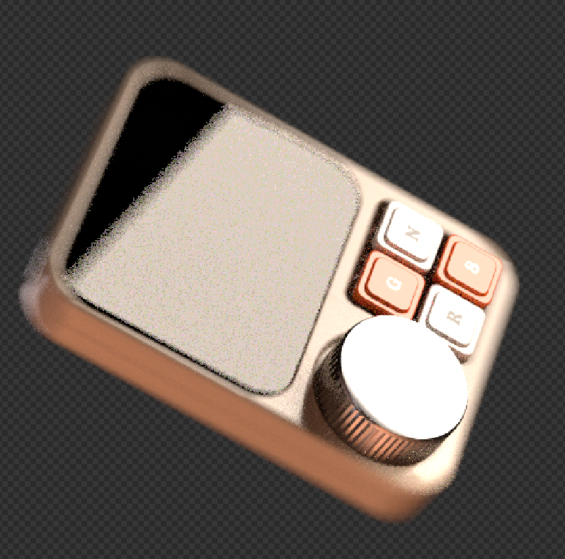
Motion blur in Cycles or Eevee is close to a non-event: you flip on a toggle, set the shutter speed, and you’re done. In Octane, enabling the equivalent global toggle did nothing on its own – the render came out exactly as sharp as if I’d never touched the setting at all. After some searching, I found that motion blur in Octane has to be enabled individually, per object, for every single item in the scene – there’s no scene-wide switch that actually works the way you’d expect it to from years of the Cycles equivalent.

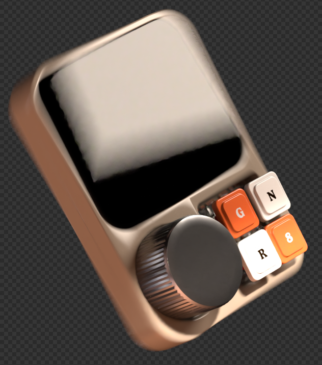
Even after going through and enabling it object by object, painstakingly clicking through every piece of the device one at a time, the results in my final render were still inconsistent. The device’s case and screen picked up motion blur correctly, softening nicely in line with the animation’s movement, but the buttons and the dial stayed noticeably crisp against the rest of the object, which had visibly blurred. I never fully resolved why those specific parts didn’t pick up the same blur as the rest of the mesh – I checked that the setting was enabled on those objects too, more than once – and it’s the one issue from this whole process I’d still call genuinely unsolved rather than merely inconvenient.

Cycles vs. Octane: What I Actually Learned

After everything – the install process, the crashes, the rebuilt lights, the motion blur that never fully cooperated – the actual point of this whole exercise was always to compare the two engines directly, using the same project as the test case. So how does that comparison actually shake out?

Looking back at the whole process, a few things stand out beyond the individual technical hiccups. The biggest one is that Octane is noticeably less forgiving of imperfect geometry than Cycles. My render came out with a handful of visible shading errors that I’m fairly confident trace back to mesh issues I never had to think about or fix in the original Cycles version – small overlapping faces, slightly non-manifold sections, the kind of thing you accumulate over a long modeling process and never go back to clean up because nothing ever visibly complained about it. Cycles seems to quietly absorb those kinds of geometry problems in a way that Octane puts right on display, which reframed a chunk of what I assumed were rendering issues into modeling issues I’d simply never had to confront before.
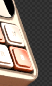
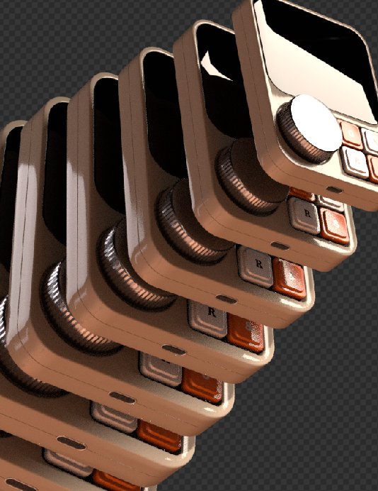
That said, I’d call the whole experiment a genuinely fun one, and I plan on continuing to learn Octane rather than treating this as a one-off experiment I ran once and set aside. For now, though, I still think my Cycles version of the render looks better overall – not because Octane is worse, but because I simply have years more experience pushing Blender’s native node tree in specific, sometimes unconventional directions to get an exact look I’m after. There were effects in the original render, like a pixelated screen look on the device’s display, that I wasn’t able to reproduce in Octane in the time I had, mostly because I haven’t yet built up the same instinct for which combination of nodes gets me there.

The two renders don’t look identical, and I don’t think they were ever going to. The Octane version came out noticeably brighter overall, which I don’t necessarily mind – it’s a different read on the same object rather than a strictly worse one – and it clearly plays to Octane’s actual strengths: realistic light behavior, convincing reflections and refractions, the caustics that got me interested in the first place. But getting the most out of that strength seems to demand a higher-quality mesh than what I was feeding it here, given how much more visible those small geometry issues became. Which, if anything, just gives me a clear next step: build something specifically for Octane next time, with clean geometry from the start, rather than testing it against a model that was designed with Cycles’ more forgiving rendering in mind. None of this changes my overall verdict, though: this was worth doing. Even setting aside which render came out looking better, going through the entire process forced me to actually understand what Cycles has been doing for me automatically all these years – the things I never had to think about precisely because Cycles handles them quietly in the background. Octane made all of that visible by simply not doing it the same way, which is its own kind of education, separate from anything about the final image. That’s reason enough to keep going with it.
Reflexion

Dieser erste praktische Test war weniger als fertiges Stilexperiment gedacht, sondern vor allem als Workflow-Einstieg. Trotzdem lassen sich schon jetzt ein paar Beobachtungen festhalten, die direkt an meine bisherigen Blogeinträge anschließen. Der Stilisierungsgrad einer Hybridanimation entsteht nicht an einer einzigen Stelle, sondern additiv aus mehreren, technisch ganz unterschiedlichen Ebenen (z. B. Geometrie, Textur, gezeichnete Linie, gemalter Hintergrund). Zweitens zeigt sich, dass Grease Pencil mir als Werkzeug erlaubt, den Grad der Ikonizität eines Objekts nachträglich und relativ unabhängig von seiner 3D-Form zu steuern, etwa durch die Dichte der gestapelten Strokes bei den Blättern oder durch die Art der gezeichneten Outline. Für die spätere Erstellung meines Masterprojektes ist das ein wichtiger technischer Anhaltspunkt. Durch den Grease Pencil könnte ich zum Beipiel denselben 3D-Grundkörper in unterschiedlichen Stilisierungsgraden (z. B. mit variierender Outline-Stärke, Strichdichte oder Texturunregelmäßigkeit) zu rendern.

Grease Pencil Projekt

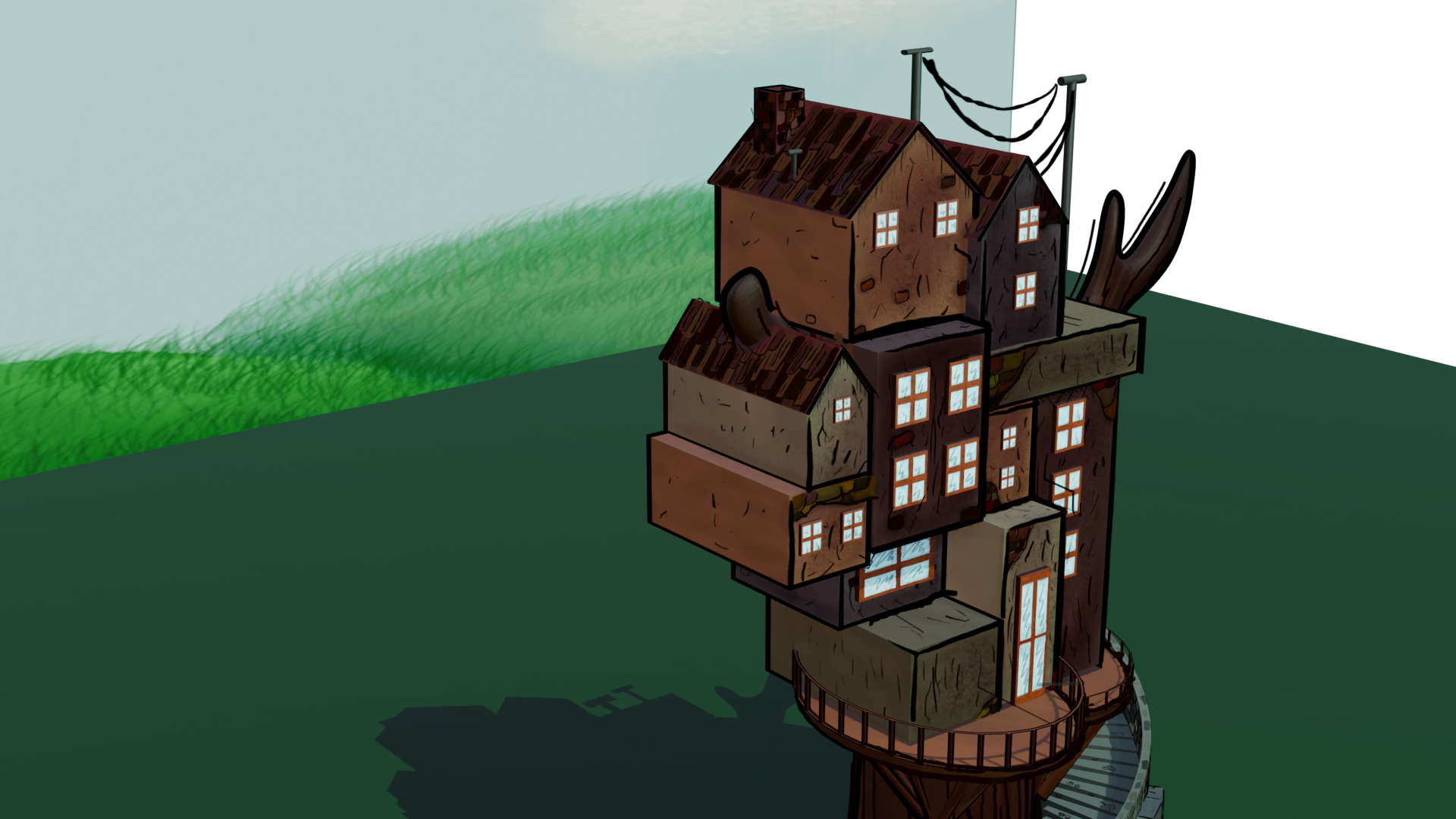
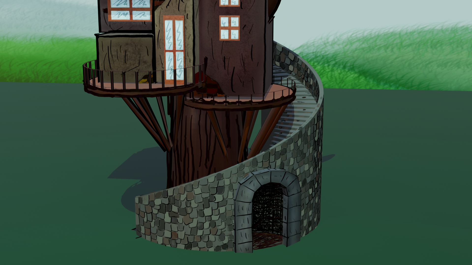
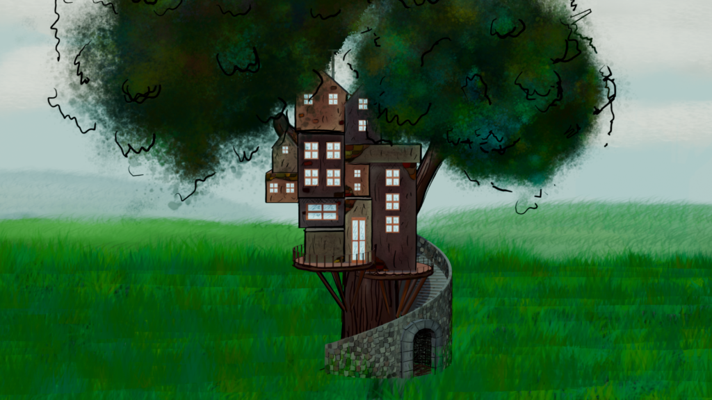
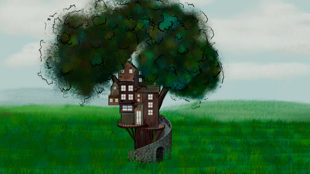
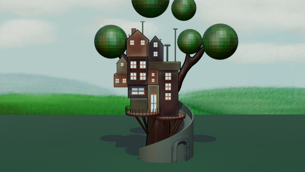
Beim Modellieren habe ich mich bewusst an einfache geometrische Grundformen gehalten. Die Stadt bzw. die Häuser bestehen im Kern aus schlichten Quadern, der Baum wurde aus einem einfachen Zylinder aufgebaut, und auch die Blätter sind zunächst nichts weiter als simple Spheres. Diese Reduktion war eine bewusste Entscheidung. Ich wollte, dass der eigentliche visuelle “Look” der Szene nicht durch komplexe 3D-Modellierung, sondern gezielt durch Texturierung und den Einsatz von Grease Pencil entsteht.

Nachdem alle Objekte nach der Vorabskizze modelliert waren, ging es an die Texturierung. Nach dem Unwrappen der UVs konnte ich direkt auf den UV-Layouts malen. In diesem Schritt habe ich jedem Objekt zunächst eine Grundfarbe gegeben und diese bereits mit ersten, groben Shading-Details versehen, um ein räumliches Grundgefühl zu erzeugen, bevor die eigentliche Detailarbeit über Grease Pencil beginnt.

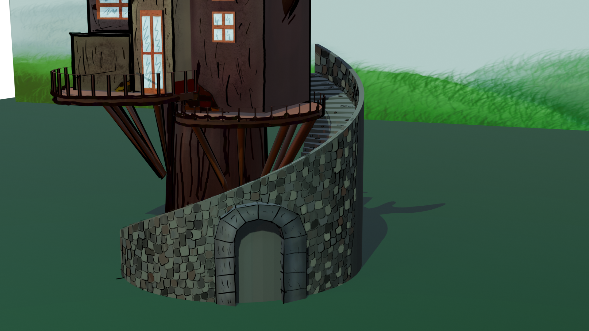
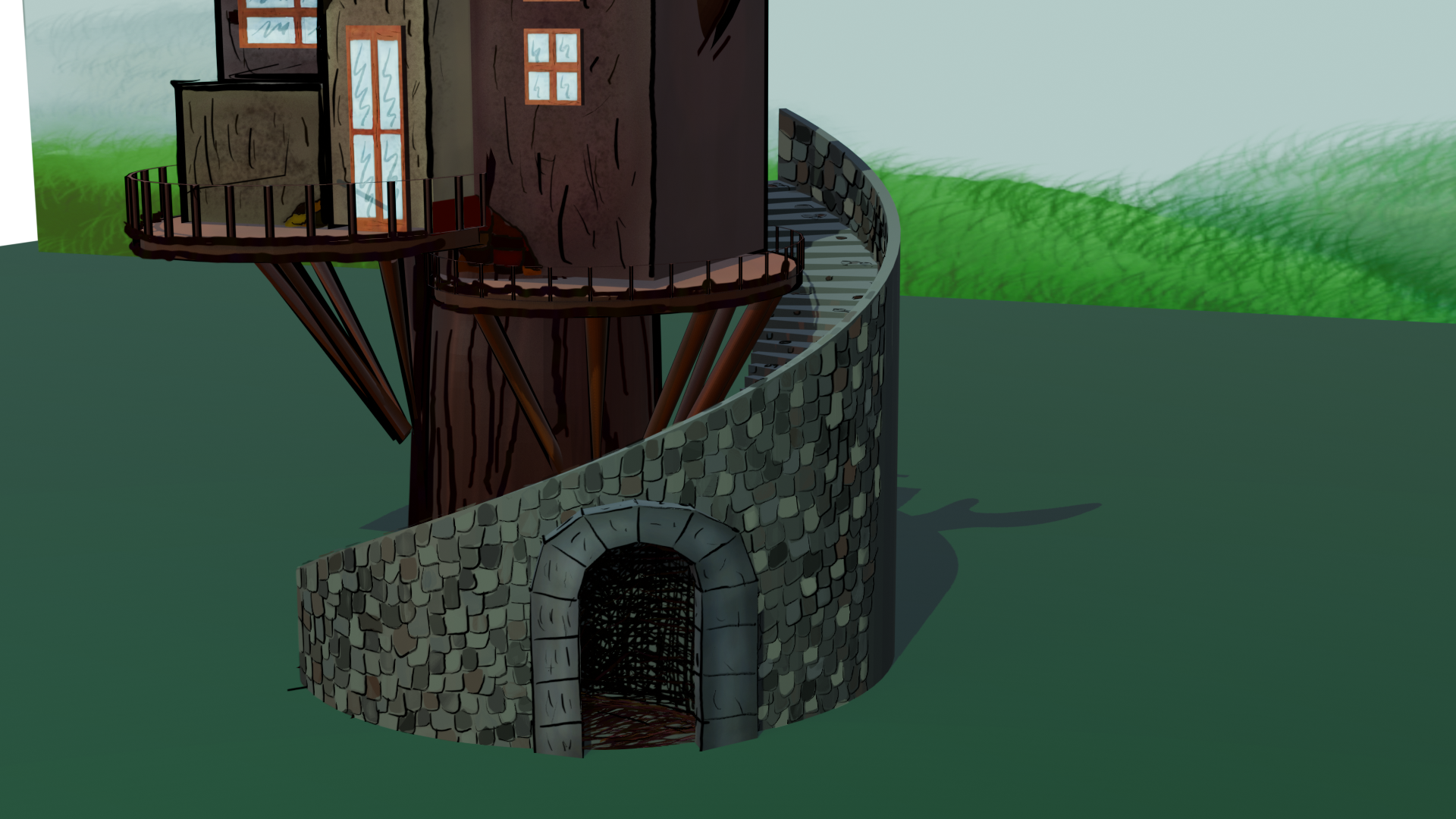
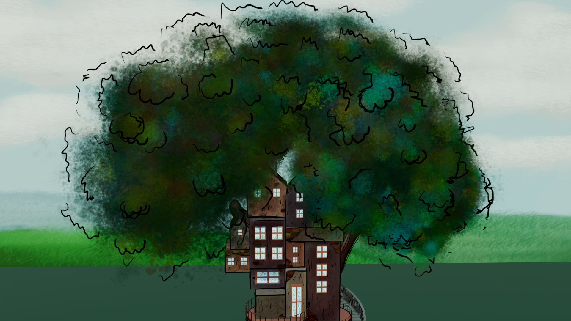
Im nächsten Schritt habe ich den Objekten zunächst eine Outline gegeben und anschließend mithilfe von Grease Pencil verschiedene Detaillinien direkt auf die 3D-Geometrie gezeichnet. Für die Blätter habe ich mehrere Strokes bewusst übereinander “gestapelt”, sodass im Endergebnis der Eindruck dichten, buschigen Laubs entsteht, statt einzelner, klar abgegrenzter Blattformen. Im Anschluss habe ich auch hier noch zusätzliche Linien als Detailebene ergänzt. Die Dächer und die Mauer habe ich ebenfalls mit dem Grease Pencil mit gezeichneten Ziegeln und Steinstrukturen versehen. Für den Eingang/Tunnel an der Mauer habe ich mir ebenfalls den Grease Pencil zu nutzen gemacht und ihn einfach auf die Mauer gezeichnet.

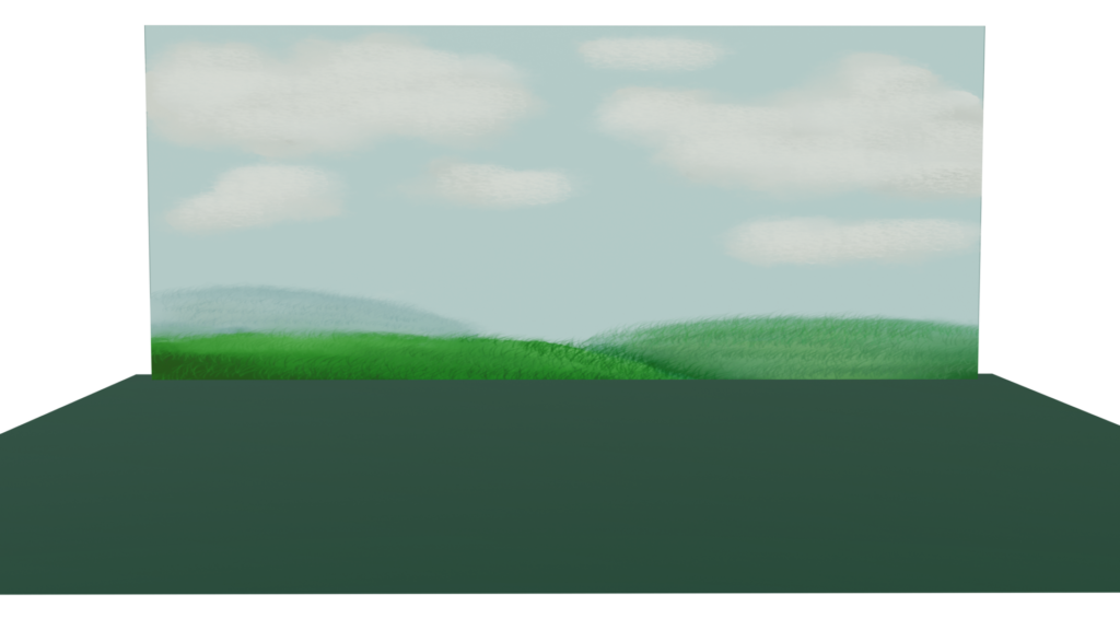
Für den Hintergrund der Szene habe ich einen anderen Weg gewählt. Statt erneut 3D-Geometrie und den Grease Pencil zu nutzen, habe ich das Hintergrundbild direkt in Photoshop gemalt und es anschließend als Textur auf ein einfaches Plane in Blender gelegt.

Fazit

Es hat Spaß gemacht sich mit dem Grease Pencil zu beschäftigen und ich bin auch der Meinung, dass es für meine Forschungsfrage hilfreich war sich damit auseinanderzusetzen und das ich eventuell für mein Masterprojekt darauf zurückgreife. Die Bildkomposition ist mir leider nicht so gelungen, aber für ein erstes Testprojekt bin ich zufrieden.

Finale Bilder

Warum Stilisierung nur ein Teil des Ganzen ist

In den bisherigen Einträgen habe ich mich stark auf den Stilisierungsgrad als zentrale Stilmittel für Empathie und Glaubwürdigkeit konzentriert. Deshalb möchte ich in diesem Eintrag einen Schritt zurücktreten und die Frage stellen, wie Immersion in der Forschung überhaupt modelliert wird. Meine These lässt sich vereinfacht als Gleichung formulieren: Story + Animation + Sound + Stilisierung = Immersion. Der Stilisierungsgrad ist demnach nicht allein verantwortlich für Immersion, trägt aber einen Teil dazu bei.

Ein naheliegender Ausgangspunkt ist Janet Murrays klassische Definition aus Hamlet on the Holodeck. Murray beschreibt Immersion als das Gefühl, vollständig von einer anderen Realität umgeben zu sein und sich so stark auf eine Erzählung einzulassen, dass die eigene Umgebung aus dem Bewusstsein verschwindet. Wichtig an Murrays Definition ist, dass sie Immersion explizit an das Eintauchen in eine Geschichte koppelt. Das deckt sich mit dem “Story”-Term meiner Gleichung: Selbst die aufwendigste visuelle Gestaltung entfaltet ihre volle immersive Wirkung erst im Zusammenspiel mit einer Erzählung, die das Publikum emotional bindet.

Differenzierter wird das Konzept bei Ermi und Mäyrä, die in ihrem SCI-Modell drei Teilarten von Immersion unterscheiden: sensorische Immersion (ausgelöst durch audiovisuelle Reize wie Bild- und Tonqualität), herausforderungsbasierte Immersion (das Gefühl, das bei einer passenden Balance zwischen Fähigkeiten und Anforderungen entsteht) und imaginative Immersion (das Eintauchen in eine Geschichte und die Identifikation mit Figuren). Für Animationsfilme lässt sich der herausforderungsbasierte Anteil zwar kaum übertragen, doch die anderen beiden Komponenten passen sehr gut zu meiner Gleichung. Die sensorische Immersion entspricht in etwa der Summe aus Animation, Sound und Stilisierung, während die imaginative Immersion dem Story-Anteil entspricht. Der Grundgedanke von dem Modell ist, dass Immersion grundsätzlich mehrdimensional ist, kein einzelner Faktor allein erklärt das Phänomen vollständig, sondern erst deren Zusammenwirken. Das heißt, dass ich den Stilisierungsgrad nicht als alleinige unabhängige Variable behandeln darf, sondern als eine von mehreren Faktoren, die gemeinsam die Immersion vermitteln und darüber auch die wahrgenommene emotionale Intensität und Glaubwürdigkeit beeinflussen. Für später bedeutet das konkret, dass ich Story, Animationsqualität (Bewegungsführung, Timing) und Sounddesign zwischen meinen Stilisierungsbedingungen möglichst konstant halten muss, um den Effekt der Stilisierung überhaupt isoliert messen zu können, ansonsten laufe ich Gefahr, Effekte fälschlich der Stilisierung zuzuschreiben, die eigentlich aus dem Sounddesign oder der Erzählstruktur stammen.

Quellenangabe:

Murray, J. H. (1997). Hamlet on the Holodeck: The Future of Narrative in Cyberspace. New York: Free Press.

Ermi, L., & Mäyrä, F. (2005). Fundamental components of the gameplay experience: Analysing immersion. In Proceedings of DiGRA 2005: Changing Views – Worlds in Play. Vancouver: Digital Games Research Association.

Death: An Honest Reflection

Honestly, I’m not entirely happy with how it turned out, but I learned a lot in the process, and sometimes that’s enough.

The Santa Muerte figure stands in a sparse environment – just a dark background and a single candle. The idea was to keep things minimal so the focus would be on the gesture of death itself: a slow, deliberate movement, almost meditative.

The design itself. I’m not happy with it, and I know why: I didn’t give myself enough time. The design reads as “Santa Muerte-adjacent” rather than a fully realised interpretation. The details don’t cohesively tell a story the way they should. I rushed through the refinement phase, and it shows.

I struggled with modeling from the start and then I combined that struggle by expecting myself to produce high-quality work in a short time. Because the character design didn’t fully land I dimmed the lights to hide what I wasn’t confident in. The single candle creates mood but drowns out form. A death ritual should feel intimate, yes, but not as a cover for incomplete work.

What I’d change: Give the design time. If I do this project again I’d give myself enought time just for the character design and iteration. Multiple rounds of sketches, feedback from others, reference gathering. No rushing to 3D. Model with intention, not speed. I’d spend more time blocking out the silhouette in 3D before detailing. Make sure the proportions feel right before committing to texture and rigging. Be realistic about scope. A fully realised 3D character with textures, rigging, and animation in one week is ambitious.

This project was always going to be about learning, not perfection. I came in wanting to explore death through visual language, informed by cultural research and ritual. I did that research. I grounded the character in Santa Muerte iconography. I created a moment of animation that (despite its flaws) communicates something about reverence and stillness.

This semester was busy, I expected too much from myself, I didn’t do enough research. All of this shows, but I learned. I may be disapointed with myself, but I hope to have grown through this project.

Roman, I hope you still accept my blog-posts. GLG Lay

Death: The rig and animation

I decided to create a very simple (Rigify) rig just so that the model is pose-able.

Step 01: Activate the Add-on Rigify.

Step 02: Add > Armature > Rigify Meta-rigs > Human

Step 03: Go into Edit-Mode and move the rig to where it’s supposed to be.

Step 04: Apply transformations in Object-Mode for good luck.

Step 05: Select the model, the rig last.

Step 06: Press Generate Rig.

Step 07: Move your rig and find mistakes!

Step 08: Send it to Maria and she starts all over again because Rigify is messy. (see: her blogpost)

Step 09: Be shook as to how good the rig is.

(While the rig is amazing, the Grease pencil got lost along the way so I had to add it back in, which was harder than expected. I drew everything again bc it broke sosmehow.)

Step 10: create a small animation that’s vibey but no one can’t see the character design because you are unhappy with it!

Blender — Final Reflection

So. Ten posts later. How did this actually go?

Let me start with the course itself. Patata School’s podcast-style teaching approach, where two people talk through the process together rather than one instructor delivering a clean structured lesson, is something I have mixed feelings about. It made me irrationally annoyed at times and I couldn’t fully explain why. Something about the pacing of it. That said, objectively it works. Especially in the earlier sessions, the lectures were genuinely detailed and thorough, and even coming in with only a basic knowledge of Blender I was able to follow along without constantly getting completely lost. The moments where I did get stuck were usually fixable with a quick search, which is about as much as you can ask for from a tutorial course.

What I’ll take away from Patata School specifically is the sheer density of useful things packed into each session. Shortcuts I didn’t know existed, workflows that made obvious sense once I saw them, features I’d walked past in the interface a hundred times without knowing what they did. That kind of practical knowledge is hard to pick up just from reading documentation or watching random YouTube videos. Having it delivered in context, at the moment you actually need it, makes it stick in a way it otherwise wouldn’t.

The later sessions were thinner. The compositing lecture in particular felt like it ran out of steam, covered less than I’d hoped, and caused more friction than it should have due to version differences between the tutorial and my Blender setup. But that’s one weak lecture out of seven, which isn’t a bad ratio.

Goals vs. Reality

The original goal, stated clearly back in blog post two, was to create a short animation of a custom character with facial animation and voice acting. Around ten seconds, nothing too cinematic, but something complete.

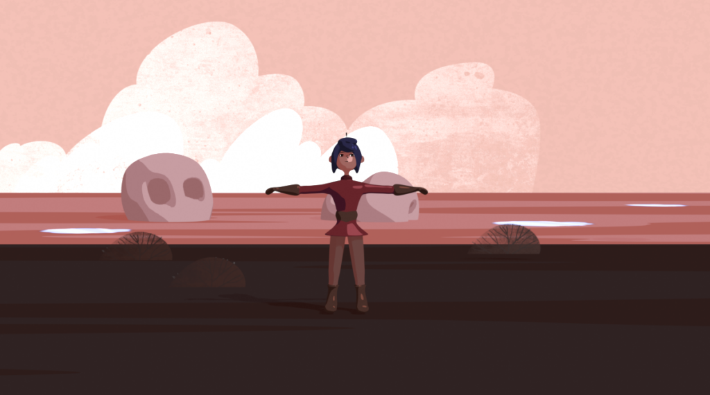
What I actually ended up with is a four second running animation of a character based on a provided reference, no facial animation, no voice acting.

Is that a gap? Yes. Am I embarrassed about it? Not really.

I said early on that the goal was optimistic, and it was. What I underestimated wasn’t the difficulty of any single part of the process so much as the cumulative time cost of learning something properly. Watching a tutorial is fast. Following along in real time, pausing, rewinding, googling the thing they glossed over, taking notes, applying it to a model that’s slightly different from the one in the video, fixing the things that broke because of that difference — that’s three or four times slower. Every session took longer than I expected, and by the time I got to compositing the scope had naturally narrowed down to something achievable rather than something ambitious.

That’s fine. The goal was always a rough target, not a contract.

What I Actually Got Out of This

More than I expected, honestly. I started this semester having never seriously touched 3D. I can now model a character, apply materials and cel shading, rig a humanoid figure, fix weight painting errors, set up a stage, create a looping background animation using the NLA editor, and put together a basic composite. That’s a real set of skills, not just theoretical familiarity. I could sit down tomorrow and do a similar project without needing to follow a tutorial step by step for most of it.

Facial animation is still on the list. It’s a big enough topic that squeezing it into these ten posts was never realistic, and I’d rather learn it properly than rush through it just to say I covered it. That’s a separate project for another time.

And the bigger picture hasn’t changed. The whole reason I started down this road was the idea that the framework I’ve been building for my master’s thesis — the one for analyzing morally complex characters — eventually deserves a practical output. A character built from the data. Something that embodies the patterns rather than just describing them. I’m closer to being able to do that now than I was at the start of the semester, which was the point all along.

See ya!

Blender Session 7 — Compositing (The Disappointing One)

Honest review of this lecture: it was the weakest one in the whole course. And coming from someone who actually enjoys compositing, that stung a little.

What They Covered

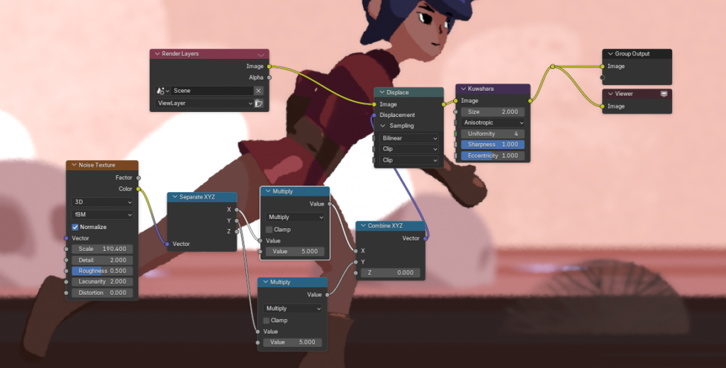
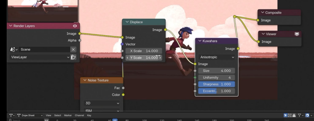
The main thing Patata School showed in this session was how to add a hand-drawn effect to the final render using a Displace node in the compositor. The idea is to introduce a subtle wobble to the image that makes it feel more like a drawn animation rather than a clean 3D render. In principle, interesting. In practice, it didn’t work for me because the tutorial was recorded on an older version of Blender and the node setup behaved differently in my version. I had to figure out a workaround myself, and even after getting it to work I wasn’t particularly happy with the direction they were going aesthetically anyway, so I altered it to something that felt more like my own style.

What I actually did
What the Tutorial told me to do

Beyond that, the session covered adding depth of field, motion blur, and a small camera movement, which I mostly improvised in the moment rather than following any specific instruction. How to actually render the project wasn’t explained in any meaningful detail either, but I’d picked up enough across the previous sessions to get through that on my own without too much trouble.

There was also something about removing the weird edges that were showing up in my shot, which I genuinely didn’t follow. I’m going to fix those in DaVinci Resolve in post instead, which honestly feels like the more sensible place to handle that kind of cleanup anyway.

General Feeling About This One

This lecture left me with very little to write about, which is itself kind of telling. The tips were basic, the main effect was a niche visual style I’m unlikely to use again, and the version gap between the tutorial and my Blender setup caused more friction than it should have. For a compositing lecture aimed at someone who wanted to add a proper finishing layer to their shot, it felt thin.

Not every session can be a revelation though, and the previous ones more than made up for it. The render is essentially done and I’m reasonably happy with how the whole thing looks.

The next post will be the last one: a full reflection on the process, how far I actually got versus where I hoped to be, and what I’d do differently if I started over.

See ya!

Blender Session 6 — Actually Animating the Thing

I’ll be upfront: I was properly scared going into this one. Animation felt like the part where everything could fall apart. You can have a great model, clean materials, a solid rig, and then the moment you try to make it actually move, it looks terrible. That was my main fear going in.

It didn’t fall apart. In fact I’m genuinely surprised by how well it turned out for a first real character animation in Blender.

How the Character Animation Works

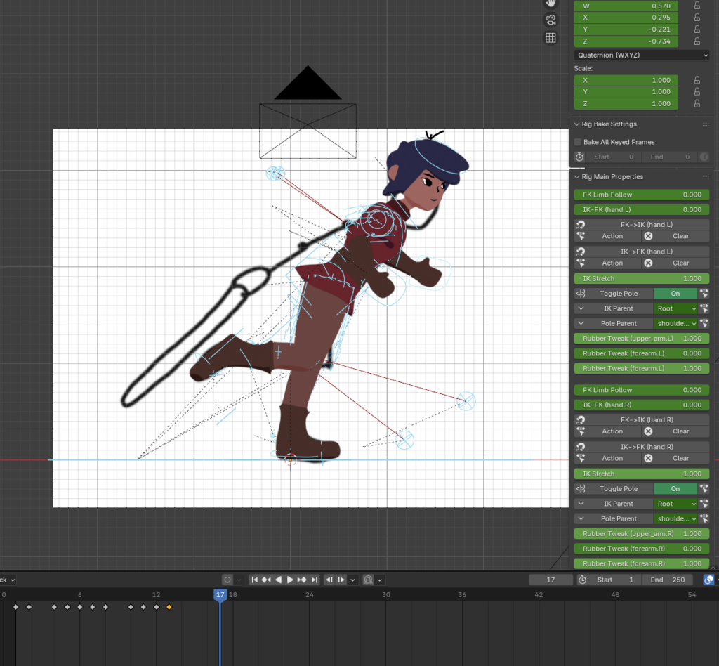
The approach Patata School uses is straightforward in principle: identify the key poses of the movement cycle, set those as keyframes, and then go back and adjust the frames in between. For a running animation specifically, the most important thing to get right is that the feet actually contact the ground at the correct moments. That’s what makes or breaks whether a run cycle looks believable. The parts where the feet are in the air matter less and give you more room to be loose. The ground contact frames are where you need to be precise, and most of the finessing happens around those.

One setting that made a noticeable difference: enabling the Pole Angle for the knee and elbow controls in the rig. This snaps the joints to point in a consistent, correct direction rather than flipping unpredictably as you move the limbs around. It’s the kind of thing that seems like a minor detail until you turn it off and suddenly your character’s knees are pointing sideways.

I’ll be honest that I didn’t go all-out on the animation quality here. This is a practice project and the goal was always to get something working rather than something perfect. That said, even with a relatively quick pass at it, it looks quite good. Better than I expected given the time I put in. I can see clearly where it could be improved, but for a first attempt I’m not unhappy with it at all.

Animating the Stage

Getting the character moving was only half of it. The background also needed to move to sell the illusion that the character is actually running through a space rather than jogging on the spot in front of a static painting.

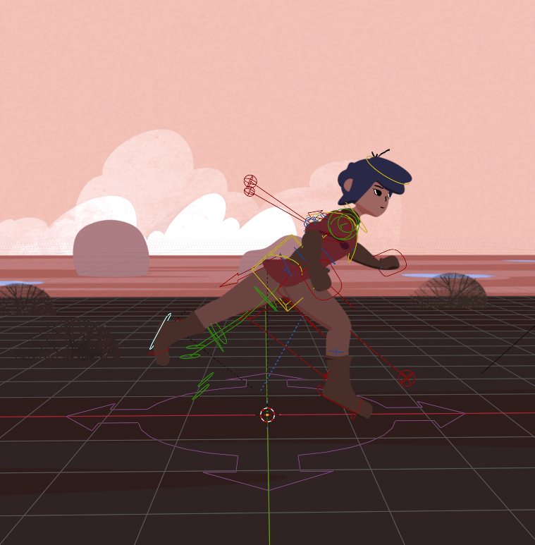
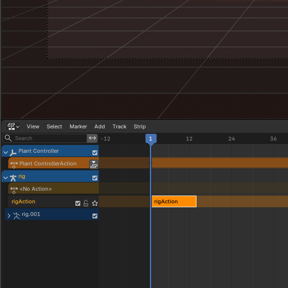
For the plants I started by copy-pasting the bushes across the stage to get a few of them distributed across the scene. Then I created an Empty using the Arrows display type, which acts as a parent controller object. By selecting all the plants and then shift-selecting the Empty, I could parent everything to it, meaning whenever the Empty moves, all the plants move with it as a group. I then animated the Empty moving across 100 frames and set the interpolation to Linear so the movement is perfectly consistent, no easing in or out, just a steady scroll. The result is that the background appears to fly past as the character runs.

To avoid having to extend the animation manually to fill the full length of the shot, I used the Nonlinear Animation editor. You push the animation down into a block in the NLA editor, which turns it into a reusable strip, and then you can set how many times it repeats. I cranked the repeat count up until the strip filled the entire 100 frames of the shot. Clean and efficient.

I repeated the same process for the other background elements. The floor texture was the most interesting part of this, because you can also animate properties that live inside geometry nodes. So instead of moving an object, you’re keyframing a value in the node graph, which then drives how the texture scrolls across the surface. One thing to keep in mind: to actually see the keyframes you’ve set for a node property, you need to have that specific node selected in the Shader Editor. If you click away, the keyframes disappear from the timeline, which is confusing the first time it happens.

Where Things Stand

That’s essentially the animation done. And with it, I’ve made a decision about scope: facial animation is a deep enough topic that covering it properly would take several more sessions on its own, and these blog posts were never meant to go on forever. So I’m leaving it out for now and treating it as a separate thing to come back to.

The last step is compositing and rendering the final animation, which is what the next post will cover.

Nearly there.

See ya!

Blender Session 5 — Setting Up the Stage

Short one this time, because honestly there isn’t that much to say. Setting up the stage for my animation was by far the easiest and most straightforward part of this whole process so far.

Before I actually got into it though, I noticed a leftover issue from the previous session. The Grease Pencil eyes I painted onto my character were still behaving strangely, changing brightness depending on the viewing angle. The fix was simple: in the Grease Pencil material settings, turning off the Use Lights option makes the material ignore scene lighting entirely and display at a flat, consistent brightness regardless of perspective. Should’ve caught that earlier, but glad it was an easy one.

Building the Stage

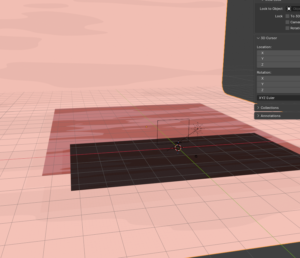
The lecture covered placing the ground plane the character walks on, adding a background plane behind the scene, and applying textures to both. The textures were set up using a geometry node structure that I’ll be honest about: I just copied it from the tutorial without fully digging into how every node connects. It worked, it looked right, moving on.

The one thing worth flagging here is clipping. If you place objects far enough from the camera, Blender stops rendering them by default. To fix that you increase the clip end distance in the camera settings, which extends how far into the scene Blender is willing to render. Easy to forget, slightly annoying when you do.

Two Things I Actually Learned

The pre-made objects in this part of the course were already prepared by Patata School, so I just had to bring them into my scene rather than building them from scratch. Which sounds simple, and it is, but the way you do it in Blender was new to me. You use the Append option from the File menu, navigate to the external Blender file you want to pull from, and select the collection you want to import. Everything comes in exactly as it was set up in the original file. Very clean, very practical, something I’ll definitely use again.

The other thing I picked up is that you can add 2D images to a 3D scene as mesh planes rather than just flat image textures floating in space. The advantage is that mesh planes actually interact with the scene lighting and cast shadows, which makes them behave like real objects rather than just stuck-on graphics. That immediately made me think of 2.5D projects, which I once tried to pull off in After Effects and found genuinely painful. Doing that kind of thing in Blender, with proper depth, lighting and shadow, seems like a much more sensible approach now that I know how it works.

Other than that, nothing dramatic happened this session. Next one is animation, which I expect to be considerably less relaxing.

See ya!