#7 – Color Grading – Den Look entwickeln

Nachdem die technischen Korrekturen abgeschlossen waren, begann für mich der kreativere Teil: das eigentliche Color Grading. Dabei ging es nicht mehr nur darum, das Bild „richtig“ aussehen zu lassen, sondern darum, einen Look zu entwickeln, der zum Inhalt meines Videos passt. Da mein Projekt ein einfacher Alltags-Vlog ist, habe ich mich bewusst für einen eher zurückhaltenden Stil entschieden.

Entwicklung eines eigenen Looks

Bei der Entwicklung des Looks war mir wichtig, dass das Video nicht künstlich oder überladen wirkt. Ich wollte keinen starken Kinolook oder extreme Farbverfremdung, sondern einen ruhigen, natürlichen Stil. Das passte für mich besser zu einem Vlog, der einen normalen Morgen und den Weg in die FH zeigt.

Deshalb habe ich den Look eher schlicht aufgebaut. Mir ging es darum, dass das Bild angenehm aussieht und trotzdem eine klare Stimmung hat. Ich wollte die Realität nicht komplett verändern, sondern sie nur etwas bewusster gestalten.

Farbtheorie

Auch wenn ich meinen Look einfach gehalten habe, spielte die Farbtheorie trotzdem eine Rolle. Farben beeinflussen die Wirkung eines Videos stark, selbst wenn man nur kleine Anpassungen vornimmt. Schon minimale Veränderungen bei Farbton, Sättigung oder Kontrast können den Eindruck eines Bildes verändern.

Für mich war dabei wichtig zu verstehen, dass Farben nicht nur dekorativ sind. Sie lenken auch die Aufmerksamkeit und erzeugen eine bestimmte Atmosphäre. Deshalb habe ich mich nicht nur gefragt, welche Farben schön aussehen, sondern welche Farben zu meinem Video passen.

Warme und kalte Farben

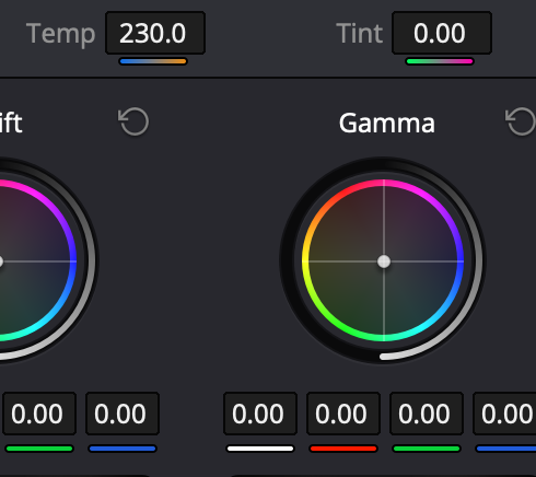
Besonders interessant fand ich den Unterschied zwischen warmen und kalten Farben. Warme Farben wirken oft freundlicher, weicher und näher, während kalte Farben eher ruhig, sachlich oder distanziert wirken können. Für meinen Vlog wollte ich keinen extrem kalten oder extrem warmen Look, sondern etwas dazwischen.

Ich habe mich also eher für eine natürliche Balance entschieden. Das Video sollte alltagstauglich und ehrlich wirken, nicht zu künstlich oder dramatisch. Gerade bei einem persönlichen Vlog finde ich es passender, wenn die Farben den Moment unterstützen, statt ihn zu stark zu verändern.
Farbkontraste

Auch Farbkontraste spielen eine wichtige Rolle beim Grading. Sie helfen dabei, bestimmte Bildbereiche stärker hervorzuheben und das Bild interessanter zu machen. Trotzdem wollte ich diese Kontraste bei meinem Projekt nicht zu stark einsetzen.

Mein Fokus lag mehr auf einer ruhigen Gesamtwirkung als auf auffälligen Gegensätzen. Das bedeutet nicht, dass ich keine Kontraste benutzt habe, sondern dass ich sie eher dezent eingesetzt habe. So bleibt das Bild natürlich, aber trotzdem nicht langweilig.

Einsatz von LUTs

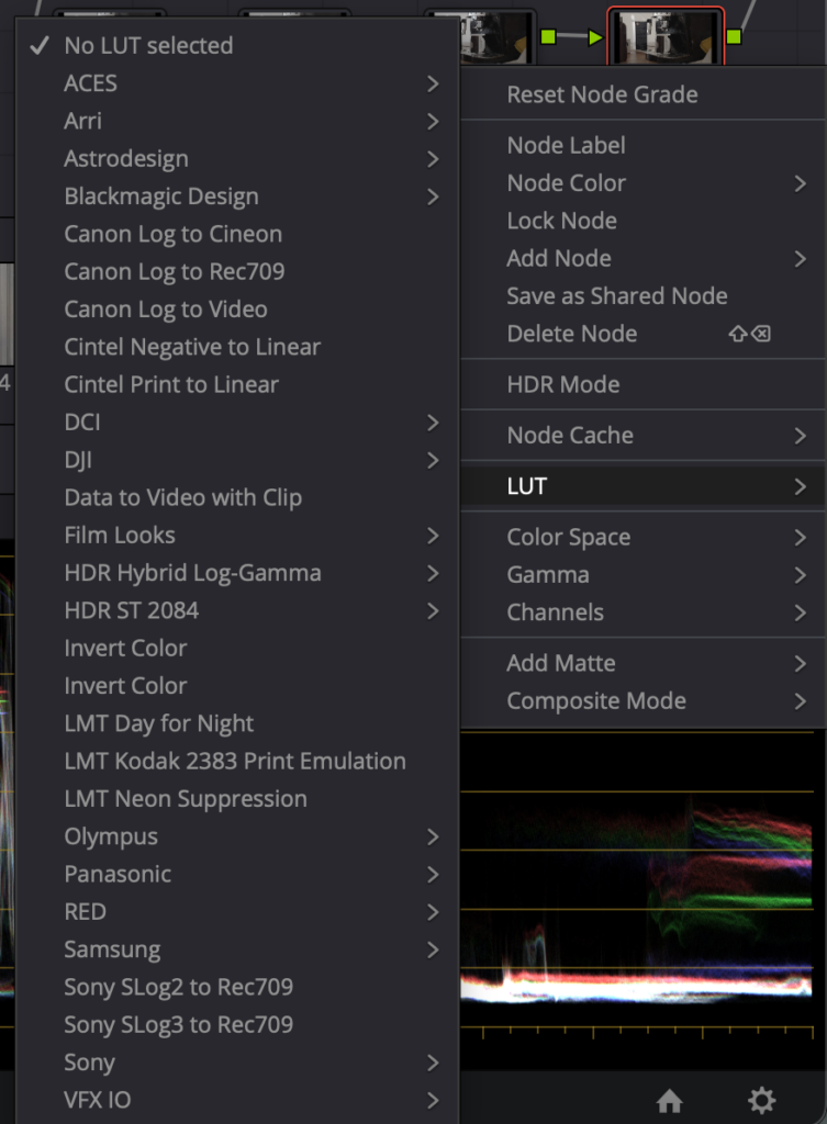
LUTs können beim Color Grading sehr hilfreich sein, weil sie schnell einen bestimmten Stil erzeugen oder als Ausgangspunkt dienen können. Für mein Projekt habe ich sie aber nicht als Hauptmittel verwendet, sondern eher als Orientierung oder Vergleich. Da ich meinen Look bewusst einfach halten wollte, war mir wichtig, dass das Ergebnis nicht zu stark von einer voreingestellten Stimmung abhängt.

Ich fand es interessant zu sehen, wie LUTs den Charakter eines Bildes sofort verändern können. Gleichzeitig habe ich gemerkt, dass ein Vlog nicht unbedingt einen großen Look braucht, um zu funktionieren. Manchmal ist eine einfache, saubere Farbgestaltung passender als ein stark bearbeitetes Bild.
Vergleich verschiedener Looks

Beim Ausprobieren habe ich verschiedene Looks miteinander verglichen. Dabei wurde schnell klar, dass nicht jeder Stil zu meinem Projekt passt. Manche Looks wirkten zu hart, zu kühl oder zu filmisch für die einfache Vlog-Struktur. Andere waren zu neutral und hatten zu wenig Stimmung.

Durch diesen Vergleich habe ich besser verstanden, wie stark der Look die Wirkung eines Videos beeinflusst. Ein und dieselbe Szene kann je nach Farbgestaltung ganz anders wirken. Genau deshalb war es für mich wichtig, bewusst einen Stil zu wählen, der zum Inhalt passt und nicht gegen ihn arbeitet.

Warum ich mich für diesen Stil entschieden habe

Ich habe mich schließlich für einen sehr einfachen, alltäglichen Look entschieden, weil das am besten zu meinem Video passt. Mein Projekt ist kein aufwendiger Kurzfilm, sondern ein Vlog aus dem Alltag. Deshalb wollte ich auch beim Grading keine künstliche Distanz schaffen, sondern die persönliche und echte Stimmung des Videos erhalten.

Außerdem war mir wichtig, dass der Look zum Lernprozess passt. Da ich Color Grading erst besser kennenlernen wollte, erschien mir ein reduzierter Stil sinnvoll. So konnte ich mich auf die Grundlagen konzentrieren, ohne mich in zu vielen Effekten oder komplizierten Farbrichtungen zu verlieren.

Was ich daraus gelernt habe

Durch diesen Schritt habe ich verstanden, dass ein guter Look nicht zwangsläufig auffallen muss. Manchmal ist gerade die Zurückhaltung die richtige Entscheidung. Für mein Projekt war es wichtiger, dass das Video stimmig wirkt, als dass es besonders spektakulär aussieht.

Ich habe außerdem gelernt, dass Color Grading immer auch mit dem Inhalt zusammenhängt. Ein Vlog braucht keinen übertriebenen Stil, sondern einen Look, der alltagstauglich und ehrlich bleibt. Genau deshalb habe ich mich für eine einfache Farbgestaltung entschieden, die das Video unterstützt, ohne im Vordergrund zu stehen.

#6 – Color Correction – Der technische Teil

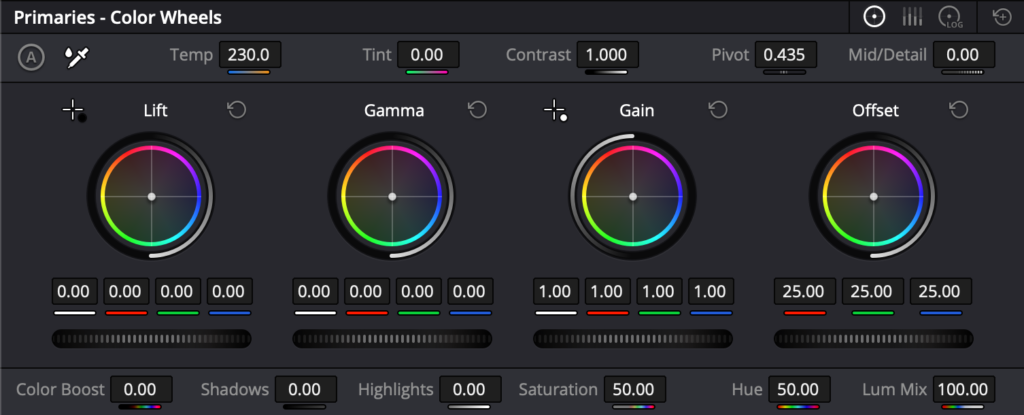
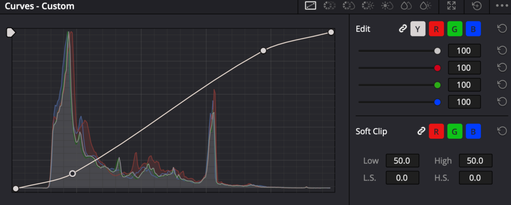
Nachdem Schnitt und Vorbereitung abgeschlossen waren, ging es für mich an den technischsten Teil des Projekts: die Color Correction. In DaVinci Resolve habe ich dabei immer in einer ähnlichen Reihenfolge gearbeitet: zuerst die Helligkeit, dann den Kontrast, danach die Sättigung und erst danach die feineren Farbwerte. Diese Reihenfolge hat mir geholfen, strukturierter zu arbeiten und das Bild Schritt für Schritt zu verbessern.

Was Color Correction bedeutet

Color Correction ist für mich der Teil, in dem ein Bild erst einmal technisch „richtig“ gemacht wird. Es geht noch nicht um einen kreativen Look, sondern darum, dass die Aufnahme natürlich, ausgeglichen und einheitlich wirkt. Besonders bei verschiedenen Clips aus einem Vlog war das wichtig, weil nicht jede Szene unter denselben Bedingungen aufgenommen wurde.

Ich habe schnell gemerkt, dass Color Correction die Grundlage für alles Weitere ist. Wenn ein Bild zu dunkel, zu hell oder farblich unausgeglichen ist, wirkt auch das spätere Grading unruhig. Deshalb musste ich zuerst die technische Basis herstellen, bevor ich überhaupt an einen Look denken konnte.

Weißabgleich

Ein wichtiger erster Schritt war der Weißabgleich. Dabei habe ich darauf geachtet, dass Weiß wirklich weiß aussieht und keine ungewollte Farbstichigkeit im Bild bleibt. Gerade bei Aufnahmen mit unterschiedlichem Licht kann das schnell passieren, zum Beispiel wenn eine Szene wärmer und die andere kühler wirkt.

Für mich war der Weißabgleich besonders hilfreich, weil er das Bild sofort sauberer und natürlicher wirken lässt. Erst wenn die Grundfarbe stimmt, kann man das Material sinnvoll weiterbearbeiten. Sonst bleibt das Bild trotz guter Ideen immer leicht „falsch“ oder unausgeglichen.

Belichtung korrigieren

Danach habe ich die Belichtung angepasst. In DaVinci habe ich dafür zuerst die allgemeine Helligkeit überprüft und das Bild so eingestellt, dass es weder zu dunkel noch zu ausgebrannt wirkt. Gerade bei einem Vlog ist das wichtig, weil die Zuschauer die Szenen schnell und klar lesen können sollen.

Die Belichtung ist für mich einer der wichtigsten technischen Schritte, weil sie sofort Einfluss auf die Bildwirkung hat. Wenn ein Clip zu dunkel ist, gehen Details verloren. Wenn er zu hell ist, wirken Gesichter und Flächen schnell flach oder überbelichtet. Durch die Korrektur konnte ich meine Aufnahmen insgesamt viel ausgeglichener machen.

Kontrast anpassen

Nach der Helligkeit kam bei mir der Kontrast. Das war ein sehr wichtiger Schritt, weil Kontrast dem Bild Tiefe und Form gibt. Ohne Kontrast wirkt ein Bild oft flach oder leblos, selbst wenn die Farben eigentlich schon stimmen.

Ich habe beim Kontrast gemerkt, dass es oft nur kleine Veränderungen braucht, um das Bild klarer wirken zu lassen. Gerade bei Alltagsszenen kann ein bisschen mehr Kontrast schon helfen, damit das Bild definierter und filmischer aussieht. Gleichzeitig durfte ich es nicht übertreiben, weil das Material sonst schnell hart oder unnatürlich wirkt.

Highlights und Schatten

Ein weiterer wichtiger Bereich waren die Highlights und Schatten. Damit konnte ich feiner steuern, welche Bildteile heller und welche dunkler erscheinen. Das ist besonders nützlich, wenn man Details retten oder einzelne Bildbereiche gezielter hervorheben möchte.

Für mein Projekt war das hilfreich, weil manche Aufnahmen sehr unterschiedliche Lichtverhältnisse hatten. Durch die Anpassung von Highlights und Schatten konnte ich das Bild besser ausbalancieren und störende Unterschiede etwas reduzieren. So wurde das Material insgesamt harmonischer.

Waveform, Histogramm und Vectorscope

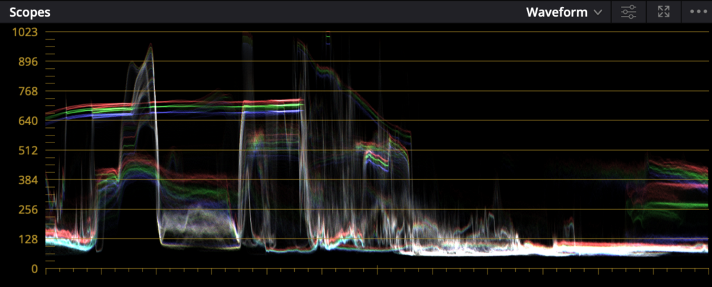
Bei der technischen Arbeit habe ich auch angefangen, mich stärker an den Scopes zu orientieren. Besonders wichtig waren für mich Waveform, Histogramm und Vectorscope, weil sie zeigen, was im Bild wirklich passiert, statt nur auf das eigene Auge zu vertrauen.

Die Waveform hilft dabei, Helligkeit und Bildverteilung zu kontrollieren. Sie zeigt mir, ob das Bild zu dunkel, zu hell oder ausgewogen ist. Das Histogramm gibt einen Überblick über die Verteilung der Tonwerte im Bild, also ob viele Bereiche eher dunkel, hell oder mittig liegen. Das Vectorscope ist vor allem bei Farben wichtig, weil es zeigt, wie stark die Farbsättigung ist und in welche Richtung die Farbtöne gehen.

Diese Werkzeuge fand ich am Anfang etwas kompliziert, aber sie waren sehr hilfreich, um objektiver zu arbeiten. Gerade wenn man mehrere Aufnahmen angleichen will, ist es besser, sich nicht nur auf das eigene Gefühl zu verlassen.

Waveform

Schwierigkeit beim Angleichen

Eine der größten Herausforderungen war das Angleichen verschiedener Aufnahmen. Obwohl die Szenen alle zu einem Projekt gehören, sehen sie nicht automatisch gleich aus. Unterschiedliche Lichtquellen, unterschiedliche Tageszeiten und verschiedene Kameraeinstellungen führen schnell dazu, dass Clips nicht zusammenpassen.

Ich habe gemerkt, dass das Angleichen nicht nur eine technische, sondern auch eine geduldige Aufgabe ist. Man muss sehr genau schauen, welche Unterschiede wirklich wichtig sind und welche man mit kleinen Anpassungen ausgleichen kann. Besonders bei einem Vlog ist das relevant, weil die einzelnen Szenen zwar zusammengehören, aber trotzdem an unterschiedlichen Orten und unter verschiedenen Bedingungen aufgenommen wurden.

Was ich dabei gelernt habe

Durch die Color Correction habe ich verstanden, wie wichtig eine saubere technische Grundlage ist. Erst wenn Helligkeit, Kontrast, Schatten, Weißabgleich und Sättigung stimmen, kann das eigentliche Grading funktionieren. In DaVinci hat mir die Reihenfolge geholfen, Schritt für Schritt vorzugehen und nicht alles gleichzeitig verändern zu wollen.

Für mich war dieser Teil des Projekts sehr lehrreich, weil ich gesehen habe, wie viel Einfluss kleine technische Anpassungen auf das gesamte Bild haben. Color Correction ist zwar weniger kreativ als Color Grading, aber ohne sie würde das Endergebnis nicht stabil wirken. Genau deshalb ist sie für mich der wichtigste technische Schritt vor dem eigentlichen Look.

PSBC: Building a Course from Scratch (2)

With the fundamentals out of the way in the first session, the second one was where things got noticeably more technical. I opened with three concepts that tend to trip people up if they’re never explained properly: vector versus pixel-based graphics, the differences between color spaces, and bit depth. None of these are exotic ideas, but they’re the kind of thing people absorb by osmosis rather than by being taught directly, which usually means there are gaps, and those gaps tend to surface at the worst possible moment, like when someone exports a file and can’t figure out why it looks wrong on a different screen.

I made a point of explaining these concepts with real consequences attached rather than as abstract theory. Vector versus pixel matters the moment you try to scale a logo without it turning to mush. Color space matters the moment a print comes back looking nothing like what was on screen. Bit depth matters the moment a gradient starts banding instead of looking smooth.

The Task: Fish, Bottle, Logo

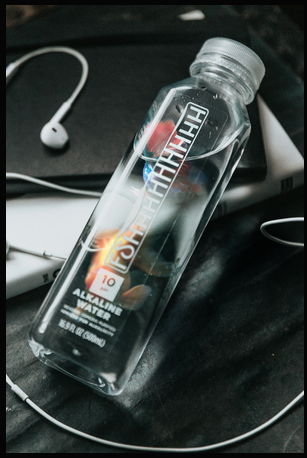
The exercise for this session was to insert an image of a fish into a water bottle and replace the bottle’s existing logo with something new. It’s a deceptively dense task for something that sounds simple. To pull it off convincingly, students had to work through smart objects and smart filters, layer masks, clipping masks, blend modes, warp transforms, Gaussian and lens blur, adjustment layers, and color and tone matching between the fish and the bottle’s existing lighting. On top of that, replacing the logo meant bringing SVG import and handling into the mix, since the original branding needed to be swapped out cleanly rather than just painted over.

Each piece of that list earns its place for a specific reason. Smart objects and smart filters keep the whole composite editable, so a filter applied early on can still be tweaked after the fact instead of forcing a redo. Clipping masks are what let the fish’s texture sit believably inside the bottle’s silhouette rather than floating on top of it. Warp transforms handle the fact that a bottle is curved and a flat logo image is not, so the replacement graphic needs to bend along the same contour the original packaging does. And the blur work – Gaussian for general softness, lens blur for anything that needed to respect depth – is what keeps the inserted elements from looking pasted in at full sharpness against a photo that has its own natural softness.

That’s a lot of separate skills stacked into one exercise, but that was intentional. Session one was about isolated fundamentals; session two was about combining them into something that actually resembles real client work, where you rarely get to use just one technique at a time.

How It Went

Unlike the first session, this one used almost the entire two-hour slot to get through the task. That wasn’t a bad sign – it meant people were engaged enough to work through problems rather than rushing past them. I wasn’t just standing at the front demonstrating either; there were real questions coming from the room, people getting stuck on specific steps and asking for help rather than silently falling behind. That’s honestly the moment teaching starts feeling worthwhile – not when people follow along smoothly, but when they get stuck on something specific enough to ask about it.

One thing caught me off guard: a handful of new faces showed up who hadn’t been at the first session. I’d assumed the intro material – the DPI/PPI, RGB/CMYK, file format rundown -would only be relevant once, but that assumption didn’t hold. As a result, I decided to bring a short version of the introductory slides back for the third session, just to make sure nobody starting fresh would be missing context the rest of the group already had.

The other realization from this session was smaller but stuck with me: switching Photoshop’s interface language to English matters more than it seems. Most tutorials, forum posts, and search results default to English menu names, and trying to follow along or troubleshoot with a German interface actively works against you – you end up hunting through translated menu labels that don’t match what any guide online is telling you to click. It’s a five-second setting change that saves people real frustration down the line, so it became something I started mentioning explicitly rather than assuming people would figure it out on their own. It’s a small piece of advice, but it’s the kind of thing that only becomes obvious once you’ve watched someone struggle to find a menu item that’s been renamed in translation. By the end of session two, the shape of the course was becoming clearer – not just as three isolated lessons, but as a progression where each session built directly on the muscle memory from the last one. Students weren’t relearning selections from scratch in session two; they were applying them without thinking, which freed up mental space for the new material layered on top. That compounding effect is exactly what I’d hoped for when planning the sequence, and it set up the third and final session to be more ambitious than either of the first two, since I could now assume a baseline of comfort that didn’t exist going into session one.

PSBC: Building a Course from Scratch (4)

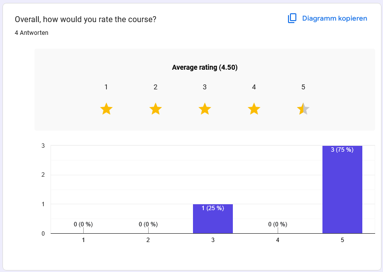
Each session ran with somewhere between 5 and 10 people – not a large group, which matters for how much weight to put on what follows. Out of that group, I got 4 responses to the feedback survey. That’s a small sample, and I’m treating the results accordingly, with a healthy grain of salt. But small or not, it’s the first real signal I’ve had on how the course landed, and after two sessions of getting nothing back at all by email, even a handful of honest answers felt like a meaningful upgrade.

The Numbers

The average rating came out to 4.5 out of 5 – three people rated it 5 stars, one rated it 3. That one 3-star rating is worth sitting with rather than averaging away; without more written context from that specific respondent, I can’t say exactly what fell short for them, and that’s a small blind spot in a four-person sample that a larger survey would have filled in.

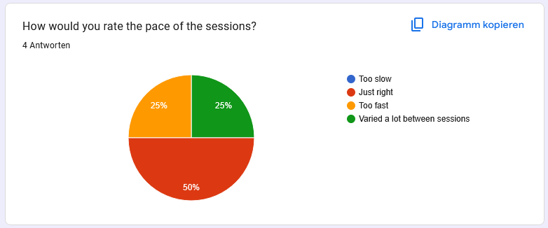
On pace, two people said it was “just right,” one said “too fast,” and nobody flagged it as too slow or inconsistent, which suggests the difficulty curve across the three sessions was reasonably well judged. That “too fast” answer lines up with something I noticed myself in session two, when the fish-in-a-bottle task pulled in more techniques than any single exercise really should – so that data point tracks with my own read of the sessions rather than coming as a surprise.

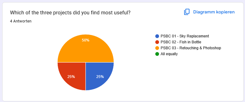
Asked which of the three projects they found most useful, the split leaned toward the final session: one vote each for the first and second sessions, and two votes for the third. Nobody selected “all equally,” which I read as a good sign – it means the sessions were distinct enough from each other that people had a real preference rather than defaulting to a neutral answer. The lean toward session three also makes sense given it was the most varied session, covering both retouching and mockup work rather than a single combined exercise.

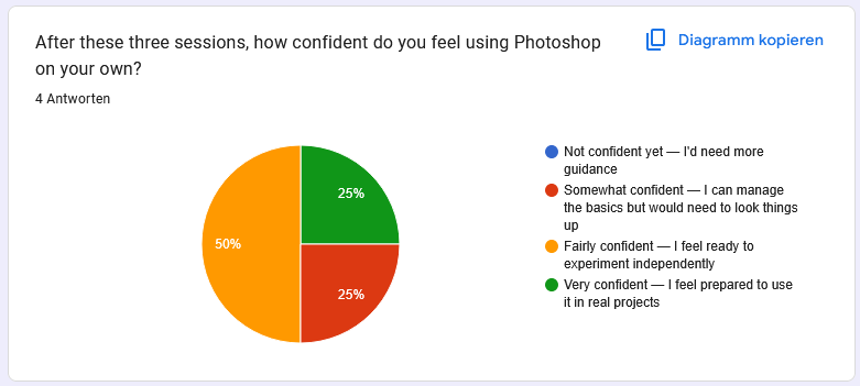
On confidence using Photoshop independently after the course, the results were more spread out: nobody said they felt “not confident yet,” one person landed on “somewhat confident,” two on “fairly confident,” and one on “very confident.” Given this was three two-hour sessions and not a semester-long course, having the majority land in the upper half of that scale feels like a reasonable outcome, and having nobody land at the bottom of the scale suggests the pacing didn’t leave anyone behind entirely – which was one of my bigger worries going in.

What People Wanted Changed

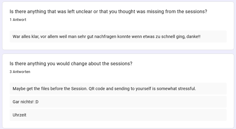
The open feedback was short but useful. One response asked for the files ahead of the session, noting that scanning a QR code and emailing yourself the material mid-session felt unnecessarily stressful – which lines up almost exactly with the file-transfer frustration I ran into myself from the presenting side, so it’s reassuring in a way to see the same friction point show up independently from the student side. Two people wrote some version of “nothing” – happy with the format as is, which I take as a decent sign the overall structure doesn’t need a rework, just refinement. One simply flagged the time slot itself as the thing they’d change, which is useful to know but not something I can fully control given it’s tied to the FH’s own scheduling rather than anything I decide.

The Real Takeaways

Numbers aside, two practical lessons stood out from running the course. The first is that file transfer needs to be smoother – the FH SharePoint QR code system worked maybe one out of every three times, and having that fail live in front of a room is not a great use of anyone’s patience. Between that and the student feedback asking for files ahead of time, the fix is fairly obvious: send the material out in advance rather than relying on an in-room QR scan that may or may not cooperate that day.

The second lesson was less about Photoshop and more about equipment: always carry a backup adapter. The final session nearly didn’t happen because my adapter stopped working for the beamer with no warning, and the only reason the session went ahead on time was that a friend happened to have one I could borrow. That’s not a mistake I plan on repeating – a spare adapter is going in my bag permanently from now on.

Taken as a whole – the ratings, the specific feedback, and the operational hiccups – I’d call the course a genuine success, with clear, specific things to improve before running it again. Nothing in the feedback pointed to a structural problem with the course itself; the issues were all around the edges – logistics, timing, hardware – rather than the actual teaching or the content. That combination is exactly what you want from a first attempt: proof the format works, plus a concrete list of what to fix next time, rather than having to question the fundamentals of the approach itself.

PSBC: Building a Course from Scratch (3)

Session 3: Retouching, Mockups, and Finally Getting Feedback That Works

The third and final session was the most content-dense of the three, both in terms of theory and in terms of what students actually had to produce. On the concept side, I covered RAW versus JPEG, frequency separation, and the distinction between color correction and color grading – three topics that are easy to gesture at vaguely but genuinely useful once explained properly, especially frequency separation, which tends to look like magic until you understand what it’s actually doing to the image.

RAW versus JPEG is one of those topics that sounds like a footnote until you actually walk through what a camera throws away the moment it compresses an image into a JPEG. Explaining that a RAW file preserves the full range of data the sensor captured, while a JPEG has already made permanent decisions about exposure and color that can’t be undone, reframes why professional retouching work almost always starts from RAW where possible. Color correction versus color grading was the other distinction worth slowing down for – correction being the technical fix to make an image look natural and accurate, grading being the creative decision layered on top to give it a mood or style. Students conflate the two constantly, and separating them clarifies why you’d reach for one tool over another depending on which problem you’re actually solving.

Frequency separation, meanwhile, is the concept that tends to get the most raised eyebrows the first time it’s explained. Splitting an image into a low-frequency layer that holds color and tone, and a high-frequency layer that holds fine texture and detail, sounds abstract right up until you see it demonstrated – retouching skin texture on one layer without disturbing the underlying tone on the other suddenly makes visible sense once you’ve seen the split happen in front of you.

Two Tasks Instead of One

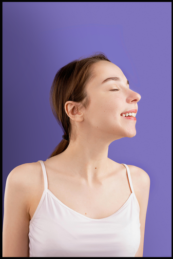
Unlike the first two sessions, which each centered on a single exercise, the third session split into two separate tasks. The first was portrait retouching – cleaning up skin blemishes using the stamp and patch tools, with an emphasis on doing it in a way that still looked natural rather than airbrushed. This is where the frequency separation concept from earlier in the session actually got put to use: students worked the low-frequency layer to even out tone without touching pore detail, then addressed blemishes on the high-frequency layer without flattening the skin’s natural texture in the process. Watching people go from “this looks like a smudge tool disaster” to a clean, natural-looking retouch once they understood which layer to work on was one of the more satisfying moments of the whole course.

The second task was building a mockup template, which brought displacement maps into play along with, once again, matching color and lighting between source elements so the final composite didn’t look pasted together. Displacement maps solve a specific problem – making a flat design wrap convincingly around a folded or textured surface, like fabric or crumpled paper – and it’s a technique students hadn’t encountered in either of the first two sessions, so it functioned as a genuinely new tool added to their kit rather than a variation on something already covered.

Splitting the session this way meant less depth on any single technique compared to session two’s fish-in-a-bottle exercise, but it exposed students to two genuinely different corners of Photoshop – retouching work and template/mockup construction – which are common enough real-world tasks that I wanted both represented before the course ended. Given this was the last session, it felt more valuable to send people off with breadth across two practical use cases than to go deeper on just one.

The QR Code Fix

The other meaningful change in this session had nothing to do with Photoshop itself. Instead of asking for feedback by email – which, across two sessions, had produced exactly zero responses – I put together a feedback QR code that students could scan and fill out on the spot, right there in the room while the session was still fresh in their minds. The difference was immediate: I actually got responses this time. It’s a small logistical change, but the lesson is bigger than Photoshop – if you want feedback, you need to make giving it take ten seconds, not require someone to remember to open their email later once they’ve already moved on to the rest of their day. That QR code approach is going into every session I run from here on out, no exceptions. With the third session wrapped, the course as a whole was done: three two-hour sessions, three tasks of increasing complexity, and – for the first time – actual usable feedback to look back on. Sitting down afterward to actually read through those responses turned out to be its own useful exercise, separate from just having run the sessions. That feedback, and what it revealed about how the sessions landed, is worth its own look.

OCTANE: A New Way of Rendering (for me) (4)

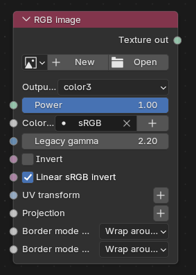
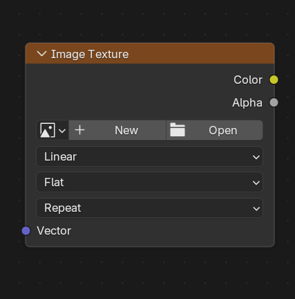
Once the interface stopped fighting me, the underlying logic of building materials in Octane turned out to be more familiar than I expected. Most nodes have a direct counterpart on the Cycles side – the equivalent of an Image Texture node in Cycles is called an RGB Image in Octane, and the big all-purpose shader that plays the role of the Principled BSDF is simply called the Basic material. Once I had those name mappings in my head, building out reasonably complex shaders wasn’t much slower than doing the same thing natively in Cycles, since the underlying logic of plugging texture inputs into a base shader is basically identical between the two.

Where things diverge more noticeably is environment setup. Blender has a native environment texture node you can just point at an HDRI and go – one node, one image, done. Octane doesn’t offer that shortcut – you need an RGB Image node feeding into a separate environment shader, which is an extra step but not a difficult one once you know it’s expected. It’s a small thing, but it’s exactly the kind of small thing that costs you ten minutes of confused searching the first time you hit it, before it becomes second nature.

Lights Turned Out to Be the Real Culprit

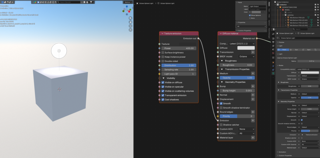
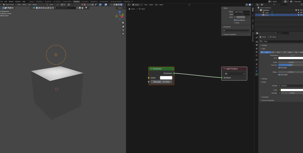
Lighting is where the two engines diverge the most, and where I lost the most time relearning something I thought I already understood. In Cycles, I almost never touch a light’s shader directly – intensity, size, shape, and color all live conveniently in the light’s properties panel, and that’s usually all I need for a full lighting setup. In Octane, most of those same settings simply aren’t in the properties panel at all. Intensity in particular lives in the shading window, meaning every light adjustment meant leaving the panel I expected to use and going back into the node editor instead – a small context switch that adds up when you’re trying to nudge a dozen different lights into place one at a time.

There’s also a more fundamental difference in how the two engines treat lights visually. In Blender, a point light is invisible to the camera no matter how large you make it – to actually see a light source in a render, you need to build a separate emissive material and apply it to real geometry yourself. Octane doesn’t work that way by default: its lights are represented as actual visible shapes in the scene, not just implied sources of illumination reflected off other surfaces. That’s a genuinely useful default for product visualization, where you often want the light source itself to be visible as part of the composition, but it meant every light in my scene needed to be rebuilt from scratch as an Octane-native light rather than simply carried over from the append.

The genuinely confusing part was how intensity and size interact. Making a light physically larger while keeping the same power setting could suddenly make it far brighter, in a way that didn’t track intuitively with what I was used to from Cycles’ units, where increasing a light’s size generally softens shadows without wildly swinging overall brightness. I never fully nailed down the exact relationship between the two values – I mostly adjusted by eye, nudging size and power back and forth until each light roughly matched what I remembered from the original scene. Cameras, by comparison, were a complete non-issue; they carried over from the old file with no adjustment needed at all, which was a small relief after everything the lights had put me through.

One smaller gap worth mentioning: there’s no dedicated “glass” shader shortcut in Octane the way there effectively is in Cycles. To get a convincing glass material, you build it out of a specular shader with the roughness pulled down and transmission dialed up – not a dealbreaker, just a bit of vocabulary I had to relearn.

OCTANE: A New Way of Rendering (for me) (1)

I’ve been using Blender for almost eight years now, and for basically the entire time, Cycles (and occasionally Eevee) has been the only render engine I’ve ever really worked in. That’s long enough to get genuinely comfortable with a tool – comfortable enough that switching to something else stops being an obvious idea and starts being a small act of stubbornness to even consider. When you know exactly how a piece of software behaves, exactly which node does what, and exactly how to fake the effect you want when the built-in tools don’t quite get there, the cost of relearning all of that from scratch starts to feel a lot bigger than the potential upside.

The project that pushed me to finally look elsewhere was a university piece I worked on with the Moya Boys: a screen-mapping project where I designed an original tech device meant to visualize the connections between everyone who attended Generate26 – a kind of physical object that made an abstract social network tangible. I modeled and rendered the whole thing in Blender using Cycles, since that’s the workflow I know inside and out, and the result held up well enough as a piece of product design. It was the kind of project that leaned heavily on getting materials and lighting right – glass, plastic, brushed metal, a glowing screen – which meant I spent a lot of time in the shading tab making small adjustments to get surfaces to read correctly.

But working on that project put me deeper into product visualization than I’d been before, and once you start paying attention to that space, Octane comes up constantly. Every comparison video, every side-by-side render breakdown, kept pointing at the same thing: Octane handles caustics and reflective, refractive shading in a way that just reads as more physically convincing than what I was used to getting out of Cycles. The light behaves more naturally – less like a render, more like something that was actually photographed. Watching enough of those comparisons back to back eventually tips you from mild curiosity into actually wanting to try it yourself.

Normally, trying Octane would mean paying for a subscription, which is enough of a barrier that I probably would have kept putting it off indefinitely – there’s no shortage of things worth learning, and a recurring cost tends to push a “maybe someday” idea further down the list. But it turns out Octane has a free version specifically for Blender, which removed the one real excuse I had left. So I decided to actually set it up, work through my old project’s assets in it, and compare the workflow directly against the Cycles version I already knew well. Going into it, my expectations were fairly modest: install the plugin, swap the render engine, see how the same scene looks with a different set of shaders doing the work underneath. What I didn’t expect was how much of the actual learning curve would have nothing to do with rendering quality at all, and everything to do with the setup, the interface, and the countless small conventions that Octane simply does differently from Blender’s native tools. That turned out to be most of the story, and it’s worth telling in full rather than skipping straight to the pretty pictures. What follows is everything that went into getting there – starting with the setup itself, which turned out to be its own small adventure before I’d rendered a single frame.

PSBC: Building a Course from Scratch (1)

Getting to teach a Photoshop course at FH JOANNEUM was one of those opportunities that sounds simple until you actually sit down to plan it. The brief was straightforward on paper: cover the basics of Photoshop for other students. The hard part was figuring out what “basics” even means when the software has a thousand entry points depending on who’s using it.

My first instinct was to think about the question from my own workflow outward — what do I actually use Photoshop for, most of the time? The honest answer was 3D-adjacent work: compositing renders, touching up textures, prepping mockups. But that’s not a useful starting point for a room full of students who don’t do 3D work, and building a course around my own niche would have meant teaching people skills they’d never actually reach for. So instead of teaching my own use case, I stripped it back to the tools that show up in almost every Photoshop session regardless of discipline: selections, masks, and the basic adjustment filters like hue/saturation and brightness/contrast. If a student walks away only knowing those three things, they can already do real work. That became the baseline I measured every other decision on.

Structuring the Sessions

The course was split into three sessions, two hours each. Before touching any Photoshop content, I built a short Canva presentation to open every session with — covering terms that get thrown around constantly but rarely get explained: DPI vs. PPI, RGB vs. CMYK, and the common file formats people are expected to already know. I’d rather spend ten minutes on vocabulary at the start than have someone quietly confused for the next two hours.

I also made a deliberate call early on about AI tools. It would have been easy to lean on Photoshop’s generative features and call it a day, but that felt like it would teach a shortcut without teaching the underlying skill. So the focus stayed on the actual mechanics of Photoshop — the idea being that if you understand selections and masking properly, the AI tools become an accelerator rather than a crutch. Running alongside that was a second thread I wanted every session to reinforce: non-destructive workflow. Adjustment layers over direct edits, smart objects over flattening. Habits that save you later even if they feel like extra steps in the moment.

One small but genuinely useful addition was Keyviz, which displays my mouse clicks and keyboard shortcuts on screen. For a follow-along format where people are watching a beamer and trying to replicate what I’m doing, seeing exactly what key I just pressed removes a surprising amount of friction — no more “wait, what did you just press?” interruptions that break the flow of the session.

Session 1: Sky, Selections, and a Plane

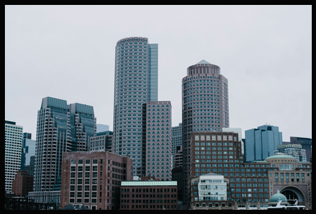
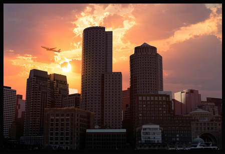
For the actual task, I gave students a dull, overcast skyline and asked them to replace the sky with a vibrant sunset and add a plane into the scene. It’s a small exercise, but it forces you through selection, masking, and matching the light and color of two images that were never meant to sit together. Getting the sky swapped out is mostly mechanical once you understand the selection tools, but making the plane sit convincingly in that new sunset, matching its exposure, its warmth, the direction the light seems to be coming from, is where the exercise stops being a tutorial and starts being an actual creative decision. That last part is where most of the real learning happens; anyone can cut out a sky, but making the replacement believable is a different skill entirely.

I provided the image material myself at the start of the session rather than asking people to source their own, mostly to keep the first session focused and avoid losing time to file hunting before anyone had even opened Photoshop. The session itself covered selections, layers, masking, and simple color grading, and it ran comfortably within the two-hour window — which, going into it, I wasn’t fully confident about.

At the end, I asked for two things: feedback by email, and ideas for what people wanted to see in the third session, along with a heads-up that they could bring their own images if they wanted. In hindsight, the email feedback request didn’t get a single response – a pattern that would repeat for the rest of the course – but the structure of asking at the end of every session was worth keeping regardless. It sets an expectation that their input matters, even if the channel needed fixing later.

Overall, the first session felt like a solid foundation. The task was scoped well enough to fit the time, the concepts built on each other logically, and nobody looked lost by the end. That gave me confidence going into session two, where the technical complexity was about to increase noticeably.

OCTANE: A New Way of Rendering (for me) (3)

Once Octane was actually rendering something recognizable, the next set of obstacles weren’t conceptual – they were just Octane doing familiar things in unfamiliar places. None of these were deal-breakers on their own, but together they added up to a surprising amount of lost time.

Denoising Is Hiding Where You Don’t Expect It

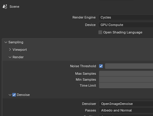
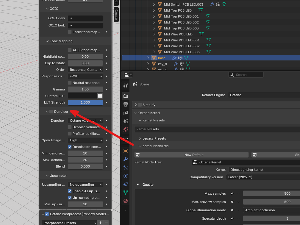
In Cycles, denoising lives exactly where you’d look for it – in the render settings. In Octane, it isn’t there at all. Instead, you have to open the properties panel from inside the viewport itself, using the N key, and enable denoising from there. Normally the properties panel mirrors what you’d see on the right-hand settings tab, so having a setting that only exists in the viewport version and nowhere else was disorienting the first few times I went looking for it.

Two Output Systems, and I Only Wanted One

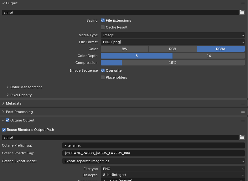
Octane comes with its own dedicated output panel, which on the surface is a nice upgrade – more options, more control. But the default behavior caught me off guard: rendering a single image produced five separate output images at once, which for what I needed was just extra clutter. I’m used to Cycles, where you deliberately set up separate view layers or render passes only when you actually need something like a depth map alongside your main image. Octane just gives you all of it by default.

That doesn’t sound like a big deal until you scale it up. My animation was 513 frames long. At five outputs per frame, that would have finished as roughly 2,500 individual frames – five times the disk space for a result I didn’t need in that form. I ended up switching back to Blender’s standard output system, which is still available alongside Octane’s own – though having two separate output windows sitting side by side in the interface is its own small source of confusion.

The Convert Material Button, With Reservations

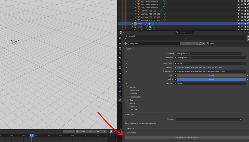
One thing that did genuinely help: the Octane add-on ships with a “convert material” button, which attempts to translate an existing Cycles shader setup into an Octane-compatible one automatically. I’d gone in assuming I’d have to rebuild every material from scratch, so this was a pleasant surprise when it worked – somewhere around half to sixty percent of the time, it did.

The rest of the time, results were mixed. Occasionally the conversion wiped the node tree entirely, leaving nothing behind. More often it partially converted but dropped information along the way, which meant I had to manually rebuild specific materials – particularly the device’s buttons, which relied on several layered images stacked on top of each other that the converter didn’t carry across cleanly.

Rearranging My Screen for Octane’s Node Editor

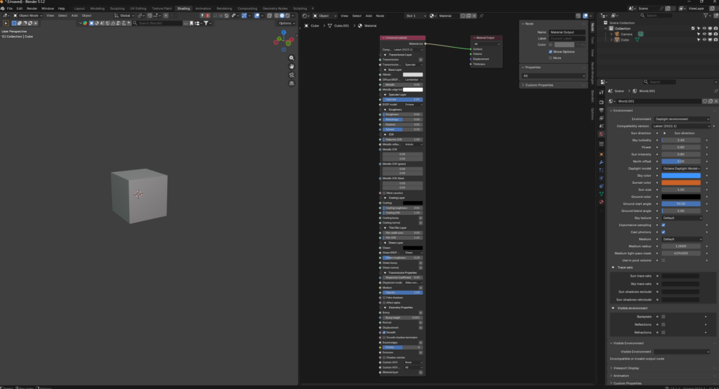
The last adjustment was purely about screen layout. Blender’s default shading workspace splits the screen horizontally – viewport on top, shader editor on the bottom. Octane’s node trees, by contrast, are tall. Very tall, especially once you factor in that most nodes come with collapsible sub-sections that are open by default and that you rarely close, since you might need them later. Working in that default horizontal layout meant constantly scrolling to see the whole graph.

I ended up rearranging my workspace so the viewport sits on the left side of the screen and the shader editor takes up the right side vertically, giving the node tree enough room to breathe. Once I made that change, actually building materials in Octane felt a lot more natural – which is a good segue into how those materials actually compare to what I’m used to in Cycles.

OCTANE: A New Way of Rendering (for me) (2)

Getting Octane Installed Was Its Own Project

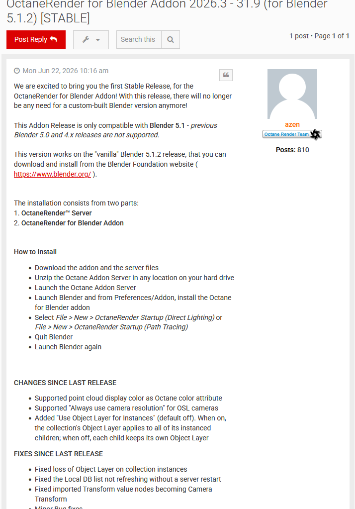
Because Octane isn’t normally free you can’t just search the add-on inside Blender and install it the way you would with any other plugin. The whole thing is gated behind an additional piece of software: a license server that runs alongside Blender, which is how the company behind Octane keeps track of who’s using it without having to open-source the renderer itself. That gating makes sense from their side, but it meant the installation process looked nothing like the one-click add-ons I was used to, where you download a zip, point Blender at it, and you’re done within a minute.

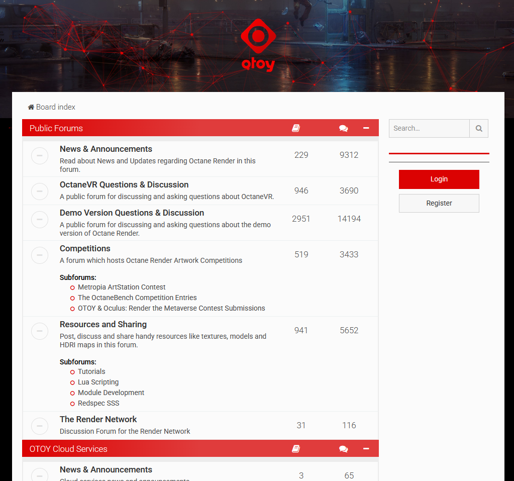
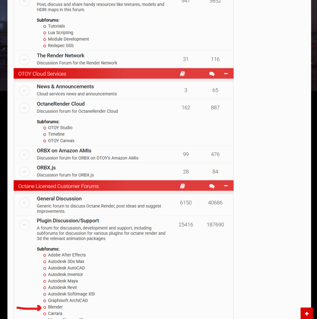
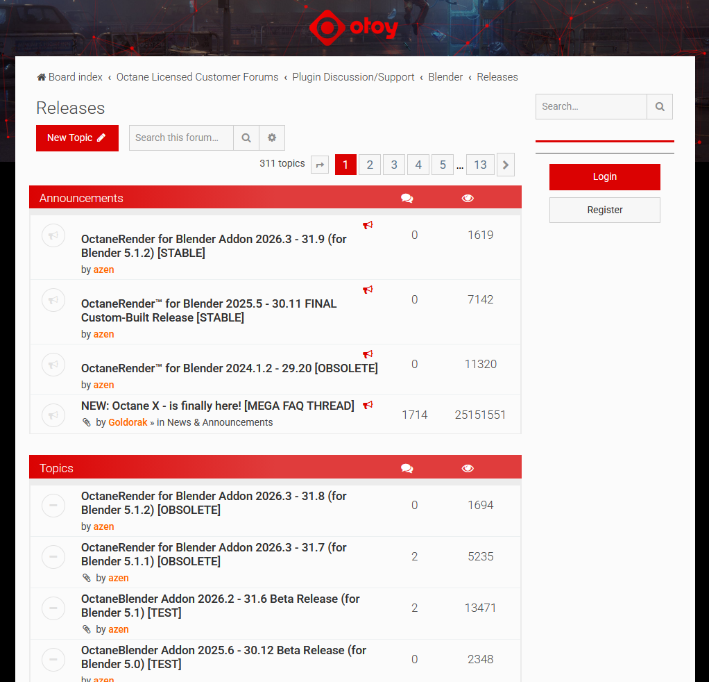
Finding the actual download files took longer than it should have. There’s no single obvious page – you end up on the Octane forums, which point you toward one of the Blender-specific install threads, which you then have to actually read through to figure out what you’re supposed to download and in what order, since the thread assumes you already know roughly what you’re looking for. I got lucky and found a stable build that matched the current Blender version, 5.1.2, but it took some digging through slightly outdated forum posts to be confident I had the right one rather than a version built for an older Blender release.

First Contact: Materials That Wouldn’t Show Up

Once Octane was installed, my first real test was appending my original Moya Boys file – the one built entirely in Cycles – into a fresh Blender file set up to render with Octane. That went badly almost immediately. None of the materials showed up. Which, in hindsight, makes complete sense: Octane can’t interpret Cycles’ native shader nodes, so of course a scene built entirely around Cycles materials was going to come in broken, with nothing but flat gray or missing surfaces where detailed shaders used to be.

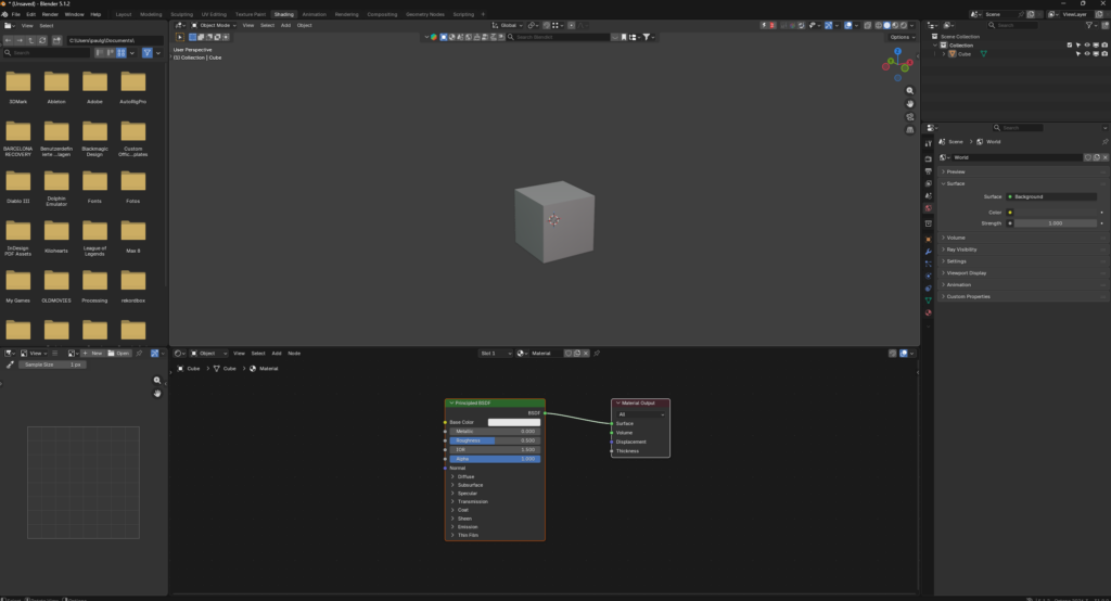
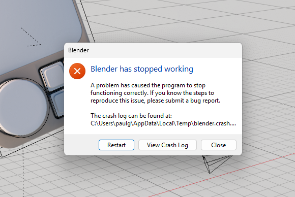
To sanity-check things, I added a plain cube with a basic Octane material applied directly, assuming that would at least confirm the renderer itself was working. Even that didn’t render properly – objects were coming through transparent, and I spent a solid half hour going back and forth trying to figure out why nothing I applied was actually showing up in the render, restarting the render itself, toggling settings, checking whether the material had actually been assigned. The fix, when I finally found it, was almost insultingly simple: restart Blender entirely, not just the render. That single move has since fixed more Octane problems for me than any actual troubleshooting step, to the point where it’s become my default first response whenever something looks broken.

That instability seems to be a pattern rather than a one-off. Blender rarely crashed for me at all in the last few years of using it normally, but with Octane running, I’m consistently seeing one to three crashes per session. Interestingly, it’s not the rendering itself that causes it – actually rendering an image has never crashed on me, even on longer, more complex frames. It’s things like resizing or moving windows within the Blender interface that bring the whole thing down unexpectedly. My read on this is that Octane itself is a solid, robust renderer, but the integration between it and Blender’s interface isn’t handling that connection especially gracefully – the crash feels like it’s coming from the plumbing between the two programs rather than the render engine itself failing. For what it’s worth, Octane also never gave me the “CUDA Error Illegal Adress” error that Cycles occasionally throws even when the GPU very clearly isn’t full – so it’s not all downside on the stability front.