This semester, I’ll be focusing on a different topic than I did last semester. At the time, I wasn’t completely sure where my research interests would lead me, so we were given the opportunity to adjust our topics later on if needed. Over the past few months, however, I found myself becoming increasingly interested in the way we perceive images and why we trust them. That curiosity eventually led me to change my focus and explore this topic in more depth.
Every day, we are surrounded by images. Whether we are scrolling through social media, reading the news, or simply browsing the internet, images are everywhere. Most of the time, we accept them without giving them much thought. We rarely stop to ask whether an image actually shows what it claims to show.
At the same time, the tools used to create images are becoming more powerful. The rapid development of artificial intelligence has made it possible to generate images that look surprisingly realistic. In many cases, it has become difficult to tell whether an image is a real photograph or something that was created entirely by AI.
Over the past few months, I have come across more and more examples of AI-generated images appearing outside of technology-related discussions. They show up on social media, in advertisements, and sometimes even alongside news stories. Seeing this made me wonder how much we can really trust what we see online.
For a long time, photographs were seen as evidence. Even though image manipulation has existed for decades, photographs still carried a certain sense of authenticity. A photo was often considered proof that something had actually happened. Today, that assumption feels less certain. With only a few prompts, AI can create convincing images of people, places, and events that never existed.
What I find particularly interesting is that many people believe they can easily spot AI-generated images. Common signs that are often mentioned include strange-looking hands, unusual facial features, or unrealistic lighting. However, image generation tools are improving at a remarkable pace, and many of these obvious clues are becoming less common.
During my initial research, I found several examples where people confidently identified AI-generated images as real photographs. At the same time, genuine photographs were sometimes accused of being fake. This suggests that distinguishing between real and artificial images may be much more difficult than we think.
What fascinates me most is not only whether people can correctly identify an image, but also why they trust it. Does the context matter more than the image itself? Are we influenced by familiar faces, personal experiences, or our own expectations? And what actually makes an image feel believable?
To explore these questions further, I plan to conduct a small experiment in one of my upcoming blog posts. I want to find out whether people are really as good at recognizing AI-generated images as they often claim to be. Before that, however, the next post will focus on explaining the methodology behind the experiment and how it will be carried out.
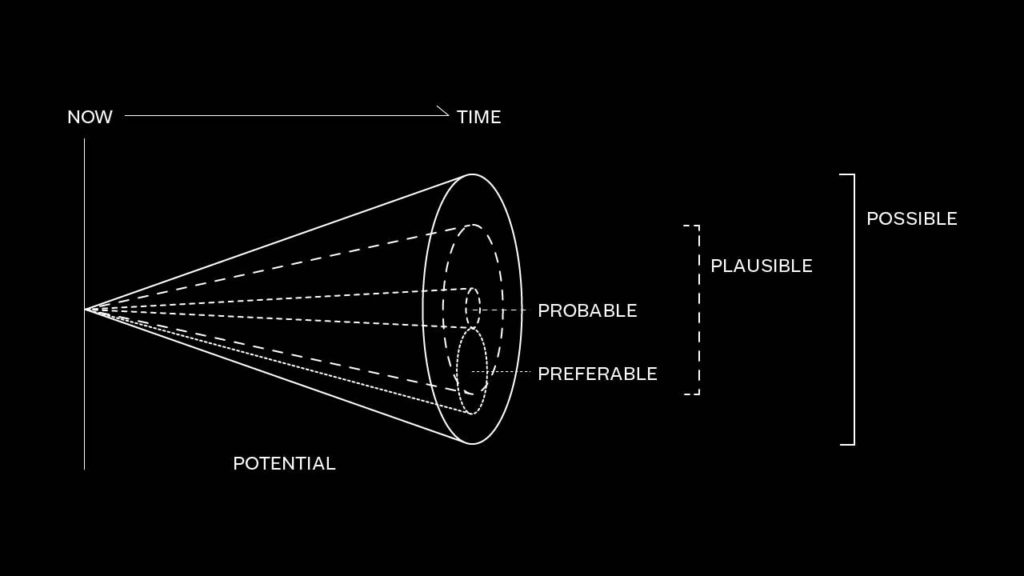
One of the most effective tools for visualizing different ways the future can unfold is the Futures Cone, also known as the 3P Model. It was developed by Anthony Dunne and Fiona Raby (2013), building on earlier work by Stuart Candy (2009) and introduced within the Design Interactions program at the Royal College of Art in London. The model is structured as a series of cones that branch out from a shared starting point, the present, each representing a different category of future. The probable refers to what is most likely to happen, and it is the space where most designers typically operate. The plausible moves beyond simple prediction, exploring scenarios that are believable, even if not certain, an approach often used by companies preparing for unexpected developments. Then there is the possible, which includes everything that may seem unattainable today due to technological, cultural, or social limits, but could become achievable in the future, as suggested by Michio Kaku in Physics of the Impossible (2008). Alongside these, we can also consider the preferable future, located at the intersection between the probable and the plausible. While it inevitably reflects subjective values, it also aligns with broader societal and market needs.
Figure 1. The Futures Cone (Candy, 2009).
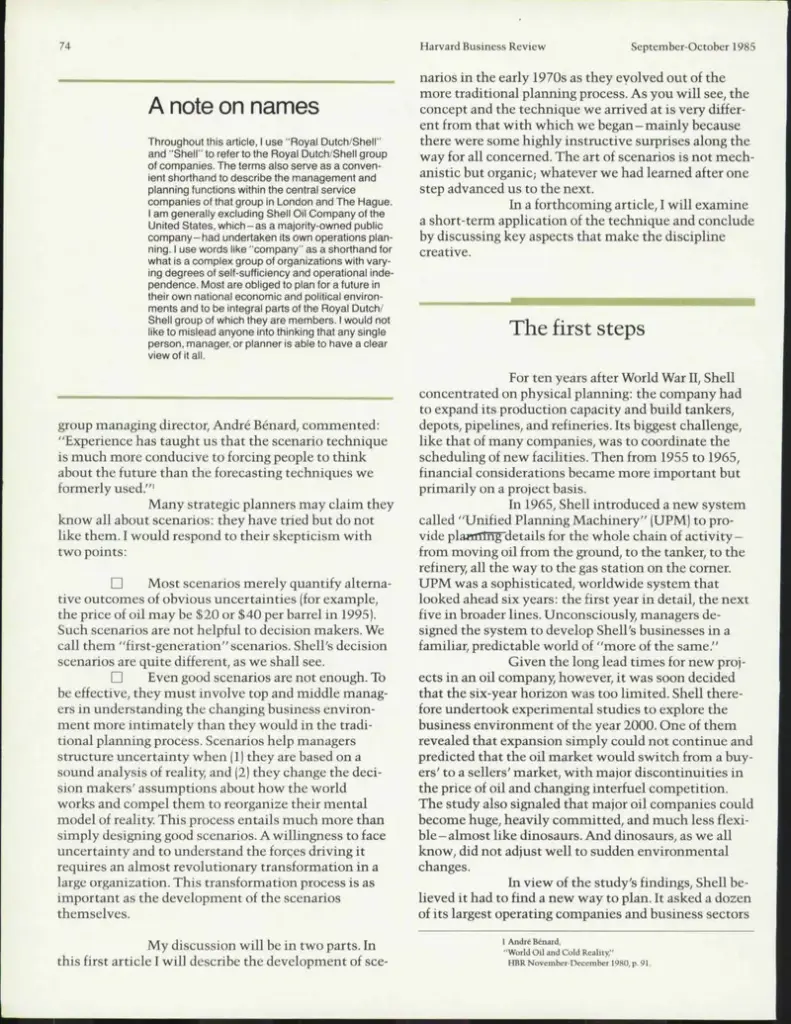
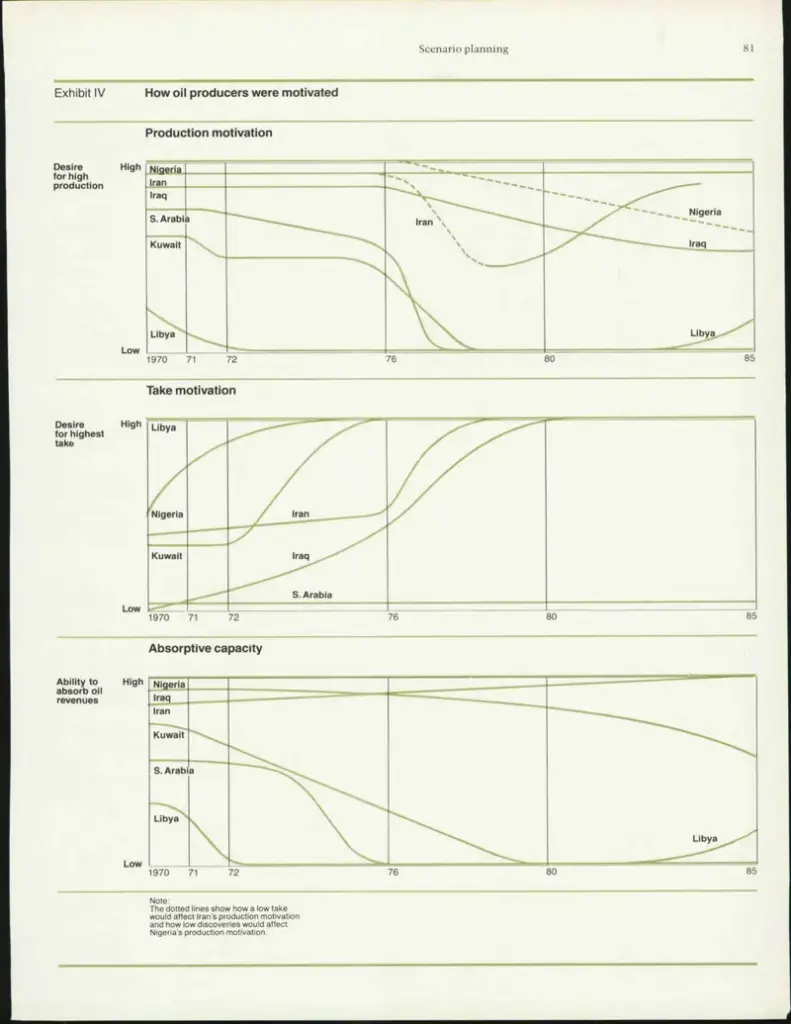
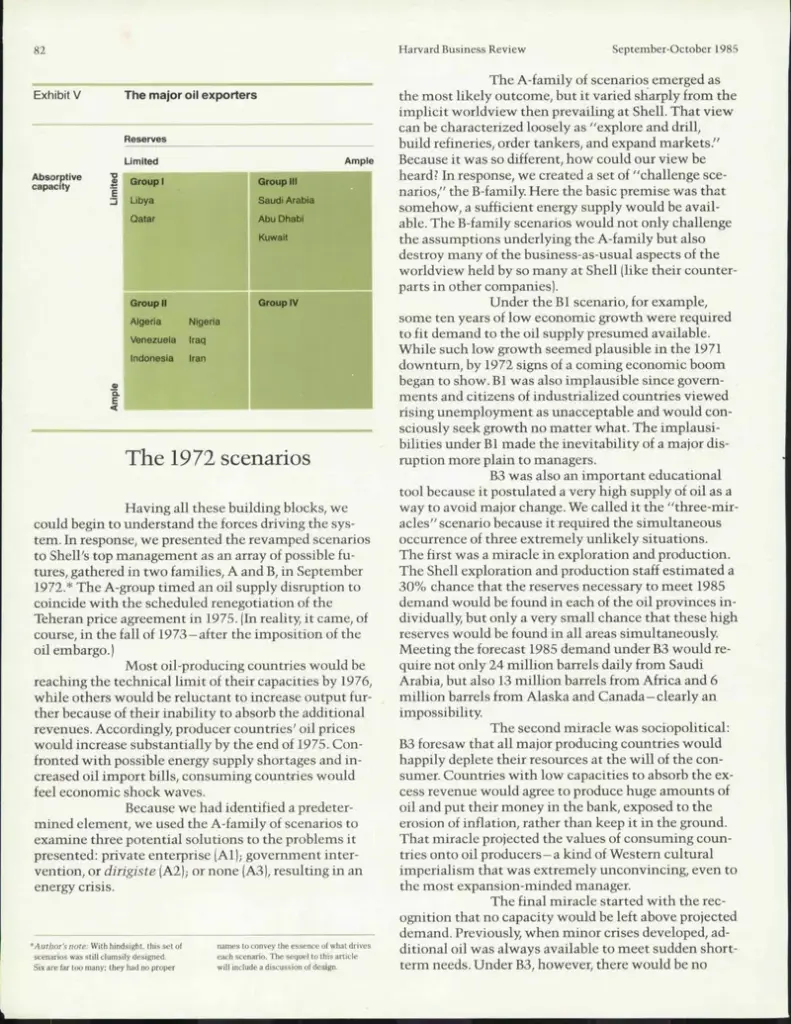
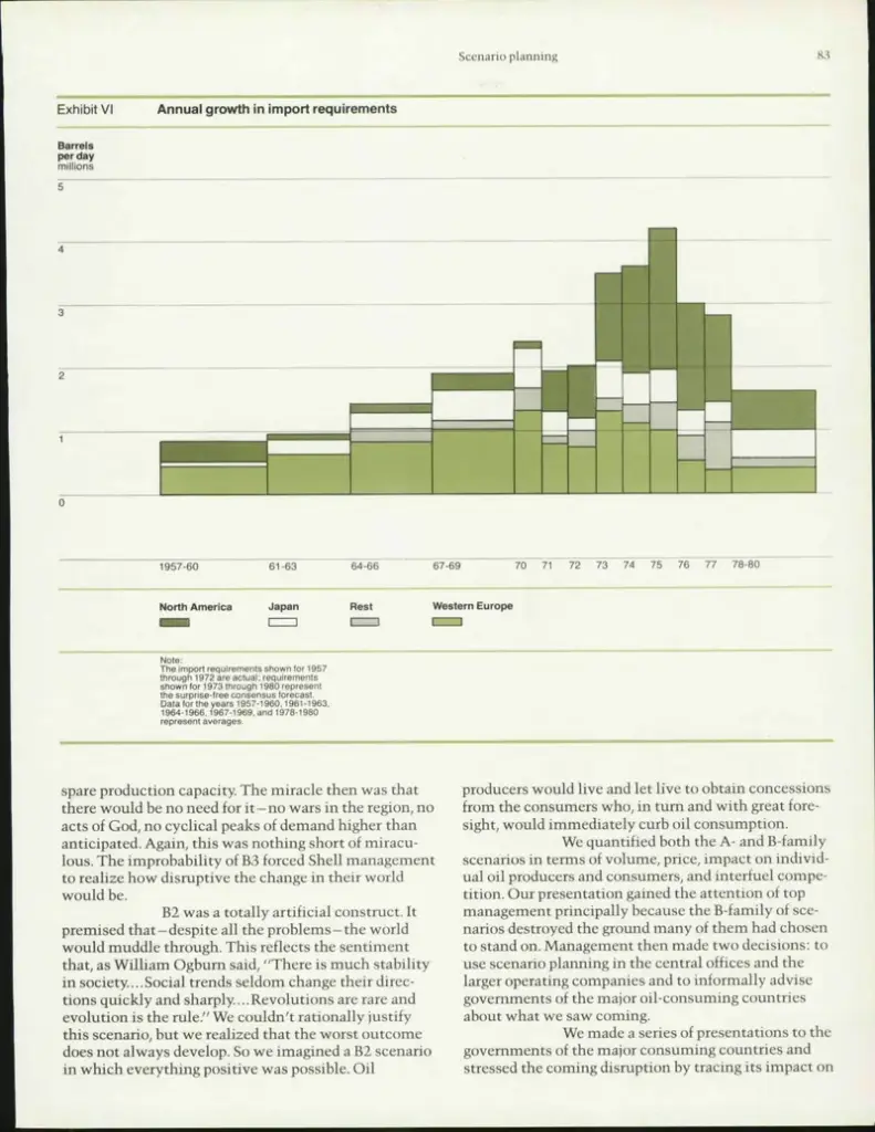
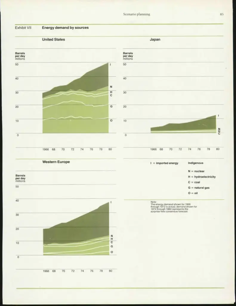
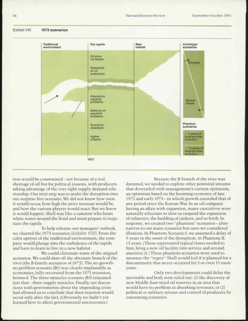
For this reason, it becomes a key area for Speculative Design, which aims to guide change by proposing alternative, inclusive, and sustainable scenarios. To better understand how these scenarios are actually constructed, it is useful to look more closely at what is known as Scenario Building, or Scenario Planning. Scenario Planning originated in the pioneering work of Pierre Wack, a French strategist at Royal Dutch Shell, one of the world’s leading oil companies. His task was to monitor global events that might influence oil prices. Until the Second World War, prices had remained relatively stable and affordable, but from the 1970s onward the situation began to shift dramatically: U.S. oil reserves were declining, global demand was rising, and exporting countries, particularly Arab nations, were gaining increasing negotiating power. This combination of factors posed a serious risk to the company’s economic stability. In response, Wack and his team developed a new planning approach that moved beyond linear forecasting. Rather than searching for a single “correct” prediction, they constructed multiple possible scenarios, each based on different political, economic and social variables. Two main scenarios stood out: a more optimistic one, in which oil prices would remain low and stable, and a more challenging but realistic one, which anticipated a sharp increase in costs. The effectiveness of this approach became clear during the 1973–1974 oil crisis. Shell was the only major company that found itself prepared, as its leadership had already adjusted their strategies according to the most plausible scenario identified by Wack. This foresight allowed the company to navigate the crisis from a position of strength, further consolidating its role in the global market. Building on this legacy, Peter Schwartz, who later succeeded Wack at Shell, defines a scenario in his book The Art of the Long View (1991) as «a tool for ordering one’s perceptions about alternative future environments in which one’s decisions might play out». He goes on to explain that «Scenario Planning is about making choices today with an understanding of how they might turn out». In this sense, Scenario Planning is fundamentally about making informed decisions in the present, with an awareness of their potential future consequences. Within this framework, the role of the designer becomes central. It is no longer just about introducing new products to the market, but about contributing to the creation of more just and sustainable futures. Design can therefore take two different directions: a traditional approach, focused on problem solving, responding to concrete needs through efficiency, aesthetics, and ergonomics and a more critical and speculative one, focused on problem finding, which brings questions to the surface and opens up space for reflection on ethical, environmental and social issues.
Figure 2. Early Royal Dutch Shell scenario planning reports.
In the collective imagination, design is almost always seen as a problem-solving process. Even in its most artistic and expressive forms, it ultimately remains tied to the idea of fixing something, of providing an answer, whether aesthetic or functional. But what if design could instead become a tool for questioning the present, or even for imagining the kinds of futures we would actually want to live in? This question lies at the core of Speculative Design, an approach that began to take shape in the early 2000s as a way of exploring alternative future scenarios, rather than simply addressing problems through rational or functional solutions. In other words, Speculative Design presents itself as a practice that does not seek definitive answers, but new questions. It is a form of design that opens up scenarios, sparks dialogue, encourages exchange, invites critique, and fuels the imagination. What truly matters here, however, is not so much predicting the future as using the idea of possible futures as a lens through which to better understand the present. These alternative futures, as mentioned earlier, do not provide solutions, they raise questions. One above all: “What if…?” It is precisely within this suspended space that the possibility emerges to think the unthinkable, to explore alternatives that would otherwise remain invisible or unexpressed.
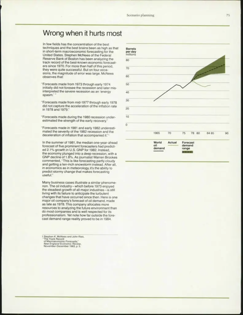
At first glance, design choices often appear aesthetic rather than political.
A blue poster is just blue. A serif font is simply elegant. Bold typography is supposedly just “good graphic design.” But political communication has never been neutral, and neither are the visual systems it relies on. Colours, typography, composition and visual style function as ideological shorthand long before audiences consciously process a message.
Politics, in many ways, is learned visually. Which we established quite well (at least in my very extremely humble opinion) last semester.
The association between colour and political identity is perhaps the clearest example of this process. Across much of Europe and North America, red has historically become linked to socialism, labour movements and revolutionary politics, while blue frequently signals conservatism, nationalism or institutional stability. Green has become inseparable from environmental politics. Black often appears in anarchist or anti-authoritarian contexts.
These associations are not biologically fixed. They are culturally constructed through repetition.
Political theorist Murray Edelman argued that political symbols gain power through emotional conditioning rather than rational understanding (Edelman, 1964). In other words, colours become political because societies repeatedly attach ideological meaning to them over time. Eventually, recognition becomes automatic.
This visual conditioning explains why certain political campaigns feel immediately legible even before any text is read. Audiences subconsciously decode ideological cues through aesthetics. A minimalist sans-serif campaign using soft gradients and inclusive photography communicates something very different from a poster built around aggressive typography, national symbols and rigid composition.
Typography functions similarly.
Fonts carry cultural histories. Serif typefaces are often associated with authority, tradition and institutional legitimacy due to their long relationship with newspapers, academia and governmental communication. Sans-serif typography, particularly geometric modernist fonts, frequently communicates progressiveness, accessibility and contemporary thinking.
These associations become politically significant because typography shapes emotional interpretation. Design theorist Ellen Lupton describes typography as a “visual form of language” that structures tone before content is consciously understood (Lupton, 2010). A slogan written in a clean modern grotesk feels fundamentally different from the exact same slogan written in a decorative script font.
This becomes especially visible in political propaganda.
Authoritarian political communication historically relies heavily on bold, condensed typography, strong geometric composition and limited colour palettes. Soviet constructivist posters, fascist propaganda and nationalist campaign materials all utilised highly controlled visual systems designed to communicate strength, urgency and collective identity.
Contemporary political branding continues these traditions, although often in more subtle ways.
Progressive political movements frequently rely on softer aesthetics, participatory visuals and inclusive colour systems intended to signal openness and diversity. Conservative campaigns often prioritise visual stability, tradition and national symbolism. These design strategies are not accidental – they are carefully constructed emotional frameworks.
Importantly, audiences do not need formal design education to interpret these signals.
Visual literacy develops culturally. Through repeated exposure, people learn how political ideologies “look.” This process operates almost automatically. You may not consciously analyse typography when looking at a campaign poster, but you still respond emotionally to its visual tone.
And this emotional response matters politically.
Communication scholar George Lakoff argues that political persuasion relies heavily on framing rather than factual argument alone (Lakoff, 2004). Visual design contributes directly to this framing process. Design shapes whether political communication feels trustworthy, threatening, rebellious or institutional before any policy position is evaluated.
This becomes particularly important in digital political culture, where audiences consume information rapidly and often superficially. Visual impressions are formed within seconds. Political branding therefore relies heavily on recognisability and immediate emotional clarity.
But these systems are never universal.
Colour associations differ internationally. In the United States, red is associated with conservative politics, whereas across much of Europe it remains linked to socialism and labour movements. Typography trends also shift culturally and historically. What feels progressive in one context may feel corporate or outdated in another.
Political design is therefore not fixed ideology translated visually.
It is negotiated perception.
And perhaps this is what makes political branding so powerful.
It rarely convinces through argument alone.
Sometimes, it simply teaches audiences what a political idea is supposed to look like.
And the more consistently these aesthetics are repeated, the more natural they begin to feel.
This is precisely why branding in politics becomes so effective. Visual language creates familiarity long before ideological understanding develops. A person may not fully understand a movement’s policies, but they can still recognise whether it appears modern, radical, patriotic, rebellious or trustworthy through design alone.
The danger, however, is that visual coherence can easily be mistaken for political coherence. A professionally branded campaign may appear organised and convincing even when its ideological foundations are weak or contradictory. Likewise, movements with less polished communication may struggle to gain legitimacy despite strong political substance.
Design therefore does not simply support political communication.
It shapes political perception itself.
And in a media environment increasingly built around rapid visual consumption, this influence becomes difficult to separate from politics entirely.
Before audiences evaluate arguments, they evaluate aesthetics.
Before they process policy, they process feeling.
And feeling, more often than not, begins with design.
Sources:
Edelman, M. (1964). The Symbolic Uses of Politics. University of Illinois Press.
Lakoff, G. (2004). Don’t Think of an Elephant! Chelsea Green Publishing.
Lupton, E. (2010). Thinking with Type. Princeton Architectural Press.
Crowley, D. (2013). Graphic Design and Protest. Design Issues, 29(3).
At this point, we’ve established that politics do not simply exist within policy documents, election campaigns or the occasional family argument at Christmas dinner. Politics exist visually. They exist culturally. They exist in the way movements present themselves, how ideologies circulate and how collective identities become recognisable. But while most political communication today lives online – optimised for feeds, algorithms and endless scrolling – one thing has stubbornly refused to disappear: physical political media.
Posters. Flyers. Stickers. Banners. Protest signs taped onto lamp posts at 2am. So here I am, about to take a deep dive into the physical appearance of political media, in hopes that what I’ll conclude at the end of this semester is not loudly yelling “print is dead and political vandalism sucks” back at me.
Despite living in what feels like an entirely digital political landscape, physical political communication still carries a strange kind of authority. A political poster on the street feels different from a sponsored Instagram post, even when both communicate the exact same message. One interrupts your environment. The other competes with cat videos and skincare ads.
This difference matters.
Political communication has always relied heavily on occupying public space. Long before social media feeds became ideological battlegrounds, walls, streets and newspapers acted as the primary sites of visual persuasion. Public space itself became political infrastructure. Cultural theorist Henri Lefebvre argued that space is socially produced and deeply shaped by power relations (Lefebvre, 1991). Political posters are therefore never “just” decoration. They actively participate in shaping who belongs, which ideologies become visible and what narratives dominate public consciousness.
Unlike digital content, physical political media cannot be easily scrolled away from. It demands confrontation through presence alone. A sticker on a street sign, a campaign poster at a bus stop or a protest banner stretched across a building occupies space in a way digital communication cannot fully replicate. It inserts ideology directly into everyday life.
And importantly, physical political communication often feels more authentic.
This perception is partly tied to labour and materiality. Analogue political media carries visible traces of production: ink textures, paper grain, imperfect alignment, weather damage, tape marks, fingerprints. These imperfections signal human involvement. Media theorist Marshall McLuhan famously argued that “the medium is the message” (McLuhan, 1964), meaning that the form of communication itself shapes how content is interpreted. A handmade protest poster communicates something fundamentally different from a polished digital advertisement – even before the text is read.
This becomes particularly interesting in relation to political trust. Contemporary political communication is increasingly associated with strategic branding, algorithmic targeting and carefully manufactured image management. Audiences are highly aware of political messaging techniques. As a result, highly polished communication can sometimes feel suspicious rather than convincing.
Analogue aesthetics often operate in opposition to this.
Rough textures, visible print errors and DIY visuals are frequently associated with grassroots activism, resistance movements and anti-establishment politics. Their “unfinished” appearance becomes proof of sincerity. Ironically, imperfection itself has become a form of branding.
This dynamic is visible across contemporary protest culture. Climate movements, feminist collectives and labour organisations regularly rely on analogue-inspired aesthetics even when their campaigns primarily circulate online. Screen-print textures, photocopy-style graphics and hand-drawn typography create the visual impression of collective effort and urgency. These aesthetics communicate political values before a single slogan is processed consciously.
But physical political media also creates a different relationship between audience and message.
Digital political communication is designed for speed. A post appears, is consumed within seconds and disappears beneath new content almost immediately. Physical media operates slower. You pass the same poster repeatedly. A sticker slowly deteriorates over weeks. A slogan becomes embedded into the visual rhythm of a city.
This persistence creates memory.
Political theorist Benedict Anderson describes collective identity as something constructed through shared symbols and repeated cultural encounters (Anderson, 1983). Physical political media contributes directly to this process. It creates visual familiarity. Repetition transforms symbols into belonging.
At the same time, analogue political communication carries historical weight. Contemporary political posters inevitably reference earlier traditions of protest, propaganda and activism. Whether intentionally or not, screen prints and wheat-pasted posters visually echo anti-war movements, labour struggles, punk culture and revolutionary propaganda. Analogue political design therefore does not simply communicate a message – it communicates a lineage.
And perhaps this is why physical political communication still matters so deeply.
Not because it is more effective than digital media.
Not because it reaches larger audiences.
But because it feels real.
In a political environment increasingly shaped by algorithms, branding strategies and disappearing content, physical political media reintroduces material presence. It reminds us that politics does not only happen online.
Sometimes, it’s taped to a wall.
And maybe that’s exactly why analogue political communication continues to matter.
Not because it resists modern media entirely, but because it slows political messaging down long enough for people to physically encounter it. A poster occupies space differently than a TikTok does. It asks to be looked at rather than immediately reacted to. Even destruction becomes part of its communication. Torn edges, graffiti additions and weather damage turn political media into an evolving object rather than static content.
This material vulnerability also makes political print feel temporary and urgent at the same time. Posters disappear. Stickers get scraped off. Banners are removed. Their physical existence mirrors the instability of political discourse itself.
Perhaps that is why analogue political communication still feels emotionally powerful despite digital dominance.
Because unlike content designed to disappear beneath the next algorithmic update, physical political media leaves traces.
Quite literally.
Sometimes in memory.
Sometimes on walls.
Sometimes both.
Sources:
Anderson, B. (1983). Imagined Communities. Verso.
Lefebvre, H. (1991). The Production of Space. Blackwell.
McLuhan, M. (1964). Understanding Media. McGraw-Hill.
Couldry, N. (2012). Media, Society, World. Polity Press.
Order as a Design Principle: In the field of communication design, a grid is the underlying structural system that governs the placement, proportion, and spatial relationships of all visual elements within a composition. Although the grid itself is rarely visible to the reader or viewer – it is removed before printing or hidden beneath the final design – its presence is continuously felt through the consistency, rhythm, and visual balance it produces. Far from being a simple set of guidelines, the grid functions as a sophisticated organisational language: it converts an undefined, empty surface into a structured environment in which information can be arranged with clarity and intention. The intellectual roots of this practice extend considerably further back than the formal birth of graphic design as a discipline. During the Renaissance, artists and architects employed mathematical principles – most notably the rules of linear perspective established by Filippo Brunelleschi around 1420 – to achieve a regulated, harmonious organisation of pictorial space. These proportional methods were transmitted into book culture through the work of early typographers. Johannes Gutenberg’s 42-line Bible of approximately 1455, often cited as the first major work of Western movable type, was set in a two-column layout with margins that followed precise proportional relationships – an early, if intuitive, application of columnar grid thinking. In the 13th century, the architect and geometer Villard de Honnecourt produced a diagram – preserved in his surviving Portfolio, held today in the Bibliothèque nationale de France – demonstrating a method for dividing a page into a text area with fixed-ratio margins. His system relied on diagonal constructions drawn across the full page and across the text area simultaneously, and the intersections of these diagonals defined the corners of the type area with mathematical precision. The resulting proportions, which placed the inner margin at approximately one-ninth of the page width and doubled that measure for the outer margin, produced a layout that felt both economical and restful – qualities that remain the ambition of book designers more than seven centuries later. The formalisation of grid thinking as a consciously theorised practice came in the early 20th century, shaped significantly by the political and social upheavals of the period. During and after the First World War, neutral Switzerland became a refuge for intellectual and artistic communities from across Europe, and the country’s design culture absorbed and synthesised diverse influences – from the Constructivism arriving from Russia to the Bauhaus principles emerging from Germany. It was within this context that the grid began to be understood not merely as a practical convenience but as an ideological position: a commitment to objectivity, rationality, and a democratic clarity of communication. Significantly, the term “grid” itself did not enter common professional usage in this sense until this period, when it was adopted to describe the systematic column-and-module structures that Swiss designers were beginning to codify.
Müller-Brockmann’s formulation is significant precisely because it resists the reduction of the grid to a mechanical formula. It positions the grid as a disciplined framework that demands creative intelligence in its application – not a constraint that eliminates individual expression, but a shared language that makes meaningful individual expression possible. This tension between system and freedom, between universal order and personal vision, remains the central philosophical debate in grid theory to this day.
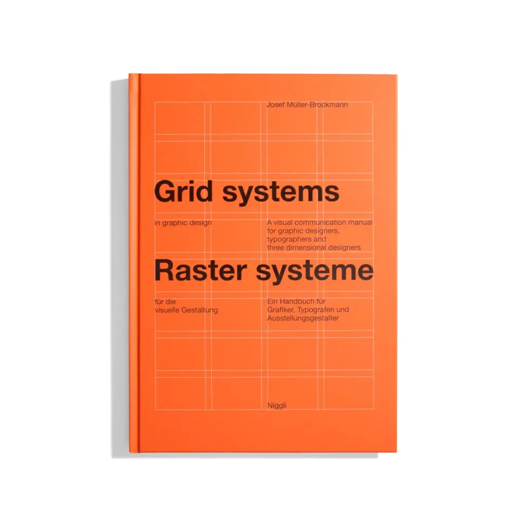
“The grid system is an aid, not a guarantee. It permits a number of possible uses and each designer can look for a solution appropriate to his personal style. But one must learn how to use the grid; it is an art that requires practice.”
– Josef Müller-Brockmann, Grid Systems in Graphic Design, 1981.
Anatomy of the Grid:
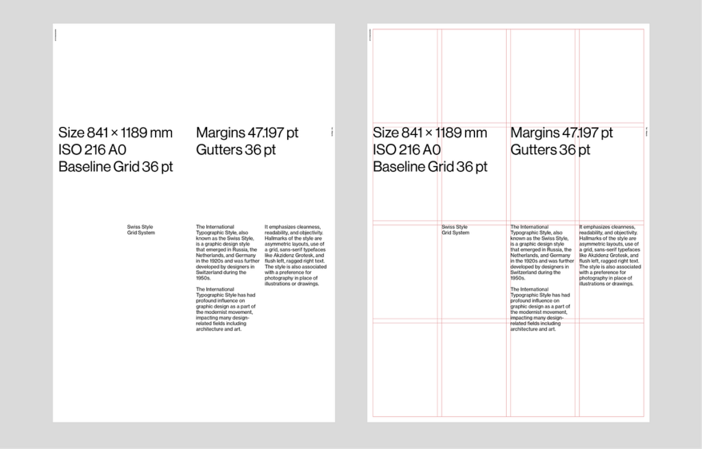
The Mechanics of Space: A grid system is not a single element but a carefully calibrated ensemble of interdependent components, each of which carries specific functional, perceptual, and ergonomic responsibilities. In communication design, these components – margins, columns, modules, gutters, and the baseline – constitute what might be described as the skeletal architecture of a composition. While a reader will never consciously perceive these structures, their cumulative effect is experienced as a sense of ease, coherence, and trust. Conversely, when these relationships are poorly calculated, the reader experiences a low-level perceptual discomfort that – while difficult to articulate – reliably reduces engagement with the content. Margins perform a dual role that is simultaneously aesthetic and physiological. As a visual “frame,” they create the breathing space necessary for the eye to approach the text area without distraction. As a physical provision, they account for the mechanics of how a printed object is held and handled. Research conducted in the context of ergonomic book design has established that if the inner (gutter) margin of a book page is less than approximately 12-15mm, the reader’s thumbs will habitually obscure the inner columns of text, causing both physical and perceptual interruption. The outer margin must be sufficient to prevent the sense that the content is pressing against the page’s edge – a condition described in classical typography as the composition “falling off” the page.The column is the fundamental vertical unit of the grid, and its width is not a matter of visual preference alone. Readability research – most extensively documented in the work of Miles Tinker, whose studies at the University of Minnesota during the 1950s and 1960s examined the eye movements of hundreds of readers – established that a line of text containing between 45 and 75 characters (including spaces) produces the highest reading speed and lowest fatigue in continuous prose. Lines significantly shorter than this force too many line-returns, interrupting the reader’s forward momentum; lines significantly longer require the eye to travel so far across the page that locating the beginning of the next line becomes effortful. Column width, therefore, is a variable directly determined by the type size in use and the target character-per-line count – not by an independent aesthetic decision. The gutter – the gap between adjacent columns – is among the most technically exacting elements of the grid. A gutter that is too narrow causes the eye to read across the column boundary, inadvertently connecting the last word of one column with the first word of the next and producing confusion. A gutter that is too wide weakens the visual unity of the page, making the columns appear as separate, unrelated elements rather than parts of a single coherent composition. In professional book and magazine design, the gutter is typically calculated as a proportion of the column width – commonly between one-quarter and one-third of the column measure – rather than as an arbitrary fixed value. Leading – the vertical distance between the baseline of one line of text and the baseline of the line below – is the component that most directly governs the readability of the type area as a whole. The term itself derives from the strips of lead alloy that compositors inserted between lines of movable type to increase the vertical spacing. When leading is set too tightly, the ascenders of one line visually interfere with the descenders of the line above, and the eye struggles to distinguish individual lines, slowing reading speed and increasing fatigue. When leading is excessive, the lines of text lose their visual connection to one another, and the paragraph ceases to function as a unified reading unit. In digital environments, the CSS property line-height is the direct equivalent of leading and is subject to precisely the same optical principles.
Beyond the individual components, the grid’s most important function is the establishment of what typographers call “vertical rhythm” – the sense that the page has a consistent, measurable beat running from top to bottom. This is achieved when the leading of the body text, the spacing above and below headings, and the heights of images and other block elements are all multiples of the same base unit. When vertical rhythm is maintained, a reader’s eye moves through the page with an unconscious sense of predictability and ease, in the same way that a listener navigates a piece of music whose rhythmic structure is clear and regular. Jan Tschichold and Josef Müller-Brockmann both argued, separately and emphatically, that this rhythmic quality – achieved through the precise, systematic application of the grid’s proportional relationships – was not merely an aesthetic refinement but a fundamental condition of legible, humane communication.
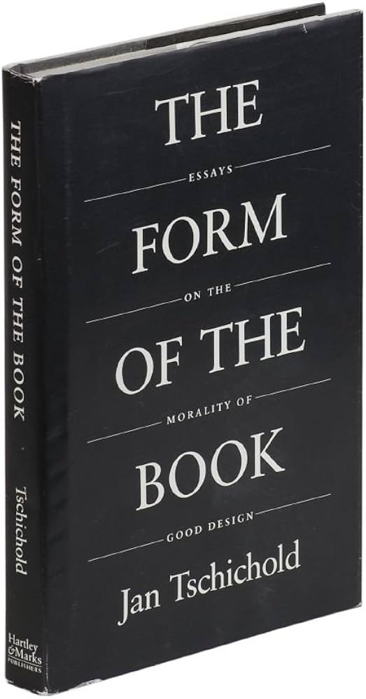
“Perfect typography is certainly the most elusive of all arts. Sculpture in stone alone comes near it in obstinacy.”
– Jan Tschichold, The Form of the Book, 1975.
The Swiss International Style:
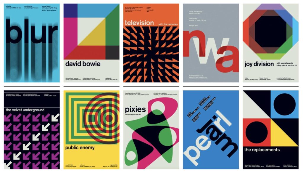
When the Grid Became a Movement: No discussion of grid systems would be complete without examining the Swiss International Typographic Style, often simply called the International Style or Swiss Style. This movement emerged formally in the late 1940s and 1950s, primarily in Zurich and Basel, and it transformed the grid from a personal working tool into a philosophical statement about objectivity, clarity, and democratic communication. The movement’s key figures – Josef Müller-Brockmann, Emil Ruder, Armin Hofmann, and Max Bill – shared the belief that design should not impose the personality of the designer onto the viewer. Instead, design should present information in the most neutral, readable, and logical form possible. The grid was their primary instrument for achieving this ideal. Müller-Brockmann’s famous series of concert posters for the Zurich Tonhalle (1950s-1970s) remain among the most studied examples of grid-based design in history: pure geometric shapes, a strict typographic hierarchy, and no decorative elements whatsoever. The practical result of this ideology was a set of very specific formal decisions. Designers favoured sans-serif typefaces – Helvetica, designed by Max Miedinger in 1957, became the unofficial typeface of the movement – flush-left, ragged-right type alignment, and generous white space. Each of these choices was directly linked to the grid. Flush-left alignment, for instance, respects the vertical axis of the column and avoids the uneven word spacing that justified text can create, which disrupts the clean horizontal rhythm of the grid module.
“The use of the grid as an ordering system is the expression of a certain mental attitude inasmuch as it shows that the designer conceives his work in terms that are constructive and oriented to the future.”
– Josef Müller-Brockmann, Grid Systems in Graphic Design, 1981.
The Swiss Style’s influence spread globally through the 1960s, particularly after Neue Grafik (New Graphic Design) magazine, launched in 1958, began publishing the movement’s principles in three languages simultaneously. By the 1970s, corporations across Europe and North America – including major airlines and international exhibitions – were adopting Swiss-based grid systems for their visual identities, recognising the grid as a sign of trustworthiness and international reach.
The Baseline Grid:
Typography’s Hidden Ruler: Among all the components of a grid system, the baseline grid is arguably the most invisible and yet most deeply felt. A baseline grid is a series of evenly spaced horizontal lines that align to the baseline of text – the invisible line upon which letters “sit.” Its purpose is to ensure that every line of text across every column of a page aligns horizontally, creating what designers call “vertical rhythm.” To understand why this matters, consider a standard magazine spread. On the left page, there may be a block of body copy in a 9pt typeface set at 12pt leading. On the right, a pull quote in 18pt and a caption in 7pt. Without a baseline grid, these three text elements would each obey their own internal rhythm and would almost certainly not align across the page. The result is a subtle but constant visual vibration – a sense of disorder that the reader cannot quite name but definitely feels. With a baseline grid, every text element, regardless of size, “snaps” to the same horizontal lines, and the spread reads as a unified whole.The baseline grid has deep roots in manuscript culture. Medieval scribes used a tool called a rastrum – a multi-nibbed pen that could rule several lines simultaneously – to create perfectly even baselines across vellum pages. The consistency this produced was not only aesthetic but also practical: it allowed multiple scribes to work on the same book and maintain a unified appearance. In digital tools like Adobe InDesign, the baseline grid function is a direct descendant of this centuries-old practice. Jan Tschichold, in his 1975 essay “The Form of the Book,” argued that the baseline grid was inseparable from good typography. He noted that in classical book design, the lines of text on the front of a page should always “back up” precisely to the lines on the reverse – meaning the baselines should align through the paper. This is not only a visual requirement but a practical one: it prevents the “show-through” of ink from the opposite side creating visual interference with the reading experience.
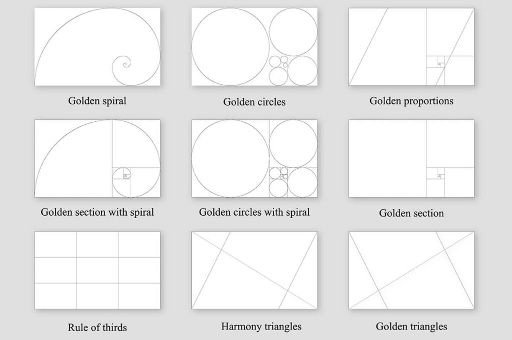
The Golden Section and Mathematical Harmony in Page Design
Long before the word “grid” entered the design vocabulary, designers and architects relied on a set of mathematical ratios to create compositions that felt naturally balanced. The most famous of these is the Golden Section (also called the Golden Ratio, represented by the Greek letter φ, approximately 1:1.618). This proportion appears throughout nature – in the spiral of a nautilus shell, the arrangement of seeds in a sunflower, and the proportions of the human face – and has been used consciously in design since at least ancient Greece.
In page design, the Golden Section can be applied at every level. The overall page dimensions can follow the ratio (a page 210mm wide would be approximately 340mm tall in Golden Section proportion). The text block can be positioned on the page according to the same ratio. Even the internal division of columns can reflect it. The medieval “Van de Graaf Canon,” rediscovered in the 20th century by Jan Tschichold, demonstrated that many manuscripts from the Middle Ages – including those of Gutenberg himself – were constructed using a page layout in which the text block occupied exactly one-ninth of the page width from the spine and two-ninths from the outer edge, creating proportions very close to the Golden Section.
A less well-known but equally important ratio is the “secret canon” described by the architect and geometer Villard de Honnecourt in the 13th century. His system divided the page using diagonal lines drawn from specific corners, and the intersections of those diagonals defined the corners of the text block. This created a text area whose proportions were in a fixed, harmonious relationship with the page – regardless of the page’s absolute size.
“A book is good when its text area, its margins, and the relationship between these parts create an impression of natural harmony and necessity, as if they could not be otherwise.”
– Jan Tschichold, The Form of the Book, 1975
These classical proportional systems are not merely historical curiosities. Contemporary designers – particularly in editorial and book design – continue to use them. The A-series paper standard (A4, A3, A5), adopted internationally in the 20th century, is itself based on a ratio of 1:√2, a number with similar aesthetic properties to the Golden Section. Every time a designer works on A4, they are, unknowingly or not, working within a mathematically harmonious framework that has roots stretching back over two thousand years.
Multicolumn Grids and the Language of Magazines
Newspapers and magazines presented a design problem that books never had: the need to display multiple unrelated stories – each with different lengths, different levels of importance, and different visual material – on a single page, simultaneously. The solution was the multicolumn grid, which divided the page into a series of narrow vertical columns that could be combined in different ways to create a flexible but consistent visual language.
The standard broadsheet newspaper typically uses between five and eight columns, while tabloids use between four and six. These are not arbitrary numbers. A narrower column forces shorter line lengths, which is essential for the small type sizes used in newspapers (typically 8-9pt). Research by Colin Wheildon, published in his book Type and Layout (1995), demonstrated that body copy set in columns of 35-55 characters per line is read up to 70% more accurately than text in wider measures. This directly informed the column counts of every major newspaper in the 20th century.
Magazines developed a more sophisticated approach. The American art director Alexander Liberman, who joined Vogue in 1943 and eventually became its editorial director, pioneered a grid system that allowed extreme visual flexibility while maintaining a consistent page architecture. His grid for Vogue used a base of three columns, but images could span across column boundaries to create dramatic horizontal movement. This system of “spanning” – where an element breaks the column boundaries to occupy one and a half or two columns – became a cornerstone of magazine design worldwide.
The magazine grid also introduced a key innovation: the modular text-image relationship. On a book page, images were traditionally subordinate to text, placed wherever the text required. In magazine design, the grid established a system of equal “modules” – rectangular units of fixed size – that could contain either text or image. This created a page architecture in which images and text were formally equal, each occupying the same structural unit. This innovation would later become fundamental to web design, where the concept of the “card” – a fixed rectangular unit containing mixed content – is a direct descendant of the magazine grid module.
The Grid in Corporate Identity:
Systems Thinking at Scale Perhaps nowhere is the power of the grid more practically evident than in corporate identity design, where a single visual system must function consistently across thousands of applications – from a business card measuring 85 × 55mm to a billboard measuring 12 × 4 metres, from a digital banner to an annual report with hundreds of pages. In this context, the grid is not merely a compositional tool; it is a governance system that ensures every communication an organisation produces is immediately and unmistakably recognisable as belonging to that organisation.
The most celebrated example of grid-based corporate identity is the visual system designed for the New York City Transit Authority (NYCTA) by Massimo Vignelli and Bob Noorda in 1970. The Vignelli Associates team created a comprehensive signage system based on a strict grid that determined the size, position, and spacing of every piece of information in every subway station. The system used Helvetica exclusively, a limited palette of colours, and a grid that was so rigidly defined that signage could be produced by multiple contractors across decades without visible inconsistency. Vignelli famously stated that he could have designed the New York City subway map on a grid so pure that it would need no revision for a hundred years – a statement that reflects both the ambition and the confidence that the grid system inspired.
The landmark 1960s-1970s Lufthansa visual identity, created by Otl Aicher with the design group HfG Ulm, went even further. Aicher’s system included a “grid bible” – a document specifying exact measurements for every element on every possible application format. The system specified not only column widths and margins but also the precise angle of shadows, the exact weight of rules, and even the maximum number of font weights permitted in a single document. This level of codification meant that the Lufthansa brand could be applied consistently by designers across four continents, none of whom had ever met or communicated directly.
“A system is only as strong as its weakest detail. If the grid is defined, the designer is freed from making decisions and can concentrate on the content.”
– Otl Aicher, The World as Design, 1991
Today, this approach is codified in what are known as “design systems” – documents that global companies like IBM, Google, and Airbnb publish publicly, specifying the exact grid, spacing units, and layout rules for all digital products. IBM’s Carbon Design System, for instance, defines a 12-column fluid grid with a base-8 spacing system, meaning that every margin, padding, and gap in every IBM digital product is a multiple of 8 pixels. This ensures mathematical harmony across thousands of screens and dozens of product teams working simultaneously around the world.
Breaking the Grid:
When Disorder Becomes the Message If the grid is a set of rules, then breaking it is an act of communication. Throughout the history of design, some of the most powerful and memorable work has been produced not by following the grid but by deliberately violating it – using the grid as a known reference point so that its disruption carries meaning. This approach requires, paradoxically, a deep understanding of the grid. One cannot break a rule effectively without first knowing exactly what that rule is.
The first significant movement to weaponise grid-breaking as a design strategy was the Dada movement of the 1910s and 1920s. Designers such as Tristan Tzara and El Lissitzky produced typographic compositions – particularly in their journals and manifestos – in which type was set at irregular angles, in multiple sizes and weights, and in apparent contradiction of every compositional principle. Yet even in these works, a careful analysis reveals an underlying structure. The chaos was calculated. The “broken” grid was present precisely because its violation created energy, urgency, and a sense of revolutionary disruption that perfectly matched the political message of the work.
This tradition was deliberately revived in the 1980s and early 1990s by the designers associated with the Cranbrook Academy of Art in Michigan, particularly Katherine McCoy, Ed Fella, and their students. Their work – often described as “deconstructivist” design – treated the grid as a target rather than a tool. Text was layered, overlapped, and fragmented. Column structures were visible but violated. The influence of French literary theory, particularly Jacques Derrida’s concept of deconstruction, was explicit: the grid was “present” in the work as a ghostly reference, and the design’s meaning was generated in the tension between the expected order and the actual disorder.
David Carson, art director of the surf-culture magazine Ray Gun from 1992 to 1995, became the most publicly visible practitioner of this approach. In one notorious issue, Carson set an entire interview with the musician Bryan Ferry as an unreadable block of Zapf Dingbats – a typeface consisting entirely of symbols – because he felt the interview was too boring to read. The grid was not merely broken; it was abandoned entirely. Yet Ray Gun‘s circulation grew precisely because of this approach, proving that in the right cultural context, the complete rejection of the grid could itself be a powerful and commercially effective communication strategy.
The Digital Grid:
From Pixels to Responsive Systems When graphic design moved from the physical page to the digital screen in the late 1980s and 1990s, the grid did not disappear – it transformed. The new medium introduced constraints and possibilities that the print grid had never encountered: variable screen sizes, user interaction, dynamic content, and the fundamental unit of the pixel rather than the millimetre.
The earliest digital grids were rigid and literal. Web designers in the 1990s used HTML tables – structures originally intended for tabular data – as a crude substitute for the column grid. A typical page would be divided into a two or three-column table, with fixed pixel widths assigned to each column. This approach had significant limitations: the layout was inflexible, it broke on screens that were narrower or wider than the designer expected, and it was structurally inaccessible to screen-reader software used by visually impaired users.
The solution came in stages. The introduction of CSS (Cascading Style Sheets) in 1996 separated visual presentation from structural content, allowing grid-like layouts to be created without misusing table markup. The development of CSS float-based grid frameworks in the mid-2000s – most famously the 960 Grid System by Nathan Smith (2008), which divided a 960-pixel page into 12 or 16 equal columns – gave web designers a standardised column system directly analogous to the print column grid. This was a significant cultural moment: for the first time, web designers and print designers were working from the same conceptual framework.
The true revolution came with Ethan Marcotte’s 2011 book Responsive Web Design, which introduced the concept of the “fluid grid.” Rather than defining column widths in pixels, Marcotte proposed defining them as percentages of the total available space. This meant that the grid would automatically reflow and adapt to any screen width – from a 320-pixel smartphone to a 2560-pixel desktop monitor. The mathematical principle was straightforward: divide the target element’s pixel width by the context’s pixel width, and use the resulting decimal as a percentage. The philosophical implication was profound: the grid was no longer a fixed object but a flexible system that maintained its proportional relationships regardless of its absolute scale – exactly as the classical proportional systems of Tschichold and de Honnecourt had always intended.
Modern CSS Grid Layout, introduced to all major browsers between 2017 and 2018, is the most powerful grid system ever available to designers. It allows elements to be positioned simultaneously along both horizontal and vertical axes, enabling complex magazine-like layouts – with overlapping elements, asymmetric columns, and variable row heights – to be implemented directly in the browser. The native CSS grid uses the same conceptual vocabulary as the print grid: columns, rows, gutters, and spanning. This convergence of print and digital grid language represents the most complete realisation yet of Müller-Brockmann’s original vision: a universal system of order that transcends any single medium.
The Future of the Grid:
AI, Motion, and the Question of Invisible Systems As communication design enters a new era defined by artificial intelligence, motion graphics, and immersive environments, the grid faces its most significant challenges and its most interesting opportunities. The fundamental tension at the heart of grid theory – between order and freedom, between the system and the individual – is now being played out in entirely new contexts, from algorithmic content generation to three-dimensional spatial computing.
Motion design has always had a complex relationship with the grid. Traditional animation, film, and television were governed by the frame – a rigid rectangular boundary analogous to the page – and designers like Saul Bass (whose opening sequences for films such as Vertigo, 1958, and Anatomy of a Murder, 1959, remain benchmarks of typographic motion design) used strict geometric grids as the foundation for dynamic, time-based compositions. As the element moved through the frame, it maintained its relationship to the underlying grid: entering, departing, and traversing the grid lines with precision. The grid provided continuity and coherence in an inherently unstable, moving image.
Contemporary motion design for digital platforms – social media, streaming services, digital out-of-home advertising – has extended this practice but also complicated it. When content is generated automatically and displayed on screens of unpredictable dimensions (a social media post might appear at 1:1 on Instagram, 9:16 on Stories, 16:9 on a web page, and 4:5 on Pinterest simultaneously), the designer can no longer define a fixed grid. Instead, they must define a grid system – a set of proportional rules that can generate an appropriate grid for any given format. This is a significant conceptual shift: the designer is no longer designing a layout but designing the logic that produces layouts.
Artificial intelligence is beginning to operate within and upon grid systems in ways that raise fundamental questions about authorship and intention. Tools such as Adobe Firefly, Figma’s AI layout features, and experimental systems developed in academic research contexts can now generate layout proposals based on content analysis – reading a collection of text and images and proposing a grid-based arrangement that follows established principles of hierarchy, balance, and readability. In some experiments, these systems produce layouts that experienced designers rate as competent or better. The philosophical implication is unsettling: if a system can learn the principles of the grid and apply them without a human designer, what is the designer’s role?
“The grid is not a straitjacket. It is a set of relationships. Understanding those relationships is what makes a designer human – or artificial.”
– Ellen Lupton, Thinking with Type, 3rd ed., 2023
The most forward-looking designers argue that the grid will remain essential precisely because it is, at its core, a human tool. It emerges from the proportions of the human body (the arm’s reach, the comfortable reading distance, the span of the eye across a line of text), the constraints of human perception (the eye’s need for rhythm, for contrast, for a path through information), and the social structures of human communication (the book, the newspaper, the screen). These are not technical problems that can be optimised away. They are expressions of what it means to communicate as a human being, to another human being. The grid, in this reading, is not a limitation on creativity. It is one of the most refined and durable technologies of human expression ever devised – an invisible scaffold that holds the visible world of ideas in a shape that others can receive, read, and understand.
Try It Yourself:
Training the Designer’s Eye: Training the Designer’s Eye Understanding alignment and spatial relationships is not only a matter of theory but also of practice. One useful exercise is It’s Centred That, an online game developed by Supremo. The objective is simple: determine whether a dot is perfectly centered within a shape. While the task appears straightforward, the dots are often positioned extremely close to the center, making accurate judgment surprisingly challenging. The game helps develop visual sensitivity to alignment, spacing, and proportion—skills that are fundamental to working with grid systems. By repeatedly evaluating geometric relationships and identifying subtle inconsistencies, designers can strengthen their ability to detect layout errors and improve their understanding of composition. https://avark.agency/designers-eye?playagain
Discussion Question: After playing the game, did any of the results surprise you? How confident are you in your ability to recognize perfect alignment?
This will be the final part of my worldbuilding concept: Today I want to discuss the Final Consumers, as well as the Decomposers of my ecosystem.
Final Consumers
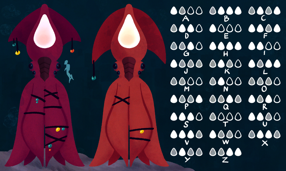
Leviathans are the dominant intelligent species living on Europa. They are the largest members of the class Multibracchia, growing up to be around 15m tall. Their last common ancestor with other members of their class was around 10 million years ago, from which point they evolved away from being free-swimming, instead using their two front tentacles to traverse the ocean floor, leaving the other four free for the usage of tools.
Their beak has moved from the centre of their tentacles, to the front of their head, giving them a forward-facing appearance similar to us humans. The fins on the side of their head serve no purpose anymore, though the size and shape hints at the origin of the Leviathan; longer ones indicating someone from abyssal regions, shorter ones indicating at someone from mid-level regions. Their skin tones range from shades of orange to red, which seems to hinge on the depths they settle in and less so actual genetics. Leviathans have a very complex system of language – using bioluminescent signals made with the spot atop their heads to communicate. Brightness, duration (not only of the signal itself, but also its brightening and fading) and fluctuation play into it.
They have settlements all across the mid-level oceans of Europa, built on the foot of large-scale vents where rich ecosystems have been established. Here they have built a form of agriculture; farming Iron Jaws, the much larger relative of the Iron Beak (and comparable to the Giant Clam on Earth). They also keep livestock in the form of Sea Maids; a domesticated form of the Sea Nymphs – this sub-species has completely atrophied fins and is much to heavy and slow to re-enter the wilderness, however. Leviathans also spread out to the cliffs bordering on the abyssal depths, where they hunt Shell-Breakers and other large Cancernatans in so called “hunting villages”.
As it seems they’re still in the early stages of civilization. Though it is unknown to which degree they will be able to develop technology, given that their circumstances are very different to ours as they are confined to the depths of the ocean.
Decomposers
Though the Depth Strider may look very imposing – being about the size of an adult human man – this member of the order of Reptator acts mostly as a scavenger, eating dead and decaying soft-bodied organism they find in shallow to mid-level oceans. On occasion they are also known to eat slow-or unmovingLaminaferrealike Iron Beaks; sticking their long arms into the stone cracks, where they reside in and prying open their shells. Some sub-species have also evolved to eat Floaters, who they catch by climbing up the vents and grabbing them out of the water.
Boneyard Crabs are part of the Armaturatus phylum, distantly related to the White Bristle Crab. They evolved away from being filter feeders, instead turning into scavengers that can be found on the abyssal ocean floor. They feed on the bodies of all matter of large marine animals; from Sea Nymphs to Black Phantoms. They play a valuable role in the ecosystem by preventing the accumulation of decaying matter – they are considered the clean-up crew of Europa’s oceans.
Once a body sinks all the way to the bottom they show up in droves, often hundreds of them crawl out from all sorts of caves and crevices and pick skeletons and exoskeletons completely clean with their two sets of pincers.
Last time I showed my concepts for Producers and Primary Consumers in the oceans of Europa, today we move on the Secondary and Tertiary Consumers.
Secondary Consumers
Volcanic Slugs are part of the same phylum as Iron Beaks, the Laminaferrea, though they belong to a wholly different class – the Saxumlucidum, a strange case of convergent evolution leading to class of animals similar to gastropods on Earth. Though unlike the gastropods we are familiar with they have developed a kind of scales on their back. It’s not clear yet what the purpose of these is, though it might be a way to protect themselves from other members of their species, as they often show cannibalistic tendencies.
Volcanic Slugs are commonly found in the shallow zones, though there are around 2.000 species we know of so far that can be found even in depths of around 70km. Volcanic Slugs are exclusively carnivores mainly predating on Antennae Trees, whose chemical-laden bodies they are not only able to process, but also turn into a strong toxin that deters predators. This might also be the reason for their bright colour.
The Pipe Cleaner Crab is another member of the Reptator order and has evolved to be monophagous, meaning they exclusively eat one type of prey. As the name might suggest, this prey is the Pipe Worm. The Pipe Cleaner Crab will crawl up their shell-structures and shove their heads into the openings. With their long, barbed tongue they will impale the worm and pull it out in pieces to be devoured. Due to their rapid metabolism, they spend a majority of their time eating, devouring about 40%-50% of their own body weight each day.
Sea Nymphs are part of the Cancernatans order, which represents members of the Armaturatus phylum that have evolved away from being ground-dwellers and instead developed their appendages into fins, allowing them to swim in the open ocean. Sea Nymphs grow to be around 1.7m, and predate on any Armaturatus, that’s small enough to fit into their claws. These claws have a very similar shape to a crab cracker tool and serve the same purpose – crushing their prey’s shell so they can get to its soft insides.
Sea Nymphs can be found anywhere in shallow to mid-level oceans. Though they are technically free-swimming, they live very close to the ocean floor and will crawl around quite frequently given that their legs haven’t atrophied as is very common for other members of their order.
Tertiary Consumers
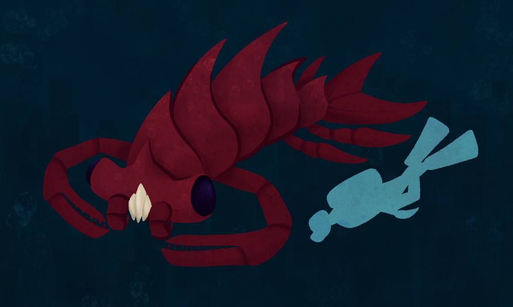
Shell-Breakers are one of the most feared predators in the oceans of Europa. They’re the largest member of the Cancernatans order, growing up to be around 2.8m long. They’re pursuit predators and hunt solitary – they usually prey on Sea Nymphs and other large members of the Armaturatus phylum that they hunt down to exhaustion. They have articulated “fangs” that allow them to not only capture their prey, but also crush it apart in order to get through its shell.
Shell-Breakers reach burst speeds up to 55 -58km/h and never stop moving, even if they sleep. Instead they enter a state of unihemispheric slow-wave sleep, where only one half of their brain rests at a time. This evolved as a way to protect them from predators, as well as allow them to travel great distances to hunt food, given the steady diet needed to support their large size. They live primarily in mid-level oceans, though they often need to travel deeper due to competition for food with other members of their species.
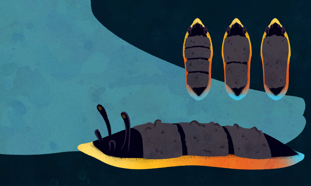
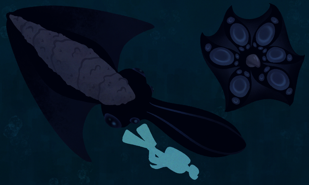
Black Phantoms are the second largest members of the phylum Laminaferrea, class Multibracchia, growing up to around 5.7m. Multibracchia are a squid-like group of animals. They commonly have six arms, though these aren’t slender and pointy like tentacles but rather spoon-shaped with suckers only in the middle of them.
Black Phantoms have webbing between their arms, resembling a cloak, that they use to rapidly engulf their prey and thus stun it before it realizes what’s happened to them. The plating on their heads is a left-over from their common ancestor with other Laminaferrea, though it does seem to play a part in territorial disputes, being used to bash against each other in order to show dominance. The “wings” on the sides of their head are used for locomotion by being flapped up and down, allowing them to reach speeds of up to 15km/h. While Black Phantoms might not be the fastest, they are highly intelligent – frequently employing ambush tactics in order to capture their prey, blending in with the darkness of the abyssal oceans that they reside in. They often lie in wait for hours in order to catch their prey, these being primarily Shell-Breakers, but also most other large marine animals.
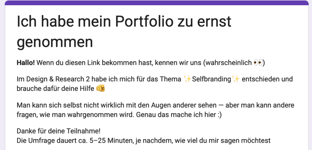
In meiner weiteren Auseinandersetzung mit Selfbranding habe ich eine Umfrage entwickelt, um meine eigene Wahrnehmung von außen zu ergänzen und zu hinterfragen.
Die bisherigen Beiträge haben bereits gezeigt, dass Selfbranding nicht nur eine visuelle Entscheidung ist, sondern stark davon abhängt, wie andere eine Person lesen und interpretieren. Genau an diesem Punkt setzt die Umfrage an.
Selbstwahrnehmung ist immer gefiltert. Man sieht die eigene Arbeit, die eigene Persönlichkeit und den eigenen Stil aus einer sehr persönlichen Perspektive. Genau deshalb wollte ich bewusst eine Außenperspektive einholen: Wie sehen mich Menschen, die mich kennen – und welche Assoziationen entstehen dabei?
Die Umfrage ist so aufgebaut, dass sie verschiedene Ebenen der Wahrnehmung abfragt: Zum einen geht es um den Kontext der Beziehung – also wie und in welchem Umfeld man mich kennt. Zum anderen um die emotionale Wirkung: Welche Gefühle verbinden Menschen mit mir oder meiner Arbeit?
Außerdem interessiert mich die Frage nach meiner kreativen Positionierung: Wirke ich eher wie eine Designerin oder eine Künstlerin? Welche visuelle Sprache wird mir zugeschrieben? Und sogar so konkrete Dinge wie Typografie oder die Form meines Namens können Hinweise darauf geben, wie Identität visuell und sprachlich gelesen wird.
Mein Ziel ist es, aus diesen Antworten ein besseres Verständnis für meine eigene Position im Designkontext zu entwickeln. Nicht im Sinne einer festen „Marke“, sondern eher als ein offenes Bild davon, wie ich bereits wahrgenommen werde – und wie sich das mit meiner eigenen Selbstwahrnehmung überschneidet oder unterscheidet.
Die Umfrage dauert ungefähr 5–25 Minuten, je nachdem, wie ausführlich die Antworten sind. Jede Teilnahme hilft mir sehr bei meinem Projekt.
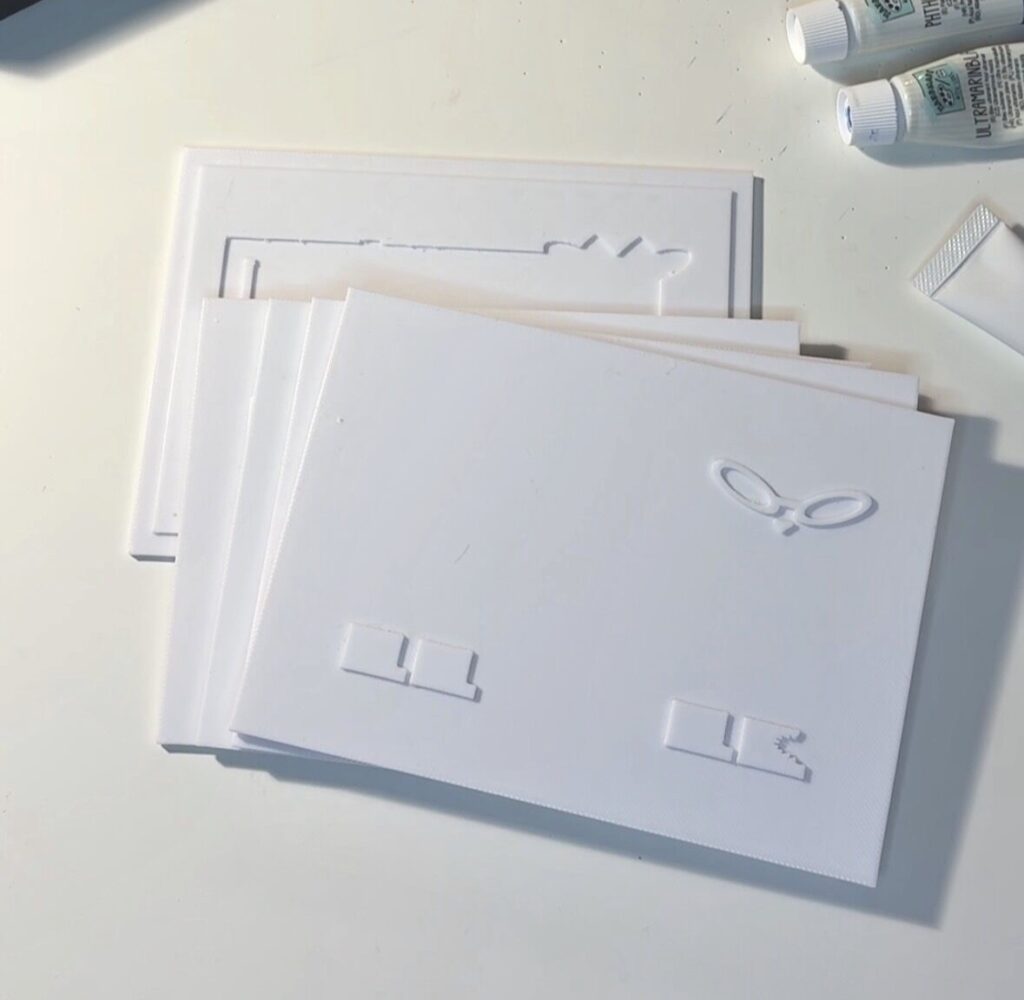
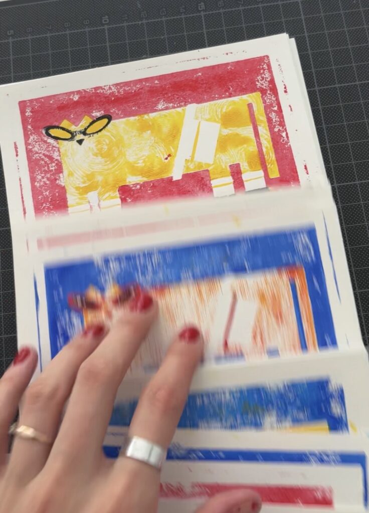
Da mir im letzten Beitrag klar geworden ist, dass viele meiner Arbeiten auf analogen Prozessen basieren und mir das sehr viel Spaß macht, möchte ich versuchen, mein Self-Branding darauf aufzubauen. Mein Ziel ist es, eine analoge Technik zu finden, die ich in Zukunft sowohl digital (Website, Social Media) als auch analog (Visitenkarten etc.) verwenden kann.
In diesem Beitrag erzähle ich über die erste Technik, die ich ausprobiert habe: 3D-Linoldruck. Was ist das eigentlich? Das Prinzip der Erstellung des finalen Bildes ist ähnlich wie beim echten Linoldruck: Man hat mehrere Farben, also mehrere Druckplatten, und druckt sie nacheinander übereinander.
Der Unterschied ist aber, dass ich nicht mit echtem Linol gearbeitet habe, sondern die Druckplatten digital erstellt und anschließend als 3D-Objekte produziert habe. Dadurch entsteht eine Mischung aus analogem Look und digitalem Prozess — genau diese Kombination finde ich gerade besonders spannend.
Was mir daran gefällt, ist, dass die Ergebnisse nicht perfekt aussehen. Kleine Verschiebungen, sichtbare Strukturen und Fehler machen das Ganze menschlicher. Gerade in einer Zeit, in der so viele Designs sehr glatt und KI-generiert wirken, fühle ich mich mehr zu solchen unperfekten und greifbaren Prozessen hingezogen.
Screenshot
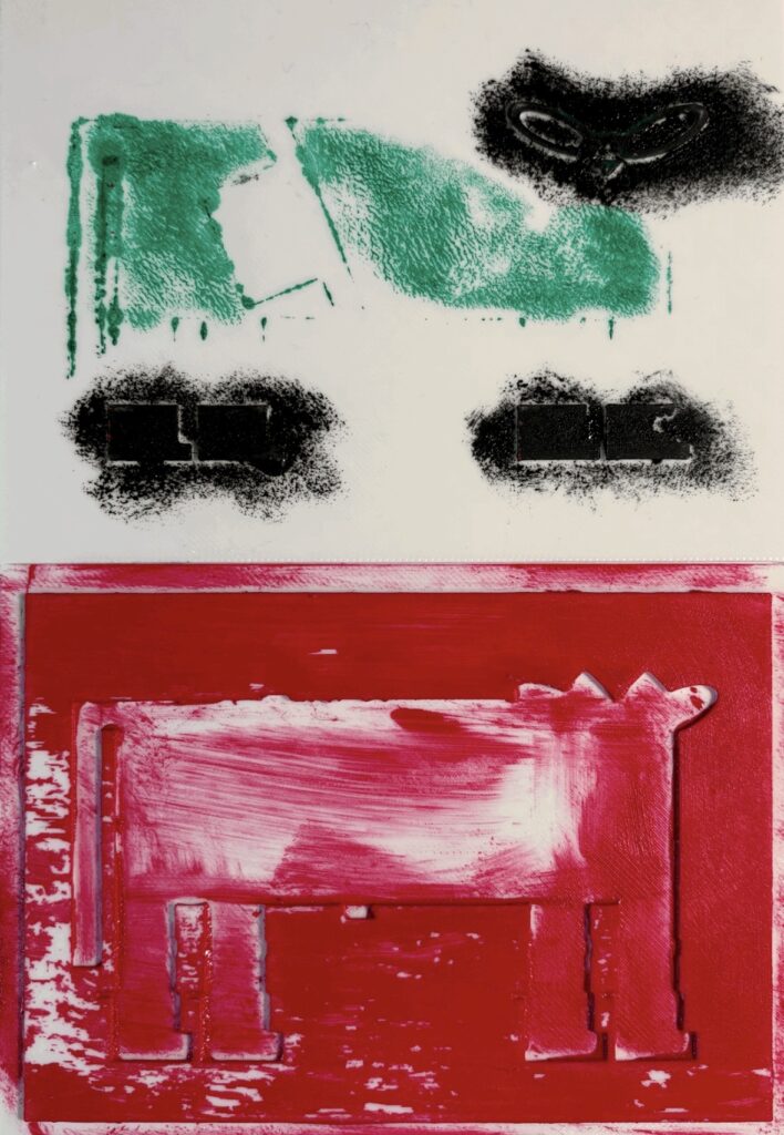
+ Mir gefällt diese Technik, weil man im Vergleich zum klassischen Linoldruck viel mehr Spielraum mit Texturen hat.
+ Außerdem kann man Acrylfarben verwenden, was diese Technik für mich einfacher und günstiger macht.
– Im Vergleich zum traditionellen Linoldruck steckt allerdings weniger Handarbeit darin, weil die Platten nicht per Hand ausgeschnitten werden. Trotzdem mag ich gerade diese Mischung aus digitalem und analogem Prozess sehr.
Für das Fanzine-Festival habe ich bereits Postkarten in diesem Stil produziert und bin gespannt, welches Feedback ich dazu bekommen werde!