01. Smart Plant Care: Concept and Low-Fi Prototyping

Introduction

What if plants could communicate their needs in a simple and intuitive way?

This project explores how design can make plant care easier and more engaging through interactive sesnsors. Instead of checking apps or guessing, the idea is to create a product that gives immediate feedback, helping users understand their plants at a glance.

In the next blog posts, the different steps of prototyping and developing this plant care product will be presented.

Concept

The aim is to transform sensor data into an intuitive visual feedback that could easily communicate the health condition of a plant within a domestic environment.

Technology and Interaction Exploration

The core of the concept is the use of moisture sensors to continuously monitor the soil’s hydration level. The collected data Different technologies are considered and tested to find the most effective solution. The collected data is then transmitted to an LED indicator, which changes color according to the soil moisture level. These include:

  • Arduino for system control
  • Soil moisture sensors
  • LED lights to display feedback through color

LO-FI Prototyping

To visualize and explore the concept, three different low-fidelity prototypes were initially developed.

First prototype:
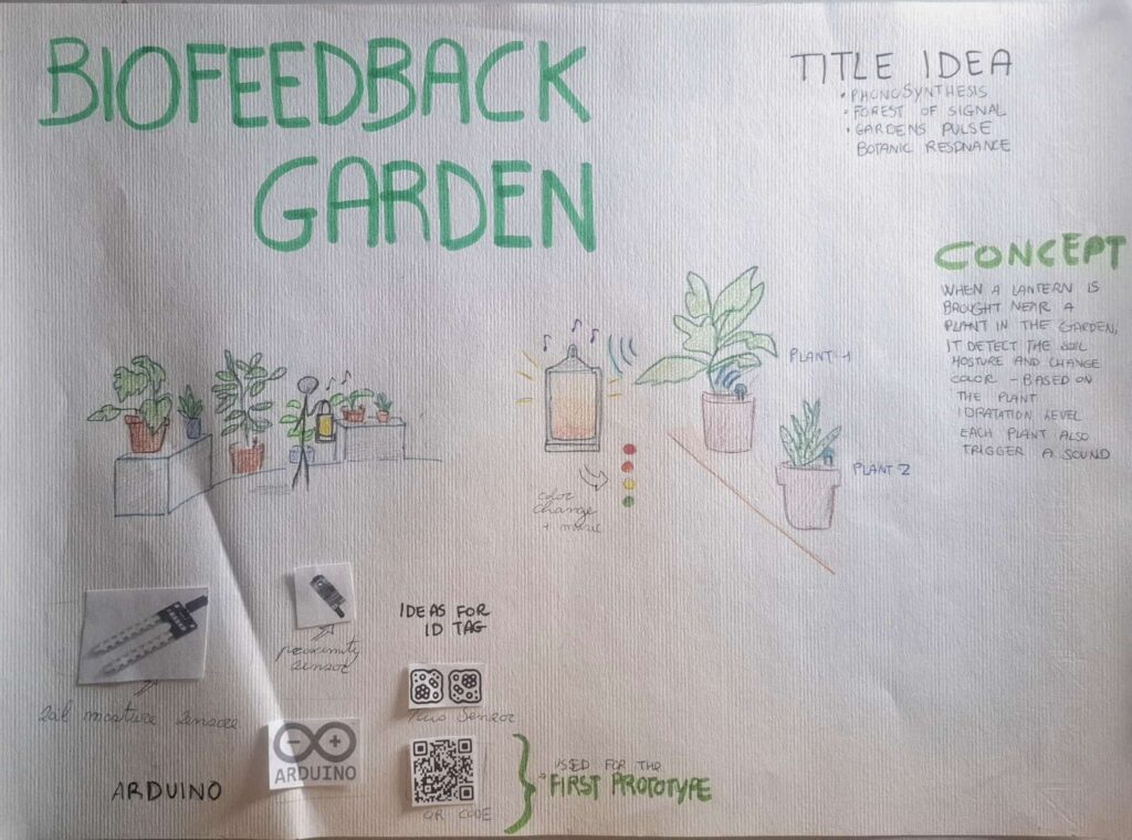
The first prototype consisted of an infographic that illustrated how the system works, and a visual will be included to support it. In the poster, the provisional title “Biofeedback Garden” was introduced, together with alternative name ideas and sketches that show how the interaction takes place.

Second prototype:

The design of the product was explored.
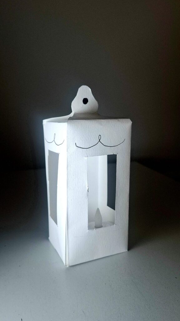
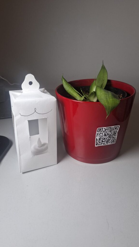
The idea is to give it the shape of a lantern, with LED lights inside that can change color. The form should feel soft and suitable for an indoor environment.

Third prototype:

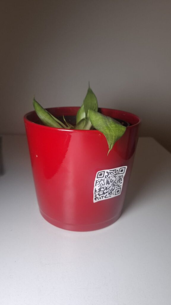
A digital simulation was created using a QR code placed on a plant.
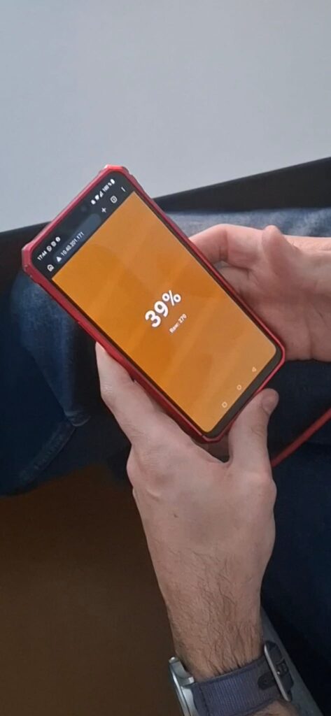
When the QR code is scanned, a website opens showing the hydration level as a percentage. The background color changes to simulate the light of the product.


Insights from User Testing

Some important insights emerged from a class test.

  • The website should not only show a percentage value, but also explain what the value means. The interface needs to be clearer and more direct.
  • It also became clear that using a phone is not the best solution. At home, people often want a break from technology. A physical, non-digital object is more appropriate for this context.

Finally, the color system needs improvement.
The initial idea was:

  • Green = well hydrated
  • Yellow = medium
  • Red = needs water

However, this feels too similar to a traffic light. For indoor use, a softer and more “cozy” color palette would be more suitable. One possible solution is to allow users to choose their preferred colors.
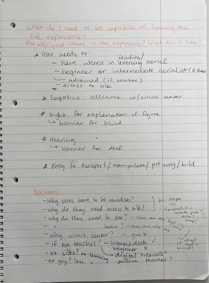
Accessibility requirements and barriers – Aerial silk teaching tool 

The following is a representation of the accessibility requirements and barriers of my prototype. 

Own image. 

The most interesting insight to come out of this exercise was the question: “does it have to be for aerial?” When thinking about this for the first time, my answer was “yes of course, that’s what my topic is about and the limit of the scope.” However, after thinking about the question a second time, and narrowing down my product from “any tool” to specifically “the third prototype (named ‘little guy’) I made”, I realized that while yes, my tool couldn’t be used for running or swimming or the like, but why not make additional attachments (instead of the external mini-silks) to represent other apparatuses, like floor pole, aerial pole, aerial hoop, trapeze, rope, hammock, straps, or similar apparatus. 

— 

Source: 

Own ideation 

Change and impact – Aerial silk teaching tool 

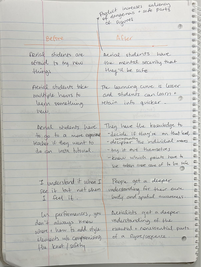
The following is a representation of the change and impact of my prototype. 

Own image. 

As mentioned before, my tool is designed to help in the understanding of figures, but it also has the added benefit of increasing the visibility of how small changes in body position can lead to different outcomes, for example (but hopefully not) falling.  

A specifically interesting part of this diagram is the 4th “before” statement, which is a direct quote from one of my aerial classmates who was a beginner in silks (but has the physical strength because of pole dance and acrobatics). “I understand it when I see it but not when I feel it,” she said once. I will know my tool succeeded if this statement is uttered less (or hopefully not at all) by students learning new tricks on the silk. 

— 

Source: 

Own ideation 

System Map – Aerial silk teaching tool 

The following is a representation of the system map of my prototype. 

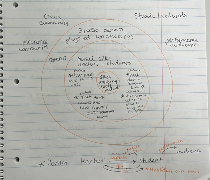
Own image. 

My tool is specifically designed to help in the teaching of proprioception in the area of aerial silks, and as such the directly impacted people are the aerial silks students (who want to make sure a figure is safe, who don’t understand immediately the new figures, and who don’t know their left from their right) and the teacher (who are not able to stay all day on top of the silk, and who would like to make the teaching process easier). The main communication happens between these 2 actors, as depicted on the lower part of the diagram, where the teacher explains and then subsequently answers any questions the student might have. 

Another aspect to this diagram can be seen in the safety aspect, as parents of students would feel better knowing their children are safe in class and being taken care of, and as such insurance companies or hospitals would not have to be called for any injuries (as I had to do just 2 months ago because of a miscommunication between the aerial teacher and me, the student).  

Plus, a third aspect can be seen in the fact that after learning a figure, aerialists can also figure out how to communicate artistic value to an audience through their performance. This aspect is furthered explored in the next post. 

— 

Source: 

Own ideation 

#2. NIME Article Review – SALTO: A System for Musical Expression in the Aerial Arts

This article presented a novel approach to sound integration in the aerial arts through SALTO (Sonic Aerialist eLecTrOacoustic system), a MaxMSP-based system that translates movement data from the Myo Armband sent via Bluetooth and OSC [1]. Christiana Rose, the author of the paper, worked with Katharine Geber, an aerial artist and choreographer, and together they created a hybrid visual and sound piece called “Splinter” as a proof of concept of SALTO [1]. 

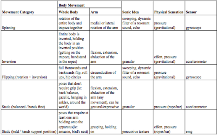
Rose uses the MAX objects of click~ (an impulse generator), a resonant filter, and a spectral delay to translate emg signals into short percussion sounds. She also uses the accelerometer values to control the MAX grainstretch~ object’s grain size, speed, and pitch. Furthermore, she uses iosc~ and cascade~ MAX objects to sonify the gyroscope data, which controls the frequency and gain of recordings loaded into the oscillator bank. 

What’s interesting about this article, in the technical sense, is that both the aerialist and the author worked together in mapping each arm movement (medial or lateral rotation; flextion, extension, and abduction; circumduction; and grasping or holding on) into a different sonic idea, as shown in the table below [1]. 

What’s interesting about this article, in the conceptual sense and relating to my own topic of investigation, is how they were able to translate internal bodily sensations into sound, so that the audience could get a modicum of understanding what it feels like to be up on the apparatus (in the paper’s case, trapeze) [1]. 

Rose even states that “An aerialist’s perception of sound during performance is unique in the way it is filtered by the body. (…) Often viewers have limited, if any, embodied idea of this kinesonic experience. Geber and I aimed to blend movement and music using the internal kinesonic experience of the performer to sonify those elements.” [1]. 

My specific area of research aims to do just that, figure out how to communicate the tacit knowledge of a performer’s physical bodily experience on the aerial silk. However, the SALTO tool proposed by Rose is limited in its scope as it was specifically designed for the trapeze and, not only that, but for this specific performance with this specific aerialist. SALTO might be a useful tool for capturing the audience’s interest, but I believe that, rather than being a potential solution to my research question, it is a valuable proof of concept showing how to implement an auditory interface into aerial dance. 

— 

Source: 

[1] C. Rose, “SALTO: A System for Musical Expression in the Aerial Arts,” Proceedings of the International Conference on New Interfaces for Musical Expression, pp. 302-306, 2017, doi: 10.5281/zenodo.1176260 

Blog Post 1: Prototyping

Prototyping is an important step in the design and development process. A prototype can be described as an early sample, model, or version of a product that is built in order to test a concept or process. It is typically used to validate a product’s design and functionality and to gather feedback from potential users before investing in mass production. In addition, prototypes help define the specifications and requirements for the final product (Arena, 2026). Because of this, prototyping often serves as a valuable starting point for projects that aim to create digital or physical products.

Within the field of design, prototypes are commonly categorized into three different stages: low, medium, and high fidelity. In this context, the term fidelity refers to the level of detail, accuracy, and realism of a prototype in comparison to the final product (Sorodoc, 2025). A low-fidelity prototype is intended to provide a rough representation of an idea and to communicate the basic concept of a product. These prototypes are usually simple, inexpensive, and quick to produce, which allows designers to visualize ideas and gather early feedback without the risk of significant costs.

Medium-fidelity prototypes contain more accurate and detailed elements and begin to demonstrate specific functions and interactions. At this stage, the prototype offers a clearer impression of how the product might look and behave, making it suitable for more structured user testing and feedback.

High-fidelity prototypes represent the stage closest to the final product. They contain a high level of visual detail and interactive elements and allow realistic testing before final production decisions are made. Due to their complexity, these prototypes typically require the greatest investment of time and resources.

The current research project focuses on user experience design at German train stations and investigates how the experience on train platforms could be improved for passengers. After examining the theoretical background of this topic over the past six months and building a solid foundation of knowledge about the relevant parameters, design considerations, and possible approaches, it is now a logical next step to move toward more practical exploration. Prototyping offers the opportunity to translate theoretical insights into tangible experiments and to explore how the project’s ideas could be implemented in practice.

Low fidelity prototype

To explore this practical dimension, three different low-fidelity prototypes were conceptualized and developed. Each prototype approaches the same problem from a slightly different perspective while using different materials and forms of interaction. The first prototype was created as a paper prototype, which is a simple yet effective method for developing an early representation of an idea using inexpensive and easily accessible materials. Paper prototyping allows designers to test concepts quickly and to discard or modify them easily while still gathering useful insights and feedback (msg, 2026). For this prototype, a sketch of a train platform was created to represent the situation of a train arriving at a station. Participants were asked to place circles representing different passenger groups on the platform drawing. The task was to indicate where they believed these users would position themselves in order to board the train. This exercise aims to identify whether there are recognizable patterns in passenger placement and whether the current signage and orientation systems on train platforms provide enough information for users to intuitively position themselves.

The second prototype also uses paper as the main material but aims to create a more interactive and flexible representation of the scenario. In this version, a simple model of a train platform was built that includes small figures representing passengers. Participants can move these figures around the platform in order to simulate their behavior when a train arrives. Similar to the first prototype, the central question concerns the positioning of passengers and the information they might need to find an optimal location for boarding. After completing the task, participants are invited to draw directly on the prototype to indicate where additional signage, markings, or guidance systems could improve the clarity and usability of the platform. This approach allows users not only to demonstrate their behavior but also to actively propose potential design improvements.

The third low-fidelity prototype explores a digital approach instead of a physical one. For this prototype, the collaborative digital workspace Miro was used. Miro functions as an online whiteboard that allows multiple users to interact with visual elements in a shared digital environment (Miro, 2026). Within this digital workspace, a simplified representation of a train platform was created. Participants join the Miro board and are asked to place themselves within the platform layout in the position where they would choose to wait for an approaching train. After this initial round, participants are allowed to add visual guidance elements such as lines, colors, signs, or other indicators that they believe would help clarify where passengers should stand. Once these elements have been added, the task is repeated so that the results can be compared, and it can be observed whether the additional guidance elements improve user behavior and decision-making.

Those three prototype will be tested and the results and observations will be evaluated to see whether one of the approaches could be beneficial and whether one of the prototypes has the potential for further improvement.

Information gathered

Exploring these different prototyping approaches has provided a deeper understanding of the role prototypes play in the design process. Prototypes are not only useful for testing digital interfaces but can also be applied to spatial and physical interaction scenarios such as those found in public transportation environments. Through the upcoming testing phase, valuable insights are expected to emerge regarding how passengers interpret spatial information on train platforms and which design interventions could help improve clarity and usability. These findings will contribute to the broader investigation of user experience design in railway environments.

Next Steps

The next step in the project will involve testing the three prototypes with participants in order to gather feedback and behavioural observations. The collected information will then be analysed to determine whether one of the approaches proves particularly effective and whether any of the prototypes show potential for further development. Based on the insights gained during this phase, the most promising concept may be refined and further developed into a medium-fidelity prototype that allows for more detailed testing and continued exploration of improved user experience design solutions for train platforms.

Reference

Arena. (2026). What is a Prototype? Von Arena: https://www.arenasolutions.com/resources/glossary/prototype/ abgerufen

Miro. (2026). Von Miro: https://miro.com/de/ abgerufen

msg. (2026). Paper prototype. Von User Experience Methods Catalogue: https://user-experience-methods.com/en/04_design/paper-prototype.html abgerufen

Sorodoc, I. (11. March 2025). Low-Fidelity vs. High-Fidelity Prototyping: Key Differences Explained. Von ProtoPie: https://www.protopie.io/blog/low-fidelity-vs-high-fidelity-prototyping abgerufen

#1. Three prototypes: Solving (or trying to) the communication problem

Last semester, I concluded the blog posts with some insights about what ideas could work for beginners and advanced students. Following up on that, I created my 3 prototypes. 

  1. Hanger silk 

Some aerial knots are easier to explain time and time again when the teacher doesn’t have to continually do them in the air. In my class observations, I’ve noticed that teachers often mimic the movement of legs or feet with their hands, like so: 

Own video. 

In order to improve this communication, I designed a prototype using 2 simple materials I already had at home: a hanger and a scarf. 

Own image. 

Own video. 

With this, I would be able to more clearly explain base knots, by using the smaller silk with my hands. The following is an explanatory video showing how this would work, specifically for demonstrating the difference between a  basic footlock and a dancer’s footlock.  

Own video. 

  1. Neon sleeves 

One of my findings of the past semester’s interviews was that a lot of people weren’t able to very clearly differentiate their right from their left. To solve this problem, I created a prototype using scissors and a 5€ thrifted sport jacket (since all of my old sports clothes are in Mexico, and I didn’t want to cut up one of my newer garments). 

Own image. 

Own video. 

With the sleeves, I would be able to quickly and efficiently demonstrate the core idea that needs to be communicated with figures. This is because, while it is possible to explain figures with left and right, what is actually important in aerial silks figures is if you’re using the same leg and arm or the opposing leg and arm. The following is a use suggestion in order to be able to differentiate sleeved side and normal side. 

Own image. 

  1. Little guy 

Last semester I also talked about having a 3D model of a person as a potential aid in teaching complex figures. A possible solution for a 3D model prototype is using a ready-made doll; however, the options available in thrift stores don’t satisfy the need that they should be articulated and able to bend both arms and legs; plus, new options would be too expensive. As such, I decided to prototype this using wood sticks, UHU Patafix, and some ribbon, all of which I already had in my house. 

Own image. 

Own video. 

Using this model, it’s possible to convey the physical movements needed for a specific figure, without needing to expense so much physical energy. Plus, students are able to see the same knot in different spatial perspective variations, improving their knowledge of the theory behind the knots and making observational learning in the future easier. An added advantage is that it’s easier to convey what effect that small bodily position changes will have on the outcome of a figure, especially as it pertains to safety. In the following example, I demonstrate how bending towards your knees while doing a hip key is the safety lock you need in order to stay in place, while if you stay straight you will fall, just like the little guy. 

Own video. 

– 

Sources: 

Own data. 

NIME Review: Between Garment and Prosthesis: The Design of an E-Textile Musical Interface

Noisy Flesh is compelling precisely because it resists the dominant paradigm of seamless, efficient wearable interaction. Instead of functioning as a “second skin,” the textile becomes an intrusive, body-altering prosthesis that reshapes posture, gesture, and sonic possibility. This shift from integration to transformation is conceptually strong and refreshingly critical.

The decision to employ audification grounds the sonic output in the material behavior of the textile. We do not simply hear mapped gestures. We hear the friction, compression, and instability of conductive threads under strain. This creates a tight perceptual loop between force and sound, reinforcing the sense that the prosthetic extensions are alive and responsive. The weighted extra limbs and collision-based sensors further introduce physical unpredictability, allowing gravity and inertia to participate in the composition. In this way, agency emerges from material dynamics rather than computational complexity.

What stands out most is the deliberate rejection of intuitive control. The interface demands negotiation, asking the performer to invent movement strategies specific to its deformable structure. As a design approach, this is bold and philosophically aligned with embodied and entangled interaction frameworks. At the same time, it raises productive questions about mastery and sustainability in performance: how the performer internalizes, or resists, the prosthesis over time would be an important area for further exploration.

The grotesque, low-frequency sonic aesthetic coherently aligns with the visual metaphor of redundant body parts, yet it also feels intentionally constrained. Expanding the sonic vocabulary in future iterations could deepen the expressive range and complicate audience expectations of what such a body might sound like.

Overall, Noisy Flesh makes a meaningful contribution to sound-centered interaction design by treating the interface not as a transparent tool but as an active, deforming collaborator. It proposes a model of wearable technology that amplifies tension rather than minimizing it, allowing sound to emerge from the friction between body, textile, and resistance.

Ich bin’s wieder! (Part 1)

Im vorherigen Semester habe ich mich bereits theoretisch mit dem Thema Self-Branding im künstlerischen Kontextbeschäftigt. In diesem Semester möchte ich den Fokus auf praktische Experimente legen und untersuchen, wie sich eine künstlerische Identität aktiv entwickeln und kommunizieren lässt.

Der experimentelle Teil meines Projekts besteht aus mehreren Elementen:

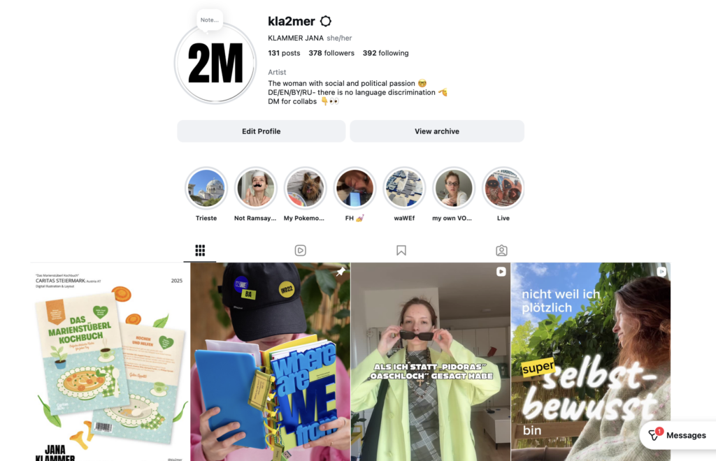
Ein wichtiger Schritt ist die Analyse meines bestehenden Instagram-Accounts. nstagram ist für viele junge Künstler:innen eine der wichtigsten Plattformen, um ihre Arbeiten zu präsentieren, Kontakte zu knüpfen und eine eigene visuelle Identität aufzubauen. Deshalb möchte ich zunächst den aktuellen Stand meines Accounts analysieren.

Dabei werde ich untersuchen, welche Inhalte ich bisher poste, wie sie visuell aufgebaut sind und wie sie von meinem Publikum wahrgenommen werden. Besonders interessieren mich Fragen wie: Welche Beiträge bekommen die meisten Reaktionen? Welche Art von Content funktioniert besser – zum Beispiel fertige Arbeiten, Einblicke in den Prozess oder persönliche Inhalte? Außerdem möchte ich analysieren, wie konsistent meine visuelle Sprache ist und ob mein Profil bereits eine klare künstlerische Identität vermittelt.

Auf Basis dieser Analyse plane ich, verschiedene Content-Formate und Präsentationsweisen auszuprobieren. Das kann zum Beispiel bedeuten, unterschiedliche Arten von Posts zu testen, neue visuelle Strategien zu entwickeln oder stärker Einblicke in meinen kreativen Prozess zu geben. Durch diese Experimente möchte ich beobachten, wie sich meine Online-Präsenz verändert und welche Formen der Darstellung besonders positiv aufgenommen werden.

Zusätzlich möchte ich Gespräche bzw. kleine Interviews mit Menschen führen, die mich aus unterschiedlichen Kontexten kennen. Ziel ist es herauszufinden, wie andere meine Persönlichkeit und meine kreative Arbeit wahrnehmen. Dadurch möchte ich besser verstehen, ob meine Außenwirkung mit meinem eigenen Selbstbild übereinstimmt.

Durch diese Experimente möchte ich untersuchen, wie Self-Branding praktisch funktioniert und welche Strategien jungen Künstler:innen helfen können, ihre Arbeit sichtbarer zu machen.

Ein weiterer Teil des Projekts sind Gespräche mit Menschen aus meinem Umfeld, die mich aus unterschiedlichen Kontexten kennen. Ziel ist es herauszufinden, wie andere meine Persönlichkeit und meine kreative Arbeit wahrnehmen. Dadurch möchte ich besser verstehen, ob meine Außenwirkung mit dem Bild übereinstimmt, das ich selbst von mir habe.

Bis dann 🫲

UPD: Falls DU Gedanken oder Feedback hast, kannst sie gerne in die Kommentare schreiben 🙂 Oder mir auch persönlich sagen, ich freue mich! 🐝

Calm UX in Healthcare

What Designing for Vulnerability Teaches Us About UX Everywhere

In the previous article, I explored how Calm UX becomes essential when digital products start predicting, recommending, and acting on users’ behalf. As systems grow more intelligent and autonomous, clarity, control, and psychological safety are no longer optional—they are prerequisites for trust.

Healthcare takes this one step further.

Healthcare is often treated as a special category in UX design—a domain with its own rules, constraints, and sensitivities. But it is not defined by different principles. It is defined by a different context of use. Healthcare doesn’t require new UX fundamentals; it requires existing ones to perform under pressure.

In healthcare contexts, users are rarely relaxed, curious, or exploratory. They interact with products while anxious, cognitively overloaded, emotionally vulnerable, or afraid of making mistakes. That makes healthcare products a powerful stress test for UX as a discipline.

If an interface fails under these conditions, it doesn’t fail because healthcare is “special.” It fails because the design was never truly calm, clear, or human-centered to begin with.

Healthcare as an Extreme UX Environment

Much of mainstream UX quietly assumes ideal conditions:

  • stable attention
  • emotional neutrality
  • tolerance for exploration
  • low cost of errors

Healthcare strips these assumptions away.

Users engage with health products while processing emotionally charged information, navigating uncertainty and risk, experiencing cognitive fatigue or distress, and fearing irreversible consequences. Under these conditions, even small ambiguities or unnecessary decisions can escalate into anxiety. This reveals a crucial insight:

Many interfaces rely on idealized users. Healthcare reveals real ones.

Calm UX becomes critical here not because healthcare is unique, but because it removes the safety buffer that often hides poor UX elsewhere. When attention is scarce and emotional stakes are high, only designs that genuinely reduce cognitive load and uncertainty can hold up.


Where Healthcare Reveals Broken UX Assumptions

Healthcare UX tends to fail in the same places where mainstream UX quietly struggles—but the consequences are far more visible. Designing for healthcare also means designing for neurodivergence and mental health, which exposes fundamental truths about how people actually interact with systems under strain.

Users with ADHD, anxiety, autism, or depression are more sensitive to cognitive load, less tolerant of ambiguity, more affected by interruptions, and more easily disoriented. These are often treated as edge cases, but they are not. They represent states that all users enter under stress—and healthcare places everyone in that state.

This is where many interfaces break down:

  • alarmist language that escalates uncertainty instead of explaining it
  • silent systems that leave users unsure whether an action succeeded
  • dense information displays that prioritize completeness over comprehension
  • binary outcomes presented without context or confidence framing

Outside healthcare, these issues cause frustration. Inside healthcare, they lead to anxiety, mistrust, and hesitation.

Calm UX reframes these moments by separating information from urgency, acknowledging uncertainty rather than hiding it, layering complexity instead of front-loading it, and reinforcing user agency at every step.

Calm UX as an Opportunity in Healthcare

In healthcare, Calm or Mindful UX is not about “being nice”—it’s about designing with a clear understanding of human limits. This means explicitly considering the user’s emotional and cognitive state: how much attention they can realistically give, how much information they can process, and how uncertainty might amplify fear or hesitation. It also means designing systems that reassure without misleading, guiding users without overwhelming them.

Focusing on Calm UX in healthcare doesn’t just improve health products. Much like accessibility features, it advances UX practice as a whole by grounding design decisions in real human constraints—and by bringing those improvements into everyday products where everyone can benefit.

My Conclusion to Calm UX and Calm Technology

The principles of Calm Technology are not a new discipline, but are already deeply embedded in established UX approaches—across digital and physical product design, and in domains such as healthcare and AI. UX has reached a level of maturity where the focus is no longer only on efficiency or fixing major usability issues, but on consciously considering people and their emotional experience throughout the process. Calm Technology makes this focus explicit, much like accessibility does, reminding us that user-centered design cannot meaningfully exist without these principles.

References:

AI Assistance Disclaimer:

AI tools were used to improve grammar and phrasing. The ideas, examples, and content remain entirely the author’s own.