#1 Erste Überlegung, Stilfindung und Idee

Es folgt ein recht kurzer Blogartikel, in dem ich meine Idee erläutere, sowie meine nächsten Schritte. Es wird noch nix spannendes passieren, doch das Niederschreiben meiner Ideen, soll mir einfach mal dabei helfen, meine Gedanken zu organisieren und mich auf eine konkrete Idee festzulegen. Es folgt: Gedankenchaos.

Ich möchte die Zeit in diesem Semester dafür nutzen, mir weiteres Können rund um 2D Animation anzueignen. Möchte ich in der Wissenschaftskommunikation bleiben, ist das Erstellen von Erklärvideos wichtig für mich zu beherrschen. Wie aus meinen Blogbeiträgen aus dem Vorsemester herauszulesen ist, gehe ich die ganze Sache mit der Darstellung wissenschaftlicher Inhalte unüblich an. Ich will, neben der korrekten Darstellung wissenschaftlicher Informationen, auch einen großen Fokus auf Storytelling und Humor legen. Wie bereits beschrieben sind diese beiden Komponenten entscheidend dafür, dass Inhalte verstanden und sich besser gemerkt werden können.

Was ist nun also mein Ziel für dieses Semester?

Ich werde mich in den nächsten Blogbeiträgen damit beschäftigen ein Erklärvideo-Skript zu verfassen. Ich werde mich in ein Thema einlesen und dazu eine Geschichte schreiben, sowie ein Storyboard und ein Storyboard-Animatic. Und dann beginnt der für mich gruselige Teil: Animieren.

Ich beherrsche ein paar Basics von After Effects. Animate habe ich auch schon mal geöffnet. Ja. Soweit so gut.

Ich werde mich damit auseinandersetzen, mit welchen Programmen ich was am besten animieren kann. Charakteranimation steht auch auf meiner Liste, das würde ich gerne lernen. Sowie das Animieren von Mundbewegungen.

Ein Referenzstil sind die Videos von JaidenAnimations. Jaiden verfolgt dabei zwar keinen Bildungsauftrag, in ihren Videos geht es eher um mehr oder weniger spannende Themen aus ihrem Leben, die sie humorvoll und erzählerisch in ca. 10- bis 15-minütigen Videos aufarbeitet. Dabei geht es oft um Videospiele, sehr häufig um Pokemon. Obwohl das nicht genau zu meinen Interessen zählt, sehe ich mir trotzdem jedes Video an, denn Jaiden trifft genau meinen Humor. Ihre Videos sind sehr fast-paced, ihr Voiceover ist schnell eingesprochen, ist laut, emotional, sehr akzentuiert und on-point. Das sind auch die Gags. In der Animation trifft sie, wie ich finde, den Sweet-Spot zwischen „zu viel Bewegung“ und „zu wenig Bewegung“. Sie animiert, was nötig ist, niemals zu viel.

Ich mag den reduzierten Einsatz von Farben, das lenkt die Aufmerksamkeit auf Wichtiges. In meiner Bachelorarbeit habe ich dies ebenfalls als gezieltes Stilmittel eingesetzt, damals basierend auf den Comixplain-Comics der FH St. Pölten. Auch dort wird Farbe nur reduziert und sehr gezielt eingesetzt, um Wichtiges hervorzuheben.

Ich werde mir also ein Themengebiet auswählen, vermutlich bleibe ich wieder in der Naturwissenschaft, und versuche dann ein Erklärvideo in Jaidens Stil zu entwickeln. Das Nachbauen eines Stils soll mir dabei helfen, erst einmal die Skills zu entwickeln, einen eigenen Stil aufbauen zu können. Vielleicht für mein Masterprojekt.

Und jetzt zum Spaß noch ein Video von JaidenAnimations:

(Schaut es euch an, es ist lustig)
Blog Post 3: Inclusion & Accessibility

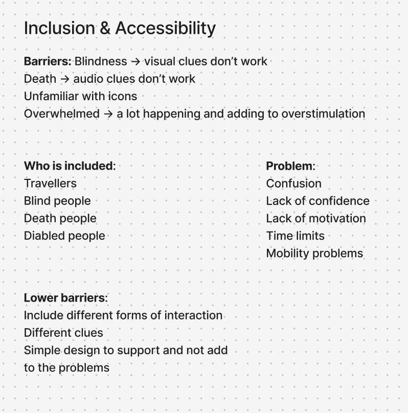
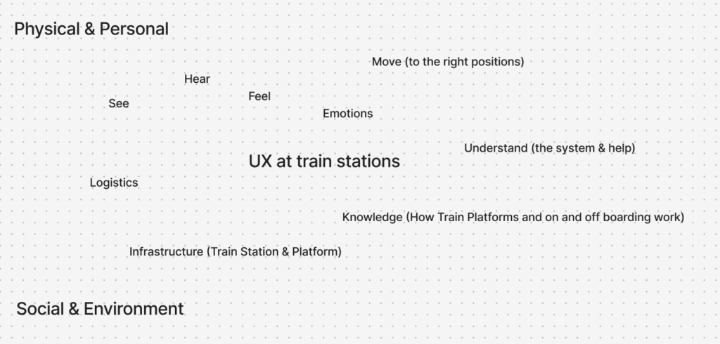
Inclusion and accessibility are essential considerations in contemporary design and innovation. Considering diverse user groups and varying physical and cognitive abilities should not be an afterthought, but rather an integral part of the design process from the very beginning. By doing so, designers can develop solutions that are inclusive by default, rather than needing later adjustments. One useful method to support this approach is the creation of a map that outlines what is required for users to fully experience a product, considering not only personal and physical aspects, but also social and environmental factors. Such a map was developed for this project, which focuses on improving the UX design of German train platforms. It highlights the various conditions that must be met to ensure an optimal and inclusive user experience.

Building on this, a second mapping method was used to specifically analyze inclusion, problems, and barriers. This map takes a closer look at potential obstacles the design might create, identifies which user groups are included or excluded, and explores the problems that arise from these barriers. Most importantly, it also considers possible solutions to reduce or eliminate them. In this project, many of the identified barriers particularly affect people with disabilities or impairments, who may not be able to fully perceive or interact with certain elements of a physical design.

To address this, the goal is to provide multiple ways for users to experience and understand the design, ensuring accessibility for as many people as possible. At the same time, a clear and minimal design approach is prioritized to avoid adding further complexity or confusion to already busy train platform environments.

Overall, inclusion has been explored through these mapping methods as a foundational step in the design process. While further refinement is necessary, this work provides valuable insights into user needs and establishes a strong basis for developing more inclusive solutions moving forward.

#4. User testing – Intermediate level 

Yesterday, I tried out the 3 prototypes with 3 different participants (henceforth referred to as P1, P2, and P3) of intermediate aerial silks level. The following are the findings of the research through design process. 

  1. Hanger silk 

This prototype was not really useful for the intermediate aerialist, since they all have knowledge of the basic knots used in most figures (e.g. footlock, hip key, russian climb, etc.) There was no use case for this object in their case. I tried to use it to teach catcher’s pose to P3, but it didn’t really help. This is because catcher’s pose is not a mentally complex knot, rather a physically complex one. She understood what she had to do, but she mentioned she didn’t have the proper bodily proportions (her arm is not long) to do it properly, nor was she strong enough to hold herself in an inverted position for a long time to try out other solutions. 

However, an interesting finding when talking with P3 is that she uses a longer (3m) piece of old silk to teach these same knots to kids. She explains that while it’s a useful tool for base knots, when it comes to kids, the problem becomes that she doesn’t know how to get them to stop playing with the silk and use it in a serious manner. As such, this made me reformulate my intended audience to exclude kids. This is because kids pose an extra challenge in their interaction with physical objects, and it’s outside of the scope of this investigation, even if I hadn’t explicitly known it before. 

  1. Neon sleeves 

P2 and P3 seemed the most interested in this prototype, since they both mentioned they have trouble remembering to distinguish between left and right, both when watching the teacher and when in the air. P2 mentioned that, when both her and the teacher wore it on the same arm, it made communication easier and faster. Not only could she visibly see the teacher’s colored vs bare arm, but also when there were errors in P2’s attempts, it was easier to identify and correct. It removed the extra layer of thinking for her. P2 noted that it sped up the learning process for her, since she was able to copy the teacher’s moves without too much mental load. Plus, after 2 times practicing the move with the sleeves on, she managed to do the 3rd try all on her own without any mistakes. 

  1. Little guy 

I had high hopes for the little guy, hoping he would be the star of the show. However, when externalizing the internal bodily sensations, little guy proved to be somewhat of a nuisance rather than a help. This doesn’t mean to say that this kind of 3d model is not useful; rather, that the framing of the model was lacking, and the fact that it was a quick-and-dirty prototype made the model itself harder to use in practice.  

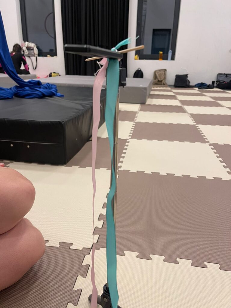
The first problem encountered was the fact that one person can’t manipulate both the little guy and the mini-silks. Luckily, P3 had a camera tripod to lend me, which made the usage of the little guy much easier (a second, smaller learning through this process was the fact that we had to tie the mini-silks to the tripod, as they can’t balance on their own). 

Own image. 

In using the little guy to teach a new sequence to P1, we found that the characteristics of the mini-silk didn’t quite match up with the intended use – the ribbons used in the prototype are much too big (width wise), too short (length wise) and don’t allow for the flowiness that real silks have. This made smaller moves like a footlock harder to display on the little guy, and it made it hard to use as a teaching tool for footlock-based sequences. Another learning was the fact that he’s missing a clearly identifiable front and back, something that both P1 and P3 agreed they would like for him to have.  

P1, a very good aerialist, mentioned she wanted to play around with the little guy and make him do a hip key. Despite being able to do this skill in her sleep, she failed to understand what she was doing wrong that made the little guy unable to hold the hip key in the mini-silks. In reality, what was missing was the fact that even if she knew what to do when she herself was up on the silk, she forgot to fold the little guy inward. This step is critically important – as I showed a few weeks ago in the prototype video, the “lock” on the hip key that makes you not fall is the physical act of folding yourself inward. When I told her what she forgot, she mentioned that she “didn’t want to break the prototype”, which is another piece of evidence supporting the fact that for the little guy to work, his model form must be easy to manipulate and visibly tough. Through this process, however, P1 mentioned that she found it much easier to learn from the little guy when it was not just the teacher showing a figure through him, but when she was actually able to touch and manipulate his figure. 

— 

Sources: 

Own research. 

Blog Post 2: Discovered Change & Impact

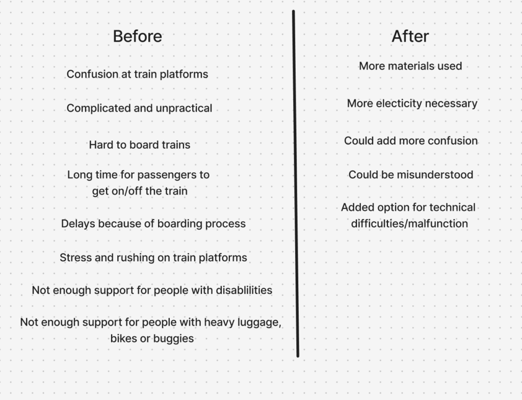
The Change and Impact map I developed is structured around two key perspectives: “Before” and “After.” These two sides represent the situation prior to and following the introduction of the proposed product. This comparative approach is intended not only to highlight the potential improvements the design aims to achieve, but also to critically reflect on any negative consequences or challenges that may arise as a result of its implementation. By placing both aspects side by side, the map encourages a balanced and realistic evaluation of the design intervention.

In my project, the “Before” section focuses on the current issues experienced at German train platforms. These include challenges faced by passengers, such as confusion, lack of orientation, or limited accessibility, as well as difficulties encountered by train conductors and Deutsche Bahn (DB), including time inefficiencies and operational constraints. This side of the map serves as a diagnostic tool, clearly outlining the pain points within the existing system and establishing a foundation for targeted improvements.

The “After” section, in contrast, explores the potential outcomes following the introduction of a physical UX solution at train platforms. It considers possible side effects, including shifts in user behavior, increased reliance on technological systems, additional resource requirements, or the emergence of technical issues. This ensures that the proposal is not viewed in an overly idealistic way, but rather as part of a complex system with both benefits and trade-offs.

When analyzing the map, it becomes evident that the “Before” side contains more negative aspects than the “After” side. This imbalance can be interpreted as a positive indicator, suggesting that the proposed solution has strong potential to improve the current situation.

Overall, the Change and Impact map provides a valuable framework for assessing both the opportunities and limitations of the design, supporting more thoughtful and responsible decision-making.

Blogpost 1: System Map

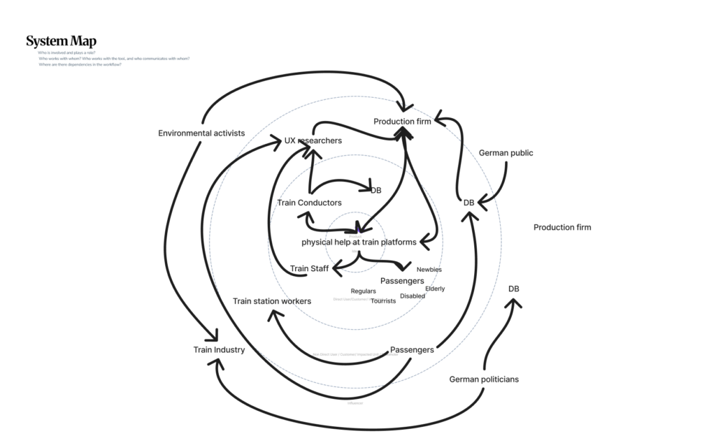
A system map is a visual tool used to understand complex environments by illustrating how different actors, elements, and relationships are connected. Within a research process, it helps designers move beyond isolated touchpoints and instead grasp the bigger picture: how users, organizations, and external influences interact with one another. By mapping these relationships, dependencies and opportunities for improvement become more visible, enabling more informed, holistic, and connected design decisions.

The project I am currently working on focuses on German train stations and explores how physical UX and UI design can improve the user experience on train platforms. At the center of my system map is the intended product: a form of physical assistance at train platforms. This core element is surrounded by the direct users, customers, and those most immediately impacted. In this case, these include train conductors, train staff, Deutsche Bahn (DB), and most importantly, passengers. These passengers represent a diverse group, ranging from regular commuters and tourists to elderly individuals and people with disabilities. Each bringing different needs and challenges to the experience.

Beyond this inner circle are indirect users and stakeholders, such as train station workers, UX researchers, and production teams responsible for developing and implementing solutions. Larger institutional actors, including DB and associated organizations, also play a key role in shaping the system.

The outer layers capture broader societal influences, such as the German public and environmental activists, who indirectly affect priorities and decision-making processes.

The connections between all these actors are visualized through arrows, representing communication and interaction within the system. The density and direction of these connections highlight the dynamic, interconnected, and often circular nature of influence, revealing the complexity of the system as a whole.

Overall, this system map demonstrates that improving a seemingly simple experience requires understanding a complex network of stakeholders, making it a valuable tool for gaining deeper insight and a clearer overview of all relevant factors.

#3. Annotated Bibliography & Reflections on the Topic “Research through Design” 

From the 6 readings we did in class, 4 stood out to me as really insightful food for thought regarding my own research project about aerial silks. 

[1]’s main argument is that the goal of research through design is not to make a single artefact; rather, the goal is to generate new knowledge and understanding. This is especially relevant to my topic in the sense that it helped me to redirect my focus and let go of the erroneous idea that everything has to be perfect. 

[1] also defines language as “all means of communications [sic] (oral or not) and terms used by a professional community”. This is definitely one of the quotes that I would like to include in my thesis, as it directly relates to my topic – teaching aerial silks is, at its core, a language and communication problem. 

[2]’s main argument is that the scientific approach to experiments and irrefutable statements are directly in conflict with research through design; rather, these generalizations should be used for inspiration, not as definite facts. Similarly to [1], this article helped me reframe my thought process and let go of the hard grasp on scientific rigidity that my previous studies had instilled in me. 

[3]’s main objective was to present the different schools of thought regarding research through design. When talking about knowledge, [3] defines and differentiates tacit vs explicit knowledge. Tacit knowledge, according to [3], “cannot be communicated by mere words. Material artifacts and experiences are deemed to be part of this communicating.” This is also relevant to my own research due to the fact that proprioception and body awareness can be deemed tacit knowledge – how do you communicate how your body feels? How do you communicate what your muscles are doing? Furthermore, I expand on this point to ask, how do you even know what your muscles are doing? With my thesis, I aim to answer these questions with research through design in the context of aerial silks.  

“Ingold (2013) explains the distinction of tacit knowledge as a difference between knowing and telling, describing how a maker’s ways of knowing and doing are told ‘by hand’. The artifacts, especially prototypes, are said to be carriers of such knowledge. Aligned with this position, some state that the prototype itself is the knowledge, but few will agree that ‘this apple’ by itself will be able to tell that it is ‘a body’. Such a framing has to be added explicitly.” – Extract from [3] 

Finally, [4] shows a practical example as to how to actually apply research through design in a real-life project. In their case, they used a physical abstraction to represent the internal bodily process of digestion, which is very similar to what I aim to achieve in my project. However, [4] rightfully states that “When we use abstractions, we hide the complexity of the actual processes and introduce new complexity. Hence, abstraction creates a challenge that users may not understand what each module represents for the first couple of interactions. However, previous works suggest that understanding of abstract physical visualisations improve over time.” This is a very important thing to keep in mind for me, since the abstract nature of my prototypes may (and has, as I will write about in the next blog post) introduce a second kind of complexity in the fact that users have to externalize their internal tacit knowledge. 

— 

Sources: 

[1] D. Godin and M. Zahedi, “Aspects of Research through Design: A Literature Review,” Design’s Big Debates – DRS International Conference, 2014, doi:10.21606/drs.2014.85. 

[2] W. Gaver, “What should we expect from research through design?,” Conference on Human Factors in Computing Systems – Proceedings, pp. 937 – 946, doi:10.1145/2207676.2208538. 

[3] P. Stappers. and E. Giaccardi, “Research through Design” IxDF – Interaction Design Foundation. https://ixdf.org/literature/book/the-encyclopedia-of-human-computer-interaction-2nd-ed/research-through-design (accessed Mar. 19, 2026). 

[4] R. A. Khot, J. Ng, and D. Aggarwal, “Crafting Tangible Interfaces for Human Digestion: Unpacking the Research through Design Prototyping Journey”, Proceedings of the Sixteenth International Conference on Tangible, Embedded, and Embodied Interaction, pp. 1 – 15, doi:10.1145/3490149.3502252. 

★3 Design Research – From Project to Product

Accessibility Requirements & Barriers

In the end, I also thought about the potential barriers of my tool or method. Since it is designed as a learning tool, users would need to be able to rely on at least one sense, such as hearing or seeing, to interact with it. At the same time, current developments show that accessibility is still not fully considered in many digital tools, which can create additional challenges.

To address this, I plan to base my approach on the strategies of the W3C Accessibility Guidelines, ensuring that the tool or method is as inclusive and accessible as possible.

Accessibility and Inclusion – Interactive Plant Care System

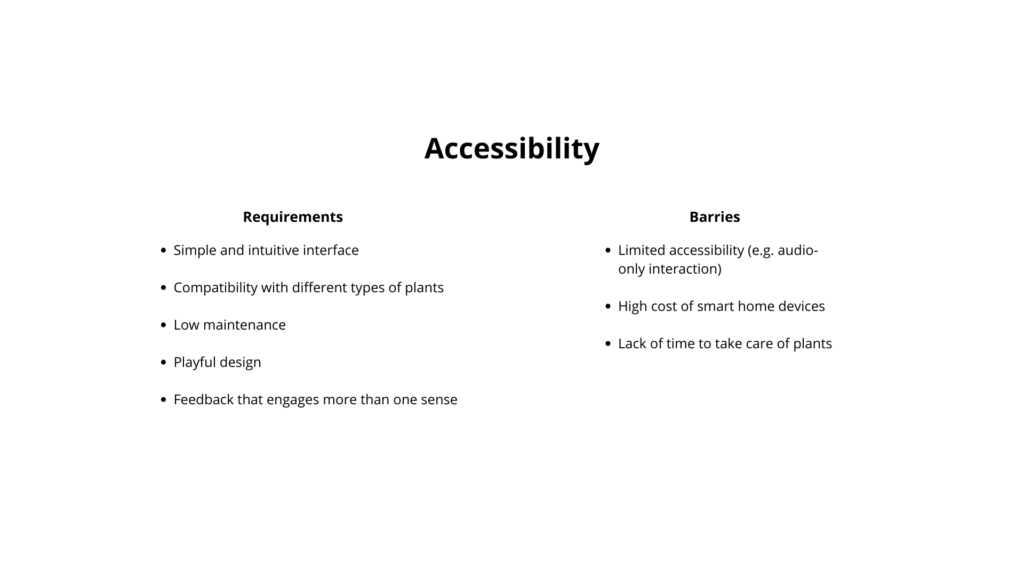
The accessibility analysis focuses on both requirements and possible barriers.

The main requirements include a simple and intuitive interface, so that the product can be used without instructions. It should be compatible with different types of plants and require low maintenance, so it does not add extra effort for the user. A playful design is also important, especially to engage children and make the experience enjoyable. Finally, the feedback should involve more than one sense, combining light and sound to create a clearer and more inclusive interaction.

At the same time, some barriers need to be considered. For example, if the interaction relies too much on sound, it may limit accessibility for some users. Smart home devices can also be expensive, which may reduce accessibility for a wider audience. Another common issue is the lack of time people have to take care of plants.

In coclusion, the product should find a balance between these different needs.

Discovering Change and Impact – Interactive Plant Care System

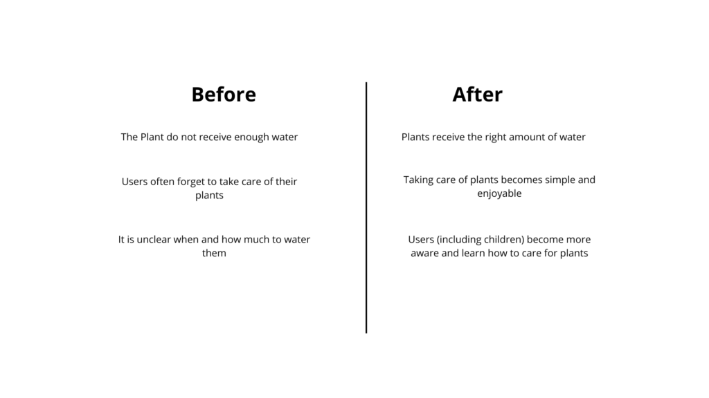
This phase explores the impact of the product by comparing situations before and after its use.

Before using the device, plants often do not receive enough water. After using it, plants receive the right amount of water. Another issue is that users frequently forget to take care of their plants, while with the device, plant care becomes simpler and more enjoyable. Finally, it is often unclear when and how much to water plants, but with the device, users — including children — become more aware and learn how to take care of them.

However, some important considerations emerge. There are many different types of plants, and not all of them need the same amount of water. In some cases, the soil may appear dry, but the plant does not need to be watered yet. For this reason, the system should not give overly simplified feedback, but should consider different plant needs.

It is also important to understand what really motivates people. Users often struggle with consistency and knowledge rather than intention. They may want to take care of plants, but forget or feel unsure about what to do.

The device should therefore not only inform, but also support and encourage users, making plant care feel easy, clear, and rewarding.

System Map – Interactive Plant Care System

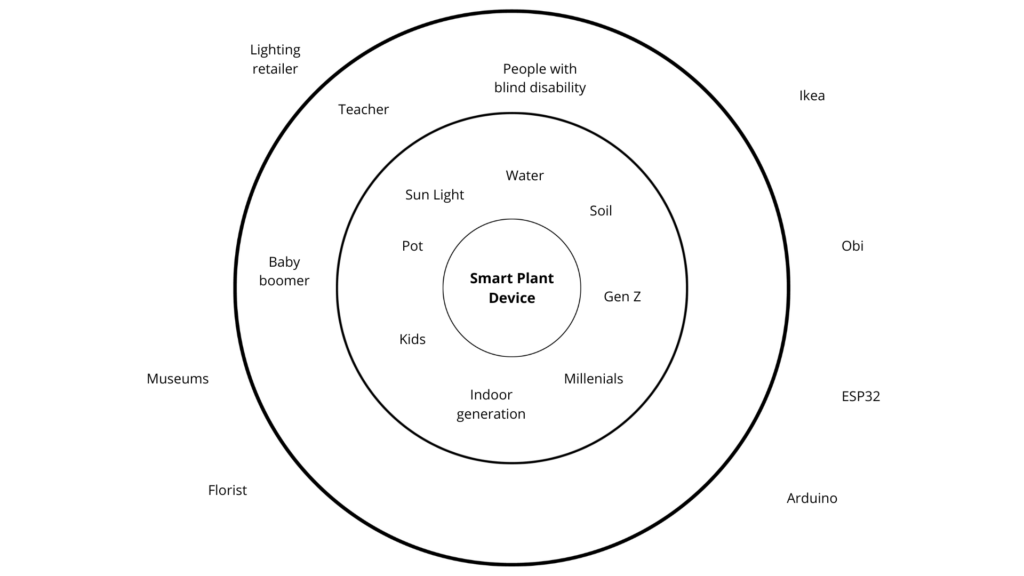
The system map places the product at the center, but expands the perspective to a wider ecosystem. Instead of defining it as a single object, such as a lantern, the project considers a broader category: a smart plant care device. This allows more flexibility in form and use.

Around the product, the first layer includes direct users and elements directly involved in plant care. These are not only people, but also natural agents such as sunlight, soil, and water, which all influence how plants grow. Human users include generations such as Gen Z, millennials, kids, and the “indoor generation,” meaning people who spend most of their time inside and may have less direct contact with nature.

The second layer includes indirect users. These are people who may not use the device directly but are still connected to it. For example, teachers could use it in educational contexts, especially with children. Kids can interact with the device in a playful and learning-oriented way. People with visual impairments are also considered, since the use of sound can support accessibility. Baby boomers, such as parents, might not be the main users but could be interested in the product through their children.

The outer layer includes providers and institutions. These can be stores like IKEA or OBI, which are related to home products, or suppliers of electronic components such as Arduino and ESP32. Florists are also relevant, as well as museums, if the product is used in installations or educational workshops. Shops that sell lighting products are important too, since the device can function both as a practical tool and as a decorative object.