Crossing the Bridges

“Crossing the bridges” can refer to a specific film, a musical album, a metaphor for spiritual or professional journeys, or a proverb about not worrying about future problems. The meaning depends entirely on the context, such as a 1992 drama film, a 2013 film about returning to a village, a 2005 documentary about Istanbul, a musical album, or the idiom “don’t cross that bridge until you come to it”

 My name is Meriç, and I’m a sound designer, music producer, and electronic dance music performer  known as numeric.

 I started making electronic music about eight-ten years ago, and over time it turned into something much deeper a lifelong search for sound, emotion, and space.  

Music and sound have always been central to my life. This passion led me to explore questions like how to create sound and arrange electronic music compositions. This curiosity drove me to research more, investigate deeply, and develop a passion for music and sound. I started my journey as a DJ in 2014, performing at various venues. Through this experience, I realized the need to create compositions that could convey my stories through sound. Over the years, I have immersed myself in music composition and production, constantly striving to enhance my sound and musical quality. I have learned sound design, production, effect techniques, mixing techniques, arranging, and experimented with various hardware/software synths.

My passion for music, especially electronic music composition, led me to pursue a Master’s degree in Music at Istanbul Technical University . During my studies, I honed my skills in sound design, mixing, and mastering techniques, solidifying my desire to build a career in the sound design area. My time at ITU provided a rich exploration of the audio realm. I deepened my understanding of musical structure and harmony through music theory courses and explored sound manipulation through audio programming . I gained insights into contemporary music trends and techniques through my coursework. I also had to meet with great professors, artists and well minded fellow students.And I think most important I discovered how interesting and at the same time beautiful to research what you are passionate about .

 Sound design, for me, is both a craft and an inquiry. I spend countless hours refining my techniques, creating unique pieces and constructing custom systems for performance and media art. This personal research runs parallel to my artistic output, which lies at the intersection of electronic music, experimental audio, and immersive experience.I’m fascinated by how sound behaves in space, how it moves around the listener, and how technology can make those experiences more alive.Studying sound design gives me the tools to connect artistic ideas with technical reality.It helps me understand how sound works, but also how to use it to create emotion, meaning, and atmosphere.In my creative work, sound design is not separate from music Its the biggest part of the music.It’s the texture, the emotion, a tool which shapes a raw material.I see it as a way to build worlds, whether in a live performance, movie, theatre  installation, or interactive setting or advertisement. In the future, I want to continue my journey in sound design on both an academic and an artistic level, developing my practice professionally through research, creative projects, and collaborations.In the next two semesters, I would like to focus on the intersection of creative sound design, spatial audio, and intelligent systems .During my previous master’s studies, I worked on projects related to immersive and 3D sound, and that’s where my real passion for this field began to grow.

That experience deeply shaped my artistic direction and was one of the main reasons I decided to join the Sound Design program at IEM, a place that, in my opinion, holds a tremendous position in the field of immersive sound.

Now, I want to take this interest to a much higher level, both creatively and conceptually.

 In the coming semesters, I plan to explore how immersive sound can be used to create emotionally powerful and spatially engaging experiences, bridging artistic expression and technological research.
Blog Post 3: Physical Environment UX

Physical Environment UX

To better understand the challenge of reimagining user experience design in train stations, I wanted to deepen my explorations in the field of physical user experience design, or PUXD. My first step was to examine the origins of UX as a concept and to consider when humans first started intentionally shaping their environments with the user in mind. One of the earliest documented examples of physical user experience design can be traced back to around 4000 B.C. in China, with the emergence of Feng Shui. This philosophy focuses on the spatial organization of objects to create harmony and an optimal flow of energy within a space (Emily Stevens, 2021). Although Feng Shui differs from modern UX methods, it illustrates that the idea of designing environments to enhance human experience has deep historical roots.

Over time, UX gained increasing recognition and gradually became a fundamental part of daily life, influencing how we interact with products, services, and environments. However, as the world becomes increasingly digital and technology-driven, the design of physical spaces is sometimes overlooked. Despite this shift, PUXD remains crucial for creating memorable, meaningful experiences and for ensuring that the environments we use are intuitive, user-centered, and comfortable (Dengiz, 2024).

This is not just a subjective view but a growing societal and political priority. In June 2025, the European Commission enacted the European Accessibility Act, a comprehensive set of regulations aimed at improving accessibility across the European Union. The Act seeks to remove barriers for businesses, elderly individuals, and people with disabilities. It targets key products and services, including public transportation. According to the Act, environments within the EU must prospectively meet four core requirements: perceivability, operability, understandability, and robustness. Furthermore, it promotes a “design-for-all” approach, calling for physical spaces to be created in ways that make them equally accessible to people with and without disabilities (Huertas, 2024).

This legislative development highlights the importance of projects such as this one. Improving the user experience of train stations is not only an opportunity to enhance comfort and efficiency, but is part of a broader shift toward inclusive, accessible, and human-centered public environments. In this context, rethinking the UX of train stations becomes not just valuable, but necessary for the future.

Information Gathered

Through this week’s research, I gathered an even deeper understanding of User Experience in physical spaces. I also learned more about the currency of the chosen topic and how similar approaches might change our physical space in the near future.

Next Steps

In my next step I will explore the ten usability heuristics by Jakob Nielsen and have a look how they can be applied to the problem at hand. After that I plan on focusing more directly on German train stations and platforms.

References

Coughenour, A. (2025). User Experience in Physical Spaces. Von Orbis Cascade Alliance: https://www.orbiscascade.org/programs/dux/documentation/user-experience-in-physical-spaces/ abgerufen

Dengiz, C. (10. February 2024). The power of Physical User Experience Design (PUXD). Von LinkedIn: https://www.linkedin.com/pulse/power-physical-user-experience-design-puxd-cansu-dengiz-zv9pe/ abgerufen

Emily Stevens. (28. July 2021). The Fascinating History of UX Design: A Definitive Timeline. Von CareerFoundry: https://careerfoundry.com/en/blog/ux-design/the-fascinating-history-of-ux-design-a-definitive-timeline/ abgerufen

Huertas, D. M. (23. October 2024). The European Accessibility Act: an overview what’s changing and for whom. Von PwC Legal Germany: https://legal.pwc.de/en/news/articles/the-european-accessibility-act-an-overview-what-s-changing-and-for-whom abgerufen

Kaarwan, T. (18. June 2025). How Does UI-UX Design Transform User Experience in Physical Spaces. Von Kaarwan: https://www.kaarwan.com/blog/ui-ux-design/ui-ux-design-transform-user-experience-in-physical-spaces?id=541 abgerufen

NSW Government. (2025). Sydney Trains environment and sustainability. Von Transport for NSW: https://www.transport.nsw.gov.au/projects/environment-and-safety/sydney-trains-environment-and-sustainability/why-rail-travel-a abgerufen

Not All Nature Is the Same: Which Forms Truly Support Our Well-Being?

From physiology to psychology, research points to a clear truth: contact with nature restores us in ways no technology can. A recent article in Frontiers in Public Health by a team of researchers, including Stefan Zerbe, Hannah-Lea Schmid, Claudia Hornberg, Julius Freymüller, and Timothy Mc Call highlights the importance of better understanding how nature, with its elements, qualities, and processes, affects human health and well-being. [3]

Saying “nature is good for us” is far too generic. We need to ask ourselves: which nature, at what scale, in what form?

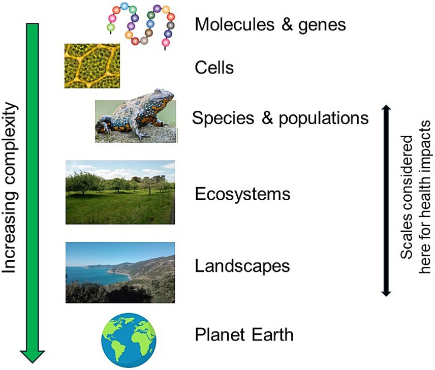
The notion of “scale” here does not refer to the physical size of a space, but to the ecological level at which we observe nature.

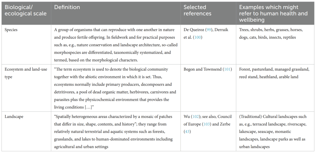
In the study mentioned above, a multidisciplinary team of scholars analyzed primary research, examining key theories, concepts, and nature-based therapeutic approaches. Through iterative discussion, they identified and mapped three distinct scales of nature—species, ecosystems, and landscapes—showing how each of these levels affects human health and offering an overview of the concepts and therapies associated with them.

The results of this research are reported in the table below.

Ecological scales provide a useful way to describe nature in health research, because they help us understand how different levels of natural complexity may influence human well-being in different ways. The authors demonstrate that certain concepts and therapeutic interventions directly correspond to these scales. For example:

  • At the species/individual scale we find interventions such as Animal-Assisted Therapy.
  • At the ecosystem/land-use scale, we encounter Forest Therapy, Green Care, and garden-based therapeutic approaches.
  • At the landscape level, broader conceptual frameworks emerge, including Therapeutic Landscapes, which consider the symbolic, cultural, and spatial dimensions of place.

In the end, nature does not affect us in the same way: its forms, its levels of complexity, and our own individual dispositions shape how we experience it. This variability supports what Zerbe’s team highlights: there is no single, universally beneficial “nature,” but rather a variety of scales and forms.


.

To be Hero X – when art styles are part of the plotline

Through the blog posts there are already examples and reasons for an art style change mentioned. Usually not everything is applied at once. The creators and producers tend to only use an art style change on specially occasions. Reasons can be a flashback or past occurrences, to show the characters thoughts and feelings or to separate spaces and universes. What if all of these possibilities are combined? What if the art style changes themselves are a part of the story themselves?

Arguably in the animated Spiderman movies from Sony the art style changes are a part of the story as well. However, they are only used to show separate spaces or universes.

“To be hero X” is an animated series from bilibili and Aniplex. The premise of the world of “To be hero X” is that everyone can be a hero as long as people believe they can be. The more followers a hero has, the stronger their abilities. The abilities themselves are limited to what their believers think they can do or want them to do. Therefore, the life of a hero in this world is limited to their image. The series has 24 episodes. There is no clear main character, but multiple important characters. Some of them get multiple episodes for their stories others get less.

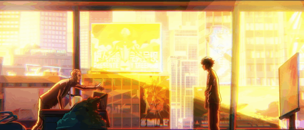
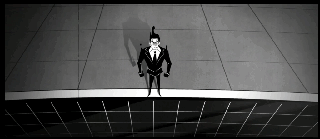
The first episode establishes 3D animation with 2D elements as it’s main art style. This art style remains the dominant one through all of Lin Lings story. Still even the first episode switches between three times between art styles. One switch is for a flashback, another one for a tragic background story of a villain and the last one happens somewhere between reality, a flashback and fantasy.

The second episode includes again multiple style changes. At this point it is clear that each character has a different art style when the viewer dives into their mind or background story, giving the characters another level of personality. All 4 episodes dedicated to Lin Ling stay in a similar fashion.

In episode 5 the main character gets switched to Yang Chen, which at a first watch was slightly confusing, since there was no indication that there would be a new main character now. The art style is in the same 3D animation as before and in flashbacks a change might occur.

With episode 8 however the biggest switch happens. The whole animation style changes to 2D anime animation. During all 3 episodes of Lucky Cyans story there are no art style changes, but also no flashbacks since her whole life is shown. If you follow the story closely the viewers might realize that everything of Lucky Cyan is already playing in the past. In the two stories before Lucky Cyan was mentioned as an already established hero while in her story arc her beginnings were shown. With later episodes the style changes reemerge.

Up until episode 22 the same main 2D animation style is kept, which indicated that all of the stories play in the same timeline. The episode marks also the first real appearance of the mysterious hero X. Fitting to that it is the first time we briefly return to the 3D animation style only to switch in a short period of time between even more styles. It is indicated that X knows of these changes and that in his case they are linked to his powers.

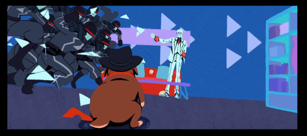
In episode 23 the main style changes again. This time it is still 2D but a lot blockier and less round than before. The reason for this could be the main character who is a dog.

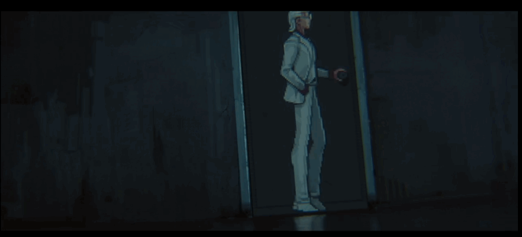
In the last episode X is the main focus, and the style is back to 3D. Since Xs powers are linked to changing art styles there are a lot of switches. Sometimes these switches are even combined. Once X transformed his art style to pixel art, where he can only run along the walls while everything else stays 3D. Whenever he snaps his fingers the art style changes, making the changes more than just a tool to create contrast.

In the case of “To be hero X” the style changes have multiple use cases. They show thoughts, personality, time and a narrative device. For now there is only one season available, which leaves many questions according to the art style and story open. But it is the first series I have seen, where style changes are used this heavily.

It is all in your head – How are thoughts of characters presented

In books it is a common occurrence to read about the thoughts of a character. They themselves describe from their perspective how they feel and how they experience the story. In movies and series, it is less common. For the most part thoughts and feelings are conveyed through the characters facial expression in combination with music, sound design and the overall cinematography.  What other ways are there to explore the inner world of a character?

Voiceover

The closest way to portray thoughts is a voiceover. Here the characters speak directly to the viewers and tell them in an inner monologue how they feel. There are two common ways this is used. One way is with the help of a narrator. For example, “How I met your mother” has the premise of Ted telling his kids about his past. He therefore plays two roles at the same time. The viewers don’t get the thoughts of the young Ted directly. They are being told the reflection of his past actions through his narrator self. Sometimes the narrator will contradict the young self and criticising his past actions.

A different approach is a live commentary. In “You” the viewer is following Joe, a book seller and as it turns out a stalker. The viewers hear all his justifications for his awful actions. One of the main female characters Beck is only really ever seen through his eyes and descriptions. There are a few scenes just following her, but the influence Joe’s description and portrayal of Beck is undeniable. Separating what he thinks, what is happening and what the actual story is, is challenging. Joe also feels more charming and charismatic as long as one hears his inner voice and thoughts. Meanwhile other characters react disturbed and confused towards him. After all he barley talks to people other than himself and the viewers. In this case the inner monologue is used to create some sympathy for an otherwise unlikable character.

Another series using inner monologue is for example “Scrubs”. They use it for the main character JD in a humorous way. In addition, the creators combined it with another way to show JDs inner thoughts.

Show don’t tell

A voiceover can sometimes be too much, especially if the narrator is unreliable like Joe. A different approach is to show the thoughts directly. While in Scrubs JD is sometimes narrating his thoughts, he tends to fantasise a lot. It is indicated with a white flash from reality to fantasy and back. In the fantasy itself the scenes are not narrated, rather everything is shown. With the white flashes between there is a clear cut between reality and thoughts. If there is no such visual aid, it is unclear whether something is supposed to be only in the head of the character. This can be used to shock viewers like in “Stranger Things” season 3 when Billy struggles to separate reality from thoughts. In his head he attacks Karen while he is spacing out. With a cut back to Karen save and unharmed the fantasy gets resolved and his instable mental state is shown.

Art style changes

For a clear cut between thoughts and reality a style change might be applied. In “Lizzie MCGuire” there are multiple techniques combined to show the main characters thoughts. With a cut to a cartoon Lizzie, she talks about everything going through her head. It is clear that no one else can see the cartoon character and only Lizzie imagines them.

Another example for a style change can happen when the characters talk about their backstories and what happened to them. Rather then only letting them talk, the viewers get to see the story unfolding before their eyes. In “To be hero X” this happens multiple times in the first few episodes alone. Similar to thinking back, an art style change may be applied while talking about future plans. In “Emperor’s new groove” the art style switches to simplified red silhouettes while Ysma talks and imagines her evil plan.

Special Effects

A less harsh cut between fantasy or thoughts and reality can be achieved with special effects. Whenever Jinx from “Arcane” is in an unstable mental health state colourful sharp lines appear, blurring into her reality. In “Scott Pilgrim vs. the world” Scott imagines the world like a comic book.  Therefore, it is no surprise that special effects like from on of the books are shown.

A slight problematic example for the usage of special effects is the stereotypic depiction of an attractive woman appearing. She appears to glow, and her hair blows perfectly in the wind.

There is a wide range of possibilities to include the inner thoughts and feelings of a character. From subtle light changes to letting them talk directly to the audience.

Art styles across universes

Warning: There will be some spoilers for the animated Spider-Man movies, don’t read if you haven’t watched it

In a previous blog post the aspects of contrast were discussed. One of these aspects talked about the change of art styles. An art style change may occur to separate present and past of a character. A different subject to art style changes happens in combination with space. Specifically, if the narrative depicts different dimensions.

Spider-Man – across dimensions

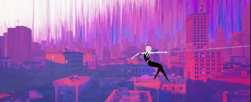
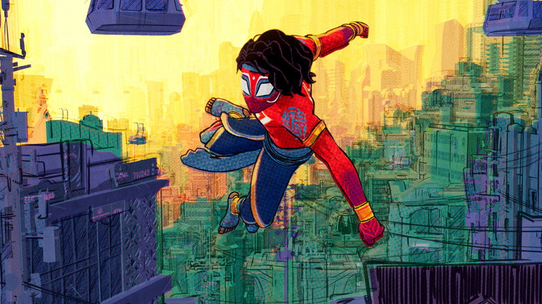
The most popular and well known example of different art styles for other dimensions are the Sony Spiderman movies. In the first movie Spider-People from other dimensions end up in Miles Morales’ world. Each one of them with their own art and animation style. A few characters such as Peter Parker and Gwen share a similar style. One plausible reason for this is that their worlds are similar, thus they themselves are. Another reason could be to surprise the viewer. Gwen is established as a character at the beginning of the movie before the plotline of different dimensions. Therefore, a too unique style would have either spoiled or confused the viewer. Later in the movie, when the other Spider-People are introduced, the viewer has had time to familiarize themselves with the concept of multiverses and other dimensions. Seeing a 2D animated character in a 3D movie is at this point less surprising and offers a visual contrast to the world around strengthening the concept of multiverses.

The first movie took place, for the most part, in Miles Morales’ dimension. Therefore, the art style changes were only present in the characters themselves. In the second movie, however, the narrative lead outside of the established dimension and dove into the multiverse. As a style concept the producers wanted the movies to look like a comic book, honouring the source material in the process. Now with new dimensions in mind, they decided to look at new art styles as well. The first dimension the viewer dives into is Gwen’s universe. The creators decided on a look like watercolour paintings. Gwen’s universe was not the only visited dimension. For the most part they all had their unique style. With this the viewers were provided with an aid to know where the movie was currently taking place. Now that the viewers have this confidence in their surroundings, the creators can use this as a story device. When the viewers see a dimension, which looks and feels like Miles’ world, they assume it is his. Therefore, at the end not being in Miles’ universe ends up being a surprising plot twist.

Other dimensions and their depictions

The theme of other dimensions or multiverses is not a new one. For example, in the movie “Pleasantville” from 1998 the main characters travel into their favourite TV-series. However, the contrast is limited to a switch from coloured to black and white. In “Tron” from 1982 the main characters land in a Computerworld. Fitting to that the scenes in the computer the creators are using a lot of CG, creating a contrast. In Marvel as well as DC Comics traveling through the multiverse is a common occurrence. In “Doctor Strange: Multiverse of Madness” shows traveling through many unique dimensions in a quick sequence, which span from close to ours to colour splashes or comic book styled worlds, just to name a few. The switches happen fast and are used to create disorientation because of the little time spent in each world. The viewers don’t have enough time to adjust. Another example of a rapid style changes, though not directly with dimensions is a scene from “Gravity Falls” were Dipper and Wendy travel through the bubbles of madness, which leads to various style changes. Similar to the Doctor Strange scene the goal is to confuse and overwhelm the viewers.

Conclusion

Changing styles can help viewers to orient themselves in movies with different dimensions or realities. It creates a clear cut between the familiar world and the new unknown. If the dimensions are very similar to the established one some confusion might occur, which can be used as a plot device like in “Spider-Man – Across the Spiderverse”. A very quick change of dimensions and art styles can have a disorientating result.

Wissenschaftsdarstellung – aber richtig

Habt ihr euch schon mal gefragt, wie man molekulare Zellstrukturen, sowie Moleküle grafisch richtig aufbereitet, damit diese ansprechend, verständlich aber wissenschaftlich trotzdem noch korrekt aussehen? Nein? Naja, ich schon. Darum geht’s jetzt in diesem Blogbeitrag. Ich weiß, das Thema interessiert nicht jede:n, ich versuch so salopp wie möglich zu schreiben.

Wir waren ja Mitte November auf der Pixel Vienna. Ein Talk davon war von Spicelabs, die sich darauf spezialisiert haben u.a. molekularbiologische Strukturen als 3D Kunst darzustellen. Sie sprachen davon, dass sie dafür chemische Datenbanken einbeziehen, von denen sie sich die Molekülstrukturen holen, die sie darstellen. Ihre Prämisse:

“By studying the techniques and materials used by artists throughout history, we developed an insight into creating visually stunning and aesthetically pleasing designs that capture the essence of the subject.” [1]

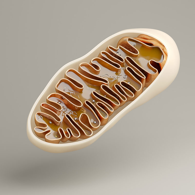
Zuerst war ich erstaunt von ihrem Werk und dem Ansatz aus Molekülstrukturen Kunst zu schaffen. Doch ich kam auch ins Nachdenken. Spicelabs kreiert unglaublich schöne und ästhetische Werke, vermischt Materialien wie Holz, Marmor und Glas mit naturwissenschaftlichen Darstellungen, verliert dabei aber total den Bezug zur Realität. Spoiler: So schaut ein Mitochondrium in Echt nämlich nicht aus.

Artworks von Spicelabs: https://spicelabs.at/artwork/

Doch sieht man sich andere Darstellungen von molekularen Strukturen an wird klar: Überall wird mit Nachstellungen gearbeitet, nicht mit dem Realbild. Auch akademische Lehrbücher verwenden Grafiken, anstatt Realbilder. Warum ist das so.

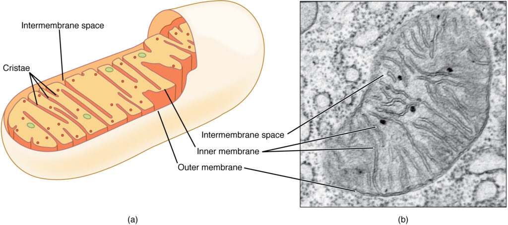
Naja. Siehe Bild.

Möchte man den Aufbau eines Mitochondriums verstehen, so kommt man mit der mikroskopierten Aufnahme schnell an seine Grenzen. Grafisch aufbereitet, mit Farbe und Beschriftungen und ohne dem ganzen Zell-Zeug drum herum ist gleich viel mehr zu erkennen. Hätte ich damals in der Schule alle Zellorganellen anhand von Realaufnahmen lernen müssen, wäre ich wahnsinnig geworden. Aber gleichzeitig lernte ich mir in der Schule ein falsches Bild von Zellen ein.

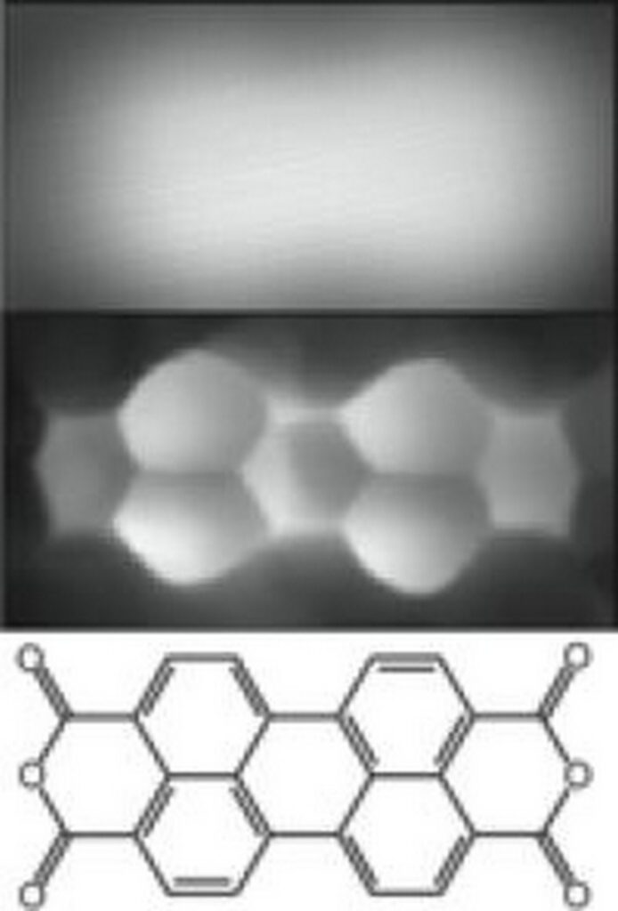
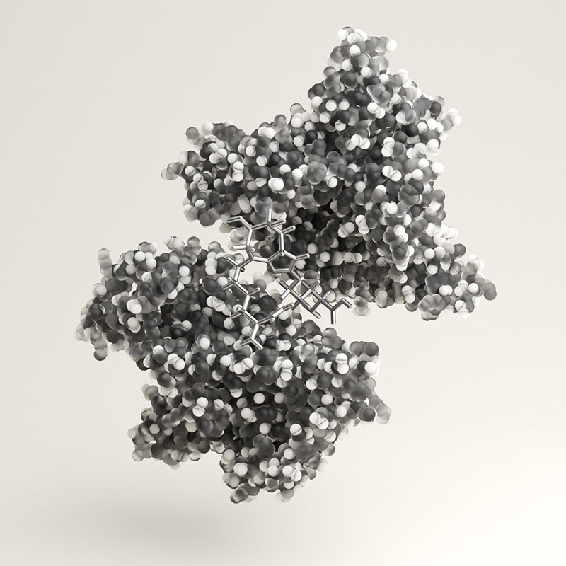
So ist es auch in der Chemie. Wir kennen alle diese Strukturformeln von Molekülen. Die werden gerne aus ästhetischen Zwecken in Werbungen für diverse Medizinprodukte verwendet. In der Realität sieht ein Molekül aber ganz anders aus. Hier mal eine Darstellung:

Die oberen zwei Bilder wurden von einem Elektronenmikroskop (EM) aufgenommen. Das funktioniert gaaaanz grob gesagt so: Das Objekt (Molekül, Zelle, was auch immer) wird auf einem Objektträger platziert. Dann wird ein sehr sehr sehr dünner Strahl von Elektronen auf das Objekt geschossen. Dieser scannt das Objekt ab, aus welchem selbst Elektronen herausgeschossen werden. Diese Elektronen werden aufgefangen von einem Sensor, der dann das Bild vielfach vergrößert, damit wir das Objekt mit freiem Auge sehen können. Anders als bei einem Lichtmikroskop, wie wir es aus der Schule kennen, sehen wir also nur ein von einem Computersensor „gezeichnetes“ Bild. Ein Molekül mit freiem Auge zu sehen wäre unmöglich, wir können immer nur eine Nachbildung davon betrachten. [2]

So, das war jetzt viel wissenschaftliches Gerede, kommen wir zum Punkt: Ist es überhaupt sinnvoll in der Wissenschaftskommunikation mit „realen“ bzw. Bildern von Mikroskopen zu arbeiten oder eignen sich Grafiken mehr?

Grafiken und Illustrationen erleichtern das Verständnis komplexer Konzepte und verbessern eine Kommunikation von Forschungsergebnissen. Sie können jedoch auch Missverständnisse auslösen, wenn Informationen ungenau sind. Künstlerische Stile können vom Verständnis wichtiger Details ablenken und die Qualität und Technik ist komplett von den Künstler:innen abhängig. [3]

Mikroskopiebilder vermitteln im Gegenzug Authentizität und zeigen tatsächliche Darstellungen. Doch sie können sehr abstrakt wirken. [3]

Wenn wissenschaftliche Information dargestellt wird heißt es also einen guten Mittelweg zu finden. Die Darstellungen müssen authentisch sein. Dabei dürfen sie nicht zu abstrakt sein, jedoch abstrakt genug, um Lernenden dabei zu helfen eine korrekte Vorstellung des Objektes zu haben. [4]

Artworks von Spicelabs: https://spicelabs.at/artwork/

Quellen:

1.Artworks von Spicelabs: https://spicelabs.at/artwork/ (zuletzt abgerufen am 23.11.2025)

      2. Astronomie-Ratgeber (16.09.2024): Elektronenmikroskop: Aufbau und Funktionsweise. In: astronomie-ratgeber.de, https://astronomie-ratgeber.de/elektronenmikroskop-aufbau-und-funktionsweise/ (zuletzt abgerufen am 23.11.2025)

      3. Mikroskop Guide (04.11.2025): Die Kunst der Mikroskop Illustration: Wissenschaft visuell darstellen. In: Mikroskop Guide, https://mikroskop-guide.de/die-kunst-der-mikroskop-illustration-wissenschaft-visuell-darstellen/ (zuletzt abgerufen am 23.11.2025)

        4. Kakoii: Grundlagen guter Wissenschaftskommunikation. https://www.kakoii.de/wissenschaftskommunikation/ (zuletzt abgerufen am 23.11.2025)

        [DesRes 1] Agile_x_SelfCheckout No. 2 :Creating User-Centered Strategies that align with Business and IT Goals in an innovative Agile Environment

        In my first blog post I explained my motivation on the topic of Creating User-Centered Strategies that align with Business and IT Goals in an innovative Agile Environment.

        Within the post I already mentioned that I might have the possibility to collaborate with a company for my thesis topic. Now I have gotten the confirmation from REWE Digital to support them during my studies as a working student. I will be working on various projects concerning the design and UX of cash registers and the checkout strategy of POS registers.

        As off today it seems my focus will be on the development of the design and UX. I am excited to see what the projects have to offer for me and how I can use my skills and grow. The specific path of my thesis will therefore heavily depend on what’s going to happen at my future workplace, where I will start in January.

        In the interview sessions and meetings I already discussed my tasks. However, as the line between confidential and public information is still a bit difficult to grasp I will try to stay as general as possible. One major aspect of the work in the UX Team is “aligning business, IT and UX goals” – so exactly what I want to focus on in my thesis. While this is not a specific topic the company is working on, it is one of the top priorities.

        Concerning my next steps of action I will do deep dives into the topic Agile and Management. Here are some of the resources and literature I am planing on having a look at:

        1. Appelo, Jurgen. Management 3.0 : Leading Agile Developers, Developing Agile Leaders. 1. ed.., 2010.

        2. Cooper, et al. About Face 3 : The Essentials of Interaction Design. Completely rev. and Updated., 2007.

        3. Boston Consulting Group. Flores, Yu. Placing Desirability at the Center of Innovation. 2024  Flyvbjerg, Gardner. How Big Things Get Done: The Surprising Factors That Determine the Fate of Every Project, from Home Renovations to Space Exploration and Everything in Between. 2023

        4. Laloux, u. a. Reinventing Organizations „visuell“ : ein illustrierter Leitfaden sinnstiftender Formen der Zusammenarbeit. 2017.

        Source Nr. 1 was recommended to me by the Chief Agile Manager at my previous internship. I am looking forward to discover more about Agility – as off today I’m only familiar with this topic on the surface. I would like to gain deeper knowledge. Furthermore, I might consider some of the Lean UX and Lean StartUp Principles. I am excited to start my first literature screening sessions. I will outline my results and key points as well as findings in the next blog entry.

        Concerning the cash registers I will stay curious whenever I go grocery shopping. I want to get a better grasp about different kinds of checkout possibilities in supermarkets. I might as well do some benchmarking and observations by myself.

        What is up, down, left, and right when you’re airborne and spinning? Where is my body and where should it go? 

        In the last post, I proposed the question: have there been experimental tests to try to overcome [learning body and silk awareness off the ground] in a different way?  

        Consider the following image of a split in the air [1]: 

        Image from Silks Stars, 2025. [1] 

        To get into a Carpenter’s square (unstandardized name), the first step the aerialist must do is turn her body in between the 2 pieces of fabric. Then, she must go in front of one piece of fabric and then hook her foot in it, like so: 

        Own gif, 2024. 

        However, this begs the question that this post is titled after, and exemplifies the interaction design problem once again. In this specific example, the direction of the 2 turns is explained as “towards the pinky toe you see”, since this is a reference relative to your body and not relative to the environment. The next moves are explained as “stand up, bring your hand up to the silk as if you had a fever, go in front of it, and bring the foot that you’re standing on to the top of the silk.” 

        3 other experimental studies address the body awareness problem through external stimuli regarding vision, sound, or both. These are explained in the next paragraphs.  

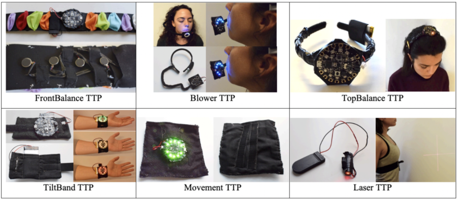
        In an experimental study, [2] created technology training probes to “augment proprioceptive information and make it available through exteroceptive senses.” These consisted of an embedded system sewn into different wearable fabrics, each designed specifically for different body parts and circus disciplines [2].  

        Image from Márquez Segura et al., 2019. [2] 

        In training with the wearable devices, [2] discovered that focusing on external stimuli made children enjoy the exercise more and improved their overall performance, specifically: children were focused more, were more aware and in control of their posture, were more aware of their movement patterns, could maintain challenging positions longer, were able to engage and relax different body parts easier, had more endurance, could move past fear, and enjoy the exercise more. This study wasn’t focused on aerial silks specifically, but it proved that, in floor acrobatics, externalizing proprioception through a range of lights and sounds helped children with sensory-based motor disorder [2]. 

        In another study, [3] created an aerial hoop which “generates auditory feedback based on capacitive touch sensing.” They added electrodes to a normal hoop in order to detect different touch data, which is then turned into auditory feedback through non-obstructing hardware housed in a wooden box [3]. 

        Image from Liu et al., 2021. [3] 

        The study found that the extrinsic auditory feedback helped artists to be more aware of the quality of their movements, including details that they would normally not pay attention to [3]. However, this study was done with expert hoop artists, which mentioned it would not be an accessible tool for beginners who are at first barely learning what their body must do [3].  

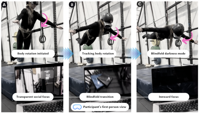
        In a third experiment, [4] used a head-mounted VR headset to partially blind participants while being suspended from a 2-point harness, as shown in the picture.  

        Image from Topaz et al., 2025. [4] 

        While not specifically designed for circus disciplines, the study found that when they took vision away from participants, they were forced to focus more on their internal sensations, muscles, and body movements, increasing their bodily awareness [4]. Two relevant quotes from participants of the study were as follows: “The black environment helped me focus on the muscles to regain balance” and “When I used to perform, I was far above the audience. Using the blindfold application reminded me how stimulating and distracting I find the outside world. It felt very peaceful and focused to be in the virtual world alone with my body” [4]. 

        – 

        [1] “Flexibility,” Silks Stars. Accessed: Nov. 23, 2025. [Online.] Available: https://www.silksstars.com/category/foundations/flexibility/ 

        [2] E. Márquez Segura, L. Turmo Vidal, L. Padilla Bel, and A. Waern, “Circus, Play and Technology Probes: Training Body Awareness and Control with Children,” Proceedings of the 2019 on Designing Interactive Systems Conference, vol. 1, pp. 1223-1236, June 2019.  

        [3] W. Liu, A. Dementyev, D. Schwarz, E. Fléty, W.E. Mackay, M. Beaudouin-Lafon, and F. Bevilacqua, “SonicHoop: Using Interactive Sonification to Support Aerial Hoop Practices,” Proceedings of the 2021 CHI Conference on Human Factors in Computing Systems, vol. 1, pp. 1-16, May 2021. 

        [4] A. Topaz, M.F. Montoya, R. Patibanda, J. Andres, and F. Mueller, “Blindfolded in the Air: Towards the Design of Interactive Aerial Play,” Proceedings of the First Annual Conference on Human-Computer Interaction and Sports, vol. 1, pp. 1-16, November 2025. 

        Blog Post 2: General Research

        General Research

        To begin my investigation into User Experience Design in German train stations, I first explored the broader field of UX and UI design within physical environments. Understanding how design influences real-world experiences was essential, as it allowed me to build a foundation before narrowing my focus to the train-station contexts. This early phase of research helped me recognize that user experience in physical spaces is shaped by a complex interaction of visual, spatial, and functional elements. It also highlighted how design decisions can significantly affect how people navigate, interpret, and emotionally respond to a given environment.

        Several core factors repeatedly emerged in the literature as central to effective physical-space design. Among the most relevant for my project are signage, visual communication, user flow, user feedback, technology integration, and accessibility (Kaarwan, 2025). Signage and visual design support wayfinding and orientation, while user flow relates to how intuitively people can move through a space. User feedback and the integration of technologies present opportunities to enhance clarity and convenience. Accessibility, of course, remains a fundamental requirement, ensuring that environments can be used by people with diverse physical, cognitive, or sensory needs. Additional aspects that influence user experience in public transport hubs include spatial organization and safety considerations (Coughenour, 2025). These dimensions will be examined in greater depth later in the design process, once the project goals and scope are more clearly defined.

        To support my analysis, I also evaluated established design principles that could guide my approach. I chose Jakob Nielsen’s Ten Usability Heuristics because they are widely recognized in UX practice and can be applied not only to digital interfaces but also to physical systems. This makes them an appropriate framework for evaluating a hybrid environment like a train station, where digital and physical elements intersect. Nielsen’s heuristics include: visibility of system status, match between the system and the real world, user control and freedom, consistency and standards, error prevention, recognition rather than recall, flexibility and efficiency of use, aesthetic and minimalist design, support in recognizing and recovering from errors, and accessible help or documentation (Heurio, 2023). By adapting these heuristics to the context of a train-station environment—where users must make quick decisions, interpret information under time pressure, and often navigate unfamiliar surroundings, I will be able to develop a structured method for identifying issues and generating improvement strategies. This framework will guide my evaluation as I begin defining how each heuristic can be meaningfully applied during the design process.

        Information Gathered

        The insights gained so far form a foundation for the planned research. These two approaches complement one another: while physical-environment principles help identify broad design challenges, the heuristics offer a concrete evaluative tool for analyzing more specific aspects of the user journey. Together, they provide an entry point into the complex field of physical user experience design and will be instrumental in shaping the direction of the project.

        Next Steps

        My next steps will involve deepening my understanding of both frameworks. I plan to continue expanding my research on physical-environment UX principles and to further explore how Nielsen’s heuristics can be adapted for real-world contexts. Once I have established a solid methodological base, I will focus more directly on German train stations and platforms. This will include investigating user behavior, spatial organization, signage systems, and potential pain points specific to railway environments. Based on this research, I aim to define the primary areas of interest for the project and identify opportunities for targeted design interventions.

        Reference

        Coughenour, A. (2025). User Experience in Physical Spaces. Von Orbis Cascade Alliance: https://www.orbiscascade.org/programs/dux/documentation/user-experience-in-physical-spaces/ abgerufen

        heurio. (2023). Nielsen’s 10 Usability Heuristics. Von heurio: https://www.heurio.co/nielsens-10-usability-heuristics abgerufen

        Kaarwan, T. (18. June 2025). How Does UI-UX Design Transform User Experience in Physical Spaces. Von Kaarwan: https://www.kaarwan.com/blog/ui-ux-design/ui-ux-design-transform-user-experience-in-physical-spaces?id=541 abgerufen

        NSW Government. (2025). Sydney Trains environment and sustainability. Von Transport for NSW: https://www.transport.nsw.gov.au/projects/environment-and-safety/sydney-trains-environment-and-sustainability/why-rail-travel-a abgerufen