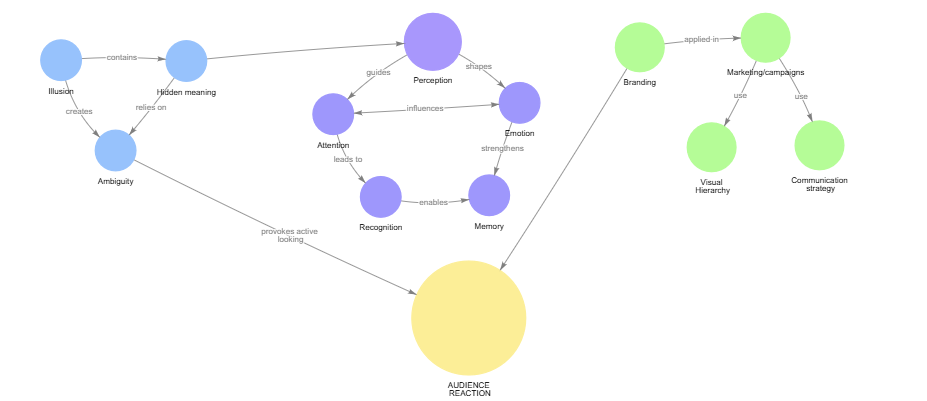
What helped this project most was starting to structure it through actual methods instead of only reflection. The concept map made the relationships between the key terms clearer and showed that the topic is no longer centered on illusion alone, but increasingly on audience reaction, attention, and guided perception.
The interview was important for a different reason. It tested these ideas through an actual viewer’s response and made the topic less abstract. Lorenzo’s point that ambiguity can either create fascination or turn into visual chaos was especially useful, because it made the role of structure much clearer.
Together, these methods helped narrow the project in a more grounded way. Instead of only collecting ideas, I was able to see which concepts are central, how they connect, and which direction feels worth developing further.
A useful distinction in my research is the difference between artistic and commercial illusion. Although both use ambiguity, layered meaning, and delayed recognition, they are built around different intentions. Commercial illusion is outcome-oriented: it has to support brand recall, clarify identity, and direct the viewer toward a specific message. Artistic illusion does not carry the same obligation. It can remain open, unresolved, and more dependent on the viewer’s own interpretation.
This distinction is important because it clarifies the split between the theoretical and practical parts of my project. The theoretical part is moving toward a more structured question: how visual form directs attention and emotional response. The practical part, however, will not try to imitate branding logic. I am more interested in building an experience in which meaning is not fixed in advance, but develops through the viewer’s own reading.
That is why, in the practical outcome, I want to work closer to artistic illusion. I want to leave space for uncertainty, projection, and multiple interpretations instead of leading everyone to the same conclusion. The value of the work, for me, lies precisely in that openness. If the viewer immediately arrives at one closed answer, the experience becomes shorter and less personal.
After skimming through different research papers conducted by the department for traffic and infrastructure of the Arbeiterkammer there was one paper left that I chose to do a deep dive on: Unterwegs zwischen Erwerbs- und Familienarbeit (Commuting between waged work and family work). This particularly stood out to me, as I can already imagine that people who tackle duties of care on top of work are facing exceptional challenges when commuting.
Gender gap in commuting
Amongst an in-depth analysis of commuting habits, also focusing on a case study in lower Austria, the report also explores the different situation for commuters in a city in contrast to rural areas. Considering employees who have care related responsibilities outside of their workplace a significant difference between men and women can be noticed. With men only participating in care and family work for 17,6 hours a week, women spend 32,1 hours a week of their time for these duties. Furthermore, the difference between rural areas and cities can once again be observed.
For whom to serve
For the sake of defining the user group of my research project women with care responsibilities living in a rural area, and working outside of their home municipality could potentially outline a possible primary persona. However, for now I haven’t had the chance to dive deeper into the topic of inclusion. I will take this with me to the next semester to explore commuting possibilities and obstacles for people with accessibility needs. I could imagine that this part might even make more sense as a seperate research project, nonetheless it’s important to have a look into the topic.
Overall Conclusion
As I have already mentionend in the introduction part of this entry I put a lot of focus on understanding transit and mobility with a focus on commuting as a whole. I purposefully chose not to narrow it down to the field of interaction design yet. Considering we are supposed to think outside of silos this only adds up in my opinion. During my professional working career for example, I have already made several experiences that showed me how harmful it is to always think inside the box and never outside.
This is why I decided to approach the topic of commuting to work holistically, before going to specific into “how could a prototype look like”. I am happy that I made this choice, because diving through mobility as an overarching topic allowed me to broaden my horizon and get an educated understanding of the real challenge behind my topic.
Some more learnings from this semester
Besides expanding my understanding of mobility and transit related facts I also found some ways of nudging myself into working on this project. I thought I could share this here since it might be inspirational to my peers.
1. Create a moodboard
Create a funky moodboard that deals with all things related to your research. Make it look cute, make it aesthetic and even consider creating it with a child-like approach. It’s a place of no judgement that allows you to get a better grasp of what exactly it is that you are doing within your research.
2. Write down some inspirational quotes
I have a personal sketchbook that I am using exclusively for my research topic. I have one full page that only consists of some motivational quotes and manifestations.
After the last iteration phase, the idea and plan for an experience prototype were developed in order to test the concept of a light-guiding system that could be implemented at German train stations through overhead projection. The prototype, together with the findings from the testing, was documented, analysed, and evaluated to draw conclusions for the next stages of the project.
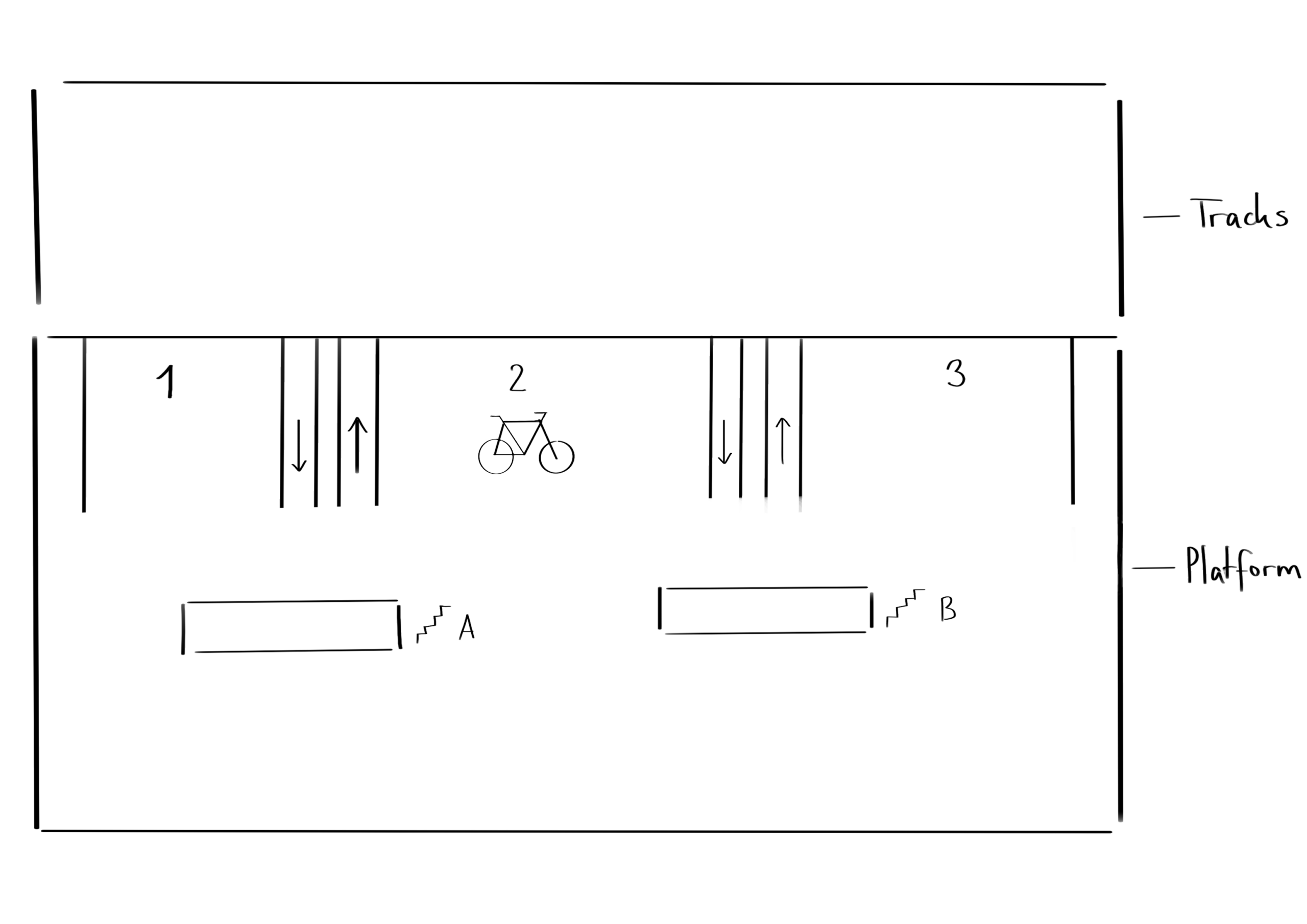
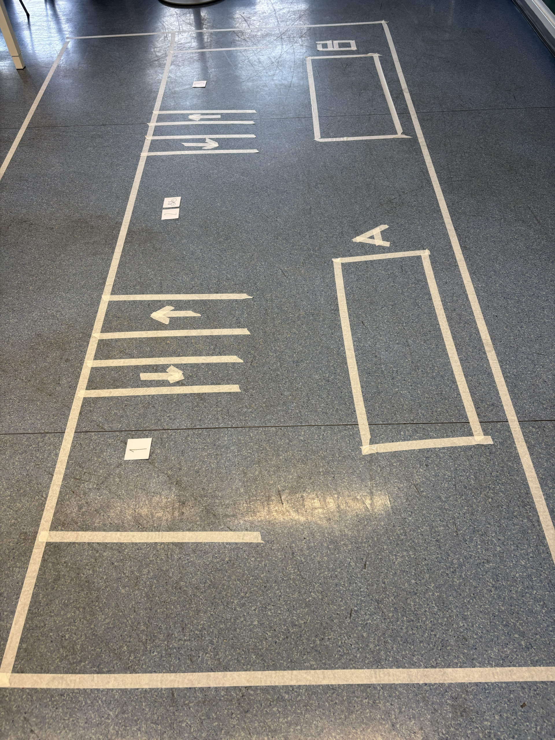
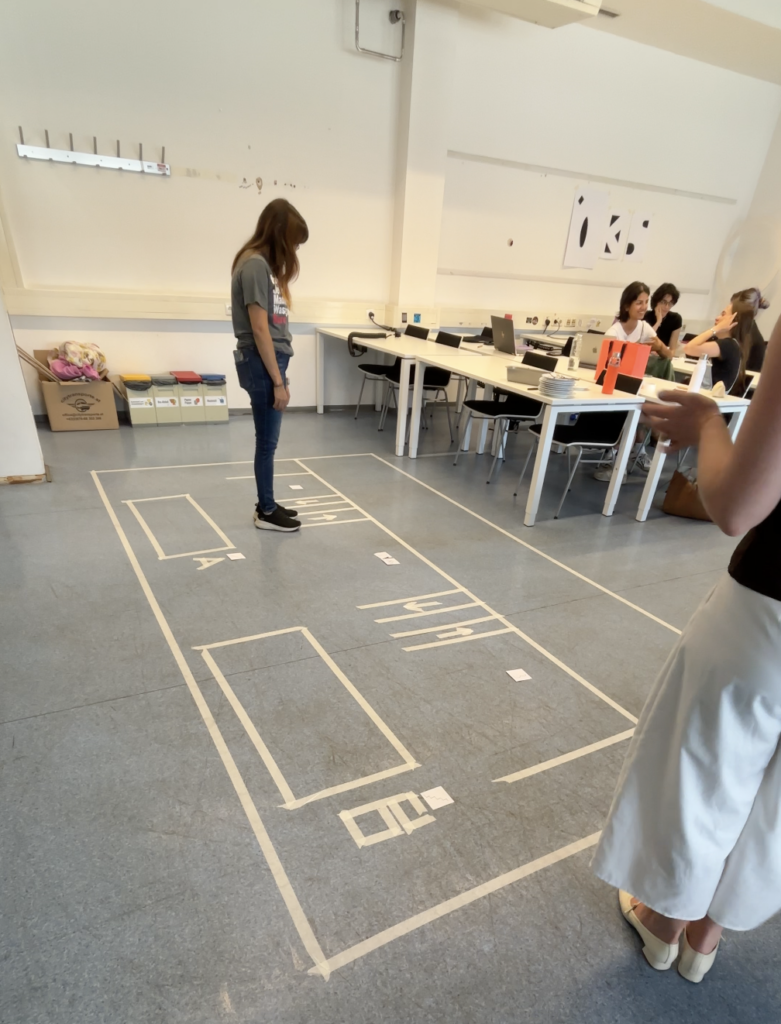
The environment in which the prototype was tested was an academic setting during a class focused on prototype testing. In preparation for the testing, the physical setup first had to be constructed within the space. For this purpose, a free area of the room was selected where the prototype could be outlined on the floor using prepared tape. Beforehand, a sketch of the site had been created, which could now be translated into the real environment. Using tape, two large rectangles were constructed to represent the train platform and the train tracks. Next, the exits were marked using smaller rectangles together with signs identifying them as exits. These elements reflected the basic structure commonly found on train platforms in Germany.
In addition to these existing platform elements, new components were introduced to represent the proposed intervention and demonstrate how the final product could improve the user experience. The first additions were two lines indicating the beginning and end of the arriving train. After this, the entrances were marked with four additional lines that created two corridors equipped with arrows to indicate the direction in which passengers should enter and exit the train. Another important part of the setup was the indication of carriage numbers through numerical markers, as well as the addition of a bicycle icon to represent the bike carriage. Finally, letters were added to the exits in order to distinguish different exit points leading towards different directions and destinations. With these elements in place, the setup of the physical prototype was completed.
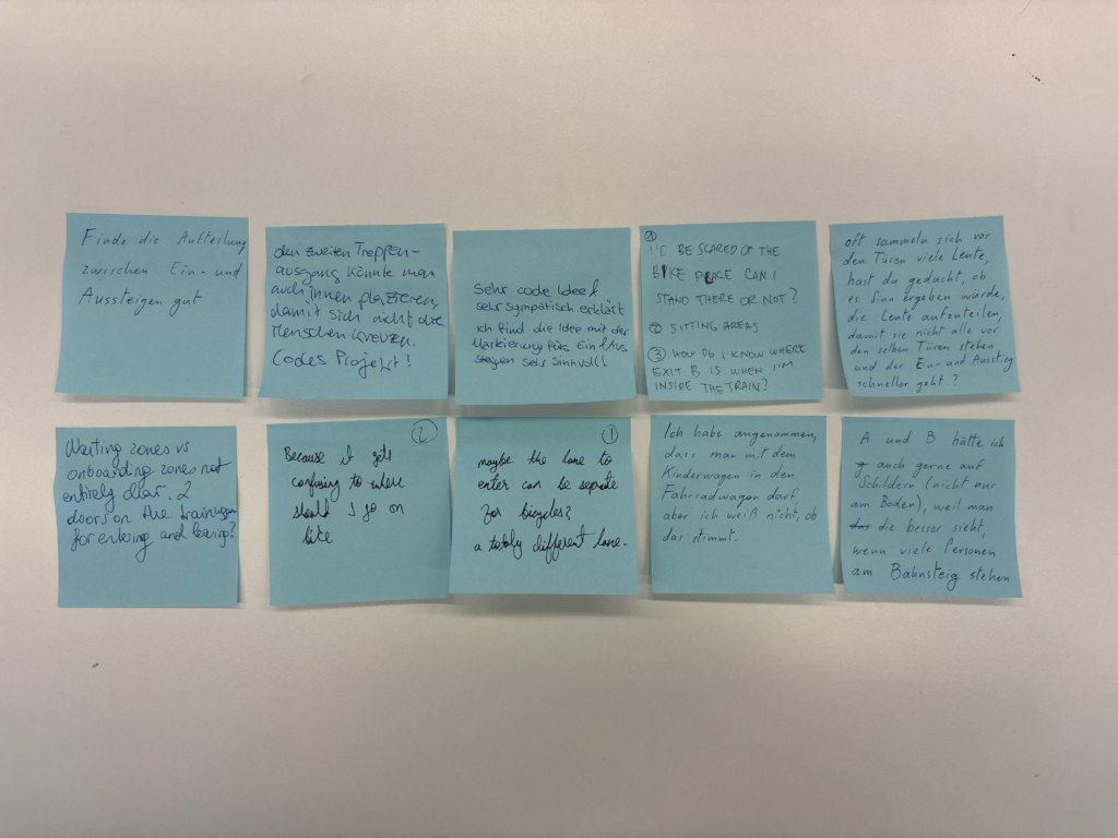
To document the testing sessions, a tripod and a smartphone were used to record videos of the interactions. Additional photographs were taken for further documentation purposes. To collect feedback after the testing, a station with sticky notes and pens was prepared where participants were invited to leave open feedback regarding their experience, including what they liked, what they found confusing, and what they believed could improve the prototype. The feedback was intentionally kept open-ended because the primary aim of the testing was to observe participants’ behaviour within the environment. The written feedback mainly served as an opportunity to gather additional ideas, comments, and perspectives. Since the product is still in the conceptual phase, changes and redirections are still possible, making further suggestions particularly valuable. With this setup completed, the first round of testing could be conducted.
Testing
For the testing sessions, different participants were recruited, most of whom were students from a variety of academic subjects. The testing was conducted in four rounds with varying group sizes. This variation proved useful because it reflected different situations that can occur on real train platforms, where there are sometimes fewer and sometimes significantly more passengers present.
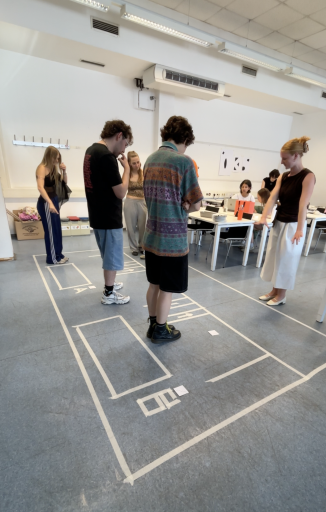
At the beginning of each session, the project and prototype were briefly introduced and the aim of the testing was explained. Afterwards, participants were divided into two groups: one group representing passengers on the platform and another group representing passengers inside the train. In cases where the participant groups were smaller, all participants took part in both scenarios one after another. Once divided, the platform group received three tasks that they were asked to complete freely within the marked platform area. Participants could position themselves and move throughout the prototype space according to the given tasks. After the first group completed their exercises, the second group was asked to position themselves within the area representing the train tracks and imagine that they were passengers inside a train arriving at the station. They were then given two tasks to complete within the prototype environment.
The instructions given to participants were intentionally kept relatively limited in order to allow users to interpret the situations independently and draw their own conclusions based on the information available within the setup. After the testing sessions, participants were invited to leave written feedback on sticky notes if they had further comments, questions, or suggestions. These feedback notes were later collected for analysis.
Result Analysis
The results of the testing, including the recorded videos, observational notes, and written feedback from participants, were reviewed and analysed in order to gain insights into user behaviour and experiences within the prototype environment.
One observation that stood out during the analysis was the influence of participant numbers on behaviour. Smaller groups were generally able to complete the tasks with fewer problems and less confusion. In contrast, the larger groups experienced greater difficulty following instructions and navigating through the tasks efficiently. This observation reflects real-life conditions, as train stations become increasingly complex and challenging when larger numbers of people occupy the same space at once. The conclusion here is, that the indications at the platform need to be clear enough so that all users can understand and interact with them, no matter how high the occupancy rate of the station is. Another important observation was that the directional lines indicating entrance and exit routes were too small in the prototype setup for many participants to actively follow during the exercises. However, the concept itself was generally understood and positively mentioned in the feedback. The carriage numbers also caused some confusion among participants, as some users were unsure whether the numbers referred to train classes or carriage numbers. This suggests that an alternative form of communication or visual representation may be necessary. A similar issue emerged with the bicycle icon intended to indicate the carriage for passengers travelling with bicycles or larger objects. Although participants understood the symbol itself, they were uncertain whether the carriage was exclusively intended for bicycles or if it could also accommodate strollers and similar items. The additional information provided at the exits was generally well understood. However, observations showed that clearer pathways towards the exits would be beneficial. It also became apparent that further consideration is needed regarding how boarding passengers and exiting passengers can move without obstructing one another.
Another piece of feedback that stood out was the suggestion to introduce designated waiting and boarding zones on the platform. Participants felt that this could reduce confusion and improve the organisation of the available space. This idea will therefore be considered further and may become an additional feature within the proposed guidance system. Overall, the testing results were highly valuable and insightful, providing many opportunities for further research, refinement, and development within the project.
Information Gathered
This testing process represented a completely new experience for me, as I had never previously worked with an experience prototype and therefore did not know what to expect from either the process or the results. However, the testing exceeded my expectations and provided a large number of insights that would not have been possible to gain from a purely digital prototype. Observing participants directly within the physical environment made the experience feel significantly closer to reality and helped reveal both possibilities and challenges that the final product could face within an actual train station setting. The testing therefore played an important role in improving my understanding of how users interact with the concept and how the idea could continue to develop in the future.
Next Steps
This testing phase marked the final step within this chapter of research and completed the first attempt at creating a functional and testable prototype for the intended project. The information gathered throughout this stage of the research process can now be carried forward into the next phase of development. The upcoming work will focus on exploring the technical feasibility in greater depth, making the final product concept more tangible and realistic, and continuing to test and refine future ideas and iterations of the project.
While doing research for my last blog post I identified the “Österreich unterwegs” study as viable for my project. Therefore I decided to skimm through it for this entry.
Mobility evaluation “Österreich unterwegs”
The study “Österreich Unterwegs” is a comprehensive research project that evaluates the mobility habits of Austrian inhabitants, currently happening in the third wave. The first time such a research was conducted in the year of 1995. Since the results from the second evaluation from 2013/14 are already outdated a third data assessment phase is currently happening. Roughly 65.000 households are invited to participate in the evaluation on a voluntary basis. The results will be collected and published in 2027. Although the data set from 2013/14 is not representative anymore I still decided to take a look at it. The numbers on motorized individual traffic are especially striking. Almost half of the mobility routes of Austrian inhabitants were cited as done via car. Additionally to the car centered habits the difference between the first and the second report are worth mentioning. While individual transport was already predominant in 1995, it increased from 39,7% to 46,2% in 2014. (1)
It is a bit unfortunate, that the results for the current evaluation will most likely not be published before I finish my thesis. However, I will keep an eye out on new developments and will try signing up for participating in the evaluation, if possible.
Expanding the Horizon
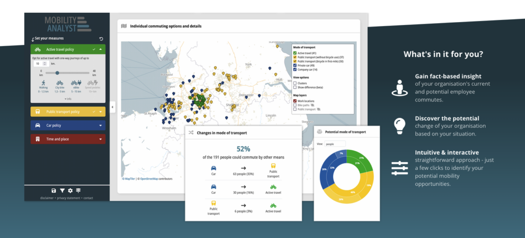
I already did a deep dive into Austrian Mobility habits in the last few blog posts. While this remains the focal challenge of my research, I decided to take a glimpse into other countries. And in terms of green and sustainable mobility the Netherlands seemed like an obvious example. After shortly researching with a focus on the Netherlands I quickly found a tool from a dutch software company called “Mobility Analyst”.
Image: Mobility Analyst Product Demo
Mobility Analyst seems to solve the exact wicked problem that I am working on. With this tool the different commuting approaches and solutions of employees can be gathered and evaluated to implement a corporate mobility strategy for companies (2).
Going back to the roots
After finding about Mobility Analyst I decided to move on and see if there’s any other countries where similar approaches have been iterated. Funnily enough, just after a quick desktop search I once again found myself within the Austrian border. A mobility consulting company from Linz called triply also seeks to find answers to the mystery of conglomerating corporate mobility (3).
Corporate with a focus on employees
In my opinion the term “corporate mobility strategy” aligns well with the german expression of “Betriebliches Mobilitätsmanagement”. However, my prototype will focus purely on the needs of employees and workers. Especially with the two previous examples in mind, I would like to empathize that I do not want to extract KPIs amongst other fancy numbers from this prototype. Instead the outcome of this project must serve employees. Of course, certain benefits can still be concluded for employers as well: for example supporting your employees when commuting can be used as a benefit in the job market.
This time I have taken a deep dive into a source from Arbeiterkammer once again. The report “PendlerInnenverflechtungen in der Ostregion” displays the different commuting streams happening in Lower Austria, Vienna as well as Burgenland. These three regions have a total of 1,3 Million employees of which only 18% live and work in the same commune (p. 1, Weninger, A. et al., 2021). I find this source especially enlightening since it covers a wide spectrum of mobility behaviors and needs from urban to rural.
Mapping commuting streams
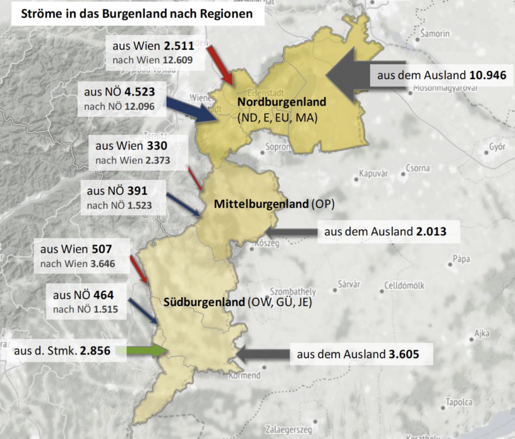
Image: Arbeiterkammer
This extraction for example showcases the commuting streams from as well as to the region of Burgenland. What’s especially notable is the behavior that can be observed in northern Burgenland. Due to it being close to two country borders the10.000 employees working in Burgenland but not living in Austria are off no surprise. However, it is notable that it’s even more – 24.000 employees living in Burgenland – that commute outside of their region to either Vienna or Lower Austria. (p. 18, Weninger, A. et al., 2021)
Commuting to school
While various challenges and needs of working commuters are pointed out the report additionally highlights that students commuting at the same time as workers can add lots of friction. Alongside considering alternatives for school starting times in the morning the concept of “Schulische Mobilitätsmanagement” (Mobility Strategy for Schools) is being proposed (p. 54, Weninger, A. et al., 2021).
This perfectly aligns with my vision for my prototype, as I am planning on testing it with high school students and not just workers.
Nudging as motivation
Alongside many other obstacles a lot of commuters seek to avoid overcrowded coaches. While trying to identify possible drivers to push commuters to adapt to public transit the report highlights the “Travel Smart Programme” introduced in Singapore, which is a reward system for which you can receive bonus points if you use less crowded coaches at an earlier or later time instead. The more points you have collected the cheaper your future tickets get (p. 67ff, Weninger, A. et al., 2021).
While I appreciate the effort of communicating the demand of different trains, I personally view the point based system as critical from an ethical standpoint. In my opinion the simple act of showcasing this demand without a reward system should be enough to “nudge” commuters. The bonus point system seems like a capitalistic extension that puts more pressure on users than relieving them from.
Picture credits: Bayrischer Rundfunk
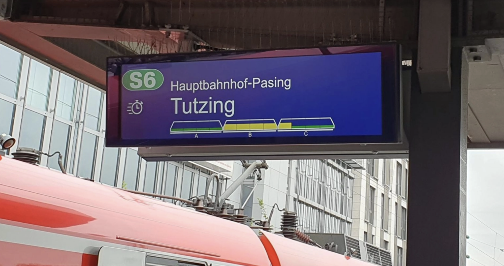
This is an example I’m familiar with from the S-Bahn in Munich. The display tells you how crowded the different coaches of the train are and allows you to strategically position yourself on the platform before entering the train.
I have found a viable source dealing with the feasibility analysis of the active2work (a2w) concept. It is also cited in my initial research kick-off document. Which is the report I have received as a starting point for the project I participated in 2 years ago. The source covers extensive research of different areas from a general mobility exploration to an economic evaluation of the concept. Especially chapter no. 3 “Involvierte AkteurInnen und Mindsets” (involved parties and mindsets) strikes my interest. For the sake of exploring the desirable impact of the concept a qualitative research in focus groups was conducted.
About active2work
The concept of active2work deals with the possibilities of commuting to work by one’s own force as a green alternative to the popular choice of driving a car within Austria. It tries to seek an answer to the status of time when commuting as well as the target audience for such a concept including it’s possible benefits to health and economic considerations for the Austrian population. (p. 8 Doiber, 2020)
Opinions of the target audience
21 representatives (9 representative from AK/WKO; 6 employers from Austrian companies; 6 employees of Austrian companies) from various fields were invited for a formal discussion on the topic. The goal of the conducted research was to explore acceptance and obstacles on various levels, such as economical or business related drivers in addition to social, financial, psychological and even feasible drivers from an individual’s point of view. (p. 54 Doiber, 2020)
Reasons for choosing a commuting option.
It is no secret that cars are predominant in rural areas. Motonormativity is a term used to describe car centered infrastructure as given. Therefore it is no surprise that the willingness to use public transport is directly correlated to it’s availability. (p. 55 Doiber, 2020)
Motivation to drive a bike
For the motivation to drive a bike the opinions vary widely. While health considerations are paramount some still empathize the possible risks of using bikes (e.g. longer distances, weather circumstances or general traffic dangers). (p. 55ff Doiber, 2020)
Companies takes on the legal concept of “Business Mobility Strategy”
Businesses would view the introduction of such a concept viable as soon as they could derive economical benefits from it. One possible enabler for this could be the state. (p. 58 Doiber, 2020)
Feasibility and obstacles of active2work
Once the overall infrastructure for bikes expands the acceptance towards using a bike will grow. Some major obstacles can be iterated right away, for example showers or expanding the amount of bicycle racks on the company grounds. Besides some obvious low hanging fruits however, the concept of active2work has been identified as biased towards jobs outside of the office, especially people working in shifts. Furthermore, the proposed concept doesn’t fully consider the different challenges between city and countryside life. Additionally the active2work approach has been named unfair towards workers with surpassing commuting distances. Last but not least, the risk of discriminating people with accessibility needs was pointed out as a major obstacle. (p. 63 Doiber, 2020)
Conclusion
Before skimming through this source I was already aware of the existing car-bias in Austria. However, I am happy to have found more sturdy facts on this topic. The way the focus group was conducted as well as the actual findings from this research are engaging and offered new revelations for me. I am especially satisfied that the danger of excluding workers with accessibility needs was mentioned, as this has been a major concern of mine from the very beginning when hearing about the active2work approach. With this I am not saying that I do not support the said concept, as it still seems tangible for a certain amount of workers. It simply shouldn’t be viewed as a one-size-fits-all solution.
References
(1) Doiber, M. (2020). active2work – Arbeits- und Mobilitätszeit neu gedacht: Machbarkeitsuntersuchung.
Im Rahmen dieser Blogbeiträge wurden die Themen „One-Shot-Productions“ und „Sport Dokumentationen“ behandelt. Im Zuge dessen entstand ein Werkstück, dass das Ziel verfolgte, die beiden zentralen Themenbereiche miteinander zu verbinden. Daraus ergab sich ein zweiminütiges One-Shot-Video im Stile einer Sport Dokumentationsserie über ein Motorsport-Team. Dafür haben sich in vergangenen Blogposts einige Merkmale herauskristallisiert, die in das Werkstück eingearbeitet wurden. Trotz sonst großer Unterschiede verfolgen beide Genres ein ähnliches Ziel: Sie wollen eine möglichst hohe Immersion und emotionale Beteiligung bei ihrem Publikum erzielen. Das fertige Werkstück hat diese und weitere Merkmale aufgegriffen und in seiner eigenen Form umgesetzt. Dieser Blogbeitrag stellt eine Analyse dessen dar.
Merkmale der One-Shot-Productions
Eines der zentralsten Merkmale von One-Shot-Productions, das sich bereits in mehreren Blogposts dieses Jahres herauskristallisiert hat, ist die Erzeugung von Immersion durch kontinuierliche Kameraeinstellungen auf eine ganz besondere Art und Weise. Für die Zuschauer:innen entsteht durch das Fehlen von (sichtbaren) Schnitten der Eindruck, dass sie die Handlungen in Echtzeit miterleben. Dieses Prinzip wurde natürlich auch in der Produktion des Werkstücks wieder aufgegriffen: Es enthält keine Schnitte und die Kamera begleitet einen Porsche Cup Fahrer in Spielberg ohne Unterbrechung von seinem LKW bis in sein Rennauto. Dadurch wird das Publikum statt als außenstehende Person als Teil des Teams positioniert und man bekommt das Gefühl selbst am Geschehen teilzunehmen. Die kontinuierliche Kameraführung verstärkt sowohl die räumliche als auch zeitliche Nähe dessen.
Merkmale der Sportdokumentationen
Auch aus diesem Genre wurden Merkmale aufgegriffen, die wichtig für das Werkstück waren. In der Recherche und theoretischen Auseinandersetzung mit dem Thema „Sportdokumentationen“ hat sich schnell herausgestellt, dass dabei nicht (nur) das sportliche Ereignis im Vordergrund steht, sondern es vor allem auch um das Storytelling dahinter geht. Sportdokumentationen sind oft emotional aufgeladen und wollen das Publikum damit anstecken. Besonders wichtig ist dabei auch, dass die Athlet:innen und deren Persönlichkeiten, Emotionen und ihr Team im Vordergrund stehen. Das war ein sehr wesentlicher Punkt, der in das Werkstück eingeflossen ist. Auch dabei steht der Athlet – in diesem Fall ein Rennfahrer für das Team Proton Competition – im Vordergrund des Werkstücks und seine Gedanken und Emotionen sollten filmisch übermittelt werden. Dabei behandelt das Werkstück mit dem Thema Unfälle und die Momente vor dem „ins Auto steigen“ auch eine sehr emotional aufgeladene Angelegenheit. Dadurch wird der Motorsport nicht nur als Wettbewerb dargestellt, sondern viel mehr als Ereignis, das geprägt ist von Emotionen, Spannung und menschlichen Erfahrungen.
Ein weiteres Merkmal von Sportdokumentationen ist die Personalisierung des Sports selbst. Wie bereits in den mehreren Blogposts beschrieben wurde, werden Athlet:innen oft zu „Schauspieler:innen“ gemacht und stellen zentrale Identifikationsfiguren für das Publikum dar. Dieses Merkmal verwenden auch viele bekannte und erfolgreiche Sportdokumentationen, wie beispielsweise die Netflix Serie „Drive to Survive“. Da es in dieser Serie ebenfalls über Motorsport geht, wurde sie auch als Inspiration für dieses Werkstück verwendet. Zuschauer:innen interessieren sich nicht mehr nur für die sportlichen Ereignisse bzw. Ergebnisse eines Events. Vielmehr geht es ihnen um die Menschen dahinter. Die persönlichen Eindrücke, Gedanken und Gefühle des Rennfahrers Keagan Masters stehen im Vordergrund des Werkstücks. So wirkt das Video zusätzlich wie eine persönliche Geschichte, die dem Publikum von Masters erzählt wird. So wirkt er als Person viel greifbarer und das gesamte Werkstück erzeugt viel mehr Nähe bei den Zuschauer:innen.
Ein weiterer essenzieller Teil von Sportdokumentationen ist Interviews mit beteiligten Personen – seien das nun Athlet:innen, Teamchefs oder Mitarbeiter:innen. Durch das Filmen einer One-Shot-Aufnahme war dies anfänglich etwas schwierig zum Einarbeiten, ohne dabei die Immersion zu „zerstören“ bzw. ohne, dass ihre Wirkung verloren geht. Als Lösung wurden die Originalsounds aus der Pit ebenfalls im Hintergrund gelassen und in Sprechpausen verstärkt. Dadurch bleibt die visuelle Kontinuität erhalten während gleichzeitig Informationen und Gedanken des Fahrers vermittelt werden können. So werden zwei wichtige Merkmale aus beiden Genres verbunden.
Sportdokumentationen balancieren häufig zwischen Authentizität und Inszenierung. Es ist ein Spannungsfeld zwischen realen Sportereignissen und dramaturgischer Gestaltung bzw. Storytelling. Auch diese Merkmale zeigt das Werkstück: Es werden reale Abläufe in der Pit gezeigt, die bewusst durch das Interview in einen erzählerischen Zusammenhang gebracht werden. So wird das Publikum bewusst auf den Moment den Qualifying-Start vorbereitet. Außerdem wurde sich stark daran orientiert, dass Motorsport aus mehr als nur Autos und Geschwindigkeit besteht. Es dreht sich vieles – vor allem im sprachlichen Teil – um die psychische Belastung und emotionale/mentale Herausforderungen und Konflikte. Das gibt den Zuschauer:innen auch eine neue Perspektive auf den Motorsport.
Fazit
Zusammenfassend lässt sich sagen, dass das Werkstück viele wichtige Merkmale beider Genres erfolgreich miteinander verbindet. Die kontinuierliche Kameraführung bringt Immersion in das Video, während typische Elemente aus Sportdokumentationen, wie beispielsweise die Identifikation mit dem Rennfahrer oder die emotionale Dramaturgie, ebenfalls eingebunden wurden. Damit setzt das Werkstück die theoretischen Grundlagen der Blogbeiträge praktisch um und beantwortet die Forschungsfrage, ob sich beide Genres verbinden lassen. Sportdokumentationen und One-Shot-Productions lassen sich durch gemeinsame erzählerische Ziele zu einem Format zusammenführen.
Es wurden Dinge aus vergangenen Blogposts „zitiert“ und Informationen daraus bezogen. Die Quellen finden sich dementsprechend dort. Außerdem wurde dieser Text von ChatGPT korrigiert. Alle Inhalte wurden von mir selbst auf Richtigkeit und Relevanz überprüft und der Text selbst wurde von mir erstellt.
This post examines an aspect of grid design that is often overlooked: its function as a form of accessibility. Grids are typically discussed in terms of visual appeal, but they also play a meaningful role in helping people process written information, particularly those whose brains process text differently from the majority of readers. For individuals with ADHD, dyslexia, or other learning differences, a clear grid is not simply a stylistic preference; it can determine whether a page is manageable or genuinely exhausting to read. To understand why, it is useful to consider the concept of cognitive load, meaning the amount of mental effort required to process information. Every individual has a limited amount of cognitive resources available at any given time. When a page lacks alignment, consistent spacing, or clear structure, the brain must expend additional effort interpreting the layout before it can engage with the actual content. For most readers, this additional effort is minor and largely unnoticed. For readers with ADHD or dyslexia, however, this effort draws on already limited cognitive resources, making reading considerably more tiring than it would otherwise need to be.
A predictable grid reduces this hidden burden. When margins remain consistent, columns are clearly defined, and text follows a steady rhythm down the page, the brain does not need to interpret the structure before reading can begin. Attention can be directed immediately to the content itself. This is particularly relevant for individuals with ADHD, who often experience difficulty maintaining focus amid visual unpredictability or excessive distraction. A clean, well-organized grid removes an entire layer of potential distraction before reading even starts. For readers with dyslexia, column width carries particular significance. As discussed earlier in this series, Miles Tinker’s research found that lines containing approximately 45 to 75 characters produce the most comfortable reading experience for most people. For readers with dyslexia, this range appears especially important. Lines that are too long increase the likelihood of losing one’s place, rereading the same line, or skipping to an incorrect line. A carefully designed column width, supported by a consistent grid, can meaningfully reduce these types of reading errors.
Spacing plays a more significant role than might initially be assumed. Tight, compressed leading, referring to the space between lines of text, can cause letters and words to visually blur together, particularly for readers with dyslexia. A grid that maintains consistent, slightly generous leading throughout a document helps prevent this visual crowding. This is not a minor stylistic detail; it represents a genuine accessibility consideration, even though it is rarely described in those terms. This reframes the purpose of the grid considerably. Grids are usually discussed primarily in terms of aesthetics, consistency, or brand identity, as in earlier posts in this series. However, a grid also functions as a basic accessibility tool, comparable in some respects to color contrast or font size. A well-designed grid does more than appear organized; it actively reduces barriers that might otherwise prevent certain individuals from accessing information at all. This consideration is especially relevant for designers working on educational platforms, government websites, or healthcare applications, where the audience is likely to include individuals with ADHD, dyslexia, or other learning differences, regardless of whether the designer is explicitly aware of this. In these contexts, a strong grid is not an optional enhancement; it is a meaningful way to ensure that more people can genuinely access and understand the information presented. This connects back to the first post in this series, which discussed how grids create a sense of trust. For individuals with ADHD or dyslexia, that sense of trust carries additional practical weight. A predictable, well-structured page does more than create a general feeling of calm; it can determine whether someone is able to read comfortably or chooses to disengage entirely. Understood in this way, the grid is not merely an invisible design convention, but a quiet and meaningful form of consideration for the reader.
Most mobile applications make use of a grid, even when this structure is not consciously noticed by the user. Buttons are aligned neatly, text blocks are evenly spaced, and icons follow a predictable pattern. This is not incidental; it is one of the most fundamental principles of effective app design. However, there is one area where this principle frequently breaks down: charts and data visualization. This post considers why that occurs. Also,most applications rely on a grid because predictability supports usability. A user opening a banking app expects the navigation menu to remain in approximately the same position each time. A user opening a shopping app expects product images to be arranged in consistent, even rows. This predictability is not simply a matter of appearance; it genuinely allows users to navigate an interface more quickly and with less cognitive effort. Major companies formalize these expectations explicitly. IBM’s Carbon Design System, for example, defines a strict 12-column grid combined with spacing based on multiples of 8 pixels, ensuring that every margin, padding value, and gap across IBM’s digital products follows the same underlying structure, regardless of which team developed it.
Data visualization presents a different challenge. A chart depicting seasonal change, or a network diagram representing relationships between many individuals, often does not correspond naturally to rectangular, grid-based structures. A circular chart may represent a yearly cycle more effectively than a bar chart. A flowing timeline may represent a process more clearly than a series of rectangular boxes. A network graph, composed of multiple interconnected points, frequently needs to depart entirely from a rectangular structure in order to represent relationships accurately.
This creates a subtle tension within many digital products. The application’s overall structure favors a clean, predictable grid, while the underlying data sometimes resists that structure, because the relationships being represented are not inherently grid-shaped. Designers cannot force every type of information into uniform rectangular units without occasionally sacrificing clarity or accuracy.
This issue relates to ideas developed by Edward Tufte, a prominent figure in data visualization. Tufte has long argued that a chart should employ the minimum number of visual elements necessary to communicate its underlying data clearly, an approach he describes as maximizing “data-ink” by removing anything that does not directly contribute to understanding. From this perspective, forcing a chart into a rigid grid simply because the surrounding interface follows one can undermine the goal of clear communication. The shape of a visualization should follow the shape of its data, rather than the reverse.
It likely explains why many well-designed applications adopt a layered approach. The overall structure, including navigation, buttons, text, and spacing, typically follows a strict grid, since users require this consistency to navigate efficiently. Within that structure, however, individual charts or visualizations are often granted greater flexibility to adopt whatever form best represents the underlying data, even when that form departs from the surrounding grid.
This does not imply that grids and data visualization are inherently opposed. Many charts continue to rely on grid lines in the background, the small horizontal and vertical lines that allow accurate comparison of values. The distinction is that these internal grid lines exist to support data comprehension, rather than to dictate the overall shape of the visualization itself.This relationship between grids and data visualization illustrates a broader principle in design more generally. Structure is valuable because it produces comfort and consistency. However, structure should never take precedence over clarity. Effective designers understand when to adhere closely to the grid, and when to allow data to depart from it, since the clearest way to present information is sometimes precisely the one that does not conform to a rectangular structure.