I believe everyone knows this situation: you go home to visit your family and within the first five minutes someone says, “I deleted the internet,” “Can you fix my phone,” or “I got this email from the ÖGK again, I don’t understand it.” And before you know it, you’ve spent the next five hours solving technical problems instead of actually spending time with your loved ones.
Many people over the age of 50 today do not have sufficient digital literacy for basic everyday tasks. This includes using common communication tools, identifying misleading information or scams and independently accessing information to form their own opinions about what is happening in the world. As a result, they often depend on others for support and miss the opportunity to fully participate in digital society.
This raises an important question: how can we support this generation in becoming more confident and independent in the digital world?
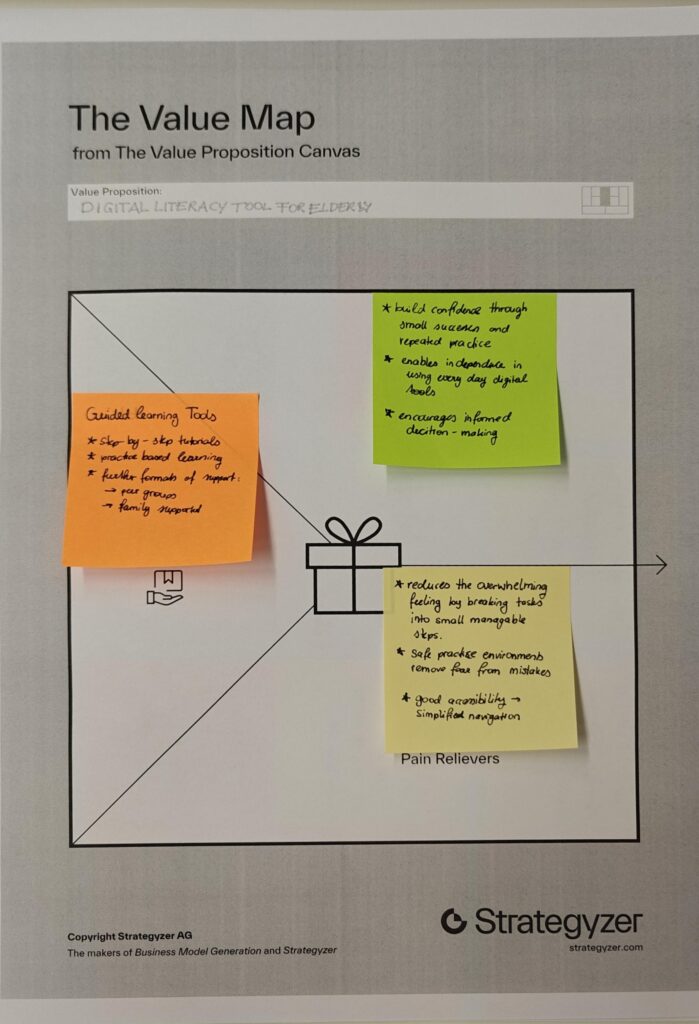
My idea is a dedicated learning platform that teaches digital literacy to older adults in an accessible and supportive way. Instead of overwhelming users with complex interfaces, it focuses on small, everyday learning steps that are easy to understand and immediately applicable. The platform could combine short guided lessons, interactive exercises and real-life scenarios, such as recognizing scams, using messaging apps or navigating government services online. It also provides on-demand help when users get stuck, so learning becomes part of daily life rather than a separate, intimidating process.
This platform would not only improve individual confidence and independence, but also reduce the constant need for family members to provide technical support. This allows families to shift their time and energy from troubleshooting problems to spending more meaningful time together. Ultimately, the goal is not just to teach technology, but to enable participation, confidence and connection in a digital society.
Imagine you’ve just bought the biggest game of the year. You sit down, you turn it on, and realize you actually can’t read anything that’s on the screen. The text is too small, the colors blend together, and no matter how much you squint, the game keeps on being a blur. For millions of players, this isn’t just a “What if?” scenario, it’s reality. Right now, most game UIs are “one-size fits all”. Designers want to help, but they’re overwhelmed by technical rules or tight deadlines. This results in cluttered UI that’s a hassle for everyone.
My solution is an interactive design toolkit that acts as a digital sandbox for game UI designers. They can drag and drop elements that are already optimized for accessibility. And it’s not just sight, it also provides a framework for haptics and audio cues. What makes it special is that it turns accessibility from a complex chore into a standard with a creative workflow. It makes games more inclusive, but also really helps designers.
I’m doing this is because games have personally improved my quality of life immensely and I’m very passionate about them and about UI design. I want to make sure that people all around the world, regardless of their physical abilities, can have the opportunity to enjoy games as much as I do and be immersed in these worlds as much as I am.
Since last semester I realized that different tools work better for different levels of aerialists, I decided to also test out the 3 prototypes with 3 different participants (henceforth referred to as P1, P2 and P3) who were complete beginners in aerial, with no experience in the field. The following are the findings of the research through design process.
Hanger silk
When explaining the basic French climb with the hanger silk, a problem arose in the fact that the explainer would need both hands to simulate the movement of the feet, but the hanger would still need to be held up. Plus, it was no more useful for P1, P2 and P3 than just explaining the French climb on the actual aerial silk, with hands instead of feet (in order to avoid the physical burnout and need for strength). P3 even mentioned that the hanger silk is not needed, since if you have the silk in front of you, you can also explain it there. Thus, I decided to remove the hanger silk from the final prototype kit.
Neon sleeves
Contrary to the advanced learners and to what was expected, P1 preferred the use of the neon sleeves when she put them on the opposite side of the side the explainer had them on. When asked about this, P1 mentioned that it helped her to pretend that she was seeing in a mirror rather than trying to copy another person. Instead of seeing this as a challenge, I choose to see it as an opportunity of the product itself – with no rules and no restrictions, people can use it however will be more useful to them. When P3 put on the sleeve, after a bit of time I noticed that she didn’t have it on anymore. When asked, she said that she took it off because she was hot. Additionally, since she doesn’t have any problem distinguishing left and right, she said that the neon sleeves didn’t really have an effect on her learning. This furthers the conclusion that the sleeves are useful only in specific cases, and should be included in the final prototype kit, even if they’re not the main focus.
Little guy
This prototype was extremely useful for P1, who said “the little guy gives me confidence that I’m not going to die, because I see that he is not falling so it means I will not fall”. For P2, since she had less upper body strength than P1, the little guy was not really useful; however, she expressed interest in being able to keep using it during her aerial silks journey as a helpful tool. In the case of P3, she said the little guy was her favorite prototype, as it really helped her to understand the difference that body position makes. However, even though she theoretically understood the importance of folding your body to do the hip-key, she still wasn’t able to perform the hip-key in the first attempts, since she wasn’t folded enough. When asked about this, P3 said that she “didn’t think it was necessary to be that extreme”. This furthers the conclusion (from the user testing with advanced students) that one of the most important elements of the little guy is the ability to let students touch and explore through him. In P3’s case, it would’ve been useful to understand the breakpoint from which you go from falling out of the hip key to being locked in place. However, despite this slight hiccup, P3 was able to successfully complete 3 new figures, stay hands-off on the hip-key, AND learn how to climb, which is an impressive feat and not at all expected for beginners, indicating that the use of the prototypes helped accelerated her learning.
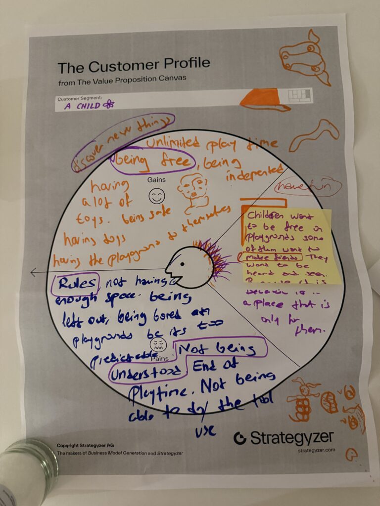
Most playgrounds are designed by adults, based on safety standards, budgets, and assumptions about children. As a result, they often become predictable, restrictive, and sometimes even boring.
From a child’s perspective, the challenges are different:
Not enough freedom or space
Too many rules
Feeling excluded or not heard
Limited opportunities to explore or discover
Playgrounds are supposed to be spaces of joy, but they often fail to reflect what children actually want: freedom, creativity, and a sense of ownership.
Why should we care?
This matters because playgrounds are not just physical spaces—they are environments where children develop socially, emotionally, and creatively.
When children are not included:
They spend less time in these spaces
They feel less connected to them
Their needs and ideas are overlooked
But when they are included, something shifts. Playgrounds become more engaging, more meaningful, and more used. They stop being just “installed structures” and start becoming lived experiences.
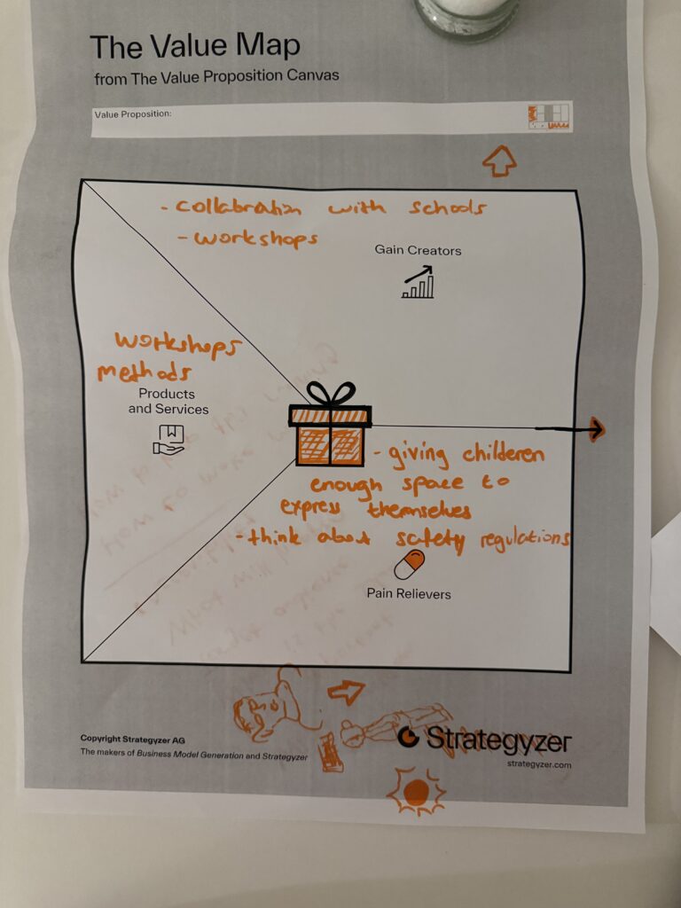
What is the solution and how does it work?
My approach is to introduce participatory design methods, especially through workshops with children.
Instead of asking children to adapt to a finished design, the process invites them to:
Express ideas through drawing, storytelling, and play
Share feelings about existing playgrounds
Imagine new possibilities
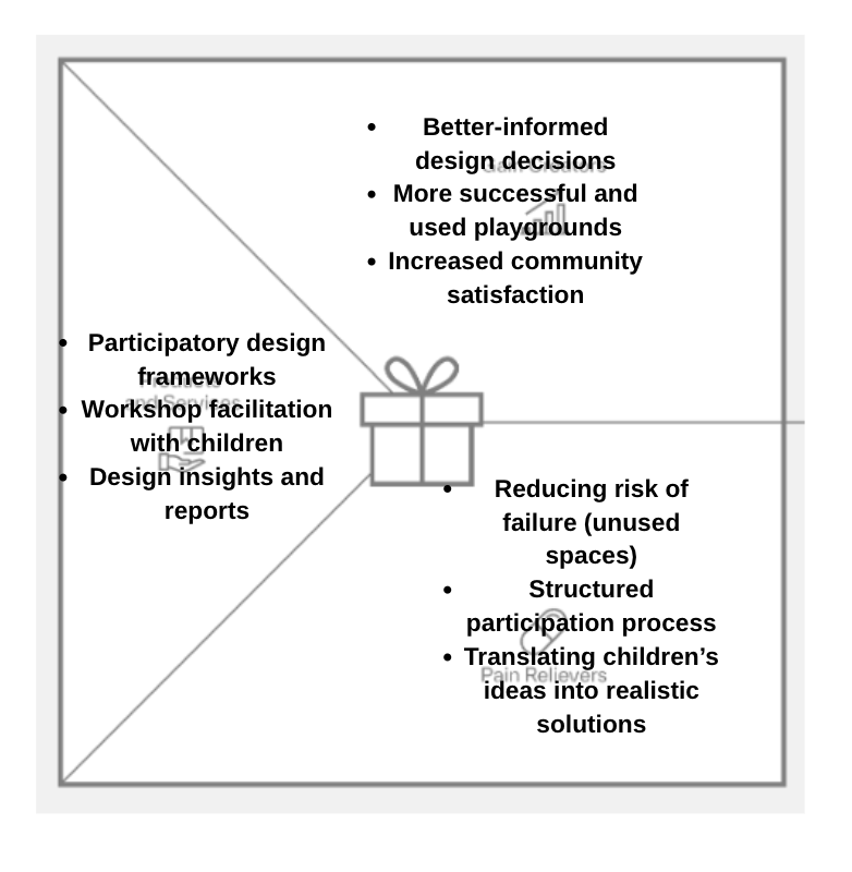
These workshops act as tools that translate children’s thoughts into design input. At the same time, the process still considers real-world constraints like safety regulations and feasibility.
So the solution is not a single playground design—but rather a design process: → one that creates space for children to be heard → one that balances creativity with structure
Who is the target audience?
The primary “users” are children, but the system involves multiple stakeholders:
Designers and urban planners
Schools (as collaborators)
Parents and caregivers
Municipalities
In this sense, children are both participants and beneficiaries, while institutions act as enablers of the process.
What is going to happen? (Change & Impact)
If children are included in the design process:
Before:
Playgrounds are standardized and repetitive
Children feel disconnected
Design decisions are top-down
After:
Playgrounds become more diverse and engaging
Children feel ownership and belonging
Spaces are used more actively
Bonus: How could this create value?
This approach could evolve into a service or framework:
Workshops organized with schools and municipalities
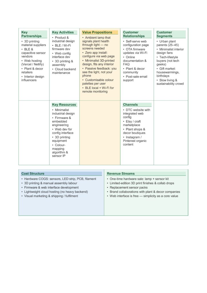
This business model canvas shows how Lumina Terra combines plant care and ambient lighting in a simple and accessible way. The main idea is a minimal lamp that uses light to communicate plant health, without the need for screens or complex apps. The product is developed through design, prototyping, and basic technology integration, supported by partners such as material suppliers, sensor providers, and plant shops. It is aimed at people who like indoor plants, simple design, and a calm home environment. The product is mainly distributed online and through design or plant-related stores. The costs are related to hardware production, development, and shipping, while revenues come from selling the lamp and sensor kits, as well as possible collaborations.
To develop an effective product, it is essential to start from an understanding of users’ needs, difficulties, and expectations.
Costumer jobs
Users want to take care of their plants, keep them healthy, and understand their needs without spending too much time or effort. At the same time, they want to create a cozy home environment where objects are not only functional but also aesthetic.
Costumer pains
However, several pains emerge. People often forget to water their plants or do not know when and how much water to give. It can be difficult to understand the real condition of the soil, especially for non-expert users. In addition, many smart solutions require continuous use of apps and screens, making them intrusive or not suitable for a home environment. There is also a sense of uncertainty, linked to the fear of damaging the plants.
Costumer gains
Users are looking for a simple and immediate way to understand the health of their plants. They want to reduce uncertainty and make plant care easier and more enjoyable. At the same time, they appreciate products that integrate well into the home space, contributing to a warm and relaxing atmosphere. A sense of satisfaction and connection with nature is also an important value.
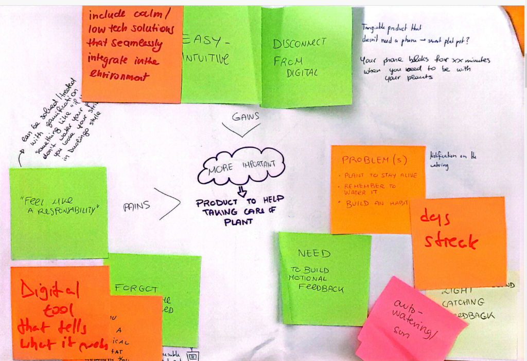
Fig 1: Feedbacks collected during a consultation workshop
Value Map
The value map translates these needs into design solutions.
Regarding the product & services, the idea is to develop a lamp as a first product, capable of combining ambient lighting and plant care. The lamp is connected to soil moisture sensors placed in plant pots and communicates via Bluetooth Low Energy, while Wi-Fi connectivity allows monitoring and configuration through a minimalist mobile app.
It is also important to consider the pain relievers, which in this case are mainly focused on reducing uncertainty for first-time users, as well as reducing the effort and time required to take care of plants. The goal is to design a slow, consistent, and non-intrusive feedback system that does not rely too much on digital technologies or continuous smartphone use.
The analysis of the gain creators helped identify which aspects to integrate in order to improve the overall experience. Users are looking for a simple and immediate way to understand the health of their plants. They want to reduce uncertainty and make plant care easier and more enjoyable. At the same time, they appreciate products that integrate well into the home space, contributing to a warm and relaxing atmosphere. A sense of satisfaction and connection with nature is also an important value.
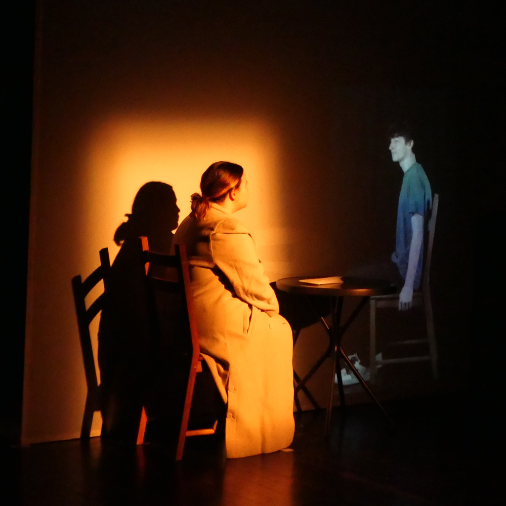
I chose the paper “Appropriating Technology for Interactive Media in Theatre: Design Strategies and Aesthetic Insights” because I have some personal experience with this topic.
Personal Experience
I have identified the potential of including animations in theatre plays a few years ago for a project in my local theatre club.
Due to the budget as well as technical restrictions we only ever played a static animations which the actors had to make movements along with it. This was challanging for them, because they always had to know the animated videos by heart. I realised that they were missing visual cues on when to, for example, raise their arm to “trigger” a certain movement.
If we had an x-box availble this would have been easier.
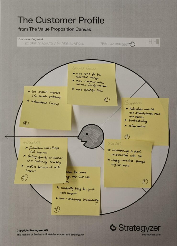
I chose two customer profiles that complement each other well, as they are closely connected in everyday life. Many younger people share the experience of being the “family tech support,” where interactions with older relatives often revolve around fixing devices or explaining the same things repeatedly. This dynamic can become frustrating over time and often takes away from the opportunity to spend more quality time together.
By looking at both older adults and their family members, it becomes clear that the problem is not one-sided but affects both groups.
Value Proposition
Product/Business Ideas
Which Problem are you solving?
Problem of digital literacy in elderly people.
Many older adults struggle to use digital technologies, which makes it difficult for them to participate in everyday online life. This can lead to social isolation, limited access to information, and increased vulnerability to scams or misinformation.
Why is it important to care about it?
Because there will be more and more elderly people in the future.
People are going to work until a later age.
Older Adults should be able to be independent as long as possible.
What is the solution you are offering? How does it work?
The solution is a tool or method that helps older adults learn how to use technology in a simple, structured and accessible way.
Who is the target audience? Who is the customer?
The primary target audience is older adults (silver surfers) who are not digital natives and need support in understanding and using technology. Secondary users include their family members, who benefit from reduced support burden and improved quality time.
What is going to happen? (Change & Impact)
The tool or method aims to increase confidence and independence among older adults, enabling them to actively participate in digital life. This can lead to stronger social connections, better access to information and safer online behavior.
How are you securing accessibilty and inclusion, and for whom?
Accessibility is a core part of the concept. The tool should to accommodate different needs, including visual, auditory and motor limitations.
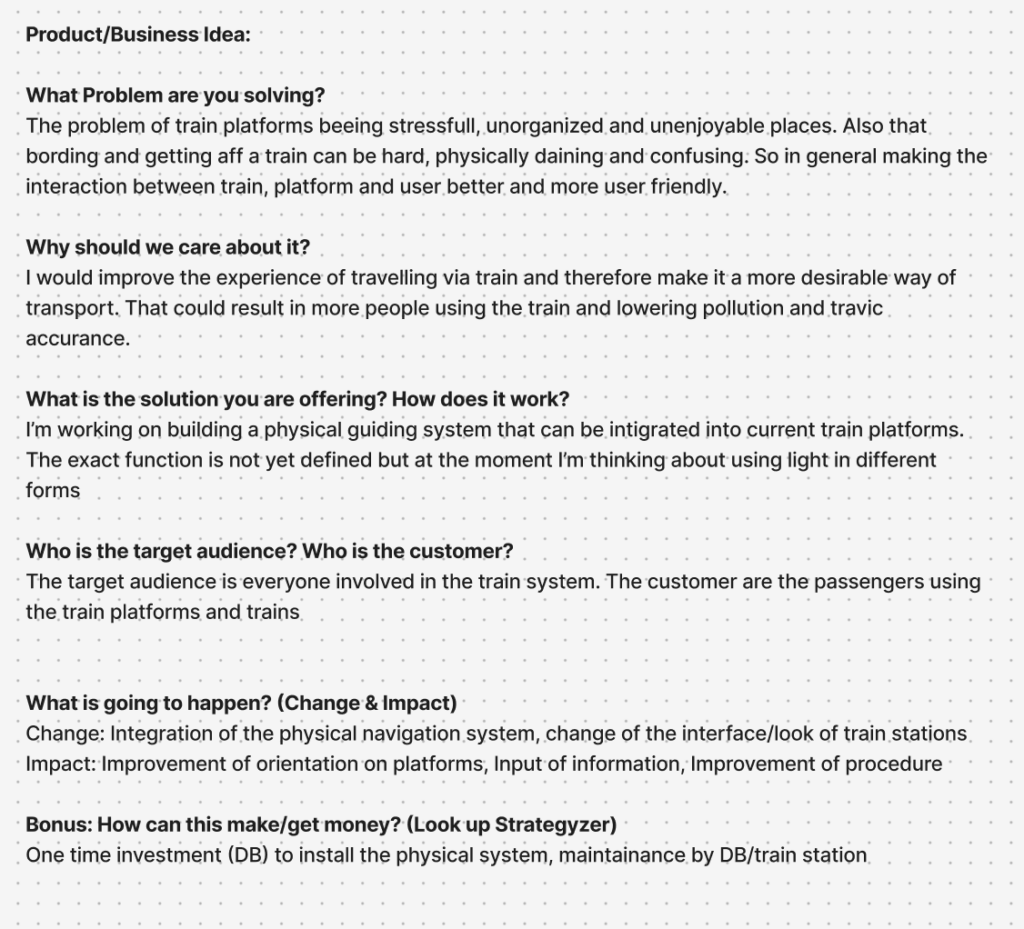
Designing for complex public environments requires more than addressing isolated user interactions. It demands an understanding of the broader system in which these interactions occur. Therefore, I decided to conduct further research in relation with the help of a university lecture and five different strategic methods, that aim to provide further clarity and a more structured insight into the different parts of this project.
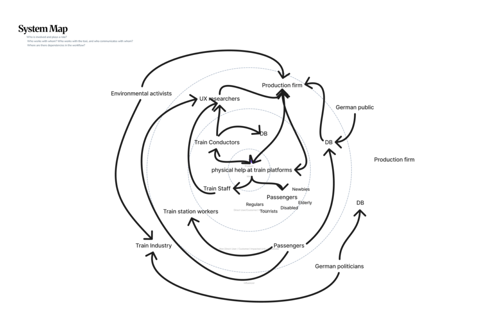
System Mapping
The first of those approaches is system mapping. It is used within design research to visualize relationships between actors, infrastructures, and external influences. Rather than focusing on single touchpoints, system maps enable designers to identify interdependencies, power structures, and flows of information, and uncover opportunities for more systemic and sustainable interventions (zero360., 2026). In this project, system mapping serves as the starting point for investigating the experience of German train platforms. These environments are characterized by high density, time pressure, and diverse user groups, making them inherently complex.
At the center of the system map lies the proposed design intervention: a physical guidance system intended to improve orientation and interaction on platforms. Placing this concept at the core allows for a structured analysis of how it connects to and influences the surrounding system. The layer around the focal point consists of direct stakeholders, including passengers, train staff, and Deutsche Bahn (DB). Passengers represent the primary user group, yet they are far from homogeneous. Commuters prioritize efficiency and speed, tourists require clarity and guidance, while elderly users or individuals with disabilities depend on accessibility and physical support. Train staff and conductors, on the other hand, are concerned with operational efficiency and safety. By mapping these different perspectives, it becomes clear that improving the platform experience requires balancing multiple, and sometimes competing, needs. Expanding outward, the system includes indirect stakeholders such as station personnel, UX designers, engineers, and production teams. These actors are responsible for implementing, maintaining, and iterating the proposed solution. Their inclusion highlights that design outcomes are not only shaped by user needs but also by technical feasibility, organizational structures, and economic constraints. On an even broader level, societal actors, such as the general public and environmental stakeholders, introduce additional layers of influence, shaping long-term priorities such as sustainability and public acceptance.
The relationships between these actors are visualized through a network of connections, illustrating flows of communication, influence, and dependency. The density of these connections reveals a highly dynamic system in which changes to one element can have cascading effects across others. This insight directly informs the next step of the design process: evaluating how an intervention might alter the system.
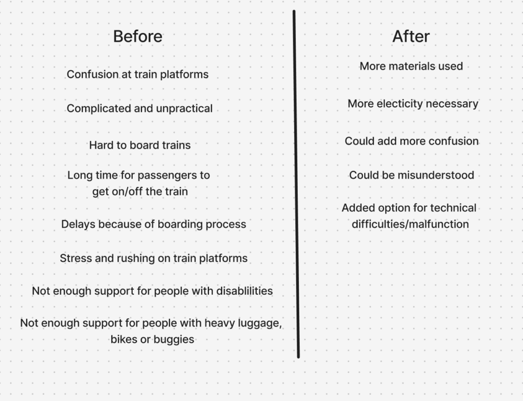
Discovered Change & Impact
To address this, a Change and Impact map was developed. Building directly on the system map, it introduces a temporal dimension by comparing the current state (“Before”) with a projected future scenario (“After”). The “Before” perspective synthesizes the key issues identified in the system analysis, including disorientation, overcrowding, inefficient boarding processes, and limited accessibility. These challenges are not isolated but interconnected, reinforcing one another and contributing to an overall stressful experience (Mural, 2025).
The “After” perspective explores how the proposed physical guidance system could transform these conditions. For example, improved orientation may reduce passenger uncertainty, which in turn can streamline movement flows and support more efficient boarding. However, the map also critically considers potential trade-offs, such as increased reliance on technological systems, maintenance requirements, or unintended behavioral changes among users. This step is crucial, as it ensures that the design is not evaluated in isolation but as an active component within a complex system. The logical progression from system mapping to impact evaluation demonstrates how insights are translated into informed design decisions.
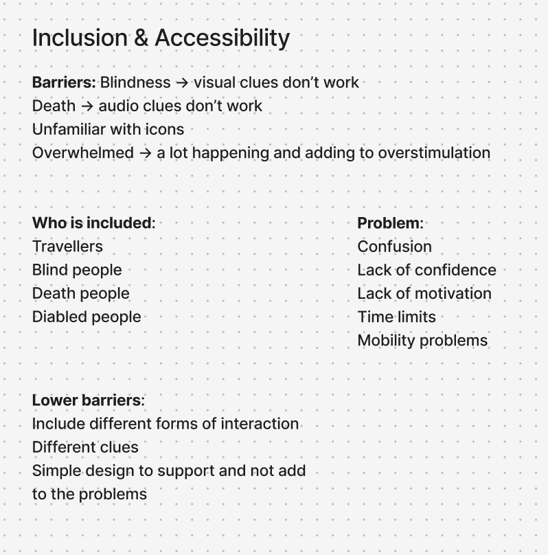
Inclusion & Accessibility
In parallel, the project integrates inclusion and accessibility as fundamental design principles. Inclusive design research emphasizes that accessibility should be embedded from the beginning, rather than later along the design process (Figma, 2026). To operationalize this, two additional mapping approaches were used. The first identifies the physical, cognitive, and social requirements necessary for users to fully experience the product. The second focuses on barriers, analyzing which user groups may be excluded and why.
This analysis revealed that physical guidance systems, while potentially beneficial, can also introduce new barriers, particularly for individuals with visual, auditory, or cognitive impairments. As a result, the design strategy prioritizes multimodal interaction, ensuring that information is communicated through multiple sensory channels. At the same time, a minimal and clear design language is emphasized to avoid adding complexity to already dense environments. These considerations are directly linked back to the system map, reinforcing the idea that inclusive design is not a separate concern, but an integral part of the overall system.
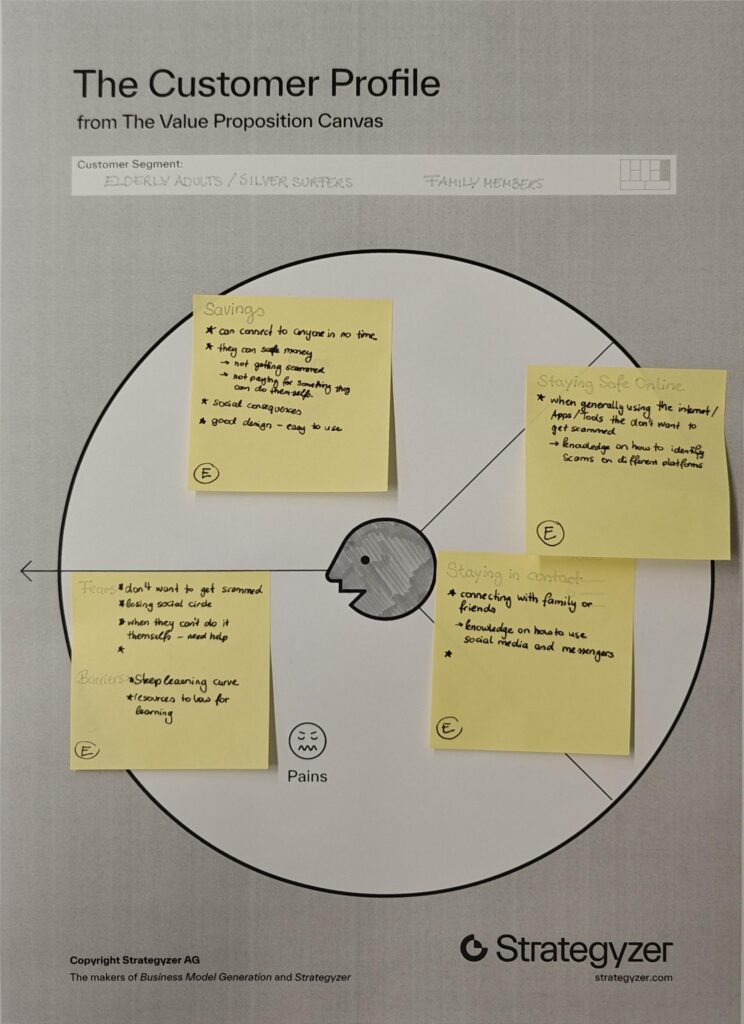
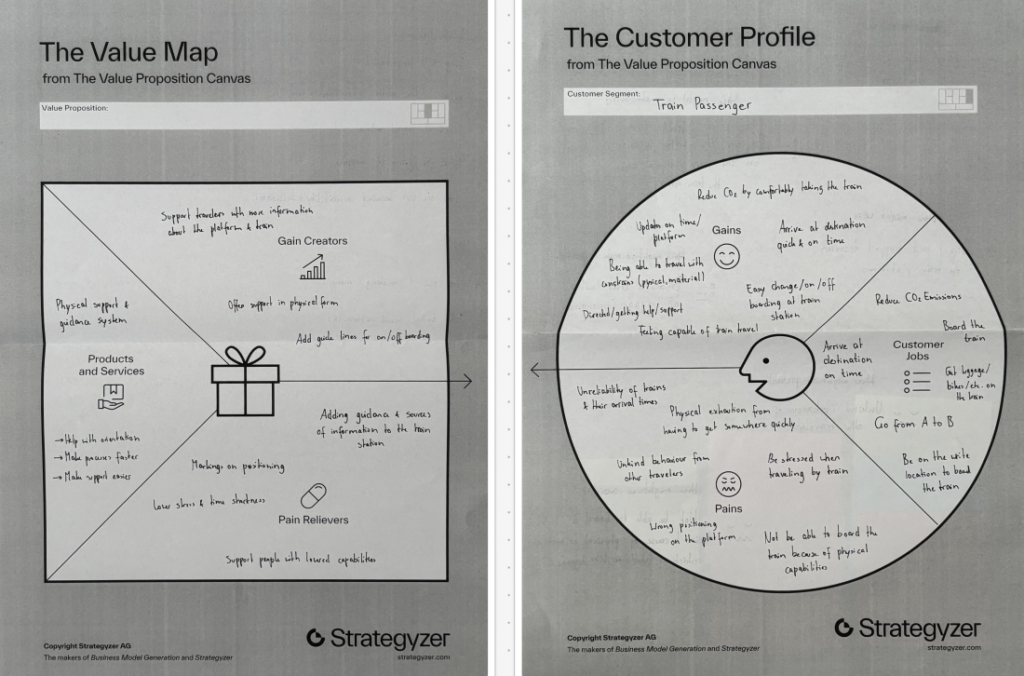
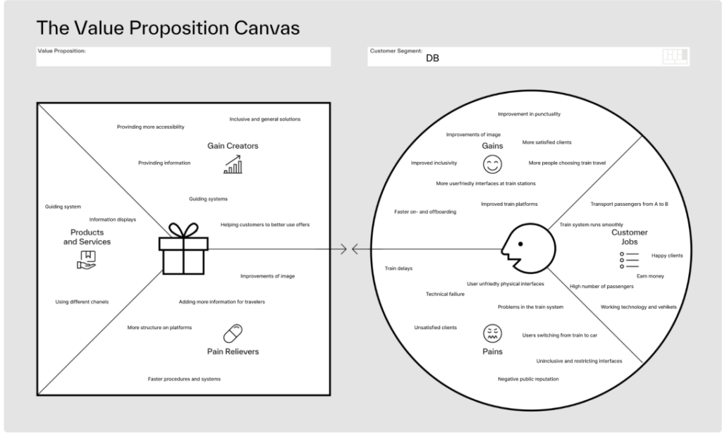
Value Proposition Canvas
To further refine the concept, the Value Proposition Canvas (Strategyzer, 2026) was applied. This tool builds on previous analyzes by explicitly linking user needs to design solutions. The Customer Profile identifies key user goals, such as navigating efficiently and reducing stress, alongside pains like confusion and overcrowding.
The Value Map translates these insights into concrete design features, including intuitive guidance systems and improved information structures. To get a second view point, the canvas was also applied to Deutsche Bahn as an organizational stakeholder, highlighting goals such as operational efficiency and customer satisfaction. This dual perspective ensures that the proposed solution aligns both with user expectations and institutional objectives.
Product Idea
The outcome of this interconnected process is a product concept for a physical guidance system integrated into train platforms. While still in the brain-storm phase, the current direction explores the use of light-based elements, such as illuminated pathways or dynamic signals, to guide passengers intuitively. The concept directly responds to the insights generated through the system mapping, the impact analysis, and the user-centered frameworks.
Information Gathered
In conclusion, the use of system mapping, Change and Impact analysis, inclusive design methods, and value-driven frameworks were valuable methods to create valid connections and help get a clearer picture of the problem at hand and what factors have to be considered, when designing for a complex and challenging physical space. Each method builds upon the previous one, creating a logical progression from understanding complexity to proposing targeted interventions. This showed me how important it is to view design not as isolated problem-solving, but as a practice to deeply understand complex interactions and interconnected systems.
Next Steps
With the added insights and findings, the prototypes that were already developed can be refined and tested. After that I want to work on defining the end product narrower through more in-depth research and prototyping with higher fidelity.
Literaturverzeichnis
Figma. (2026). Accessibility and inclusion in design. Von Figma: https://www.figma.com/resource-library/creating-accessible-and-inclusive-design/ abgerufen
Mural. (2025). Change impact assessment template. Von Mural: https://www.mural.co/templates/change-impact-assessment abgerufen
Strategyzer. (28. January 2026). The Value Proposition Canvas. Von Strategyzer: https://www.strategyzer.com/library/the-value-proposition-canvas abgerufen
zero360. (2026). Was ist: System Mapping. Von zero360.: https://zero360.de/glossar/system-mapping/ abgerufen