Die analoge Welt (Part 6)

Da mir im letzten Beitrag klar geworden ist, dass viele meiner Arbeiten auf analogen Prozessen basieren und mir das sehr viel Spaß macht, möchte ich versuchen, mein Self-Branding darauf aufzubauen. Mein Ziel ist es, eine analoge Technik zu finden, die ich in Zukunft sowohl digital (Website, Social Media) als auch analog (Visitenkarten etc.) verwenden kann.

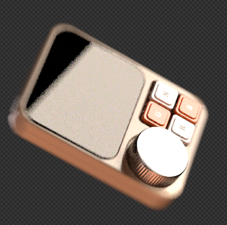
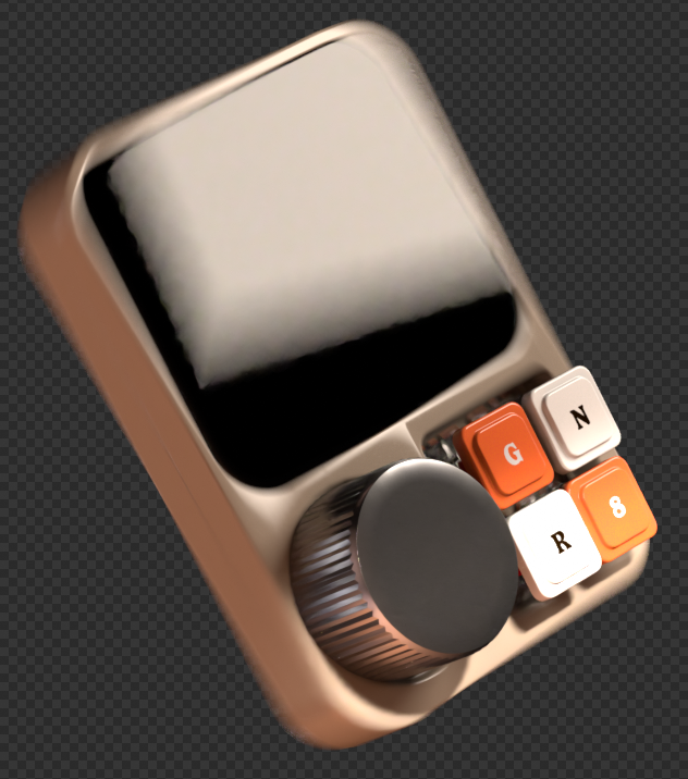
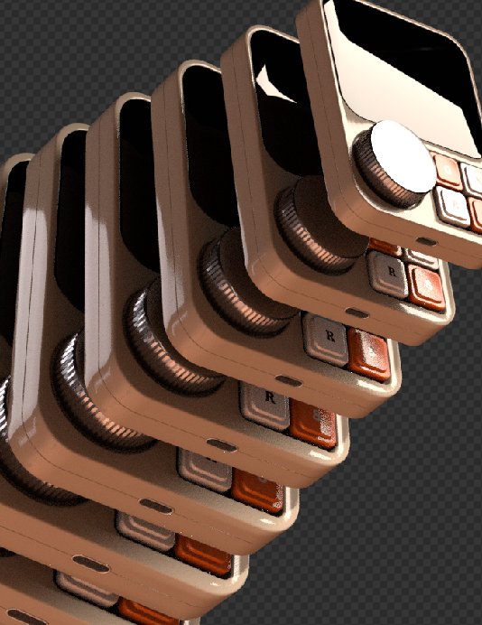
In diesem Beitrag erzähle ich über die erste Technik, die ich ausprobiert habe: 3D-Linoldruck. Was ist das eigentlich? Das Prinzip der Erstellung des finalen Bildes ist ähnlich wie beim echten Linoldruck: Man hat mehrere Farben, also mehrere Druckplatten, und druckt sie nacheinander übereinander.

Der Unterschied ist aber, dass ich nicht mit echtem Linol gearbeitet habe, sondern die Druckplatten digital erstellt und anschließend als 3D-Objekte produziert habe. Dadurch entsteht eine Mischung aus analogem Look und digitalem Prozess — genau diese Kombination finde ich gerade besonders spannend.

Was mir daran gefällt, ist, dass die Ergebnisse nicht perfekt aussehen. Kleine Verschiebungen, sichtbare Strukturen und Fehler machen das Ganze menschlicher. Gerade in einer Zeit, in der so viele Designs sehr glatt und KI-generiert wirken, fühle ich mich mehr zu solchen unperfekten und greifbaren Prozessen hingezogen.

Screenshot

+ Mir gefällt diese Technik, weil man im Vergleich zum klassischen Linoldruck viel mehr Spielraum mit Texturen hat.

+ Außerdem kann man Acrylfarben verwenden, was diese Technik für mich einfacher und günstiger macht.

Im Vergleich zum traditionellen Linoldruck steckt allerdings weniger Handarbeit darin, weil die Platten nicht per Hand ausgeschnitten werden. Trotzdem mag ich gerade diese Mischung aus digitalem und analogem Prozess sehr.

Für das Fanzine-Festival habe ich bereits Postkarten in diesem Stil produziert und bin gespannt, welches Feedback ich dazu bekommen werde!

Was haben meine Projekte gemeinsam? (Part 5)

Also, wie ich in vorherigen Blogposts schon überlegt habe, brauche ich sicher eine neue Website, die meine Zielgruppe besser ansprechen wird und meine Identität besser darstellen kann.

Aber was soll da alles rein? Ich habe mir überlegt, dass ich auf jeden Fall meine Poster zeigen will, die bereits an einigen Ausstellungen teilgenommen haben. Damit werde ich mich nicht nur als Designerin, sondern auch als Künstlerin präsentieren!

Zurzeit habe ich an sechs Poster-Ausstellungen teilgenommen, und die siebte wird unsere Master-Ausstellung sein. Meine Poster waren bereits in unterschiedlichen Ländern zu sehen, wie der Ukraine, Spanien, Österreich und der Türkei. Auf meiner Website möchte ich klar machen, dass ich nicht nur eine in Österreich basierte Designerin/Künstlerin bin, sondern auch gerne an internationalen Projekten teilnehme.

Die Themen, die meine Poster ansprechen, sind unterschiedlich, aber eines ist klar: Es geht immer um den Menschen. Das ist, was ich ausgesucht habe:

Dann habe ich mir gedacht, dass ich meine Bachelorarbeit unbedingt als künstlerisches Projekt integrieren möchte, weil ich sie sehr liebe und gerne an ähnlichen Projekten teilnehmen würde.

Damit ich mich auch als Designerin präsentieren kann, möchte ich zwei Projekte einbauen, die ich für echte Kund*innen umgesetzt habe. Eines davon ist das Kochbuch für das Caritas Marienstüberl, bei dem ich auch die Design Direction übernommen habe. Dabei ging es um Illustrationen, Layoutdesign und Druckvorbereitung.

Das letzte Projekt, das ich gerne in meinem Portfolio zeigen möchte, ist ein ganz frisches Projekt, das ich für die FH Joanneum beziehungsweise den Studiengang Nachhaltigkeitskommunikation und Klimajournalismus gestaltet habe. Dort habe ich mit dem Risodrucker gearbeitet und außerdem Layout- sowie Social-Media-Design umgesetzt.

Als ich mir alle meine Projekte gemeinsam angeschaut habe, bin ich draufgekommen, dass sie alle etwas verbindet: menschliches Leben und die Abwesenheit von KI. Viele Projekte wurden mit analogen Techniken umgesetzt oder sehen zumindest so aus, als wären sie analog gestaltet worden. Ich glaube, dass das eine gute Basis für mein Self-Branding ist, mit der ich weiterarbeiten kann.

From Interruption to Adaptation: Narrowing a Research Direction

In my first blog post of this semester, written after the lo-fi prototyping session, I described a frustration that felt more important than the prototype itself. Moving from theoretical research into a quick physical test forced me to confront something I had been postponing: my topic is difficult to make visible. Attention, interruption and cognitive recovery are not things you can easily point at on a screen. They happen internally, across time and often become visible only through their consequences.

At the time, that post was mostly about the limitations of the format I had tested. Looking back, it was also the beginning of a more important question. If the topic I am researching is hard to prototype, then maybe the issue is not only the prototype. Maybe I had not yet defined clearly enough what kind of design problem I was actually trying to make visible.

This post continues that questioning.

Where the First Semester Left Off

Last semester I wrote ten posts about attention, flow, interruption, memory, emotion, and neuroadaptive interfaces. Taken one by one they look scattered. Taken together, they were building toward something I could not yet name.

The clearest position I reached was in my final post: interruption is not a problem to eliminate, it is a condition to design for. What matters is not whether a system interrupts, but whether it does so at the right moment, with the right cost, and with enough support for the user to recover.

That framing felt like a conclusion at the time. Looking back, it was more like a door. The research had built a detailed picture of what goes wrong attention fractures, cognitive load spikes, emotional friction accumulates, memory decays but it had not yet said what to do about it, in what context, using what kind of design.

That is what this semester is supposed to resolve.

A Detour That Wasn’t Really a Detour

Earlier this semester I joined a project connected to CERN’s IdeaSquare initiative through our university. My group was working on individual and communal spaces, specifically the idea of modular, adaptive environments that can shift and reconfigure themselves in response to the people using them.

At some point during the project I pushed the team toward a particular angle: spaces that adapt to their users, not the other way around. The environment should read who is there, what they are doing, and what they need, then reorganize accordingly. Less about static design and more about responsive systems.

I did not connect this to my research at the time. It just felt like the right direction for that project.

Later I realized I had done exactly the same thing I had been studying. The question I brought into that spatial design project was the same question underneath my first semester work: what would it look like if systems adapted to human state, rather than expecting humans to adapt to them? In the CERN project, the system was a physical space. In my research, it had been a digital interface. But the logic was identical.

That overlap was worth noting. Not because it proves anything, but because it confirmed something: this is not an academic interest I adopted for a class. It is genuinely how I think about design.

The Problem With Where I Was

After last semester, I had a topic cluster but not a research direction. There is a real difference. A topic cluster is a set of connected ideas you can read about indefinitely. A research direction has a specific question, a context, and a method.

My cluster was attention, interruption, cognitive load, recovery, neuroadaptive systems. Interesting and defensible, but I was circling the same ideas without committing to a specific design problem.

The first blog post of this semester already hinted at this. The lo-fi prototype did not fail because the topic was weak. It struggled because I was trying to represent an internal and temporal topic before fully deciding what form of intervention I was actually designing toward. The session was useful precisely because it exposed that gap.

The second semester also added a different kind of pressure. The business-framing exercises pushed me to specify who is affected, how and what a system would actually do. Together with the prototyping difficulties, this made clear that narrowing was not optional anymore.

What I Actually Want to Research

The direction I have arrived at is best described as adaptive interaction design.

Not notification management. Not UX for focus apps. The broader question is what it would mean for interfaces to adapt their behavior based on the user’s current cognitive state, rather than treating every moment as equally available for input, output, or interruption.

The interest in neuroadaptive and EEG-based systems from last semester was never really about brainwaves. It was about the interaction logic they represent: a closed-loop system that reads the user continuously and responds accordingly. That loop, not the hardware, is what I find compelling. The philosophical stance is that machines should adapt to humans, not the other way around. The sensor stack is just one implementation of that idea.

What has become clearer this semester is that newer forms of adaptive systems make this question even more urgent. When systems act, update, or reorganize information while the user is absent, the moment of return becomes a design problem in itself. My earlier research on interruption, memory, and resumption maps directly onto this. The cognitive science is already there. What is still missing is a clear design response.

Where This Is Heading

I am not committing to a final thesis question this semester. That is not what this phase is for. What I am committing to is a direction: adaptive interaction design, specifically the intersection of cognitive state, interruption, and resumption in contexts where systems change while the user is absent.

The medium is still open. It could remain screen-based. It could later move into spatial or wearable contexts if the research actually needs that. I do not want to decide the form too early.

What I want to do this semester is go deeper into the literature on workload-aware systems, neuroadaptive interaction, and newer adaptive interface models, then develop a prototype concept that makes the re-entry problem testable. Not to solve it immediately, but to make it visible enough to study.

The first blog post of this semester started with a prototype that revealed the limits of my current framing. This post is the continuation of that realization. The question is no longer only how to prototype interruption and recovery. It is how to define a research direction where adaptation itself becomes the design material.

That is the point I seem to have reached. Now the next task is to see whether I can narrow it without losing what made it interesting in the first place.

One-Shot-Sport-Dokumentation: Die Production 

Anmerkung: Dieser Blogbeitrag wurde etwas weniger wissenschaftlich und mehr subjektiv bzw. persönlich verfasst

Für den Dreh des Werkstücks der One-Shot-Sportdokumentation ging es am 24. April auf den Red Bull Ring in Spielberg. Das Porsche Cup Deutschland Team „Proton Competition“ hat sich bereit erklärt, für den Dreh einen Fahrer bereitzustellen. Das Team war mit rund 20 Leuten und fünf Fahrern für den österreichischen Bewerb der Rennserie angereist. Am Freitagnachmittag, zwischen freiem Training und den beiden Qualifying-Sessions des Wochenendes, war der Dreh des Werkstücks geplant. 

Die Ankunft 

Bereits sehr früh stellte sich durch diverse Gespräche heraus: Proton Competition ist es ein sehr entspanntes und cooles Team! Alle Planung und jedes Entgegenkommen wurden immer mit einem Satz beantwortet: „Du wirst Teil des Teams sein und wir richten uns nach dir!“. Das erleichterte den organisatorischen Teil des Werkstücks bereits in der Planung um einiges. 

Da das letzte freie Training am Freitag von 13:00 bis 14:00 Uhr stattgefunden hat, aber die beiden Qualifyings für die Rennen am Wochenende erst um 18:00 Uhr geplant waren, bot sich der Nachmittag perfekt für den Filmdreh an. Mit wenigen Erwartungen und viel Freude ging es also an den Red Bull Ring, um für einen Tag einem Traumjob nachzugehen. Bereits am Eingangstor erwartete mich ein Teammitglied von Proton Competition – Theresa. Auch sie ist noch Studentin und kümmert sich an den Rennwochenenden um alle organisatorischen Angelegenheiten. Mit einem Season 2026 Pass und einem Media-Parking-Ticket ging es dann weiter zum Parkplatz direkt vor dem Eingang der Rennstrecke. 

Wie bereits in vorherigen Blogposts erklärt, sind die Pitboxen des Porsche Sixt Carrera Cup Deutschlands in Spielberg durch die vielen Support-Rennserien der DTM „nur“ Zelte. Diese sind für alle Zuschauer:innen erreichbar, was die Rennserie im Allgemeinen sehr nahbar macht. Am Freitagnachmittag war am Red Bull Ring noch nicht so viel los, wie am Rest des Wochenendes, was das Filmen aus Platzgründen im Zelt später erleichtern würde. 

Zuallererst durfte ich das gesamte Team kennenlernen. Proton Competition besteht aus ca. 20 bis 25 Mitglieder, die an den Rennwochenenden dabei sind. Bis auf die CEO und Senior Engineer Positions, sind alle sehr jung und im Alter zwischen 18 und 25 – auch die Fahrer. Proton Competition hat fünf Fahrer: 

  1. Markus Amand, den Porsche Junior
  2. Keagan Masters, mein Interviewpartner und der derzeitige Championship-Leader 
  3. Dylan Yip, der temperamentvolle Rookie 
  4. Gustav Berström, dessen Vater ihm den Rennsport ermöglicht 
  5. Daniel Ros, der etwas ältere Schwede, der nicht in der Teamwertung fährt 

Nicht nur bei der Ankunft, sondern auch über den gesamten folgenden Samstag waren alle Teammitglieder außerordentlich freundlich und herzlich. Alle waren per Du und gaben mir das Gefühl, wirklich Teil des Teams zu sein. Außerdem durfte ich auch am Samstag mit Proton Competition das Rennen aus der Pitlane direkt an der Start-Ziel-Gerade verfolgen, sowie vor dem Start die Rennstrecke betreten. Auch am Freitagabend wurde ich zum Qualifying in die Pit eingeladen, was dem Sport eine ganz andere Bedeutung und Gefühl gibt. 

Der Dreh 

Durch das Post-Scrutineering, was nach jeder Bewegung des Autos auf der Strecke erfolgt, um zu sehen, ob alles regelkonform abgelaufen ist, verspätete sich der gesamte Zeitplan ein wenig. Trotzdem nahm sich Championship-Leader Keagan Masters sofort Zeit für das Projekt. Nachdem die Idee erklärt war, gingen wir in den großen Team-LKW, in dem sich auch das (Gott sei Dank klimatisierte) Büro bzw. Meeting-Raum befand, wo wir das Interview drehen konnten. Da Keagan aus Südafrika stammt, wurde dieses auf Englisch durchgeführt. Bei dem 8-minütigen Interview ging es vor allem um Emotionalität, Mentalität und die Bedeutung des Rennsports, um dem Werkstück einen emotionalen Touch zu verleihen und Gefühle hervorzurufen. Gleichzeitig soll es sowohl den Fahrer als auch den Sport näher an das Publikum bringen und ihn menschlich darstellen. 

Nach einem erfolgreichen Interview waren die Mechaniker des Teams gerade dabei das Auto auf das anstehende Qualifying vorzubereiten. Deshalb folgte ein sehr wichtiger Teil von One-Shot-Produktionen, der vor allem aus Zeitgründen sehr wichtig für das Projekt war: die Proben. Dabei ging es darum, Keagan den Ablauf zu zeigen und den Platz in der Box bestmöglich auszunutzen, ohne jemandem im Weg zu stehen. 

Fotos: Lorenz Rist

Learnings

Das Schrauben am Auto und die Proben führten dann zu einem kleinen Hindernis: Die eigentlich lange Zeit zwischen Training und Qualifying war zu einer beträchtlich kürzeren geschrumpft. Deshalb fehlte dieser wichtige Teil der Proben und der ausreichenden Zeit für einen perfekten Take. Trotzdem gab das Team mir zwei Versuche und die Möglichkeit, am Samstag gegebenenfalls nochmal zu Drehen. 

Ein weiteres Problem stellte die Größe von Keagan dar, die sich mit dem nicht so vorhandenen Platz manchmal im Video zeigt. Gleichzeitig wurde der Gimbal samt Kamera nach einer Zeit etwas schwer. Außerdem war ich trotz Proben zuhause und vor Ort nicht vertraut genug mit dem Gimbal, was das Drehen etwas erschwerte. 

Trotzdem war der Dreh ein Erfolg. Nicht nur war es ein Schnuppern von Traumberuf-Luft, sondern auch das Networken mit der Branche. Das Rohmaterial ist etwas wackelig, was aber gut zur Stimmung des Videos passt, und etwas kürzer als geplant (knappe zwei statt geplanten drei bis fünf Minuten). Alles in allem bin ich zufrieden mit dem Produktionsteil des Werkstücks. 

Das Wochenende wurde noch mit einem Doppelsieg von Markus und Keagan am Samstag und einem zweiten und dritten Platz der beiden am Sonntag abgerundet. 

Blog Post 3: From Perception to Persuasion

As my research develops, I find myself moving from a more artistic and perceptual understanding of illusion toward a question that feels increasingly relevant within contemporary design practice: what happens when these same mechanisms enter the fields of branding, marketing, and visual identity? If illusion can hold attention, invite interpretation, and create emotional engagement, then its role may not end in the gallery or installation space. It may also operate powerfully in commercial and communicative design.

This shift in my thinking does not mean abandoning the earlier questions. On the contrary, it grows directly out of them. If people are naturally drawn to images that contain more than one layer, then it seems important to ask how this functions in visual systems that are meant to communicate quickly and memorably. In a world overwhelmed by messages, perhaps what stays with us is not always what is most direct, but what gives us something to discover.

Branding is full of such moments, even if we do not always name them as illusions. Hidden meanings in logos, unexpected uses of negative space, double-image packaging, and visual metaphors in advertising all rely on a similar principle – they reward attention. They ask the viewer to complete something mentally, and that small act of participation can make communication feel more intelligent, more satisfying, and often more memorable. In this sense, illusion may not simply decorate a message, it may strengthen the relationship between the message and its audience.

What interests me here is the possibility that ambiguity can function strategically. We often assume that effective branding must be immediate and fully transparent. Yet some of the most recognizable visual identities are built on subtlety, suggestion, and layered communication. A logo that reveals something more upon closer inspection creates not only recognition, but also a sense of discovery. A campaign that uses visual surprise can interrupt routine perception in a way that feels fresh rather than forced. These are not only aesthetic choices, they are communicative decisions.

This has made me curious about the border between perception and persuasion. How much do visual ambiguity and illusion influence decision-making? Can a brand become more memorable because it asks more from the viewer? Does surprise generate trust, curiosity, or emotional attachment? And where is the line between meaningful visual intelligence and empty cleverness? These questions feel especially relevant today, when attention has become one of the most contested spaces in design.

Some designers and artists offer useful points of reference here. Shigeo Fukuda’s work, for example, demonstrates how with reduction, and visual misdirection can produce images that are both playful and conceptually sharp. Even artists such as Erik Johansson, whose manipulated scenes belong more to constructed image-making than branding, reveal how impossible visuals can remain persuasive when they are emotionally coherent. In different ways, these examples suggest that visual complexity can communicate with force when it is purposeful.

For now, I remain in the research phase, following the thread wherever it becomes most alive.

Blog Post 2: Why Illusion Holds Our Attention

The more I think about illusion, the less I understand it as a separate category of visual play and the more I begin to see it as something deeply connected to the way human perception works. What first appeared to me as an artistic and spatial device now seems to touch something more fundamental: our need to search for coherence, to resolve uncertainty, and to make meaning out of what is not immediately clear.

Perhaps this is why illusion has such a lasting power. It does not simply present an image, it stages a relationship between what is visible and what is withheld. It creates a small instability in perception, a moment in which the viewer cannot remain passive. Something does not fully make sense at first glance, and that very hesitation becomes compelling. In a visual culture saturated with instant readability, this interruption feels important. It makes us stop.

I have started to wonder whether the strength of illusion lies precisely in this delay. Instead of offering immediate clarity, it asks for attention, and in doing so, it changes the quality of looking. The eye becomes slower, more investigative. Perception turns into interpretation. This transition feels central to my research, because it suggests that illusion is not only about misseeing, but about deeper forms of engagement.

This has led me to questions that move beyond formal experimentation. Why are we drawn to images that reveal themselves gradually? What happens emotionally when something is hidden, fragmented, or double-layered? Is the pleasure of illusion only intellectual, or can it also be emotional? I find myself increasingly interested in the possibility that illusion can carry feelings such as curiosity, discomfort, wonder, nostalgia, or even tension. In that sense, it may operate not only as a visual strategy, but also as a symbolic one.

Many artists and designers have approached perception in ways that go far beyond mere trickery. Looking at the work of M. C. Escher, for example, one encounters worlds built on visual contradiction, but also on a profound questioning of logic and reality. Bridget Riley’s optical fields do not simply confuse the eye, they activate the body and generate a physical sensitivity to rhythm and movement. James Turrell and Olafur Eliasson, in very different ways, use light and space to destabilize certainty and make perception itself the subject of the work. These practices suggest that illusion can be immersive, psychological, and even philosophical.

I am particularly drawn to the idea that ambiguity might have depth rather than weakness. In many contexts, clarity is treated as the highest goal of communication. Yet some of the most memorable visual experiences are not the ones that explain themselves immediately, but the ones that remain partially open. Ambiguity leaves room for projection. It allows the viewer to participate, to bring memory, emotion, and association into the act of seeing. This makes the encounter with the work more personal, and perhaps more lasting.

At this stage of my research, I am trying to resist the temptation to define illusion too narrowly. I do not want to reduce it to a category of optical phenomena alone. I am beginning to think of it more broadly, as a condition in which appearance becomes unstable and meaning is produced through active perception. This could include distortion, hidden images, layered forms, spatial transformation, or even symbolic visual language. What connects these approaches is not only surprise, but the invitation to look twice.

I still do not know where this line of inquiry will lead me. But I am increasingly convinced that illusion matters not because it fools us, but because it reveals something about us: about how we search for meaning, how we tolerate uncertainty, and how much of seeing is shaped by expectation, memory, and desire.

Blog Post 1: From Seeing the Invisible to Questioning What We See

My bachelor’s thesis began with a sentence that stayed with me long before I fully understood its depth: Vision is the art of seeing the invisible. At the time, I was drawn to it intuitively. I was interested in illusion, in the strange and beautiful moments when the eye does not simply register what is in front of it, but actively participates in constructing meaning. What initially fascinated me was the visual effect itself: the possibility that something could appear, disappear, transform, or reveal itself only from a certain position, under a certain light, or through a certain act of attention.

As the project developed, that fascination became material. I explored different types of illusion and translated them into installations, allowing visual ideas to become spatial experiences. What had started as a conceptual and aesthetic interest gradually became something more complex once it entered the space of public encounter. The work no longer belonged only to me. It was confronted by viewers, by expectations, by doubt, and by reaction.

One of the most important parts of that experience was the response it provoked. At first, many people approached the idea with skepticism. Some did not immediately understand where it was leading, and others seemed unsure whether illusion could carry enough conceptual weight to become a serious field of inquiry. I remember this clearly, not as discouragement, but as part of the work’s life before completion.

But once they were finished, something shifted. The same hesitation that had surrounded the project seemed to turn into curiosity. People stopped longer. They looked again. They asked questions. What interested me most was not that everyone reacted positively in the same way, but that each reaction was different. Some viewers were intrigued by the technical aspect, others by the surprise of recognition, and some seemed affected by the experience in a more emotional or reflective way. It became clear to me that illusion does not simply deceive the eye. It creates a pause. It interrupts automatic perception. It asks the viewer to become active.

That moment stayed with me. It made me wonder whether illusion should really be understood only as a visual trick, or whether it might be part of a much broader language of communication. Why do people become so engaged when an image or object withholds its meaning for a moment? Why does ambiguity invite attention instead of pushing it away? And why does the act of “finally seeing” something produce such a strong reaction?

#14 All Eyez On Me

Eye-tracking sounds deceptively simple: you track where someone looks, and suddenly you “understand” perception. Unfortunately (or fortunately, depending on your tolerance for complexity), it is not that straightforward. There isn’t just one way to track eyes. There are multiple methods, each producing different kinds of data, each shaping what you think you are observing. So before interpreting gaze behaviour, it is essential to understand how that gaze was captured in the first place

1. Screen-Based Eye-Tracking 

Screen-based eye-tracking represents one of the most established and controlled methods for analyzing visual attention. Often referred to as the “lab classic,” it provides a highly precise way of measuring how users engage with visual content on a screen. In this setup, participants are positioned in front of a stationary device that tracks their eye movements while they observe a digital stimulus. This could be anything from a website interface to a poster layout or typographic composition. The controlled environment allows researchers to isolate visual variables and focus specifically on how attention is distributed across a given design.

Technically, the system operates through infrared light, which is projected onto the eye and reflected off the cornea. Cameras capture this reflection and calculate the direction of the gaze. This data is then mapped onto a two-dimensional surface, allowing researchers to reconstruct exactly where and for how long a participant looked at specific elements within the design. The strength of this method lies in its precision. It allows for detailed analysis of visual behavior, making it particularly suitable for areas such as graphic design, UI and UX interfaces, as well as typography and layout studies. Designers can identify whether key elements such as headlines, images, or navigation structures are effectively capturing attention, or whether they are being overlooked entirely.

However, this level of control also introduces certain limitations. The artificial nature of the lab setting reduces real-world context. Participants remain stationary, and natural body movement is restricted. As a result, the findings reflect focused screen-based interaction rather than more dynamic, environmental forms of perception. To visualize how this data is typically interpreted, heatmaps are often used. These maps translate gaze data into areas of intensity, highlighting where attention is concentrated and where it fades.

In this example, the viewer’s gaze is primarily drawn to the image and title, while the body text receives significantly less attention. The footer is nearly ignored. This kind of visualization makes it immediately clear how hierarchy, scale, and placement influence perception. To extend this further into a more dynamic visualization, gaze sequences can also be mapped as a path across the layout:

START → Title → Image → Image → Text → Image → (exit)

This sequence reflects not just where attention occurs, but how it moves over time. It reveals patterns such as repeated focus on dominant elements or skipping behavior across less engaging areas. Ultimately, screen-based eye-tracking becomes a tool for making the invisible visible. It translates subconscious visual behavior into measurable data. If the goal is to understand whether a design communicates effectively at first glance, or whether certain elements fail to engage, this method offers a direct and reliable way of observing that interaction.

It answers a very specific question with clarity: where do people actually look?

2. Mobile Eye-Tracking Glasses 

Mobile eye-tracking glasses represent a shift from controlled laboratory conditions to real-world observation. Instead of viewing static stimuli on a screen, participants move freely through physical environments while their gaze behavior is recorded in real time.In this setup, participants wear lightweight glasses equipped with multiple cameras. A forward-facing scene camera captures the surrounding environment, while inward-facing eye cameras track pupil movement. The collected data is then combined, allowing gaze points to be overlaid onto a continuously moving field of view. This method is particularly well suited for contexts where spatial interaction plays a central role. These include exhibitions, spatial design environments, wayfinding systems, and retail spaces. Unlike screen-based setups, it captures how attention unfolds dynamically in relation to movement, orientation, and environmental context. However, this increased realism comes with certain trade-offs. Compared to stationary eye-tracking systems, the level of precision is lower. The data itself is also more complex to analyse, as it combines movement, shifting perspectives, and changing visual stimuli. In addition, calibration requires careful setup and can introduce variability into the results. To visualize this type of data, gaze paths are often mapped within a spatial layout.olds in space and time, not just on a flat surface. 

3. Fixation Mapping vs. Gaze Plotting 

Once eye-tracking data has been collected, the focus shifts from observation to visualization. The central question becomes how this data can be translated into a format that reveals meaningful patterns of visual attention. Two primary methods are commonly used for this purpose: fixation maps and gaze plots. Fixation maps, often referred to as heatmaps, display the intensity of attention across a visual surface. They aggregate data from multiple users and highlight areas where gaze is concentrated over time. Warmer zones indicate higher levels of attention, while cooler areas suggest that elements are either overlooked or only briefly viewed. This type of visualization is particularly useful when evaluating the overall effectiveness of a design, as it reveals which components consistently attract attention across a group of participants. In contrast, gaze plots, also known as scanpaths, focus on the sequence of eye movements. Instead of showing intensity, they map the order in which visual elements are explored. Individual fixations are numbered, and connected by lines that represent the movement of the gaze from one point to the next. This allows for a more detailed understanding of how a design is navigated over time.issing structure or missing behaviour. 

In this representation, the numbers indicate the order of attention, while the connecting lines illustrate the direction of gaze movement. Each method answers a different question. Heatmaps reveal what is seen, highlighting areas of focus and neglect. Gaze plots, on the other hand, explain how attention unfolds, showing the path users take as they move through a design.

For a comprehensive understanding of visual behavior, both approaches are necessary. Heatmaps provide an overview of attention distribution, while gaze plots introduce temporal structure. Without one, the analysis remains incomplete, either lacking insight into sequence or missing the broader patterns of engagement.

4. Remote vs. Head-Mounted Tracking 

A fundamental distinction in eye tracking lies between remote systems and head mounted approaches, each offering different advantages depending on the research context. Remote eye tracking is non intrusive and typically screen based. Participants remain stationary while their gaze is recorded with a high level of precision. This setup allows for controlled conditions, making it particularly effective when detailed and accurate measurements are required. In contrast, head mounted eye tracking involves wearable devices that participants use while moving through real world environments. This approach captures visual behavior within natural contexts, where movement, surroundings, and situational factors influence perception. While this increases ecological validity, it also reduces the level of control and precision compared to lab based systems.

Understanding this distinction is essential when designing experiments. A poster observed in a controlled laboratory setting may produce very different results than the same poster experienced within a crowded exhibition space, where distractions, movement, and environmental complexity shape how attention is distributed.

Choosing the Right Method (or: It Depends, Obviously) 

Each method answers different questions: 

Method Strength Best For 
Screen-based Precision UI, graphic design 
Mobile glasses Real-world behaviour Exhibitions, spatial design 
Gaze plots Sequence of perception Understanding navigation 
Dynamic tracking Temporal behaviour Motion design, video 

Final Thought 

Eye-tracking does not show you everything. It shows you where attention is directed, which is only one layer of perception but a crucial one.  And perhaps the most important realisation: The method you choose does not just measure reality it frames it. 

Sources:

  • Holmqvist, K. et al. (2011) Eye Tracking: A Comprehensive Guide to Methods and Measures. Oxford University Press. 
  • Duchowski, A.T. (2017) Eye Tracking Methodology: Theory and Practice. Springer. 
  • Wedel, M. & Pieters, R. (2008) Eye Tracking for Visual Marketing. Foundations and Trends in Marketing. 
  • Poole, A. & Ball, L.J. (2006) Eye tracking in human-computer interaction and usability research
  • Goldberg, J.H. & Wichansky, A.M. (2003) Eye tracking in usability evaluation: A practitioner’s guide
  • Holmqvist, K. & Andersson, R. (2017) Eye Tracking: A Comprehensive Guide to Methods and Measures (2nd ed.)

#13 Structuring the Chaos: Integrating the Double Diamond into a Neurodesign Research Process

After establishing a general research direction around neurodesign and eye-tracking, the next step is less glamorous but significantly more important: structure. Or, more precisely, preventing this project from turning into an endless collection of “interesting observations” without a clear outcome. Following a strong recommendation from Prof. Baumann, I am integrating the Double Diamond model (Design Council, 2005) into my research process—adapting it to fit an empirical, neurodesign-driven approach. The goal is to align creative exploration with methodological rigour, especially in preparation for the exhibitions taking place in early June. The Double Diamond framework divides the design process into four phases: Discover (diverging) , Define (converging), Develop (diverging), Deliver (converging). While traditionally used in design practice, it is increasingly applied in research contexts to structure problem framing and solution validation (Design Council, 2005). 

    For a neurodesign project, this is particularly useful because the field itself sits between disciplines. Without a clear framework, it is very easy to: 

    • read everything, 
    • test everything, 
    • and conclude… nothing specific. 

    Trust me, I’ve been there…

    Phase 1: Discover

    The objective at this stage is to build a broad theoretical and contextual foundation.

    To do so, the research begins with an extensive review of existing literature across multiple fields. This includes neurodesign and cognitive processing (Posner, 1980; Auerhammer, 2020), offering insight into how visual information is received and interpreted in the brain. In parallel, methodologies such as eye tracking (Holmqvist et al., 2011) provide a measurable way of observing attention in real time. Further perspectives on visual attention and cognitive load (Sweller, 1988; Spinks & Mortimer, 2016) help frame how and why certain elements are noticed, ignored, or cognitively processed. Alongside this theoretical groundwork, existing exhibition formats and visual environments are analyzed to understand how design operates within spatial and contextual settings. These observations help translate abstract concepts into applied scenarios.From this, a set of initial variables begins to emerge. Among them, the distinction between viewer expertise, comparing designers and non designers, becomes particularly relevant, as well as the type of visual stimuli presented. At this stage, the focus remains intentionally broad. The aim is not immediate clarity, but rather to create a state of informed confusion, an expanded field of understanding from which more precise questions can later develop.

    Phase 2: Define

    The objective at this stage is to narrow the research focus into a testable direction before the exhibitions begin. This process is guided through continuous refinement of the research question, supported by weekly discussions with Prof. Baumann. These conversations help translate broader interests into a more precise and actionable framework. Based on this, key parameters are defined. This includes identifying the target groups, as well as establishing clear measurement criteria such as fixations, gaze paths, and areas of interest. In parallel, a structured experimental setup is developed, specifically adapted to exhibition contexts, where environmental factors play a significant role in how visual information is perceived. To ensure feasibility, initial pilot tests are conducted. These include calibration processes and technical validation, allowing potential issues to be identified and resolved early on. This phase is critical because it transforms the intention to study neurodesign into a research approach that can be systematically observed, tested, and measured in practice.

    Phase 3: Develop

    The objective at this stage is to collect and expand empirical data within real world contexts. Eye tracking studies are conducted during exhibitions, with early June marking a key milestone in the data collection process. Participants are drawn from both designers and non designers, allowing for a comparative perspective on how visual information is processed across different levels of expertise. The experimental setup remains flexible throughout this phase. Adjustments and iterations are made where necessary in order to respond to practical challenges and ensure the reliability of the collected data. In addition to quantitative measurements, observational notes are recorded to capture contextual factors that may influence participant behavior but are not directly measurable through eye tracking alone. This phase represents the core stage of data generation. While grounded in a defined structure, it remains intentionally exploratory, balancing controlled conditions with the variability of real world environments.

    Phase 4: Deliver

    The objective at this stage is to consolidate the findings and translate collected data into meaningful outcomes. The process begins with the analysis of eye tracking data, including heatmaps, fixation durations, and gaze sequences. These metrics provide insight into how visual attention is distributed and how information is processed over time. Based on this, comparisons are drawn between different participant groups, particularly between designers and non designers. This allows patterns in visual attention and perception to emerge, highlighting both similarities and differences in how visual stimuli are interpreted. The identified patterns are then translated into research insights, forming a foundation for further reflection. In addition, potential implications for design practice are developed, connecting empirical findings back to applied design contexts. At this stage, the project shifts from collecting data to actively interpreting and applying it, turning observations into structured knowledge.

    The exhibitions in early June function as a fixed point within the process. Instead of treating them as just another data collection opportunity, they become: A deadline for having a functional methodology . A contextual test environment for real-world perception. A transition point between defining and developing phases. In other words, if the setup is not ready by then, the entire timeline politely collapses. This structured approach also aligns with key ideas in neurodesign research. Auerhammer (2020) emphasises the importance of linking design decisions to measurable cognitive and emotional responses, rather than relying on subjective interpretation. 

    Similarly, attention research highlights that perception is: selective (Posner, 1980), capacity-limited (Sweller, 1988)  and expertise-dependent (Lohmeyer et al., 2014). By embedding these principles into the Double Diamond framework, the process becomes not just structured, but scientifically grounded

    The Double Diamond does not reduce complexity—it organises it. And for a project dealing with neurodesign, eye-tracking, and human perception, that is probably the closest thing to control we are going to get. 

    Sources: 

    • Auerhammer, J. (2020) Neurodesign: Perspectives on an emerging discipline
    • Design Council (2005) The Double Diamond: A universally accepted depiction of the design process
    • Holmqvist, K. et al. (2011) Eye Tracking: A Comprehensive Guide to Methods and Measures. Oxford University Press. 
    • Lohmeyer, Q., Matthiesen, S. & Meboldt, M. (2014) Task-dependent visual behaviour of engineering designers – an eye-tracking experiment. DESIGN Conference. 
    • Posner, M.I. (1980) Orienting of attention. Quarterly Journal of Experimental Psychology, 32(1), pp. 3–25. 
    • Spinks, J. & Mortimer, D. (2016) Lost in the crowd? Using eye-tracking to investigate information processing in choice experiments. BMC Medical Informatics and Decision Making. 
    • Sweller, J. (1988) Cognitive load during problem solving: Effects on learning. Cognitive Science, 12(2), pp. 257–285. 

    .

    #12 Building a Research Practice Around Eye-Tracking in Design

    Design education often trains us to justify decisions conceptually or aesthetically. However, across my earlier work, a recurring question has emerged: How reliable is our intuition about where people look? We are holding on to principles that have been established, way before technological advancements took off. So how can we truly know how our eyes and brains experience our designs?

    Eye-tracking offers a way to approach this question empirically. By recording gaze behaviors, specifically fixations, it becomes possible to reconstruct how viewers navigate visual material in real time (Scene Grammar Lab, 2023). This allows for a shift from speculative reasoning to evidence-based analysis of perception. Visual attention is not arbitrary, it is shaped by task, context, and prior knowledge (Eisma, Eijssen & de Winter, 2022). This suggests that design cannot be understood independently of its viewers. Or, put less diplomatically: a design without an audience is just a very confident arrangement of pixels. 

    Expertise and the Problem of “Seeing Differently” 

    Another key aspect I want to research further is the distinction between designers and non-designers as viewing groups. Existing research indicates that expertise significantly influences visual behaviour. Designers, due to training, tend to process layouts more strategically, while non-experts rely more on saliency and immediate visual cues (Lohmeyer et al., 2014). This in return raises an uncomfortable but necessary question for all design practice: Are we designing for ourselves, or for the people who will actually engage with the work? Because if these groups fundamentally see differently, then evaluating design solely within expert circles risks missing how it functions in real-world contexts. Giving that Personas and Target Groups are ofcourse researched, there is still a barrier we simply can not forsee and that is: the individuality of each person viewing a design. Circling back to the fact that we all live in constant progress. Meaning each age-, social- and targetgroup adapts differently to trends, animations or context. o build a structured research foundation, I will focus on eye-tracking in applied design contexts, particularly exhibitions and curated visual environments.

    Planned approach: 

    • Conduct observational studies using eye-tracking technology 
    • Compare two primary groups: 
    • Designers (trained visual literacy) 
    • Non-designers (general audience) 
    • Analyse: 
    • Fixation duration 
    • Gaze paths 
    • Areas of interest (heatmaps) 

    The aim is to generate empirical data on how different audiences engage with design, rather than relying on assumptions or post-rationalised explanations. Alongside data collection, I will have weekly consultations with Professor Baumann to refine the research direction. At this stage, the topic is intentionally broad, perhaps too broad. The goal of these meetings is to iteratively narrow the focus into a clearly defined research question. Because right now, the working title could easily be:  “Everything About Eye-Tracking, Everywhere, All at Once.”

    Semester Plan & Why This Matters

    To keep this project from dissolving into beautifully organised chaos, I am going to need a more narrow downed timetable. Since the beginning of the semester can turn slightly hectic, I will start my research a month after the start. So I propose the following structure:

    Weeks 4–6:  Methodological framework and technical setup (including inevitable calibration struggles) 

    Weeks 7–10: Data collection in exhibitions and design environments 

    Weeks 11–12:  Data analysis (heatmaps, gaze plots, mild existential doubt) 

    Weeks 13–14:  Synthesis and refinement of research focus 

    This project is ultimately about repositioning design as an evidence-informed practice. By integrating eye-tracking data, we can begin to understand not just what design communicates, but how it is actually perceived

    Because if design is a form of communication, then attention is its most fundamental currency. 

    Sources:

    • Eisma, Y.B., Eijssen, D. & de Winter, J.C.F. (2022) What attracts the driver’s eye attention as a function of task and environment. Information (Switzerland), 13(7). 
    • Lohmeyer, Q., Matthiesen, S. & Meboldt, M. (2014) Task-dependent visual behaviour of engineering designers – an eye-tracking experiment. DESIGN Conference. 
    • Rodemer, M. et al. (2022) Dynamic signals in instructional videos support students to navigate through complex representations. Applied Cognitive Psychology. 
    • Scene Grammar Lab (2023) Eye-tracking research overview
    • Spinks, J. & Mortimer, D. (2016) Lost in the crowd? Using eye-tracking to investigate information processing in choice experiments. BMC Medical Informatics and Decision Making.