What Makes a Villain? An Introduction to Character Analysis Frameworks (Part 1)

Simply listing the reasons why people root for villains and antiheroes wasn’t enough for me. I wanted to explore the deeper question of what truly makes a villain a villain. To understand that, I also needed to examine how a typical villain is structured and designed. In other words, this is a matter of character analysis.

Conducting character analysis in a scientific context is far from simple. In my case, I aim not only to analyze several well-known villains but also to compare them in order to identify shared traits and distinct differences among some of the most popular antagonists in contemporary media.

In this two-part blog post, I will present three established models of character analysis and discuss how these frameworks can help reveal the psychological and narrative patterns that define our favorite villains. Furthermore, I will try to combine them and create my own framework for analyzing villains in TV and movies. Keep in mind that many more models exist for analyzing both fictional characters and real people – such as Aristotle’s Poetics, Campbell’s Hero’s Journey, Freytag’s Pyramid, and the Myers-Briggs Type Indicator, just to name a few. I chose these models because they seemed fitting for my plan to analyze and compare villains, and I often came across them during my research.

The Jungian Archetype Theory

The Twelve Archetypes in Marketing

Named after the renowned Swiss psychiatrist Carl Gustav Jung, the Jungian Archetype Theory describes characteristic patterns that categorize attributes into different persona types. While this theory has been highly influential in analyzing characters and crafting stories and narratives, it is not considered a strictly scientific approach to character analysis because it relies heavily on the interpretation of stories, myths, and images, which is subjective and difficult to validate with empirical evidence.

Bassil-Morozow explains in Jungian Theory for Storytellers: A Toolkit that archetypes manifest in narratives as familiar character types – such as the Hero, the Shadow (the villain) and the trickster (among many others). Each archetype represents recurring motifs and psychological dynamics within stories. These archetypes are not rigid but act as flexible templates that can be adapted depending on the context, genre, and cultural interpretation. While Jung originally identified four archetypes, his concept was later developed and expanded to include nine archetypes in analytical psychology, and even twelve archetypes to align with marketing principles.

Since the Jungian Archetype Theory is rather pseudoscientific, I won’t use it for my character analysis of popular villains. However, because it is still quite renowned – and even our lecturer in narratives and dramaturgy, Mr. Köpping, mentioned that I should take a look at it – I thought I might as well present it in this blog post.

The Big Five

Although the Big Five was not originally created as a model for analyzing fictional characters but rather as a framework in personality psychology to describe human personality, it is a scientific approach to understanding personalities. You might have come across this model, as it is widely used in various personality tests available across the internet. The key traits this model focuses on are Extraversion, Neuroticism, Agreeableness, Conscientiousness, and Openness to Experience. In an analysis, each of these traits is assigned a high or low value, which is then interpreted accordingly. These traits are relatively stable over time and have been supported by extensive empirical research.

Extraversion describes whether a person is more introverted or extraverted. While an extraverted person is sociable, energetic, and assertive, introverts tend to be more reserved and solitary.

Neuroticism reflects emotional instability and the tendency to experience negative emotions such as anxiety and sadness. High neuroticism means a person may be more prone to stress and mood swings.

Agreeableness measures how cooperative, kind, and empathetic an individual is toward others. A high score indicates helpfulness and trust, while a low score suggests competitiveness or antagonism.

Conscientiousness refers to self-discipline, organization, and dependability. High conscientiousness is linked to goal-directed behavior, reliability, and a strong sense of duty.

Openness to Experience describes intellectual curiosity, creativity, and preference for novelty. Individuals with high openness enjoy new experiences, cultural pursuits, and abstract thinking, while those lower prefer routine and practicality.

You thought that we were done with boring character analysis models? Unfortunately, I have yet one other framework I want to talk about! But you’re lucky because the third model, as well as my own approach to a combined model, will be presented in Part 2.

See ya!

Literature:

  1. Asendorpf, Jens B. Persönlichkeitspsychologie für Bachelor. Springer Berlin Heidelberg, 2019.
  2. Bassil-Morozow, Helena. Jungian theory for storytellers: A toolkit. Routledge, 2018.

Disclaimer: This text was proofread for punctuation, grammar, and spelling errors with the help of Perplexity. The content of the text remains unaffected.

Die Geschichte darüber, wie ich mich auf die künstlerische Bühne bringen will ._. (Part 3. Theory)

Hallo 👊


Letzte Woche habe ich mich mit der Definition von Self-Branding beschäftigt. Diese Woche wollte ich herausfinden, welche Ziele und Funktionen Self-Branding eigentlich hat. Dafür habe ich einen sehr interessanten Artikel gefunden von Scheidt/Gelhard/Henseler, der viele meiner Fragen beantwortet hat. Was mir gleich aufgefallen ist: Self-Branding arbeitet auf mehreren Ebenen gleichzeitig – beruflich, persönlich und sozial. Einer der wichtigsten Punkte ist, dass man die eigene Persönlichkeit, also Stärken, Werte und Fähigkeiten, so klar formuliert, dass daraus eine erkennbare Markenpersönlichkeit entsteht. Authentizität spielt dabei die größte Rolle, denn je glaubwürdiger jemand wirkt, desto stärker baut sich Vertrauen auf. Das ist im Grunde der Kern einer persönlichen Marke.

Ein weiteres Ziel ist die Differenzierung. Self-Branding hilft uns dabei, uns im eigenen Feld sichtbar abzuheben und einen Wiedererkennungswert zu schaffen. Interessant fand ich, dass es dabei nicht nur um Unterschiede geht, sondern auch um Gemeinsamkeiten mit der eigenen Community oder Branche – beides zusammen macht eine Marke verständlich und dennoch besonders. Auch provozierende oder normabweichende Eigenschaften können hier eine Funktion erfüllen, weil sie Aufmerksamkeit erzeugen und die Positionierung schärfen. (vgl. Scheidt/Gelhard/Henseler, 2020)

Eine sehr praktische Funktion ist die Herstellung von Sichtbarkeit. Ohne Präsenz kann keine persönliche Marke entstehen. Sichtbarkeit entsteht durch Vorträge, Publikationen, Netzwerken oder Social Media. Dadurch stärkt man nicht nur die eigene Reputation im Berufsfeld, sondern baut gleichzeitig eine öffentliche Persona darüber hinaus auf. Heute passiert das oft transmedial: Man erzählt seine Geschichte auf mehreren Plattformen gleichzeitig, aber im besten Fall immer konsistent und wiedererkennbar.(vgl. Scheidt/Gelhard/Henseler, 2020)

Der Artikel erklärt auch, dass Self-Branding stark mit der eigenen narrativen Identität zu tun hat. Wenn wir über unsere Erfahrungen, Ziele oder Wendepunkte sprechen – egal ob online oder offline –, entsteht eine fortlaufende Geschichte, die uns selbst erklärt und anderen Orientierung gibt. Das Online- und Offline-Selbst verschmelzen dabei immer stärker. Gleichzeitig gibt es im digitalen Raum eine klare Beziehungsfunktion: Menschen bauen emotionale Nähe zu einer Marke auf, identifizieren sich damit und entwickeln eine Art Loyalität. Durch Social Media wird das eigene Selbst sogar zu einer Art „digitalem Arbeitsmaterial“, das sozialen und symbolischen Wert produziert. (vgl. Scheidt/Gelhard/Henseler, 2020)

Spannend ist auch die Rolle von Co-Branding. Self-Branding passiert nie isoliert, denn persönliche Marken stehen ständig im Austausch mit Organisationen, Medien, Unternehmen, Fans oder Kolleg*innen. Dadurch können positive Netzwerkeffekte entstehen, aber auch Risiken, wenn Bedeutungen nicht zueinander passen. Zusätzlich wird im Artikel betont, dass eine weitere Funktion die Bewertung des eigenen Markenwerts ist. Obwohl es schwer messbar ist, zeigt Forschung, dass Self-Branding sowohl die berufliche Reputation als auch die öffentliche Sichtbarkeit verbessert. Es gibt verschiedene Modelle, die versuchen, Faktoren wie Führung, Performance, Charakter oder Sichtbarkeit zu erfassen – ein umfassendes Werkzeug existiert aber noch nicht. (vgl. Scheidt/Gelhard/Henseler, 2020)

Kurz gesagt: Self-Branding ist weit mehr als Selbstdarstellung. Es hilft, die eigene Persönlichkeit sichtbar zu machen, sich im eigenen Feld zu unterscheiden, Beziehungen aufzubauen und die eigene Geschichte zu erzählen. Wer seine Marke bewusst gestaltet, steigert nicht nur die berufliche Reputation, sondern schafft auch eine klare, authentische Identität, die andere wahrnehmen und nachvollziehen können.(vgl. Scheidt/Gelhard/Henseler, 2020)

Quelle (heute nur eine, aber so informative)

Scheidt/Gelhard/Henseler: Old Practice, but Young Research Field: A Systematic Bibliographic Review of Personal Branding. In: Frontiers in Psychology (2020), doi: 10.3389/fpsyg.2020.01809

Tschüß 👣

Person holding their head in pain showing and covering their face in them.

In(visible) disease – migraine: raising awareness and designing solutions for migraine patients

Is this what going blind feels like?

During physical education class in fifth grade I thought I was going blind. From one second to the next, I couldn’t see my friend’s face anymore. I could still hear her talking but some weird lights started appearing in front of my eyes which followed my gaze everywhere I looked and were blocking my sight. They made me feel nauseous and I started panicking. “I can’t see you anymore.” was all I was able to say in that moment. My friend first was confused, then scared and everyone started panicking. I had to sit down and drink water but while everyone was asking me questions I couldn’t answer I realized that even closing my eyes made me feel sick and disoriented. I lost my ability to speak, even think in that moment and could barely express what I was physically and emotionally going through. My mother had to pick me up from school and I spent the rest of that day in pain lying in bed after the “scary lights” and a tremendous head pain had kicked in. Every stimuli even a weak source of light or any kind of noise felt like it directly hurt my brain. I had never felt this senstive and concious of my surroundings. I could only lay in my dark room, cry, vomit and wait for the torture to stop. My mom wasn’t suprised to hear what had happened to me at all but obviously seemed very concerned. This was the day I first heard about migraine. What I had just experienced was called a migraine attack and I am not the first person in my family to suffer from it. My mother, my father and grandmother were affected by them as well – and mine had started at ten years old. And this wouldn’t be the last one to appear out of nowhere.

This was a rather personal story to dive into this topic but as every person describes their suffering from this disease in a different way, I thought it could give an insight into what it feels like to experience a migraine attack (at least how I do).

What is migraine and how many people are affected?

According to the Medical Univertsity of Vienna (2024) one million people in Austria suffer from migraine. It is a primary headache disorder which lasts about 4 to 72 hours. What I experienced with the strange flashing lights is a typical symptom of a certain type of migraine known as “migraine with aura”. Aura referring to the visual elements such as flashes of light, blind spots, zigzag patterns, blurred vision, or seeing spots and wavy lines. In my case I would describe them as blind spots that block your sight and increase so much that you can’t see what is in front of you anymore. The intense sensitivity to light and noises is called photo- and phonofobia. The fact that I couldn’t speak and struggled to find words is also a side-effect of experiencing aura. It can lead to the person loosing their speech and just mumbling or struggling to form a whole sentence. After reading more about this disease I learned that most of my symtoms and the different phases of my attack were already known in science and a pretty typical case.

Lack of awareness and medical treatment

Although lots of people suffer from migraine with or without aura, the neurological disease still remains a topic the majority of society doesn’t know or talk about enough. The lack of awareness and no access to proper treatment is what can lead to frustration and even anxiety or depression. In a world where this disease is treated as a simple headache (don’t get me wrong, I don’t mean that a headache can’t be painful) we need to stop avoiding talking about certain diseases only because it makes us feel unconformtable start being curious instead.

Unfortunately, many patients suffering from headache disorders never receive an appropriate diagnosis and don’t have access to treatment or medications. Receiving an appointment with a neurologist is almost hopeless nowadays.

The cause of migraine attacks is still unkown but is usually treated with specific medication but also by following a healthy diet and regular exercise schedule, staying hydrated and using a migraine headache calender to identify possible triggers.

Relevance for design

But in what way does migraine relate to design? Well, currently there are several migraine tracking-apps in the Google Play Store and Apple Store. Most of these apps are free and their goal is to track details about migraine attacks e.g. the intensity of the migraine so that the user can identify their individual triggers and patterns such as weather changes, sleep problems, caffeine and alcohol intake, etc. Users are supposed to track their daily habits to receive an overview of the disorder’s frequency and eventually improve their understanding of the disease.

Personal motivation

As my neurologist has recommended to keep track of my migraine attacks and recommended an app from the pain clinic in Kiel to use it as a “headache diary” I have made experience with different applications over the years. In the following posts I would like to dive into those experiences and analayze them. From a design point of view but also from the perspective of the targeted user group there are several aspects I perceived that should be improved and tested! I believe that combining both of these perspectives and talking to experts (neurologists, psychologists and patients) could be helpful to create a meaningful solution that is tailored to the user’s needs.

My approach

  1. Initial resarch to gain an essential understanding of the disease and it’s characteristics
    • What is the status quo in science? (cause, treatment,…)
  2. Identify problems considering all pain points e.g. medical treatment and health system
  3. Analyze migraine apps for a state of the art research
  4. Ideate possible solution to found problems
  5. Online survey

References

  • Medical University of Vienna. (2024, May 7). One million people in Austria affected by migraine.
    https://www.meduniwien.ac.at/web/en/ueber-uns/news/2024/news-im-mai-2024/one-million-
    people-in-austria-affected-by-migraine/
  • World Health Organization. (2024, March 5). Migraine and other headache disorders. Retrieved October 19, 2025, from https://www.who.int/news-room/fact-sheets/detail/headache-disorders

Blog Post 1: UX at train stations

How can the user experience at train platforms in Germany be improved through user-centered design?

Topic Explanation

The topic I have chosen for this research course—and potentially for my master’s thesis—focuses on the User Experience (UX) of train stations, with a particular emphasis on train platforms and the ways in which users interact with these spaces. My goal is to better understand how design, infrastructure, and user behaviour intersect in this specific environment, and how these factors influence the overall experience of passengers.

The geographical focus of my research will be Germany, as this is the country I know best and where I have gathered the most personal experience as a regular train user.

Personal Motivation

My motivation for choosing this topic stems partly from my own observations and sometimes rather unpleasant experiences on train platforms throughout Germany. Issues such as unclear signage, confusing platform layouts, overcrowding and a general lack of comfort have made me think about how these environments could be improved from a user-centered perspective. At the same time, my interest is also academic and professional. During my bachelor’s studies in Nuremberg, I briefly touched on the idea of examining train stations through the lens of user experience design. However, at that time I only had the chance to scratch the surface of the topic. Now, through this research course and the upcoming master’s thesis, I see an opportunity to develop this initial idea into a structured and in-depth study. Ultimately, my aim is to identify key challenges and opportunities in the design of train platforms that could contribute to a more intuitive, inclusive and pleasant user experience. One that meets the diverse needs of passengers and enhances the overall perception of rail travel in Germany.

Main questions

The main research question of this project is: “How can the user experience at train platforms in Germany be improved through user-centered design?” Since this is a complex and multi-layered topic, it requires breaking down into smaller guiding questions, in order to build a strong foundation. The first sub-question concerns the scope and focus area of the project. Train stations are multifaceted environments, so I need to decide which specific aspects of the station experience to examine more closely. Should the focus be on way finding, comfort, accessibility, safety or emotional experience? I also must determine how many regions or stations can realistically be analyzed without losing depth and focus. The next major question centers on the users themselves and their pain points. What are the biggest challenges travelers face while using train platforms and what needs to change for them to have a more positive and stress-free experience? To answer this, I will need to identify and engage with different user groups like commuters, tourists, elderly passengers or people with disabilities. Each of whom may have very different expectations and problems that require distinct solutions. Once these foundational questions are clarified, the project can move toward developing potential design solutions. This involves not only generating ideas to address the identified issues but also exploring how to communicate these solutions effectively. This could happen through visualizations, prototypes or user scenarios that make the improvements tangible and easy to understand.

Problems and solutions

One major issue I have repeatedly noticed as a train passenger is the lack of sufficient signage and clear indications at stations. When traveling, I want to be as well-informed as possible so I can plan my journey accurately, avoid missing connections and move through the station without unnecessary stress. However, the information provided is often limited or unclear, making smooth and uninterrupted travel harder than it should be. For example, having clear indications of the train’s exact position before it arrives would be extremely helpful. This would allow passengers to wait at the correct spot rather than having to reposition themselves or even run once, the train arrives. Additionally, better communication about where specific sections of the train will be located, such as areas for wheelchairs, bicycles or heavy luggage, would make boarding much easier. Currently, these zones are usually marked only on the train itself, which prevents passengers from preparing in advance.

Clearer platform markings and communication would not only improve the boarding and exiting process but also make it faster and more efficient. As a result, this could contribute to better punctuality for German trains and reduce the overall stress and chaos often experienced on platforms.

Figure 1: own photographs.

This is just one problem I have personally encountered and would like to see addressed. However, further research and especially input from other passengers will be necessary to gain a broader and more inclusive understanding of the challenges faced by different user groups. For this reason, the issues and possible solutions will be re-evaluated later in the project as more data becomes available.

Relevance

The relevance of this topic lies in the essential role train stations play in ensuring that rail travel functions efficiently and reliably. Train stations and their platforms are the central points of the railway network. If they fail to operate properly, the entire system suffers. Malfunctions, poor design or inadequate maintenance can lead to delays, cancellations and frustration among passengers. These issues not only disrupt daily commuting and long-distance travel but also discourage people from choosing the train as a preferred mode of transportation. In comparison to cars or airplanes, traveling by train is significantly more environmentally friendly. Rail transport produces lower carbon emissions, consumes less energy and can transport large numbers of people efficiently (NSW Government, 2025). For these reasons, trains should be placed at the heart of sustainable mobility strategies for the future. However, this can only happen if the infrastructure that supports train travel, particularly stations and platforms, is reliable, comfortable and accessible to all users. Unfortunately, train travel today is still often associated with problems such as frequent delays, outdated facilities and a lack of convenience. Many travellers therefore continue to use cars or planes, even for short distances, because these options seem faster or more dependable. To change this perception, we must rethink how train stations are designed and managed. Improving the user experience at stations could have a significant impact on how people perceive train travel overall. A more efficient and enjoyable station environment could increase public trust and encourage more people to travel by train. In this way, enhancing train stations and platforms is not just about improving transport operations. It is about investing in a more sustainable, connected and environmentally responsible future of travel.

Expected challenges

While working on this important and complex topic, I expect to face several challenges, such as a lack of information, difficulties finding suitable participants for surveys, uncertainty about where to begin and the risk of feeling overwhelmed by the many possible directions the project could take. To handle these challenges, I plan to work according to a clear and structured concept to stay focused and avoid getting sidetracked.

Next steps

To achieve that, my research will start broadly, allowing me to gain a general understanding of the topic and identify the range of available sources. As the project progresses, I will gradually narrow my focus to filter out the most relevant findings and build a clear direction. During the first few weeks, I aim to conduct general research to grasp the topic more deeply. Once that foundation is set, I will identify gaps in knowledge and look for ways to fill them. A possible way to do that, that I can already define as a useful way for gathering unexpected and new information, could be conducting surveys or interviews in my surroundings or at train stations. With that information, I hope to then define specific pain points and problem that I can afterwards take as a base to develop practical and testable solutions.

Reference

NSW Government. (2025). Sydney Trains environment and sustainability. Von Transport for NSW: https://www.transport.nsw.gov.au/projects/environment-and-safety/sydney-trains-environment-and-sustainability/why-rail-travel-a abgerufen

Biophilic Domotics Reconnecting Humans and Nature Through Domestic Technologies

This research explores how nature and technology can work together to strengthen the human connection with the natural world in indoor spaces. It examines the integration of biophilic design principles within smart-home systems and identifies key gaps and opportunities in the field of interaction design.

The rapid urbanization and the technological progress of the modern world have profoundly transformed everyday life, especially in domestic environments.
Today, most people spend the majority of their time indoors, separated from the natural environments in which human beings have evolved for over 99% of their history [1].” This growing separation from nature is due to many factors and reflects the mindset of a technologically driven, sedentary society that views contact with nature as outdated or secondary.

Over the past decades, architecture has begun to acknowledge the importance of reconnecting people with nature. In response to the growing awareness of the psychological and ecological benefits of natural contact, several projects have sought to integrate greenery and natural elements into urban contexts. Initiatives such as the Vertical Forest exemplify these efforts, showing how architecture can merge built and natural environments to restore a sense of balance and connection with the living world [1]. However, the integration of biophilic principles within modern smart-home technologies remains at an early stage.

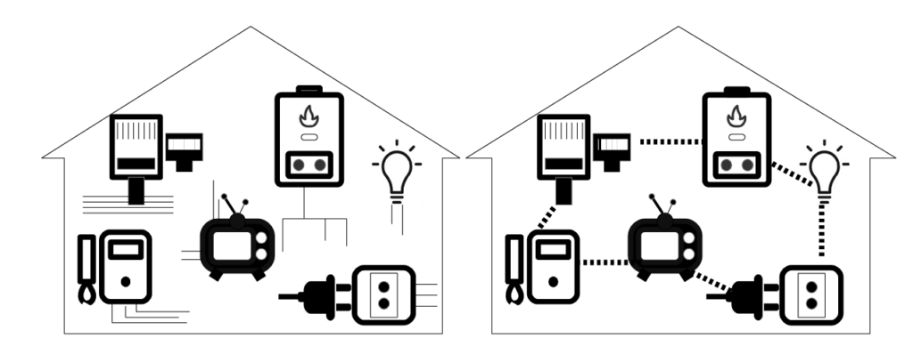
In a Smart-home environments all the devices can gather information and transfer it to a special app, or perform certain actions automatically. Current smart-home systems manage lighting, climate, security, entertainment, and energy consumption.

According to the biophilia hypothesis, humans seek more than comfort. Edward Wilson described biophilia as humanity’s evolutionary need to connect with nature, an “life and lifelike processes” [4]. That’s why humans need and prefer environments that evoke sensory richness, emotional resonance, and ecological awareness [1], [2]. Biophilic design aims to restore this connection by incorporating natural elements, materials, and processes into built spaces. Research shows that such environments can enhance well-being, reduce stress, and support mental restoration [1], [2]. Biophilic architecture often uses light, vegetation, and natural patterns to evoke the sensations and rhythms of the natural world [1].

Interaction design plays a decisive role in bridging the gap between unctional efficiency and biophilic engagement. By developing interfaces that are sensory, emotional, and ecological, designers can transform smart-home systems from passive regulators of comfort into active mediators of human–nature connection. Gamification elements can further motivate users to care for plants, monitor environmental data, or follow natural cycles, turning routine tasks into meaningful rituals.

The research adopts a two-phase methodological framework to explore how biophilic principles can be integrated into smart-home systems. The first phase involves a descriptive analysis of how experts understand the relationship between biophilia and domotics, including:
– Mapping current technologies, perceptions, and design frameworks in domotics
– Reviewing existing literature on biophilic design, smart-home technologies, and human–nature interactions
The second phase is exploratory, focusing on speculative design scenarios that imagine new ways for humans, nature, and technology to coexist in domestic settings.

A major challenge in biophilic domotics is ensuring accessibility and inclusivity. Not everyone has the same access to technology, natural resources, or ecological knowledge. Therefore, hould be intuitive, adaptable, and sensitive to different levels of engagement. Another challenge lies in integrating biophilic features within existing smart-home infrastructures. Many homes were not designed with biophilia in mind, and retrofitting can be costly or technically complex.
In conclusion, as we design the homes of the future, we must remember that true well-being does not come from mastering artificial environments but from maintaining a meaningful relationship with the living world.


Flow, Interruption and Recovery in Interaction Design

Background

In a world where digital tools shape almost every aspect of daily life, uninterrupted attention has become a scarce resource for user experience. Whether working on a document, attending an online lecture or simply watching a video, users are constantly interrupted by notifications, pop-ups and interface prompts. While these features are designed to inform or engage, they often lead to fragmented interaction experiences. Our devices or services demand responsiveness, but rarely provide space for focus.
This tension between engagement and distraction has turned into one of the central design challenges of our time. How can systems sustain the user’s sense of continuity in an age of constant interruption?

The psychological foundation of this issue lies in Flow Theory, introduced by Mihaly Csikszentmihalyi. Flow describes a mental state in which people become fully absorbed in an activity, experiencing deep concentration, clarity and enjoyment. In design contexts, flow translates into seamless user experiences where goals are clear, challenges match skill levels and feedback feels immediate. However, digital systems frequently break this rhythm. A notification arriving at the wrong moment or a forced software update, can instantly push a user out of flow. Even minor interruptions transforms into a cognitive burden, leading to fatigue, frustration and reduced task performance.

The Problem of Digital Interruption

Interruptions are not inherently negative. Some are necessary, such as reminders or alerts that prevent mistakes. Yet, the majority of digital interruptions are poorly timed, irrelevant, or overly demanding. They shift control away from the user, forcing attention to fragment across multiple contexts. Psychologically, every interruption requires cognitive order; the user must pause the primary task, process new information and later recall where they left off. Research in cognitive psychology refers to this as “resumption lag”, the mental cost of re-establishing task focus after being distracted.

The modern work environment amplifies these effects. On average, users switch digital tasks every “47 seconds”, often without completing the previous one. This continuous switching prevents the brain from reaching a deeper state of engagement. When digital systems are designed without regard for cognitive continuity, they silently erode attention over time. Instead of enhancing productivity, they generate anxiety and emotional exhaustion.

In contrast, some interactive systems, especially video games and movies, demonstrate how flow can be protected. Games use adaptive pacing, contextual pausing and clear progress indicators to support immersion. Even when interruptions occur, players can usually recover easily, thanks to consistent feedback and memory cues.

Research Focus

My research project aims to investigate how interaction design can manage interruptions more intelligently. The main question guiding my work is:
How can design strategies preserve user flow and support faster cognitive and emotional recovery after interruptions?

The research focuses on three interrelated aspects:

  1. Understanding the psychological impact of interruptions. How do different types of disruptions: external (like notifications) and internal (like self-interruptions), affect users attention, emotions and sense of control?
  2. Identifying design patterns for recovery. What interface elements, transitions or cues help users focus and continue smoothly after being interrupted?
  3. Comparing domains of experience. What can productivity tools learn from entertainment systems, such as games or movies, which often handle interruptions gracefully?

The project draws from existing studies on attention, cognitive load and media psychology. For instance, Marotta and Acquisti (2018) found that even short digital interruptions can lower task performance by increasing cognitive load and emotional irritation. Similarly, Reinecke (2009) highlighted how interactive media can act as recovery spaces, offering emotional balance after periods of stress. Together, these insights suggest that recovery is not only a technical question but also an ethical and emotional one designers shape how users experience focus, fatigue and relief.

Relevance for Design

From a design perspective, this topic bridges psychology and user experience. Interaction design is not only about aesthetics or usability; it is also about shaping the rhythm of attention. The way we design transitions, notifications, or feedback loops determines whether an experience feels calm or chaotic.
In practical terms, exploring interruption and recovery can influence several design areas:

  • Interface design: crafting non-intrusive, adaptive notifications and context-aware pausing.
  • UX strategy: balancing engagement metrics with respect for user attention and mental well-being.
  • System design: creating recovery cues such as “Continue where you left off” or visual markers that help users recall previous actions.
  • Ethical design: addressing the moral responsibility of designers to avoid exploiting users’ attention for profit.

Recent examples show that large tech companies are beginning to integrate these principles. Apple’s “Focus Mode” and Microsoft’s “Focus Assist” both allow users to filter and schedule interruptions intentionally. These features represent early steps toward a design culture that values user agency and mental clarity. Yet, they remain optional features rather than integrated philosophies. My aim through this research is to understand how such mechanisms could be embedded at the core of interaction design, not just added later as fixes.

References

  • Csikszentmihalyi, M. (1990). Flow: The Psychology of Optimal Experience. Harper & Row.
  • Pattermann, J., Pammer, M., Schlögl, S., & Gstrein, L. (2022). Perceptions of digital device use and accompanying digital interruptions in blended learning. Education Sciences, 12(3), 215.
  • Marotta, V., & Acquisti, A. (2018). Interrupting interruptions: A digital experiment on social media and performance. SSRN Electronic Journal. https://doi.org/10.2139/ssrn.3283951
  • Reinecke, L. (2009). Games and recovery: The use of video and computer games to recuperate from stress and strain. Journal of Media Psychology, 21(3), 126–142. https://doi.org/10.1027/1864-1105.21.3.126
  • Mark, G. (2023). Attention Span: A Groundbreaking Way to Restore Balance, Happiness and Productivity. Hanover Square Press.
  • Nielsen Norman Group. (2022). How Notifications Impact User Attention and Task Focus. https://www.nngroup.com/articles/notifications-user-focus/
  • Adobe Blog. (2024). Designing for Digital Well-being: When Less Screen Time Means Better UX. https://blog.adobe.com/en/publish/2024/01/17/designing-for-digital-wellbeing
  • Medium. (2023). Calm UX: Designing Interfaces That Respect Human Attention. https://uxdesign.cc/calm-ux-designing-for-human-attention


    AI Assistance Disclaimer:
    AI tools were used at certain stages of the research process, primarily for source exploration, grammar refinement and structural editing. All conceptual development, analysis and final writing were made by the author.

User Interfaces in Video Games

User Interfaces in Video GamesThe quest for genre-appropriate and usable game UI

This thesis would explore the relationship between video games, user interfaces and users, in the context of genres and usability. It would place a focus on the history, genres and UI elements and their functions in games, as well as examine accessibility options and overall usability. Some games have interfaces with very small text, which is a result of no standardised guidelines. Some games also have user interfaces that are completely divorced from the style of the game, making them look jarring and potentially taking away from the overall user experience.

At the beginning, UI wasn’t an established field in the game development industry, but has since evolved to slowly include not only UI but also UX [1]. I want to explore how UX/UI manifests itself in this medium while taking a look at the industry, past and present.

  • How can user interfaces in video games harmonise with the aesthetics of the game and to provide a seamless experience? How do they become one with the game?
  • How do genre conventions influence user interface design choices in video games?
  • Should games sacrifice functionality for style and vice versa? Do accessibility options affect the art being made?
Figure 1: MGS1 Screenshot
Source: [2]
Figure 2: Persona 3 Portable Screenshot
Source: [3]

The relevance of this topic comes down to the different ways UX/UI principles can be reinforced within games, a huge medium that often gets ignored in academic contexts for being too playful.

Human-centered design bases itself on, among other things, existing patterns . These patterns can be hard to grasp in more complex interfaces such as games, where standardisation isn’t reinforced, or expected, in the same way it is with websites. Regulations don’t exist for games like they do for websites, because websites are an essential part of everyday life, but games aren’t. I still think that they are an important everyday medium that should be accessible to anyone and not shut anyone out.

It’s also relevant to examine the aesthetics, personality and style of these interfaces which is the more graphical angle to approaching game user interfaces. Knowing how to ride the line can be difficult. So, should games sacrifice functionality for style and vice versa?

Interaction design could help to deal with these issues by using existing knowledge, guidelines and research about usable interfaces and cross examining them with game interfaces. User experience design would help with making sure the interfaces are usable and clear, while user interface (and general graphic design) would help with making them aesthetic and cohesive.

The biggest challenge I have right now is to narrow down the scope of the project and see a clear path. Theres many things I want to touch upon, and I’m not sure yet how they will come together. Initially, I wanted to also examine the “responsive” angle of video game user interfaces, by exploring desktop, mobile and console games. While I’m still interested in this and the differences in developing interfaces for such varying screen and control schemes, I’m not sure where the focus would lie in the end.

Another challenge would be how to produce qualitative and quantitative data from my analysis efforts, and if I will actually find discrepancies and scientific value. The biggest challenge I will have in the future is deciding on an outcome/workpiece, as I’m not sure how to target this overall research into a design outcome.

In my next steps I would like to:

  • start actual research and try to build my literature collection on the topic
  • gain proper knowledge on the history of games, UI elements and their functions as well as accessibility issues
  • familiarise myself with the current state and find best practice examples
  • maybe even play games and note down experiences

My personal motivation lies in my immense enjoyment of games in the past year. They have improved my quality of life ten-fold, became a part of my routine and, for that reason, I would love to make games a good experience for everyone. I’ve been noticing that games have accessibility options such as subtitles available but then the subtitles are incredibly hard to read due to their size, font choices or contrast. This always bothered me and eventually I started thinking about how most people even play games when the interfaces don’t help but rather distract. I would love to combine my passion for usable user interfaces with games, which are full of interface elements.

Game UI Database – initially, building a database was also part of my probable outcome, but since I have come across this giant database of screenshots of various menus and game states for thousands of games

The future is too bright

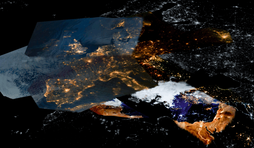
satellite photo of Europe where light pollution can be seen
Artificial light as seen from satellites. Protege Noctem, Mattia Balsamini

83% of the world’s population has never seen the Milky Way, living disconnected from our cosmos. This is due to light pollution, which is the excessive or inappropriate use of artificial outdoor light. Apart from distancing us from nature, it impacts human health and wildlife behaviour.

The invention of light completely changed our society: thanks to artificial illumination, after sunset we can do almost everything we would do during daytime. This revolution has lengthened the workday, allowing economic growth.

But like all great inventions, it comes with a downside. Due to poor design, light reflects in directions other than the intended one: streetlamps, cars, windows, factories and billboards significantly brighten the night sky, especially over urban areas. 

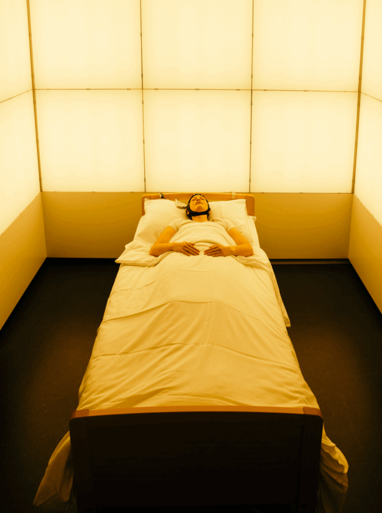
For what concerns health, artificial light confuses the production of melatonin, therefore damaging the human circadian cycle. This results in sleep deprivation, stress, anxiety and according to recent studies it is even linked to cancer.

a person lying on a bed with a measuring device attached to their head
Studies show how exposure to artificial light is linked to several health issues. Protege Noctem, Mattia Balsamini

Wildlife is also deeply affected: migration patterns are damaged, wake-sleep habits changed, nocturnal insects are disoriented, plant leaves no longer sense the start of winter. Often the consequence of these anomalies is death.

dead moths
Artificial light causes the death of many small insects. Protege Noctem, Mattia Balsamini

I became passionate about this cause after visiting the photography exhibition Protege Noctem by photographer Mattia Balsamini. In his project, he documents the disappearance of the night and its creatures. Thinking about what humans are doing to nature is frustrating and I often feel powerless about it. I decided to try to contribute by asking myself: “How can interaction design combat light pollution?”. 

I think there are three directions that can be taken: raising awareness, designing eco-friendly products and supporting ways to take action. My aim for the next few weeks is to explore each of these aspects, starting from what already exists in the design field, moving onto what can be implemented and finally figuring out what is missing.

We can raise awareness on the disappearing stars, the health risks of light pollution and its impact on wildlife. In addition, we can draw attention to the importance of preserving darkness. There are several organizations working to reduce light pollution and create dark sky reserves. One of these is the DarkSky International, which fights for dark sky reserves.

Where light is necessary, we can limit it. This is where light design kicks in. Many examples come to my mind: the design of light itself, in private and public settings, its intensity, temperature, duration, disposition, reflection, orientation and its sensors. On the other hand, we can also explore shadows and how to create them: curtains, blinds and shields for instance. Another direction could be exploring light alternatives: is it possible to fulfill certain needs with the help of other means, such as sound, touch or motion? 

different lamp designs from a light pollution perspective
Street light design. © Valeria Montjoy (ArchDaily)

Finally, design can support various ways to take action. These are advocating for changes in schools, workplaces and communities, spreading the word or citizen science. The latter involves regular citizens, who submit measurements of the night sky brightness and support scientific projects, such as the Globe at Night Project.

Light pollution is a broad topic and I am excited to investigate its relation to interaction design. Nevertheless, I fear that any solution I might come up with may be difficult to apply to daily life. I therefore aim to focus on realistic ideas that can actually make a difference during my research.


Sources

Balsamini, M. (2023, December 18). Protege noctem. Mattia Balsamini. https://mattiabalsamini.com/project/protege-noctem/

Light pollution. (n.d.). https://education.nationalgeographic.org/resource/light-pollution/

MapMaker: Light pollution. (n.d.). https://education.nationalgeographic.org/resource/mapmaker-light-pollution/

Gaston, K. J., Davies, T. W., Bennie, J., & Hopkins, J. (2012). REVIEW: Reducing the ecological consequences of night‐time light pollution: options and developments. Journal of Applied Ecology, 49(6), 1256–1266. https://doi.org/10.1111/j.1365-2664.2012.02212.x

Light pollution – artificial sky brightness – science on a sphere. (2016, August 4). Science on a Sphere. https://sos.noaa.gov/catalog/datasets/light-pollution-artificial-sky-brightness/

Designing for Slowness: The Role of Slow Living in Interaction 1/10

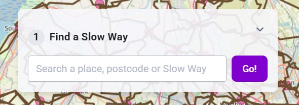
[5] Image source: Slow Ways, a UK-based initiative encouraging slower, more mindful mobility.

1.Delving deeper into the concept of “slowness”

2.Comparing urban contexts

3.Analysis of existing tools and platforms

4.Methods and design experiments

5.Conceptual framework

Interaction Design in Aerial Silks: Teaching Proprioception in High-risk Scenarios

Aerial silks are pieces of fabric hung from the ceiling and used as an apparatus for dance. In this practice, people are suspended in the air, and students must be able to figure out how their own body must move in order to successfully complete a figure or sequence, while not falling to the ground in the process.  

As such, I ask, is there a way to blend the digital and physical world to help in the learning of new aerial silks figures? What can we as interaction designers do to help design the transfer of information of each movement in a figure or sequence? Can we use digital and/or analog methods to enhance people’s proprioception to make it easier to learn new figures? 

For example, one of the first skills you need to learn is how to do a basic foot lock. [1] explains it with the following image: 

Image from [1]

My personal motivation for this topic is the fact that I’ve been learning aerial silks for about a year and a half, in 4 different studios with 12 different teachers. Throughout this process, both the teacher and I have had to adapt to each other’s learning and teaching styles, respectively, and I have observed how different strategies help different students. Even with advanced students and teachers, the vocabulary used is not always the same, and the memory processes involved oftentimes affect the time it takes to learn a new sequence. 

This is relevant for design fields especially when thinking about full-body experiences. As we move to a more technologically integrated future, fully immersive interaction will become even more common. In this, one of the most important senses to study is proprioception – how do we teach people to be aware of their body? Besides that, this research is also relevant for the sports science field, as its findings can be used to help in the teaching of not just aerial silks, but also other non-standardized acrobatic sports. Design could help these fields through using user research and prototyping methods to reduce uncertainty in the unstandardized teaching methods and providing a good approach to help people with a less developed proprioceptive sense. 

Some of the challenges I expect are encountering little or no previous research exactly regarding this topic. I expect to find research about proprioception, maybe some research about silks, but not too many scientific papers combining the two. I also expect to find a challenge in the fact that everyone learns differently, and not only each individual country but also each individual aerial studio and teacher has its own internal language to define specific movements. In other, more studied fields, the best practice is to have a international committee where the rules are standardized for the profession worldwide. For example, gymnastics has the International Federation of Gymnastics, which is responsible for the language dictating every move. [2] 

Moving forward, I plan to: 

  • start talking with different aerial teachers and students in informal interviews to gather some background about how they deal with this problem 
  • delve deeper into shared resources to gain more knowledge 
  • ideate and list possible solutions depending on the findings 

[1] B. Borzillo. “How to Do Aerial Silks.” WikiHow. Accessed: Nov. 4, 2025. [Online]. Available: https://www.wikihow.com/Do-Aerial-Silks  

[2] “Mission and values”. Federation Internationale de Gymnastique. Accessed: Nov. 11, 2025. [Online]. Available: https://www.gymnastics.sport/site/pages/about-missionValue.php