Value Proposition Map

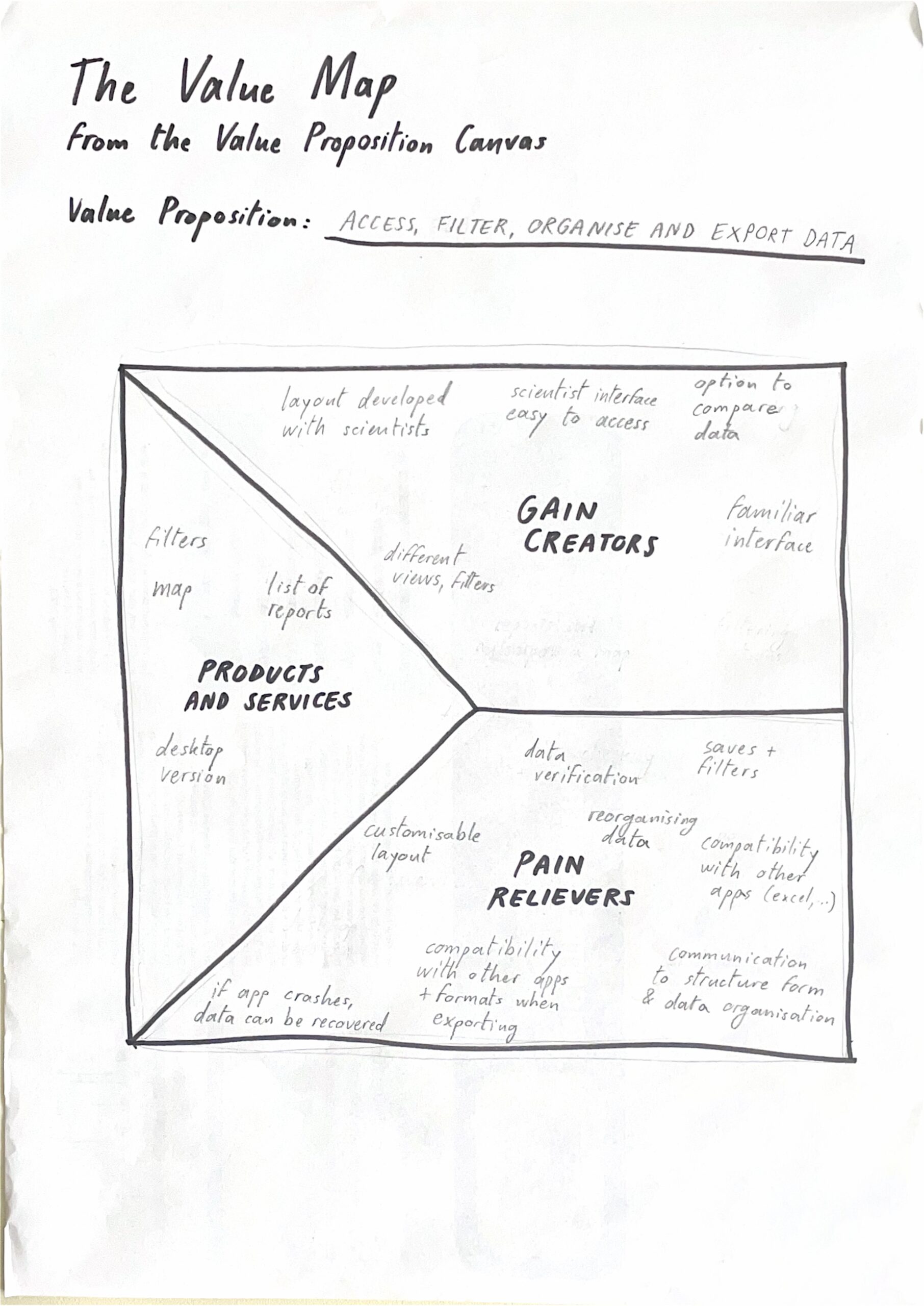
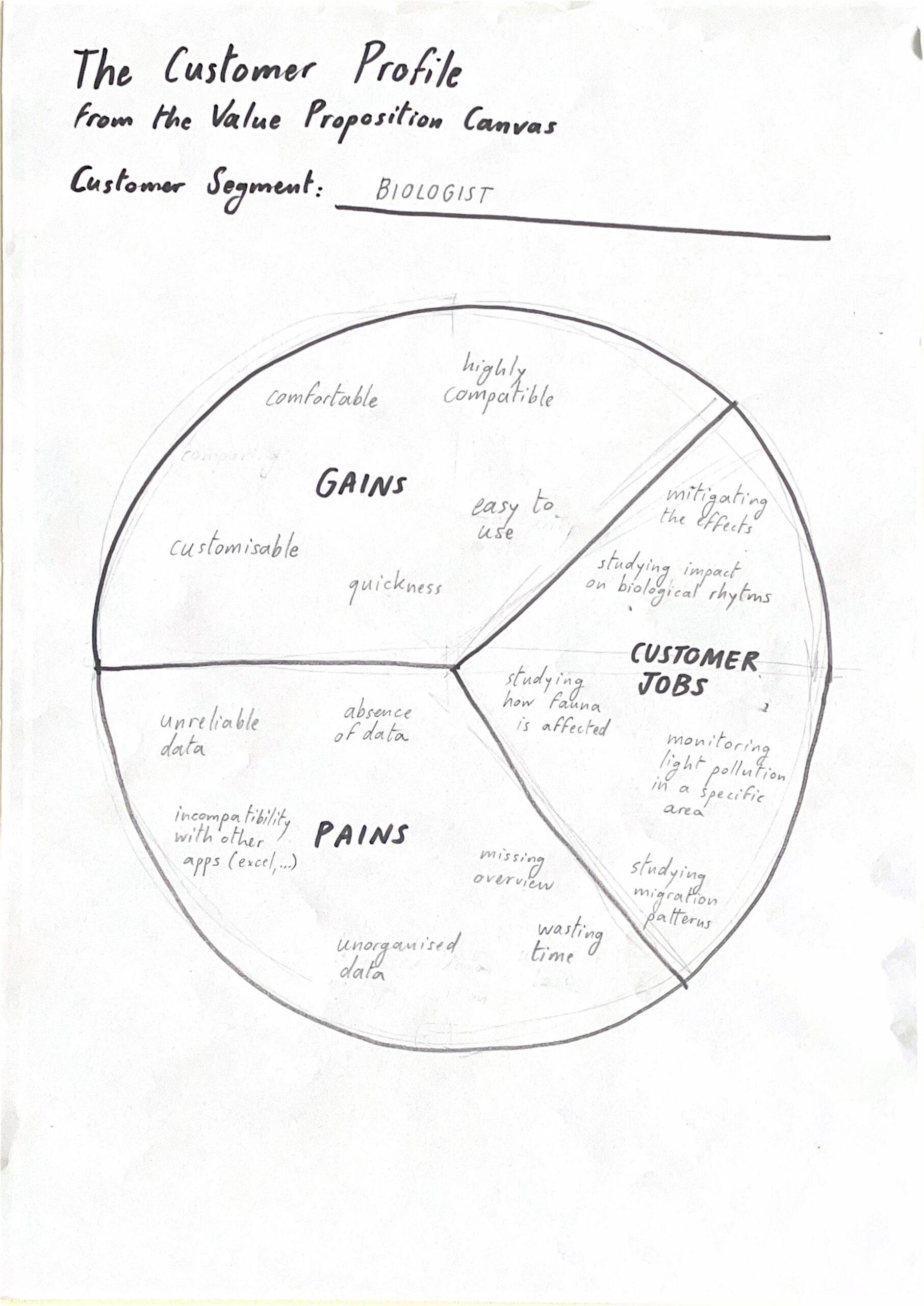
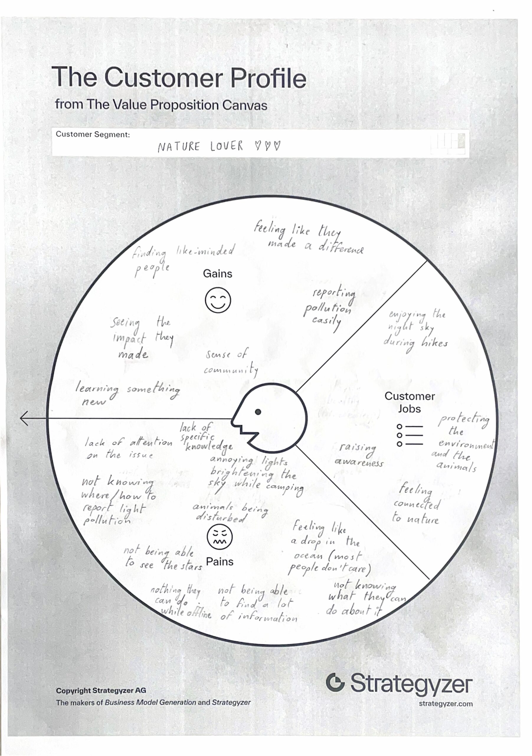
I created two value proposition maps for my app, one per customer. The first one is for nature lovers and aims to give them a tool to actively protect the environment.

The second one is for biologists and wants to give them a tool to access, filter, organise and export data about light pollution.

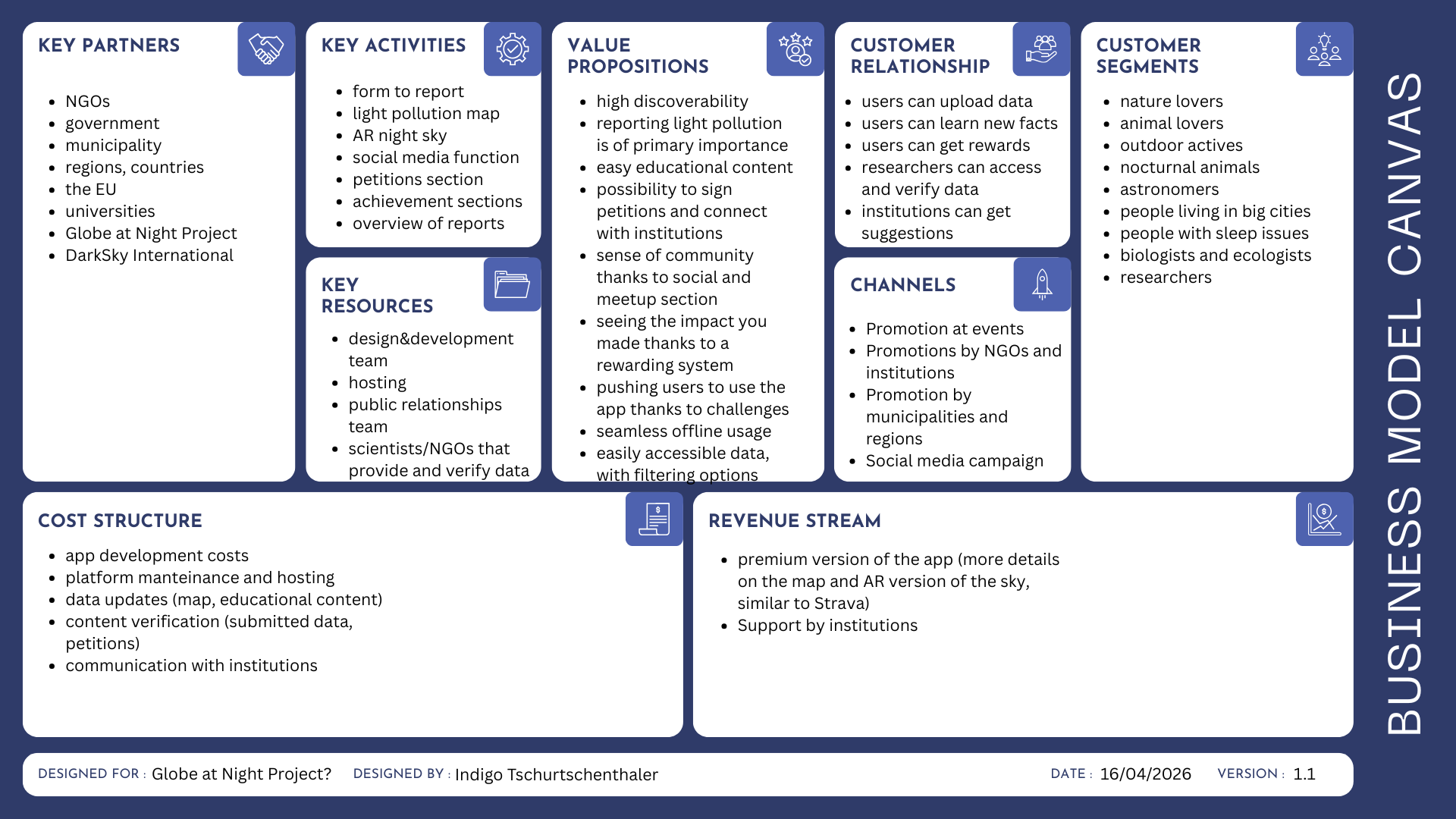
I also created a business model canvas to explain the idea.

DesRes2 @SeppoGruendler “NIME”

I chose the paper “Appropriating Technology for Interactive Media in Theatre:
Design Strategies and Aesthetic Insights” because I have some personal experience with this topic.

Personal Experience

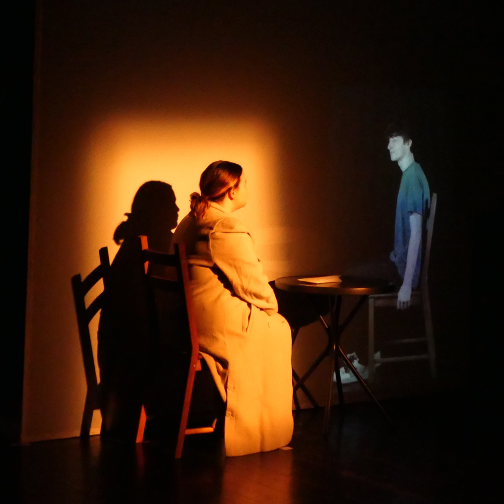
I have identified the potential of including animations in theatre plays a few years ago for a project in my local theatre club.

Due to the budget as well as technical restrictions we only ever played a static animations which the actors had to make movements along with it. This was challanging for them, because they always had to know the animated videos by heart. I realised that they were missing visual cues on when to, for example, raise their arm to “trigger” a certain movement.

If we had an x-box availble this would have been easier.

Source: Theaterzentrum Deutschlandsberg

who I am talking to?? 👀 (Part 4)

So jetzt geht’s in meine Zielgruppe…

Alter? Eigentlich egal. Ich habe gemerkt, dass ich meine Zielgruppe nicht wirklich über Alter definieren möchte.

Irgendwie fühlt es sich für mich falsch an zu sagen „meine Zielgruppe ist 25–35“ oder so, als wären alle Menschen in diesem Alter gleich. Das entspricht einfach nicht meiner Realität – weder in meinem Umfeld noch online.

Stattdessen interessiert mich viel mehr, wie Menschen denken, was sie fühlen und wofür sie sich interessieren.

Ich möchte Leute erreichen, die:

– offen für visuelle Experimente sind

– sich für Kunst, Design und Ästhetik interessieren

– sich inspirieren lassen wollen oder selbst kreativ sind

Und das hat meiner Meinung nach weniger mit Alter zu tun als mit Haltung.

Ich glaube auch, dass diese Art von Einteilung schnell in eine Richtung gehen kann, die eher einschränkend als hilfreich ist. Für mich fühlt es sich stimmiger an, meine Zielgruppe über gemeinsame Interessen und Werte zu definieren, statt über Zahlen.

Am Ende geht es für mich nicht darum, wie alt jemand ist, sondern darum, ob eine Verbindung entsteht.

Ich habe 3 personas definiert:

Persona 1: Alex (Designer/Künstler)

Alex ist selbst kreativ tätig und sucht ständig nach Inspiration, neuen visuellen Ansätzen und Menschen aus der Szene. Er nutzt Instagram aktiv, um andere Künstler:innen zu entdecken und sich weiterzuentwickeln.

Warum folgt er mich?

-Er findet meine Ästhetik spannend

-Er erkennt sich in meinem Prozess wieder

-Er könnte sich vorstellen, mit mir zu arbeiten

 Was spricht ihn an?

-Einblicke in meinen kreativen Prozess

-Experimente, mutige visuelle Entscheidungen

-Persönliche Gedanken über Design & Selbstfindung

Potential:

-Ein gemeinsames Projekt

Persona 2: Sophia (arbeitet im Büro)

Sophie ist keine Designerin, aber sie liebt ästhetische Inhalte und moderne Kunst. Sie folgt Künstler:innen, weil sie sich inspirieren lassen möchte und gerne visuell „eintaucht“.

Warum folgt sie mich?

-meine Inhalte sind visuell ansprechend

-Sie spürt eine gewisse Persönlichkeit dahinter

-Sie fühlt sich emotional oder ästhetisch angesprochen

Was spricht ihn an?

-Starke visuelle Posts (Farben, Stimmung, Ästhetik)

-Authentische, nicht zu perfekte Inhalte

-kurze, verständliche Einblicke

Potential:

-Sie liked, teilt und verbreitet meine Inhalte

-Könnte in Zukunft auch Kunst/Merch kaufen

Persona 3: Marie (Die Kuratorin / Galerie)

Marie ist ständig auf der Suche nach neuen, jungen Positionen in der Kunst- und Designszene. Sie entdeckt Künstler:innen oft über Social Media oder Websites.

Warum interessiert sie sich für mich?

-meine Arbeiten haben eine klare visuelle Sprache

-meine Präsentation wirkt eigenständig und nicht generisch

-sie erkennt Potenzial für Ausstellungen oder Projekte

Was ist ihr wichtig?

-Klarheit in meiner künstlerischen Position

-Konsistenz in meinem visuellen Auftritt

-Professionalität (Website, Portfolio, Auftreten)

Potenzial:

-Einladung zu Ausstellungen

-Kooperationen

-Einstieg in die Kunstszene

Meine Zielgruppe ist für mich kein starres demografisches Konstrukt, sondern ein Zusammenspiel aus Interessen, Haltung und ästhetischer Wahrnehmung.

Im weiteren Verlauf meines Projekts möchte ich diese Definition nicht nur theoretisch festhalten, sondern durch meine Experimente auf Instagram und meiner Website weiter überprüfen und schärfen.

Am Ende geht es für mich nicht darum, wer genau zuschaut, sondern darum, ob eine Verbindung entsteht.

P.S. Ich bin mir noch nicht sicher, ob ich eher mit einer deutschsprachigen oder englischsprachigen Audience arbeiten möchte. Darüber werde ich mir noch Zeit nehmen, um nachzudenken!

Website ._. (Part 3)

Im Rahmen meines Self-Branding-Experiments habe ich begonnen, meine bestehende Portfolio-Website genauer zu analysieren. Nachdem ich mich im vorherigen Semester vor allem theoretisch mit dem Thema auseinandergesetzt habe, interessiert mich nun besonders die Frage, wie sich meine künstlerische Identität konkret in meinen eigenen Medien widerspiegelt – und ob diese auch für andere nachvollziehbar ist.

Meine Website dient aktuell als klassisches Portfolio und ist in mehrere Bereiche gegliedert. Die Startseite enthält grundlegende Informationen über mich, wie meinen Namen und meine Tätigkeit, bleibt dabei jedoch bewusst reduziert und eher kurz gehalten.

Ergänzend dazu gibt es eine ausführlichere About-Me-Seite, auf der ich näher auf meinen Hintergrund, meine Erfahrungen und Kontaktmöglichkeiten eingehe.

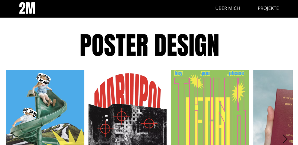
Den zentralen Teil bildet die Projektseite, auf der meine gestalterischen Arbeiten präsentiert werden – mit einem klaren Fokus auf Posterdesign, ergänzt durch weitere Projekte aus dem Designbereich.

Gestalterisch ist die Website eher minimalistisch und zurückhaltend aufgebaut. Sie wurde mit Wix umgesetzt (was man auch auf der website sieht, weil ich zu geizig war haha), was einerseits eine einfache Umsetzung ermöglicht hat, andererseits aber auch gewisse gestalterische und technische Einschränkungen mit sich bringt.

Meine bisherigen Webdesign-Kenntnisse sind eher grundlegend, was sich ebenfalls im Aufbau und in der visuellen Ausarbeitung widerspiegelt.

Trotzdem lassen sich bereits erste Ansätze einer eigenen gestalterischen Handschrift erkennen. Besonders die Verwendung der Schrift „Anton“, die ich bewusst gewählt habe, spiegelt meinen persönlichen Geschmack wider. Auch die insgesamt eher offene und informelle Stimmung der Website entspricht meinem Anspruch, mich nicht zu distanziert oder zu „perfekt“ zu präsentieren, sondern zugänglich zu bleiben.

Gleichzeitig wurde mir durch die Analyse klar, dass die Website in ihrer aktuellen Form noch nicht vollständig meine tatsächliche künstlerische Identität widerspiegelt. Der visuelle Ausdruck wirkt auf mich zu vorsichtig und „zu brav“, während meine Arbeiten und mein persönlicher Stil oft experimenteller, mutiger und lebendiger sind. Hier entsteht eine deutliche Diskrepanz zwischen dem, was ich gestalterisch ausdrücken möchte, und dem, was tatsächlich sichtbar wird.

Ein besonders auffälliger Punkt ist die Startseite, die aktuell sehr reduziert ist und dadurch eher leer wirkt. Obwohl Minimalismus bewusst eingesetzt werden kann, fehlt hier aus meiner Sicht ein klarer visueller oder inhaltlicher Einstieg, der meine Persönlichkeit oder meine Arbeit stärker vermittelt. Dadurch geht ein wichtiger Moment verloren, in dem Besucher:innen eine erste Verbindung zu mir und meiner Arbeit aufbauen könnten.

Interessant ist jedoch, dass die Website trotz dieser kritischen Punkte bereits eine gewisse Funktion erfüllt: Sie wurde im Kontext einer Masterbewerbung akzeptiert. Das deutet darauf hin, dass die strukturelle und inhaltliche Basis funktioniert, auch wenn die visuelle und konzeptionelle Ausarbeitung noch Entwicklungspotenzial hat.

Im weiteren Verlauf meines Projekts möchte ich die Website daher nicht nur optimieren, sondern gezielt als Experimentierfeld für mein Self-Branding nutzen. Dabei interessiert mich vor allem, wie sich Veränderungen im Design, in der Bildsprache oder in der Art der Präsentation auf die Wahrnehmung meiner Person auswirken.

Ziel ist es, die Website von einem eher funktionalen Portfolio zu einer klar positionierten, persönlichen Plattform weiterzuentwickeln, die meine künstlerische Identität nicht nur zeigt, sondern auch erlebbar macht. Dabei werde ich verschiedene Ansätze testen, dokumentieren und reflektieren, um besser zu verstehen, welche gestalterischen Entscheidungen tatsächlich zu einer stärkeren und authentischeren Außenwirkung führen.

P.S. Ah ja und die Website existiert heutzutage nur für Desktop, das will ich auch im Zukunft ändern und sie für handy zu optimieren 🙂

IRCAM Excursion Blog Part-2

The previous blog focused primarily on workshops rooted in neuroscientific research. The following three delve into digital signal processing, visual generation from audio and dynamic spatialisation. Each of these highlights features I am planning to integrate into my personal project.

Moving with time

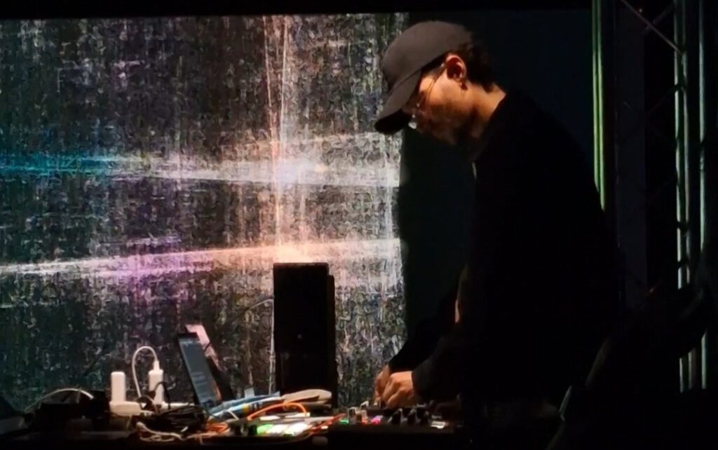
Moving with Time is an immersive audiovisual performance exploring the evolving relationship between sound, image, and culture through real-time interaction. Amongst all the projects I have seen and been a part of during the entirety of the workshop, this particular performance had the closest semblance to my research project.

Some of the common processes this project shares with the research project include real-time digital signal processing, transforming sound and modifying it in real time. They had used granular and concatenative synthesis in Max/MSP to achieve this. I am still unsure whether to include this in my project, but I would definitely implement an interactive feature for users to stay engaged with the installation. Another common element present in both projects is real-time visual generation, made using TouchDesigner. 

Speaking about the performance, I personally really enjoyed the fusion of music styles from the traditional Persian Setar to the warm textures of the ARP Odyssey and the Monotribe, it progressively builds and resolves eloquently.

Generative Music from the Quantum World

I could have never  imagined using quantum mechanics to make music until Jean-Claude Heudin had talked about it. In this fascinating presentation, we were introduced to ANGELIA, a hybrid generative AI developed to enhance the creativity of the artist for composing, and to augment performative capabilities.

Heudin briefly explained some fundamental concepts of quantum mechanics like superposition, entanglement and measurement (or collapse). He also mentioned how qubits that exist in superposition states, can be subjected to incompatible measurements, and even be entangled with other qubits.

We were also introduced to Qunotes, which are like qubits but with musical notes instead of binary information. The quantum state of a qunote is represented by a linear superposition of a defined number of pitch values. It’s only when the piece of quantum music is played that a qunote collapses into a defined state. Each time the same qunote plays, a different note is obtained depending on the probability amplitudes. This results in many possible interpretations of the same score. Therefore, the composing is done with probability amplitudes instead of fixed notes.

Dynamic Spatial Mixing for Multi-Channel Audio

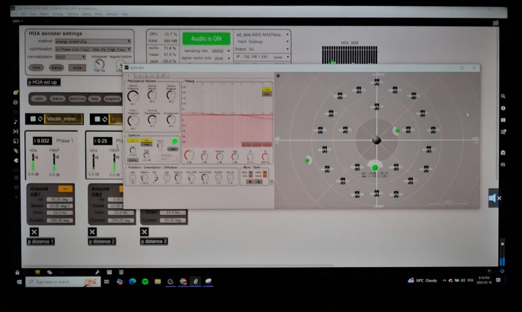
I was drawn to this project due to our course this semester (Surround Sound and spatialization). I also wanted to know more about spatial rendering and how to implement this in a mixing environment.  This live demo introduces a system for dynamic spatialization and mixing in multi-channel environments using Max/MSP and IRCAM’s SPAT library. The framework combines adaptive spatial rendering with dynamic mixing to create an evolving, responsive sonic field.

It is a unique approach to spatialisation as they combined higher order ambisonics and VBAP to achieve a unified spatial rendering system.The term they used to describe this process is ‘sidechaining’, similar to the one we use in mixing, as audio objects dynamically influence one another and interact with static beds, generating shifting amplitude and frequency relationships and establishing priority-based behaviour between moving and static spatial elements. A parallel binaural rendering was implemented into the system for headphone users as well.

Overall, I found all the sessions at the IRCAM Forum very insightful. There was a diverse mix of topics and workshops hosted by artists, performers, researchers, engineers and so on. I was able to gather a lot of interesting ideas and got introduced to some really cool concepts, some of which I would attempt to apply to my research project.

IRCAM Excursion Blog Part-1

Last month, I had the opportunity to attend the IRCAM Forum in Paris with my classmates. It was very enjoyable and provided a pathway to explore a variety of projects in the innovative fields of sound technology and research. The workshops were generally well presented and featured discussions that helped attendees better understand the concepts and workflow. Some of these projects really stood out to me, and I would like to share them in detail throughout this set of blog posts.

Liberated frequencies 

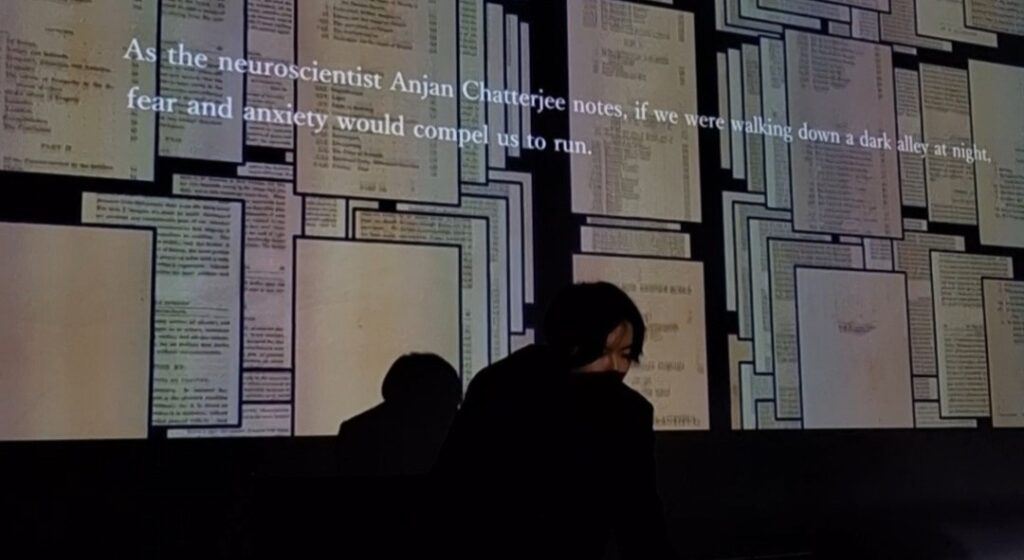
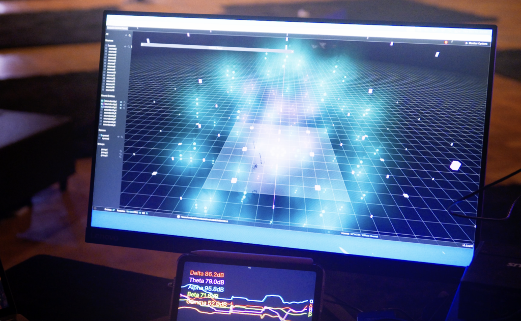
“Liberated frequencies” is a Bio-interactive Audiovisual performance by Keigo Yoshida which combines neuroscientific research with machine learning to generate sounds in real-time. During this performance, an AI is trained to learn favorable patterns and generate sounds from signals triggered by the user’s EEG sensors. In other words, the brainwaves (theta waves in particular) of the user are measured and sonified to form abstract compositions from preferred sound textures.

The team behind the installation collected a library of glitch, experimental, voice and noise sounds, which the subject rated based on the pleasure they evoked. During the performance, the AI learns in real-time from the most preferred sounds. However, instead of simply creating a comforting environment, the AI utilizes this data to intentionally disrupt the experience. Once high auditory pleasure is detected, the system alters the pitch, tempo, and rhythm, pulling the listener out of their comfort zone to challenge human-centric aesthetics and create an unpredictable, evolving soundscape.

The RAVE (Realtime Audio Variational autoEncoder) framework was used to process and generate the sounds, while the visual representations were made and mapped through TouchDesigner. The translation of data to an audiovisual form in real-time is one of the primary aspects of my research for my personal project. Therefore, I remain open to explore more in the world of real-time data audification and visualisation. This brings me to the next workshop, which is also based on neuroscientific studies.

Brainwave-Modulated Generative Music

This live demo presentation was done by Zap Bain, musician, sound engineer researching on auditory neurofeedback and spatial audio. This project also dwells on real-time EEG brainwave control of spatial audio systems. Despite not being familiar with neuroscience, I found the research very fascinating and it made me curious about neurofeedback responses in general.

The artist used embodied cognition techniques including movement, neural asymmetry, vestibular system engagement and brainwave frequency ratios for this research. The presentation showcases ambisonic work developed with SPAES using Spat~ and boids algorithms.

I was able to link some of the methodology behind this presentation to my own research project. I was exploring ways to utilize sounds in a surround sound/ambisonic setup just using vocal feedback and this session gave me some hints on how I could integrate different parameters to control the sound signals and how it could be linked with the visual element to make it more understandable.

Design & Research II – My Product & Business Strategy

Design & Research 2 | For: Katerina Sedlackova

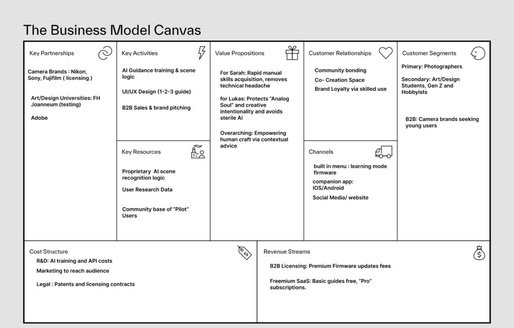
After spending a lot of time mapping out the “system,” I’ve finally landed on a solid plan for what this project actually is and how it works as a business. Here is the breakdown of the Photography Co-Pilot.

Cameras today are too much. You either have a professional DSLR with 100 confusing menus, or a smartphone that does everything for you. This “Automation Gap” means people never actually learn how to take a real photo. They just push a button and hope the AI makes it look good.

Photography is an art. If the computer does everything, the “human” part of the art dies. Plus, so many young people are buying old cameras because they want that “analog” feel, but they give up because the settings are too hard to learn. We’re losing the craft.

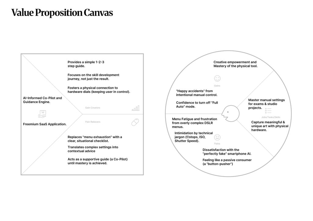
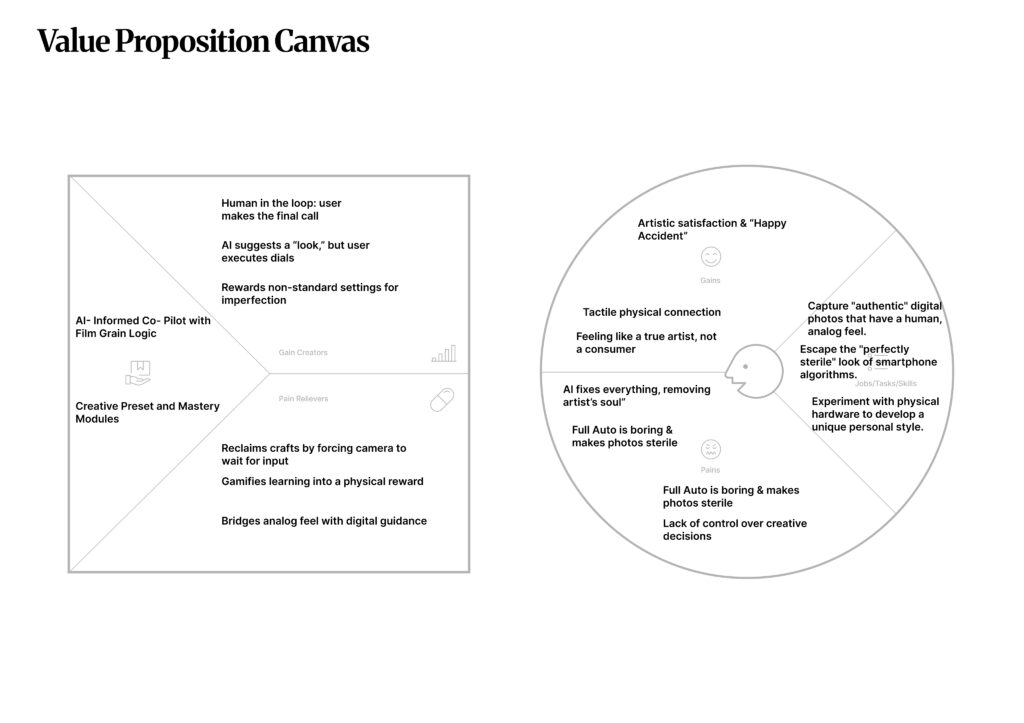
Think of it as a bridge. Instead of the AI fixing the photo for you, it talks to you. It looks at what you’re trying to shoot and gives you a simple 1-2-3 checklist (on your phone or in the viewfinder). It says: “To get this look, turn this physical dial to f/2.8.” You still do the work; the AI just points the way.

The main users are students and hobbyists (like the Gen Z “analog” crowd). The people who will actually pay for this are the big camera brands like Nikon or Sony who want to make their gear easier for new people to use.

We move from being “Passive Button-Pushers” to “Active Pilots.” It turns frustration into that “Aha!” moment when you finally get a manual shot right.

We license the “Logic” to camera brands so they can put a “Learning Mode” in their cameras. We also have a pro version of our app for people who want even more advanced guides.

To make sure this actually works, I looked at two types of people who really need this help.

This is the “behind-the-scenes” look at how the project stays sustainable. To make this a real-world product, I’ve mapped out a strategy that involves partnering with the big players in the industry while keeping the focus on the student community.

Design & Research II – System, Impact, and Inclusion

Design & Research 2 | For: Katerina Sedlackova

Following my prototypes, I am now looking at how my project fits into the bigger world. I have broken this down into three parts: the system, the change it creates, and who can actually use it.

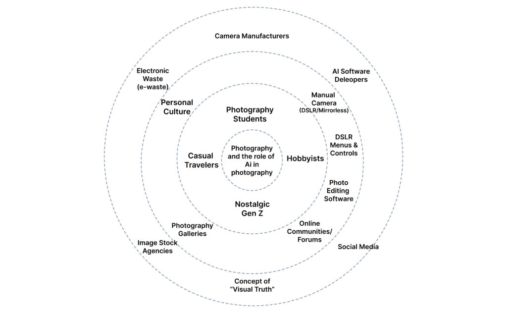
This diagram illustrates the broader ecosystem surrounding my camera-AI guidance system. I have mapped it from the core outwards to show how the project connects to the world.

The Core: The interaction between the Photographer and the Manual Camera.
Direct User Context: Students, hobbyists, and “Nostalgic Gen Z” looking for a creative rhythm.
External Ecology: The heavy hitters—Nikon/Sony (Hardware), Adobe/Midjourney (AI), and Instagram (Social). I also included E-waste, as the sustainability of our gear is part of the system.

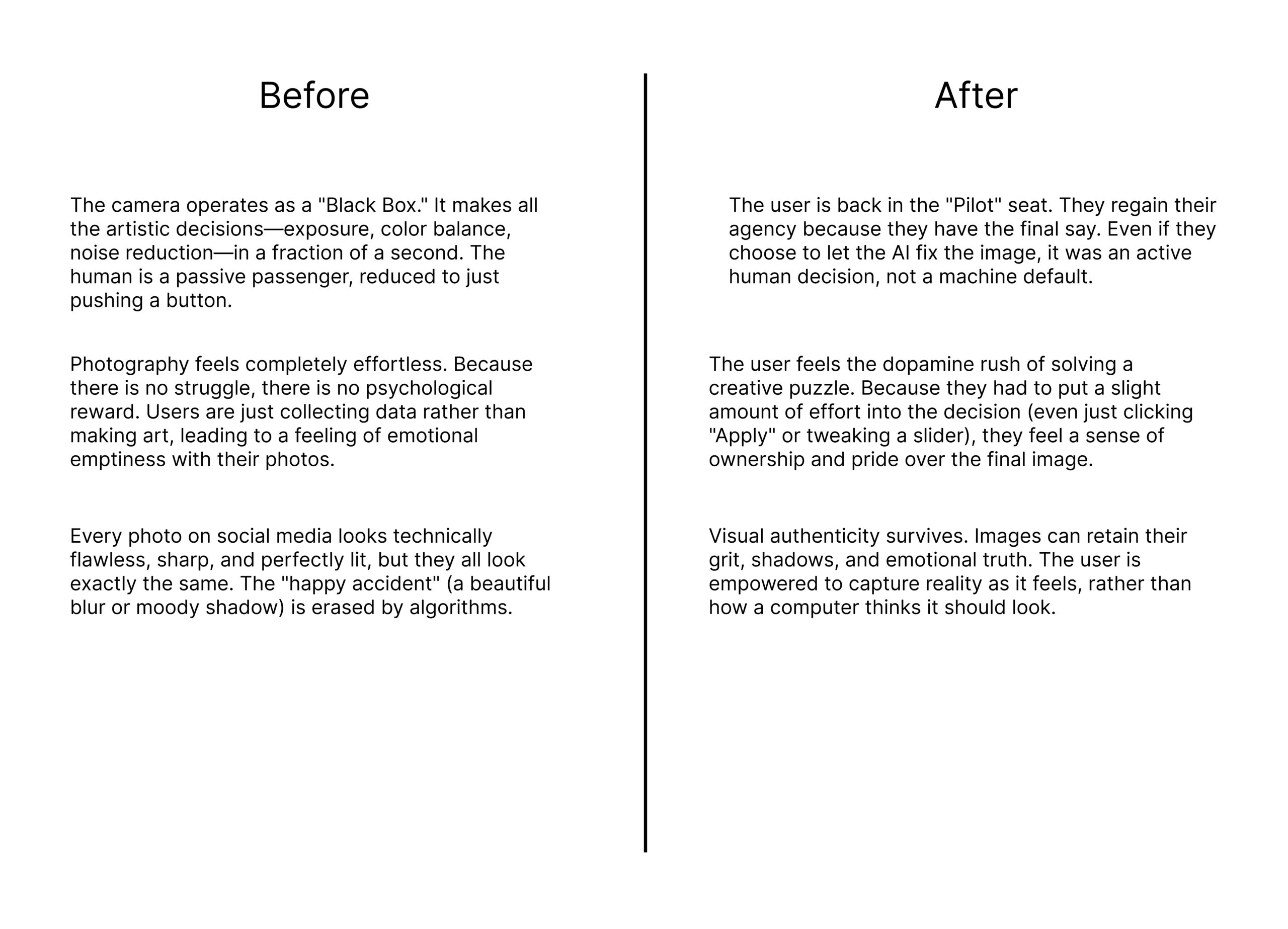
This comparison highlights the shift from automation-first snapping to learning-aware photography.

The Goal: The goal is to move the user from being a passive passenger of an automated process to an active “Pilot” who understands their tools.

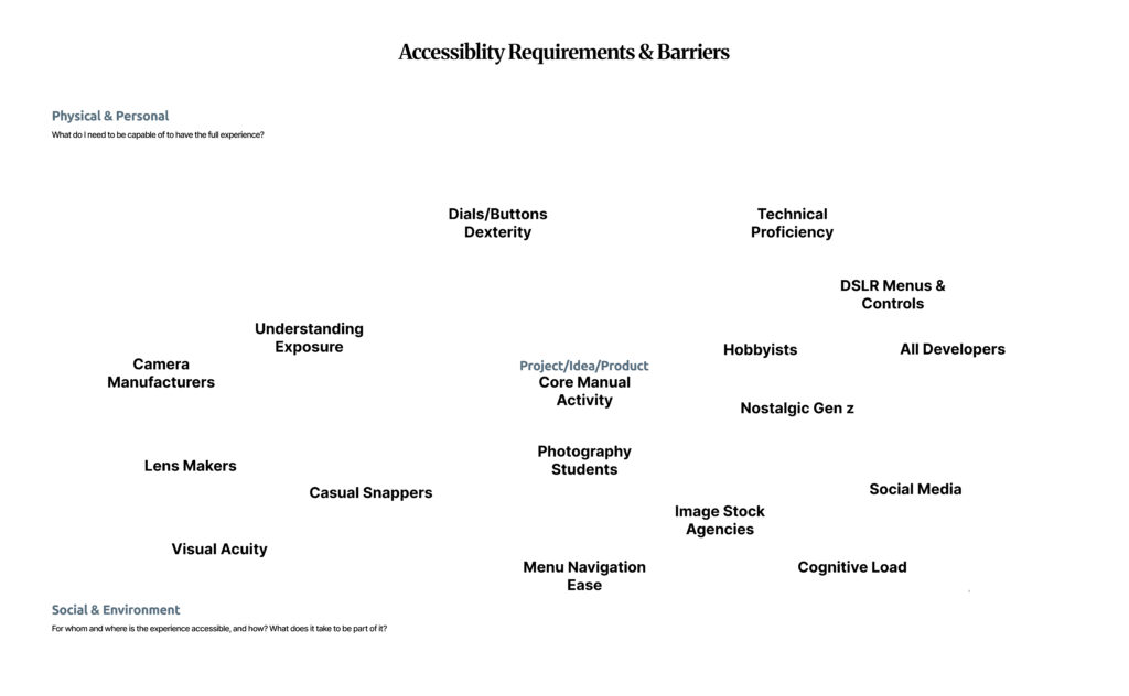
Accessibility in photography is not just about “talent”; it is a systemic issue. Using the floating barrier map, I identified the physical and cognitive hurdles that stop people from mastering manual photography.

★4 Design Research – From Project to Product

Customer Profiles

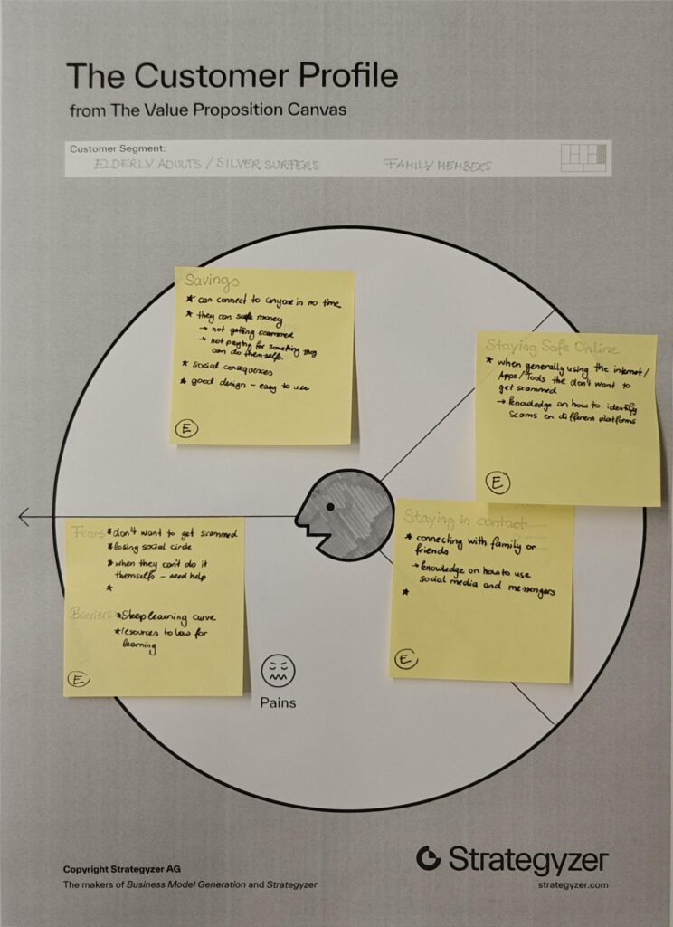
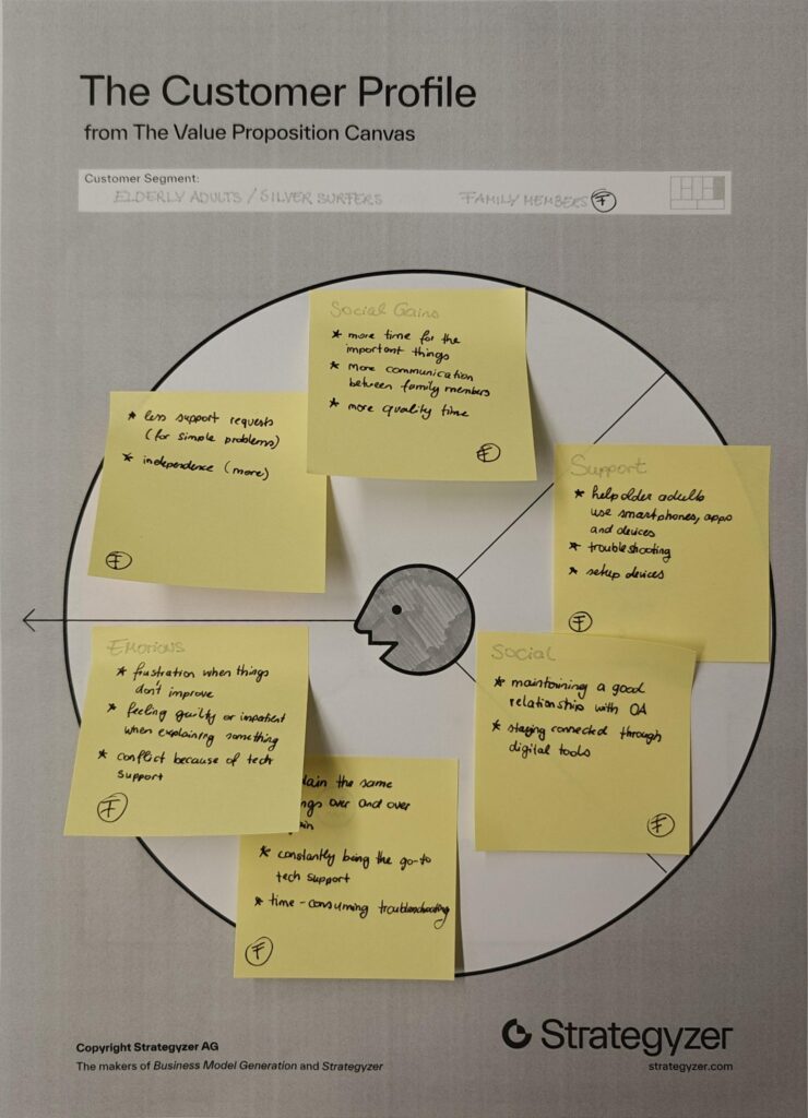
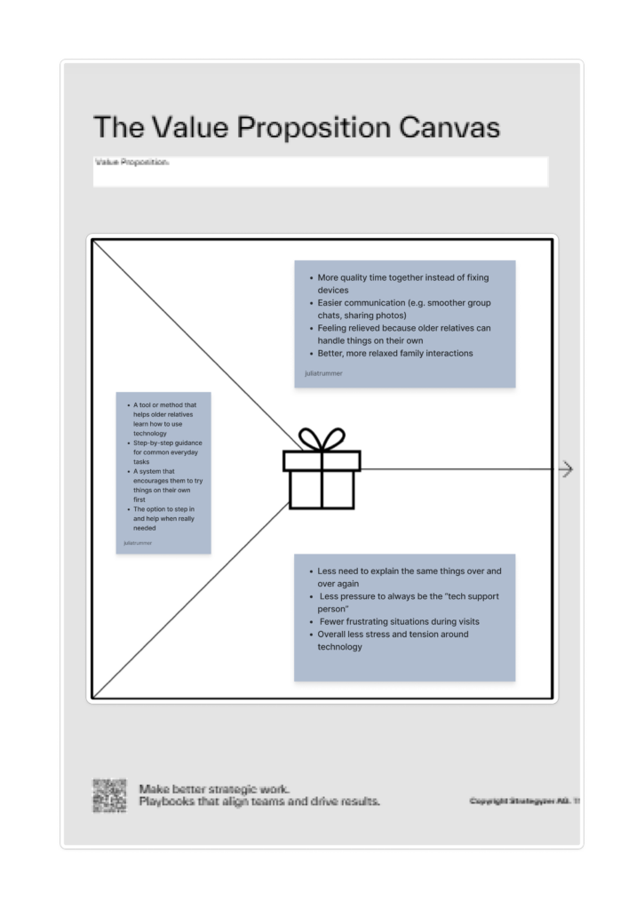
I chose two customer profiles that complement each other well, as they are closely connected in everyday life. Many younger people share the experience of being the “family tech support,” where interactions with older relatives often revolve around fixing devices or explaining the same things repeatedly. This dynamic can become frustrating over time and often takes away from the opportunity to spend more quality time together.

By looking at both older adults and their family members, it becomes clear that the problem is not one-sided but affects both groups.

Value Proposition

Product/Business Ideas

Which Problem are you solving?

  • Problem of digital literacy in elderly people.
  • Many older adults struggle to use digital technologies, which makes it difficult for them to participate in everyday online life. This can lead to social isolation, limited access to information, and increased vulnerability to scams or misinformation.

Why is it important to care about it?

  • Because there will be more and more elderly people in the future.
  • People are going to work until a later age.
  • Older Adults should be able to be independent as long as possible.

What is the solution you are offering? How does it work?

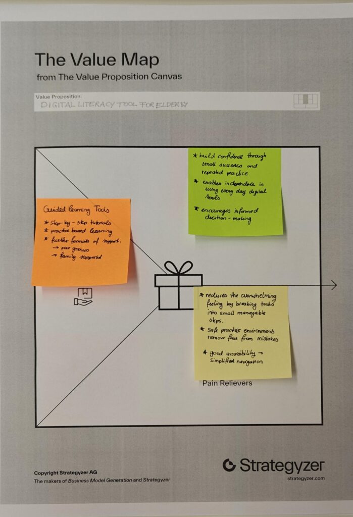
  • The solution is a tool or method that helps older adults learn how to use technology in a simple, structured and accessible way.

Who is the target audience? Who is the customer?

  • The primary target audience is older adults (silver surfers) who are not digital natives and need support in understanding and using technology. Secondary users include their family members, who benefit from reduced support burden and improved quality time.

What is going to happen? (Change & Impact)

  • The tool or method aims to increase confidence and independence among older adults, enabling them to actively participate in digital life. This can lead to stronger social connections, better access to information and safer online behavior.

How are you securing accessibilty and inclusion, and for whom?

  • Accessibility is a core part of the concept. The tool should to accommodate different needs, including visual, auditory and motor limitations.

Design & Research II – Lo-Fi Prototypes 1/6

Following my research on “Automation in Photography,” I have spent this week diving deeper into my project by creating three different prototype scenarios. Even though I haven’t tested these with real users yet, the act of making them helped me see points I was missing and gave me a better direction for my Master’s thesis.

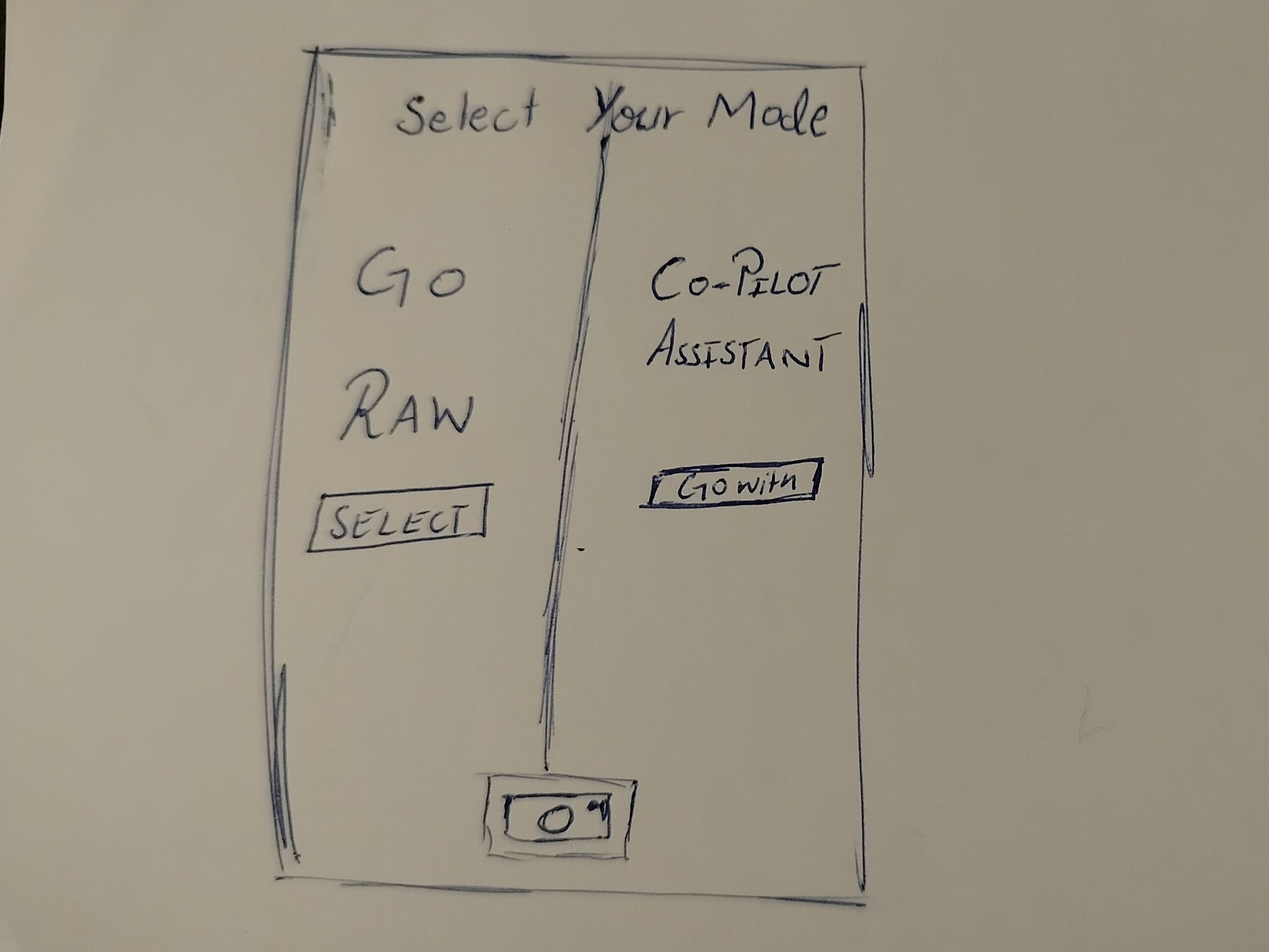
In this one, when the user opens the camera, they have to choose between two options. One is a Raw Mode where the user has all the control, and the other is an AI Automation mode.

The Goal: To see if forcing the user to pick a mode at the start makes them more intentional about how they want to take the photo.

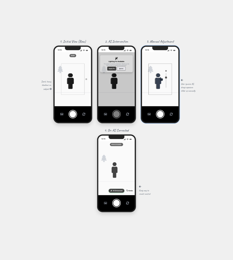
This is a digital assistant that pops up on the screen while you are shooting. It explains what is happening based on the scene. For example, it might say “increase shutter speed because you are shooting action” or “reduce ISO because there is too much light.”

The Goal: To see if giving the user a “why” helps them stay in control instead of the camera just fixing the settings automatically.

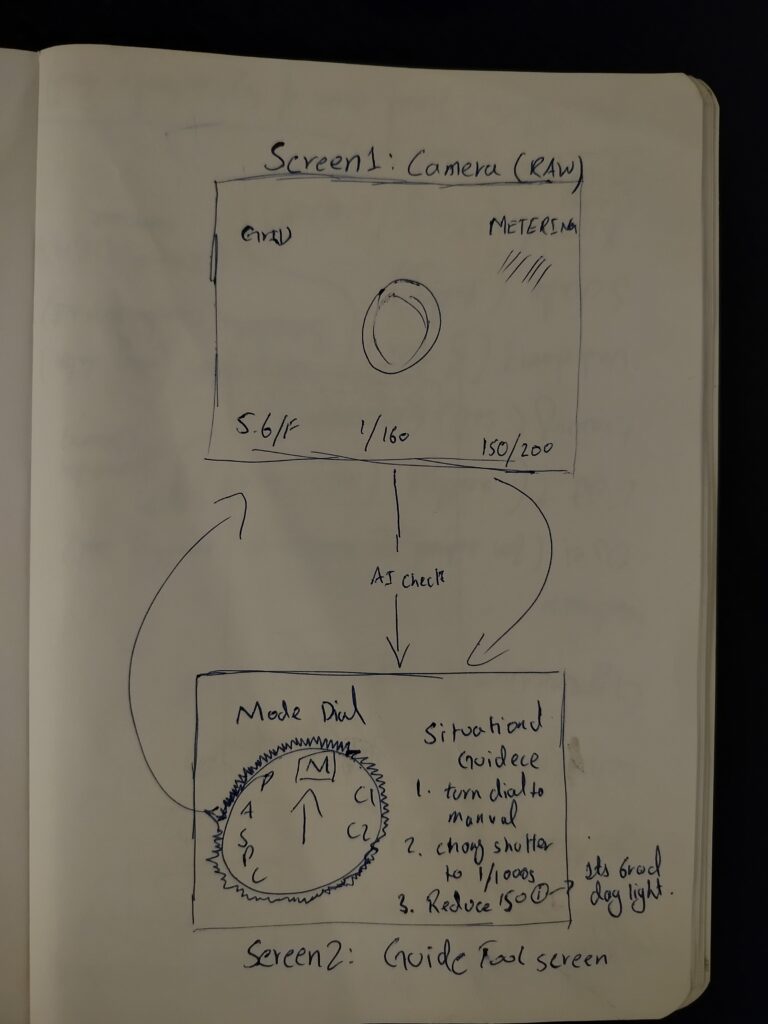
This is for professional cameras. A separate device (like a phone) is attached to the camera to guide the user. It shows suggestions on which physical dials to turn to get the right settings.

The Goal: To see if the AI can act as a teacher that helps the user learn how to use the manual settings on their professional camera.

Creating these scenarios helped me see which directions I might follow, but it also left me with a big question about the design process. I understand that if you have a clear vision, prototyping early can save a lot of time. But when you are still in the early stages of defining and understanding the problem, I found it extremely difficult.

To be honest, it doesn’t make total sense to me to build a solution when I haven’t even fully decided what the actual problem is yet. While I know it is supposed to be beneficial, I personally didn’t find it that helpful at this stage. It felt a bit like guessing. However, the exercise did at least show me which side of the camera-AI idea has the most potential, even if the final direction is still a bit blurry.