Reading the Results: Why It Split This Way

The last block was only what came back. This one is me trying to understand it. Three results are worth digging into, and I will take them in order: the trust surprise, the confusion both versions caused, and the clean split between instruction and feeling. The sample is small, so this is interpretation, not proof.

1. The trust surprise

People trusted the illustration more as an instruction, even though the photograph is the more realistic image. That is the result I expected least, and honestly I am still not certain why it happened. But I can see a few possible reasons, and they probably work together.

One is that realistic and clear are not the same thing. A photograph shows one specific person, one specific door, one specific moment, full of detail that the viewer has to sort through. A drawing has already removed all of that. Nothing in the frame is accidental, so it reads as someone deliberately telling you the rule, not as a photo of a thing that happened once. The reduction itself might be what makes it feel like guidance.

Whatever the exact reason, the real world clearly agrees. Airplane safety cards, IKEA manuals, medication leaflets, and exit signs are almost always drawn, never photographed. Not because photographs were unavailable, but because for “do this, then this,” a clean diagram feels clearer and more authoritative than a real picture. My ten people landed in the same place that decades of instruction design already did, which makes me trust the signal even with a small sample.

2. The confusion is itself the finding

Both versions made people reach for words like stupid, confusing, and a plain “huh?”. My first instinct was to treat that as a problem with my images. But the more I look at it, the more I think the confusion is the actual finding, not a flaw to fix.

The story has no words at all. So when something is even slightly unclear, the viewer has nothing to fall back on, no caption, no label, no sentence to rescue them. That is exactly the condition I set out to study: communication when words are removed. The confusion is the cost of going wordless, made visible. It shows where a pure image starts to wobble and where a single word would have instantly steadied it.

You can see the same thing in real pictograms. A toilet sign works perfectly, but plenty of public symbols leave people guessing, which is why airports and hospitals so often pair the symbol with a word. The “huh?” my viewers felt is the same “huh?” everyone has had standing in front of an unlabelled sign. That reaction is not noise. It is the edge of wordless communication showing itself.

3. Instruction versus feeling

Putting the first two together gives the cleanest result of the pilot. The drawing was stronger for the instruction: clarity, trust, ease of reading. The photograph was stronger for the feeling: emotion, calm, the sense of a real person in a real moment. Comprehension was a tie, so neither medium was simply better. They were better at different jobs.

This lines up with how the two are used in the world. Instructions are drawn. Manuals, signs, and diagrams strip a task down to its logic. Emotion is photographed. Advertising, journalism, and portraits use real images to make you feel a real presence. A charity poster uses a photograph of a real face to move you, then often switches to simple icons to explain what to actually do. The medium follows the job.

Where this leaves me

The honest headline is the one I guessed at the start. There is no single winner. The drawing carries the instruction, the photograph carries the feeling, and which one is right depends entirely on what you are trying to say. The confusion sits underneath both, marking the limit of saying anything at all without words. Ten people cannot prove this, but the pattern is clean enough that I want to test it properly on the shower and the phone, with more people, in the next block.

First Results: The Door Story Pilot

I decided not to go all out at the start. I was not sure the testing method would hold up, so instead of sending all three stories to a big group, I ran a small pilot with just the door story. The goal was to see whether the test does what I designed it to do before I scale it up. This block is only what came back. The analysis comes in the next one.

I tested it on 10 people, split into two groups of five. Five saw the illustration first, and five saw the photograph first. Everyone saw both versions in the end and answered about each one, then compared them. The numbers are small, so I treat them as a first signal, not as proof.

What came back

Understanding. Both versions got the story across. Four of the five who saw the illustration correctly mentioned the final push, and four of the five who saw the photograph did too. On pure comprehension, the two were even. The medium did not decide whether people understood the story.

The turning point. The illustration group named the push moment a little earlier and more consistently, which fits, since the arrows point straight at it. The photo group was more spread out. Some sensed it at the confused pause, some only at the last frame.

Feeling. This is where the two parted. The illustration pulled words like funny, frustrating, stupid, and confusing. The photograph pulled serious, funny, calm, and stupid, with a few people writing in a confused “huh?”. Both read as a little silly, which suits a story about failing at a door, but the texture differed. The illustration felt light and funny, but its simplicity also made some people call it confusing. The photograph felt calmer and more serious, more like watching a real person have an ordinary moment.

Trust. People trusted the illustration more as an instruction. This surprised me, because I expected the photograph to feel more credible by default. It did not work that way. For something you are meant to follow, the clarity of the drawing seemed to count for more than the realism of the photo.

Effort. The illustration was rated easier to read. Less visual noise, and attention goes straight to the action. The photograph carries a whole real room, so there is more to take in.

Consistency. This was my fairness check, to see whether one set simply looked more finished than the other. The two came out close, with no clear winner. That was good news. It means the comparison was not obviously unbalanced.

Neither version won overall. The illustration was stronger for clarity, trust, and reading ease, and it carried a light, funny tone. The photograph was stronger for emotion, calm, and the sense of a real person in a real moment. Comprehension was a tie, and consistency was even.

So the early pattern is the one I guessed at the very beginning. There is no single winner. The drawing seems to communicate the instruction, the photograph seems to communicate the feeling. Ten people cannot prove that, but it is a good sign that the split showed up this clearly this early. Why it split this way is the question for the next block.

D&R2 03 – Reading Toward Adaptive Interaction Design

In the previous post, I arrived at a direction that feels more specific than the topic cluster I carried through last semester: adaptive interaction design. I am not treating it as a finished thesis definition. It is a working direction that gives my reading and prototyping somewhere to go.

That shift changes how I look at the literature. Before, I was reading broadly in order to understand interruption, flow, cognitive load, memory, emotion and neuroadaptive interfaces. The breadth was necessary. It helped me see that interruptions are not isolated design failures but events that affect attention, task continuity and a person’s ability to return to what they were doing. Now I need to ask a different question. If an interface is going to adapt to the user, what should it pay attention to, what should it be allowed to change and how should the user remain involved?

The older work on adaptive and mixed-initiative systems has become especially useful here. It is easy to speak about adaptive interfaces as if they are a recent consequence of AI, but many of the central interaction questions are older. Horvitz (1999) wrote about mixed-initiative user interfaces at a time when the examples looked very different from current AI agents. Yet the core problem is familiar: a system may have enough information to make a suggestion or take an action, but it still has to decide whether this is the right moment to involve the user.

That matters because a useful system can also become a badly timed system. It may offer a recommendation while somebody is already working through a difficult task. It may ask for confirmation when the person has no real capacity to evaluate the decision. It may quietly act on the person’s behalf, then leave them to reconstruct what happened later. The design problem is not simply how to make the system more proactive. It is how to distribute initiative without turning the user into a passive observer of their own work.

This connects directly to the research I had already done on interruption. Adamczyk and Bailey (2004) showed that the timing of an interruption changes its effects on performance, emotion and the way people perceive the interrupting system. Their basic point remains important: “user attention is a scarce resource” (p. 271). An interface cannot assume that a message, recommendation or request for approval has the same cost at every point in a task.

Iqbal and Horvitz (2007) make the picture more realistic by looking at interruption and recovery in everyday computing work. Their work shows that disruption is not just the moment somebody looks away from a task. There is a longer process of reorientation afterwards. People need to recover their goal, remember the current state of the work and decide what comes next. This is why I am interested in adaptation not only as a way to prevent badly timed interruptions, but also as a way to support the return after they happen.

The return is where memory becomes a design concern. Altmann and Trafton (2002) describe pending goals in terms of activation and retrieval. In simple terms, an interrupted goal does not wait untouched until a person comes back to it. It has to compete with everything else that happened in the meantime. The task may still be open on the screen, but the reasoning behind it may have faded. A system that changes information, makes suggestions or completes work while the user is away has a responsibility to make the return understandable.

This becomes particularly relevant in AI-assisted work. Recent research on agentic systems is often framed around how much work an agent can perform autonomously. I find the moment of human re-entry more interesting. Zhou et al. (2026) examine when people should check multi-step agentic tasks. Their findings suggest that constant confirmation becomes costly, while waiting until the end can make correction much more expensive. The issue is not whether the human should supervise every action. It is how the system can involve the human at moments that protect both control and continuity.

The same question appears in workload-aware systems. The literature does not support a simple idea of a system knowing exactly when someone is busy. Workload overlaps with attention, task difficulty, stress, effort and fatigue, but it is not interchangeable with any of them. Kosch et al. (2023) show that HCI researchers use self-report, performance, behaviour and physiological measures, each with different strengths and limits. There is no single number that can tell an interface everything it needs to know about a person.

That uncertainty is not a reason to abandon adaptive design. It is a reason to design it carefully. Fairclough’s (2009) work on physiological computing describes a loop in which a system senses something about the user, infers a state, adapts and then observes the result. The word infers is important. Signals from gaze, EEG, typing or task performance are not direct access to a person’s internal life. They are partial evidence that may or may not be useful in context.

I find the interaction logic of this early experimental work more compelling than the promise of any individual sensor. The system does not need to claim that it has discovered a person’s true mental state. It can respond modestly to patterns that suggest a change in task pressure, then let the user inspect or reject that response. Treacy Solovey et al. (2015) argue that physiological input is often better suited to implicit and supportive adaptation than direct control. Their point is not that systems should become invisible. It is that they should not behave with more certainty than their input allows.

This is starting to give my research a clearer shape. I am not looking for the perfect way to measure attention. I am looking at what happens when an interface has incomplete information about the user’s situation and still needs to make decisions about timing, assistance and interruption. What would it mean for that interface to be helpful without becoming intrusive? How could it support recovery without taking ownership away from the person?

The answers will depend on the context. A work tool, a wearable device, a spatial interface and an AI agent all create different conditions. For now, I do not want to lock the research into one medium too early. I want to keep reading across these contexts while holding onto the same underlying question: how can systems adapt to human capacity without asking humans to adapt to the system first?

This post is a research checkpoint rather than a conclusion. The previous post helped me name a direction. This one is helping me understand the problems inside that direction.

References

Adamczyk, P. D., & Bailey, B. P. (2004). If not now, when?: The effects of interruption at different moments within task execution. In Proceedings of the SIGCHI Conference on Human Factors in Computing Systems (pp. 271-278). ACM. https://doi.org/10.1145/985692.985727

Altmann, E. M., & Trafton, J. G. (2002). Memory for goals: An activation-based model. Cognitive Science, 26(1), 39-83. https://doi.org/10.1207/S15516709COG2601_2

Fairclough, S. H. (2009). Fundamentals of physiological computing. Interacting with Computers, 21(1-2), 133-145. https://doi.org/10.1016/j.intcom.2008.10.011

Horvitz, E. (1999). Principles of mixed-initiative user interfaces. In Proceedings of the SIGCHI Conference on Human Factors in Computing Systems (pp. 159-166). ACM. https://doi.org/10.1145/302979.303030

Iqbal, S. T., & Horvitz, E. (2007). Disruption and recovery of computing tasks: Field study, analysis, and directions. In Proceedings of the SIGCHI Conference on Human Factors in Computing Systems (pp. 677-686). ACM. https://doi.org/10.1145/1240624.1240730

Kosch, T., Karolus, J., Zagermann, J., Reiterer, H., & Schmidt, A. (2023). A survey on measuring cognitive workload in human-computer interaction. ACM Computing Surveys, 55(13s), Article 286, 1-39. https://doi.org/10.1145/3582272

Treacy Solovey, E., Afergan, D., Peck, E. M., Hincks, S. W., & Jacob, R. J. K. (2015). Designing implicit interfaces for physiological computing: Guidelines and lessons learned using fNIRS. ACM Transactions on Computer-Human Interaction, 21(6), Article 35, 1-27. https://doi.org/10.1145/2687926

Zhou, Y., et al. (2026). When should users check? Modeling confirmation frequency in multi-step agentic AI tasks. In Proceedings of the CHI Conference on Human Factors in Computing Systems. ACM.
Functional Prototype with added features | R&D 2 | Blog 7

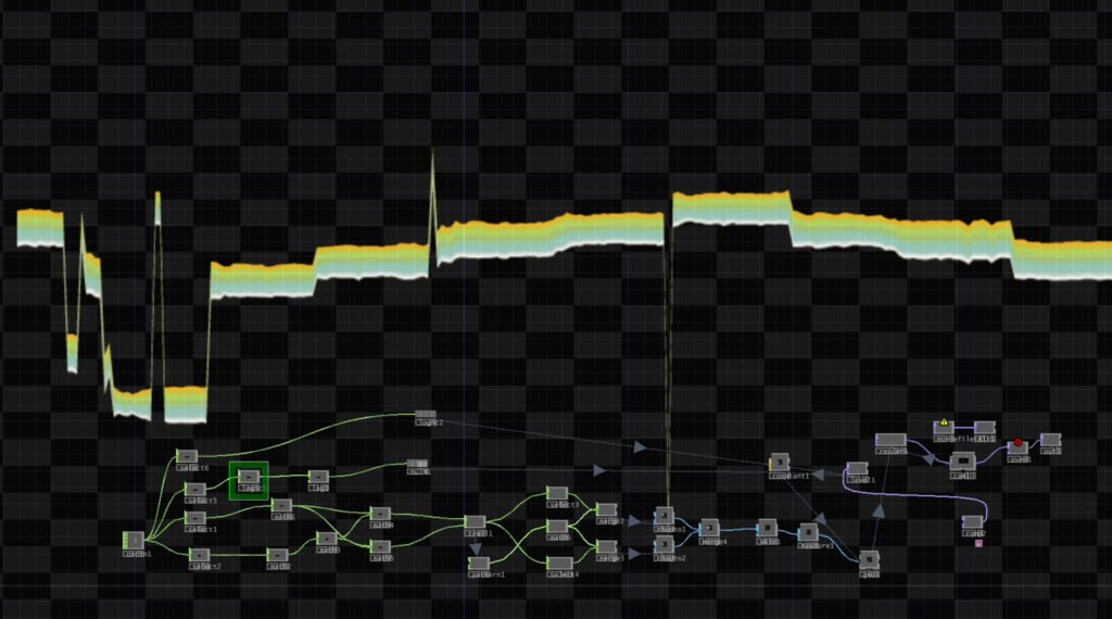
My prototype for this semester is finally complete. After much trial and error, I was able to build a visualizer that functions as per the user’s input and is represented in a model that is easily understandable to the user. The waveform morphs and reacts based on the user input and doesn’t break or alter its core geometry in the process, finally maintaining a smooth and fluid visual experience. There are still a few additional tweaks that can be done, but it’s somewhat functional at the moment, which means that I have met my primary goals for this semester.

Some additions include the audio feedback response, which acts as a monitor based on chords to determine the pitch accuracy of the user. This was done using the quality parameter in the sigmund object, a very useful tool for pitch tracking. The signal runs through a relational operator (>) and when the signal fulfills the condition (greater than 90%), the patch plays back a chord for the user from an oscillator based on their pitch quality. If the user is perfectly in pitch, it will play a pleasant major chord, while a slightly off-pitch input would trigger a more dissonant minor chord, providing immediate auditory feedback without the user needing to look at a screen.

Another addition is the waveform, which now features a visual activation response where the visualiser remains inactive or dark when there is little to no input signal. The colour in the waveform reappears when the user is speaking, and this is a vital visual feature to indicate that the signal is being successfully received from the user. By fading to dark during silence, the interface reduces visual fatigue and makes the interactive moments feel much more dynamic. This addition was done using the data from the quality argument in the sigmund object, which was mapped to a Logic CHOP in TouchDesigner to trigger the visual state changes seamlessly.

I also considered adding a few advanced audio analysis tools from a Python library to give users more speech information. What I had imagined was an algorithm which collects a live data feed and predicts the different groups of consonants present in the speech (fricatives, affricates, plosives, etc). You would see numbers fluctuating on screen showing the variations in frequency as well as the tonal quality.  Unfortunately, I won’t have enough time to implement this into the prototype, and it would be considered as a feature to be added in the future.

In the final blog, I will share my overall experience building the prototype, reflect on the challenges, and give insights on what to look forward to in the upcoming semester.

Blog Post 5: Experience Prototype Testing

Prototype Setup

After the last iteration phase, the idea and plan for an experience prototype were developed in order to test the concept of a light-guiding system that could be implemented at German train stations through overhead projection. The prototype, together with the findings from the testing, was documented, analysed, and evaluated to draw conclusions for the next stages of the project.

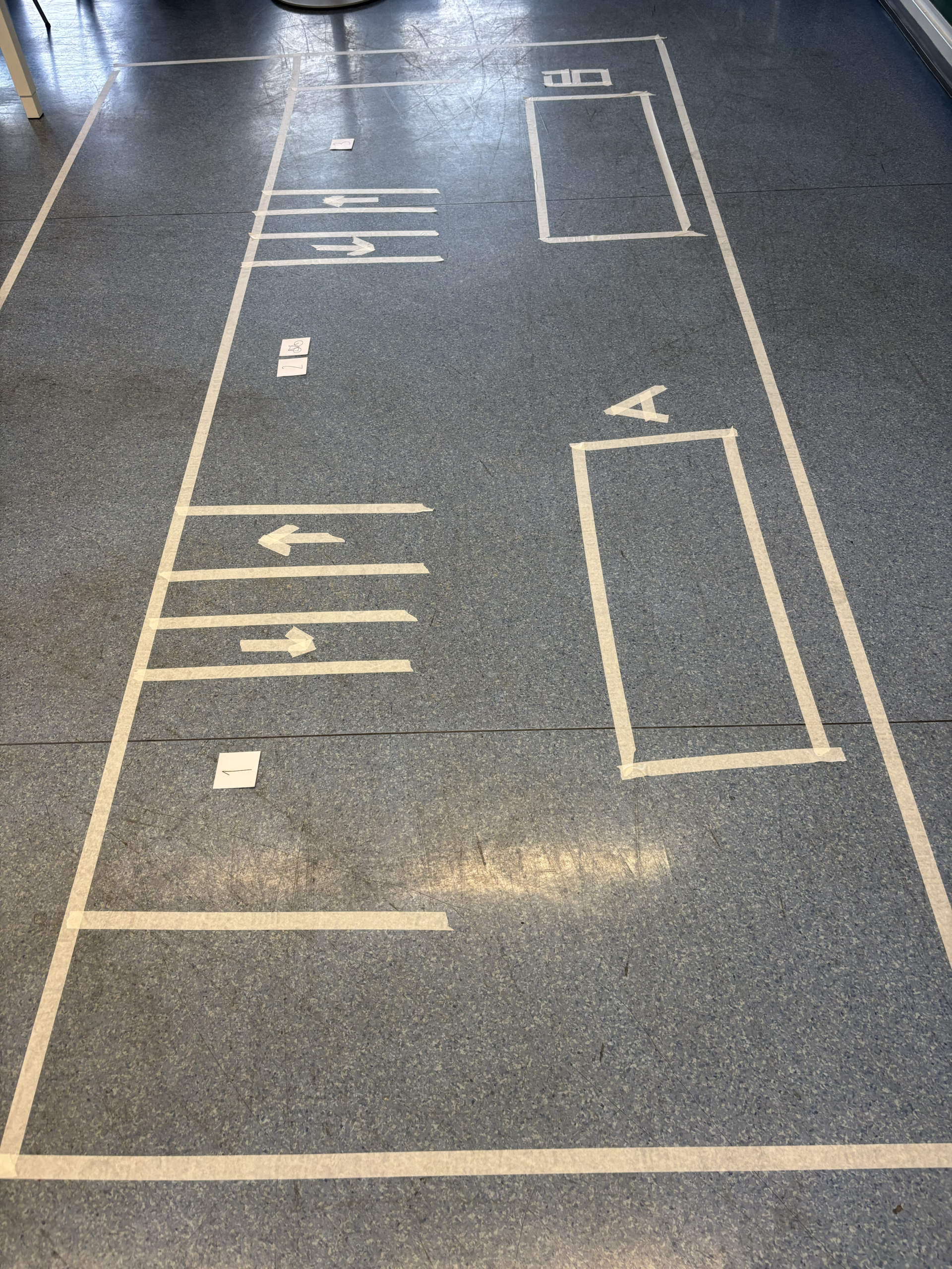
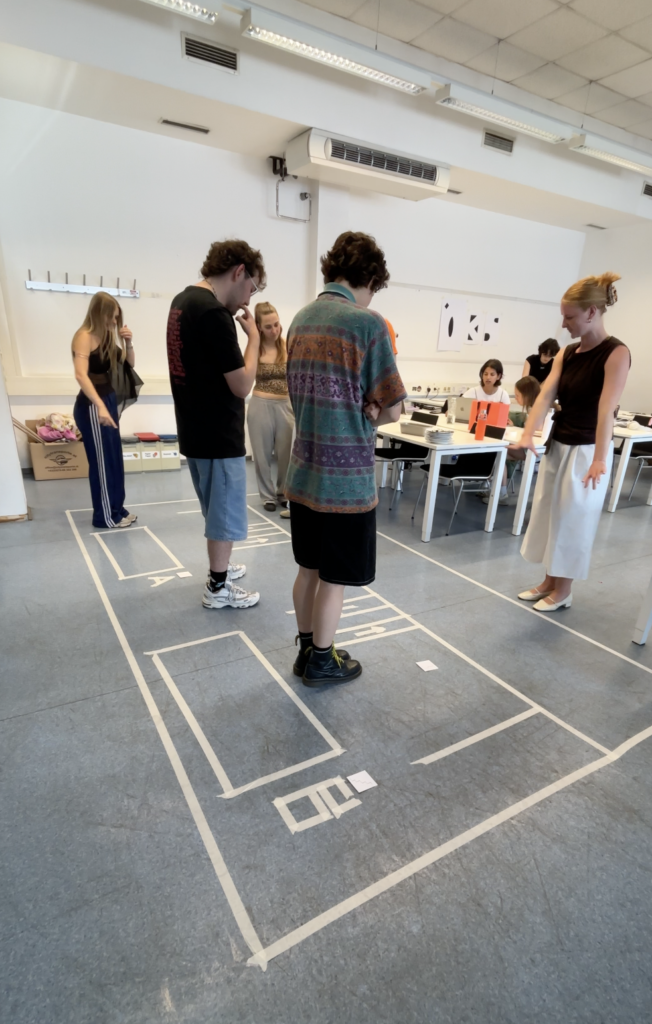
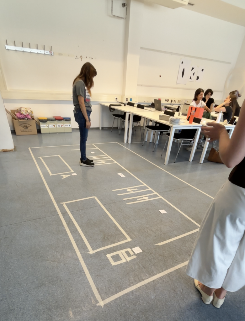
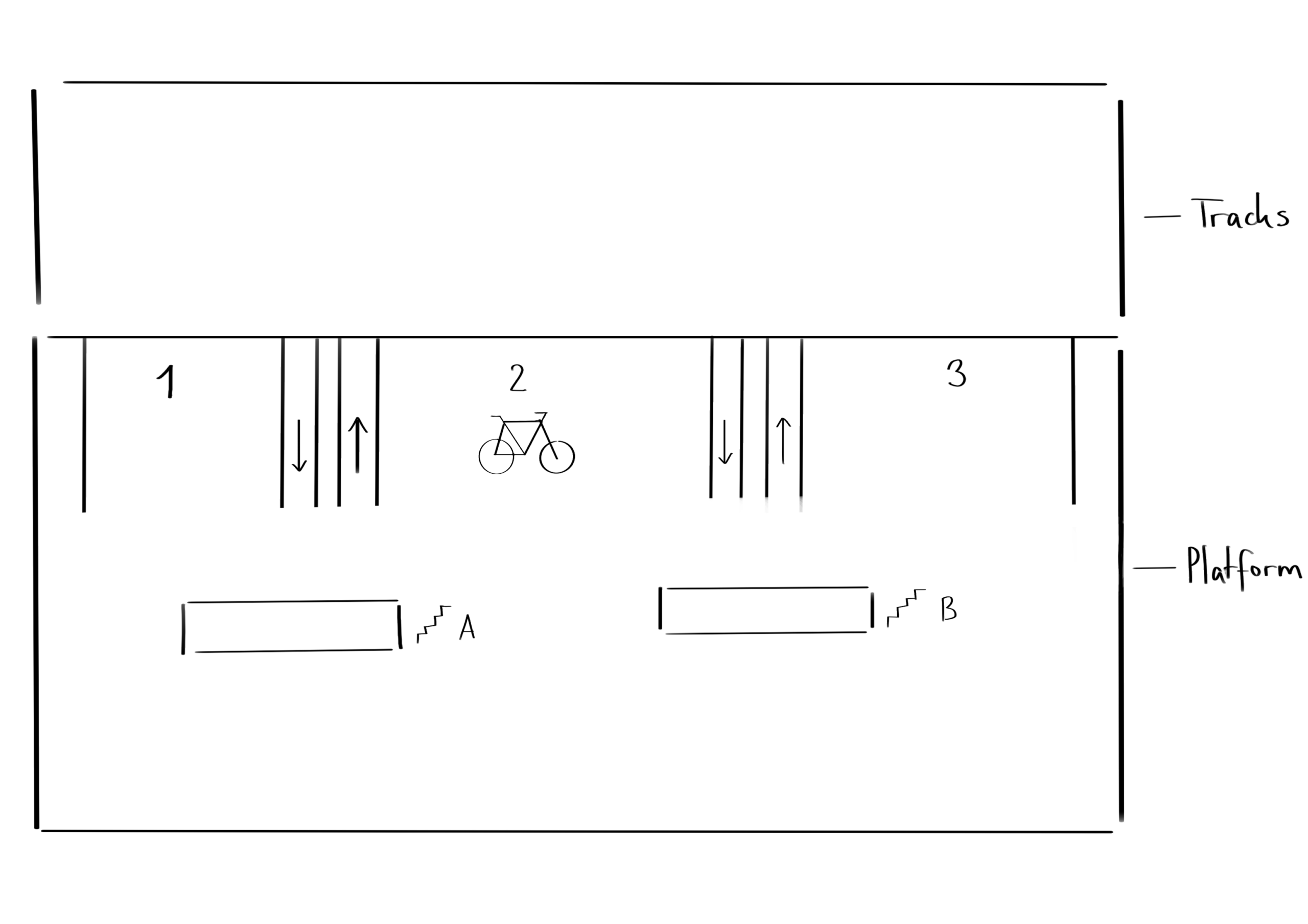
The environment in which the prototype was tested was an academic setting during a class focused on prototype testing. In preparation for the testing, the physical setup first had to be constructed within the space. For this purpose, a free area of the room was selected where the prototype could be outlined on the floor using prepared tape. Beforehand, a sketch of the site had been created, which could now be translated into the real environment. Using tape, two large rectangles were constructed to represent the train platform and the train tracks. Next, the exits were marked using smaller rectangles together with signs identifying them as exits. These elements reflected the basic structure commonly found on train platforms in Germany.

In addition to these existing platform elements, new components were introduced to represent the proposed intervention and demonstrate how the final product could improve the user experience. The first additions were two lines indicating the beginning and end of the arriving train. After this, the entrances were marked with four additional lines that created two corridors equipped with arrows to indicate the direction in which passengers should enter and exit the train. Another important part of the setup was the indication of carriage numbers through numerical markers, as well as the addition of a bicycle icon to represent the bike carriage. Finally, letters were added to the exits in order to distinguish different exit points leading towards different directions and destinations. With these elements in place, the setup of the physical prototype was completed.

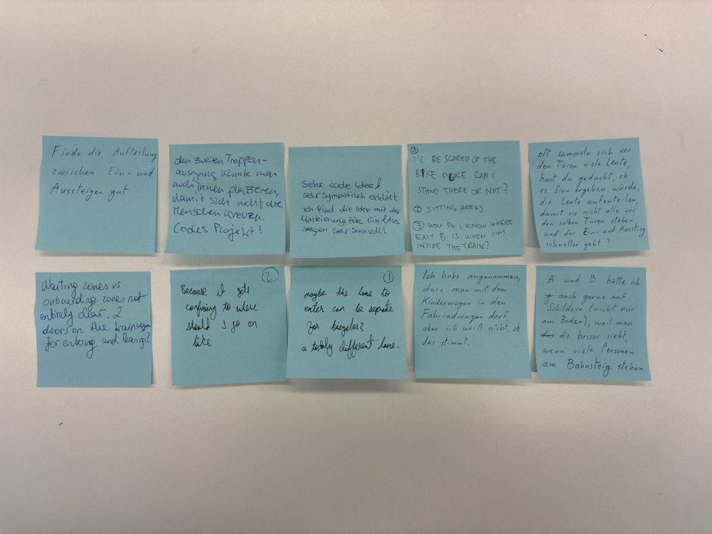
To document the testing sessions, a tripod and a smartphone were used to record videos of the interactions. Additional photographs were taken for further documentation purposes. To collect feedback after the testing, a station with sticky notes and pens was prepared where participants were invited to leave open feedback regarding their experience, including what they liked, what they found confusing, and what they believed could improve the prototype. The feedback was intentionally kept open-ended because the primary aim of the testing was to observe participants’ behaviour within the environment. The written feedback mainly served as an opportunity to gather additional ideas, comments, and perspectives. Since the product is still in the conceptual phase, changes and redirections are still possible, making further suggestions particularly valuable. With this setup completed, the first round of testing could be conducted.

Testing

For the testing sessions, different participants were recruited, most of whom were students from a variety of academic subjects. The testing was conducted in four rounds with varying group sizes. This variation proved useful because it reflected different situations that can occur on real train platforms, where there are sometimes fewer and sometimes significantly more passengers present.

At the beginning of each session, the project and prototype were briefly introduced and the aim of the testing was explained. Afterwards, participants were divided into two groups: one group representing passengers on the platform and another group representing passengers inside the train. In cases where the participant groups were smaller, all participants took part in both scenarios one after another. Once divided, the platform group received three tasks that they were asked to complete freely within the marked platform area. Participants could position themselves and move throughout the prototype space according to the given tasks. After the first group completed their exercises, the second group was asked to position themselves within the area representing the train tracks and imagine that they were passengers inside a train arriving at the station. They were then given two tasks to complete within the prototype environment.

The instructions given to participants were intentionally kept relatively limited in order to allow users to interpret the situations independently and draw their own conclusions based on the information available within the setup. After the testing sessions, participants were invited to leave written feedback on sticky notes if they had further comments, questions, or suggestions. These feedback notes were later collected for analysis.

Result Analysis

The results of the testing, including the recorded videos, observational notes, and written feedback from participants, were reviewed and analysed in order to gain insights into user behaviour and experiences within the prototype environment.

One observation that stood out during the analysis was the influence of participant numbers on behaviour. Smaller groups were generally able to complete the tasks with fewer problems and less confusion. In contrast, the larger groups experienced greater difficulty following instructions and navigating through the tasks efficiently. This observation reflects real-life conditions, as train stations become increasingly complex and challenging when larger numbers of people occupy the same space at once. The conclusion here is, that the indications at the platform need to be clear enough so that all users can understand and interact with them, no matter how high the occupancy rate of the station is. Another important observation was that the directional lines indicating entrance and exit routes were too small in the prototype setup for many participants to actively follow during the exercises. However, the concept itself was generally understood and positively mentioned in the feedback. The carriage numbers also caused some confusion among participants, as some users were unsure whether the numbers referred to train classes or carriage numbers. This suggests that an alternative form of communication or visual representation may be necessary. A similar issue emerged with the bicycle icon intended to indicate the carriage for passengers travelling with bicycles or larger objects. Although participants understood the symbol itself, they were uncertain whether the carriage was exclusively intended for bicycles or if it could also accommodate strollers and similar items. The additional information provided at the exits was generally well understood. However, observations showed that clearer pathways towards the exits would be beneficial. It also became apparent that further consideration is needed regarding how boarding passengers and exiting passengers can move without obstructing one another.

Another piece of feedback that stood out was the suggestion to introduce designated waiting and boarding zones on the platform. Participants felt that this could reduce confusion and improve the organisation of the available space. This idea will therefore be considered further and may become an additional feature within the proposed guidance system. Overall, the testing results were highly valuable and insightful, providing many opportunities for further research, refinement, and development within the project.

Information Gathered

This testing process represented a completely new experience for me, as I had never previously worked with an experience prototype and therefore did not know what to expect from either the process or the results. However, the testing exceeded my expectations and provided a large number of insights that would not have been possible to gain from a purely digital prototype. Observing participants directly within the physical environment made the experience feel significantly closer to reality and helped reveal both possibilities and challenges that the final product could face within an actual train station setting. The testing therefore played an important role in improving my understanding of how users interact with the concept and how the idea could continue to develop in the future.

Next Steps

This testing phase marked the final step within this chapter of research and completed the first attempt at creating a functional and testable prototype for the intended project. The information gathered throughout this stage of the research process can now be carried forward into the next phase of development. The upcoming work will focus on exploring the technical feasibility in greater depth, making the final product concept more tangible and realistic, and continuing to test and refine future ideas and iterations of the project.

Design & Research II – 4/6

Design & Research 2 | For: Birgit Bachler

Let’s suppose you just graduated from your Bachelor’s program and you are planning to go outside of your country for higher studies. You look around on the internet, figure out exactly what you want to do, and find a university that teaches exactly what you want to study. You decide to apply, you get your admission, and you get ready to move to a new country and meet new people. Sounds incredibly smooth right?

Well there is a catch. If you want to study in Europe as a non EU student, and especially if you are from a third world country, I really wish it was that smooth.

A Year of Paperwork

Let me take you through my personal journey. After doing my Exchange Semster here, I saw exactly what I wanted to pursue. I decided to apply for my Master’s in Interaction Design at FH JOANNEUM because I believed it was the right decision. But just coming to Austria meant going through a year long process. For some people it takes even longer than a year.

First I had to get all my documents attested by local courts in Pakistan. Then I had to get them attested again by every single authority that originally issued them. Then they had to be stamped by the Ministry of Foreign Affairs. After waiting four to five months, you finally get an appointment at VFS Global just to have the Austrian embassy legalize your documents to prove they are not fake. Once that is done, you try to get an appointment at the embassy to actually apply for your permit. That part is a total nightmare in itself.

After you finally submit your application, you have absolutely no clue what is happening or what is going on behind the scenes. Then suddenly, I got an email from the Magistrate in Graz. They told me I needed to submit my police clearance certificate, fully legalized by the Austrian embassy, because they suspected my current one was fake. And they gave me exactly 14 days to do it.

I wish I had known this beforehand so I could have legalized that document early. But I did not know because there is no proper channel or guide available to tell you these things. It was physically impossible to make it happen in 14 days. I emailed the embassy four times and could not get a response. I even showed the Magistrate my emails, asking for more time and showing that I was trying my absolute best to cooperate.

Their response? The Magistrate rejected my residence application. In their official rejection document, they literally used the term that I was a “security threat to Austria.”

Going to Court to Study Design

I had to file an appeal in court in Graz against this decision. According to Austrian law, they cannot reject your application for being unwilling to cooperate or call you a security threat just because things are out of your hands when you are trying your best. The case went to court, and thank god I won. They granted me my residence permit.

Because of all this chaos, I was a month and a half late to start my studies. I was so stressed that I almost emailed the university to ask for a refund on my fee because I thought I might not be able to make it anymore even after that much effort.

And just so you know, this was my experience as someone who actually has an Austrian embassy in their home country. Just imagine what happens to students from Bangladesh. They do not even have an embassy in their country and have to travel to a completely different country like India just to get their documents checked.

How Do We Fix This Broken System? This whole experience is exactly why I moved to this topic. The system is fundamentally broken. It places a massive emotional weight and cognitive load on students before they even step foot in a classroom.

I want to see if there is any way to fix this problem and figure out what the best way to do it would be. For my next steps, I am exploring the world of service design to see how we can make this journey more humane and transparent. I tried making a prototyping idea of an online portal and a digital status tracker that might actually solve this issue. I recently tested it with my class fellows and colleagues, and I will tell you all about their feedback in my next post.

Design Activism “Bügelperlen/Steckperlen”

Since I wanted to try out some very different methods for this process of experimenting with different things, I decided to take a trip back down to memory lane and experiment with “Bügelperlen/Steckperlen”. I couldn’t really find the right english equivalent for this word, but maybe it is ironing beads or something similar. These are small plastic beads coming in different colours that you can form shapes with and then put some paper between them and the iron and iron them flat so that they melt together. With this technique you can make coasters out of them or charms or anything that is flat and comes to mind really.

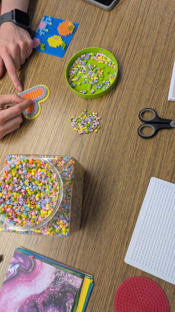
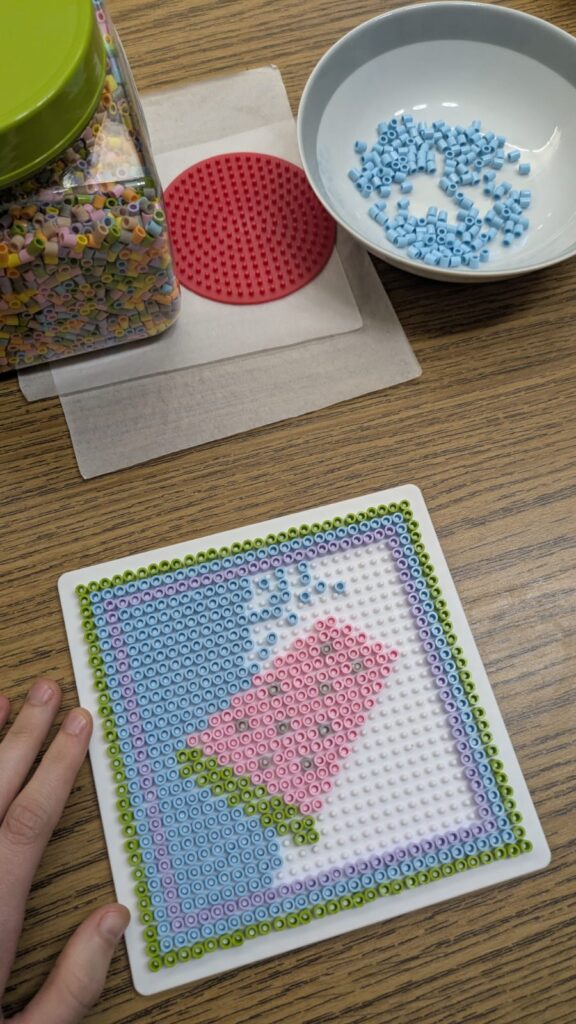
The process is quite simple and repetitive, depending on the motive that you’re trying to make and the size that you want to make it in. You have a plate that is specifically made for these beads that has several elevated areas. The beads are not round, but cylindrical and have a hole right through the middle. This hole is supposed to be put on the elevated area in the plate so that the motive stays in place when you’re building it and especially also when ironing later on. Then you can either think about how to make something on your own or try to find some examples in the internet. I tried both methods, in order to see how each one works. The more creative approach is of course trying out how to create your own motive. It is a simple process, but it can take a while and needs a lot of patience, when the pattern that you want to make is quite big. Below you can see two pictures of my process. However, I also had to seperate the beads by colour since the packages that you can buy are always mixed. This added even more time to the process. But it is still fun and takes me back to my childhood, you might also want to retry some things that you’ve done in your past, it is quite fun.

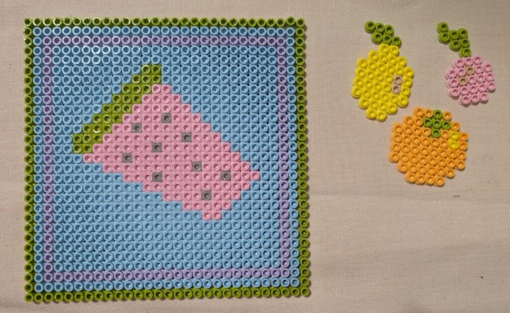
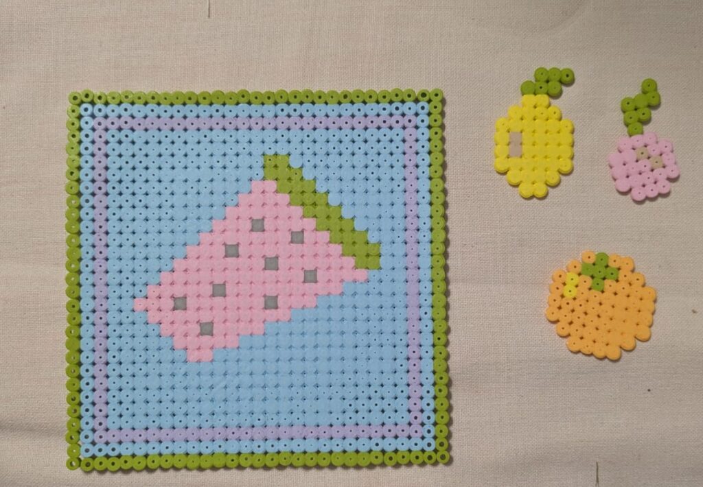
The topic that I’m working on for these experiments is still the same as you can see: “food is political”. I decided to stay with the watermelon motive from the free palestine mouvement and also made some other fruits, an orange, a lemon and a cherry. The crab and the heart was just something I added for fun. The longest of these was the watermelon, which took ages and also shows some of the limitations of this medium. It looks quite pixel based, since you also only have limited ways to place the beads and filling large areas can take quite a while and be tedious, since the beads are small and you need to be able to work very precisely if you don’t want all the other beads to fall.

The last step in the process is the ironing and this ties it all together, since the beads melt into a flat mass that can later also be hanged on a window or used as a coaster, for instance, as I’ve already mentioned in the beginning. See below how my pieces turned out, front and back view.

[DesRes 2 @BirgitBachler] Entry 04: Solutions for Austria inside and outside

While doing research for my last blog post I identified the “Österreich unterwegs” study as viable for my project. Therefore I decided to skimm through it for this entry.

Mobility evaluation “Österreich unterwegs”

The study “Österreich Unterwegs” is a comprehensive research project that evaluates the mobility habits of Austrian inhabitants, currently happening in the third wave. The first time such a research was conducted in the year of 1995. Since the results from the second evaluation from 2013/14 are already outdated a third data assessment phase is currently happening. Roughly 65.000 households are invited to participate in the evaluation on a voluntary basis. The results will be collected and published in 2027. Although the data set from 2013/14 is not representative anymore I still decided to take a look at it. The numbers on motorized individual traffic are especially striking. Almost half of the mobility routes of Austrian inhabitants were cited as done via car. Additionally to the car centered habits the difference between the first and the second report are worth mentioning. While individual transport was already predominant in 1995, it increased from 39,7% to 46,2% in 2014. (1)

It is a bit unfortunate, that the results for the current evaluation will most likely not be published before I finish my thesis. However, I will keep an eye out on new developments and will try signing up for participating in the evaluation, if possible.

Expanding the Horizon

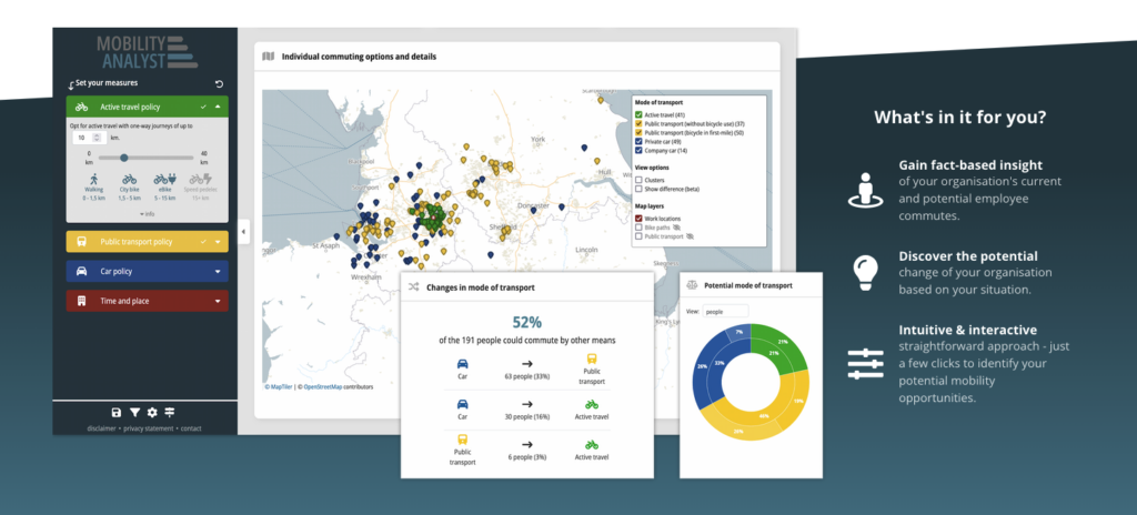
I already did a deep dive into Austrian Mobility habits in the last few blog posts. While this remains the focal challenge of my research, I decided to take a glimpse into other countries. And in terms of green and sustainable mobility the Netherlands seemed like an obvious example. After shortly researching with a focus on the Netherlands I quickly found a tool from a dutch software company called “Mobility Analyst”.

Image: Mobility Analyst Product Demo

Mobility Analyst seems to solve the exact wicked problem that I am working on. With this tool the different commuting approaches and solutions of employees can be gathered and evaluated to implement a corporate mobility strategy for companies (2).

Going back to the roots

After finding about Mobility Analyst I decided to move on and see if there’s any other countries where similar approaches have been iterated. Funnily enough, just after a quick desktop search I once again found myself within the Austrian border. A mobility consulting company from Linz called triply also seeks to find answers to the mystery of conglomerating corporate mobility (3).

Corporate with a focus on employees

In my opinion the term “corporate mobility strategy” aligns well with the german expression of “Betriebliches Mobilitätsmanagement”. However, my prototype will focus purely on the needs of employees and workers. Especially with the two previous examples in mind, I would like to empathize that I do not want to extract KPIs amongst other fancy numbers from this prototype. Instead the outcome of this project must serve employees. Of course, certain benefits can still be concluded for employers as well: for example supporting your employees when commuting can be used as a benefit in the job market.

References

(1) https://oesterreich-unterwegs.gv.at/

(2) https://mobilityanalyst.com/en/

(3) https://www.triply.net/solutions/companies/mobility-consultants

Design Activism Silkscreen Printing

I had the chance to join a silkscreen printing workshop and decided that it would be a nice addition to my experiments. I was only able to do one print, since you have to prepare the silkscreen accordingly and I only had the option to use one screen, therefore I really had to think about how I could get the best out of it.

In the beginning, we were told how the process works. On the first day we had to prepare a black and white image or text that we wanted to print and then we had to start prepping the screen. Each one of us were given a screen according to the size of our image. It was already prepared and had a paste on it that was reactive to light. We then placed our images on top and went into the dark room, where we exposed it to light. She mentioned that it needed at least 8 hours, so we had to start the rest of the printing process on the next day.

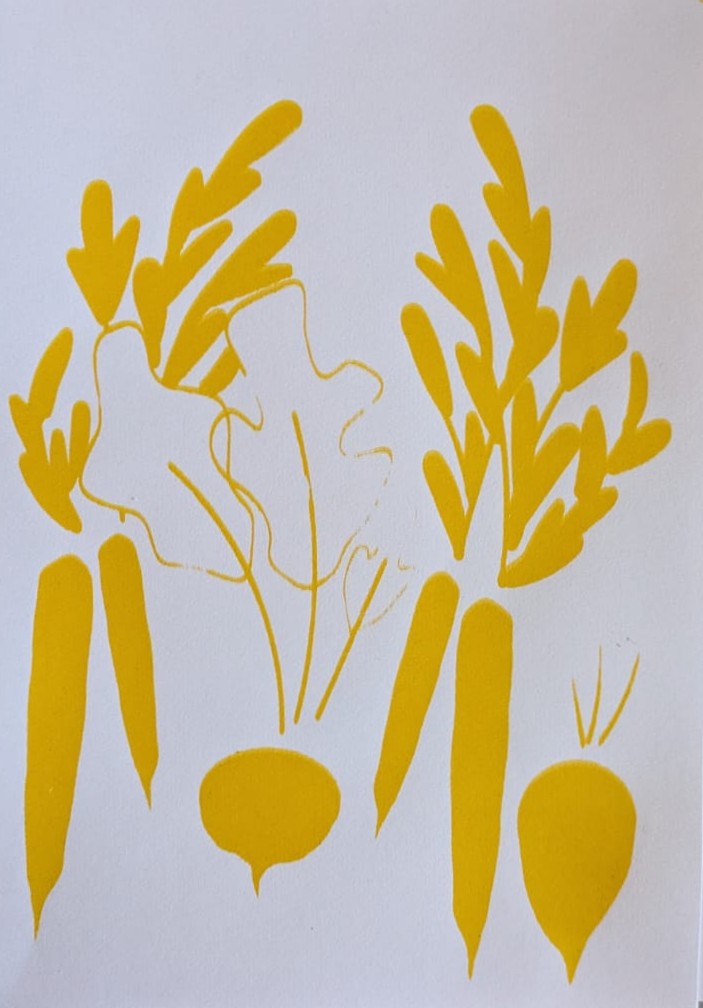
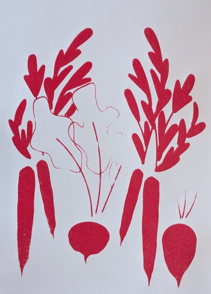
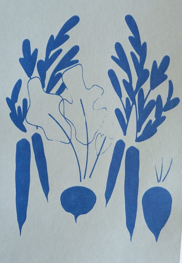
Therefore, when we came back in the morning, we took our screen and washed it carefully with a pressure washer, so that our motifs became visible, since the paste only stayed in the areas without the image. When we were done with this part everyone got to mix some colours I decided on doing a light green, a red, a yellow and a dark blue, to get some different print options in the end.

Then we were able to start printing, all of us got a ‘Rakel’ (the tool that you use for the printing) and she explained the process once more. First, you put some colour just above your image, but you have to be careful that it is not too much and then you use the Rakel in the right angle and put a certain amount of pressure on it while filling the whole image with colour. Once you are finished, you take the rest of the colour that is left on your screen and put it back into the container. If you want your images to look well-made and clean it is advised to wash the screen after each print or after two prints in a row. This is a little tedious, but the results really showed the difference. I also realized that it will take a bit of time to get the hang of it, since you can easily tell when you’ve used too much colour and when you’ve not washed the screen enough, since the colour that is still on it then dries.

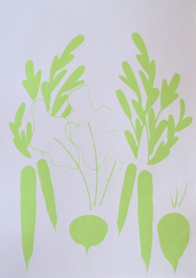
I decided to use make a similar print to what I’ve already tried out with the collage experiment. I made a vegetable print that featured carrots, a beet and a radish (on the topic of “food is political” as I’ve already mentioned in the blogposts before). The dark blue ended up on a mint green paper since the colour came out much nicer in this combination. Below you can see my results. Even though the process was sometimes a bit tedious it was a lot of fun and I also learned that the lines should not be too thin when doing silkscreen printing.

Design Activism Collage Part 2

If you’ve been reading my blog posts you know that my last experiment was focused on doing collages on the topic: “food is political”. In my last post I got a bit into how my process started and talked mainly about how I was able to find my topic and which factors make the sentence true on several different levels. I focused on privileges and the accessibilty of food, as well as how food is tied to survival and can be tied to cultural identity. To add to that, I already started mentioning that food has been used either as a symbol for political mouvements or as a way of dealing with historical pieces of art or statues of questionable people, when vandalizing these with food.

As I’ve already mentioned in my last blog post, my process was rather messy, but I think with collages this is mostly the case anyways. I started to search my box of scraps to find some things that might be used for food, first I started to search for certain colours that remind me of specific vegetables. But I also searched for pieces of food and things associated with food. In the following picture you can see just how messy my process really was.

I decided to focus on doing three collages that were focusing on different aspects of “food is political”. In one of them I wanted to show different types of vegetables as a symbol for farmers implying the different accessibilty of food over time. In the second one I wanted to show how charged it has become to see objects that are associated with watermelons, and how easily the Free Palestine Mouvement can be implied, when adding a view conceptual changes to it. In the last one I tried to show that food connects people and is also a symbol of identity, people tend to identify themselves through food, especially in Europe a table full with different types of foods shows wealth that isn’t only measurable in money.

As I’ve already mentioned, with the collage you can see on the left below, I was trying to find ways to show vegetables without cutting them out as finished versions already. I searched for different colours and thought about whtat they reminded me of and then proceeded to find the leaves or other parts that might match and make sense for the composition. In the collage you can see a tomato, an aubergine, a carrot, a beet and a zucchini all perched upon a cutting board. These are supposed to show an everyday situation, implying the accessibility of food, as well as, the history of farming.

The poster in the middle is focusing on palestinian identity, as well as the free palestine movement. The watermelon set of tableware just came at the exact right time, to clearly show that it is supposed to make sense in a palestinian context, I added some tiles that reminded me a bit of the palestinian fabrics that also show elaborate patterns. To add to that, the stars above showase freedom and to fight for freedom usually some tools are needed, in this case the cutlery.

Finally, the poster on the right explores cultural identity through food. It showcases a table filled with food, and adds some botanical details reminding that food always somehow comes from nature. This again features the question of accessibilty and that in certain areas of the world having a table filled with food can be considered normal, even if it shows great privilege.

All in all, this experiment was a really fun process and it opened my eyes to making collages in a simpler way that is really fun and also creates outcomes that really make sense and work for certain projects.