Design Activism Collage Part 1

In my second experiment for my Design Activism topic I decided to go for the classic approach of trying out some collages. For this I first had to decide on a topic, since Design Activism can come in many different forms and it would’ve been harder to work on several different topics at once. So for this first try in collage, because I haven’t done them in a while and I also haven’t liked my previous tries at collage very much, I have to say that I’m quite happy with my process, as well as, the outcome.

Firstly, I gathered some materials, luckily since I cannot seem to throw away stuff easily, I’ve already been preparing for doing collages for years, in case I someday want to do them. Therefore, I had a big box full of magazine scraps and textured papers that I wanted to scour for some useful things that I might be able to integrate in my collages. To add to that, I prepared some differently coloured papers as a background for my collages.

It took me quite a while to think about what kind of topic might be the right approach for these experiments that I’m doing, therefore I decided on trying it with the topic: “food is political”. Food is something important to every human being, since it is necessary for survival and, therefore, one of the central topics of life, whether we want it to be or not. Some people eat food to have energy to do the things they enjoy or have to do in life and some see food as something that can be enjoyed and does not only serve to keep the body functioning. As we all know, food is something that can put countries in crisis since it is so very necessary for our survival, this means that food has always been and will always be political, even if many people might not want to see it that way. Even in earlier times, farmers could not freely decide, who gets their food, because there was always someone else they had to listen to and they had to serve to even be able to afford having their own fields. Nowadays, access to food is also not certain for everyone. Depending on how privileged you are, in which country you live and what kind of work you are able to do already changes the accessibility that you might have to daily goods for survival. Usually it also depends on how much money you have, whether you can afford to make healthier choices or have to stick to whatever is available for cheaper prices. To add to that, many cultures build their identity based on typical foods, which makes different types of vegetables or grains culturally loaded and also victims to colonization, as can be seen by researching African plants, for instance.

Food has also been used as a symbol for several different political mouvements. Whether it is by throwing different kinds of food at pieces of art or vandalizing statues of people that have been doing questionable things during history or just using a certain type of food for a certain mouvement, e.g. watermelon for Palestine. These are all things that I have kept in mind during my collaging process. If you’re interested and want to follow along and see what kinds of collages I made, there will be a part two of this long process. 🙂
Design Activism Interview

I know I am quite late to be starting with my blogposts for this semester, but I’m trying. I’m currently in one of the hardest periods of my life so far, so please, bear with me.

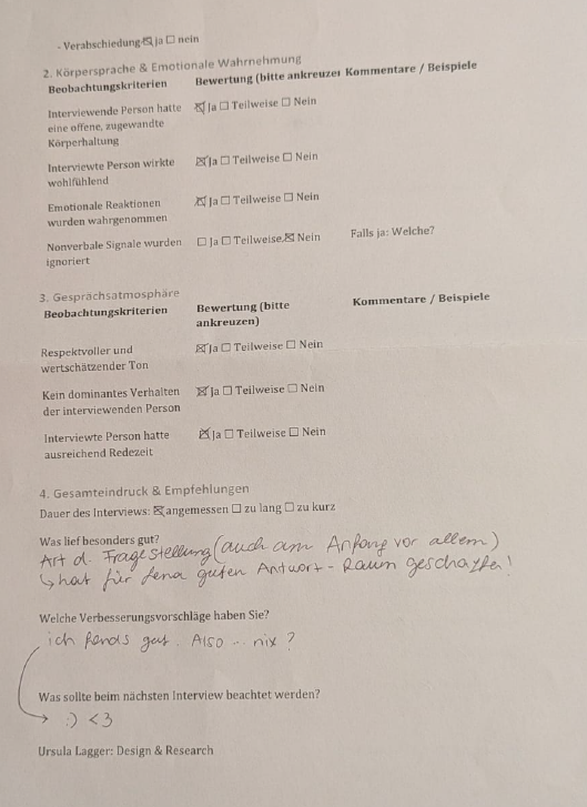
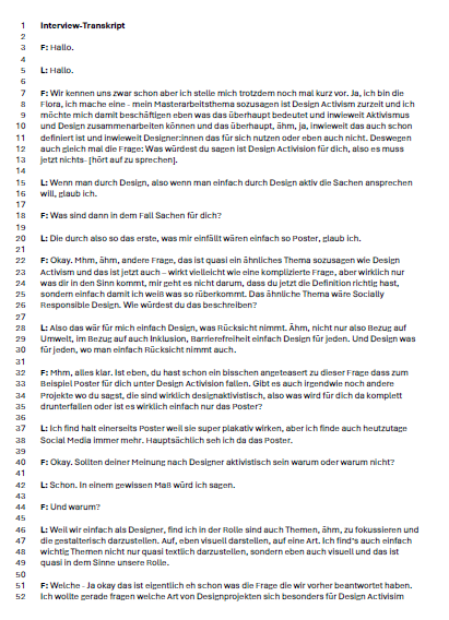
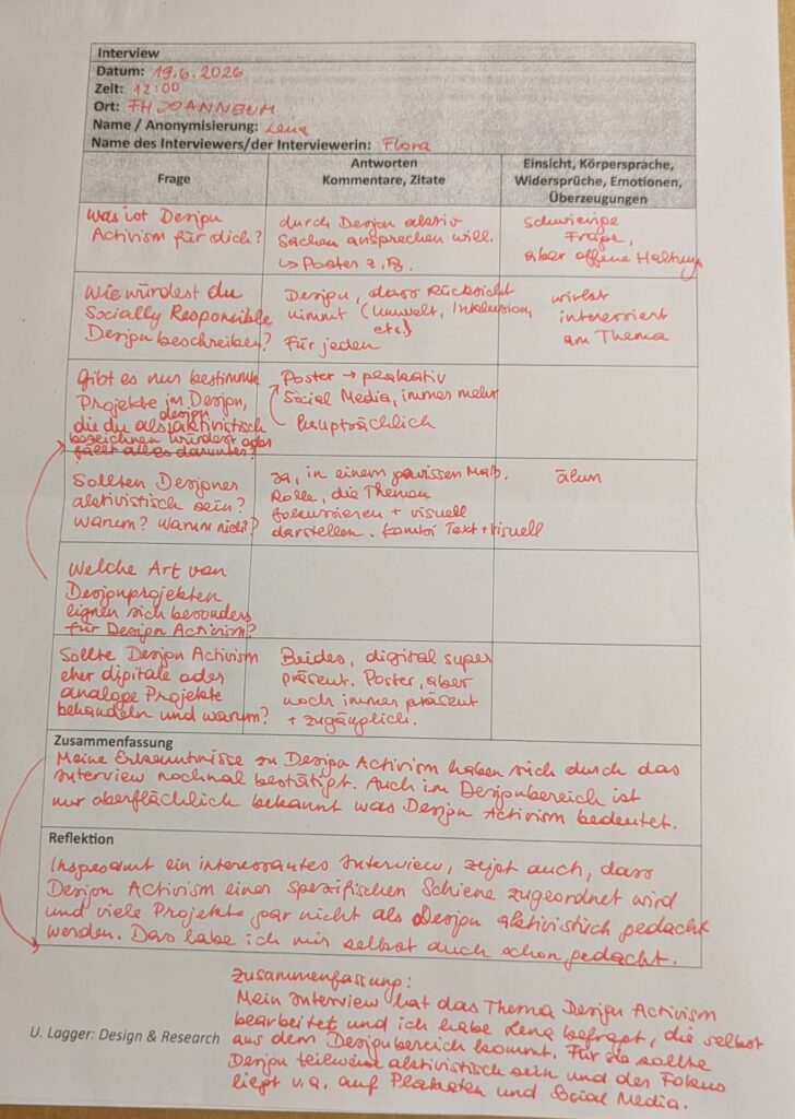
I decided to do an interview for my topic of Design Activism, but since I’m still missing my research question, finding interview questions turned out a little harder than I thought. For this exact reason, I currently only interviewed one person, because I wanted to find out if the questions would work and what results I could get. For my master’s thesis I will probably be reworking the interview, in order to make it more specific and accurate for my future research question. I decided to focus on how Design Activism is viewed by people within the Design industry. For this I decided to interview Lena, who turned out to be a really good interviewee and confirmed many of the thoughts that I had about designers dealing with Design Activism, so thank you for that.

In the beginning I instantly wanted to start with some hard questions, because it gives me a better idea what designers might know about Design Activism without having spent time researching it in-depth. So my first two questions were: What is Design Activism for you and how would you describe Socially Responsible Design? Lena told me that Design Activism is when someone actively talks about things through design, while Socially Responsible Design is design that takes things into consideration (for instance, environment, inclusion, accessibility, etc.) it is Design that is for everyone.

In the next step I asked her which types of design projects she would describe to be design activist and she said that she mainly thinks posters and social media are platforms people use to show design activist work. This showed me that, as I thought, the main idea of activist work nowadays (excluding demonstrations, of course) is being presented and spread throughout social media or posters. Lena mentioned that although many things happen on social media nowadays, posters still have a lot of power and are sometimes even more accessible to people than social media. This is also why she thinks that both the digital and the analogue space are important for Design Activism, since they are accessible for different people and the message can be spread in numerous ways depending on the area, where it is shared.

Last but not least, I wanted to know if designers should show activist work or not and Lena answered that to a certain degree designers should add activist works, because they are responsible for focusing on and showing certain topics in a visual and easily understandable manner, so people might be able to understand some causalities better.

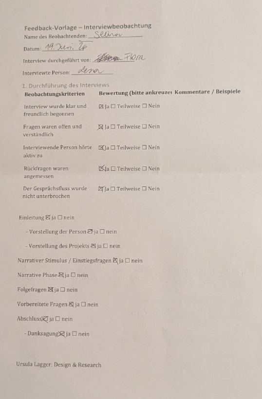
Thank you Lena for the interview and for the experience of professionally creating and conducting an interview! And thank you Selina for the observations concerning my interview. Below this blogpost you can see my interview notes, a short summary and reflection on the interview, the observation sheet from Selina, a Feedback from Lena and the transcript of the interview. Keep in mind that it was conducted in German so all the mentioned documents are in German too, sorry.

[DesRes 2 @BirgitBachler] Entry 03: Commuting Streams in Eastern Austria

This time I have taken a deep dive into a source from Arbeiterkammer once again. The report “PendlerInnenverflechtungen in der Ostregion” displays the different commuting streams happening in Lower Austria, Vienna as well as Burgenland. These three regions have a total of 1,3 Million employees of which only 18% live and work in the same commune (p. 1, Weninger, A. et al., 2021). I find this source especially enlightening since it covers a wide spectrum of mobility behaviors and needs from urban to rural.

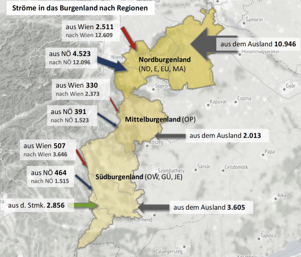
Mapping commuting streams

Image: Arbeiterkammer

This extraction for example showcases the commuting streams from as well as to the region of Burgenland. What’s especially notable is the behavior that can be observed in northern Burgenland. Due to it being close to two country borders the10.000 employees working in Burgenland but not living in Austria are off no surprise. However, it is notable that it’s even more – 24.000 employees living in Burgenland – that commute outside of their region to either Vienna or Lower Austria. (p. 18, Weninger, A. et al., 2021)

Commuting to school

While various challenges and needs of working commuters are pointed out the report additionally highlights that students commuting at the same time as workers can add lots of friction. Alongside considering alternatives for school starting times in the morning the concept of “Schulische Mobilitätsmanagement” (Mobility Strategy for Schools) is being proposed (p. 54, Weninger, A. et al., 2021).

This perfectly aligns with my vision for my prototype, as I am planning on testing it with high school students and not just workers.

Nudging as motivation

Alongside many other obstacles a lot of commuters seek to avoid overcrowded coaches. While trying to identify possible drivers to push commuters to adapt to public transit the report highlights the “Travel Smart Programme” introduced in Singapore, which is a reward system for which you can receive bonus points if you use less crowded coaches at an earlier or later time instead. The more points you have collected the cheaper your future tickets get (p. 67ff, Weninger, A. et al., 2021).

While I appreciate the effort of communicating the demand of different trains, I personally view the point based system as critical from an ethical standpoint. In my opinion the simple act of showcasing this demand without a reward system should be enough to “nudge” commuters. The bonus point system seems like a capitalistic extension that puts more pressure on users than relieving them from.

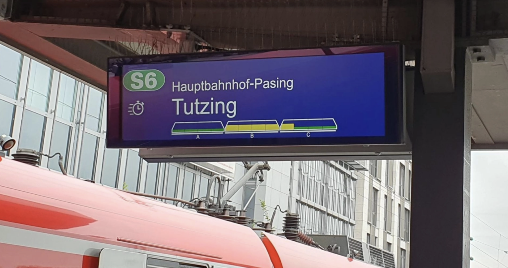
Picture credits: Bayrischer Rundfunk

This is an example I’m familiar with from the S-Bahn in Munich. The display tells you how crowded the different coaches of the train are and allows you to strategically position yourself on the platform before entering the train.

Ars Electronica Center Blog Post

Last month, the sound designers and exhibition designers of FH Joanneum jointly participated in an excursion to the Ars Electronica Center in Linz. The center is a museum that focuses on new media art and is most renowned for its annual festival, the Ars Electronica Festival, which critics have praised as a pivotal exhibition in the digital arts. It is widely considered one of the best known creative arts festivals in Austria. Over the years, the people behind the center have been praised for their unique integration of technology into the creative field. They also have a dedicated inhouse research facility called the Futurelab, which focuses on modern technological advancements, particularly artificial intelligence. 

There were a lot of engaging exhibits. Some memorable ones included the fascinating “tardigrade” under a microscope, as it made its way through its tiny surroundings. These remarkable creatures are incredibly resilient, capable of withstanding extreme temperatures and are known to be some of the only organisms able to survive in outer space. Another interesting part of the excursion was the Deep Space 8K experience, which drew us into a world of 3D visuals. We heard various soundscapes, ranging from the planets of our solar system to our oceans, and even the unique art of yodelling.

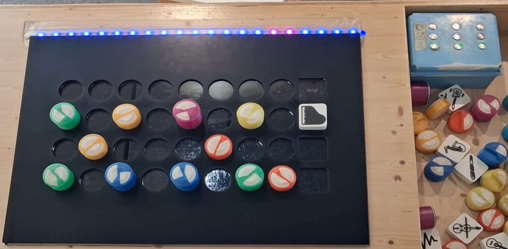
The exhibit I would like to speak about in detail is the simple sequencer, which was located in the Kids Research Lab on the first floor of the building. I really enjoyed the sequencer and felt like a kid again while playing around with it for some time. It was a really nice setup, especially for children who are curious about music and sound in general. It was a simple concept, but one that was very much fun to use due to the various patterns you could recreate.

The sequencer was off by default, so you had to place blocks (or tiles) representing a particular instrument onto the vacant slots to produce sounds. On the left hand side of the instrument block was the fill pattern, consisting of 8 distinct beats that the user could customize to recreate a unique rhythm. There was an LED strip on the top edge of the sequencer, which indicated the beat being played at the time. The beat blocks came in different colours and sizes. Some were taller than the others and had unique shapes on the top facing size. However, I was not able to decipher exactly what these could have stood for. This may have possibly been a measure used for quarter or half notes, but I am not entirely sure. The instrument blocks included an acoustic guitar, a piano, an electric bass and even a saxophone.

The sequencer could only accommodate 4 instruments at a time as there were only 4 slots available. Apart from this, there was also a small blue box on the right side of the sequencer with buttons featuring images of snares, cymbals and kick drums. I do not recall if these sounds played in sync with the sequencer but pressing them did produce the sounds of the instruments I just described.

Overall, I really enjoyed the visit and gained valuable insights from the unique exhibits. From the way they were presented to the overall setup of the installations, it was a good trip to explore and brainstorm ideas for our own installations at Klanglicht later this year. 

[DesRes 2 @BirgitBachler] Entry 02: Evaluating the active2work concept

I have found a viable source dealing with the feasibility analysis of the active2work (a2w) concept. It is also cited in my initial research kick-off document. Which is the report I have received as a starting point for the project I participated in 2 years ago. The source covers extensive research of different areas from a general mobility exploration to an economic evaluation of the concept. Especially chapter no. 3 “Involvierte AkteurInnen und Mindsets” (involved parties and mindsets) strikes my interest. For the sake of exploring the desirable impact of the concept a qualitative research in focus groups was conducted.

About active2work

The concept of active2work deals with the possibilities of commuting to work by one’s own force as a green alternative to the popular choice of driving a car within Austria. It tries to seek an answer to the status of time when commuting as well as the target audience for such a concept including it’s possible benefits to health and economic considerations for the Austrian population. (p. 8 Doiber, 2020)

Opinions of the target audience

21 representatives (9 representative from AK/WKO; 6 employers from Austrian companies; 6 employees of Austrian companies) from various fields were invited for a formal discussion on the topic. The goal of the conducted research was to explore acceptance and obstacles on various levels, such as economical or business related drivers in addition to social, financial, psychological and even feasible drivers from an individual’s point of view. (p. 54 Doiber, 2020)

Reasons for choosing a commuting option.

It is no secret that cars are predominant in rural areas. Motonormativity is a term used to describe car centered infrastructure as given. Therefore it is no surprise that the willingness to use public transport is directly correlated to it’s availability. (p. 55 Doiber, 2020)

Motivation to drive a bike

For the motivation to drive a bike the opinions vary widely. While health considerations are paramount some still empathize the possible risks of using bikes (e.g. longer distances, weather circumstances or general traffic dangers). (p. 55ff Doiber, 2020)

Companies takes on the legal concept of “Business Mobility Strategy”

Businesses would view the introduction of such a concept viable as soon as they could derive economical benefits from it. One possible enabler for this could be the state. (p. 58 Doiber, 2020)

Feasibility and obstacles of active2work

Once the overall infrastructure for bikes expands the acceptance towards using a bike will grow. Some major obstacles can be iterated right away, for example showers or expanding the amount of bicycle racks on the company grounds. Besides some obvious low hanging fruits however, the concept of active2work has been identified as biased towards jobs outside of the office, especially people working in shifts. Furthermore, the proposed concept doesn’t fully consider the different challenges between city and countryside life. Additionally the active2work approach has been named unfair towards workers with surpassing commuting distances. Last but not least, the risk of discriminating people with accessibility needs was pointed out as a major obstacle. (p. 63 Doiber, 2020)

Conclusion

Before skimming through this source I was already aware of the existing car-bias in Austria. However, I am happy to have found more sturdy facts on this topic. The way the focus group was conducted as well as the actual findings from this research are engaging and offered new revelations for me. I am especially satisfied that the danger of excluding workers with accessibility needs was mentioned, as this has been a major concern of mine from the very beginning when hearing about the active2work approach. With this I am not saying that I do not support the said concept, as it still seems tangible for a certain amount of workers. It simply shouldn’t be viewed as a one-size-fits-all solution.

References

(1) Doiber, M. (2020). active2work – Arbeits- und Mobilitätszeit neu gedacht: Machbarkeitsuntersuchung.

Blog Post 6: How Form Directs Feeling

After focusing on attention and memory, I started looking more carefully at the formal side of visual response. If some images hold us longer than others, that cannot depend only on hidden meaning. It also depends on how the image is built. Shape, contrast, scale, spacing, and hierarchy do not simply organize information. They shape the emotional and perceptual conditions in which information is received.

One of the clearest findings I came across concerns shape. Studies repeatedly show a general preference for curved forms over angular ones, while sharper forms are more often associated with tension, alertness, or even threat. That is important to me because it means that visual response begins before conscious interpretation. Form already sets a tone. The same is true of hierarchy. Eye-tracking research shows that viewers do not move through an image evenly. Their attention is guided by contrast, scale, grouping, and placement. In other words, design does not just communicate meaning. It directs the path through which meaning becomes visible.

This makes me think differently about ambiguity. A hidden meaning is not effective on its own. It depends on whether the rest of the composition leads the viewer toward discovery or leaves them lost. Surprise becomes stronger when it is structured. Ambiguity becomes engaging when it is supported by control. What initially seemed to me like a question about illusion now starts to look more like a question about visual guidance.

Blog Post 5: Why Some Images Stay With Us

At this point in the research, I am becoming less interested in illusion as a category and more interested in what it does to the viewer. Some images disappear almost immediately, while others remain in the mind long after the moment of looking has passed. What seems to matter is not only what is shown, but how the viewer is made to encounter it. The more I read, the more I see that attention, surprise, and memory are closely tied together.

Research in visual memory suggests that people are capable of remembering a surprisingly large number of images in detail, especially when those images are distinctive and meaningfully processed. This makes delayed recognition particularly important. When an image does not reveal itself all at once, it creates a short cognitive pause. That pause is not empty. It becomes part of the experience, and perhaps part of the reason the image is remembered more strongly. In this sense, ambiguity may work not because it hides meaning, but because it turns recognition into an event.

I also found that surprise plays an important role here. Unexpected visual information tends to interrupt routine perception and can strengthen encoding, especially when the viewer has to resolve or reinterpret what they are seeing. This gives more structure to something I had mostly understood intuitively before: the moment of “getting it” is not just satisfying, it is cognitively active. Curiosity, tension, and reward are not side effects of visual communication. They may be part of its mechanism.

This is beginning to change the center of my project. I am no longer asking only how illusion works as an effect, but why certain visual experiences stay with people while others do not. That shift feels important. It suggests that the stronger topic may not be illusion itself, but the relationship between perception, attention, and memorability.

Blog Post 4: From Hidden Meanings to Public Spectacle

At this stage in my research, I feel the need to move away from speaking about illusion only in theoretical or artistic terms and begin testing it through real commercial examples. If illusion, ambiguity, and layered meaning are truly relevant to contemporary visual communication, then they should be visible not only in galleries, installations, or experimental design, but also in branding systems, advertising campaigns, product packaging, and promotional strategies that compete for attention in everyday life.

What interests me here is not simply whether commercial design can be clever, but whether visual cleverness actually does something. Does it make people remember a brand more easily? Does it reward attention in a way that strengthens emotional connection? Or does it sometimes stop at the level of spectacle, creating visibility without meaning? These questions have led me to look more closely at examples in which illusion or layered perception is used not as decoration, but as part of communication itself.

Some of the most well-known logo examples suggest that hidden meaning can be effective when it is both subtle and conceptually aligned with the brand. The FedEx logo is perhaps the most obvious example. Its hidden arrow, formed in the negative space between the “E” and the “x,” has become iconic because it communicates movement and direction without interrupting clarity. It works not because the viewer notices it immediately, but because it remains there as a quiet second layer, one that feels satisfying once discovered. The same can be said for the Toblerone logo, where the mountain contains a hidden bear that refers to Bern. In this case, the image does not simply function as a visual trick. It ties geography, identity, and storytelling together in a compressed and memorable form.

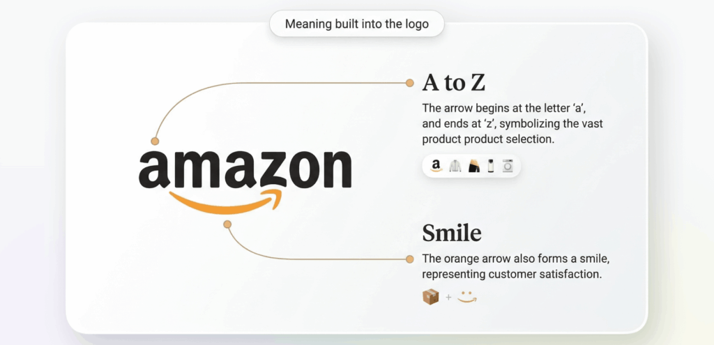
Other brands operate in a similar way, though with slightly different intentions. Amazon’s arrow connects the “A” to the “Z” while doubling as a smile, combining range and customer satisfaction in a single gesture. The older Formula 1 logo famously created the number “1” through negative space, showing how speed and reduction could work together. What links all of these examples is that they do not use ambiguity to confuse. They use it to deepen the message without sacrificing legibility.

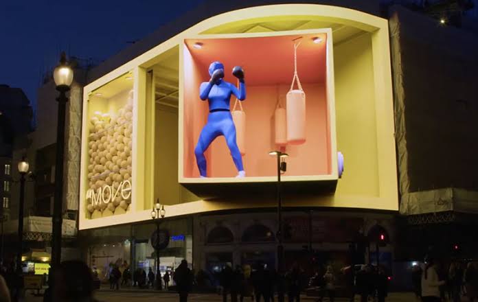
What becomes even more interesting is what happens when illusion leaves the logo and enters space. Anamorphic billboards and large scale 3D out of home campaigns have turned visual surprise into a public event. Their success depends on perspective, scale, and digital illusion, but also on something more social: people stop, film, share, and circulate them. In that sense, illusion here is not just about perception. It becomes a strategy for attention and participation. The campaign exists both in physical space and in the secondary life it gains online.

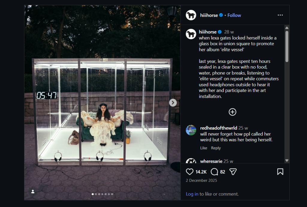
This is where more performative promotional work also becomes relevant. A case that stayed with me is Lexa Gates’ transparent box listening stunt in Union Square, where she placed herself inside a clear box for hours while people gathered around, watched, and engaged with the performance. What makes this especially interesting is that it is not an illusion in the classic visual sense, yet it still relies on spectacle, framing, containment, and public curiosity. These examples push the research into a broader territory, where visual surprise is no longer only about hidden forms, but also about staged visibility and controlled public attention.

Analyse und Fazit des WerkstĂĽcks

Im Rahmen dieser Blogbeiträge wurden die Themen „One-Shot-Productions“ und „Sport Dokumentationen“ behandelt. Im Zuge dessen entstand ein WerkstĂĽck, dass das Ziel verfolgte, die beiden zentralen Themenbereiche miteinander zu verbinden. Daraus ergab sich ein zweiminĂĽtiges One-Shot-Video im Stile einer Sport Dokumentationsserie ĂĽber ein Motorsport-Team. DafĂĽr haben sich in vergangenen Blogposts einige Merkmale herauskristallisiert, die in das WerkstĂĽck eingearbeitet wurden. Trotz sonst groĂźer Unterschiede verfolgen beide Genres ein ähnliches Ziel: Sie wollen eine möglichst hohe Immersion und emotionale Beteiligung bei ihrem Publikum erzielen. Das fertige WerkstĂĽck hat diese und weitere Merkmale aufgegriffen und in seiner eigenen Form umgesetzt. Dieser Blogbeitrag stellt eine Analyse dessen dar. 

Merkmale der One-Shot-Productions 

Eines der zentralsten Merkmale von One-Shot-Productions, das sich bereits in mehreren Blogposts dieses Jahres herauskristallisiert hat, ist die Erzeugung von Immersion durch kontinuierliche Kameraeinstellungen auf eine ganz besondere Art und Weise. FĂĽr die Zuschauer:innen entsteht durch das Fehlen von (sichtbaren) Schnitten der Eindruck, dass sie die Handlungen in Echtzeit miterleben. Dieses Prinzip wurde natĂĽrlich auch in der Produktion des WerkstĂĽcks wieder aufgegriffen: Es enthält keine Schnitte und die Kamera begleitet einen Porsche Cup Fahrer in Spielberg ohne Unterbrechung von seinem LKW bis in sein Rennauto. Dadurch wird das Publikum statt als auĂźenstehende Person als Teil des Teams positioniert und man bekommt das GefĂĽhl selbst am Geschehen teilzunehmen. Die kontinuierliche KamerafĂĽhrung verstärkt sowohl die räumliche als auch zeitliche Nähe dessen. 

Merkmale der Sportdokumentationen 

Auch aus diesem Genre wurden Merkmale aufgegriffen, die wichtig für das Werkstück waren. In der Recherche und theoretischen Auseinandersetzung mit dem Thema „Sportdokumentationen“ hat sich schnell herausgestellt, dass dabei nicht (nur) das sportliche Ereignis im Vordergrund steht, sondern es vor allem auch um das Storytelling dahinter geht. Sportdokumentationen sind oft emotional aufgeladen und wollen das Publikum damit anstecken. Besonders wichtig ist dabei auch, dass die Athlet:innen und deren Persönlichkeiten, Emotionen und ihr Team im Vordergrund stehen. Das war ein sehr wesentlicher Punkt, der in das Werkstück eingeflossen ist. Auch dabei steht der Athlet – in diesem Fall ein Rennfahrer für das Team Proton Competition – im Vordergrund des Werkstücks und seine Gedanken und Emotionen sollten filmisch übermittelt werden. Dabei behandelt das Werkstück mit dem Thema Unfälle und die Momente vor dem „ins Auto steigen“ auch eine sehr emotional aufgeladene Angelegenheit. Dadurch wird der Motorsport nicht nur als Wettbewerb dargestellt, sondern viel mehr als Ereignis, das geprägt ist von Emotionen, Spannung und menschlichen Erfahrungen.

Ein weiteres Merkmal von Sportdokumentationen ist die Personalisierung des Sports selbst. Wie bereits in den mehreren Blogposts beschrieben wurde, werden Athlet:innen oft zu „Schauspieler:innen“ gemacht und stellen zentrale Identifikationsfiguren fĂĽr das Publikum dar. Dieses Merkmal verwenden auch viele bekannte und erfolgreiche Sportdokumentationen, wie beispielsweise die Netflix Serie „Drive to Survive“. Da es in dieser Serie ebenfalls ĂĽber Motorsport geht, wurde sie auch als Inspiration fĂĽr dieses WerkstĂĽck verwendet. 
Zuschauer:innen interessieren sich nicht mehr nur fĂĽr die sportlichen Ereignisse bzw. Ergebnisse eines Events. Vielmehr geht es ihnen um die Menschen dahinter. Die persönlichen EindrĂĽcke, Gedanken und GefĂĽhle des Rennfahrers Keagan Masters stehen im Vordergrund des WerkstĂĽcks. So wirkt das Video zusätzlich wie eine persönliche Geschichte, die dem Publikum von Masters erzählt wird. So wirkt er als Person viel greifbarer und das gesamte WerkstĂĽck erzeugt viel mehr Nähe bei den Zuschauer:innen. 

Ein weiterer essenzieller Teil von Sportdokumentationen ist Interviews mit beteiligten Personen – seien das nun Athlet:innen, Teamchefs oder Mitarbeiter:innen. Durch das Filmen einer One-Shot-Aufnahme war dies anfänglich etwas schwierig zum Einarbeiten, ohne dabei die Immersion zu „zerstören“ bzw. ohne, dass ihre Wirkung verloren geht. Als Lösung wurden die Originalsounds aus der Pit ebenfalls im Hintergrund gelassen und in Sprechpausen verstärkt. Dadurch bleibt die visuelle Kontinuität erhalten während gleichzeitig Informationen und Gedanken des Fahrers vermittelt werden können. So werden zwei wichtige Merkmale aus beiden Genres verbunden. 

Sportdokumentationen balancieren häufig zwischen Authentizität und Inszenierung. Es ist ein Spannungsfeld zwischen realen Sportereignissen und dramaturgischer Gestaltung bzw. Storytelling. Auch diese Merkmale zeigt das Werkstück: Es werden reale Abläufe in der Pit gezeigt, die bewusst durch das Interview in einen erzählerischen Zusammenhang gebracht werden. So wird das Publikum bewusst auf den Moment den Qualifying-Start vorbereitet. Außerdem wurde sich stark daran orientiert, dass Motorsport aus mehr als nur Autos und Geschwindigkeit besteht. Es dreht sich vieles – vor allem im sprachlichen Teil – um die psychische Belastung und emotionale/mentale Herausforderungen und Konflikte. Das gibt den Zuschauer:innen auch eine neue Perspektive auf den Motorsport.

Fazit 

Zusammenfassend lässt sich sagen, dass das WerkstĂĽck viele wichtige Merkmale beider Genres erfolgreich miteinander verbindet. Die kontinuierliche KamerafĂĽhrung bringt Immersion in das Video, während typische Elemente aus Sportdokumentationen, wie beispielsweise die Identifikation mit dem Rennfahrer oder die emotionale Dramaturgie, ebenfalls eingebunden wurden. Damit setzt das WerkstĂĽck die theoretischen Grundlagen der Blogbeiträge praktisch um und beantwortet die Forschungsfrage, ob sich beide Genres verbinden lassen. Sportdokumentationen und One-Shot-Productions lassen sich durch gemeinsame erzählerische Ziele zu einem Format zusammenfĂĽhren. 

Es wurden Dinge aus vergangenen Blogposts „zitiert“ und Informationen daraus bezogen. Die Quellen finden sich dementsprechend dort. AuĂźerdem wurde dieser Text von ChatGPT korrigiert. Alle Inhalte wurden von mir selbst auf Richtigkeit und Relevanz ĂĽberprĂĽft und der Text selbst wurde von mir erstellt.

How Grids Support Readers With ADHD and Dyslexia

This post examines an aspect of grid design that is often overlooked: its function as a form of accessibility. Grids are typically discussed in terms of visual appeal, but they also play a meaningful role in helping people process written information, particularly those whose brains process text differently from the majority of readers. For individuals with ADHD, dyslexia, or other learning differences, a clear grid is not simply a stylistic preference; it can determine whether a page is manageable or genuinely exhausting to read. To understand why, it is useful to consider the concept of cognitive load, meaning the amount of mental effort required to process information. Every individual has a limited amount of cognitive resources available at any given time. When a page lacks alignment, consistent spacing, or clear structure, the brain must expend additional effort interpreting the layout before it can engage with the actual content. For most readers, this additional effort is minor and largely unnoticed. For readers with ADHD or dyslexia, however, this effort draws on already limited cognitive resources, making reading considerably more tiring than it would otherwise need to be.

A predictable grid reduces this hidden burden. When margins remain consistent, columns are clearly defined, and text follows a steady rhythm down the page, the brain does not need to interpret the structure before reading can begin. Attention can be directed immediately to the content itself. This is particularly relevant for individuals with ADHD, who often experience difficulty maintaining focus amid visual unpredictability or excessive distraction. A clean, well-organized grid removes an entire layer of potential distraction before reading even starts. For readers with dyslexia, column width carries particular significance. As discussed earlier in this series, Miles Tinker’s research found that lines containing approximately 45 to 75 characters produce the most comfortable reading experience for most people. For readers with dyslexia, this range appears especially important. Lines that are too long increase the likelihood of losing one’s place, rereading the same line, or skipping to an incorrect line. A carefully designed column width, supported by a consistent grid, can meaningfully reduce these types of reading errors.

Spacing plays a more significant role than might initially be assumed. Tight, compressed leading, referring to the space between lines of text, can cause letters and words to visually blur together, particularly for readers with dyslexia. A grid that maintains consistent, slightly generous leading throughout a document helps prevent this visual crowding. This is not a minor stylistic detail; it represents a genuine accessibility consideration, even though it is rarely described in those terms. This reframes the purpose of the grid considerably. Grids are usually discussed primarily in terms of aesthetics, consistency, or brand identity, as in earlier posts in this series. However, a grid also functions as a basic accessibility tool, comparable in some respects to color contrast or font size. A well-designed grid does more than appear organized; it actively reduces barriers that might otherwise prevent certain individuals from accessing information at all. This consideration is especially relevant for designers working on educational platforms, government websites, or healthcare applications, where the audience is likely to include individuals with ADHD, dyslexia, or other learning differences, regardless of whether the designer is explicitly aware of this. In these contexts, a strong grid is not an optional enhancement; it is a meaningful way to ensure that more people can genuinely access and understand the information presented. This connects back to the first post in this series, which discussed how grids create a sense of trust. For individuals with ADHD or dyslexia, that sense of trust carries additional practical weight. A predictable, well-structured page does more than create a general feeling of calm; it can determine whether someone is able to read comfortably or chooses to disengage entirely. Understood in this way, the grid is not merely an invisible design convention, but a quiet and meaningful form of consideration for the reader.