What Am I Actually Asking?

The plan is set. Three banal stories, two visual languages, two groups. But before building the test, I have to be precise about what I am actually asking. A questionnaire can only answer the questions that are put into it, so this post is about the questions themselves.

The main question of the semester is what each visual language does to the same message. That is too big to ask directly, so I broke it into three core questions.

The first is understanding. Did the message arrive? If someone looks at the images and cannot say what the story was, nothing else matters. This is the baseline of all communication design.

The second is feeling. Images carry mood before they carry information. The same simple action can feel warm, cold, funny, or official depending on how it is shown. I want to know what atmosphere each style creates, and whether the drawn version and the photorealistic version of the same story produce different feelings.

The third is trust. Which version feels more credible, more like something you would actually follow? This question has become especially interesting today, when photorealistic images can be generated without a camera ever being present. Does the photographic look still carry its old authority, or does a clear drawing feel more honest?

Around these three, I added four smaller lenses. Appeal: how much do people simply like what they see? Perceived effort: does the image feel easy or hard to read? Memorability: which version stays in the head after the form is closed? And one question that comes directly from my storyboarding semester: does the image make you want to see the next frame? A sequence only works if each image creates a pull toward the following one. Last semester I studied how sequences carry meaning. Now I can ask whether the visual language itself changes that pull.

One rule shapes how all of this will be asked. Since each group sees only one version, nobody can compare anything. So I can never ask which one is better. Every question must work on a single version standing alone: describe it, rate it, react to it. The comparison happens later, in my analysis, between the answers of the two groups. This is less comfortable than a side-by-side test, but cleaner. People judge the image in front of them instead of choosing a favorite.

Order matters too. The understanding question has to come first, as an open answer, before anything else. If I ask first how clear the instruction was, I have already told the participant that it was an instruction. A questionnaire can leak information through its own wording, so its sequence has to be designed as carefully as any other piece of communication.

Finally, the participants. The forms stay anonymous, but I will ask three things: age, whether the person has a design background, and which languages they speak. The last one matters most to me. My whole interest in wordless communication comes from living between languages. If people who move between several languages read these images differently from people who live in one, that is exactly the trace I want to follow in the next semester.

The next post will show the test itself: the three stories, and how the questionnaire is built so that seven questions do not turn into an exhausting form.

The Plan: Same Story, Two Visual Languages

In my last post I marked a turning point. The question of this semester is no longer how to master one medium, but what each medium actually does to a message. This post explains the plan and the goal behind it.

The goal is simple to say and hard to answer. I want to find out what kind of information each visual language suits best. When a story is told through illustration, what does it gain and what does it lose? When the same story is told through photographic imagery, what changes? I do not expect a single winner. My expectation, written down here before any testing, is that each language will be useful in different situations. I also know that illustration and photography are both enormous worlds. A technical line drawing and an expressive painting are both illustrations, but they behave completely differently, and the same is true for photography. So I will not compare the two worlds. I will compare one defined style from each: a flat, reduced illustrative style on one side, and a clean photorealistic style on the other. Whatever I find will only be true for these two styles, and I want to be honest about that limit from the start.

The plan looks like this. I will take three very simple, everyday stories. Stories so banal that nobody has to think about the content itself. This is intentional. When the content is trivial, the only thing left to react to is the image. Each story will be told twice, once in each style. The two versions will then go to two separate groups through an online questionnaire, and I will compare how each group understood the story and how they felt about it. Which stories I will use, and how the questionnaire works, will come in the next posts.

One decision needed the most thought: how to produce the images. My first idea was to draw the illustrations myself and to photograph the photographic versions myself. But the more I thought about it, the more problems appeared. My drawing skills and my photography skills are not on the same level, so the comparison would partly measure me instead of the medium. Photography also needs a person, a place, and time that I do not have this semester. And keeping three stories visually consistent across two media, alone, within a few weeks, is not realistic. So I decided to generate both versions with AI. This keeps the production conditions identical. Same maker, same tool, same amount of effort. The only variable left is the visual language itself. To be precise, this also means the photographic versions are not photographs. They are photorealistic images, and I will call them that. The decision also continues a thought from my first semester research on AI and storyboarding: the role of the designer is shifting from the one who draws to the one who directs, selects, and judges. This semester I will practice exactly that role.

So this is the plan. Three banal stories, two visual languages, two groups, one questionnaire. The next post will define the exact research questions I am trying to answer.

Stabilisierung von Videos – Teil 2

Systeme hinter modernen Stabilisierungsverfahren 

In der Medientechnik wird die Videostabilisierung primär in drei technologische Kategorien unterteilt: 

  1. Mechanische/Elektronische Hardware-Gimbals 
  2. Optische Bildstabilisierung (OIS) 
  3. Digitale/Softwarebasierte Videostabilisierung (EIS/Post-Processing) 

Die erste Kategorie umfasst moderne, elektronische 3-Achsen-Gimbals. Das sind sogenannte Closed-Loop Control Systems, also aktive, geschlossene Regelsysteme, die die Kamera entlang ihrer drei klassischen Rotationsachsen des Raumes stabilisiert. Das sind die Z-Achse (Pan), an der ungewollte Drehungen nach links bzw. rechts kompensiert werden, die Y-Achse (Roll), an der der Ausgleich von horizontalen Kippbewegungen stattfindet und die X-Achse (Tilt), an der Kompensationen von Bewegungen nach oben und unten erfolgen.
Dieses System funktioniert aufgrund der Basis von einer permanenten sensorischen Erfassung und gleichzeitig motorischen Gegensteuerung. Innerhalb des Sensors werden Winkelgeschwindigkeiten und Orientierungsänderungen der Kamera im dreidimensionalen Raum gemessen. Ein Mikrocontroller berechnet mithilfe eines Algorithmus und ein Fusionsverfahren (beispielsweise durch den Komplementär- oder Kalman-Filter) die Abweichungen der Position, an der die Kamera eigentlich sein sollte. Durch die vorher genannten bürstenlosen Motoren wird die Kamera im Raum inertial im Gleichgewicht gehalten, in dem diese auf allen drei Achsen gleichzeitig ein exaktes Gegendrehmoment applizieren. 

Die zweite Kategorie umfasst die optische und Sensor-Shift-Stabilisierung, auch OIS oder IBIS genannt. Sie greift direkt in dem Moment der Belichtung ein, bevor jegliche Bildinformationen den Sensor digital verlassen. Dabei gibt es ein Lens-Based OIS und die In-Body-Image-Stabilization (IBIS). Die Lens-Based OIS funktioniert durch bewegliche Linsengruppen, die im Kameraobjektiv integriert sind. Sobald deren integrierte Sensoren eine Erschütterung registrieren, verschieben kleine Elektromagneten die Stabilisierungslinse um 90 Grad zur optischen Achse. Dabei wird der einfallende Lichtstrahl so umgelenkt, dass er trotz einer (unbeabsichtigten) Bewegung trotzdem exakt auf denselben Punkt im Sensor trifft. 
Bei der IBIS ist der Bildsensor selbst mechanisch beweglich gelagert, was man den sogenannten Sensor-Shift nennt. Dabei wird der Sensor durch Aktuatoren in bis zu fünf Achsen verschoben, wodurch sich Vibrationen ausgleichen. 

Die letzte und dritte Kategorie ist die digitale bzw. Software-basierte Videostabilisierung, auch EIS (Electronic Image Stabilization ) genannt. Sie arbeitet auf algorithmischer Ebene und funktioniert entweder in Echtzeit oder nachträglich in der Post-Production. In Echtzeit kann sie auf den Bildprozessor (ISP) durchgeführt werden, während sie nachträglich beispielsweise durch Softwares angewendet werden kann. Unabhängig davon funktioniert die EIS immer durch eine dreistufige Abfolge. Zuerst erfolgt eine Bewegungsschätzung des unstabilen Videos, in dem Trajektorien erkannt werden. Die realen Bewegungen der Kamera werden zwischen aufeinanderfolgenden Frames mathematisch modelliert. Dazu werden entweder das feature-basierte Tracking durch markante Punkte im Bild oder der optische Fluss, wobei für Pixel ein Verschiebungsvektor bestimmt wird, verwendet. Danach erfolgt die Bewegungsglättung durch die Trennung von Rauschen und intentionaler Bewegung. Ziel ist es, eine glatte Trajektorie zu generieren, was durch mathematische Filterverfahren, wie den Kalman-Filter, passiert. Als drittes wird das Bild formiert und geometrische sowie beschneidende Korrekturen vorgenommen, um am Ende ein fertiges Video zu haben. Dafür wird auf jeden Frame eine kompensierende geometrische Transformation angewendet, die den Frame entgegen der Störbewegung verschiebt oder rotiert. Dadurch entstehen oft Löcher an den Rändern des Bildes, weshalb es ebenfalls beschnitten und anschließend wieder auf die Zielauflösung skaliert werden muss.

Die Wahl des Stabilisierungsverfahrens: Vor- und Nachteile 

Die Wahl des perfekten Stabilisierungsverfahrens ist oft schwer zu treffen und bringt meist Kompromisse mit sich – sei es nun technisch, physikalisch oder algorithmisch. 

Die Stabilisierung durch mechanische bzw. elektronische Gimbals bringt die Vorteile einer vollen Sensorenauflösung, keine algorithmischen Bildartefakte und die Kompensation von extrem weiten Bewegungsradien mit sich. Gleichzeitig haben sie den Nachteil eines hohen physischen Gewichts und viel Platzbedarf, sowie Akkuabhängigkeit oder (bei Drohnen) eine Anfälligkeit gegen Windlasten. 

OIS oder IBIS funktioniert direkt bei der Akquisition, eignet sich perfekt für Low-Light-Aufnahmen und es gibt keinen Auflösungsverlust. Allerdings hat man dabei einen physikalisch limitierten Bewegungsspielraum der Linse bzw. der Sensoren. Zusätzlich können starke bzw. hochfrequente Erschütterungen oft nicht vollständig kompensiert werden. 

Digitale Stabilisierungen erfordern keine zusätzliche Hardware, sind extrem flexibel in der Post-Production anpassbar und kostengünstig integrierbar. Allerdings gibt es den Bildbeschnitt sowie oft einen Qualitätsverlust. Gleichzeitig werden falsche Konfigurationen erzeugt, die das Bild trotzdem wabern bzw. wackeln lassen. Ein weiteres zentrales Problem der reinen Software-Stabilisierung ist das Auftreten von Bewegungsunschärfe. Durch das Zittern der Kamera bei der Aufnahme wird direkt in den Frame eine Unschärfe „eingebrannt“. Die Software-Algorithmen können den Frame zwar geometrisch richtig ausrichten, die Bewegungsunschärfe innerhalb bleibt jedoch bestehen. Dies kann zu unnatürlichen Bildern führen. Modernere Ansätze kombinieren deshalb oft OIS mit EIS.

Fazit 

Die Videostabilisierung hat sich über die Jahre durch Ingenieure, Mathematik und Digitalisierung stark weiterentwickelt. Auch in Zukunft soll viel weiter in diesem Bereich geforscht werden. Sowohl in dem Segment des Deep Learnings als auch in integrierten Kamerasensoren wird viel weiterentwickelt. Außerdem ist die Videostabilisierung ein weitaus komplexeres System als man denken könnte.  

Quellen

Awad, O. J. (2020). Image stabilization for video productions: A survey about technologies and methods for counteracting blurry footage (Bachelorarbeit, Fachhochschule St. Pölten).

Cardani, B. (2006). Optical image stabilization for digital cameras. IEEE Control Systems Magazine, 26(2), 21–22. https://doi.org/10.1109/MCS.2006.1611130

Digital Kamera. (2019). Vor- und Nachteile verschiedener Stabilisierungsverfahren bei Videos. digitalkamera.de. https://www.digitalkamera.de/Fototipp/Vor-_und_Nachteile_verschiedener_Stabilisierungsverfahren_bei_Videos/11275.aspx?page=2

Guilluy, W., Oudre, L., & Beghdadi, A. (2021). Video stabilization: Overview, challenges and perspectives. Signal Processing: Image Communication, 90, Article 116015. https://doi.org/10.1016/j.image.2020.116015

Magix. (o. D.). Video stabilisieren in der Postproduktion. Magix Software. https://www.magix.com/at/videos-bearbeiten/postproduktion/video-stabilisieren/

de Souza, M. R., de Almeida Maia, H., & Pedrini, H. (2022). Survey on digital video stabilization: Concepts, methods, and challenges. ACM Computing Surveys, 55(3), 1–37. https://doi.org/10.1145/3494525

Wang, Y., Huang, Q., Jiang, C., Liu, J., Shang, M., & Miao, Z. (2023). Video stabilization: A comprehensive survey. Neurocomputing, 516, 205–230. https://doi.org/10.1016/j.neucom.2022.10.021

Yu, J., & Ramamoorthi, R. (2020). Learning video stabilization using optical flow. In Proceedings of the IEEE/CVF Conference on Computer Vision and Pattern Recognition (CVPR) (S. 8759–8767). Computer Vision Foundation.

Zhao, M., & Ling, Q. (2020). PWStableNet: Learning pixel-wise warping maps for video stabilization. IEEE Transactions on Image Processing, 29, 3582–3595. https://doi.org/10.1109/TIP.2020.2963952

Dieses Literaturverzeichnis wurde von Google Gemini erstellt. 

Stabilisierung von Videos – Teil 1

Nachdem die Welt der One-Shot-Produktionen noch nicht so wissenschaftlich erforscht ist, war die Suche nach Quellen zur Stabilisierung von Videos bzw. Filmen dieses Genres nicht sonderlich erfolgreich. Bei One-Shot-Productions wie beispielsweise Adolescence wurde mit Gimbals oder ähnlichem gearbeitet. 
Deshalb geht es in diesem Blogpost um die Stabilisierung von Videomaterial im Generellen.  

Die Instabilität von Videomaterial stellt nicht nur in der modernen Filmproduktion, sondern auch in der Post-Production oder auch in der alltäglichen Nutzung von Mobiltelefonen eine Herausforderung dar. Dazu zählen menschliches Zittern, unbeabsichtigte Kamera- bzw. Körperbewegungen oder auch andere natürliche Einflüsse, wie beispielsweise Erschütterungen beim Gehen oder gegebenenfalls auch Windverhältnisse. Dadurch wird nicht nur die visuelle Qualität verschlechtert, sondern auch die Nachbearbeitung erschwert sich. 

Definition Videostabilisierung 

Die Videostabilisierung bzw. Video Stabilization wird durch eine Reige an technologischen und algorithmischen Verfahren beschrieben, deren Primärziel es ist, eine unruhige oder störende Kamerabewegung in eine glatte und visuell ansprechende zu verwandeln, ohne die dabei intendierte Bewegung zu verfälschen. Zu diesen intendierten Bewegungen zählt beispielsweise ein bewusster Schwenk.  Dabei ist dieses Verfahren sehr mathematisch (was mir zu Beginn nicht in diesem Ausmaß bewusst war). Die Bewegung einer Kamera lässt sich in zwei physikalische bzw. mathematische Hauptkomponente zerlegen: Die ebene genannte intentionale Bewegung, auch Niederfrequenzkomponente genannt, und die (stochastische) Störbewegung, oder Hochfrequenzkomponente. Durch mathematische Formeln und Filterungen wird versucht, diese Hochfrequenzkomponenten zu eliminieren. 

Historischer Wandel der Videostabilisierung 

Dieser Prozess der Videostabilisierung hat sich über die Jahre hinweg immer weiterentwickelt und verändert. Die Geschichte der Videostabilisierung beginnt bereits mit den ersten Bemühungen, eine Kamera von den physischen Einschränkungen eines menschlichen Körpers zu entkoppeln. Bereits mit dem Aufkommen von Kinos wurde stabile Kamerabewegungen und -Aufnahmen durch Dreibeinstative oder Dollys bzw. Schienenfahrzeuge ermöglicht. 

In den frühen 1970er Jahren ermöglichte Kameramann und Erfinder Garrett Brown jedoch ein technologisch riesiger Fortschritt. Er suchte nach einer Möglichkeit, die Flexibilität einer Handkamera mit der Ruhe eines Schienenwagens zu kombinieren und entwickelte dadurch die Steadicam. Diese wurde auch 1975 bereits patentiert. Das Prinzip dieser Steadicam war recht simpel und basiert auf rein mechanischer Natur und dem Newton’schen Gesetz der Mechanik, insbesondere dem Trägheitsmoment. Mithilfe einer Art von Gimbal (auch: kardanisches Gelenk) entkoppelte sie die Kamera vom Körper des Kameraoperators. Der Schwerpunkt dieses Gesamtsystems wurde durch das präzise Anordnen von Monitor und Batterie am unteren Ende exakt in den Drehpunkt dieses kardanischen Gelenks gelegt. Stoßbewegungen des Kameraoperators, die durch beispielsweise durch Gehen oder Laufen entstehen, wurden durch einen federbalancierten Arm absorbiert. Diese Steadicams waren die Grundlagen für das heutige Konzept der Gimbals und revolutionierten außerdem die Kinoästhetik, wie beispielsweise im Film „Rocky“. 

Mit der Digitalisierung kam auch die rasche Entwicklung von sogenannten MEMS, mikroelektromechanischen Systemen. Dadurch entstand zwischen den späten 2000er und den frühen 2010er Jahren ein Wandel: Die klassischen, passiv-mechanischen Schwebestative wurden von aktiven, elektronisch gesteuerten Systemen nach und nach ersetzt. Der Grund dafür war vor allem auch die große Verfügbarkeit von günstigen, leichten und vor allen Dingen sehr präzisen Trägheitssensoren und bürstenlosen Gleichstrommotoren, die es erlaubten, die dreidimensionalen, kardanischen Gelenke zu automatisieren. Damit entstand der moderne, elektronische 3-Achsen-Gimbal, die wir heute kennen. 

Neue Forschungen in der Videostabilisierung 

Weiterhin wird an der Videostabilisierung geforscht. Jüngere wissenschaftliche Forschungen haben nun datengetriebene Ansätze mittels Deep Learning die klassischen Methoden weitgehend revolutioniert. Beispielswiese gehen neu entwickelte Modelle, wie beispielsweise die Pixel-Wise Warping Stable Networks (PWStableNet) oder Architekturen, die auf gelernten optischen Flüssen basieren, über die bisherigen zweidimensionalen bzw. starren Transformationen hinaus. Solche Netzwerke werden mit riesigen Datensätzen gefüttert und trainiert, die meistens aus Paaren von synchron aufgenommenen instabilen und stabilen Videos bestehen. Diese Datensätze sind meist durch mechanische Robotersysteme oder Simulationen generiert. Diese neuronalen Netzwerke lernen dann, aus dem optischen Fluss einer aufgenommenen Szene die intrinsischen Bewegungskomponenten (von den sich bewegenden/dynamischen Objekten, z.B. ein vorbeigehender Mensch) von der globalen Kamerabewegung zu isolieren. Dabei applizieren sie ihr Netzwerk nicht auf eine einzige globale Matrix, sondern auf ein pixelweises Deformationsfeld, das sogenannte Per-Pixel Warp Field. Dadurch können nicht-lineare Verzerrungen, die beispielsweise bei sehr schnellen Vibrationen erzeugt werden, sehr gut korrigiert werden, ohne dass ein dreidimensionales Modell der Umgebung berechnet werden muss. 

Feedback on “Creature Design – Visual Exploration Parts 1-3”

After writing my last three entries and developing a fictional ecosystem for Jupiter’s moon Europa, I though it was about time to get some feedback on what I had written so far. Get some insight if what I created was believable, felt thought out or was even just understandable.

Feedback

Are the descriptions of the animals believable? Why/Why not?

Until the last entry I wasn’t sure if you were telling me actual information or fictional one. all creatures except the Leviathan seem believable. Could be due to me not knowing much about oceanic creatures, but i think it is rather that the proposed food chain, their designs and their behaviours make sense for animals and I buy into the fantasy since it resembles the animals I know irl.

Yes, because once I read the second blog is when I realised that these aren’t actually real (actually I’m still unsure if they are or aren’t real…)

Yes, they seem believable because they resemble encyclopedia descriptions.

Only the leviathan text didn’t seem as believable starting with the paragraph where it says they have settlements. I think this part was not as believable because nothing else implied that there would be an animal with this much intelligence that even keeps livestock of others/is this far developed. All the other descriptions felt like something I have read before in some encyclopedia. Only with this one entry I was like “Oh hmm I guess this is some other universe?”. For me there was just some discrepancy between this entry and the others.

I wonder whether maybe different words for “livestock”, “farming” “agriculture” and “settlements”would be better, because in my eyes these words are so deeply connected to humans. I don’t even know how farming by a leviathan would look like, because when I just hear it I imagine someone like a farmer holding a pitchfork or shovel. Maybe describing how leviathans farm instead of using the word “farming” would form a more realistic picture?

I think it’s because I have never read of an animal that farms or keeps livestock. Which is why I can not imagine it when someone/something does it, but not the typical way a human does. (Like keeping stuff in cages, …)

Also you wrote that the leviathan is “living on Europa”. Is it not “in” Europa? Maybe that’s why all of a sudden the immersion broke and I started imagining them walking on land and farming like actual humans.

Are the designs of the animals believable? Why/Why not?

Yes, mostly. The leviathan with their communication system seem believable but the ABC took me out of the fantasy. I do think that with sea creatures one can figure out a way of greating and such, but the whole ass Latin alphabet?? why would they use that?? It would’ve made more sense to just see signals and phrases or usage similar to human like “hello”, “warning signal”.

Otherwise, the creatures looked real. Idk much about shell-like animals, but from what I know they look the part.

They’re believable because they look grounded in reality. The one that made me snap out of just believing these are real is the shell breaker because I was shocked at the size comparison. In my knowledge there isn’t a crab/prawn looking thing that big but I don’t know too much about the topic.

The designs seem believable because they seem to be grounded in reality. Only the leviathans felt like they didn’t fit with the others, because of the decorations. It feels very customized in comparison to all the other animals presented before. When I saw the strings and pearls I thought a human decorated them like a christmas tree. It is fine for them to have decoration, especially since your text seems to imply they are very intelligent, however the accessories seem very “human” and not like a squid put it onto itself. The strings remind me of nets/seem like of restricting in my eyes for instance. Especially the ones that form an X

For the chart on the leviathan image maybe you should change the teardrop shape a little so it looks exactly like the glowing part on the head of the leviathan, because at first I didn’t realize it referred to that. Also I was confused why the used the latin alphabet. You wrote they have a very complex system of language, but seeing just the latin alphabet kind of diminished that and also it just doesn’t feel realistic to me that they would use letters like a morse code, since this way of communicating feels like it takes too much time on average.

Does the information presented feel like a good insight or should there be more?

It feels a rather scientific insight, like from a science journal or article. The information is understandable though.

I don’t think there should be more but maybe you could also structure it in a bulletpoint list or something like that for easier scanning.

I think a bit more information regarding the environment would be good. How far in the water are we? Is this set on Earth in Europe or is this an alternate universe?

Also I assume we are in the deep sea, because animals in the deep sea tend to be bigger. If yes it would be nice if that was written somewhere at the start, because when I first saw one of the giant jellyfish, I felt like they shouldn’t be that big till i realized this is probably set in the deep sea.

Does the ecosystem feel well-structured?

If you mean that there is a food chain established then yeah sure. Food chains always make stuff more believable, especially since you also got some non-predators in there or some that only pery on specific animals.

The ecosystem had a source for it so it does seem well structured/based on reality with food chains

Yes it feels well structured.

Any additional notes?

The size comparisons took a bit to get used to but ended up working well when i realised what was going on (I didn’t even realise I was looking at anything with the first image because I thought it was just a random BG pattern)) The placements of the people are also dynamic which is stylistically and aesthetically pleasing but can be confusing on a strictly “scientific comparison” level)

You don’t have to take my feedback too seriously. I don’t really know a lot about marine biology unfortunately. So maybe there is an animal that farms and stuff and I just don’t know it. That is why it feels so advanced to me and maybe even unrealistic. I do however think that maybe actually describing the actions rather than using the words “farming”, “keeping livestock” might make it seem more realistic and give it a more animalistic feel rather than a human one. Also the leviathan path is longer all the others so it sticks out more. I wonder whether shortening that one or lengthening the others would balance it out more.

Conclusion

The entries were well-received overall – they feel mostly believable and are easy to understand. Though it seems with the Leviathans I missed the mark by quite a lot. The criticism here seemed pretty consistent – they feel a bit too human, which is something I know is an easy trap for developing alien species. A lot of terms used for their culture felt too human, maybe here it would be better to come up with something more specified. It’s also possible to simplify their culture overall – they might come across as too developed and making them more feral could make them feel more realistic.

I translated their alphabet into our Latin alphabet because I thought it made the comparison easier to grasp, but it breaks immersion. Rather, I should go about the alphabet a different way or just use stock phrases and translate them not directly, but in a way that feels more like paraphrasing.

Their way of dressing also feels too human – maybe here I should put more thought into what makes sense and also dive more into what aligns with cephalopod behaviour (the coconut octopus for example uses coconuts and shells as shelter, maybe I could take that as inspiration).

Finally, it would have been good to make a separate post about the world itself – a lot of my former blogs explained the ecosystem and how it would generally look like and be structured, but maybe I should have started off just delving into the setting itself.

Grease Pencil 01

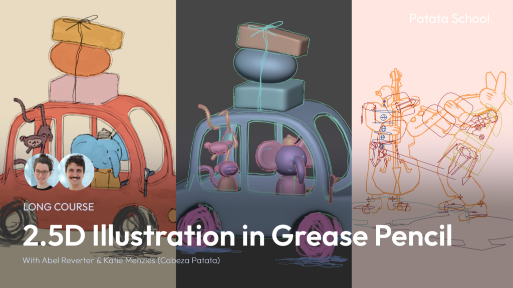
In this blog post I’ll be following the following course:

2.5D means taking the useful features of 3D (like moving in 3D space) and make it look handdrawn.

Lesson 1 | Cat Line Art

The first lesson was about creating this simple cat head. The rough workflow was modeling the head and hat with subdivided cubes and add them to a collection “OutlinesGeo”, add blank grease pencil for the outlines, add the lineart modifier to the grease pencil and change the source type to collection (OutlinesGeo). IMPORTANT: For the lineart to show up correctly you have to add a camera and set it up in a way where you always look though it. For some simple animation add the thickness and noise modifier.

To make the background one solid colour, go to the world settings and change the colour, then go to the render settings and change the “View” Settings (under Color Management) from AgX to Standard. For the object to be a solid colour go to the shading tab, delete everything but the “Material Output”, add the “Color” node and connect it into “Surface”.

The face is drawn on a new blank grease pencil. Go into draw mode, change the stroke placement to “Surface” and draw until satisfied. For the whiskers change the mode to “Origin” and go into the front view. To move them to the correct place go to Edit mode and select the whiskers and move them.

HOWEVER: I run into one issue I haven’t been able to resolve. When I try to render this scene, it looks a lot different than it does in the viewport.

Viewport
Render

Lesson 2 | Elephant Car

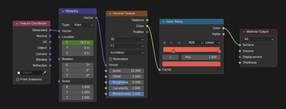
This project works the same as the cat head, just way more detailed. Model the objects, add outlines, model characters, draw details. However this project has colour, thus I created a shader that looks like paint by plugging a Voronoi Texture into a Color ramp, press “Ctrl+T” (activate Node Wrangler Plugin) on the Voronoi Texture, then animate location X in the Mapping.

This is the shader:

Instead of an elephant, I decided to make a cat driving the car…because cats are cuter not going to lie. Certain lines can be marked in the Editor Mode with “Mark as Freestyle Edge” and it’s going to show up like the outlines without having to hand-draw it.

The head was animated by parenting the head to an Empty with the “Track to” modifier. Then I keyed the head in real-time by playing the scene at the same time as I moved the empty while autokeyer was on. This however is still just a screenrecording – I still don’t know how to fix the render.

I’m a bit disappointed that the moneys and baggage is not part of the tutorial.

Lesson 3 | Rabbit Musician

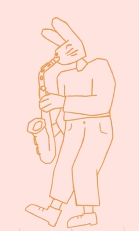
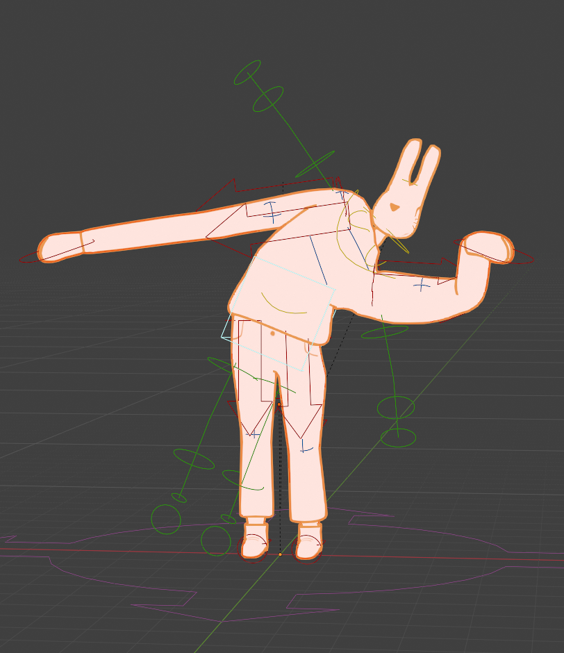
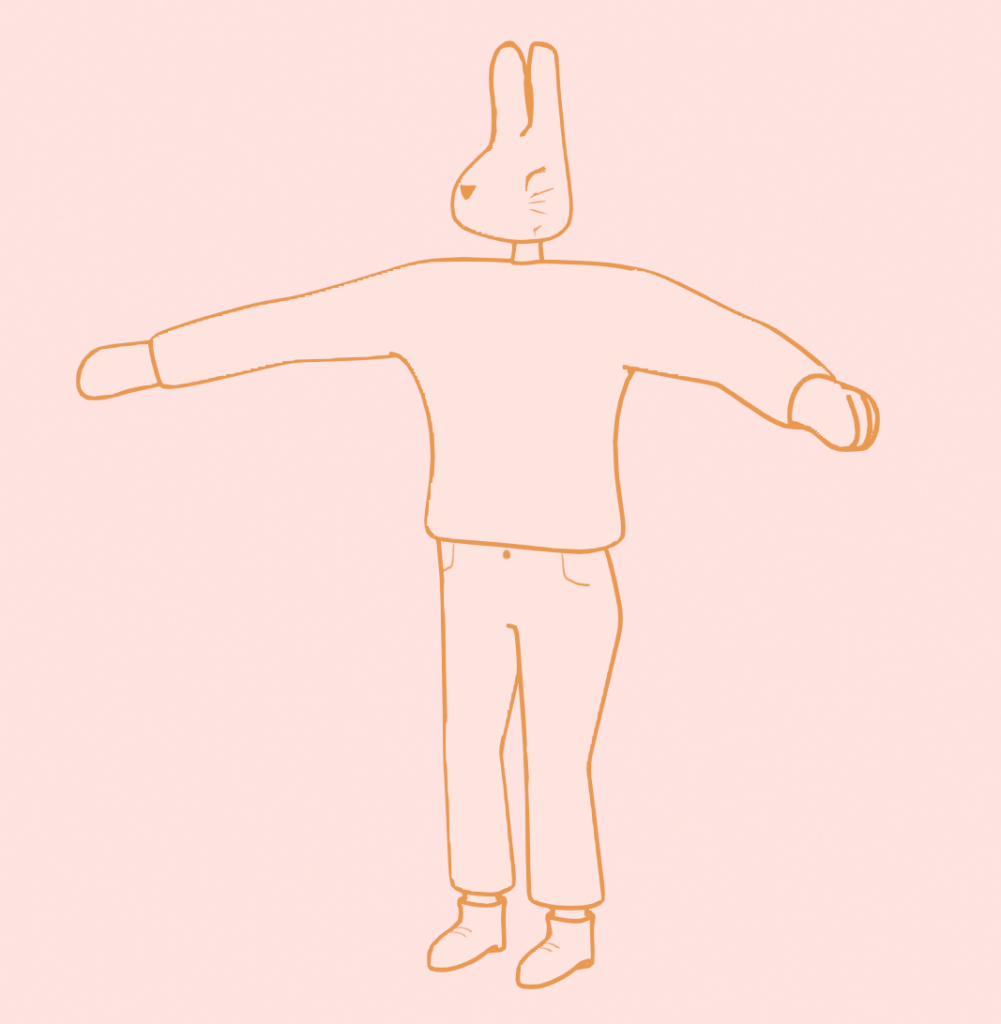
The character image isn’t in an A/T-pose, so it’s just used as a rough reference.

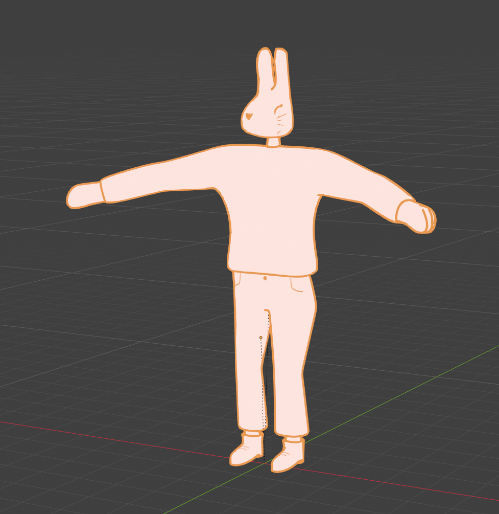
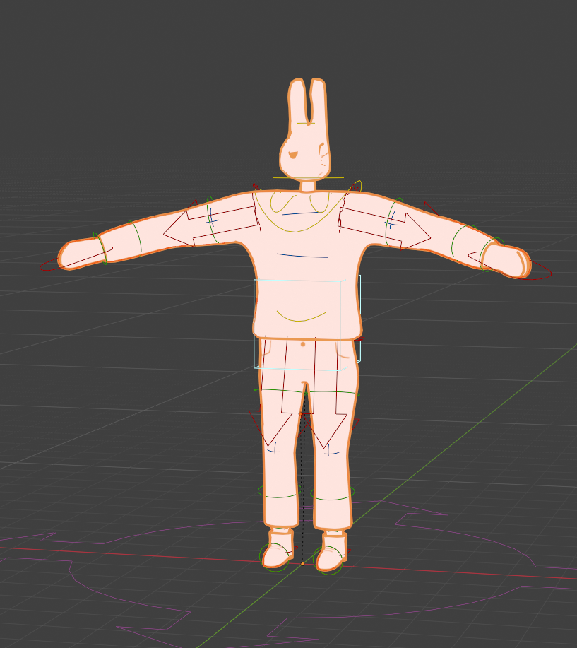
So…I finished this lesson, and the rabbit DOES look good. However at the end I ran into some frustrating problems. The pants are painted in the “Texture Paint” mode, and I did remove the “Mirror” modifier from the body, but it’s still mirroring everything. So I was not able to create the zipper detail. Also there were some paint splotches on the face (which is not connected to the body) and I was not able to remove them for some reason. And then the rig: It worked well at first. I created an Rigify Meta Basic Human Rig, set the bones in the correct place, pressed “Generate Rig”and then parented it by selecting the rig and then the body, using “With Automatic Weights”. The head was added seperately with the face paint bc selecting the head bone, then the face paint and then parenting it with “Bone”. However at some point the rig broke and the hands weren’t working correctly and it frustrated me so much that I stopped. Rigging is not the focus of my project so I will leave Lesson 4 – the Animation be and move on to more relevant things.

Deciphering OSC data & Visual Model | R&D 2 | Blog 5

In the last blog, I discussed the functioning and features of the audio pipeline, which was built using plugdata. We were able to collect pitch and loudness data from our audio stream and were attempting to send it to TouchDesigner via OSC. However, the connection was not successful. I had to redo the patch and will share my insights and methodology on fixing the issues.

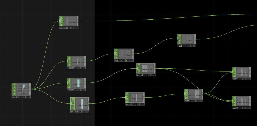
I had to repackage the data streams into an [oscformat] object and then prepend them into a list before moving on to the next step, which was to replace the [oscsend] object I had previously used with a [netsend] object containing the arguments ‘-u’ and ‘-b’. This sends data through the UDP protocol. It was configured to send messages to localhost on the port I set at 3000. 

In TouchDesigner, I used the ‘OSC In CHOP’ to collect the information sent from plugdata. I had a small monitor indicating the variations in values inside the CHOP, this meant that the data connection was successful. I was now ready to build the audio reactive visualizer. I wanted to see how the OSC data affected the visual output. So, I tried testing it out with a project I found through the Youtube channel supermarket sallad. It was a spherical visualizer which simulated various particles and noise. It was a visually appealing piece, I was able to play around with the lighting along with particles and found it really interesting. I wanted to implement a similar visual model with particle clouds for my project but later decided to go with an alternate approach.

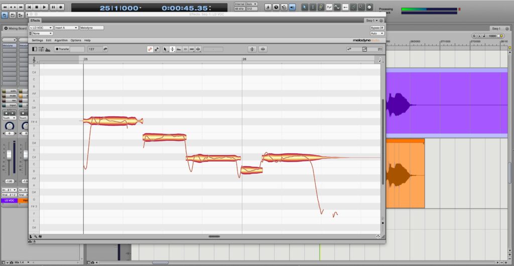
My initial concept was to build a 3D waveform model for the visualizer, but it was proving to be quite difficult. After consulting with my mentor, he suggested that I work on a simpler model and if needed modify it later on. I was now trying to think and come up with ideas for new visualizer styles which can also be easily understood by a user. So, I kept searching and eventually got curious with the waveform structures found in pitch shifting plugins like Melodyne. It seemed like an interesting model as you could tell the variation in pitch based on different positions along the y-axis. This also made me move away from mapping pitches to colour (Camelot wheel) as I had described earlier.

I would still have to consider a couple of things to see if this model works for me. What kind of elements (CHOPs, SOPs, TOPs) would I require to build this model and how accurately can I display the concept I had initially planned? Some of these will be answered in my next blog. Until then!

#5 Uncomfortable Futures

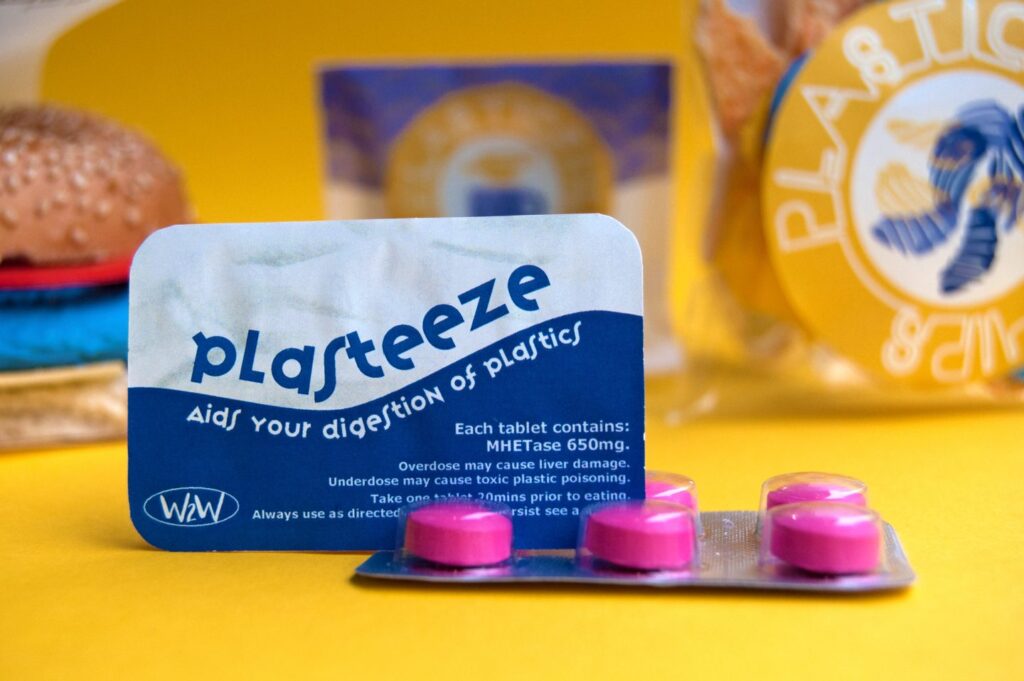
One project that clearly shows how design can engage with social issues is Plasticful Foods, developed by an interdisciplinary team from the University of Amsterdam and the Amsterdam University of Applied Sciences. Rather than simply informing people about plastic pollution, the project tries to unsettle them, disrupting familiar assumptions about waste and consumption just enough to trigger a shift in perspective. It does this by blending real data on plastic pollution with humor and marketing strategies borrowed from commercial advertising. The result is a near-future scenario in which plastic has become so widespread that it ends up in our daily diet. From this premise comes the deliberately provocative idea of Plasticful Foods: a line of “food products” made with recycled plastic, supposedly made digestible through a fictional enzyme called Plasteeze, styled like a dietary supplement.

The logic behind it is intentionally extreme: if microplastic consumption keeps increasing and waste management doesn’t improve, we might eventually have to adapt, not by reducing plastic, but by learning to digest it. It’s a disturbing thought, but that’s exactly the point. It pushes us to ask a simple question: Is this really the future we want? In this sense, the project moves beyond provocation and becomes a tool for critical reflection, asking us to confront the consequences of what we’re doing, or not doing, today.

Figure 4. Plasticful Foods, 2020

Moving away from sustainability but staying within the same speculative framework, technological development offers another rich area for exploration. As digital technologies become more pervasive, they are reshaping not only how we interact with the world, but how we perceive reality itself.

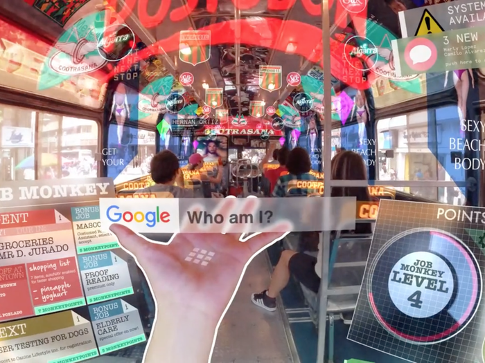
This is where Hyper-Reality comes in, a short conceptual film by Keiichi Matsuda that explores a future in which the boundary between physical and digital has completely collapsed. In this hyper-mediated everyday life, augmented reality, wearable devices, and constant streams of information create an environment saturated with digital stimuli. The result is both fascinating and overwhelming: a world full of possibilities, but also one where perception becomes fragmented and distorted. Matsuda doesn’t offer answers, he opens up a space for reflection, asking us to consider where this trajectory might lead and what it could mean for our sense of identity, control, and freedom.

Figure 5. Hyper Reality, 2024

A similar approach can be found in the work of Anthony Dunne and Fiona Raby, who often construct alternative worlds to explore the social, political, and technological implications of the future.

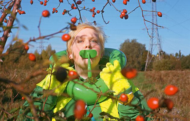
In Foragers, they imagine a scenario shaped by extreme overpopulation and food scarcity. If traditional food systems can no longer sustain the global population, what alternatives might emerge? Their answer takes the form of a speculative community equipped with wearable devices and biotechnological enhancements, capable of extracting and metabolizing nutrients directly from the environment. While the concept is visually striking, its real strength lies in the questions it raises, about adaptation, inequality, and the extent to which we might be willing to alter the human body in response to global crises.

Figure 6. Foragers, 2009

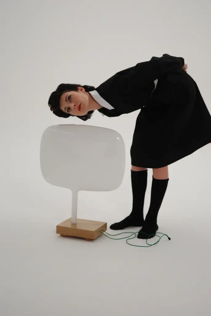
In Needy Robot, Dunne and Raby shift the focus to our relationship with technology, asking what might happen if machines began to exhibit emotions and desires of their own. The robots in the project display subtle but unsettling behaviors: one holds eye contact for too long, another appears anxious when someone gets too close. These small details make the interaction feel strangely human, and slightly uncomfortable. The project doesn’t try to predict the future, but to probe it, inviting us to consider what coexistence with increasingly “human-like” technologies might actually feel like and what kind of relationships we might end up forming.

Figure 7. Needy Robot, 2007

#4 The A/B Manifesto

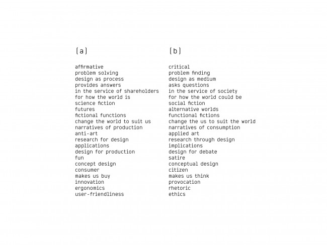
Through prototypes, narratives  and fictional artefacts, Speculative Design does not set out to provide answers; instead, it encourages collective reflection. In Speculative Everything (2013), Anthony Dunne and Fiona Raby outline what can be understood as a manifesto for this approach, framing it through a direct comparison between two ways of thinking about design.

They present this comparison as a set of paired concepts: on one side, those associated with traditional design (A), and on the other, those that define Speculative Design (B). The aim is not to replace one with the other, but to open up an alternative perspective, a parallel lens through which to reflect on design and better grasp its critical potential.

Expanding on this framework, Leon Karlsen Johannessen from the Norwegian University of Science and Technology revisits the so-called “A/B Manifesto” in The Young Designer’s Guide to Speculative and Critical Design (2017). He suggests that the two sets of concepts should not be read as strict opposites, but as complementary viewpoints. Rather than excluding each other, they operate in tension: each element in “column A” is mirrored by one in “column B”, creating a contrast that helps clarify what Speculative Design is, and, just as importantly, what it is not.

Figure 3. The A/B Manifesto

#2 The future as a critical tool

In a context marked by profound instability and continuous change, the future takes shape as a fundamental tool for expanding the horizon of design. Not as something to be predicted, but as a reflective dimension that stimulates the imagination, opening the way to the construction of possible scenarios and to the definition of visions capable of guiding action in the present.
According to the writer H. P. Lovecraft, the unknown generates fear in human beings, an emotion that has played a crucial evolutionary role in survival, protecting us from potential dangers. However, the unknown does not represent only a threat, but also a generative resource: it is from what we do not know that new narratives, visions, and civilizations emerge.
As the anthropologist David Graeber states, it is precisely imagination that distinguishes humans from other animals: «…it differentiates humans from animals, a bee from an architect».
Even the simple question “What if?” becomes fundamental in shifting design toward the realm of hypothesis and the exploration of what could happen (Anthony Dunne & Fiona Raby, 2013).
The future, therefore, is not a fixed or abstract entity, but a complex human process that emerges from the interaction of multiple presents and generates just as many possibilities.