Most playgrounds are designed by adults, based on safety standards, budgets, and assumptions about children. As a result, they often become predictable, restrictive, and sometimes even boring.
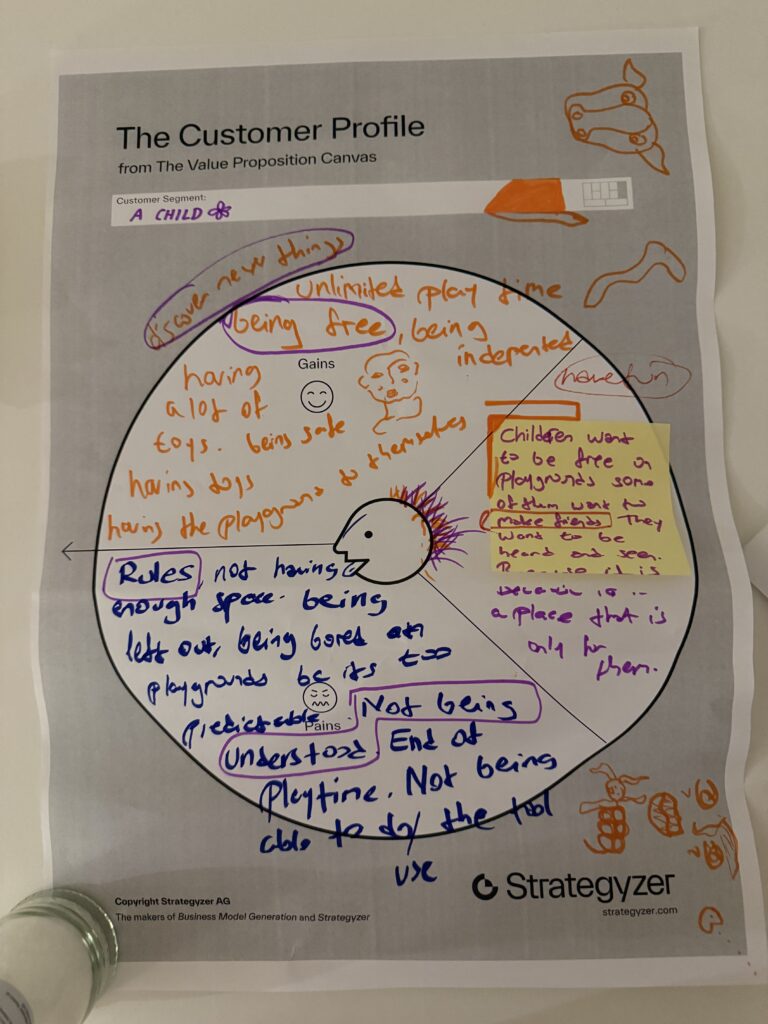
From a child’s perspective, the challenges are different:
Playgrounds are supposed to be spaces of joy, but they often fail to reflect what children actually want: freedom, creativity, and a sense of ownership.
This matters because playgrounds are not just physical spaces—they are environments where children develop socially, emotionally, and creatively.
When children are not included:
But when they are included, something shifts. Playgrounds become more engaging, more meaningful, and more used. They stop being just “installed structures” and start becoming lived experiences.
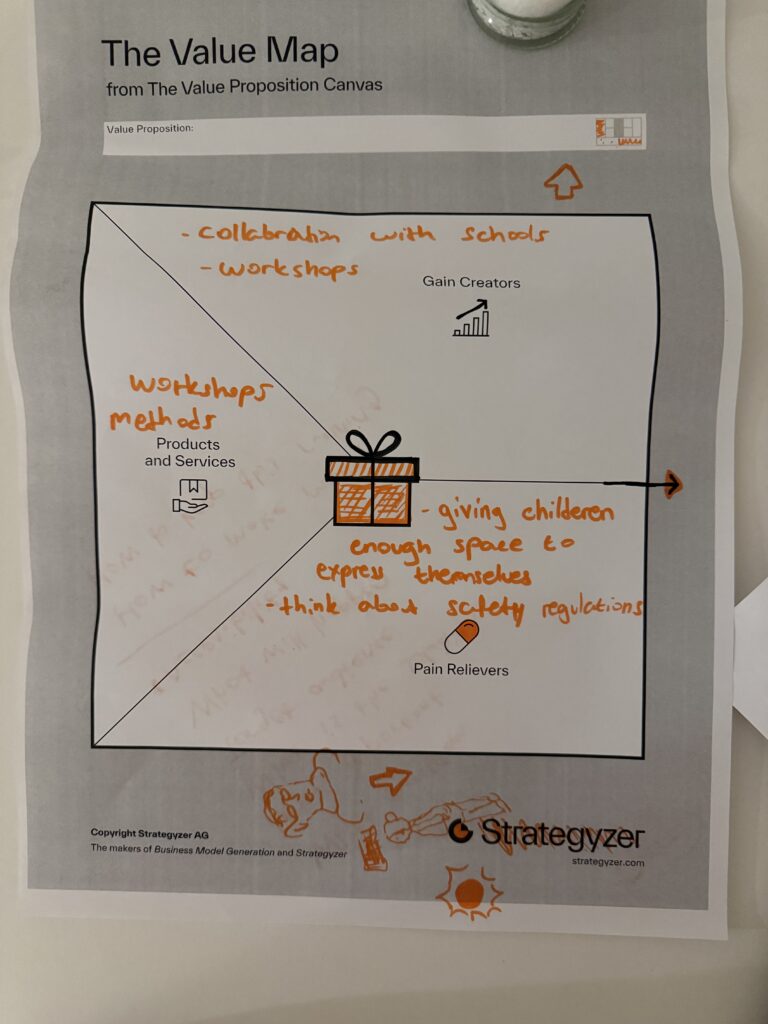
My approach is to introduce participatory design methods, especially through workshops with children.
Instead of asking children to adapt to a finished design, the process invites them to:
These workshops act as tools that translate children’s thoughts into design input. At the same time, the process still considers real-world constraints like safety regulations and feasibility.
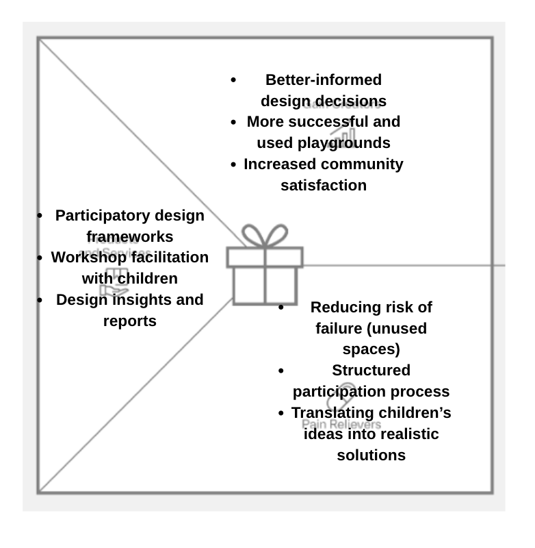
So the solution is not a single playground design—but rather a design process:
→ one that creates space for children to be heard
→ one that balances creativity with structure
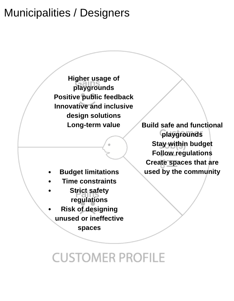
The primary “users” are children, but the system involves multiple stakeholders:
In this sense, children are both participants and beneficiaries, while institutions act as enablers of the process.
If children are included in the design process:
Before:
After:
This approach could evolve into a service or framework:
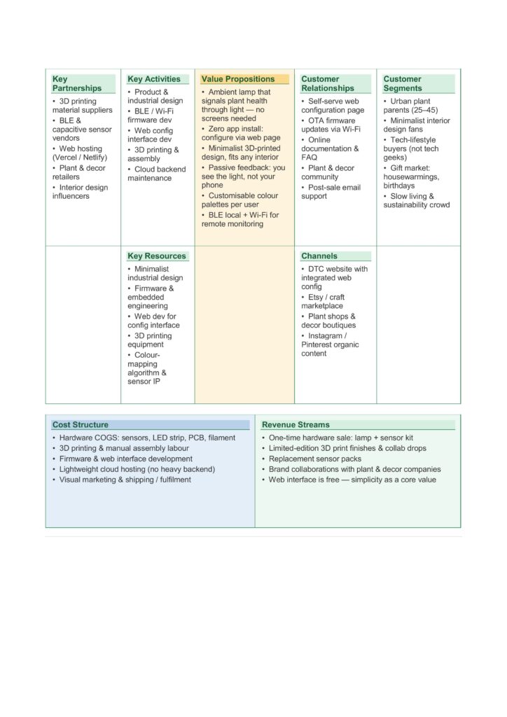
This business model canvas shows how Lumina Terra combines plant care and ambient lighting in a simple and accessible way. The main idea is a minimal lamp that uses light to communicate plant health, without the need for screens or complex apps. The product is developed through design, prototyping, and basic technology integration, supported by partners such as material suppliers, sensor providers, and plant shops. It is aimed at people who like indoor plants, simple design, and a calm home environment. The product is mainly distributed online and through design or plant-related stores. The costs are related to hardware production, development, and shipping, while revenues come from selling the lamp and sensor kits, as well as possible collaborations.
Fig 1: Business Model Canvas
To develop an effective product, it is essential to start from an understanding of users’ needs, difficulties, and expectations.
Users want to take care of their plants, keep them healthy, and understand their needs without spending too much time or effort. At the same time, they want to create a cozy home environment where objects are not only functional but also aesthetic.
However, several pains emerge. People often forget to water their plants or do not know when and how much water to give. It can be difficult to understand the real condition of the soil, especially for non-expert users. In addition, many smart solutions require continuous use of apps and screens, making them intrusive or not suitable for a home environment. There is also a sense of uncertainty, linked to the fear of damaging the plants.
Users are looking for a simple and immediate way to understand the health of their plants. They want to reduce uncertainty and make plant care easier and more enjoyable. At the same time, they appreciate products that integrate well into the home space, contributing to a warm and relaxing atmosphere. A sense of satisfaction and connection with nature is also an important value.
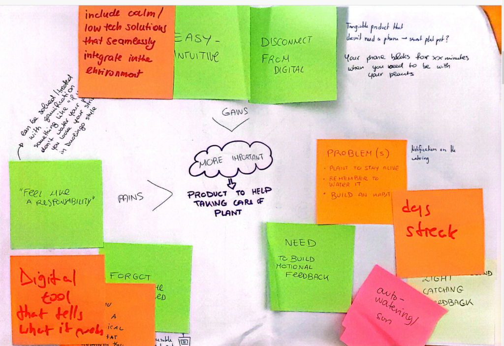
Fig 1: Feedbacks collected during a consultation workshop
The value map translates these needs into design solutions.
Regarding the product & services, the idea is to develop a lamp as a first product, capable of combining ambient lighting and plant care. The lamp is connected to soil moisture sensors placed in plant pots and communicates via Bluetooth Low Energy, while Wi-Fi connectivity allows monitoring and configuration through a minimalist mobile app.
It is also important to consider the pain relievers, which in this case are mainly focused on reducing uncertainty for first-time users, as well as reducing the effort and time required to take care of plants. The goal is to design a slow, consistent, and non-intrusive feedback system that does not rely too much on digital technologies or continuous smartphone use.
The analysis of the gain creators helped identify which aspects to integrate in order to improve the overall experience. Users are looking for a simple and immediate way to understand the health of their plants. They want to reduce uncertainty and make plant care easier and more enjoyable. At the same time, they appreciate products that integrate well into the home space, contributing to a warm and relaxing atmosphere. A sense of satisfaction and connection with nature is also an important value.
I chose the paper “Appropriating Technology for Interactive Media in Theatre:
Design Strategies and Aesthetic Insights” because I have some personal experience with this topic.
I have identified the potential of including animations in theatre plays a few years ago for a project in my local theatre club.
Due to the budget as well as technical restrictions we only ever played a static animations which the actors had to make movements along with it. This was challanging for them, because they always had to know the animated videos by heart. I realised that they were missing visual cues on when to, for example, raise their arm to “trigger” a certain movement.
If we had an x-box availble this would have been easier.
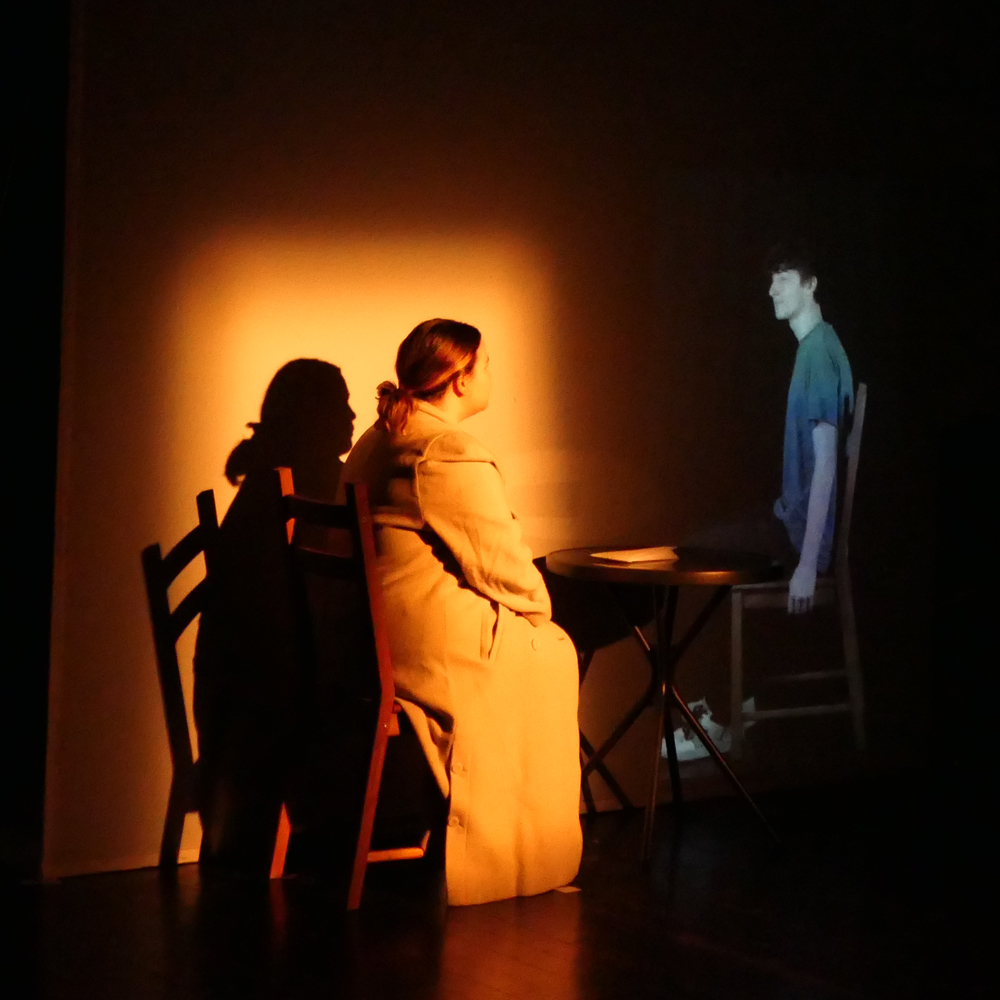
Source: Theaterzentrum Deutschlandsberg
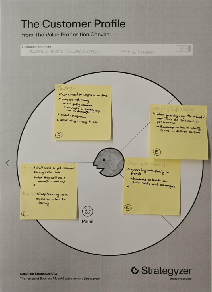
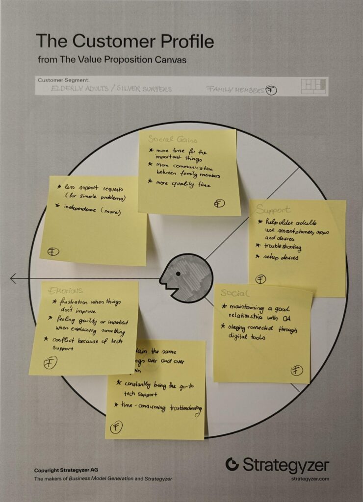
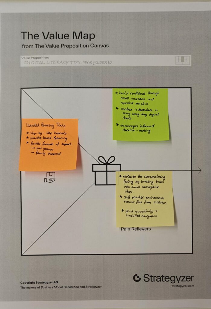
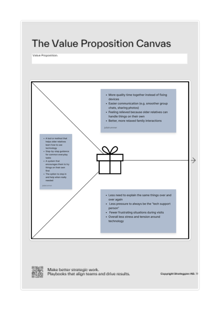
I chose two customer profiles that complement each other well, as they are closely connected in everyday life. Many younger people share the experience of being the “family tech support,” where interactions with older relatives often revolve around fixing devices or explaining the same things repeatedly. This dynamic can become frustrating over time and often takes away from the opportunity to spend more quality time together.
By looking at both older adults and their family members, it becomes clear that the problem is not one-sided but affects both groups.
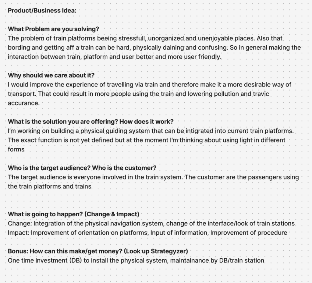
Which Problem are you solving?
Why is it important to care about it?
What is the solution you are offering? How does it work?
Who is the target audience? Who is the customer?
What is going to happen? (Change & Impact)
How are you securing accessibilty and inclusion, and for whom?
Designing for complex public environments requires more than addressing isolated user interactions. It demands an understanding of the broader system in which these interactions occur. Therefore, I decided to conduct further research in relation with the help of a university lecture and five different strategic methods, that aim to provide further clarity and a more structured insight into the different parts of this project.
The first of those approaches is system mapping. It is used within design research to visualize relationships between actors, infrastructures, and external influences. Rather than focusing on single touchpoints, system maps enable designers to identify interdependencies, power structures, and flows of information, and uncover opportunities for more systemic and sustainable interventions (zero360., 2026). In this project, system mapping serves as the starting point for investigating the experience of German train platforms. These environments are characterized by high density, time pressure, and diverse user groups, making them inherently complex.
At the center of the system map lies the proposed design intervention: a physical guidance system intended to improve orientation and interaction on platforms. Placing this concept at the core allows for a structured analysis of how it connects to and influences the surrounding system. The layer around the focal point consists of direct stakeholders, including passengers, train staff, and Deutsche Bahn (DB). Passengers represent the primary user group, yet they are far from homogeneous. Commuters prioritize efficiency and speed, tourists require clarity and guidance, while elderly users or individuals with disabilities depend on accessibility and physical support. Train staff and conductors, on the other hand, are concerned with operational efficiency and safety. By mapping these different perspectives, it becomes clear that improving the platform experience requires balancing multiple, and sometimes competing, needs. Expanding outward, the system includes indirect stakeholders such as station personnel, UX designers, engineers, and production teams. These actors are responsible for implementing, maintaining, and iterating the proposed solution. Their inclusion highlights that design outcomes are not only shaped by user needs but also by technical feasibility, organizational structures, and economic constraints. On an even broader level, societal actors, such as the general public and environmental stakeholders, introduce additional layers of influence, shaping long-term priorities such as sustainability and public acceptance.
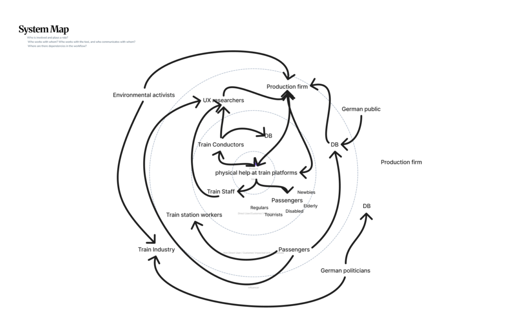
The relationships between these actors are visualized through a network of connections, illustrating flows of communication, influence, and dependency. The density of these connections reveals a highly dynamic system in which changes to one element can have cascading effects across others. This insight directly informs the next step of the design process: evaluating how an intervention might alter the system.
To address this, a Change and Impact map was developed. Building directly on the system map, it introduces a temporal dimension by comparing the current state (“Before”) with a projected future scenario (“After”). The “Before” perspective synthesizes the key issues identified in the system analysis, including disorientation, overcrowding, inefficient boarding processes, and limited accessibility. These challenges are not isolated but interconnected, reinforcing one another and contributing to an overall stressful experience (Mural, 2025).
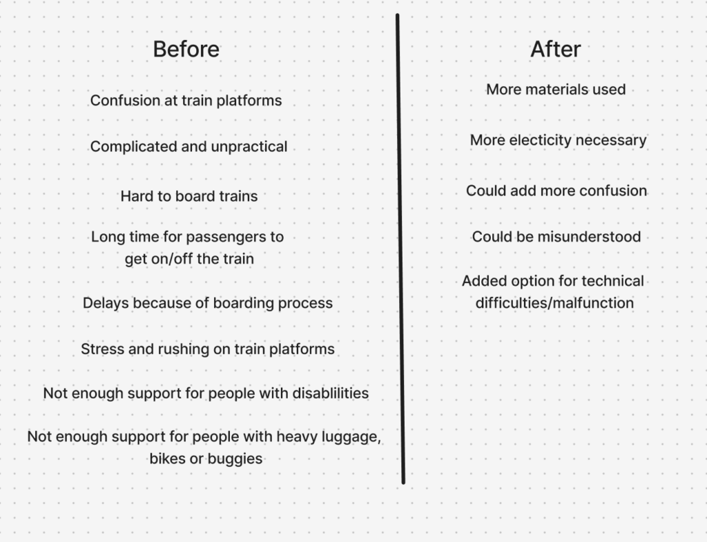
The “After” perspective explores how the proposed physical guidance system could transform these conditions. For example, improved orientation may reduce passenger uncertainty, which in turn can streamline movement flows and support more efficient boarding. However, the map also critically considers potential trade-offs, such as increased reliance on technological systems, maintenance requirements, or unintended behavioral changes among users. This step is crucial, as it ensures that the design is not evaluated in isolation but as an active component within a complex system. The logical progression from system mapping to impact evaluation demonstrates how insights are translated into informed design decisions.
In parallel, the project integrates inclusion and accessibility as fundamental design principles. Inclusive design research emphasizes that accessibility should be embedded from the beginning, rather than later along the design process (Figma, 2026). To operationalize this, two additional mapping approaches were used. The first identifies the physical, cognitive, and social requirements necessary for users to fully experience the product. The second focuses on barriers, analyzing which user groups may be excluded and why.
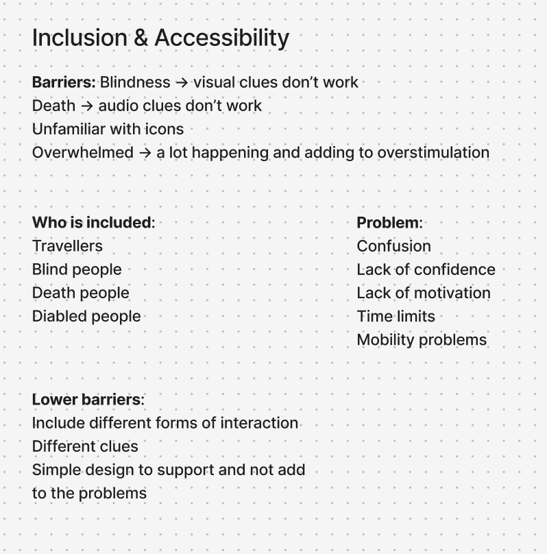
This analysis revealed that physical guidance systems, while potentially beneficial, can also introduce new barriers, particularly for individuals with visual, auditory, or cognitive impairments. As a result, the design strategy prioritizes multimodal interaction, ensuring that information is communicated through multiple sensory channels. At the same time, a minimal and clear design language is emphasized to avoid adding complexity to already dense environments. These considerations are directly linked back to the system map, reinforcing the idea that inclusive design is not a separate concern, but an integral part of the overall system.
To further refine the concept, the Value Proposition Canvas (Strategyzer, 2026) was applied. This tool builds on previous analyzes by explicitly linking user needs to design solutions. The Customer Profile identifies key user goals, such as navigating efficiently and reducing stress, alongside pains like confusion and overcrowding.
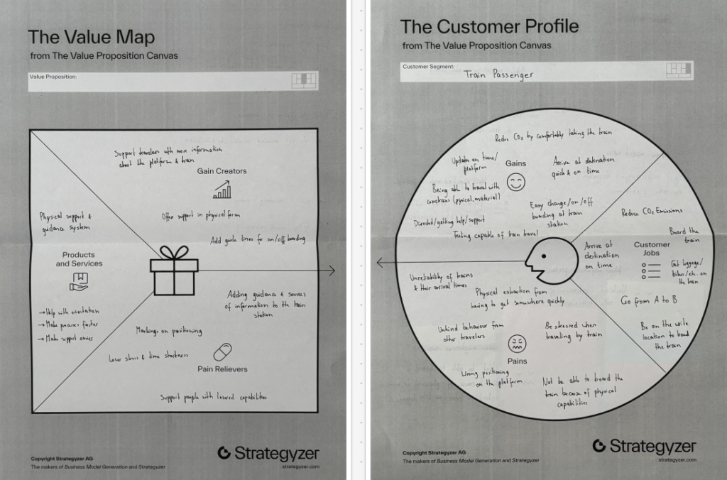
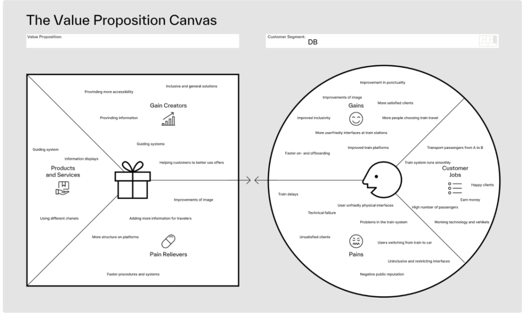
The Value Map translates these insights into concrete design features, including intuitive guidance systems and improved information structures. To get a second view point, the canvas was also applied to Deutsche Bahn as an organizational stakeholder, highlighting goals such as operational efficiency and customer satisfaction. This dual perspective ensures that the proposed solution aligns both with user expectations and institutional objectives.
The outcome of this interconnected process is a product concept for a physical guidance system integrated into train platforms. While still in the brain-storm phase, the current direction explores the use of light-based elements, such as illuminated pathways or dynamic signals, to guide passengers intuitively. The concept directly responds to the insights generated through the system mapping, the impact analysis, and the user-centered frameworks.
In conclusion, the use of system mapping, Change and Impact analysis, inclusive design methods, and value-driven frameworks were valuable methods to create valid connections and help get a clearer picture of the problem at hand and what factors have to be considered, when designing for a complex and challenging physical space. Each method builds upon the previous one, creating a logical progression from understanding complexity to proposing targeted interventions. This showed me how important it is to view design not as isolated problem-solving, but as a practice to deeply understand complex interactions and interconnected systems.
With the added insights and findings, the prototypes that were already developed can be refined and tested. After that I want to work on defining the end product narrower through more in-depth research and prototyping with higher fidelity.
Figma. (2026). Accessibility and inclusion in design. Von Figma: https://www.figma.com/resource-library/creating-accessible-and-inclusive-design/ abgerufen
Mural. (2025). Change impact assessment template. Von Mural: https://www.mural.co/templates/change-impact-assessment abgerufen
Strategyzer. (28. January 2026). The Value Proposition Canvas. Von Strategyzer: https://www.strategyzer.com/library/the-value-proposition-canvas abgerufen
zero360. (2026). Was ist: System Mapping. Von zero360.: https://zero360.de/glossar/system-mapping/ abgerufen
This project explores a more intentional and sustainable way of creating visual sources for VJing by working with the node-based software “Resolume Wire” in combination with “Resolume Arena”. Instead of relying solely on downloaded or self-made pre-rendered clips or effect chains, the goal is to build adaptable systems that can evolve, just as the VJ evolves.
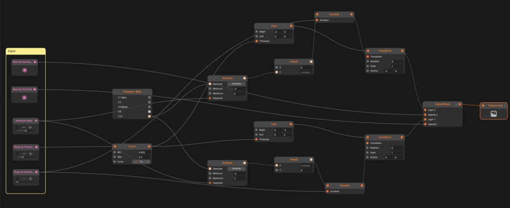
At its current stage (see node patch above), the project consists of two lines, a vertical and a horizontal line that behave like dancing entities by giving it specific parameters like minimum and maximum size, line thickness and random position appearances, which creates the dancing look (see below).

By mapping parameters in Wire to Midi controls in Arena, the lines can be manipulated in real time, shifting rhythm, shape and interaction dynamically during a set. This turns a simple visual into a responsive instrument rather than a static asset.
What makes this approach particularly compelling is its openness. The system is not a finished or fixed file. It is procedural and expandable. Additional parameters can be introduced in Wire at any point, allowing for more complex behaviors or nuanced control if required. Of course, that is as long as one has a Wire and Arena licence.
For example, arrays of color profiles could be implemented to either randomize colors or trigger specific palettes via MIDI or by making this effect sound reactive. This creates a balance between unpredictability and control, depending on how the performer chooses to engage with it.
This ongoing, system-based workflow differs significantly from more common approaches. Creating visuals directly in Arena often encourages experimentation through layering and applying effects in the moment. This can lead to surprising and playful results, driven by intuition rather than planning. On the other hand, producing pre-rendered content in tools like Adobe After Effects offers precision and high visual fidelity, making it ideal for detailed compositions that need to remain consistent.
I do not position myself against any of these methods. Both approaches have their place and I will likely try out all the mentioned workflows.
However, integrating Wire into the mix introduces a different layer. Independence as a VJ and longevity of visual sources. Instead of solely building a collection of fixed clips, this method contributes to a growing and reusable visual system. A personal databank of generative tools. Ironically, I will mix the content that I am writing about live at the “Generate” event in Graz. As I said, intentional design is the keyword here.
In that sense, this project is less about producing a finished visual and more about establishing a process, similar to a DJ set. The two dancing lines are just a starting point: One of the simplest structures that demonstrates how even minimal elements can become expressive when they are designed to be performed.
If you’re curious, here is a snippet of me testing and practicing. Or should i say I am cooking in my kitchen?
The color shift from white to, e.g., green is actually just an iPhone camera fault, but this inspired me to try and add a color randomizer for a certain number of frames, similar to how the lines appear in different positions on the screen.
Once again, testing has proven its worth beyond VJing being incredibly fun.
It is also rewarding to see how I presented last semester that I want to get into VJing and now I am already deep into the matter and have gone back to where it started – simple lines, as seen in my old presentation slide below.
Full circle moment!
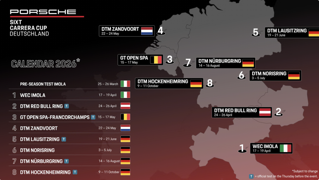
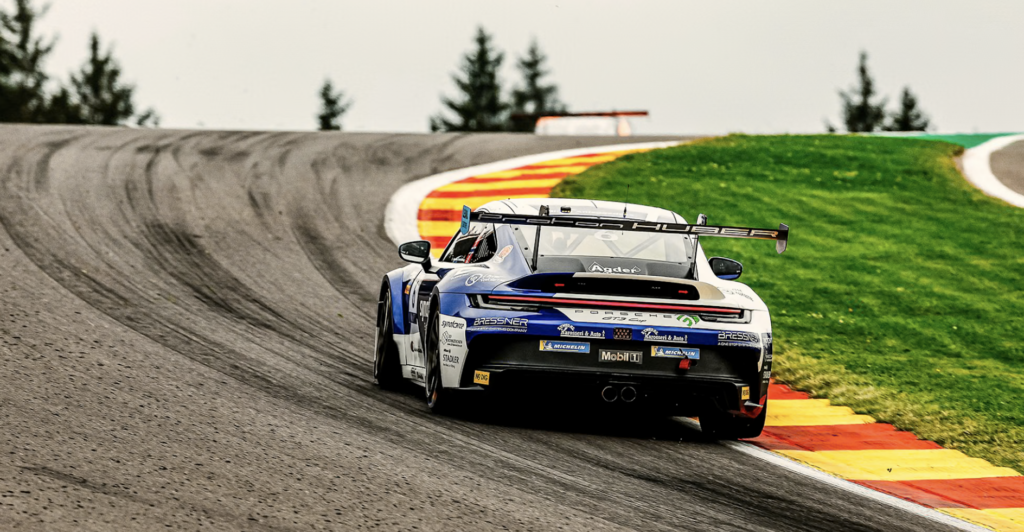
Für das Werkstück dieser Blogpost-Reihe über One-Shot-Produktionen und Sport-Dokumentationen wurde endlich eine Sportart auserwählt: Motorsport. Motorsport umfasst allerdings eine große Bandbreite an verschiedenen Disziplinen. Eine davon ist der Porsche Sixt Carrera Cup Deutschland, der von 24. bis 26. April als Teil der DTM (Deutsche Tourenwagen Masters) am Red Bull Ring in Spielberg stattfindet. Im Rahmen des Werkstücks wird dabei ein spezifisches Team begleitet und der Protagonist des Videos sein: das deutsche Team Proton Huber Competition.
Bereits im Jahr 1990 startete die Rennserie „Porsche Sixt Carrera Cup Deutschland“, wie der Name schon sagt, in Deutschland als Markenpokal des Porsche-Modells 911. Dabei handelt es sich um ein 30-minütiges Sprintrennen in einem professionellen Umfeld. Es ist der älteste Porsche Markenpokal der Welt und ist bekannt für spannende Duelle zwischen ambitionierten Nachwuchstalenten aus dem Motorsport.
Dieses Jahr gibt es einige Änderungen und der neue Porsche 911 Cup feiert im April in Imola, Italien, im Zuge der Langstrecken-Weltmeisterschaft (WEC) seine Premiere. Am Start stehen 31 Fahrer:innen von neun Teams, die teilweise an zwei voneinander getrennten Meisterschaften teilnehmen. Im Laufe des Jahres gibt es sechs weitere Stationen im Rennkalender. Unter anderem auch die DTM in Spielberg oder am Nürburg- und Hockenheimring.
Die neuen Änderungen beziehen sich vor allem auf das Auto selbst: Das neue Porsche 911 Modell erhielt umfangreiche Modifikationen im Design und wird von einem 4.0 Liter großen Sechszylinder angetrieben. Dadurch steigert sich die Performance des Autos. Gleichzeitig gibt es ein vereinfachtes Handling sowohl für die Teams als auch für die Fahrer:innen. 18 der 31 Teilnehmenden stehen zum ersten Mal vor einer vollen Saison im deutschen Carrera Cup.
Insgesamt gibt es zwölf Porsche Carrera Cup Serien, die in verschiedenen Teilen der Welt. Alle Rennautos dieser Serie sind ident, da sie ausschließlich dem 911 GT3 Cup vorbehalten sind.
2016 gründete Christoph Huber „Huber Racing“, nachdem er bei Porsche-Rennlegende Walter Lechner bereits seit sechs Jahren agierte. Lechner half Huber auch dabei den Traum vom eigenen Rennstall wahr werden zu lassen. Seit der Gründung ist Huber Racing ein fester Bestandteil der Porsche Carrera Cup Serie und konnte bereits unzählige Podeste, Siege und Titel einfahren. Mit Beginn der Saison 2024 schloss sich Huber Racing mit Proton Competition in einem Joint Venture zu Proton Huber Competition zusammen. Unter diesem Namen geht das Team seither an den Start. Mit dem Fahrer Larry ten Voorde verlief die Porsche Carrera Cup Deutschland Saison dabei mehr als erfolgreich: Sowohl in der Fahrer- als auch in der Teamwertung krönte sich der Rennstall zum Champion. Im August 2025 zog sich Teamgründer Christoph Huber aus dem operativen Geschäft zurück, nachdem Huber Racing bzw. Proton Huber Racing mehr als ein Jahrzehnt an der Spitze stand und sah die erfolgreiche Saison als guten Ausstiegspunkt. Für die 2026 Saison gehen Youngster Theo Oeverhaus, Jaap van Lagen und Gustav Burton an den Start.
Im Jahr 2021 wurde der Dokumentarfilm „Schumacher“ auf Netflix veröffentlicht, die sich um den ehemaligen und erfolgreichsten Formel 1 Fahrer der Geschichte dreht: Michael Schumacher. Die Dokumentation liefert Eindrücke in die Persönlichkeit und das Leben des seit 2013 im Koma liegenden Deutschen. Obwohl ich, die Autorin dieser Blogpostreihe, zuvor wenig mit Motorsport zu tun hatte, fesselte mich diese Dokumentation und noch in derselben Nacht wurde ich eine von Vielen. Denn nach „Schumacher“, schaute ich „Drive to Survive“, die Netflix-Serie über die Formel 1. Seit diesem Tag – bzw. dieser Nacht – ist der Motorsport für mich persönlich nicht mehr wegzudenken. Dabei war ich nicht die einzige: Wie bereits in früheren Blogposts erwähnt, brachte Drive to Survive unzählige Tausend neue Fans in den Sport. Die Formel 1 gilt als Königsklasse des Motorsports und ihre Wurzeln reichen bis in die 1920er Jahre zurück. Seitdem ist nicht nur das Publikum enorm gewachsen, sondern auch die Popularität von Motorsport im Allgemeinen ist gestiegen. Das zeigt sich auch durch die Präsenz in den sozialen Medien bzw. im Internet generell. Außerdem ist Motorsport auch eine der Schlüsselkomponenten im ESport.
Nachdem ich mit Beginn meines Studiums auch dem Studierendenverein der FH JOANENUM, „Joanneum Racing Graz“, beigetreten bin, war für mich klar, dass ich am liebsten im Motorsport arbeiten würde. Sport im Allgemeinen – dazu gehörten Fußball, Reiten, Turnen, Tennis und Schwimmen – war seit meiner Kindheit ein fester Bestandteil des Unterhaltungs- und Freizeitprogramms. Auch wenn der Motorsport erst viel später dazugekommen ist, ist er nun trotzdem einer meiner liebsten Interessen. Ein weiterer Punkt, der dafürspricht, ist, dass Motorsport neben dem Reitsport die einzige Sportart ist, in der Frauen und Männer gleichberechtigt gegeneinander antreten dürfen (trotzdem gibt es aus biologischen bzw. körperlichen und auch patriarchalen Gründen sehr wenige Frauen im Motorsport).
Action, Zusammenarbeit, Köpfchen und Teamgeist ist für mich die perfekte Mischung für eine Sportart. Das Werkstück für ein professionelles Racing-Team zu machen (noch dazu für meine liebste Automarke) ist für mich ein großer Schritt in Richtung meines Traumberufs, der nicht nur meine Interessen, sondern auch die Themen meiner Blogposts bestens miteinander vereint.
Porsche AG. (2026). Porsche Sixt Carrera Cup Deutschland: Saison-Vorschau. https://newsroom.porsche.com/de/2026/motorsport/porsche-sixt-carrera-cup-deutschland-saison-vorschau-42001.html
Porsche AG. (o. D.). Carrera Cup Deutschland – About the series. https://racing.porsche.com/de-DE/carrera-cup-deutschland-about-the-series
Porsche AG. (o. D.). International one-make series: Carrera Cups. https://racing.porsche.com/de-DE/international-one-make-series/carrera-cups
Huber Racing. (o. D.). Über uns. https://huberracing.de/ueber-uns/
Porsche AG. (o. D.). PMSC Proton Huber Competition. https://racing.porsche.com/de-DE/teams/pmsc-proton-huber-competition
Motorline.cc. (2022). Warum Motorsport für uns kaum mehr wegzudenken ist – Die Faszination der Geschwindigkeit. https://www.motorline.cc/motorsport/2022/Last-but-not-least/Warum-Motorsport-für-uns-kaum-mehr-wegzudenken-ist-Die-Faszination-der-Geschwindigkeit-259280.html
Dieses Literaturverzeichnis wurde von ChatGPT erstellt.
The paper introduces the concept of ViVo, a tool for instrument learning, that combines the already well-researched but until now separately used methods of vocalization and visualization. It has two modes: One that visualizes the real-time vocalizations of the user, transforming it into illuminations of the corresponding piano keys and a mode where the user can practise with visualizations of pre-recorded vocalizations.
In the introduction the author gives information about the technique of vocalizing, which is an important tool to learn instruments and improve the general sense of music and improvisation and composition skills. Its effectiveness can be attributed to the fact that vocalized melodies can be memorized better than instrumental melodies. Despite this, vocalization is not used in instrument learning environments to its full potential. Visualization, on the other hand, is broadly used in music education, guiding the learners through real-time instructions and feedback. ViVo aims to combine both learning methods to create a more effective and intuitive tool.
The tool consists of a microphone that’s being used to record the vocalizations, a processor and an electronic piano with illuminable keys. In another section there is more specific information on the used hardware.
The goals of ViVo are described as follows: portability, low material costs, effective real-time operation, pitch accuracy, pitch range and note onset/offset fidelity.
The author then describes the algorithms, that were used for ViVo: firstly, two pitch detection methods (YIN algorithm and an FFT-based heuristic approach) to extract pitch from vocal input. While standard interpolation techniques (like parabolic fitting) are already known, ViVo adapts them specifically for singing. Its modified method focuses on a typical vocal pitch range (100–1000 Hz), calculates the average energy within that range, and then scans for the first three consecutive frequency bins exceeding this average. It applies a parabola fit to these bins to estimate the fundamental frequency (f₀), optionally smoothing the result with a filter. These adjustments improve robustness to noise and reduce common errors, such as detecting the wrong octave when harmonics are stronger than the fundamental frequency.
To test if ViVo fulfils the previously set goals, it was being tested by playing a voices library through a speaker placed 70cm from the microphone to simulate the expected use conditions.
In the following sections the methods of pitch detection, range and note onset/ offset are described in more detail. After this the author gives an outlook on future work. Planned features are for example the extension of the detection system to recognize polyphonic melodies which allows to use recorded music instead of only relying on unison vocals. The use case will be extended to larger music education contexts such as classrooms. There will also be studies on how the tool can help to learn jazz improvisation. Another mentioned step is to develop the ViVo tool for other instruments such as guitar. Then the author illustrates how the tool could be used in live performances.
In the last part of the paper there is a section on ethical standards. The author declares that she used low-cost materials and open-source software that was funded by herself. She also indicates that there were no conflicts of interest and that all participation in the project was voluntary. This part is followed by the references.
I found the approach of combining vocalization and visualization as learning methods very interesting. The prototype shown on a picture seems a bit raw and unfinished, but I think has potential to be further developed. I wonder if the idea of this tool can also be applied to other instruments that do not have a visible scale, such as trumpet, saxophone or French horn. In my own experience of learning the flute, trumpet, French horn and guitar I never worked with visualization, but sometimes used vocalization with my French horn teacher, which I think is helpful to establish a feeling for pitch and intervals and makes it easier to hit the right notes. This is especially crucial for brass instrument players, since those instruments usually only have 3-4 keys, so the same key combinations are being used for various notes that have to be controlled through air pressure.
The paper itself was well structured, although I would have put some of the sections in a different orde. In my opinion it would make more sense to put the goals of the tool right after the introduction that describes the concept of the tool. Other than that I think it was easy to understand the idea and how ViVo works.