Elevator Pitch; Playgrounds

Here is my pitch for design and research class;

Have you ever imagined of a playground where children can explore imagine and learn through play ? Traditional playgrounds are often designed by adults and not by children. I am interested in play based interaction- driven methods that allows children to participate as co-designers.

Play is essential for children’s development like social skills, cognitive abilities and physical health. Interaction design can help include children in the design process of playgrounds. I believe children should have more saying in a place where it is only for them and not for adults.

13*BRANDING POLITICS: Analogue authenticity and why handmade print feels political

There is something strangely emotional about badly aligned ink.

A slightly crooked screen print, uneven letterpress pressure or rough photocopy texture often feels more politically sincere than an expensive, perfectly polished campaign advertisement. Even when communicating identical messages, analogue print aesthetics carry entirely different emotional weight.

And that difference says a lot about how we understand authenticity in contemporary political culture.

Over the past decades, political communication has become increasingly professionalised. Campaigns are data-driven, strategically branded and visually optimised across platforms. Political actors operate similarly to corporations, carefully managing tone of voice, visual identity and public image. As political branding became more polished, audiences simultaneously became more sceptical.

Authenticity emerged as a response to this distrust.

In contemporary political branding, this dynamic is also visible in campaigns – such as Zohran Mamdani – where visual identity often leans into a deliberately analogue-inspired, community-made aesthetic. Rather than presenting overly polished corporate-style branding, these materials frequently emphasise warmth, locality and a handmade visual language that feels closer to neighbourhood organising than institutional campaigning. This analogue touch contributes to a perception of being more personal, more grounded, and therefore more trustworthy, as if the communication is emerging from lived community experience rather than distant political machinery.

Sociologist Alison Hearn argues that contemporary culture increasingly values performances of authenticity as a reaction against excessive commodification and strategic self-branding (Hearn, 2008). In political communication, this means that “imperfect” aesthetics often appear more trustworthy precisely because they seem less manufactured.

Analogue print aesthetics benefit heavily from this perception.

Unlike digital design, analogue printing processes leave visible traces of labour. Screen printing produces texture variations. Letterpress creates physical pressure marks. Risograph printing often misaligns colours slightly. Photocopies degrade image quality through repetition. These imperfections reveal process.

And process feels human.

Historically, analogue print has also been deeply connected to political resistance. Protest posters, underground newspapers, activist zines and labour pamphlets relied on accessible print methods long before digital media existed. Political movements used whatever reproduction technologies were available – often cheaply, quickly and collectively.

This historical relationship matters because aesthetics carry memory.

Contemporary analogue-inspired political design unconsciously references these earlier traditions. A rough screen print visually echoes anti-war posters, punk zines, feminist publishing and grassroots organising. Even when reproduced digitally, analogue aesthetics signal resistance culture.

Design historian Steven Heller notes that alternative print cultures historically prioritised urgency and accessibility over technical perfection (Heller, 2003). The goal was communication, mobilisation and visibility – not polished branding consistency. Ironically, these “imperfect” aesthetics later became highly recognisable visual identities in themselves.

Today, many contemporary political movements intentionally recreate analogue aesthetics, even within digital environments.

Instagram graphics imitate photocopies. Protest campaigns use hand-drawn typography. Digital posters simulate screen-print textures. This aestheticisation of analogue media reflects a broader desire for authenticity within increasingly corporate communication systems.

But authenticity itself is complicated.

Just because something looks handmade does not necessarily make it politically radical or sincere. Analogue aesthetics can be strategically manufactured like any other branding technique. Large corporations frequently adopt “DIY” visual language to appear approachable, ethical or community-oriented. Handmade aesthetics have become marketable.

This creates an interesting contradiction.

The visual signs of authenticity are now fully integrated into contemporary branding culture. What once signalled anti-establishment politics can now be reproduced intentionally by institutions themselves.

And yet, audiences still respond emotionally to material imperfection.

Part of this response may relate to physicality. Digital communication often feels temporary and endlessly replaceable. Analogue print, by contrast, exists materially. Ink occupies space. Paper deteriorates. Posters wrinkle, fade and tear over time. Political messages become objects rather than purely images.

Media theorist Walter Benjamin famously argued that mechanical reproduction transforms how audiences experience authenticity and presence within visual culture (Benjamin, 1935). In many ways, analogue political print reintroduces a sense of aura into contemporary communication. Its imperfections make each object feel slightly singular.

This singularity becomes politically meaningful.

Analogue aesthetics suggest effort. Time. Human involvement. Collective production.

Whether these assumptions are always accurate is almost secondary.

What matters is perception.

In a political environment dominated by hyper-polished digital branding, analogue print aesthetics create emotional distance from institutional communication. They feel slower. More personal. More grounded in physical reality.

Not because they are inherently more honest.

But because they still look like someone made them.

This perception becomes especially relevant in contemporary protest culture, where movements constantly negotiate visibility, credibility and emotional resonance. Handmade aesthetics visually communicate effort and participation. They imply that politics is not only produced by institutions, but also by ordinary people physically engaging with public space.

And perhaps this is why analogue print continues to survive despite the efficiency of digital communication.

Analogue political media is slower. More expensive. Less scalable. Often messier.

But it also feels tangible in ways digital media rarely can.

You can hold it.

You can damage it.

You can walk past it every day on the same street corner until the message embeds itself into memory.

In that sense, analogue political print does more than communicate ideology.

It materialises it.

And maybe, in a political landscape increasingly shaped by polished branding and disappearing content, material presence itself has become a form of resistance.

Sources:

  • Benjamin, W. (1935). The Work of Art in the Age of Mechanical Reproduction.
  • Hearn, A. (2008). “Meat, Mask, Burden”: Probing the Contours of the Branded Self. Journal of Consumer Culture.
  • Heller, S. (2003). Merz to Emigre and Beyond: Avant-Garde Magazine Design of the Twentieth Century. Phaidon.
  • McQuiston, L. (1993). Graphic Agitation: Social and Political Graphics Since the Sixties. Phaidon.
02. Smart Plant Care: Hands-on prototyping

After the paper prototyping phase, discussed in the previous article:
Concept and Low-Fi Prototyping for an Interactive Plant Care System,the next step was to analyse the different types of sensors and boards available in order to develop a first testable version of the prototype.

Main Goal

The goal of the project is to create a simple and intuitive system capable of providing visual feedback about the health status of plants. In particular, the system integrates:

  • capacitive soil moisture sensors placed inside plant pots to detect the percentage of soil humidity;
  • a lighting system able to provide real-time visual feedback on the plant’s condition;
  • a minimal digital interface (website/app) useful for configuring the system and displaying information.

The idea behind the digital interface is not to create a complex app, but an essential tool mainly useful for configuring the sensors, accessing plant information, or customising some design elements such as the lamp’s colour palette. The main interaction should therefore happen through the physical object rather than through screens or continuous notifications.

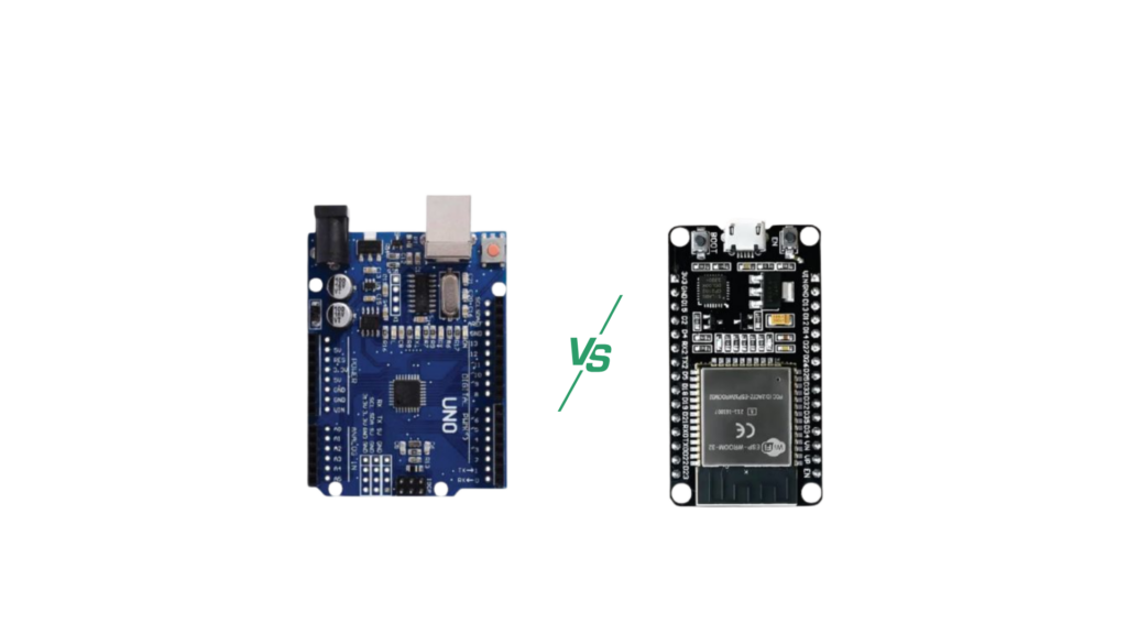
Technical Comparison: ESP32 vs Arduino Uno

Feature
ESP32 Solution (Recommended)

Arduino Uno Solution (Not Recommended)
ConnectivityIntegrated: Wi-Fi and Bluetooth (BLE) are included in the same chip.Absent: Requires external modules (HC-05 for Bluetooth, ESP01 for Wi-Fi).
Web InterfaceCan host an internal Web Server (HTML/JS) for the minimal app.
Impossible alone. Requires extra hardware and very complex code.
LED Management
Can manage thousands of WS2812B LEDs without slowing down the system.

Limited memory (RAM); managing many LEDs and sensors together can crash the system.
Power Supply
Supports Deep Sleep mode (ideal for battery-powered sensors).

High and constant power consumption (not optimised for batteries).
Dimensions
Compact: thumb-sized, fits inside the lamp base.

Bulky: credit-card sized, plus external modules and cables.

Total Cost

~15–20€ (all-in-one chip + sensor + LED).
~40–50€ (Arduino + Wi-Fi module + Bluetooth module + cables).

The analysis showed that the ESP32-S3 represents the most modern and suitable choice for an integrated design, since it reduces the cost of external components and allows the creation of a more compact system.

At the same time, this comparison highlighted some important aspects related to the accessibility of the project.

Although the ESP32-S3 is more powerful, for an initial prototype it was preferable to use a more intuitive system. One of the project goals is in fact to keep the system understandable and replicable even for users with basic electronic skills.

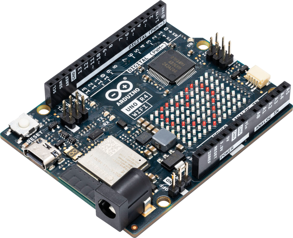
The final choice was Arduino R4 Wi-Fi, mainly because it is more intuitive for beginners and more accessible from a learning perspective.

Blogpost Number 1 (Birgit): What is the topic?

„Your Master Thesis should be the most ambitious thing you ever did.” This sentence, written on a presentation slide of our Design and Research course with Birgit made me think. It made so much sense to me, but at the same time it shifted my view on the Masters thesis. It’s not only something that I have to do, but also something that should feel in a way meaningful to me. It also made me rethink the topic I chose for last semester. I think the sentence wouldn’t apply to that – it doesn’t feel big enough. It would not be the most ambitious and meaningful thing I ever did. It doesn’t seem important enough to me.

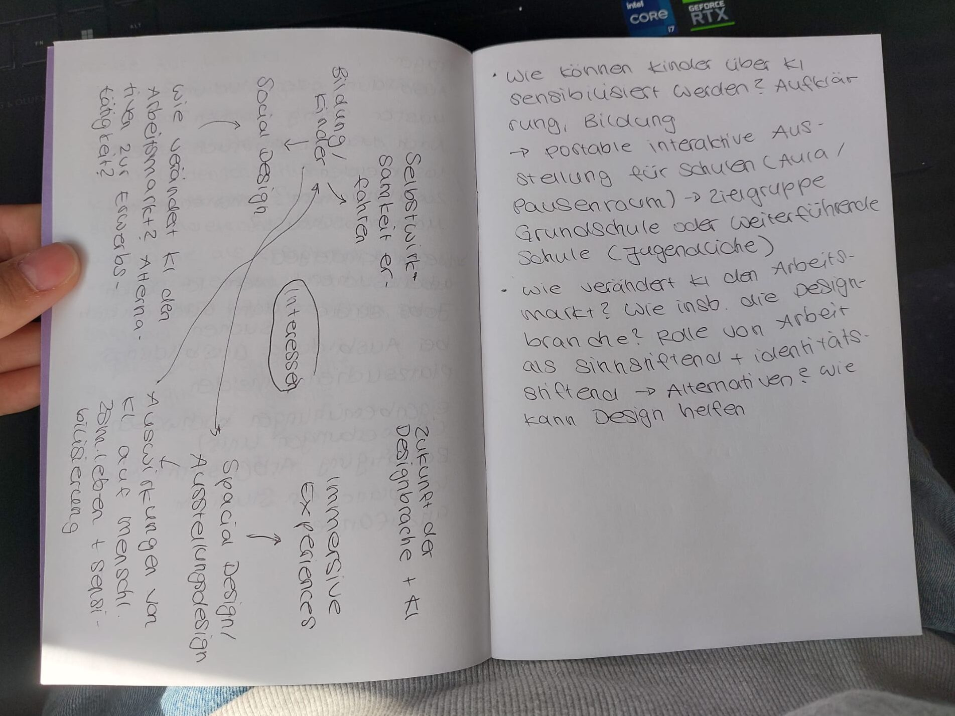
So what now? What would feel important enough? As always when I need to sort my thoughts, I pulled out a notebook (I upgraded from random sheets of paper to something more durable) and started writing everything that would interest me as a topic on a mindmap and connected aspects that I thought would match. I wrote topics as well as things that make me worried, but also possible media I would specifically like to design as an outcome of the process. I will later take a picture of the notebook pages and upload them to this post.

The outcome of my brainstorming session was the following:

  • Idea 1: Investigate how the use of AI will affect human coexistence. Then think about how the situation could be improved by design. Then think about how to raise awareness about the effects of AI and what people could do to avoid possible negative consequences. How could this be conveyed? Possible outcome: interactive installation / exhibition either for adults or children / youths, that travels from school to school
  • Idea 2: How will AI affect the job market? Will paid work play a lesser role or even disappear entirely? How will the design sector in particular be affected? Research on the role of employment in building identity and creating meaningfulness. How could alternatives that fulfil the same purpose look like? What role can design play here?
I took notes in german since it’s easier that way for me.

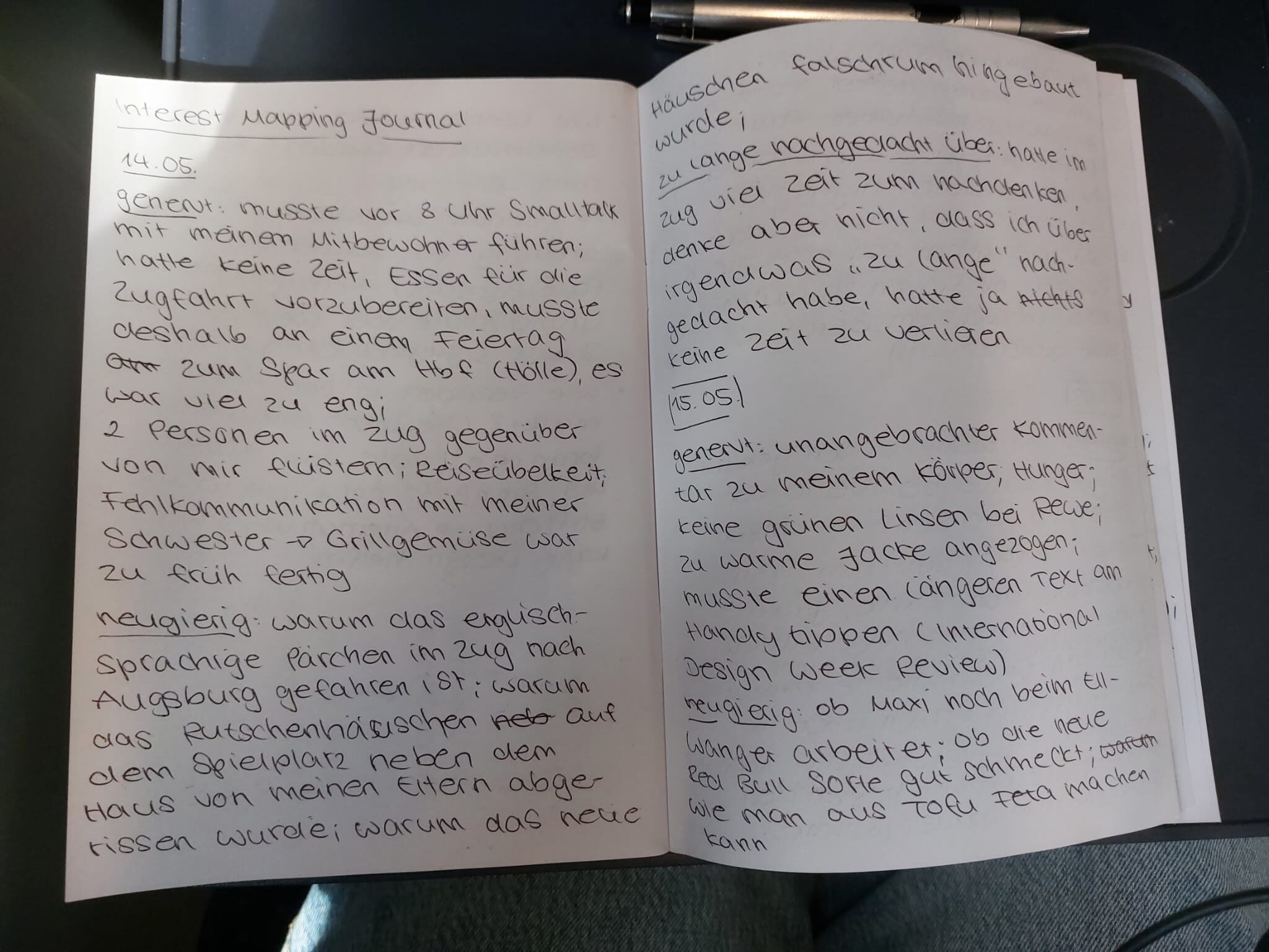
After this first round of brainstorming I read some online articles on how to find a topic for a master thesis. Then I asked ChatGPT to give me 3 journal prompts to find a suitable topic. This is what it gave me as a first task:

1. Interest Mapping Journal
(What really draws you in?)

Here’s how it works: For 1–2 weeks, keep a daily journal with three brief categories:

  • What sparked my curiosity today?
  • What irritated or annoyed me?
  • What did I think about longer than necessary?

Important: Don’t filter. Everything counts:

  • Interfaces
  • social situations
  • technologies
  • habits
  • physicality
  • work
  • learning
  • AI
  • public spaces
  • games
  • digital fatigue, etc.
  • Why this helps

Master’s thesis topics often don’t arise from “cool ideas,” but from:

  • recurring attention
  • unresolved tensions
  • personal obsessions

After a few days, you’ll start to see patterns:

  • recurring terms
  • specific contexts
  • the same emotions
  • similar problems

These often lead to promising research directions.

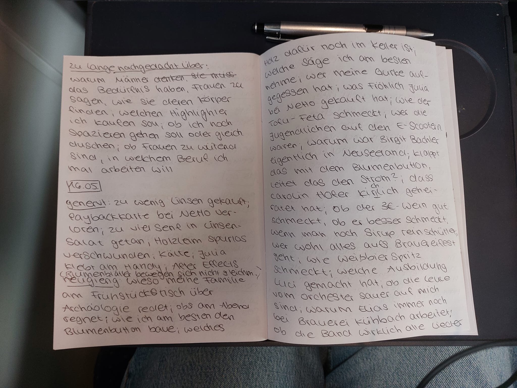
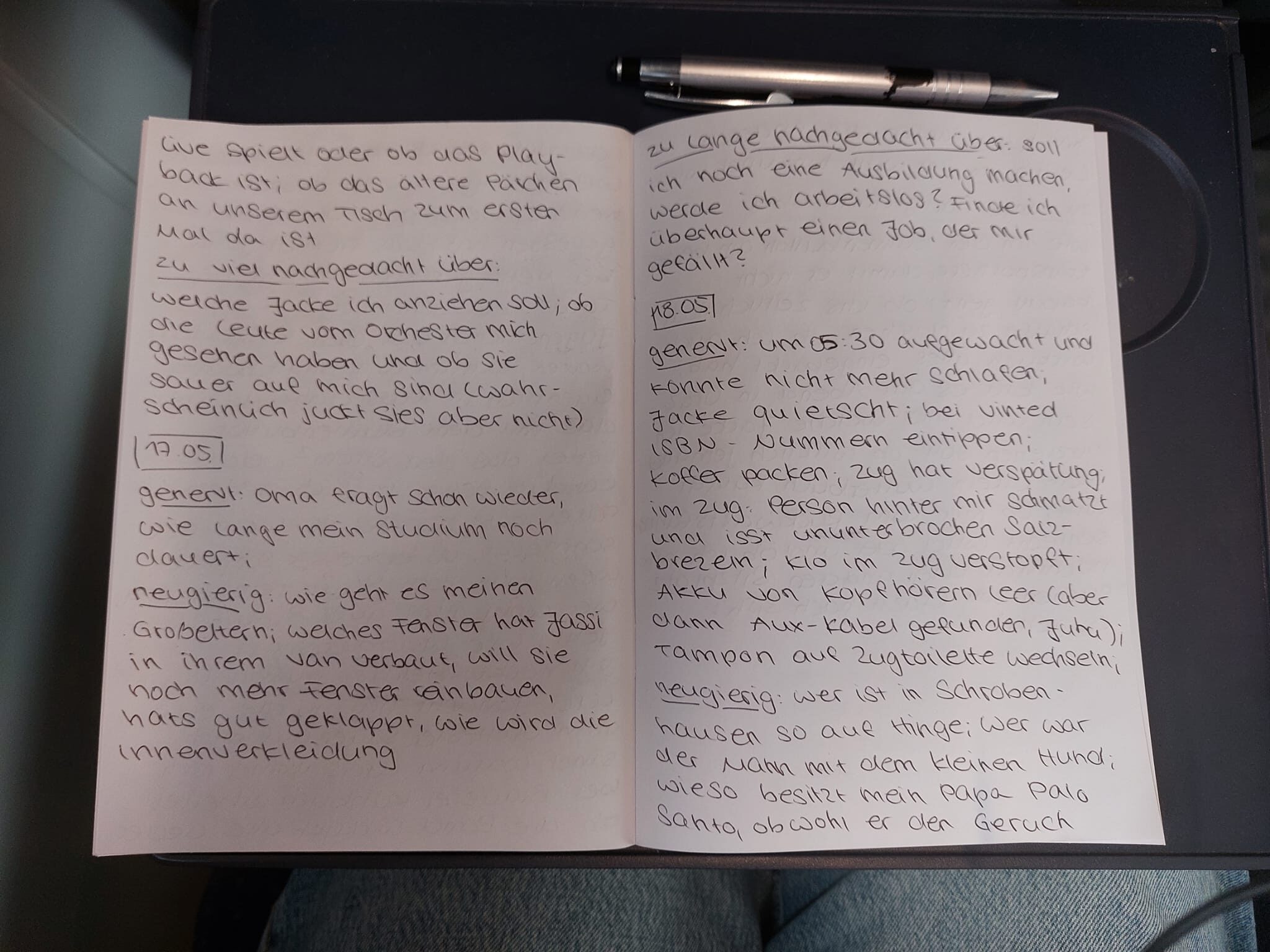
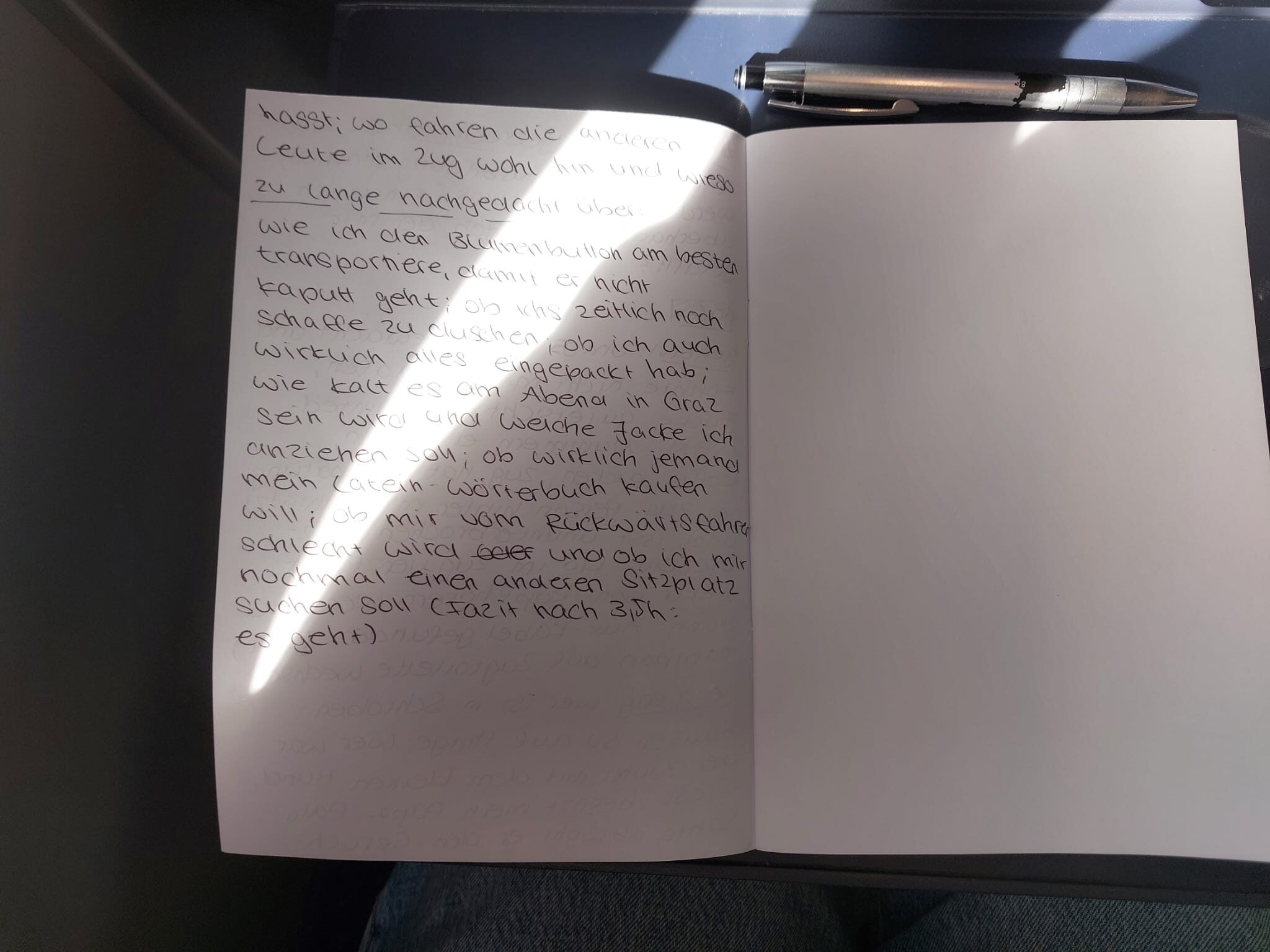
I documented the questions for five days in my notebook. I found that I’m annoyed either by people or the sounds they make, by the weather or trains, I’m apparently quite curious about gossip and people on the train and think a lot about what jacket to wear, my future and daily errands. While analysing this, I kind of got stuck on my curiosity for other people and their travel destinations. I sometimes wonder if I should just ask the people opposite of me in the 4-person seat where they are going and why, but I’m usually too shy or I fear I might annoy them. I once had a very nice conversation with a woman from Graz who lives close to Mannheim now. We even ended up exchanging numbers because she was looking for a new renter for her apartment in Graz.

I take the train home to Germany every few months and I’m usually quite bored during the 6h journey. I think it would be cool to ask the people next to me if they would be interested in a round of card games, but first, I never have any games with me and second of all they usually seem very busy on their laptops or wear headphones. Maybe it would be interesting to investigate if people are generally open to connecting with others on long train rides, e.g. while playing games, or if they prefer to just be by themselves. I also wonder how people could naturally be motivated to interact with each other without making it feel forced.

Thoughts on the journalling method

I was a bit sceptical about this method in the beginning, especially because I went home to my parents place this weekend and didn’t expect anything extraordinary interesting to happen during those days – even while writing things down I thought there would be nothing relevant as a research topic. I’m surprised that it actually helped me a bit. I’m not sure if I will stick with the connecting-people-on-trains thing, but I definitely think it could be interesting. I will continue this method for the upcoming week since I think there might be different results when I may days are more structured and when I spend more time at FH. Also continuing especially the curiosity part during our trip to WebExpo in Prag could bring some interesting findings.

I think I will have to postpone the other 2 journalling methods to another day, but I’m already curious about what new ideas they might bring me. For a start I don’t feel as lost anymore as I did on thursday, when I started writing this post.

For the sake of completeness I will include pictures of my notes at the end of this post.

Next steps:

Try out the other methods, hopefully find another interesting topic idea and start prototyping for some interactive approaches to connect travellers.

Journalling pages

Blog Post 6: Elevator Pitch

Picture the situation: You’re at a train station and there’s so much going on. You may be at the wrong part of the platform or it’s crowded and getting in and out of the train is very complicated. You may be limited physically so you cannot even board the train or you have heavy luggage or a bike with you. That’s a problem that occurs on many train stations around Europe but especially in Germany. There are missing cues for communication and support for stress-free and efficient structure.

The idea that I have to solve this problem is a leading system that would be integrated into the platform that would make orientation, understanding and a barrier-free use much easier. The USP is very simple, it’s not there yet. There is information and a leading system happening at the moment but it’s often handled with signs which can be insufficient or wrong. The information is there but it’s normally more in an app or on paper and not in a physical space visible.

And why I want to take on this problem is because I am also going on trains a lot of the time, traveling a lot via train and I want to solve this problem because it would help a lot of people and also an interaction designer and a media designer that wants to take on this challenge.

My rigging journey part 3 – hear me out: a ball but more complex

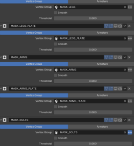
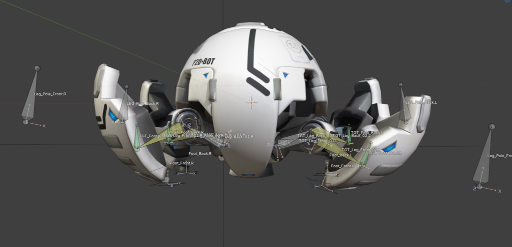
Back again with my rigging process. As already mentioned, the next project is the spider ball. The spider ball is a little robot. It is a ball that can extend its legs, head and guns. Since the model itself is quite complex the teacher provided it divided into different parts as Masks in the Modifier tab. I have never used it before, and it proofed very helpful. With it the different sections of the robot can be easily isolated.

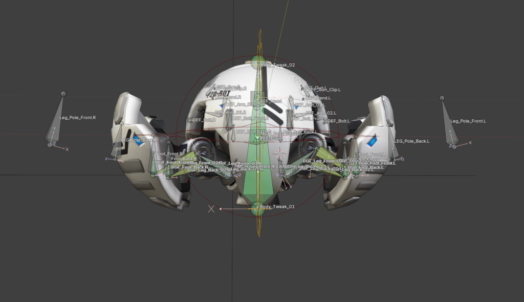
As usual at first every deformation bone needed was created. Then the process of the basic ball rig repeated. Root, Rotation, Body and squash and stretch work pretty much the same.

I really appreciated using my 3D cursor to snap bones onto vertices. I can slowly see the appeal of it. I still don’t like it that I use it accidently all the time. I will get used to it.

The skinning was quick; due to the mechanical function there is no need for soft edges. The skinning was done with empty groups. The parts were selected and assigned in the vertex groups. The explanation that every weight is listed on the right side in the transfom window was helpful. In case something is assigned into multiple groups they can be kicked with one klick.

One thing I found myself thinking about again and again is how much I have learned in this rigging course about modelling. There is so much thought about how something will later work in the rig and animation in the model itself. Of course this is also a byproduct of it being a robot. Every function needs to be thought about in the design process. Behind the parts which open needs to be a fleshed-out design and not just an empty hole. I have never modelled a robot myself, but I feel better prepared to do so from now on.  It is fun to work with a model that itself doesn’t have mistakes in it and is properly prepared for the rigging process. It makes the work a lot easier.

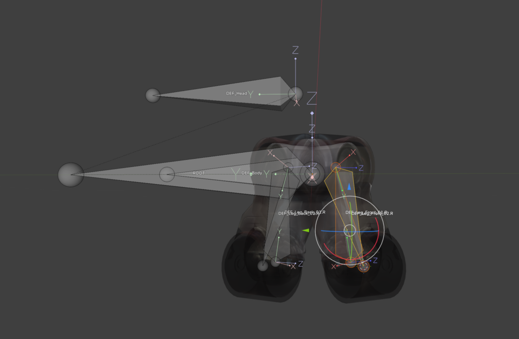
The longest part so far of the tutorial is the IK-leg rig. Number one rule for all bones is that you don’t use the deformation bones in the final rig. Just in case something goes wrong in the process it is easier to go back. Therefore, in the first step the leg bones were duplicated and as usual put into a separate Bone collection. All the deformation bones get the copy transformation constraint, and they follow our copied bones. Then the IK Constraint is used. To keep the leg in the correct angle a Pole bone was added. To get it correct it is important to switch to Normals instead of Global in the Viewport and move the bone via the X Aches.  To keep the knee from popping IK-stretch can be used with a very small value. Since a robot is not stretchy a new bone was added at the beginning of the leg bone chain. With a limit distance from this bone to the foot the stretching can be negated. To get the correct length the length of the two leg bones needs to be added together. Just copy them and paste them with a plus in the blender tab console. Tada! Blender has a little calculator too.

As a last step everything got its custom shape and color. To conclude, I worked through 13 out of 26 lessons. Another 13 and the ball is finished.

Pitch (video and transcript) 

Link to video – https://www.youtube.com/watch?v=YZzD1ZcvYe4 

Transcript – 

Do you know how to use chopsticks? If so, how did you learn? If you’ve ever tried to teach anybody, how did that go?  

Now, imagine those chopsticks are actually 6 m tall pieces of fabric and the student is airborne and spinning. Hard, right?  

I’m talking about the same problem as the chopsticks, but in a bigger scale. It’s proprioception, spatial awareness, and observational learning in hybrid scenarios with your life on the line.  

For those who don’t know what I’m talking about, aerial silks are pieces of fabric hung from the ceiling and used as an apparatus for aerial dance. While propioception is the awareness of the body. 

I’m talking about a design and communication problem. And with 2 years of aerial silks experience, four years in UX research and already eight months of user testing and validation, I can confidently say that there’s no one-size-fits-all solution.  

Instead, I propose an aerial silk teaching kit which would support both students who are beginners and advanced in furthering their acrobatic studies by allowing both teachers and students to externalize the internal body process of proprioception.  

The kit will be anchored in a 3D model and accompanying app, but will also include supporting elements to tackle each student’s individual challenges like not being able to distinguish left from right.  

And just like user research in traditional learning methods in the classroom, I believe this has the potential to revolutionize learning in the gym. Thank you. 

★5 Design Research – From Project to Product

Pitch

I believe everyone knows this situation: you go home to visit your family and within the first five minutes someone says, “I deleted the internet,” “Can you fix my phone,” or “I got this email from the ÖGK again, I don’t understand it.” And before you know it, you’ve spent the next five hours solving technical problems instead of actually spending time with your loved ones.

Many people over the age of 50 today do not have sufficient digital literacy for basic everyday tasks. This includes using common communication tools, identifying misleading information or scams and independently accessing information to form their own opinions about what is happening in the world. As a result, they often depend on others for support and miss the opportunity to fully participate in digital society.

This raises an important question: how can we support this generation in becoming more confident and independent in the digital world?

My idea is a dedicated learning platform that teaches digital literacy to older adults in an accessible and supportive way. Instead of overwhelming users with complex interfaces, it focuses on small, everyday learning steps that are easy to understand and immediately applicable. The platform could combine short guided lessons, interactive exercises and real-life scenarios, such as recognizing scams, using messaging apps or navigating government services online. It also provides on-demand help when users get stuck, so learning becomes part of daily life rather than a separate, intimidating process.

This platform would not only improve individual confidence and independence, but also reduce the constant need for family members to provide technical support. This allows families to shift their time and energy from troubleshooting problems to spending more meaningful time together. Ultimately, the goal is not just to teach technology, but to enable participation, confidence and connection in a digital society.

Video

Can be found in the OneDrive: VIDEOLINK

D&R2 SED D3 – Pitch

Video link.

Imagine you’ve just bought the biggest game of the year. You sit down, you turn it on, and realize you actually can’t read anything that’s on the screen. The text is too small, the colors blend together, and no matter how much you squint, the game keeps on being a blur. For millions of players, this isn’t just a “What if?” scenario, it’s reality. Right now, most game UIs are “one-size fits all”. Designers want to help, but they’re overwhelmed by technical rules or tight deadlines. This results in cluttered UI that’s a hassle for everyone.

My solution is an interactive design toolkit that acts as a digital sandbox for game UI designers. They can drag and drop elements that are already optimized for accessibility. And it’s not just sight, it also provides a framework for haptics and audio cues. What makes it special is that it turns accessibility from a complex chore into a standard with a creative workflow. It makes games more inclusive, but also really helps designers.

I’m doing this is because games have personally improved my quality of life immensely and I’m very passionate about them and about UI design. I want to make sure that people all around the world, regardless of their physical abilities, can have the opportunity to enjoy games as much as I do and be immersed in these worlds as much as I am.

#5. User testing – Beginner level 

Since last semester I realized that different tools work better for different levels of aerialists, I decided to also test out the 3 prototypes with 3 different participants (henceforth referred to as P1, P2 and P3) who were complete beginners in aerial, with no experience in the field. The following are the findings of the research through design process. 

  1. Hanger silk 

When explaining the basic French climb with the hanger silk, a problem arose in the fact that the explainer would need both hands to simulate the movement of the feet, but the hanger would still need to be held up. Plus, it was no more useful for P1, P2 and P3 than just explaining the French climb on the actual aerial silk, with hands instead of feet (in order to avoid the physical burnout and need for strength). P3 even mentioned that the hanger silk is not needed, since if you have the silk in front of you, you can also explain it there. Thus, I decided to remove the hanger silk from the final prototype kit. 

  1. Neon sleeves 

Contrary to the advanced learners and to what was expected, P1 preferred the use of the neon sleeves when she put them on the opposite side of the side the explainer had them on. When asked about this, P1 mentioned that it helped her to pretend that she was seeing in a mirror rather than trying to copy another person. Instead of seeing this as a challenge, I choose to see it as an opportunity of the product itself – with no rules and no restrictions, people can use it however will be more useful to them. When P3 put on the sleeve, after a bit of time I noticed that she didn’t have it on anymore. When asked, she said that she took it off because she was hot. Additionally, since she doesn’t have any problem distinguishing left and right, she said that the neon sleeves didn’t really have an effect on her learning. This furthers the conclusion that the sleeves are useful only in specific cases, and should be included in the final prototype kit, even if they’re not the main focus. 

  1. Little guy 

This prototype was extremely useful for P1, who said “the little guy gives me confidence that I’m not going to die, because I see that he is not falling so it means I will not fall”. For P2, since she had less upper body strength than P1, the little guy was not really useful; however, she expressed interest in being able to keep using it during her aerial silks journey as a helpful tool. In the case of P3, she said the little guy was her favorite prototype, as it really helped her to understand the difference that body position makes. However, even though she theoretically understood the importance of folding your body to do the hip-key, she still wasn’t able to perform the hip-key in the first attempts, since she wasn’t folded enough. When asked about this, P3 said that she “didn’t think it was necessary to be that extreme”. This furthers the conclusion (from the user testing with advanced students) that one of the most important elements of the little guy is the ability to let students touch and explore through him. In P3’s case, it would’ve been useful to understand the breakpoint from which you go from falling out of the hip key to being locked in place. However, despite this slight hiccup, P3 was able to successfully complete 3 new figures, stay hands-off on the hip-key, AND learn how to climb, which is an impressive feat and not at all expected for beginners, indicating that the use of the prototypes helped accelerated her learning. 

— 

Sources: 

Own research.