A Workshop with Mariam Rezaei

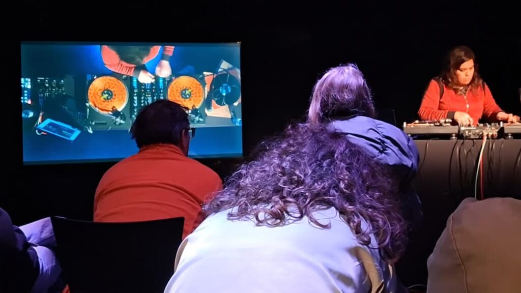
On the final day of the Elevate Festival (March 7th, 2026), I had the privilege of attending a workshop led by the renowned composer, performer, and turntablist Mariam Rezaei, alongside my fellow classmates from the Sound Design program. I wanted to write a short blog post about my experience during the session and the insights I gained into this intriguing art form.

Based in the UK, Mariam Rezaei has built an astounding repertoire through her diverse range of performances and compositions, collaborating with artists from all over the world. She has such a unique approach to turntablism and was kind enough to share her insights on the interesting world of vinyl players and record spinning.

I went into the workshop not knowing exactly what to expect and feeling like I knew far too little about the performative art of turntablism. Some of the performances Mariam did were so distinct that they mimicked actual acoustic instruments with total authenticity. This was made apparent when she played a sample of a Japanese wind instrument (likely the shakuhachi). The velocity, tempo, and pitch were all controlled meticulously using only the vinyl player. It became clear that beat matching and pitch matching are second nature to her, developed through an exceptionally trained ear from years of experience.

The immense dedication she has poured into her craft was evident throughout her performances; everything from the hand-eye coordination to her perception of pitch and time was outstanding. The ability to seamlessly switch between tracks and sync them perfectly without breaking a sweat is a skill that is criminally underrated and underappreciated by the general public.

Speaking of which, she briefly discussed the bias turntablists face while performing in orchestras and philharmonics, as many critics still do not classify the turntable as a real instrument. However, she is gradually helping to break this stereotype by demonstrating how valuable and resourceful the turntable is, especially when recreating the textures of specific instruments. She described the experience as blending so seamlessly into an arrangement that listeners are unable to tell if the physical instrument is actually present on stage.

It was also intriguing to see her building on established styles and redefining them as her own. This was evident in the different techniques she demonstrated, from beat juggling to fractured beats; each technique came with her own signature “spin” (no pun intended). She showed us that turntablism isn’t just about playing records, but about deconstructing and reassembling sounds in real-time in the most artistic way.

Overall, the workshop broadened my view of turntablism. It is a demanding, nuanced art form that deserves far more recognition than it currently receives.

D&R2 – Lo-Fi Prototypes 1/6

Continuing on with my theme of User Interfaces in Video Games, I developed 3 quick and dirty prototypes for the Design & Research 2 course kick-off.

This prototype that I will most likely bring to class is the sticky UI kit. I want to see how people who might not have preconceptions (but also those that do) would naturally arrange different UI elements when put on the spot. User expectations are pretty important when it comes to interfaces so that’s why I decided to play around with that idea, where people could tangibly display their expectations and intuitions in a setting where I could also document it.

It consists of:

  • piece of paper with a background
  • 10 pieces of paper with UI elements with tape on the back

This prototype is based on diving in and out of menus and the information hierarchies associated with them. It’s made with folded papers which would be flipped up depending on which button is clicked. The task would, for example, be finding how to change subtitle sizes, as they are often in video settings under accessibility. The confusing part is also that its also sometimes under audio settings so this could serve as sort of cart sorting test as well. Traversing complex tree menus that just keep going in and in can be frustrating.

It consists of:

  • 3 folded pieces of paper with 6 different menus

This prototype is about my biggest pet peeve with games, which is subtitles. It’s uses a piece of paper with scribbles to simulate complex backgrounds that acts as the background and a strip with different subtitle styles. I would simulate different situations (e.g. placing the paper further away) and slide the subtitle styles and ask what was written. This could open a discussion about what is necessary and what works in situations like a game where a lot of mental power could be being used.

It consists of:

  • piece of paper that acts as a background with a cutout
  • strip of paper with different subtitles

NIME Review: Between Garment and Prosthesis: The Design of an E-Textile Musical Interface

Noisy Flesh is compelling precisely because it resists the dominant paradigm of seamless, efficient wearable interaction. Instead of functioning as a “second skin,” the textile becomes an intrusive, body-altering prosthesis that reshapes posture, gesture, and sonic possibility. This shift from integration to transformation is conceptually strong and refreshingly critical.

The decision to employ audification grounds the sonic output in the material behavior of the textile. We do not simply hear mapped gestures. We hear the friction, compression, and instability of conductive threads under strain. This creates a tight perceptual loop between force and sound, reinforcing the sense that the prosthetic extensions are alive and responsive. The weighted extra limbs and collision-based sensors further introduce physical unpredictability, allowing gravity and inertia to participate in the composition. In this way, agency emerges from material dynamics rather than computational complexity.

What stands out most is the deliberate rejection of intuitive control. The interface demands negotiation, asking the performer to invent movement strategies specific to its deformable structure. As a design approach, this is bold and philosophically aligned with embodied and entangled interaction frameworks. At the same time, it raises productive questions about mastery and sustainability in performance: how the performer internalizes, or resists, the prosthesis over time would be an important area for further exploration.

The grotesque, low-frequency sonic aesthetic coherently aligns with the visual metaphor of redundant body parts, yet it also feels intentionally constrained. Expanding the sonic vocabulary in future iterations could deepen the expressive range and complicate audience expectations of what such a body might sound like.

Overall, Noisy Flesh makes a meaningful contribution to sound-centered interaction design by treating the interface not as a transparent tool but as an active, deforming collaborator. It proposes a model of wearable technology that amplifies tension rather than minimizing it, allowing sound to emerge from the friction between body, textile, and resistance.

✿1 Design & Research 2

Step 0 – 1st March 2026

The next two weeks will be focused on developing three different prototypes. My main goal is to explore how interfaces can be designed to better support older adults, especially those who didn’t grow up with digital technology. But before diving into design, I need to ask myself some questions: what is the real problem here? What do older users struggle with the most? Is it that apps and websites are simply too complex, with too many steps and features? Or is it that digital interfaces don’t match the way they expect things to work? Or perhaps it’s not the design at all, but a broader question of digital literacy, understanding how devices, apps and online systems actually function.

Step 1 – 8th March 2026

At the beginning I thought the main challenge would be designing intuitive, accessible interfaces. But as I began talking to people, I realized the picture is much bigger. Many of the people I asked weren’t just struggling with specific apps, they were struggling with digital literacy itself.

This opened my eyes to an important distinction: while good design can make apps easier to use, it can’t replace the need to teach fundamental digital skills. Tasks like navigating menus, understanding security warnings, or even recognizing phishing emails require guidance and practice.

I focused on brainstorming what the digital learning platform should actually teach and how it should support older adults in learning digital skills. Instead of starting directly with the design, I tried to map out the most important areas of digital literacy that the platform could cover. These include basic device skills such as navigating smartphones or adjusting settings, understanding common apps and websites, learning fundamental digital concepts like cloud storage or files, as well as topics related to online security, communication and everyday digital tasks.

While collecting these topics, it also became clear that the platform should not only provide information but guide users through learning in a structured way. One idea that was to create a “Today’s Lesson” feature. Instead of presenting users with many options at once, the platform could suggest one small learning session per day. This approach could help reduce decision fatigue.

Prototype 1

Prototype 2

Prototype 3 – Final Prototype

With the last prototype I tried to move away from the “dashboard” layout a bit and instead focus on something much clearer. Rather than showing lots of different options right away, the interface tries to guide the user through what to do next.

The “Today’s Lesson” feature became the main focus of the layout. It’s the first full-width card right after the hero section and noticeably larger than everything else on the page. The idea is that the most important action of the day should require zero searching. Many older users don’t scan pages the same way younger users do. Instead, they read from top to bottom.

Another element I tried out is a progress tracker with color-coded topics. Each topic has its own color instead of everything looking the same. The idea behind this is that color can become a kind of memory anchor. Over time users might remember something like “orange was the security lessons” without needing to read every label again.

For the lesson library I created video cards that show the duration and difficulty level right away.

Another thing I want to add is an accessibility toolbar directly in the Navigationbar. Instead of hiding text size or contrast settings somewhere deep in a settings menu, the controls (A / A+ / A++ and a contrast toggle) are always visible. My thought here was: if someone needs larger text, they probably need it immediately, not after navigating through several menus they might already struggle to read.

Sportdokumentation als One-Shot-Produktion? 

Die vergangenen zehn Blogbeiträge aus dem ersten Semester haben sich um die zwei großen Themen „Sport-Dokumentationen“ und „One-Shot-Productions“ gedreht. Vor allem die beiden Serien „Drive to Survive“ und „Adolescence“ sind dabei vermehrt vorgekommen und wurden als Vorzeigebeispiele verwendet. Doch wie lassen sich diese beiden Themen zusammenführen und verbinden? Ist es möglich eine Geschichte im dokumentarischen Stil über eine Sportart zu erzählen und das nur einem einzigen Take? Diese Herausforderung wird der Inhalt der nächsten zehn Blogbeiträge sein und am Ende dieses Semester (hoffentlich) zu einem positiven Ergebnis führen. 

Was bisher geschah…

Sowohl One-Shot-Produktionen als auch Sport-Dokumentationen spielen eine wichtige Rolle im Filmgeschehen. One-Shot-Filme gab es schon etwas länger: 1948 kam der Spielfilm „Rope“ von Alfred Hitchcock heraus, der als erste die One-Shot-Einstellung nutzte, auch wenn dabei in mehreren 10-Minuten-Takes gedreht und mit sogenannten invisible cuts gearbeitet wurde. Invisible Cuts sind Schnitte, die das Publikum weder sieht noch bemerkt. Sie dienen dazu, dass eine Aufnahme kontinuierlich und ohne Pause erscheint. One-Shot-Produktionen sind nicht nur für die gesamte Filmcrew extrem anstrengend, sondern auch für die Akteur:innen, die vor der Kamera stehen. Solche Produktionen erfordern viel Aufwand, Logistik und Proben. Die neueste One-Shot-Produktion ist die Netflix-Serie Adolescence, die 2025 auf der Streamingplattform erschien. In Interviews erzählen sowohl die Schauspieler:innen als auch Kameramenschen und der Regisseur von den stundenlangen – bzw. wochenlangen – Proben und den kräftezerrenden Drehtagen. Auch über das verwendete Equipment wurde viel nachgedacht, um es den Kameramenschen so einfach und vor allen Dingen leicht wie möglich zu machen. Für das Publikum haben One-Shot-Produktionen einen immersiven Effekt: Es glaubt Teil des Geschehens zu sein und alles in Echtzeit zu erleben. Gleichzeitig können kontinuierliche Einstellungen auch ein Gefühl der Langeweile hervorrufen, welches es durch gezieltes Storytelling zu vermeiden gilt. 

Auch Sport-Dokumentationen sind sehr beliebt, was beispielsweise die Netflix-Serie „Drive to Survive“ zeigt. Sie zeigt einzigartigen Behind-the-Scences-Content der Formel 1 und brachte hunderttausende neue Fans in den Sport. Auch Sportdokumentationen haben ein hohes Immersionspotenzial. Das Publikum entwickelt eine andere Sichtweise und Identifikationsgefühl gegenüber der Athlet:innen und den dahinterstehenden Teams. Die Sportarten profitieren sowohl von den kommerziellen Aspekten als auch von den neugewonnenen Fans. Gleichzeitig bringt es Publikum und unnahbar scheinende Sportler:innen näher zusammen. Vor allem durch Storytelling lassen sich Sport-Dokumentationen lenken und es beeinflusste die Zuschauer:innen nochmal auf eine intensivere Weise. Auch Sport-Dokumentationen nutzen eine Form von One-Shot durch ihre Onboard- bzw. Go-Pro-Aufnahmen. Auch wenn diese aus anderen Gründen in einem einzigen Take aufgenommen werden, sind es kontinuierliche Aufnahmen. 

Thema des Werkstücks

Sowohl Sportdokumentationen als auch One-Shot-Produktionen profitieren beide von emotionalem Storytelling. Außerdem nutzen Sport-Dokumentationen (ungewollt) ebenso One-Shot-Aufnahmen für eine stärkere Immersion des Publikums, die auch bei ganzen One-Shot-Produktionen eine große Rolle spielt. Somit ist das Ziel des Werkstücks der folgenden Blogbeiträge diese beiden Themen zu verbinden und zusammenzuführen. Am Ende soll ein etwa ein- bis dreiminütiges One-Shot-Dokumentarvideo entstehen, bei dem es um eine Sportart geht. Diese soll dabei auf an Dokumentarserien angelehntes Storytelling dem Publikum nähergebracht werden. Welche Sportart es am Ende des Tages sein wird, steht noch in der Planung und wird in den folgenden Blogbeiträgen genauer erläutert und entschieden. 

Vorläufige Timeline

Da Ende Juni ein kurzer One-Shot-Sport-Dokumentarfilm fertig sein soll (bzw. muss), ist die Timeline etwas knapp. Im Laufe des nächsten Monats soll die Planung und das Storyboard des Videos stehen und eine Sportart ausgewählt sein. Im April werden Kameras, Gimbals und andere technische Mittel ausgetestet und -probiert, um was passende Werkzeug für den anstehenden Dreh zu finden. Auch mit der/dem Sportler:in werden Proben und Meetings durchgeführt, um alle Beteiligten so gut wie möglich vorzubereiten. Der Dreh soll spätestens im Mai stattfinden und so effizient und „leicht“ (auch in Bezug auf das Equipment) wie möglich gestaltet werden. Die verbleibende Zeit bis zur Abgabe des Werkstücks soll für die Postproduktion aufgewendet werden. 

Zusammenfassung und Moods

Das Endprodukt soll ein etwa zweiminütiger One-Shot-Film sein, der einen guten Einblick in die ausgewählte Sportart zeigt und von gutem Storytelling profitiert. Außerdem wird sich gegebenenfalls mit invisible cuts ausprobiert, um etwa andere technische Mittel einzusetzen und das Potenzial von One-Shot-Produktionen weiter auszureizen. Als Moods dient dabei das untenstehende Moodboard. Die Farben bzw. der Stil sollen warm sein und dem „cinematic“-Look folgen. Außerdem soll damit ein Gefühl des Sommers bzw. Frühlings vermittelt werden, sofern es die Sportart zulässt. In der engeren Auswahl stehen zurzeit Rennradfahren, Laufen, Air-Hoop, Akrobatik oder der Reitsport. 

Die Zusammenfassung der vorherigen Blogposts sind mit meinem hängengebliebenen Wissen entstanden und überprüft worden. Die Quellen dazu finden sich in den vergangenen Blogposts zu den Themen .

Creating Alien Environments

Last time I talked about using Jupiter’s moon Europa as basis for worldbuilding. Today, let’s look at what the parameters are – what we can surmise about Europa as well as the bottom of the sea floor.

The Oceans of Europa

Europa is covered by an ice shell, which could be from a few kilometres to as much as 30 km thick. The fractures in the ice criss-cross along its surface, showing regions that are “geologically chaotic”. Here the ice would be especially thin and allow sunlight to peak through.

Europa has a density of about 3,000 kg/m3, same as our moon. This means it has enough rock mass to form a proper sea floor. Unlike our moon however, water makes up about 6% of its total mass. In comparison, Earth is about 0.02% water. This means the oceans on Europa are much vaster and deeper than on Earth – about 100 km of depth. Earth’s deepest point, the Challenger Deep, only ranges about 11km.

Europa has a lot of sulfur, as seen in the yellowish-reddish-brown regions on its surface. It has about the same amount of carbon dioxide as in our atmosphere, which means carbon as a basis for life is available.

Life Around the Hydrothermal Vents

Hydrothermal vents exist in total darkness, under relentless water pressure. They spew hot water loaded with dissolved gases and minerals, which quickly cools down and forms solid structures around the vent – these are also known as vent chimneys. Depending on the temperature these vents expel white or black “smoke”.

White smokers occur at lower temperatures, they appear white because of the minerals they carry. These are usually silica and barite. Black smokers are hotter and carry iron sulphides for the most part.

Life around the hydrothermal vents is rich and bizarre – ranging from red tube worms, molluscs and crustaceans all the way to octopuses and eelpout fish. The food chain relies on chemosynthesis, which works similar to photosynthesis. But instead of using sunlight as energy, the bacteria use chemicals from the vent smoke.

First Explorations

I started my process by looking at how life by the thermal vents looked like – making studies of the structures, finding ways to translate what I see into my personal drawing style.

Afterwards I started to experiment; how could I estrange the shapes, but keep them looking believable? What diversity could exist in its forms?

Sources

Using “Alien Oceans” as Basis for Worldbuilding

In order to continue my research into how we could depict life outside our known world, I began reading the book Alien Oceans by the astrobiologist and planetary scientist Kevin Peter Hand. The book explores the possibility of life within our solar system – though not on a planet, but on Jupiter’s moons.

I want to explore what alien life on one of these moons, more specifically Europa, could look like – what environment could exist, what flora, what fauna. What intelligent life could look like – how it would behave, communicate, what culture it would develop. Using both science and my own imagination I want to create a far-off world and use this book as basis for storytelling.

Life Here and Possibly Elsewhere

But first of, what’s so special about Jupiter’s moons? How could life possibly exist there? Well, for a long-time we believed alien life was only possible in the habitable zone, on a planet not too hot or too cold. But that’s not true. Life is possible on the floor of our oceans, down where no light or warmth from the sun may ever reach. Entire ecosystems have grown around hydrothermal vents deep in the Arctic Ocean. It’s quite likely that under the frozen surface of Jupiter’s moons lie unknown oceans, brimming with life.

What is needed to sustain an ocean out there?

Ice: The ice surface of Saturn’s moons serves as a kind of blanket – it keeps in the heat generated in the bottom of the ocean.

Seafloor: The moons would need the necessary space and materials to form hydrothermal vents – it has to have a rocky seafloor.

Tidal Pull: The heat needed for creating and sustaining liquid water oceans would be most likely generated by tidal energy – for this the moons would need to experience a changing gravitational field. Meaning they would need elliptical orbits. E.g..: Europa and Ganymede

Planet Size: If a moon is too large, it’s possible that that the pressure within may be high enough for ice to form at the bottom of the ocean, thus stopping hydrothermal vents from forming. Thus, smaller to medium-sized high-density moons are more likely to have the right measurements for chemically rich liquid water oceans in contact with rocky seafloors. E.g.: Enceladus and Europa

This leaves three moons as possible hot spots for alien life – Europa and Enceladus possess the right combination of liquid water, elements, and energy to sustain life. While Titan might be too big to have a rocky seafloor, it’s flush with carbon and interesting organic chemistry that could support life.

Sources

  • Hand, Kevin Peter: Alien Oceans. The Search for Life in the Depths of Space. New Jersey, Oxfordshire: Princeton University Press 2020 [E-Book]

Lo-fi Prototypes: Exploring Ways to Include Children in Playground Design (D&R2)

As my research focuses on how interaction design can help include children in the playground design process, I created three low-fidelity prototypes that explore different ways children might express their ideas, feelings, and experiences related to playgrounds.

Rather than designing a playground itself, the goal of these prototypes was to design methods of participation. Each prototype approaches the design process from a slightly different perspective: materials and elements of play, emotional experiences, and spatial interactions within playground environments.

Prototype 1: Playground Idea Cards

The first prototype is a simple card-based toolkit designed to help children communicate their playground ideas through categories. The cards are grouped into three themes: materials and elements, types of play, and feelings. For example, materials might include elements such as wood, sand, or water, while play cards might refer to activities like climbing, sliding, or jumping.

Children can select and combine cards to describe what kind of playground they imagine. This format allows them to build ideas visually rather than relying only on verbal explanations. The simplicity of the cards makes them flexible and easy to use in workshops, where children can rearrange, group, or expand the combinations while discussing their ideas.

Prototype 2: Playground Reflection Sheet

The second prototype takes a more reflective approach. It consists of a large sheet that asks children three questions about playground experiences. The first question asks how children feel on playgrounds, which they can answer by choosing emotion stickers. The following questions invite children to describe how they usually play and how they would like to play, using drawings or written responses.

This structure allows children to express themselves through multiple modes of communication. Some children may prefer stickers, while others may choose drawing or storytelling. By combining emotional responses with descriptive answers, this prototype helps reveal not only what children do in playgrounds but also how they experience those spaces.

Prototype 3: Mapping the Playground

The third prototype focuses on spatial interaction. In this activity, children are given a simple drawing of a playground that includes common elements such as slides, swings, or climbing structures. Children are then invited to place stickers on different parts of the playground to indicate how they feel about those elements.

Through this mapping activity, children can visually communicate which areas they enjoy, which spaces they find exciting, or which ones they might avoid. This approach transforms the playground into a map of experiences rather than just a collection of equipment.

ID1 – NIME Article Review

Paper Review – Concerts of the Future: Designing an Interactive Musical Experience in VR

Ciaran Frame. 2024. Concerts of the Future: Designing an interactive musical experience in VR. Proceedings of the International Conference on New Interfaces for Musical Expression. DOI: 10.5281/zenodo.13904880


For this semester’s assignment we were asked to review a paper from the NIME (New Interfaces for Musical Expression) conference. This topic sits somewhat outside the research direction I explored last semester, which focused more on interruption, attention and interaction design. However, I think stepping outside of that research boundary could offer me an interesting opportunity to look at how immersive technologies are being used in other creative fields.

The paper “Concerts of the Future: Designing an Interactive Musical Experience in VR” by Ciaran Frame presents a virtual reality system that attempts to bridge the gap between passive music listening and active musical participation. The project allows participants to enter a VR concert environment and perform alongside a chamber ensemble using a gestural digital instrument called the AirStick. Importantly, the system is designed for people without any musical training, meaning that the experience focuses more on accessibility and participation rather than musical expertise.

The motivation behind the project comes from an interesting observation: while the majority of people regularly listen to music, only a small portion actively create or perform it. Traditional concert formats reinforce a strict separation between composer, performer and audience. The project therefore explores whether VR could blur these boundaries by placing audience members directly into the performance environment.

The experience itself combines several technological and design components. Participants first enter a physical “green room” where they are introduced to the AirStick and given time to experiment with it. After this preparation phase, they put on a VR headset and are transported to a virtual concert stage where recorded musicians appear around them in a 360-degree environment. Movement of the AirStick is translated into musical output through MIDI mapping, allowing participants to generate sound by performing gestures in the air.

From a design perspective, one of the most interesting aspect of the project for me is how the creators intentionally limit the possible musical outcomes. Early tests showes that participants were often anxious about “playing the wrong note” or disrupting the performance. To address this, the system constrains the musical input so that participants always remain harmonically aligned with the ensemble. This design choice effectively creates “musical guardrails,” ensuring that users feel safe experimenting within the system.

Another notable design decision is the use of extra-VR elements, such as the green room and staged performance environment. These elements extend the experience beyond the headset and I believe it helps to construct a narrative context around the interaction. Instead of VR functioning as an isolated digital space, the project integrates physical staging to strengthen immersion.

From my perspective as someone with a background in game design and interactive media, the use of VR here is interesting primarily in terms of embodied interaction. Similar to many VR games, the experience relies on physical movement and spatial presence to create engagement. However, unlike most game environments, the participant’s agency is intentionally constrained to maintain musical coherence. This highlights a tension between creative freedom and system control, which is a recurring design challenge in interactive systems.

Overall, the paper demonstrates how VR can be used not only as a visual medium but also as a participatory performance platform. While the project is rooted in experimental music practice, it also raises broader questions about how immersive technologies can reshape the relationship between audiences and creative content. Even though my own interests lie more in interaction design than in musical interfaces, the project offers an interesting example of how immersive systems can transform traditionally passive cultural experiences.

Ich bin’s wieder! (Part 1)

Im vorherigen Semester habe ich mich bereits theoretisch mit dem Thema Self-Branding im künstlerischen Kontextbeschäftigt. In diesem Semester möchte ich den Fokus auf praktische Experimente legen und untersuchen, wie sich eine künstlerische Identität aktiv entwickeln und kommunizieren lässt.

Der experimentelle Teil meines Projekts besteht aus mehreren Elementen:

Ein wichtiger Schritt ist die Analyse meines bestehenden Instagram-Accounts. nstagram ist für viele junge Künstler:innen eine der wichtigsten Plattformen, um ihre Arbeiten zu präsentieren, Kontakte zu knüpfen und eine eigene visuelle Identität aufzubauen. Deshalb möchte ich zunächst den aktuellen Stand meines Accounts analysieren.

Dabei werde ich untersuchen, welche Inhalte ich bisher poste, wie sie visuell aufgebaut sind und wie sie von meinem Publikum wahrgenommen werden. Besonders interessieren mich Fragen wie: Welche Beiträge bekommen die meisten Reaktionen? Welche Art von Content funktioniert besser – zum Beispiel fertige Arbeiten, Einblicke in den Prozess oder persönliche Inhalte? Außerdem möchte ich analysieren, wie konsistent meine visuelle Sprache ist und ob mein Profil bereits eine klare künstlerische Identität vermittelt.

Auf Basis dieser Analyse plane ich, verschiedene Content-Formate und Präsentationsweisen auszuprobieren. Das kann zum Beispiel bedeuten, unterschiedliche Arten von Posts zu testen, neue visuelle Strategien zu entwickeln oder stärker Einblicke in meinen kreativen Prozess zu geben. Durch diese Experimente möchte ich beobachten, wie sich meine Online-Präsenz verändert und welche Formen der Darstellung besonders positiv aufgenommen werden.

Zusätzlich möchte ich Gespräche bzw. kleine Interviews mit Menschen führen, die mich aus unterschiedlichen Kontexten kennen. Ziel ist es herauszufinden, wie andere meine Persönlichkeit und meine kreative Arbeit wahrnehmen. Dadurch möchte ich besser verstehen, ob meine Außenwirkung mit meinem eigenen Selbstbild übereinstimmt.

Durch diese Experimente möchte ich untersuchen, wie Self-Branding praktisch funktioniert und welche Strategien jungen Künstler:innen helfen können, ihre Arbeit sichtbarer zu machen.

Ein weiterer Teil des Projekts sind Gespräche mit Menschen aus meinem Umfeld, die mich aus unterschiedlichen Kontexten kennen. Ziel ist es herauszufinden, wie andere meine Persönlichkeit und meine kreative Arbeit wahrnehmen. Dadurch möchte ich besser verstehen, ob meine Außenwirkung mit dem Bild übereinstimmt, das ich selbst von mir habe.

Bis dann 🫲

UPD: Falls DU Gedanken oder Feedback hast, kannst sie gerne in die Kommentare schreiben 🙂 Oder mir auch persönlich sagen, ich freue mich! 🐝