In the current music industry, dominated by the dematerialization of streaming and the algorithmic logic of social media, the paradigm for emerging artists has radically changed. In a hyper-saturated market where the barrier to entry for releasing a track is practically non-existent, competition is no longer based exclusively on the sonic component. The real challenge for an independent artist, lacking the financial backing and support of a major record label, is managing to stand out in the endless user feed.
The solution to this positioning problem is not purely musical, but profoundly design-oriented. The answer lies in worldbuilding—the ability to construct a visual and narrative ecosystem around one’s music. To break through, artists must become their own art directors. When massive promotional budgets are absent, a rigorous, recognizable, and hyper-coherent visual infrastructure becomes the primary driver of value. Design is no longer a decorative embellishment added at the end of the musical process; it is a strategic architecture conceived alongside the track itself.
An emblematic case study in the recent Italian scene that illustrates this dynamic is the trajectory of Sayf. Even before achieving top-tier institutional positioning—culminating in his appearance at the Sanremo Music Festival, Italy’s premier televised musical event—Sayf built his entire fanbase by leveraging Instagram with surgical precision.
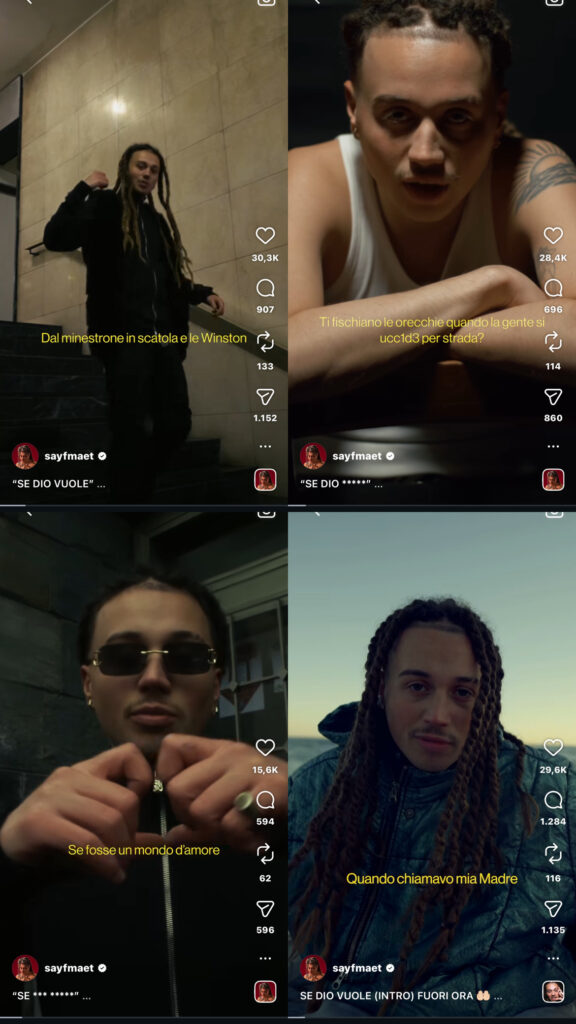
His emergence strategy did not rely on the compulsive release of songs, but rather on the seriality of a highly precise visual format. Sayf began by posting short freestyle videos on social media, all bound by strict and immutable design rules. Analyzing his pre-success content reveals a very clear design grid:
Color Grading: A recognizable and constant color palette in every video, giving his feed a cinematic atmosphere that instantly set him apart from other emerging rappers.
Framing and Composition: A personal and intimate shooting technique, designed not to mimic a high-budget music video, but to create a sense of visual proximity with the smartphone user.
Typographic Format: The use of a subtitle system that was always identical in font, size, and placement. In a context where social media content is often consumed “sound-off,” this typographic grid became a crucial visual anchor.
The hyper-coherence of this setup allowed Sayf to transform simple Instagram videos into a proprietary format. Users scrolling through their feeds—even before turning on the audio and hearing the lyrics—could recognize the colors, the framing, and the font, instantly associating them with his narrative world.
The Sayf case demonstrates a fundamental principle of modern music marketing: the coherence and solidity of a visual project can effectively compensate for the lack of a large production entourage. Designing sharp aesthetic boundaries does not limit the artist’s creativity; on the contrary, it generates the recognizability needed to turn a newcomer into a cultural brand capable of climbing the charts.
In 2023, Italian rapper Tedua released La Divina Commedia (The Divine Comedy), an album whose world-building strategy relied on an unprecedented communication design challenge: translating a 14th-century literary masterpiece into a contemporary urban narrative ecosystem. This project demonstrates how world-building does not always require inventing a universe from scratch; it can involve the architectural adaptation of an existing cultural monument.
Rather than merely borrowing Dante Alighieri’s aesthetic as a superficial theme, Tedua used the structure of Hell, Purgatory, and Paradise as the literal scaffolding for his entire rollout. To translate this literary vision into visual design, he collaborated with iconic photographer David LaChapelle for the album’s artwork. The cover did not feature the standard hip-hop portrait; instead, it presented a hyper-saturated, theatrical tableau depicting the artist and his peers as damned souls in the circles of hell. It functioned as a Renaissance fresco reimagined for the streaming age.
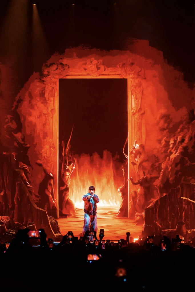
This world-building extended seamlessly into the live experience. The stage design for his arena tour was not built around standard digital screens and lasers, but around physical scenography: an imposing reconstruction of the “Selva Oscura” (the Dark Wood) and the gates of Hell. The concert functioned as a theatrical act, where lighting, set design, and choreography guided the audience through the narrative descent and ascent mirroring the album’s structure.
From a communication design perspective, this case study illustrates the concept of “intertextual world-building.” The designer’s role shifts from creator to translator and orchestrator. By systematically applying the narrative structure of a classic epic to every touchpoint — from the tracklist nomenclature to high-end photography and physical stage architecture — the project elevates a rap album into an immersive, multi-sensory theatrical world, proving that literature can function as a highly effective design framework.
In an industry obsessed with the artist’s face, personal life, and constant social media exposure, total anonymity is a radical communication strategy. But what happens when you erase the physical protagonist from the narrative ecosystem? The space left empty must be filled by a world. A prime example of this dynamic is the Italian musical phenomenon Liberato. Since his debut in 2017, the artist has achieved massive mainstream success and sold out stadiums without ever revealing his identity.
From a communication design perspective, Liberato is not a person; he is a rigorously controlled visual and narrative system. Because the artist has no face, the core of this ecosystem shifts to a specific geography: the city of Naples. The physical absence of the frontman forces the city itself to become the protagonist.
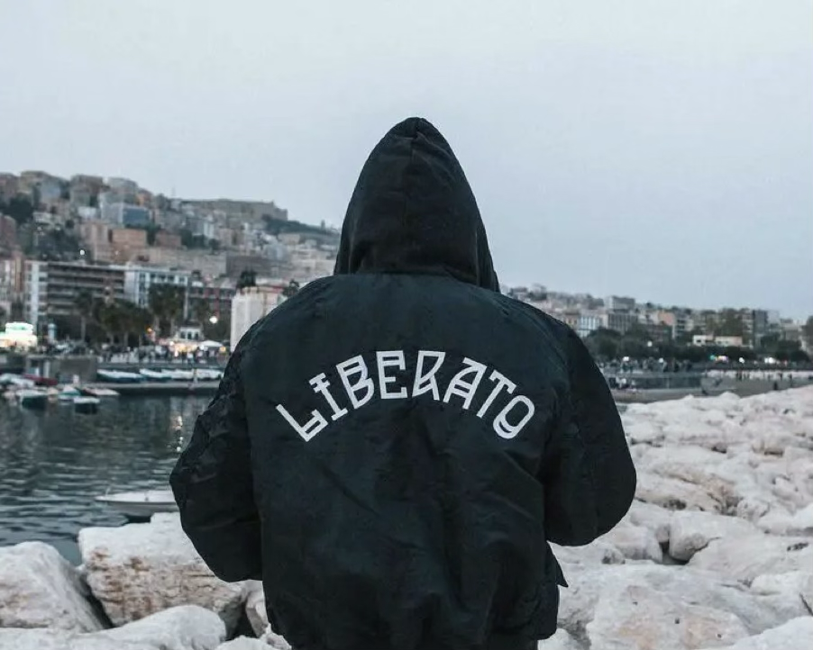
The communication design behind this project relies on a minimal but maniacally consistent set of symbols: a black bomber jacket with bold, unbranded white typography, the stylized graphic of a rose, and the use of the Neapolitan dialect treated almost as a distinct typographic and sonic texture. These elements function as a uniform and a logo, completely replacing the traditional artist photoshoot.
This world is then expanded into a cinematic universe, primarily through music videos directed by filmmaker Francesco Lettieri. Rather than standard promotional clips, these videos are serialized short films with recurring characters and intersecting storylines, framing the city through a specific, highly aestheticized lens. The audience does not follow a celebrity; they follow a carefully designed mythology.
What this case study demonstrates is a significant shift in the objective of communication design. The strategic goal here is not to build an idol, but to design a hyper-local myth. By translating a geographical and cultural identity into a precise, reproducible visual framework, the designer creates an iconography strong enough to sustain a massive commercial project entirely without a human face.
On August 19, 2016, after four years of total silence, Frank Ocean published a livestream on his website. No announcement, no press release, just footage of a man building a wooden staircase, with fragments of music in the background. It ran for hours. Nobody knew what it was. And yet millions of people watched it.
This is the paradox that interests me. In an industry built on visibility, constant content, and algorithmic presence, silence had become one of the most powerful communication tools available. Ocean wasn’t failing to communicate. He was communicating through absence and doing it with a precision that most artists never achieve with words.
The four years between Channel Orange and Blonde were not empty. They were punctuated by carefully dosed fragments: a cryptic Tumblr post reading “I got two versions”, a library due-date slip with dates crossed out, a rumour, sparked by Ocean himself, that he might never make another album. Each intervention was minimal enough to sustain ambiguity, but precise enough to sustain attention. The silence was modulated, not total. And the modulation, I would argue, was the design.
What Ocean understood intuitively, and what this research wants to investigate systematically, is that silence, in communication design terms, is not the absence of content. It is a specific kind of content. It is negative space. It is the pause that gives weight to what follows. When the release finally came, it arrived not as a product launch but as a cultural event: two albums in three days, a 360-page magazine, four pop-up shops across the world. The silence had built a world of anticipation so charged that anything released into it would have been received as extraordinary.
What this case suggest is something that communication design research has not yet taken seriously enough: that the rhythm of presence and absence, these is design decisions, with consequences for how meaning is produced and how audiences are formed. Studying them requires tools that neither musicology nor marketing research alone can provide. That is exactly where this research wants to go.
“With Midjourney, I feel like I’ve got 300 illustrators working for me, and within 10 seconds each illustrator comes back to me with stuff that’s unexpected and that I never would have come up with myself.” This is how Tino Schaedler, production designer and art director whose work spans feature films, music videos, and commercials, described his first experience with generative AI tools in an interview with Filmmaker Magazine in 2023. The statement is striking not because it celebrates a new technology, but because of what it reveals about a specific phase of the creative process: the moment, before any camera is turned on and before any location is scouted, when a visual world needs to be found.
This moment, the pre-production phase, where a sonic or narrative idea must be translated into a shared visual language, is where this article begins. Because what Schaedler is describing is not simply a faster way to make images. It is a fundamental redesign of one of the most delicate and expensive stages of visual communication design: the construction of the moodboard.
Pre-production has always been the most expensive and most uncertain part of any visual campaign. Traditionally, it unfolds over weeks: reference images collected from films, photography books, fashion editorials and archive material, assembled into physical or digital moodboards, presented, debated, revised. The process is slow not because the people involved are slow, but because translating a feeling into a shared visual language is genuinely difficult. Words like “melancholic but not dark” or “futuristic but analog” mean different things to different people. A moodboard tries to resolve that ambiguity by showing rather than describing, but building one that is precise enough to actually guide a shoot requires significant time, taste, and resources.
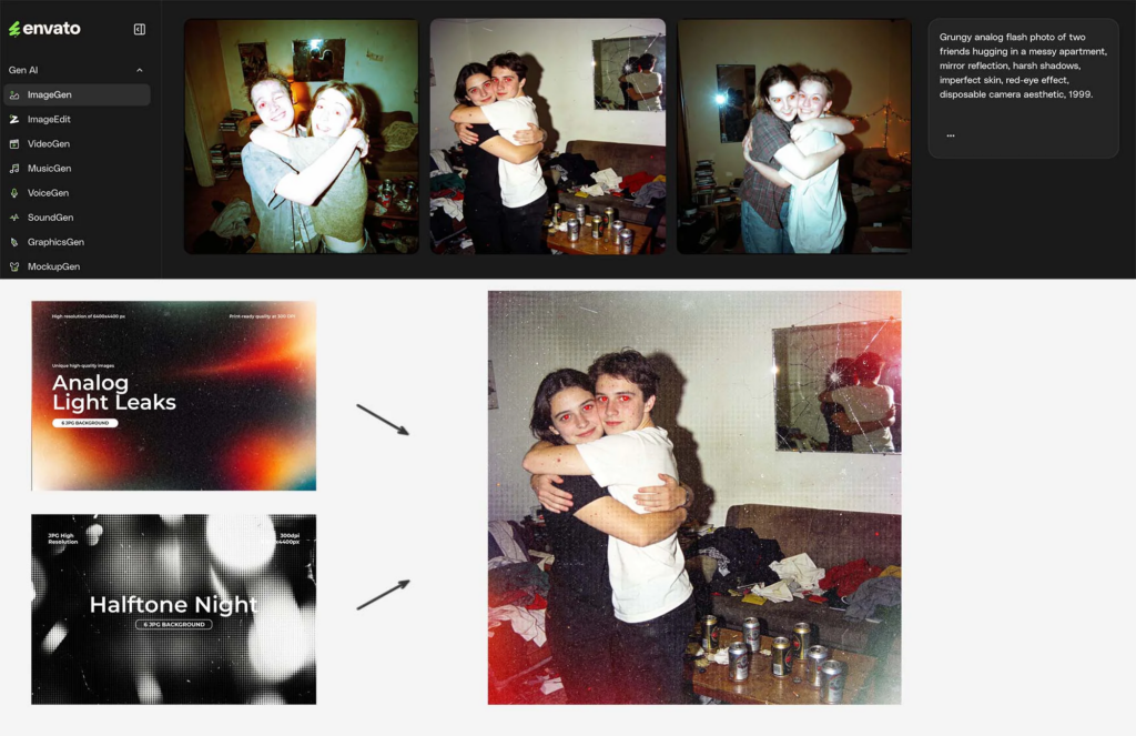
Generative AI tools like Midjourney, Adobe Firefly, Stable Diffusion, DALL-E have inserted themselves into this process in a way that is neither a revolution nor a mere upgrade. They are something more specific: a new kind of thinking tool. A creative director can now generate fifty visual variations of an idea in an afternoon, test different aesthetic directions in parallel, and arrive at a shoot with a level of visual specificity that previously required either a very large budget or a very long timeline. The moodboard is no longer assembled from existing images — it is generated from a described intention.
This shifts something fundamental in the design process. When a moodboard is built from found images, a still from a Tarkovsky film, a photograph by Nan Goldin, a frame from a 1970s Italian western, it carries with it all the cultural and historical weight of those references. The designer is curating a conversation between existing visual worlds. When a moodboard is generated, the designer is instead describing a world that does not yet exist and watching it appear. The references are still there, embedded in the model’s training data, but they are dissolved and recombined rather than cited.
My thesis investigates the strategic role of communication design in the contemporary music industry.
The starting point is a simple observation: in the streaming era, music itself has become a commodity, almost invisible, endlessly available, and economically devalued. In this context, the most successful artists are no longer competing on sound alone. They are competing on worlds.
What I want to study is how artists and communication designers build complex, multi-platform narrative ecosystems — coherent systems of visuals, stories, objects, and experiences that extend far beyond the album cover. These are not just marketing campaigns. They are designed worlds, and the designer’s role within them is closer to that of a narrative architect than a graphic designer.
In October 2024, fans of Tyler, the Creator began receiving mysterious cardboard boxes in the mail. Inside: a map, a mirror, a mask, and a handwritten note. No explanation. No release date. No album title. Just objects, carefully designed physical artifacts that arrived weeks before anyone knew Chromakopia existed. By the time the album dropped, thousands of people had already held a piece of its world in their hands.
This is not marketing. Or rather, it is not only marketing. It is communication design operating at a level of strategic and narrative complexity that the discipline has rarely theorized in the context of the music industry. And Tyler, the Creator is arguably its most complete contemporary practitioner.
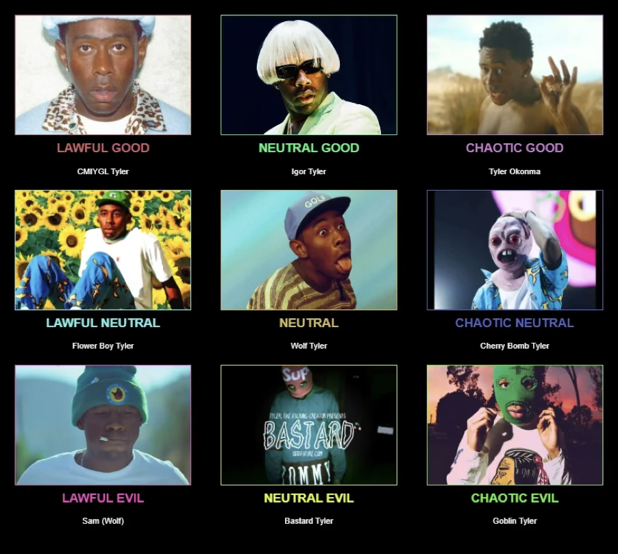
What makes Tyler’s work so relevant as a starting point for this research is not just the visual quality of his albums, though that is remarkable in itself. It is the systematic consistency with which he builds, across every release, a coherent narrative world. Each album introduces a character: not a fictional persona entirely detached from reality, but a version of Tyler himself pushed into a specific emotional and aesthetic universe. Goblin was a troubled teenager talking to an imaginary therapist. Igor was a lovesick figure in a blonde wig whose story unfolded across the album’s tracks like acts of a play. Tyler Baudelaire, the protagonist of Call Me If You Get Lost, was a wealthy wanderer with a European sensibility, announced through fake DJ flyers and street posters scattered across American cities before anyone had heard a single note.
Each of these characters does not exist only in the music. They exist in the visual language of the album packaging, in the art direction of the music videos, in the clothing collections released by Golf Wang (Tyler’s own fashion brand) in the Camp Flog Gnaw festival, which began as a narrative element of an album and became a real annual event. The world precedes the music, accompanies it, and survives it.
This is what I mean when I use the term world-building. Not a metaphor, but a precise description of a design practice: the construction of a coherent narrative and visual ecosystem across multiple platforms and media, where every designed element, an object, an image, a typeface, a physical experience, is a fragment of a larger system. The designer’s role in this process is not to decorate a product, but to architect a world.
After the whole semester of prototyping and testing, the following is a summarized video (in portrait format because it’s easier to visualize in WordPress of course, not just because I’m gen Z) of the work done and the final result of my prototyping phase.
The next step in this project is to define my project outcome in greater detail and assess the feasibility of my idea. Once this direction has been established, the following phase of the prototype will focus on preparing and refining the testing process. The intended medium fidelity prototype will be the final step for this section of research and will hopefully provide new insights and results for the chapter of investigation surrounding this topic.
Solution Vision
Over the past year, I have explored the topic of train stations in Germany and investigated how the User Experience could be improved for travellers. This process has involved a combination of online research, surveys, prototyping, and user testing. Through these activities, I have gradually narrowed the scope of the project, shifting my focus from the broader train station environment to the more specific and manageable context of the platform itself. This refinement has allowed me to concentrate on a smaller physical space while still addressing a wide range of possible interactions. The first round of testing played a significant role in shaping the direction of the project. It provided valuable insights into the structure of the problem and highlighted the needs and expectations of participants. One of the key findings was the recurring desire for additional information and clearer guidance. Participants expressed that more support during moments of uncertainty would improve their experience and help them navigate the station environment more confidently. These findings encouraged me to explore solutions that respond directly to these needs and contribute to a more intuitive and supportive travel experience.
The vision for this project is to investigate how light can function as a flexible and adaptive orientation system on the platforms of German train stations. Through my research, I found that the information currently available on platforms often needs to be translated into forms of interaction that better respond to users’ changing needs. Rather than relying solely on fixed signs and static displays, this project explores how light itself could become a medium for communication and guidance. Light offers several characteristics that make it particularly suitable for this purpose. It can be switched on and off when needed, adjusted in brightness and opacity, directed towards specific areas, and adapted to different situations. This flexibility creates the possibility of an orientation system that is not tied to a single location but can change according to the circumstances of the station environment. In addition to its practical function, light can influence how people perceive and experience a space by contributing to atmosphere, increasing comfort, and enhancing the feeling of safety, particularly during the evening.
I imagine the concept as a series of lighting panels integrated into the ceilings above the train platforms. During regular operation, these panels could provide ambient illumination for the station. However, when additional information is required, they could transform into an active guidance system, communicating directly with passengers through dynamic visual cues. The lighting system could extend across the entire platform, offering invitations or directions tailored to different trains and routes. Rather than requiring travellers to search for static signs, information could appear exactly where it is needed. For example, the light could indicate where a train will arrive, guide passengers towards the correct boarding area, or highlight the most efficient path through the platform. It could also adapt to changes in real time, responding to delays, platform alterations, or varying passenger flows.
Technical Feasibility
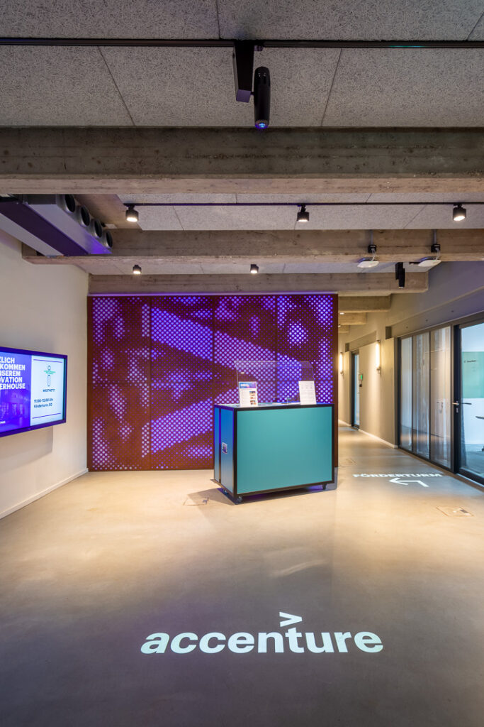
At this phase of the project, the technical feasibility can only be estimated and will require further investigation and planning at a later stage of the process. However, the proposed technical setup of using ceiling-mounted projectors to display objects and wayfinding systems onto the floor is not a new invention and has already been implemented in a variety of contexts. One example is the entrance area of Accenture Dienstleistungen GmbH at their location in Essen, Germany. In this project, projectors mounted on lighting tracks were used to display text and arrows on the floor in order to support orientation within the space (derksen lichttechnik, 2020). Another example is the development of personalised wayfinding and guidance systems for elderly people in private homes. This project, initiated by the University of Applied Sciences Vorarlberg in Austria in 2012, aimed to support elderly people in their spatial orientation and improve their independent mobility (Kempter, 2012).
Although these examples were implemented in environments very different from a train platform, they demonstrate that projector technology capable of displaying guidance systems already exists and is actively being used. They also illustrate that such systems can be customised and adapted to the needs of individual users. Furthermore, they show that relatively simple interventions can enhance a space and improve the experience of navigating through it.
Prototype Iteration
To test this idea not only through a digital prototype but also in a real-life setting, the development of an experience prototype is planned as the next step. This type of prototype makes it possible to move beyond testing interactions on a screen and instead simulate the user experience, including emotions, pain points, behaviours, and physical interactions (Medium, 2025).
Planning for Conduction
The prototype is planned to be tested within an academic setting using students as participants. This environment is not ideal, as it does not represent the full diversity of users found in German train stations. However, considering the opportunities currently available and the limitations of time and resources, this testing phase can still serve as a valuable first step in understanding users’ reactions to the proposed setup. At a later stage, the testing could be repeated with a broader and more diverse participant group in order to further validate the findings and gain a wider range of insights. Nevertheless, the planned study already provides an opportunity to test the concept at an early stage without requiring a significant investment of time or money, while allowing the prototype to be implemented quickly in a controlled environment.
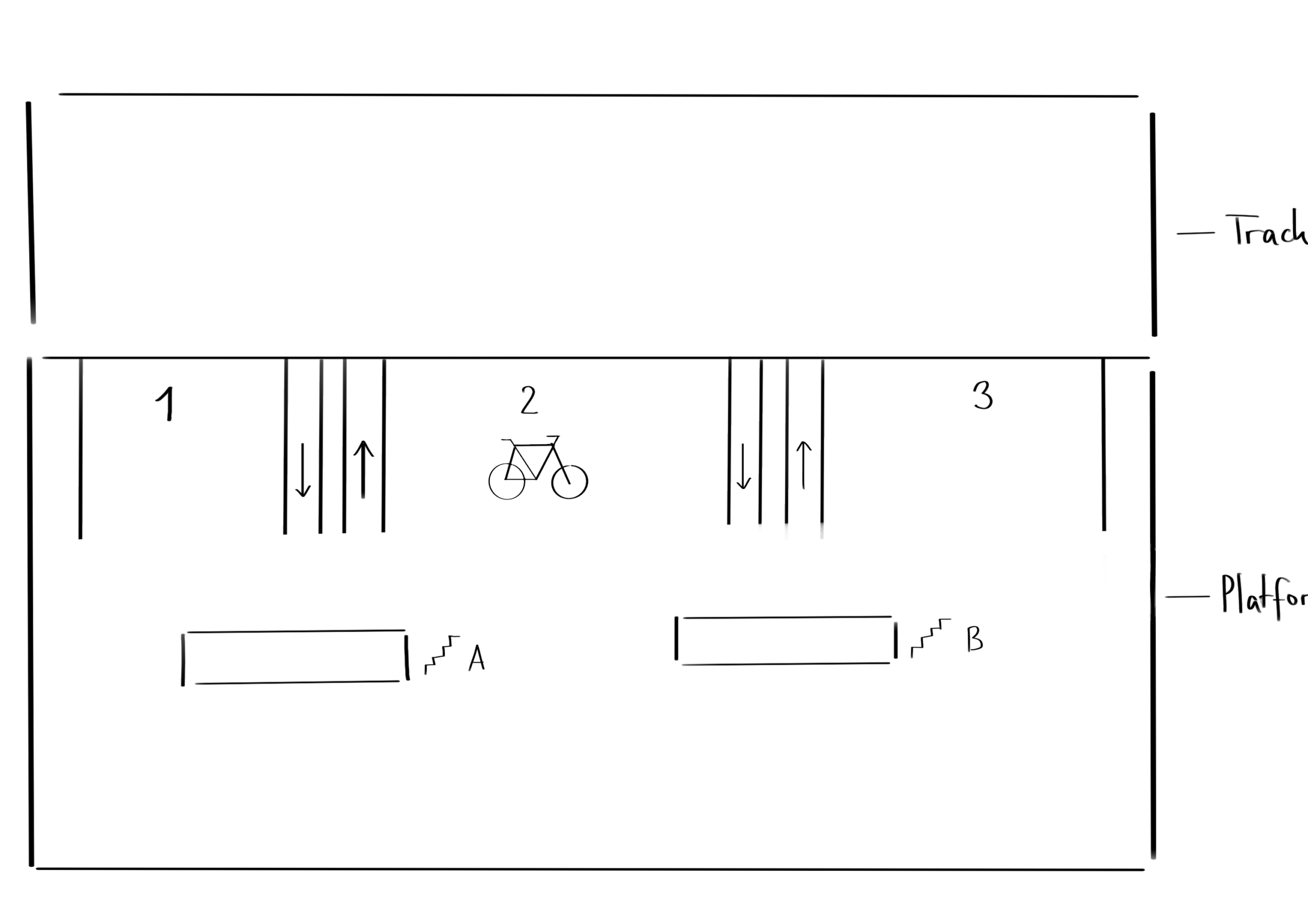
Preparations for the testing include mapping the space that will represent the train platform, preparing the materials that will be provided to participants, writing the instructions for the testing procedure, and planning the camera setup used to document the sessions. To build the prototype environment, sticky tape, markers, and sticky notes will be used. A rectangle constructed from tape on the floor of the testing room will represent the train platform. A second rectangle positioned alongside it will represent the train tracks. Participants will be instructed to remain within the platform area and avoid entering the space representing the tracks. In addition to these spatial boundaries, the prototype setup will include coloured lines and symbols representing the projected light elements that would eventually be integrated into the platform environment. These elements will indicate where the train is expected to stop, where the train doors will be located, designated areas for boarding and alighting passengers, and the position of the bicycle carriage on the platform. Once participants enter the prototype environment, they will be given a number of tasks to complete within the setup. At the end of the testing session, they will receive sticky notes on which they can record their thoughts, identify problems, suggest improvements, and add any additional wishes or ideas they may have. If time allows, the prototype will be tested with two to three groups consisting of three to five participants each. This approach would make it possible to observe different group dynamics and collect feedback from a larger number of users, providing a broader range of opinions and ideas for future development.
Information Gathered
The process of defining the idea for the final outcome in greater detail has been an important step within this project. By examining both the concept itself and its technical feasibility more closely, I have gained a clearer understanding of the direction of the project and what I aim to achieve by its conclusion.
In addition, the planned experience prototype will provide valuable insights into whether the proposed idea can function within a real physical environment. It offers the opportunity to identify strengths and weaknesses early in the process and to assess how users respond to the concept before investing further resources into its development.
Next Steps
The next stage of the project will involve conducting the physical prototype testing, filming and documenting the sessions, and collecting feedback and suggestions for improvement from participants. Once the testing has been completed, the findings will be analysed, written up, and documented. The outcomes of this phase of the project will also be summarised in a video format. Both the written documentation and the video can then serve as a foundation for the next chapter of the project, supporting further research, additional testing, and continued development of the concept.
Bibliography
derksen lichttechnik. (29. September 2020). Guidance system and lighting design in the Accenture office. Von derksen lichttechnik: https://www.derksen.de/en/projekt/guidance-system-and-lighting-design-in-the-accenture-office/ abgerufen
Kempter, P. D. (01. May 2012). GUIDING LIGHT. Von AAL: https://www.aal-europe.eu/projects/guidinglight/ abgerufen
Medium. (2. July 2025). Experience Prototyping: Blending Physical, Digital & Spatial Elements. Von Medium : https://medium.com/@harsh.mudgal_27075/experience-prototyping-blending-physical-digital-spatial-elements-74a7257bfbc9 abgerufen
Nachdem ich durch die Umfrage ein gutes Bild bekommen habe, was Erwachsene sich für Kinder wünschen, war mein nächster Schritt, mir Kinderbücher genauer anzuschauen. Ich wollte recherchieren, welche Bücher es gerade gibt, wie Geschichten geschrieben werden, wie die Bücher illustriert sind und auch welche gestalterischen Möglichkeiten es im Kinderbuch überhaupt gibt.
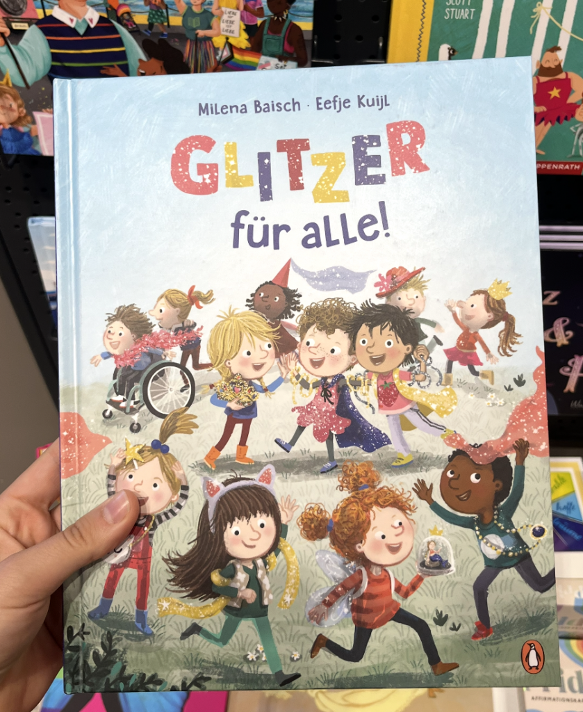
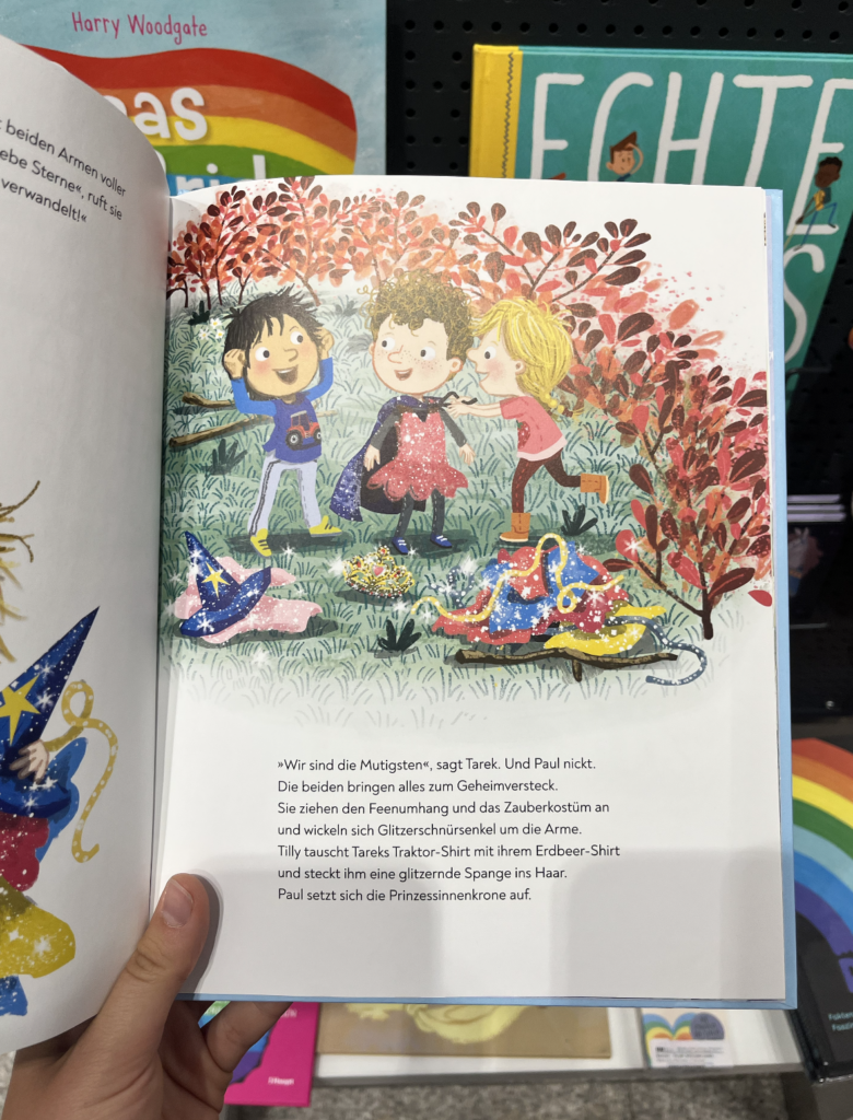
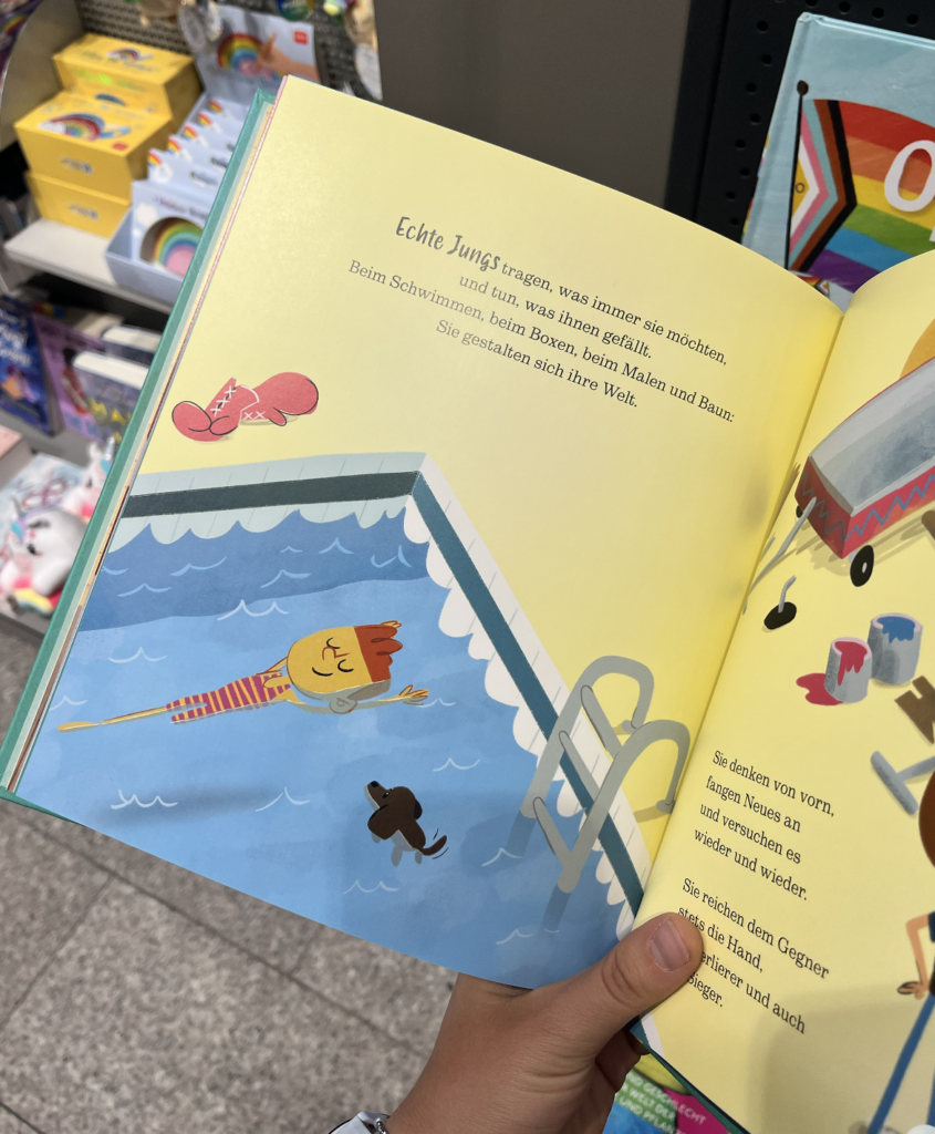
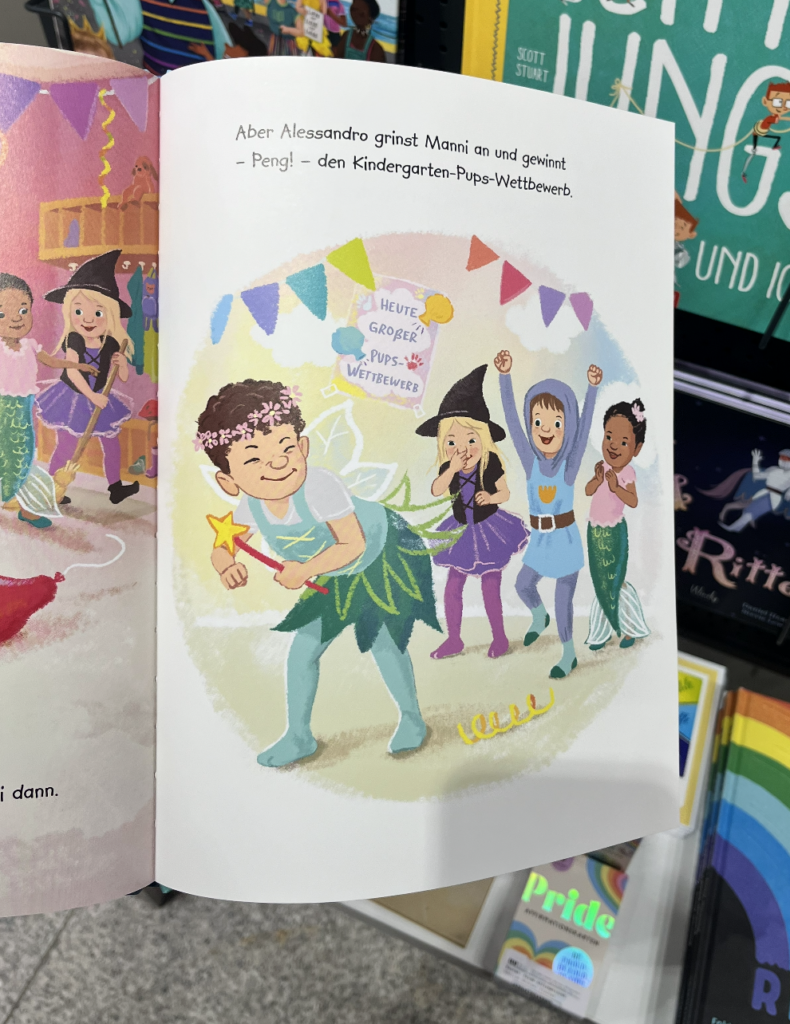
Was mir beim Durchblättern als erstes aufgefallen ist, ist dass sehr viele Bücher Diversität als zentrales, explizites Theme einsetzten. Zum Beispiel bei „Glitzer für alle“ dreht sich die gesamte Gesichte um Geschlechterrollen, bei „das ist doch nur für Mädchen“ genauso. Das ist ja prinzipiell nicht falsch oder schlecht aber es bedeutet, dass das Thema immer im Vordergrund steht und aktiv erklärt wird. Kinder merken sofort, worum es geht. Genau das ist der Punkt, an dem ich mich frage, ob dass die Art und Weise ist, wie ich gestalten möchte. Denn mein Ziel wäre es, Vielfalt so zu gestalten, dass sie als selbstverständlicher Teil einer Gesichte gesehen wird nicht als Botschaft, die vermittelt werden muss.
Gestalterisch ist aber so einiges möglich. Auf der einen Seite gibt es Bücher mit weichen, handgezeichnete Illustrationen in warmen Farben, viele Figuren im Bild, viel Bewegung und Ausdruck. Gruppen von Kindern, die sich alle voneinander unterscheiden: unterschiedliche Hautfarben, Haartypen, Körper, Figuren mit Beeinträchtigungen und das alles ohne größer Erklärung. Auf der anderen Seite gibt es Bücher mit deutlich reduzierten grafischen Stil, der fast schon plakativ wirkt. Beides funktioniert, aber für unterschiedliche Stimmungen und Zielgruppen.
Was mit außerdem besonders aufgefallen ist, ist dass bei Büchern für jüngere Kinder, die Illustrationen die eigentlichen Träger der Gesichte sind. Der Text ist oft sehr kurz, manchmal nur eins Satz pro Seiten und die Illustration erzählt den Rest. Das bedeutet, dass gestalterische Entscheidungen hier besonders viel Gewicht haben.
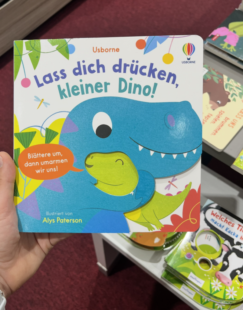
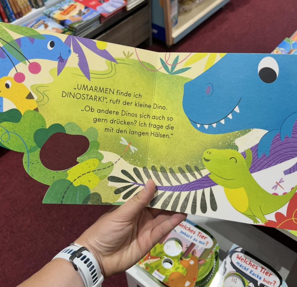
Beim Format und er Haptik gab es ebenfalls viele unterschiedliche Ansätze. Zum Beispiel bei dem Buch „Las dich drücken kleiner Dino! hatte eine ausgestanzte Seite, durch die man die Figuren der nächsten Seite schon durch sehen kann. Ein einfaches Mittel was sofort Neugierde erzeugt. Bei einem anderen Buch gab es Klappseiten, die die Gesichte in zwei Ebenen erzählt haben was man auf den ersten Blick sieht und was sicher dahinter verbirgt. Das hat mir besonders gut gefallen, weil das Aufklappen nicht nur Spaß macht, sondern inhaltlich Sinn ergibt.
Was ich aus der Recherche vor allem mitgenommen habe, ist dass es schon viele Bücher zu diesem Thema gibt, aber nicht alle lösen das gleich gut. Und der Unterschied liegt meistens nicht im Thema selbst, sondern darin wie es erzählt und gestaltet wird, Das ist auch der Ansatz, von dem ich für mein eigenes Projekt am meisten mitnehmen kann.
Im heutigen blogpost geht es um die Auswertung der Umfrage:
Der Großteil der Teilnehmer:innen waren Eltern mit 77,8%, 22;2% sind Großeltern und ebenfalls 22,2% Verwandte. Zusätzlich haben auch einige pädagogische Fachkräfte und Babysitter:innen teilgenommen. Die Kinder, über die berichtet wurde, waren überwiegend im Alter zwischen zwei und sieben Jahren, also genau die Altersgruppe, für die das Buch gedacht ist.
Was das Leseverhalten betrifft, zeigt sich ein gemischtes Bild: Rund 40% der Befragten lesen täglich mit Kindern, etwa 20% mehrmals pro Woche und der Rest eher selten. Das hat mich daran erinnert, dass ein Buch auch dann funktionieren muss, wenn es nicht jeden Tag in die Hand genommen wird, es sollte also beim erneuten Aufschlagen sofort wieder einladen.
Besonders interessant war die Frage, was ein Kinderbuch zu einem guten Buch macht. Hier kamen sehr ähnliche Antworten: Die Geschichte soll spannend sein, die Illustrationen ansprechend und die Sprache kindergerecht, aber nicht kindisch. Mehrere Personen betonen außerdem, dass das Buch auch für die vorlesenden Erwachsenen angenehm sein soll. Ein Punkt, der mich persönlich sehr gefreut hat, ist der Wunsch, dass Kinder als Publikum ernst genommen werden und der Text nicht übertrieben vereinfacht oder verniedlicht wird.
Beim Thema Inklusion und Diversität war die Übereinstimmung besonders eindeutig. Ungefähr 75% der Befragten haben bereits Bücher zu diesem Thema genutzt oder kennen zumindest welche. Hier wurden Beispiel wie die Conny Geschichten genannt aber auch spezifische Bücher zu Körper, wie Jeder hat einen Popo, Familienformen wie das Mädchen mit den vier Namen oder Bücher über Beeinträchtigungen. Eine Sache die dabei am häufigsten positiv hervorgehoben wurde ist, dass Diversität in diesen Büchern als selbstverständlich vorkommt, ohne es jedes Mal explizit zu betont zu werden. Eine Person brachte es besonders gut auf den Punkt, denn wenn inklusive Details jedes Mal extra hervorgehoben werden müssen, verlieren sie ihre Normalität. Genau das ist auch mein Ansatz.
Die am häufigsten genannten Themen, die Befragten für Kinder als besonders wichtig sehen, waren Gefühle und Emotionen, Beeinträchtigungen sowie Familienformen, diese Themen wurden jeweils von über 80% der Befragten angekreuzt. Auch Hautfarbe und Herkunft, Geschlechterrollen sowie Körper und Aussehen als ebenfalls wichtig eingestuft. Bei der Frage, ob Kindern selber über Unterschiede zwischen Menschen reden haben 88,9% mit Ja abgestimmt und 11,1% mit selten aber niemand mit Nein. Des Weiteren gaben 66,7% an, bereits Kinderbücher zum Thema Inklusion und Diversität zu kennen, 22,2% verneinten und 11,1% meinten, sie kennen nicht so wirklich welche.
Was Erwachsene für Kinder klar ablehnen, war ebenfalls sehr eindeutig, denn das Buch soll auf keinem Fall belehrend wirken. Nahezu alle Befragten sagten das als zentralen Kritikpunkt. Ein Buch zu diesem Thema soll kein Lehrbuch sein sondern eine Geschichte, wo Diversität einfach sichtbar ist und als normal gilt. Diese Rückmeldung hat meine Richtung für das Projekt klar bestätigt
Bei den interaktiven Elementen war die Begeisterung besonders groß. Alle Befragten gaben an, diese Art von Büchern bereits zu kennen. Entscheidungsseiten, also Seiten auf denen Kinder selber wählen können wie die Geschichte weitergeht, sowie Klappseiten wurden am besten bewertet. Verschieden Texturen und Materialien, Spiegel- und Schiebelemente wurden als durchschnittlich gut bewertet und eher skeptisch waren viele gegenüber Pop-ups und 3D-Elementen. Die meisten Elemente wurden als gut bis sehr praktisch im Kindergartenalltag und Zuhause eingeschätzt, die diese als hinderlich beschrieben wurden. Das sind Wichtige Hinweise für die gestalterische Umsetzung
Im letzten Abschnitt der Umfrage ging es um konkrete Wünsche und Anregungen. Hier zeigte sich, dass sich die Befragten vor allem Lebensnähe wünschen. Kindern sollen Situationen und Figuren begegnen, mit den sie sich identifizieren können, Geschichten erleben die ihre Realität Wiederspiegeln und Dialoge hören die sie selbst anwenden können. Mehrere Personen wünschen sich außerdem, dass Stereotypen aktiv gebrochen werden und eine Vielfalt an Lebensformen, Körpern und Familienformen ganz selbstverständlich abgebildet wird. Eine Antwort hat mich dabei besondre zum Nachdenken gebracht: „Wenn alle Bücher etwas von der Norm abweichen würden und unterschiedliche Familienkonstellationen, Körper etc. abbilden, wären extra Diversitätsbücher nicht notwendig…“ Das ist letztendlich auch da Ziel, ein Buch zu machen, das irgendwann gar nicht mehr als besonders gilt, weil das was es zeigt längst selbstverständlich ist.
Ingesamt hat mir die Umfrage ein sehr klares Bild gegen, was für diese Zielgruppe passend und gewünscht wird: Ein Buch, was Kinder begeistert und das Vielfalt ganz selbstverständlich gezeigt werden soll, ohne den gesamten Fokus darauf zu legen. Mit diesen Erkenntnissen kann ich jetzt in den gestalterischen Teil des Projekts starten.