The Door Story, and the Questions I Will Ask

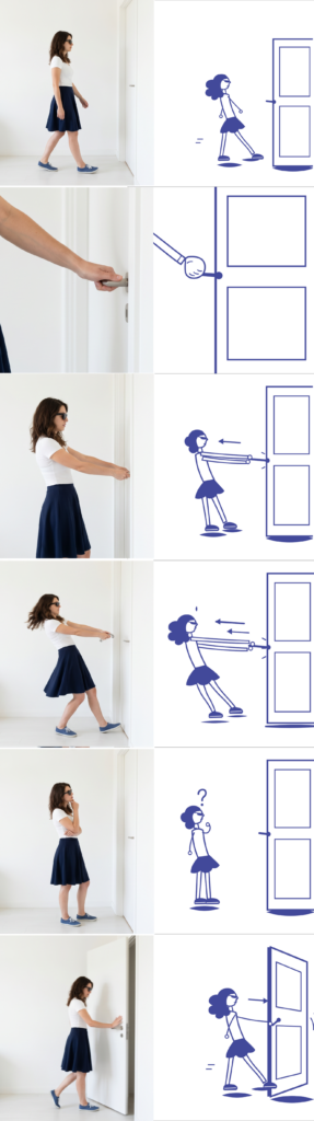
Both versions of the door story are now made. Both are AI: the illustration as vector code, the photographs from Firefly, which I kept generating and curating until they held together as one set instead of drifting frame to frame. Are they exactly the same quality? I am honestly not sure, and I have decided not to pretend otherwise. That uncertainty is part of the question now, which is why one of the questions below asks the viewer about it directly, so the data can speak instead of me claiming the sets were equal.

The story

The first of the three stories is the door, the most banal thing imaginable, which is exactly why it works. A woman walks up to a closed door. She grips the handle and pulls. It does not open. She pulls harder, leaning back with real effort, and still nothing. She stops, confused. Then she pushes instead, and the door swings open. The small joke underneath is something everyone has done: when a door does not work, we blame ourselves and pull harder, instead of trying the other direction.

Both versions tell this in six frames. The illustration uses its own language: arrows for the pulling direction, small marks for effort, a question mark for the pause. The photograph uses its own equivalents: the strain in the body, the hair caught in motion, the door actually swinging. Same story, same six beats, two visual languages.

How people will see it

This time everyone sees both versions, not one. But the order is split. One group sees the illustration first, then the photograph. The other group sees the photograph first, then the illustration. The reason for the swap is simple: whichever version you see first can bias how you judge the second, so flipping the order between the two groups balances that out.

The form has two phases. First the solo phase: you see one version and answer about it before the other version ever appears. Those first answers are a clean reaction to that medium on its own. Then the comparison phase: both versions are shown together, and now the comparing questions are easy to answer honestly, because both are right in front of you. So one form captures two things at once, how each medium works alone, and how the two feel side by side.

The questions

Solo phase, asked about the first version before the second is shown. Comprehension always comes first, so the form does not give away the answer.

  1. In one sentence, what is happening in this story? Open text, no hints. The most important question.
  2. How clear was each step? 1 to 5.
  3. At what moment did you understand the door had to be pushed, not pulled? This checks whether the joke landed.
  4. Which words fit the mood? A fixed list, the same for everyone: funny, serious, warm, cold, friendly, technical, calm, frustrating.
  5. How much does this feel like something you would actually follow? 1 to 5.
  6. Did this set feel consistent and finished? 1 to 5. This is the quality check.

Comparison phase, both versions now visible.

  1. Which version was clearer? Which felt warmer or friendlier? Which would you trust more as a real instruction?
  2. Which one stayed in your head more, and why?

The same questions go to both groups, only the order of the two versions swapped. Two forms, spread as evenly as I can, and then the real work begins, which is reading what the two groups did differently. The next block is the shower and the phone, built the same way, and after that the results.
Back on the Path

The last two blocks were detours. A useful one about quality, and a more philosophical one about the variables you cannot measure. Both were worth thinking through, but I can feel the project drifting away from the thing it is actually about. So this block is a reset. I want to restate the real question, keep what the detours taught me, and commit to a direction again.

The question has not changed since the beginning. How do visuals communicate a story when there are few or no words? Everything else, the stories, the styles, the test, is just a way to get at that. It is easy to lose sight of it while fighting with file consistency and AI quality, so I want it back in the center where it belongs.

Here is what the detours gave me, kept short. From the quality problem: the two image sets have to sit at a similar level of finish, or the test measures polish instead of medium. From the variables detour: I can control the expected things and never fully control the human ones, and the human conditions around an image are part of how images really work, not just noise. Both of those are now part of how I think, but neither one is the project. They are guardrails, not the road.

So, the direction. I am pulling the experiment back to its simplest honest form. Same banal stories, two visual languages, but this time quality and consistency are treated as something I actively control before anyone sees the images, not something I hope works out. If I keep using AI, the photographic set has to be curated until it holds together as one coherent thing, at the same standard as the illustrations. If I cannot reach that standard, I switch the photographic side to images I can fully control. The test does not go out until the two sides are honestly comparable. That is the rule now.

And I am keeping the test deliberately modest. Two groups, each sees one version, a short questionnaire, the comparison done by me afterward between the groups. I do not need a perfect study. I need a fair one, small enough to actually finish this semester, clean enough that the result points at the medium and not at my production problems.

But that raises an obvious question: how do I actually measure quality? I had to be honest with myself here. There is no quality score, no single number, and worse, illustration and photography are judged by different standards anyway, so I cannot really put them on the same ruler. Trying to prove one set is as good as the other is a dead end.

So I am dropping that impossible half and measuring something I can actually check: consistency. Not whether each set is good, but whether each set holds together as one coherent thing. Does the same person stay recognizable across all six frames. Is it the same world. Is the level of detail and finish steady. Is there a single frame that looks obviously broken. This is almost a checklist, and it is visible rather than subjective. My illustrations pass it. My AI photographs, right now, do not. That is the bar both sets have to clear before the test goes out.

And I can let the people confirm it for me. If I add one small question to the questionnaire, asking whether the images felt like a consistent set, then I am not just claiming the two sides were fair, I have evidence. If both groups rate consistency about the same, the comparison was fair. If one is much lower, that itself is honest data telling me the sets were not equal. Either way I learn something instead of guessing.

So that is the reset. The question is the same one it always was. The detours are folded in as rules to follow, not problems to keep circling. And the next concrete step is clear: lock the two image sets to the same quality, then finally put them in front of people.

A Detour: What Can and Cannot Be Measured

Before I solve the quality problem from the last block, I want to take a detour. The problem pushed me into a bigger topic that I find more interesting than the fix itself, and it is worth thinking through out loud: the difference between the variables you can plan for and the ones you cannot, and between the things you can measure and the things you simply cannot.

Let me start with the obvious layer. In this experiment there is a whole list of variables I can name in advance and, with enough effort, hold steady. The quality and finish of each set. The consistency between frames. The colour. The amount of background detail. Whether the character reads as the same person. The style inside each medium, since illustration and photography are each huge worlds on their own. These are the expected variables. They are annoying, but they are visible. I can see them coming, and at least in principle I can control them.

Then there is the other layer, and this is the one the detour is really about. There are variables you cannot predict and cannot measure, because they do not live in the design at all. They live in the person.

I learned this the hard way in my previous master’s thesis. I was testing whether lighting alone could tell a story, so I designed four scenarios and let people walk through them and do whatever they wanted. The scenarios were controlled. The people were not. One person came at lunchtime and was so hungry that they could not really engage with anything. Another came last in a long day and was already tired before they started. Their reactions were shaped by hunger and tiredness, not by my lighting. And there was no scenario, no matter how carefully built, that could have accounted for that. I could not have predicted it, and I could not have measured it even as it was happening in front of me.

So this is the food for thought. No matter how clean your test is, there is always something you did not think of, sitting inside the person, quietly bending the result. And the frustrating part is not just that you cannot control it. It is that you often cannot even see it or put a number on it. A questionnaire will never have a field for “arrived hungry.”

There is a simpler lesson hiding in this too. Sometimes as designers we get so deep into a project that we forget we are designing for real people, and not just for a rectangle on a monitor. We tune the file, the colours, the spacing, and we forget that the thing will eventually be seen by a person who is hungry, or tired, or distracted, or sad, a person with feelings and a whole day behind them. The work does not live on the screen. It lives in front of someone.

For a while this felt like a reason to despair about testing at all. But I am starting to think the opposite. Maybe the messiness is not noise to be deleted. Maybe it is part of what is actually being studied. When I show someone an image and ask what it means, their hunger, their tiredness, their language, their mood are not contamination. They are the real conditions under which images are actually read in the world. Nobody looks at a picture in a perfect vacuum. People look at things while distracted, rushed, hungry, half paying attention. An image that only communicates to a calm, rested viewer is arguably a weaker image than one that survives a tired one.

I am not resolving this here. The expected, measurable variables I will still try to control, because that is just good practice. But the unexpected and unmeasurable ones might be worth turning toward instead of away from. Maybe the question is not how to eliminate the human conditions around an image, but how much an image can carry despite them. That feels closer to the real life of visual communication than any perfectly controlled test would be.

For now this stays an open thought. But it changes how I see the quality problem from the last block. Control what you honestly can, accept that something will always escape, and consider that what escapes might be telling you something too.

I Cannot Test It This Way

I finished the illustration set and started on the photographic side, and somewhere in the middle I realised I cannot run this test the way I planned. The reason is simple, and it took me a while to see it clearly. The illustrations and the photographs are not at the same level of quality, and because of that, any result I got would be about quality, not about the medium.

That is the whole problem in one sentence. I set out to compare illustration and photography. But if the two sets do not match in quality, then the thing people actually react to is which one looks better made, not whether it is drawn or photographed. The comparison quietly stops being about what I wanted it to be about.

And the mismatch is not in one direction. It is not that the illustrations are good and the photographs are bad, or the other way around. Each set is uneven in its own way. The illustrations are very consistent but clearly stylised. The photographs look real but shift from image to image and never quite hold together as one thing. So I cannot even say one medium is winning. They are simply unequal in different ways, and that is enough to break the test.

This is where I have to be honest about quality itself. I had been treating it as a background detail, something I would clean up later. But it is not a detail. Quality is one of the variables in this experiment, maybe the most important one, and I had not been controlling it at all. As long as it floats freely, it sits on top of everything else people see, and it drowns out the difference I am trying to measure.

So the real question is not finished, it is just beginning. If quality is a variable, then I have to find a way to hold it steady before I can fairly compare anything. Both versions would need to sit at a similar level of finish, so that the only thing left to react to is illustration versus photography. Right now I do not know how to guarantee that, and I would rather admit it than run a test I already know I cannot defend.

I do not have the answer yet. What I have is a clearer question. Before I can test what each medium does, I have to figure out how to make the two sides equal enough that the test is actually fair. That is the problem the next block has to deal with.

Creature Design – Visual Exploration (Part 4)

I initially didn’t plan another part for my Creature Design series, but after the feedback I received last time it felt necessary to go back and fix what I got wrong last time. So for this entry, I want to rework the Leviathans from my last entry to make them more believable.

Final Consumers

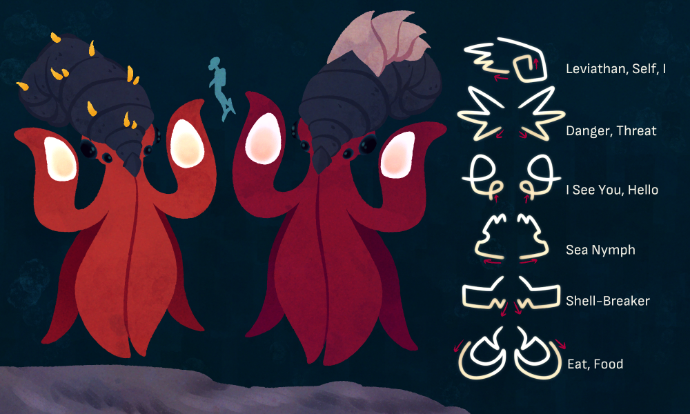
Leviathans are the dominant intelligent species living in the oceans of Europa. They are the largest members of the class Multibracchia, growing up to be around 8m tall. Their last common ancestor with other members of their class was around 10 million years ago, from which point they evolved away from being free-swimming, instead using their two front tentacles to traverse the ocean floor, leaving the other four free for the usage of tools and communication.

Their beak has moved from the centre of their tentacles, to the front of their head, giving them a forward-facing appearance similar to us humans. Like many other members of the Laminaferrea phylum, they have a shell. It connects through platting to their beaks and grows into a horn-like shape. Its rough texture frequently attracts members of the Caulispennatus phylum, like Antennae Trees, who settle on their shells. It was previously thought this serves towards camouflage, though in actuality it has cultural significance for the Leviathans. Being viewed as a sign of good fortune. This might be because Antennae Trees  and the like attract prey animals.

Leviathans have a very complex system of sign language – using bioluminescent signs drawn with the spots atop their back-facing tentacles to communicate. Brightness, duration (not only of the signal itself, but also its brightening and fading) and fluctuation play into it. While there seems to be a lot of differences between regions, some signs appear to be mostly consistent between them – these being terms used for prey and predators.

They have settlements all across the mid-level oceans of Europa, built into the caverns of large-scale vents where rich ecosystems have been established. They’re almost exclusively hunter-gatherers, though some settlements towards the north have begun to farm of Iron Jaws, the much larger relative of the Iron Beak (and comparable to the Giant Clam on Earth) as well as making attempts to domesticate Sea Nymphs.

Some Leviathan tribes have also begun to settle along the cliffs bordering on the abyssal depths, where they hunt Shell-Breakers and other large Cancernatans. Abyssal Leviathans are biologically the same as their mid-level oceans relatives, though they seem to have developed some physical differences to adapt to the depths. They’re a bit larger, for starters, growing up to be around 9 to 10m. Their skin is a more saturated red as well. What also seems more wide-spread amongst them is their habit for self-decoration; many of them wear the carapaces of Shell-Breakers on their heads.

As it seems they’re still in the early stages of civilization. Though it is unknown to which degree they will be able to develop technology, given that their circumstances are very different to ours as they are confined to the depths of the ocean.

#11 A possible direction

Among the projects discussed so far, Quick Fix and Hyper-Reality are probably the ones that stayed with me the most. They are very different projects, but both deal with aspects of contemporary life that have become increasingly difficult to separate from the digital systems surrounding us.

Online visibility, social validation, algorithms, information overload, digital interfaces, and the growing overlap between physical and virtual experiences are no longer future scenarios. They are already part of how many people experience the world. At the same time, these systems are so embedded in everyday life that many of their effects become difficult to notice. What I find particularly interesting is that both projects make these dynamics visible in different ways. Rather than focusing on distant futures, they take conditions that already exist and push them just far enough to make them impossible to ignore. In doing so, they show how speculative design can be used not only to imagine what might happen next, but also to question realities that are already taking shape around us.

For this reason, the relationship between people and digital environments feels like a particularly interesting area to explore further. Many of the themes that emerged throughout this research seem to converge here, from online identities and social media to information, perception, and the ways reality is increasingly experienced through digital platforms.

#10—The Narrative Uniform: Fashion as Structural Costume Design in World-Building

In the construction of a cohesive narrative world, one of the most powerful yet frequently misunderstood tools at a communication designer’s disposal is the uniform. While traditional music marketing often relies on the concept of “styling”—a fluid process where an artist changes outfits to suit different contexts—the most sophisticated world-building strategies do the opposite. They embrace the rigidity of the costume. By effectively freezing an artist’s visual appearance into a signature uniform, the designer transforms the performer from a human being into a fixed, recurring character within a larger narrative ecosystem.

This shift represents a departure from fashion as a personal expression toward fashion as a core element of architectural design. When an artist commits to a specific uniform—a garment, a color palette, or a recurring physical accessory—worn consistently across music videos, red carpet appearances, live performances, and social media content, they are creating a visual anchor. This anchor functions similarly to a uniform in cinema or theater; it signals to the audience that they have entered a world with its own internal rules, where the protagonist is not just an artist, but an inhabitant of that specific reality.

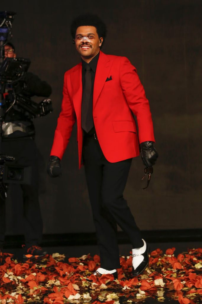
The most emblematic practitioner of this strategy in recent years is The Weeknd during his After Hours and Dawn FM era. For over a year, across every single public touchpoint, he appeared exclusively in a single, rigorously designed uniform: a bright red blazer, black leather gloves, and—at the height of the narrative—a face entirely covered in prosthetic bandages, suggesting a post-surgical, distorted transformation. This was not a stylistic choice; it was an act of extreme communication design. By refusing to deviate from this “costume,” he forced his audience to engage with his narrative of psychological decay and Hollywood-induced trauma. The uniform became the logo of the era.

From a communication design perspective, this strategy is highly effective because it simplifies the brand identity. In a digital environment where audiences are bombarded with thousands of images per day, the “Narrative Uniform” provides instant, sub-second recognition. It bypasses the need for the audience to “read” the artist’s changing moods; instead, they instantly recognize the character. The designer, in this scenario, functions as a costume designer for an ongoing, multi-year performance art piece.

Crucially, this uniform acts as a boundary. It defines what is “inside” the world of the album and what is “outside.” When the artist eventually discards the uniform, it functions as a definitive narrative beat—the “third act” of a movie, signaling the end of one visual ecosystem and the birth of another. By utilizing fashion as a structural design constraint rather than a fluid accessory, communication designers gain the ability to build worlds that feel deeply cinematic, immersive, and, above all, persistent. In the streaming age, where music is fleeting, the Narrative Uniform is the designer’s way of ensuring that the artist’s visual mark remains indelible.

#9—The Typographic Anchor: Letterforms as Architectural Identity in the Scrolling Era

In an industry governed by the relentless speed of the algorithmic feed, images have become inherently ephemeral. The lifespan of a promotional photograph or a meticulously styled music video is often measured in seconds before the user inevitably scrolls past. How, then, do you build a lasting, coherent narrative world in an environment designed for constant visual turnover? The answer often lies in one of the most fundamental, yet overlooked, tools of communication design: typography.

In the context of contemporary music world-building, typography ceases to be mere text and becomes infrastructure. It is no longer about selecting a pleasing font to sit neatly on an album cover; it is about engineering a typographic system that acts as the primary visual anchor for an entire era. When a custom typeface or a strict typographic cage is applied obsessively across every single touchpoint—from Spotify canvases and stadium billboards to Instagram stories and physical merchandising—it transcends its linguistic function. It becomes the logo, the architecture, and the geographical boundary of that specific narrative ecosystem.

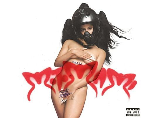
A striking example of this dynamic is Rosalía’s Motomami era. The communication design for this project was not primarily anchored by a single photographic portrait, but by a highly specific, custom-designed typographic treatment. The lettering was aggressive, scratched, spiky, and unapologetically chaotic. It was not just a title; it was the exact visual translation of the album’s sonic contrast—the friction between the vulnerability of “mami” and the industrial hardness of “moto.” Whenever fans encountered that specific spiky lettering—even as a simple black-and-white graphic, completely stripped of the artist’s face—they instantly knew they had stepped inside the Motomami world.

This approach elevates type design from a functional necessity to a core world-building strategy. We can observe this methodology functioning across various genres and aesthetic paradigms. Whether an art director employs the rigid, grid-based precision of Swiss Style typography to construct a cold, dystopian electronic narrative, or utilizes the raw, unpolished, and anti-aesthetic layouts of Brutalist design to signal disruption within the underground urban scene, the principle remains the same. The typographic grid becomes the spatial boundary of the artist’s world.

Ultimately, in contemporary music marketing, typography is spatial. It is the architectural framework that holds the narrative together when the imagery itself is forced to constantly mutate to feed the algorithm. By designing a proprietary typographic language, the communication designer ensures that the artist’s identity remains instantly recognizable, providing a sense of stability and permanence within a digital ecosystem defined by chaos.

#8—The Physical Fetish: Merchandising as a Tangible Relic of a Dematerialized World

The defining characteristic of the streaming era is weightlessness. Music is everywhere, instantly accessible, yet entirely invisible. The physical artifact—the CD jewel case, the cassette tape, the gatefold vinyl—used to serve as the primary visual and tactile gateway into an artist’s universe. It was the object that proved the music existed in the physical realm. When the industry transitioned to digital files and algorithmic playlists, it created a profound psychological gap: how does a fan “own” an ecosystem that exists purely as data?

The answer has reshaped the role of communication design within the music industry. The human desire to possess something tangible did not disappear; it was displaced. As a result, merchandising has evolved from a secondary revenue stream—a simple tour t-shirt printed with dates—into the central physical manifestation of the album’s world. In contemporary world-building, these items function no longer as mere merchandise, but as “relics.”

In narrative theory, a relic is an object that proves a mythology is real. When communication designers build a multi-platform ecosystem for an artist, they are essentially designing a fictional universe. For that universe to feel credible, it needs physical gravity. The designer’s job shifts from formatting packaging to designing props for the fan’s daily life.

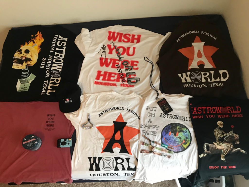
Consider the architectural rollout strategies of an artist like Travis Scott, particularly during the Astroworld and Utopia eras. Scott does not just release albums; he engineers highly commodified narrative worlds. His communication strategy relies on flooding the physical world with artifacts that carry the specific aesthetic code of his Cactus Jack brand. From limited-edition action figures and customized cereal boxes to meticulously designed fake company receipts and branded fast-food meals, every object is treated as a piece of the lore. When a fan purchases these items, they are not simply buying clothing or food; they are buying a physical ticket that grants them citizenship within Scott’s sonic theme park.

This dynamic entirely reframes the recent “vinyl revival.” The massive resurgence of physical records is rarely about audiophile sound quality; it is a design-driven phenomenon. The vinyl record has become the ultimate fetish object of the streaming age. Today’s most successful releases are heavily engineered physical artifacts. The communication designer constructs an unboxing experience that often includes elements far beyond the music itself: cryptographic zines, fake passports, architectural blueprints, and cryptic handwritten notes. The record itself is almost an excuse to distribute a highly curated art object.

What this demonstrates is that in a hyper-digital landscape, physical design is not obsolete; it is more critical than ever. The algorithmic feed is ephemeral, scrolling past the user in fractions of a second. To counter this, communication designers must create objects that occupy physical space—items that sit on a fan’s bedroom shelf and serve as a permanent, tactile anchor to the artist’s narrative world. The designer is no longer just visualizing the music; they are manufacturing the archaeological evidence that the world they built actually exists.

#7—Beyond Western Boundaries: AI, Fandom, and Worldbuilding in the K-Pop Model

Before diving into the core of this reflection, a special acknowledgment is necessary. This specific analysis is the direct result of academic networking, and I want to thank Didi for connecting me with Franzi, a fellow researcher currently based in Seoul. Her insights into the South Korean design and marketing landscape completely opened my eyes to a market I knew nothing about, allowing me to push my research far beyond its initial Western-centric focus.

When we analyze Communication Design in the contemporary music industry, we often focus on how artists construct visual architectures around their releases. However, building a “narrative world” is only half the job. According to the principles of Transmedia Storytelling, a worldbuilding strategy can only be considered successful when the audience actively inhabits it. The ultimate metric of a working design is the fandom. If fans decode the visual rules, engage with the ecosystem, and build a sense of community around it, the design has fulfilled its purpose.

While Western artists are experimenting with these concepts, the Korean music market (K-Pop) is lightyears ahead. In South Korea, the creation of a fandom is not left to chance; it is a highly engineered process where design, marketing, and cutting-edge technology merge. Specifically, the Korean industry has embraced Generative AI far more aggressively than the European market, using it as a structural tool to design these complex narrative worlds.

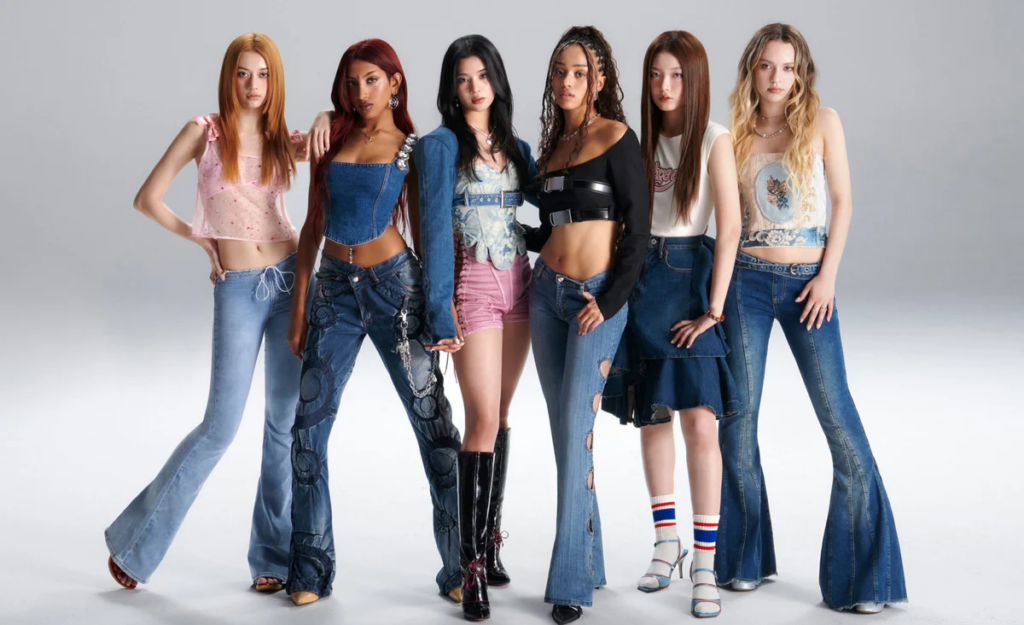
A perfect case study of this phenomenon is the group Katseye. Formed through a crossover collaboration between an American and a Korean label, they represent a fascinating hybrid: a global girl group designed for the international market, but entirely built using K-marketing strategies. From the meticulous curation of their visual codes to the heavy integration of AI in their promotional ecosystem, Katseye exemplifies how to systematically trigger community engagement.

Their visual branding isn’t just about looking good; it’s about creating shared feelings of belonging among millions of fans across the globe. Thanks to this new perspective, it becomes clear that the future of music marketing lies precisely in this intersection: using advanced technological workflows to design visual worlds that fans actually want to live in.