Du musst HEULEN, um zu lernen.

Reißerischer Titel, ich weiß. Worum geht es in diesem Blogeintrag?

Wie bereits mehrmals in meinen anderen Blogbeitragen erwähnt lernt es sich besser, wenn man den Lernstoff mit Emotionen verbinden kann. Das Prinzip wollte ich weiter erforschen. Hierfür habe ich mir ein paar Erklärvideos angeschaut und diese nach ihrem emotionalen, sowie wissenschaftlichen Faktor bewertet.

Doch warum lernen wir besser mit Emotionen? Und ist das wirklich immer von Vorteil?

Jetzt wird’s scientific

Die Neurowissenschaft hat schon längst bewiesen, dass Emotionen unser Gehirn beeinflussen und in diesem Zuge auch das Lernverhalten beeinflusst. Der präfrontale Kortex – das ist die Hirnregion, die für die Emotionsregulation, das Arbeitsgedächtnis, die Planung ua verantwortlich ist – sowie andere Hirnregionen werden aktiviert, je nach Emotion, die wir erleben. Sprich: Sind wir ängstlich wird eine andere Region aktiviert, als wenn wir Freude empfinden. All diese Bereiche sind an der Regulation von Emotionen, jedoch auch an der Entscheidungsfindung und dem Gedächtnis beteiligt. Die Amygdala (ganz wichtig für emotionale Aktivität) ist ganz eng verknüpft mit dem Hippocampus, der besonders wichtig für das Abspeichern von Erinnerungen ist. Diese eng miteinander verknüpften Hirnstrukturen führen also dazu, dass Emotionen und Lernen in einer totalen Abhängigkeit zueinanderstehen. Werden Emotionen getriggert, werden Erinnerungen erzeugt. [1]

Die „University of Wollongong Australia” veröffentlicht einen Artikel über „Affective learning“ [2] (affective = affektiv, gefühlsbetont lt. PONS.com). Affective learning beschreibt einen Lernprozess, bei dem Wissen durch emotionales Engagement gewonnen wird. Affective learning schafft eine Lernumgebung, in der positive Emotionen wachsen, wie Neugierde oder Enthusiasmus, wodurch größere Lernerfolge entstehen. [2] Für Designer:innen wie mich ist dies eine gute Nachricht: Möchten wir Wissen verbreiten, so haben wir nicht bloß Visuals und Interfaces zu gestalten, sondern ein emotionales Erlebnis.

Doch… ist emotionales Lernen wirklich IMMER besser?

Um besser zu veranschaulichen, was ich damit meine, habe ich mehrere Erklärvideos herausgesucht. Manche davon sind eher trocken gehalten und erklären das Notwendigste, manche davon arbeiten bewusst mit emotionalen Erzählstrukturen. Ich habe mich, ohne weitere Begründung, für das Thema Immunsystem des menschlichen Körpers entschieden und die erstbesten Vorschläge auf YouTube angeschaut, ohne weitere Auswahlkriterien.

Video 1:

Zero To Finals (30.12.2017): Understanding the Cells of the Immune System

Dieses Video ist eine klassische Whiteboard Animation. Die Betrachter:innen beobachten den „Lehrer“ beim Zeichnen, während ein Voiceover die Inhalte weiter erklärt. Dadurch ist es leicht den Informationen zu folgen. Die Stimme des Lehrers ist emotional wenig aufgeladen, eher recht faktisch. Generell ist das ganze Skript sehr faktisch. Die Erklärungen sind klar und leicht verständlich, jedoch unspannend. Dies ist ein klassisches Video, das sich Schüler:innen ansehen, die für die nächste Prüfung lernen. Es ist nicht für Unterhaltungszwecke gedacht.

Meine Bewertung:

1/5 Emotionaler Faktor

5/5 Wissenschaftlicher Faktor

Video 2:

CrashCourse (08.12.2015): Immune System, Part 1: Crash Course Anatomy & Physiology #45

Dieses Video ist eine Kombination aus Live Action und 2D Animation. Der Erzähler sitzt in einem „Klassenraum“ und spricht direkt zum Publikum. Einige seiner Erklärungen werden durch 2D Animationen ergänzt. Diese Animationen sind recht bunt, Zellen werden mit Gesichtern dargestellt. Die „bösen“ Zellen haben fiese Gesichtsausdrücke, die „guten“ Zellen schauen freundlich drein. Hier soll ein emotionaler Bezug zu den Visuals hergestellt werden. Kombiniert mit dem teilweise sehr reißerischem Erklär-Stil des Lehrers wirkt das gesamte Video emotional sehr aufgeladen. Erklärungen sind voll mit kleinen Storytelling-Elementen. Es werden viele beschreibende Adjektive verwendet. All das regt Emotionen an. Ein Beispielsatz aus dem Video zur Veranschaulichung:

„Like a wall around a fortress, your skin does a fantastic job of keeping out all manner of malevolent microorganisms.”

Hintergrundmusik und Soundeffekte tragen auch stark dazu bei.

Ich muss in meiner Bewertung jedoch Punkte beim Lern Faktor abziehen. Das Video ist sehr unterhaltsam und legt wert auf viele Visuals und Storytelling-Elemente. Diese lenken jedoch ab und an von den wissenschaftlichen Fakten ab. Das rasante Erklärtempo macht es einen fast unmöglich sich jede Information zu merken. Dieses Video ist mehr dafür geschaffen zu unterhalten und Basiswissen zu verbreiten, als dass Schüler:innen oder Studierende damit für eine Prüfung lernen könnten.

Meine Bewertung:

4/5 Emotionaler Faktor

2/5 Wissenschaftlicher Faktor

Video 3:

Dinge Erklärt – Kurzgesagt (15.08.2021): Das Immunsystem erklärt

Videos von Kurzgesagt arbeiten mit viel Storytelling, sei es in der 2D Animation, dem Sprechertext, der Sprecherstimme oder der Hintergrundmusik. Im Video „Das Immunsystem erklärt“ wird die Immunabwehr dramatisiert. Anstatt dass Zellen „abgebaut“ werden, wie man in der Zellbiologie darüber spricht, werden hier Zellen „getötet“. Die Zellen des Immunsystems werden als Soldaten, Geheimagenten und Selbstmordbomber bezeichnet. Die Immunabwehr ist ein dramatischer Kampf um Leben und Tod, Zellen „opfern“ sich für das Überleben anderer Zellen.

Das Video ist damit höchst unterhaltsam und erzählt eine äußerst emotionale Geschichte. Der:die Betrachter:in fiebert mit den kleinen Soldaten-Zellen in ihrem Kampf gegen die „bösen“ Bakterien mit.

Faktisch lässt das Video dabei jedoch nach. In den anderen Videos werden komplexe Bezeichnungen eingeblendet, das fehlt hier vollkommen.

Meine Bewertung:

5/5 Emotionaler Faktor

1/5 Wissenschaftlicher Faktor

So, das war jetzt viel Analyse, was haben wir daraus gelernt?

Die Videos haben gezeigt: Emotion kommt vor allem durch Storytelling. Und je mehr Storytelling, desto unterhaltsamer war das Video. Ich habe jetzt keinen Prä- und Post-Wissenstest gemacht, nehme jedoch an, dass der Unterhaltungs-Faktor mit dem Erinnerungs-Faktor zusammenhängt. Was mir jedoch auffiel: Je unterhaltsamer die Videos, desto weniger Fokus lag auf dem eigentlichen wissenschaftlichen Inhalt. Hier müsste man ebenfalls Prä- und Post-Wissenstests durchführen, doch ich nehme an, dass all das Storytelling oftmals vom eigentlichen Lerninhalt ablenken kann.

Erstellt man also ein Erklärvideo, muss man sich dafür entscheiden, was man damit erzielen will: Soll dieses Video der Unterhaltung dienen, oder soll das Video Schüler:innen und Studierenden als Lernhilfe für den nächsten Test dienen? Geht man zu weit in die Richtung der Unterhaltung, geht der Fokus auf die Fakten verloren. Geht man zu weit in die Richtung der Fakten, wird das Video langweilig.

Ich denke nicht, dass es unmöglich ist ein Lernvideo zu erstellen, das sowohl unterhaltsam als auch höchst faktisch ist, doch es bedarf viel Fingerspitzengefühl den Fokus nicht zu verlieren und auf eine der beiden Seiten zu schwappen.

Quellen:

  1. Silva, Clarice Gomes da/ Nóbrega, Manassés Pereira: A neuroscientific approach to the importance of emotions for the meaningful learning process In: Navigating through the knowledge of education. o.O.: Seven Editora 2024, S. 690-702
  2. Nepal, Rabindra/Mahadeo, Jyoti Devi(10.10.2023): Using affective learning to foster engagement and critical thinking. In: University of Wollongong, https://www.uow.edu.au/media/2023/using-affective-learning-to-foster-engagement-and-critical-thinking.php (zuletzt abgerufen am 21.01.2026)
Integration of 3D Models on the Web p.02

3D Model Formats and Web Optimization

In web-based 3D visualization, file format plays a big role, impacting performance, compatibility and efficiency in the workflow. That is why choosing the wrong file format can be catastrophic for the project, increasing load times, putting a lot of strain on system resources and creating incompatibilities with software tools. Apart from the standard 3D file formats such as obj and fbx, there are formats specifically designed for usage in game development and the web. Those two are glTF and GLB. Both of these serve as containers for 3D models but they differ in use cases.

glTF

glTF (Graphics Library Transmission Format) is a text-based, JSON(JavaScript Object Notation)-encoded standard specifically designed for the efficient transmission of 3D scenes and models. The text-based nature of the file enables humans to be able to read it and thus, be able to easily edit and debug the files. This transparency is especially advantageous during development, as that is the stage where small adjustments can be made directly in the file instead of having additional editing steps.

Compared to GLB, glTF produces a slightly higher file size as it relies on JSON. However, the modularity glTFs provide allow developers to reference external assets such as textures and animations. This flexibility makes glTF very suitable for large projects that reuse assets across multiple scenes. The increased file size needs to be accounted for when planning such a project, but this drawback is often outweighed by the ease of customization within these big projects. This is why glTF is often chosen for complex web applications that need more flexibility with updates.

GLB

GLB represents the binary version of the glTF file format. It combines all the model data (geometry, materials, textures and animations) into a single binary file. This structure enhances machine readability and thus, significantly improves loading time. Browsers can read the files directly instead of needing to interpret the JSON text.

This is why the GLB is typically smaller and loads faster, leading to a big advantage in environments that require high performance such as augmented reality applications. The unified structure of the GLB also simplifies file management, since everything is embedded into a single file. This unification reduces the risk of textures going missing or references being mismatched.

Requirements for Web Based 3D

With the knowledge of the different methods how 3D environments can be rendered on the web and the special file formats for 3D files, creating these web based 3D applications comes with additional platform specific requirements. For example, even though WebGPU represents the future of browser based graphics, it is currently limited to a certain set of browsers and computers. Mobile browsers for example do not have WebGPU support, which is why WebGL is still used so much today. Optimizing for mobile ensures that performance stays stable and responsive interactions are maintained, even under constrained resources. Another limiting factor is bandwidth, as large files can become bottlenecks for load time, especially on slower network connections. That is why file compression and small file sizes are so important in web development in general.

3D Model Optimization

Effective 3D model optimization is extremely important in web design. Unoptimized assets can severely reduce performance regardless of hardware or bandwidth availability. Assets that have been optimized have much faster load times, reduced bandwidth usage and improved user interaction. Smaller models are also easier to animate and integrate.

An important concept in model optimizations is LOD (Level of Detail). The same object often has several LODs, that represent the models complexity based on the distance of the viewer. For example when the camera is within 10 meters of the model, the full resolution is shown. But at 10-50m the full resolution model is replaced by a simplified version with, for example, 50% less polygons. Sometimes the reduction in LOD goes so far as to replace the whole model with a static image at great distances. The distances and transitions between LODs have to be chosen very carefully though as to avoid loading artifacts or noticeable changes in detail.

Simplifying the geometry is another major optimization technique. It is also needed for LODs, but the full resolution model for example should still be as optimized as possible. Mesh simplification tools can automatically remove unnecessary vertices and faces that might be duplicates or not even visible to the camera. Manual retopology is another very powerful but time extensive method that allows artists to craft low poly versions of the models.

SOURCES

1: https://visody.com/this-is-what-you-need-to-know-about-gltf-3d-model
2: https://resources.imagine.io/blog/gltf-vs-glb-which-format-is-right-for-your-3d-projects
3: https://ikarus3d.com/media/3d-blog/glb-and-gltf-files-purpose-difference-and-area-of-application-in-3d-modeling-services
4: https://www.sloyd.ai/blog/how-to-optimize-3d-models-for-real-time-generation
5: https://mazingxr.com/en/glb-vs-gltf/
6: https://blog.pixelfreestudio.com/how-to-optimize-webgl-for-high-performance-3d-graphics/

Conclusions, Part 2: What works for advanced students? 

As a continuation of the last blog post, I would like to explain my findings about what works for advanced students, regarding the central research question of: How can we use interaction design to assist in the training of aerial silks, especially in enhancing people’s proprioception? 

Besides what was already explained as best practices for beginners (which can also help some advanced students), the other strategies that I’ve found to be beneficial are as follows. 

  • 3D model miniature 

Some teachers utilize novel methods such as 3D miniatures to explain figures and sequences, eliminating the need to go up in the silk, which when done repeatedly, takes a lot of physical energy from the teacher. 

  • Real-time communicator (through video or speech) 

When up in the air, advanced aerialists find it helpful to have a second person (or even a video projection) to keep track of what the next move is, and either be able to communicate it through shared language (if there’s a second person), or through observational learning (if it’s a video). 

  • Reference to base knots and common language 

Since advanced aerialist now have learned the names of the base knots and basic figures (footlock, kneelock, hip key, catcher’s pose, porter, star drop, etc.), when building new knowledge it’s more beneficial to fall back on this past knowledge, instead of relying on the beginner’s explanation methods. 

  • Analogies to other figures 

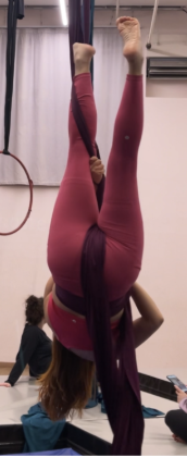
In a similar manner to the past point, when learning a new skill in aerial silks, advanced students find themselves unconsciously relating them to past knowledge. For the figure shown in the picture, the unmethodological approach would be to explain it as “go upside down, hug one silk with one leg, keep grabbing it, and now use the hand that’s not on the wrapped silk to grab it from below and put it over your other leg, so that the silk is hanging in between your legs and toward the back.” Obviously, this unmethodological approach to explaining the knot is not sustainable, so advanced aerialist would translate it as follows: 

  1. Go upside down = invert 
  1. Hug one silk with one leg = make a half angel 
  1. Everything else = make a catcher’s pose / as if you were doing a star drop 

Or, even simpler, a more advanced aerialist would just explain it as “make a catcher’s wrap on one silk” (since it’s assumed that to do a catcher’s wrap you must either invert and make a half angel, or invert and hook). 

Own image. 

– 

Sources: 

Own research. 

Conclusions, Part 1: What works for beginners? 

Throughout the whole semester, I’ve been conducting field research in order to try to answer the question of: How can we use interaction design to assist in the training of aerial silks, especially in enhancing people’s proprioception? 

In these last 2 blog posts, I would like to expose my findings, divided by what works for beginners and what works for advanced students. Moving forward, I expect these 2 to be protopersonas for testing future prototypes and validating my results next semesters. 

Now, on to what works for beginners: 

  • Naming figures 

Even though there are no international or national standards for naming sequences or figures, each studio should have their own set of naming conventions to facilitate shared language. 

  • Directory of figures 

Since new students can join a studio at any time, and to lower the cognitive load of remembering previously learned sequences or figures, studios should follow Nielsen’s heuristic of Recognition rather than Recall, and document the names and pictures (or ideally, videos) of the sequences and figures in a directory accessible to all students. 

  • 2-colored unitard / specific accessories 

For students who struggle differentiating their left from their right, teachers could provide the option to tailor a custom unitard with half a side in one color and the other half in another. This would help students clearly see and understand the relationship between each side of their body in the air, whether it be through observational learning or through own practice with a real-time communicator. 

If there’s not enough budget for this, however, students could also wear a big bracelet on one hand and a big anklet on the respective leg, in order to help in differentiating left from right. 

  • 2-colored silk 

For even more directionally challenged students, silks where each tail is a different color could be helpful, since it would be easier to explain to them “grab the red silk” instead of relying on “grab one silk … no not that one, the other one.” 

  • Floorial work

Learning a new wrap and understanding how it feels is not an easy task. As such, it’s always easier to simulate the silk wrapping process while on the floor, to be able to wrap your mind around where each silk and part of your body must go in order to complete it.

  • Limb position references relative to our body, not the world 

When communicating a new sequence or figure, teachers must not use world-relative references. It’s easier for students to understand relationships between body parts when they’re being explained to them in a way that they can see (eg. Explaining directions of turns with either “towards your pinky toe” or “towards your big toe”). 

  • Analogies to everyday experiences 

When teaching new moves, it’s also helpful to relate the physical movements to other, everyday movements students are already used to. For example, one specific type or grip (depicted in the image), can be explained as “look at your watch, and then straighten your arm” / “move your hand to your temple as if you had a fever, and then straighten your arm” / “imagine you were a flamenco dancer, now do the typical move” — this helps the student more easily learn and remember the direction of the grip, instead of needing advanced spatial awareness. 

Image from [1]. 

– 

Sources: 

[1] “Half flamenco grip,” Aerial Fit Online, Accessed: Jan. 22, 2026. [Online.] Available: http://aerialfitonline.com/silks/half-flamenco-grip/ 

Who Was It?

Another popular board game is “Who Was It?”, in which players must search a castle for a magical ring that has been stolen by one of the castle’s inhabitants. Only the magical ring can save the kingdom from the evil wizard, who will reach the castle at 6 p.m. With the help of an interactive treasure chest, which also lets time run down and puts the players under pressure, the animals can be questioned as witnesses. Each animal demands a specific type of food that the players must find in the castle. Once they have found the food, they can give it to the animal, which then provides a clue in return, such as: “The thief is wearing black shoes.” In this way, the castle inhabitants who are not suspects can gradually be eliminated.

The game is made more challenging by a ghost that moves from room to room and chases the players back to the children’s bedroom, where they must start over, as well as by trapdoors, failed magic spells, and a thieving raven that steals food.

If the thief is caught before time runs out, the players can open the thief’s chest and the kingdom is saved.

Why is “Who Was It?” so well suited for physical education classes?

It requires a high level of cooperation and communication: players must coordinate with one another about which animals have already been questioned, in which rooms keys or food are hidden, and who can be ruled out as the thief. In addition, players do not compete against each other but work together toward a common goal: saving the kingdom. The time frame is particularly suitable for PE lessons, as the length of the game can be adjusted individually. The number of castle inhabitants and animals can also be adapted. In the original game, there are three different difficulty levels, which can be selected according to the students’ age and transferred to the real-life version of the game.

How the game could be adapted for physical education:

The animals or rooms of the castle are distributed across different stations in the gym or on the sports field. Simply running back and forth between the stations already gets the students moving. To perform actions such as searching, feeding, or asking, physical exercises must be completed. These could be detected by a Kinect sensor, which would then trigger the corresponding action in the interface. For this, each station would need a sensor and a device that enables interaction and provides audio feedback. At a central station, the food items are stored and the clues about the thief are collected.

The history of aerial silks 

The exact origins of aerial silks are still disputed [1]. Some sources mention that the first mentions of it were in a French newspaper in the 1950s, in which a circus student presented a novel act with long pieces of fabric [1] [2].  

Other sources debate that it was actually invented by André Simard of Cirque du Soleil in 1980s Canada, where he combined his circus and gymnastics training into this new discipline [1]. However, Simard not only focused on the athletic aspect of the sport, but he also transformed silks into the highly performative art form it is today – it’s not just a display of strength, but also a method to convey narrative through performance art [1]. 

Isabelle Vaudelle is also sometimes credited as one of the initiators of the sport, since she performed silks at the Festival Mondial du Cirque de Demain in 1995, where according to some, it was first officially recognized [1]. On the other hand, some say the first official recognition of the sport was when Vaudelle performed silks with Isabelle Chassé in the Cirque du Soleil show Quidam in 1998 [1]. 

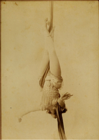
Several sources report the following photo being taken in the early 1900s, showing a silks performance at a vaudeville theater by Amy LeVan [1]. 

Image from [1]. 

The origins of the art get even more complicated to pinpoint with some sources citing records of silks being used in ancient Chinese circus performances more than 2,000 years ago [2].  

Whatever the origin, modern aerial silks captivated the audience for its unique storytelling, since earlier circus apparatuses used for acrobatic performances were rigid and unmoving, such as the trapeze [2]. As such, acrobats could now use not only their own bodies but also the apparatus in itself in their narrative pursuits [2]. 

Nowadays, aerial silks are not only used in a circus context, but they have also been introduced as a fun fitness exercise due to the nature of the sport, which requires full-body strength [2]. 

– 

Sources: 

[1] “The Fuzzy History of Aerial Silks,” Aerial Physique, Accessed: Jan. 16, 2026. [Online.] Available: https://www.aerialphysique.com/post/have-you-been-wondering-this-too 

[2] “A Fascinating Guide to Aerial Silks History,” Synergy Gymnastics London, Accessed: Jan. 16, 2026. [Online.] Available: https://www.synergygymnastics.co.uk/a-fascinating-guide-to-aerial-silks-history/ 

5. The Invisible Bias

Away from the “fidgety boy”: Why our view of neurodiversity is often blind to gender and culture

When we talk about neurodiversity, many people still have a very specific image in their minds: the young student who disrupts class or the brilliant but socially awkward IT expert. These clichés are not only outdated, they are dangerous. They shape how we build simulations, how we design software, and who ultimately gets the support they need and who doesn’t.

In my research, I noticed that most tools that depict “sensory overload” focus on the visible, almost “loud” symptoms. We see someone covering their ears or closing their eyes. But what about those we don’t see?

A key reason for gender bias in diagnosis and design is what is known as masking (or camouflaging). FLINTA individuals in particular often learn at an early age to suppress their neurodivergent traits in order to meet social expectations.

Masking is not simply “pretending.” It is a highly complex, unconscious, and extremely exhausting process. You are constantly scanning your surroundings: Am I laughing at the right moment? Am I staring at the person I’m talking to for too long? Do I seem too absent-minded right now? While you appear completely calm and “functional” on the outside, your brain is racing at 200% in the background.

In terms of design, this means that if we only optimize for visible symptoms, we exclude the entire group of people who mask their symptoms perfectly. A study clearly shows that this camouflaging correlates directly with a higher rate of depression and burnout. So if an interface wants to be “barrier-free,” it can’t wait for a user to “look overwhelmed.” It must assume that stress often occurs internally.

Neurodiversity does not exist in a vacuum. It is inextricably linked to gender, but also to cultural and ethnic origin. Researchers often refer to this as the intersectional gap.

For example, a white child with ADHD symptoms is often seen as “in need of treatment” or “gifted but restless.” Statistically, the same symptoms are far more likely to be misinterpreted as “indiscipline” or “aggression” in Black children or children from marginalized communities. As a result, neurodivergent people from these groups are often diagnosed very late or not at all.

For us designers, this means that when we create personas or look for test groups for our products, we must not only represent “standard neurodivergence.” We have to ask ourselves: How does a person with ADHD use my app who also struggles with racist stereotypes in everyday life and therefore has an even greater need for security and predictability?

And in order to improve it, we first need to understand it better.

Conclusion: Inclusion requires diversity in the database

Accessibility is not an “add-on” that you slap onto a finished product. It is an attitude. Ultimately, greater inclusion helps everyone.

Neurodiversity does not exist in a vacuum. A woman with ADHD experiences barriers differently than a man, as racialized and gendered stereotypes complicate diagnosis and acceptance.

Sources & Links:

  • Hull et al. (2017/2020): Sex/Gender Differences in Camouflaging in Autism. Link to Study (PMC)
  • Hull‑Artikel (Journal)
    Hull, L., Lai, M.-C., Baron-Cohen, S., Allison, C., Smith, P., Petrides, K. V., & Mandy, W. (2020). Gender differences in self-reported camouflaging in autistic and non-autistic adults. Autism, 24(8), 1–13.
  • John Innes Centre Blog (Webseite/Blog)
    John Innes Centre. (2025, 5. August). Exploring neurodiversity through an intersectional lens. Abgerufen von https://www.jic.ac.uk/blog/exploring-neurodiversity-through-an-intersectional-lens/
  • Tiimo App Blog (Webseite/Blog)
    Tiimo. (2024, 12. Dezember). Masking in autistic women and girls: What it is and why it matters. Abgerufen von https://www.tiimoapp.com/de/resource-hub/masking-autistic-women-girls
  • Crenshaw‑Aufsatz (Original 1989)
    Crenshaw, K. (1989). Demarginalizing the intersection of race and sex: A Black feminist critique of antidiscrimination doctrine, feminist theory and antiracist politics.

Note: This text was developed with the assistance of artificial intelligence for research purposes and to refine the linguistic clarity and flow of the final draft.

4. Experiencing the World Differently: Experiential Design as an Empathy Bridge

Another area I want to explore is awareness of neurodiversity. What is it actually like to have a brain that functions differently? To answer this, static descriptions often fall short. This is where interactive simulations, such as VR or AR applications, come into play. There are already impressive tools helping neurotypical people understand sensory processing in autism and ADHD.

In the world of design, we often repeat the mantra: “You are not your user.” But how do you design for someone whose neurological sensory processing is calibrated fundamentally differently? This is where Experiential Design becomes essential. Instead of just reading facts about neurodivergence, simulations allow us to physically bridge the “empathy gap” and experience the Double Empathy Problem (the mutual struggle for understanding between neurodivergent and neurotypical individuals) firsthand.

Simulations: Feeling the Sensory Overload

A “sensory overload” is not just mere discomfort; it is a neurological flood. Interactive systems use visual and auditory distortions to make this state tangible:

  • The Party (The Guardian VR): This VR experience places users in the shoes of an autistic teenager at a birthday party. You experience how harmless sounds—laughter, the clinking of ice cubes—gain the same priority in the brain as the main conversation, eventually leading to a “meltdown.”
  • Too Much Information (National Autistic Society): A simulation of a supermarket visit. It uses extreme contrasts, flickering lights, and amplified audio frequencies to represent the failure of “sensory gating”—the neural filter that normally sifts through stimuli.

The Next Level: Simulating Cognitive Barriers

While sensory input is often the focus, other aspects of neurodiversity remain largely invisible in the design process. It would be fascinating to incorporate concepts like Time Blindness or Object Permanence into these interactive experiences:

  • Time Blindness: A simulation could manipulate the perception of time—perhaps by having a UI clock run irregularly or by delivering notifications in a way that dissolves the sense of “soon” versus “now.” For designers, this highlights the need for clear progress bars and visual timers rather than vague temporal cues.
  • Object Permanence: In the world of ADHD, the phrase “out of sight, out of mind” is often a literal cognitive hurdle. A simulation could demonstrate how quickly vital tasks or tools “cease to exist” once they vanish from the immediate field of vision. This would underscore the importance of persistent navigation and visual anchors.

Why This Matters for Designers

These tools are not built for “spectacle” but for awareness. When we, as designers, experience how paralyzing a flashing banner or a loud autoplay video can be during sensory overload, it permanently shifts our priorities in the UI/UX process.

It’s no longer just about aesthetics or conversion rates; it’s about cognitive accessibility. We learn that accessibility isn’t a “plug-in” or a secondary feature, it is the foundation of an inclusive digital space. It is time we stop designing for a “standard user” who doesn’t actually exist in reality.

This is a really good example of sensory overload. It would be interesting to incorporate other issues, such as time blindness or object permanence, into the experience. It’s something to consider further.

Sources & Links:

  • The Guardian VR (2017): The Party: A virtual experience of autism. Link to Project
  • National Autistic Society (2016): Too Much Information (TMI) Campaign. Link to Campaign
  • Damian Milton (2012): On the ontological status of autism: the ‘double empathy’ problem. In: Disability & Society. Link

Note: This text was developed with the assistance of artificial intelligence for research purposes and to refine the linguistic clarity and flow of the final draft.

Blog Post 9: Survey preparations

As mentioned in the previous blog post, the final step of the project at this stage is to prepare and conduct surveys at at least two train stations in Germany. To achieve this, all preparations for the survey execution must be carefully planned and completed. Once this is done, the questions can be tested in a pilot phase before being used in a public setting.

Locations

To gain a more diverse insight into the opinions and experiences of travelers at German train stations, I plan to conduct surveys at two different locations. If the project is continued at a later stage, this approach could be expanded to include additional stations in order to further broaden the range of perspectives. For the current phase, however, two locations are realistic given the available time and resources. The selected stations are Augsburg Main Station and Berlin Main Station. These two locations differ significantly in terms of size, geographical context, and user demographics, which should provide insights from a wide range of travelers in varying situations.

Questions

There are several types of questions that can be used in a survey, including open-ended and closed-ended questions, as well as formats such as nominal scales, Likert scales, rating scales, and yes-or-no questions. To begin the survey, closed-ended questions are particularly useful because they offer predefined answer options, making them quicker and easier for participants to respond to. They also allow for the collection of clear, comparable data. These questions can then be followed by open-ended questions, which do not restrict responses and give participants the freedom to express their thoughts in their own words, allowing for deeper qualitative insights (Content Square, 2024).

For this project, I will primarily use closed-ended questions, specifically rating-scale questions and yes/no questions. These formats provide participants with clear answer options, making the survey quick and easy to complete while still producing structured and comparable results. In addition, I will include a small number of open-ended questions to gather more detailed and in-depth responses. Overall, the survey will be designed to be brief, keeping the required effort for participants as low as possible. A shorter questionnaire also allows me to approach more people within a limited time frame, enabling the collection of a wider range of perspectives.

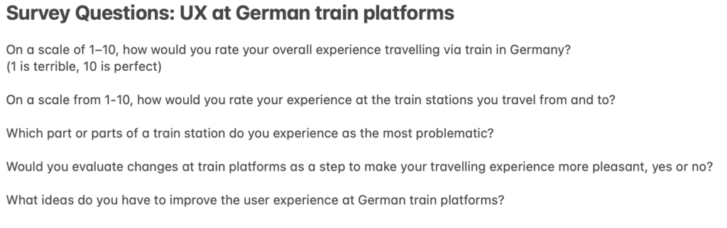
The questions I’m planning to ask are:

Approach

Before finalizing the questionnaire, I will test the questions with people in my immediate surroundings. Based on their feedback, I will make the necessary adjustments to improve clarity and effectiveness. This process will result in a finalized version of the questionnaire, which will then be used at the selected train stations.

I plan to record the interviews after obtaining the participant’s consent. As I do not intend to ask any personal or sensitive questions, data protection regulations should not pose an issue when using the collected information. The interviews will be recorded on my phone and later used to support a more accurate and efficient analysis of the data. I plan to visit each selected location one to two times and approach as many travelers, station employees, and other relevant individuals as possible.

Information Gathered

This week, I was able to develop a more detailed and finalized plan for the survey process. I also deepened my understanding of different question types and identified those most suitable for this project, allowing me to integrate them effectively into my research design.

Next Steps

I will allocate up to two weeks for conducting the surveys, particularly because the research location in Berlin requires travel. During this period, I aim to collect as many responses as possible to analyze the data thoroughly and draw meaningful conclusions.

References

Content Square. (5. November 2024). 24 on-site survey questions to ask your users. Von Content Square: https://contentsquare.com/guides/surveys/questions/ abgerufen

3. Designing for ADHD vs. Designing for Awareness

Okay, I’m wondering where I want to go with my research. Do I want to do something for neurodivergent people, or do I want to raise awareness among neurotypical people about what it’s like to be neurodivergent?

I have ideas and approaches for both directions, which I would like to discuss here one by one in the hope of being able to make a decision afterwards.

Direction 1: Tools for people with ADHD

The aim here is to make everyday life easier. As I mentioned in my last blog post, executive dysfunction is a big issue. Tasks can feel very daunting for people with ADHD, so it can help to break large tasks down into smaller subtasks.

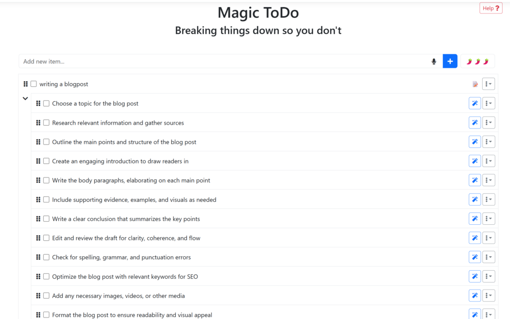
There is already a tool called gooblin.tools that breaks a large to-do list down into many small subtasks.

But here’s where it gets tricky: if I break a task down into twenty small steps, I suddenly have twenty tasks instead of one. For an ADHD brain, this can be just as paralyzing. You get lost in the details, the list seems endless, and your focus wanes. Real interaction design for neurodiversity must therefore go beyond simply “breaking things down.”

Where my research comes in: Three ways beyond the list

I ask myself: How can interfaces help us without overwhelming us with new information? In the specialist literature, there are strategies that I want to examine as design principles:

1. Adaptive scaffolding Instead of immediately showing the user all 20 subtasks, a system should only highlight the zone of next development. This means that I only ever see the next step. The interface keeps the rest of the list “invisible” in the background so as not to overload the working memory. Only when step A has been completed does step B appear.

2. Externalization & visual anchors Executive dysfunction often means that you cannot keep track of the time and sequence of tasks in your head. Design can act as an “external cognitive support” here.

• Instead of text: visual roadmaps or timers that show where I am in the process.

• Instead of lists: interactive boards that make priorities tangible through color or size.

3. Digital body doubling: An exciting approach from practice is “body doubling”. The mere presence of another person helps you stay in the flow. How can interaction design simulate this feeling?

•    Through focus spaces where you can see that others are also working.

•    Through interfaces that create a kind of “gentle presence” or social commitment without building up pressure.

It requires a balance that still allows for autonomy and does not come across as patronizing. A tool like this would have to function as a “breathing scaffold”: providing structure when task paralysis kicks in, but discreetly retreating as soon as you are hyperfocused,

It’s not about taking the user by the hand like a child, but rather making the interface flexible enough to adapt to the current cognitive load.

References & Further Reading

  • Vygotsky, L. S. (1978): Mind in Society. The foundational work on the “Zone of Proximal Development” (ZPD). It explains why effective support (Scaffolding) must be placed just beyond a person’s current independent ability to help them reach the next level of action.
  • Schmidt-Pott, H. (2024): Executive Dysfunction & The Action-Gap. A deep dive into why neurodivergent individuals often struggle to translate complex internal plans into physical steps. It highlights the specific need for tools that bridge this “initiation gap.” (Link)
  • Bien-être Autiste (2023): Understanding Task Paralysis. This research discusses how “Choice Overload” and unorganized information lead to mental freezing. It advocates for reducing visible options to prevent the brain from becoming overwhelmed by its own to-do lists. (Link)
  • Maier, G. (2024): Externalization and Body Doubling Strategies. An exploration of how external cues (visual timers, roadmaps) and the presence of others (Body Doubling) can bypass executive blocks and create a sustainable flow state. (Link)

Note: This text was developed with the assistance of artificial intelligence for research purposes and to refine the linguistic clarity and flow of the final draft.