Blog Post 6: Elevator Pitch

Picture the situation: You’re at a train station and there’s so much going on. You may be at the wrong part of the platform or it’s crowded and getting in and out of the train is very complicated. You may be limited physically so you cannot even board the train or you have heavy luggage or a bike with you. That’s a problem that occurs on many train stations around Europe but especially in Germany. There are missing cues for communication and support for stress-free and efficient structure.

The idea that I have to solve this problem is a leading system that would be integrated into the platform that would make orientation, understanding and a barrier-free use much easier. The USP is very simple, it’s not there yet. There is information and a leading system happening at the moment but it’s often handled with signs which can be insufficient or wrong. The information is there but it’s normally more in an app or on paper and not in a physical space visible.

And why I want to take on this problem is because I am also going on trains a lot of the time, traveling a lot via train and I want to solve this problem because it would help a lot of people and also an interaction designer and a media designer that wants to take on this challenge.

Phonetics | R&D 2 | Blog 2

The human voice is such a fascinating tool, yet so complex. My project is heavily dependent on input signals based on human speech and so I considered doing some dedicated research on it. I was quite astonished by the results and was surprised to discover this world of phonetics and linguistics, which were so new to me.

I wanted to dive deeper and understand the ways the sounds in human speech differ and see just how varied they are. This brought me back to one of the assignments I did last semester for the Digital Signal Processing course. We were asked to record different vowels and analyze the distinctions between them. Formants were identified as the primary acoustic cues for vowel identification. The differences between the first two formant frequencies (F1 and F2) helped us distinguish each vowel. 

For instance, in our exercise the vowel “U” only had a difference of 500 Hz, while a vowel like “E” had a difference of over 1600 Hz. The vocal tract acts as a filter, by altering the position of the tongue, jaw, and lips the speaker changes the shape of this resonating tube. This physical manipulation amplifies specific frequency bands (formants) while dampening others.

Apart from this, we also have consonants which possess their own unique characteristics. In English phonology, consonants can be split into 6 different categories based on their articulation. These include plosives, fricatives, affricates, nasals, approximants and laterals. These sounds are produced based on variations in airflow between the vocal tract and lips. Additionally, linguists have classified these consonants into 2 categories based on voicing: voiced (where the vocal cords vibrate when the sound is made) and voiceless (where the vocal cords do not vibrate, and the sound is shaped purely by breath).

While figuring out ways to test out these consonants with my prototype, I realized it would be cool to experiment with modern day beatboxing. I was inspired to do this while watching a WIRED video about the different levels of beatboxing. Popularized by the African American communities in the US during the mid 80s, it grew into a huge sensation and remains a staple in pop culture today. It would be a really cool way to experiment and analyze speech, as these artists use fricatives and plosives to recreate the rhythms similar to a drumkit. I am curious to see how this will turn out.

This also made me realize that I could add some sort of live audio detection tool for speech analysis. I am planning to search for a few Python libraries I could use to achieve this. This could be a very interesting add on to the project and would validate important information about the phonetic structure of the speech, providing valuable insights for singers, voice actors and other professionals working with the human voice.

Creature Design – Visual Exploration (Part 2)

Last time I showed my concepts for Producers and Primary Consumers in the oceans of Europa, today we move on the Secondary and Tertiary Consumers.

Secondary Consumers

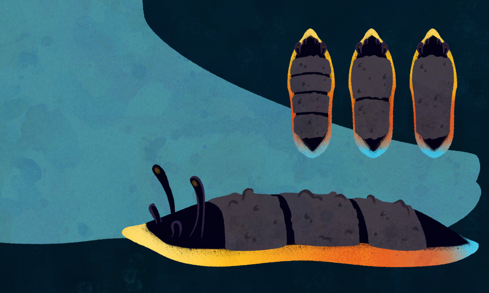
Volcanic Slugs are part of the same phylum as Iron Beaks, the Laminaferrea, though they belong to a wholly different class – the Saxumlucidum, a strange case of convergent evolution leading to class of animals similar to gastropods on Earth. Though unlike the gastropods we are familiar with they have developed a kind of scales on their back. It’s not clear yet what the purpose of these is, though it might be a way to protect themselves from other members of their species, as they often show cannibalistic tendencies.

Volcanic Slugs are commonly found in the shallow zones, though there are around 2.000 species we know of so far that can be found even in depths of around 70km. Volcanic Slugs are exclusively carnivores mainly predating on Antennae Trees, whose chemical-laden bodies they are not only able to process, but also turn into a strong toxin that deters predators. This might also be the reason for their bright colour.

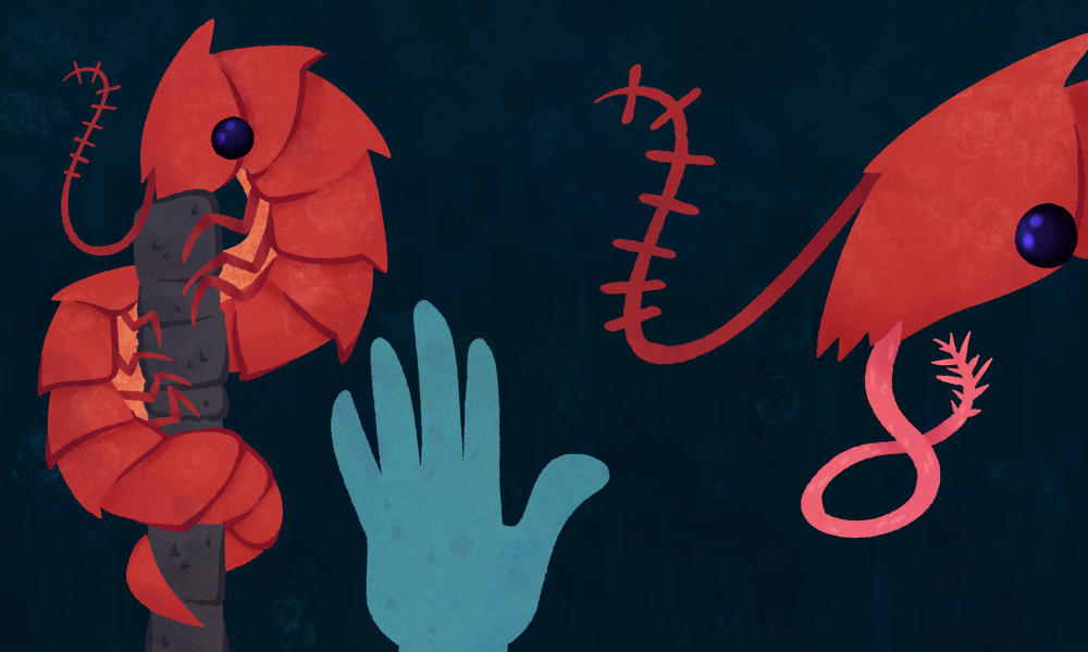
The Pipe Cleaner Crab is another member of the Reptator order and has evolved to be monophagous, meaning they exclusively eat one type of prey.  As the name might suggest, this prey is the Pipe Worm. The Pipe Cleaner Crab will crawl up their shell-structures and shove their heads into the openings. With their long, barbed tongue they will impale the worm and pull it out in pieces to be devoured. Due to their rapid metabolism, they spend a majority of their time eating, devouring about 40%-50% of their own body weight each day.

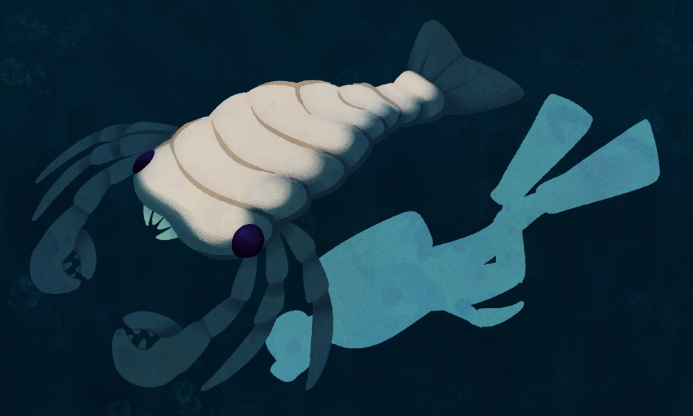
Sea Nymphs are part of the Cancernatans order, which represents members of the Armaturatus phylum that have evolved away from being ground-dwellers and instead developed their appendages into fins, allowing them to swim in the open ocean. Sea Nymphs grow to be around 1.7m, and predate on any Armaturatus, that’s small enough to fit into their claws. These claws have a very similar shape to a crab cracker tool and serve the same purpose – crushing their prey’s shell so they can get to its soft insides.

Sea Nymphs can be found anywhere in shallow to mid-level oceans. Though they are technically free-swimming, they live very close to the ocean floor and will crawl around quite frequently given that their legs haven’t atrophied as is very common for other members of their order.

Tertiary Consumers

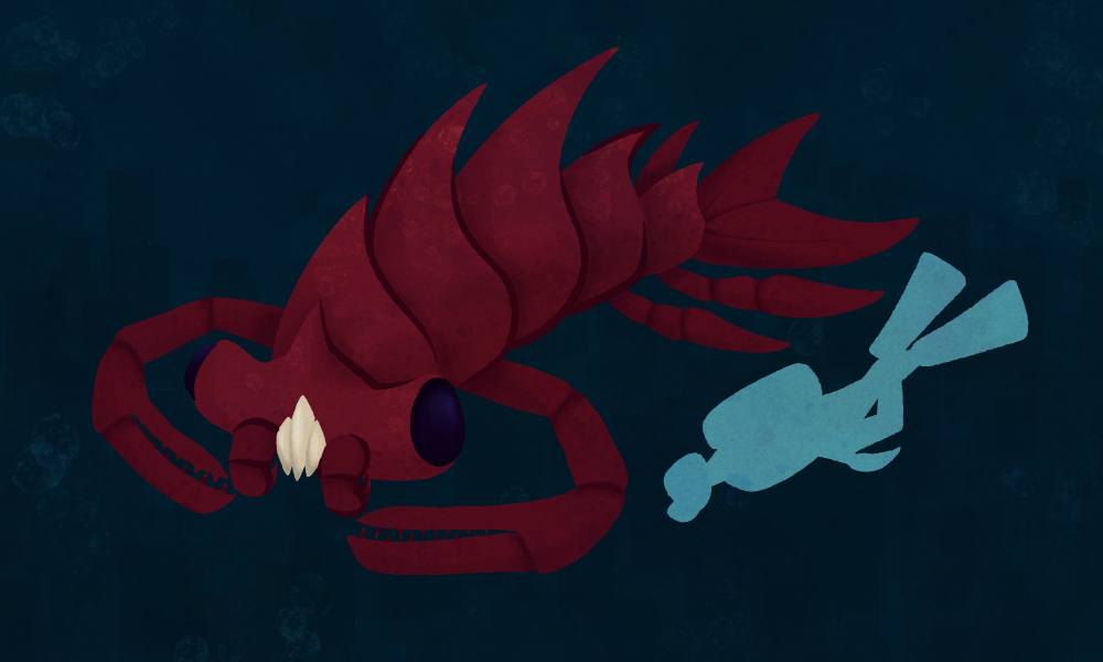
Shell-Breakers are one of the most feared predators in the oceans of Europa. They’re the largest member of the Cancernatans order, growing up to be around 2.8m long. They’re pursuit predators and hunt solitary – they usually prey on Sea Nymphs and other large members of the Armaturatus phylum that they hunt down to exhaustion. They have articulated “fangs” that allow them to not only capture their prey, but also crush it apart in order to get through its shell.

Shell-Breakers reach burst speeds up to 55 -58km/h and never stop moving, even if they sleep. Instead they enter a state of unihemispheric slow-wave sleep, where only one half of their brain rests at a time. This evolved as a way to protect them from predators, as well as allow them to travel great distances to hunt food, given the steady diet needed to support their large size. They live primarily in mid-level oceans, though they often need to travel deeper due to competition for food with other members of their species.

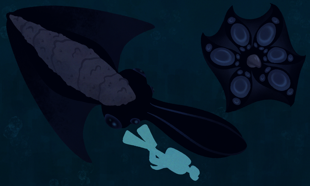
Black Phantoms are the second largest members of the phylum Laminaferrea, class Multibracchia, growing up to around 5.7m. Multibracchia are a squid-like group of animals. They commonly have six arms, though these aren’t slender and pointy like tentacles but rather spoon-shaped with suckers only in the middle of them.

Black Phantoms have webbing between their arms, resembling a cloak, that they use to rapidly engulf their prey and thus stun it before it realizes what’s happened to them. The plating on their heads is a left-over from their common ancestor with other Laminaferrea, though it does seem to play a part in territorial disputes, being used to bash against each other in order to show dominance. The “wings” on the sides of their head are used for locomotion by being flapped up and down, allowing them to reach speeds of up to 15km/h. While Black Phantoms might not be the fastest, they are highly intelligent – frequently employing ambush tactics in order to capture their prey, blending in with the darkness of the abyssal oceans that they reside in. They often lie in wait for hours in order to catch their prey, these being primarily Shell-Breakers, but also most other large marine animals.

Umfrage (Part 7)

In meiner weiteren Auseinandersetzung mit Selfbranding habe ich eine Umfrage entwickelt, um meine eigene Wahrnehmung von außen zu ergänzen und zu hinterfragen.

Die bisherigen Beiträge haben bereits gezeigt, dass Selfbranding nicht nur eine visuelle Entscheidung ist, sondern stark davon abhängt, wie andere eine Person lesen und interpretieren. Genau an diesem Punkt setzt die Umfrage an.

Selbstwahrnehmung ist immer gefiltert. Man sieht die eigene Arbeit, die eigene Persönlichkeit und den eigenen Stil aus einer sehr persönlichen Perspektive. Genau deshalb wollte ich bewusst eine Außenperspektive einholen: Wie sehen mich Menschen, die mich kennen – und welche Assoziationen entstehen dabei?

Die Umfrage ist so aufgebaut, dass sie verschiedene Ebenen der Wahrnehmung abfragt:
Zum einen geht es um den Kontext der Beziehung – also wie und in welchem Umfeld man mich kennt. Zum anderen um die emotionale Wirkung: Welche Gefühle verbinden Menschen mit mir oder meiner Arbeit?

Außerdem interessiert mich die Frage nach meiner kreativen Positionierung: Wirke ich eher wie eine Designerin oder eine Künstlerin? Welche visuelle Sprache wird mir zugeschrieben? Und sogar so konkrete Dinge wie Typografie oder die Form meines Namens können Hinweise darauf geben, wie Identität visuell und sprachlich gelesen wird.

Mein Ziel ist es, aus diesen Antworten ein besseres Verständnis für meine eigene Position im Designkontext zu entwickeln. Nicht im Sinne einer festen „Marke“, sondern eher als ein offenes Bild davon, wie ich bereits wahrgenommen werde – und wie sich das mit meiner eigenen Selbstwahrnehmung überschneidet oder unterscheidet.

Die Umfrage dauert ungefähr 5–25 Minuten, je nachdem, wie ausführlich die Antworten sind. Jede Teilnahme hilft mir sehr bei meinem Projekt.

Hier ist der Link zur Umfrage:

https://forms.gle/W8KrUXzUsS7sRB4h9

Danke an alle, die sich Zeit nehmen und mir ihre Perspektive geben!!!

Die analoge Welt (Part 6)

Da mir im letzten Beitrag klar geworden ist, dass viele meiner Arbeiten auf analogen Prozessen basieren und mir das sehr viel Spaß macht, möchte ich versuchen, mein Self-Branding darauf aufzubauen. Mein Ziel ist es, eine analoge Technik zu finden, die ich in Zukunft sowohl digital (Website, Social Media) als auch analog (Visitenkarten etc.) verwenden kann.

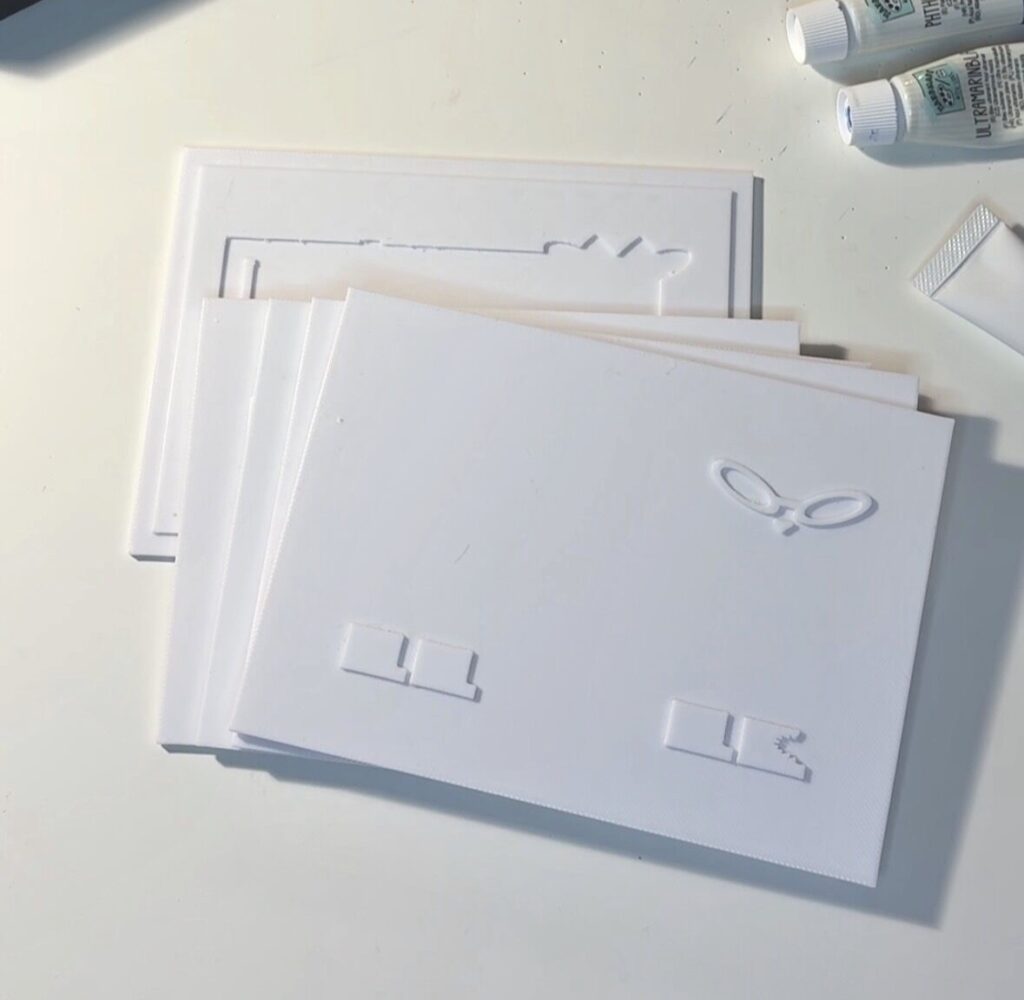
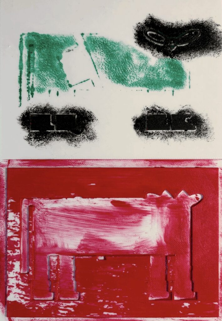
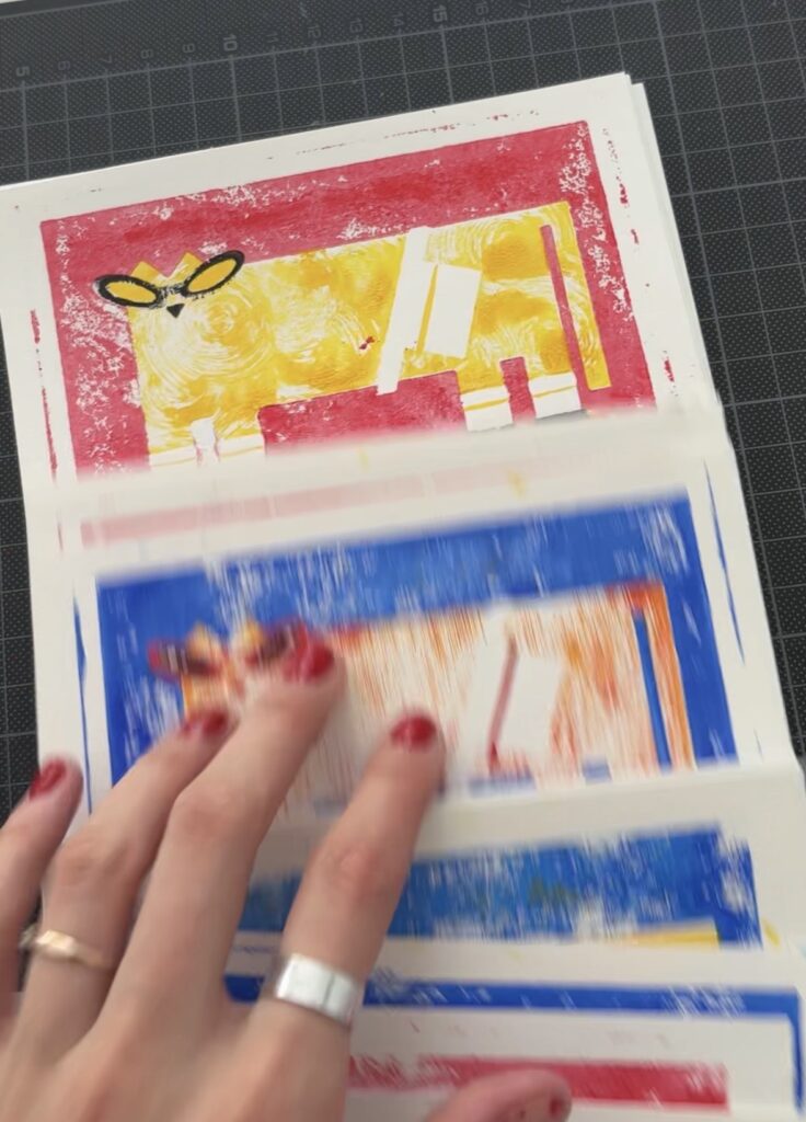
In diesem Beitrag erzähle ich über die erste Technik, die ich ausprobiert habe: 3D-Linoldruck. Was ist das eigentlich? Das Prinzip der Erstellung des finalen Bildes ist ähnlich wie beim echten Linoldruck: Man hat mehrere Farben, also mehrere Druckplatten, und druckt sie nacheinander übereinander.

Der Unterschied ist aber, dass ich nicht mit echtem Linol gearbeitet habe, sondern die Druckplatten digital erstellt und anschließend als 3D-Objekte produziert habe. Dadurch entsteht eine Mischung aus analogem Look und digitalem Prozess — genau diese Kombination finde ich gerade besonders spannend.

Was mir daran gefällt, ist, dass die Ergebnisse nicht perfekt aussehen. Kleine Verschiebungen, sichtbare Strukturen und Fehler machen das Ganze menschlicher. Gerade in einer Zeit, in der so viele Designs sehr glatt und KI-generiert wirken, fühle ich mich mehr zu solchen unperfekten und greifbaren Prozessen hingezogen.

Screenshot

+ Mir gefällt diese Technik, weil man im Vergleich zum klassischen Linoldruck viel mehr Spielraum mit Texturen hat.

+ Außerdem kann man Acrylfarben verwenden, was diese Technik für mich einfacher und günstiger macht.

Im Vergleich zum traditionellen Linoldruck steckt allerdings weniger Handarbeit darin, weil die Platten nicht per Hand ausgeschnitten werden. Trotzdem mag ich gerade diese Mischung aus digitalem und analogem Prozess sehr.

Für das Fanzine-Festival habe ich bereits Postkarten in diesem Stil produziert und bin gespannt, welches Feedback ich dazu bekommen werde!

Was haben meine Projekte gemeinsam? (Part 5)

Also, wie ich in vorherigen Blogposts schon überlegt habe, brauche ich sicher eine neue Website, die meine Zielgruppe besser ansprechen wird und meine Identität besser darstellen kann.

Aber was soll da alles rein? Ich habe mir überlegt, dass ich auf jeden Fall meine Poster zeigen will, die bereits an einigen Ausstellungen teilgenommen haben. Damit werde ich mich nicht nur als Designerin, sondern auch als Künstlerin präsentieren!

Zurzeit habe ich an sechs Poster-Ausstellungen teilgenommen, und die siebte wird unsere Master-Ausstellung sein. Meine Poster waren bereits in unterschiedlichen Ländern zu sehen, wie der Ukraine, Spanien, Österreich und der Türkei. Auf meiner Website möchte ich klar machen, dass ich nicht nur eine in Österreich basierte Designerin/Künstlerin bin, sondern auch gerne an internationalen Projekten teilnehme.

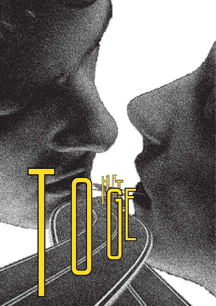
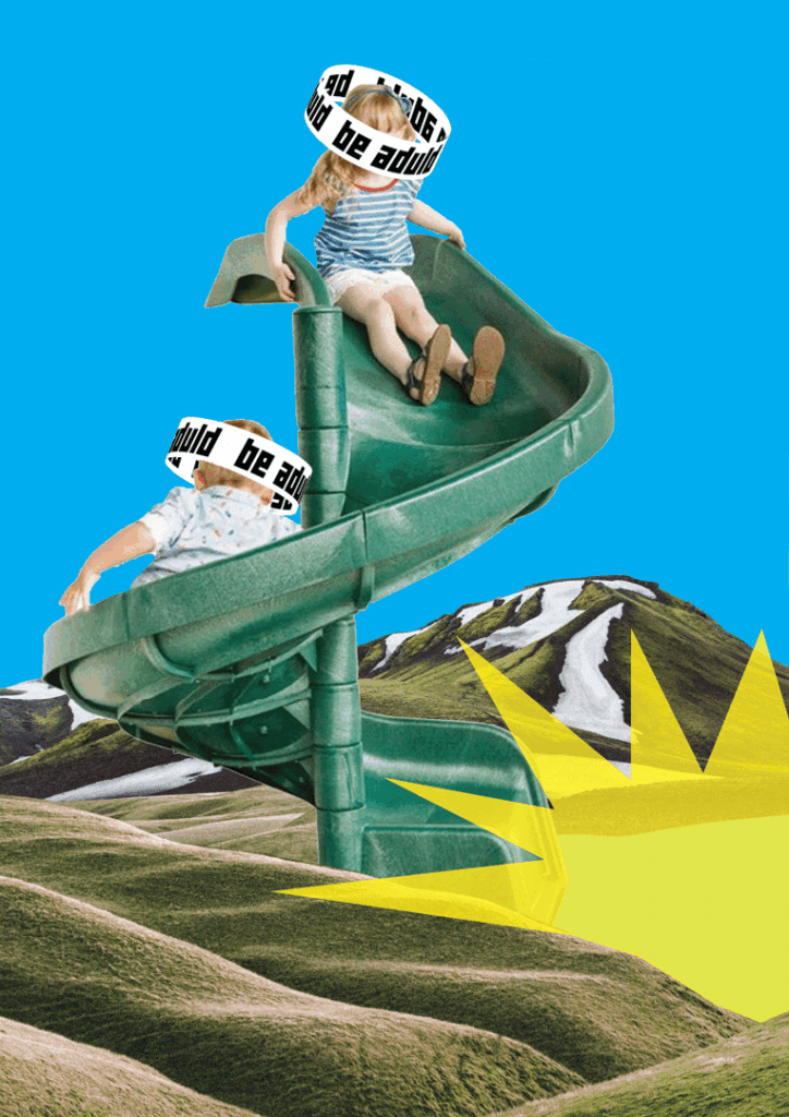
Die Themen, die meine Poster ansprechen, sind unterschiedlich, aber eines ist klar: Es geht immer um den Menschen. Das ist, was ich ausgesucht habe:

Dann habe ich mir gedacht, dass ich meine Bachelorarbeit unbedingt als künstlerisches Projekt integrieren möchte, weil ich sie sehr liebe und gerne an ähnlichen Projekten teilnehmen würde.

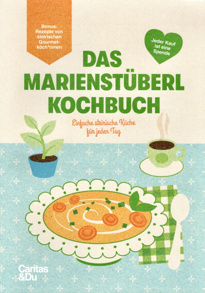
Damit ich mich auch als Designerin präsentieren kann, möchte ich zwei Projekte einbauen, die ich für echte Kund*innen umgesetzt habe. Eines davon ist das Kochbuch für das Caritas Marienstüberl, bei dem ich auch die Design Direction übernommen habe. Dabei ging es um Illustrationen, Layoutdesign und Druckvorbereitung.

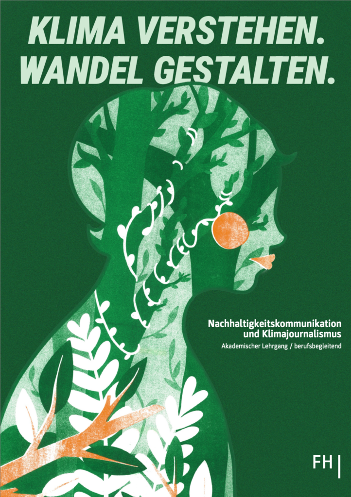
Das letzte Projekt, das ich gerne in meinem Portfolio zeigen möchte, ist ein ganz frisches Projekt, das ich für die FH Joanneum beziehungsweise den Studiengang Nachhaltigkeitskommunikation und Klimajournalismus gestaltet habe. Dort habe ich mit dem Risodrucker gearbeitet und außerdem Layout- sowie Social-Media-Design umgesetzt.

Als ich mir alle meine Projekte gemeinsam angeschaut habe, bin ich draufgekommen, dass sie alle etwas verbindet: menschliches Leben und die Abwesenheit von KI. Viele Projekte wurden mit analogen Techniken umgesetzt oder sehen zumindest so aus, als wären sie analog gestaltet worden. Ich glaube, dass das eine gute Basis für mein Self-Branding ist, mit der ich weiterarbeiten kann.

D&R2 02 – From Interruption to Adaptation: Narrowing a Research Direction

In my first blog post of this semester, written after the lo-fi prototyping session, I described a frustration that felt more important than the prototype itself. Moving from theoretical research into a quick physical test forced me to confront something I had been postponing: my topic is difficult to make visible. Attention, interruption and cognitive recovery are not things you can easily point at on a screen. They happen internally, across time and often become visible only through their consequences.

At the time, that post was mostly about the limitations of the format I had tested. Looking back, it was also the beginning of a more important question. If the topic I am researching is hard to prototype, then maybe the issue is not only the prototype. Maybe I had not yet defined clearly enough what kind of design problem I was actually trying to make visible.

This post continues that questioning.

Where the First Semester Left Off

Last semester I wrote ten posts about attention, flow, interruption, memory, emotion, and neuroadaptive interfaces. Taken one by one they look scattered. Taken together, they were building toward something I could not yet name.

The clearest position I reached was in my final post: interruption is not a problem to eliminate, it is a condition to design for. What matters is not whether a system interrupts, but whether it does so at the right moment, with the right cost, and with enough support for the user to recover.

That framing felt like a conclusion at the time. Looking back, it was more like a door. The research had built a detailed picture of what goes wrong attention fractures, cognitive load spikes, emotional friction accumulates, memory decays but it had not yet said what to do about it, in what context, using what kind of design.

That is what this semester is supposed to resolve.

A Detour That Wasn’t Really a Detour

Earlier this semester I joined a project connected to CERN’s IdeaSquare initiative through our university. My group was working on individual and communal spaces, specifically the idea of modular, adaptive environments that can shift and reconfigure themselves in response to the people using them.

At some point during the project I pushed the team toward a particular angle: spaces that adapt to their users, not the other way around. The environment should read who is there, what they are doing, and what they need, then reorganize accordingly. Less about static design and more about responsive systems.

I did not connect this to my research at the time. It just felt like the right direction for that project.

Later I realized I had done exactly the same thing I had been studying. The question I brought into that spatial design project was the same question underneath my first semester work: what would it look like if systems adapted to human state, rather than expecting humans to adapt to them? In the CERN project, the system was a physical space. In my research, it had been a digital interface. But the logic was identical.

That overlap was worth noting. Not because it proves anything, but because it confirmed something: this is not an academic interest I adopted for a class. It is genuinely how I think about design.

The Problem With Where I Was

After last semester, I had a topic cluster but not a research direction. There is a real difference. A topic cluster is a set of connected ideas you can read about indefinitely. A research direction has a specific question, a context, and a method.

My cluster was attention, interruption, cognitive load, recovery, neuroadaptive systems. Interesting and defensible, but I was circling the same ideas without committing to a specific design problem.

The first blog post of this semester already hinted at this. The lo-fi prototype did not fail because the topic was weak. It struggled because I was trying to represent an internal and temporal topic before fully deciding what form of intervention I was actually designing toward. The session was useful precisely because it exposed that gap.

The second semester also added a different kind of pressure. The business-framing exercises pushed me to specify who is affected, how and what a system would actually do. Together with the prototyping difficulties, this made clear that narrowing was not optional anymore.

What I Actually Want to Research

The direction I have arrived at is best described as adaptive interaction design.

Not notification management. Not UX for focus apps. The broader question is what it would mean for interfaces to adapt their behavior based on the user’s current cognitive state, rather than treating every moment as equally available for input, output, or interruption.

The interest in neuroadaptive and EEG-based systems from last semester was never really about brainwaves. It was about the interaction logic they represent: a closed-loop system that reads the user continuously and responds accordingly. That loop, not the hardware, is what I find compelling. The philosophical stance is that machines should adapt to humans, not the other way around. The sensor stack is just one implementation of that idea.

What has become clearer this semester is that newer forms of adaptive systems make this question even more urgent. When systems act, update, or reorganize information while the user is absent, the moment of return becomes a design problem in itself. My earlier research on interruption, memory, and resumption maps directly onto this. The cognitive science is already there. What is still missing is a clear design response.

Where This Is Heading

I am not committing to a final thesis question this semester. That is not what this phase is for. What I am committing to is a direction: adaptive interaction design, specifically the intersection of cognitive state, interruption, and resumption in contexts where systems change while the user is absent.

The medium is still open. It could remain screen-based. It could later move into spatial or wearable contexts if the research actually needs that. I do not want to decide the form too early.

What I want to do this semester is go deeper into the literature on workload-aware systems, neuroadaptive interaction, and newer adaptive interface models, then develop a prototype concept that makes the re-entry problem testable. Not to solve it immediately, but to make it visible enough to study.

The first blog post of this semester started with a prototype that revealed the limits of my current framing. This post is the continuation of that realization. The question is no longer only how to prototype interruption and recovery. It is how to define a research direction where adaptation itself becomes the design material.

That is the point I seem to have reached. Now the next task is to see whether I can narrow it without losing what made it interesting in the first place.
One-Shot-Sport-Dokumentation: Die Production 

Anmerkung: Dieser Blogbeitrag wurde etwas weniger wissenschaftlich und mehr subjektiv bzw. persönlich verfasst

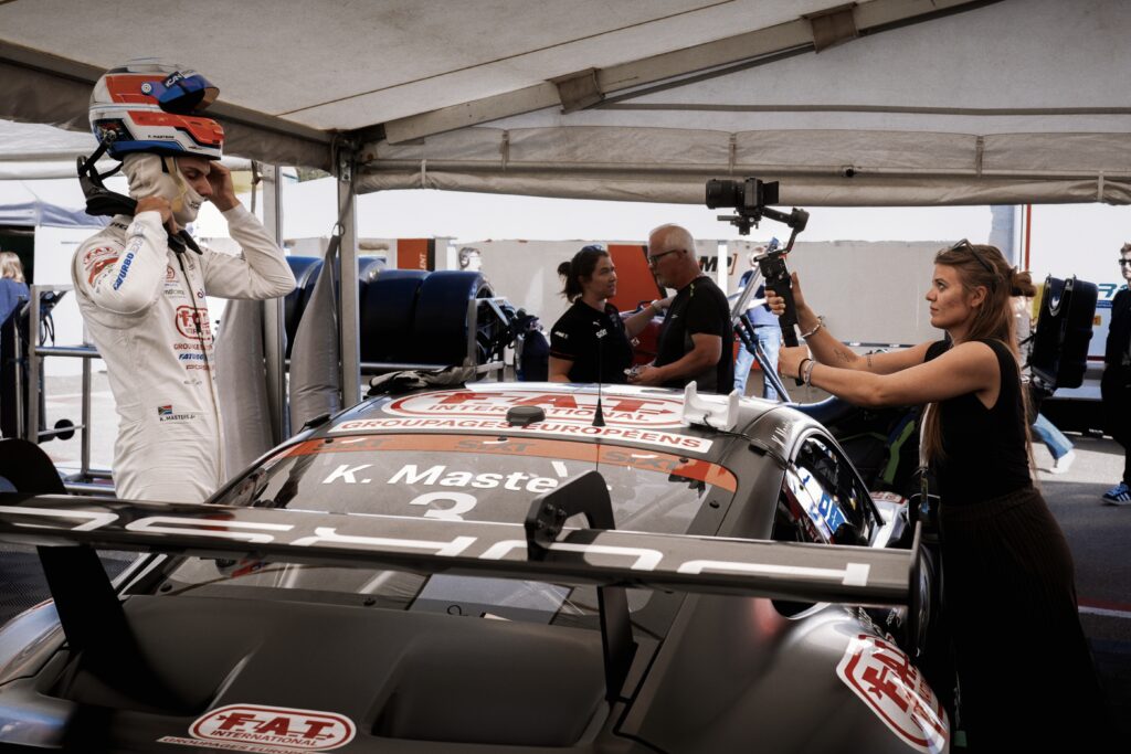
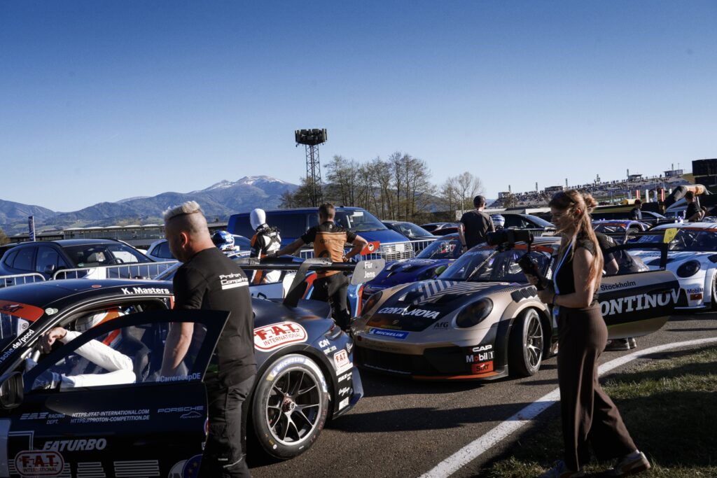
Für den Dreh des Werkstücks der One-Shot-Sportdokumentation ging es am 24. April auf den Red Bull Ring in Spielberg. Das Porsche Cup Deutschland Team „Proton Competition“ hat sich bereit erklärt, für den Dreh einen Fahrer bereitzustellen. Das Team war mit rund 20 Leuten und fünf Fahrern für den österreichischen Bewerb der Rennserie angereist. Am Freitagnachmittag, zwischen freiem Training und den beiden Qualifying-Sessions des Wochenendes, war der Dreh des Werkstücks geplant. 

Die Ankunft 

Bereits sehr früh stellte sich durch diverse Gespräche heraus: Proton Competition ist es ein sehr entspanntes und cooles Team! Alle Planung und jedes Entgegenkommen wurden immer mit einem Satz beantwortet: „Du wirst Teil des Teams sein und wir richten uns nach dir!“. Das erleichterte den organisatorischen Teil des Werkstücks bereits in der Planung um einiges. 

Da das letzte freie Training am Freitag von 13:00 bis 14:00 Uhr stattgefunden hat, aber die beiden Qualifyings für die Rennen am Wochenende erst um 18:00 Uhr geplant waren, bot sich der Nachmittag perfekt für den Filmdreh an. Mit wenigen Erwartungen und viel Freude ging es also an den Red Bull Ring, um für einen Tag einem Traumjob nachzugehen. Bereits am Eingangstor erwartete mich ein Teammitglied von Proton Competition – Theresa. Auch sie ist noch Studentin und kümmert sich an den Rennwochenenden um alle organisatorischen Angelegenheiten. Mit einem Season 2026 Pass und einem Media-Parking-Ticket ging es dann weiter zum Parkplatz direkt vor dem Eingang der Rennstrecke. 

Wie bereits in vorherigen Blogposts erklärt, sind die Pitboxen des Porsche Sixt Carrera Cup Deutschlands in Spielberg durch die vielen Support-Rennserien der DTM „nur“ Zelte. Diese sind für alle Zuschauer:innen erreichbar, was die Rennserie im Allgemeinen sehr nahbar macht. Am Freitagnachmittag war am Red Bull Ring noch nicht so viel los, wie am Rest des Wochenendes, was das Filmen aus Platzgründen im Zelt später erleichtern würde. 

Zuallererst durfte ich das gesamte Team kennenlernen. Proton Competition besteht aus ca. 20 bis 25 Mitglieder, die an den Rennwochenenden dabei sind. Bis auf die CEO und Senior Engineer Positions, sind alle sehr jung und im Alter zwischen 18 und 25 – auch die Fahrer. Proton Competition hat fünf Fahrer: 

  1. Markus Amand, den Porsche Junior
  2. Keagan Masters, mein Interviewpartner und der derzeitige Championship-Leader 
  3. Dylan Yip, der temperamentvolle Rookie 
  4. Gustav Berström, dessen Vater ihm den Rennsport ermöglicht 
  5. Daniel Ros, der etwas ältere Schwede, der nicht in der Teamwertung fährt 

Nicht nur bei der Ankunft, sondern auch über den gesamten folgenden Samstag waren alle Teammitglieder außerordentlich freundlich und herzlich. Alle waren per Du und gaben mir das Gefühl, wirklich Teil des Teams zu sein. Außerdem durfte ich auch am Samstag mit Proton Competition das Rennen aus der Pitlane direkt an der Start-Ziel-Gerade verfolgen, sowie vor dem Start die Rennstrecke betreten. Auch am Freitagabend wurde ich zum Qualifying in die Pit eingeladen, was dem Sport eine ganz andere Bedeutung und Gefühl gibt. 

Der Dreh 

Durch das Post-Scrutineering, was nach jeder Bewegung des Autos auf der Strecke erfolgt, um zu sehen, ob alles regelkonform abgelaufen ist, verspätete sich der gesamte Zeitplan ein wenig. Trotzdem nahm sich Championship-Leader Keagan Masters sofort Zeit für das Projekt. Nachdem die Idee erklärt war, gingen wir in den großen Team-LKW, in dem sich auch das (Gott sei Dank klimatisierte) Büro bzw. Meeting-Raum befand, wo wir das Interview drehen konnten. Da Keagan aus Südafrika stammt, wurde dieses auf Englisch durchgeführt. Bei dem 8-minütigen Interview ging es vor allem um Emotionalität, Mentalität und die Bedeutung des Rennsports, um dem Werkstück einen emotionalen Touch zu verleihen und Gefühle hervorzurufen. Gleichzeitig soll es sowohl den Fahrer als auch den Sport näher an das Publikum bringen und ihn menschlich darstellen. 

Nach einem erfolgreichen Interview waren die Mechaniker des Teams gerade dabei das Auto auf das anstehende Qualifying vorzubereiten. Deshalb folgte ein sehr wichtiger Teil von One-Shot-Produktionen, der vor allem aus Zeitgründen sehr wichtig für das Projekt war: die Proben. Dabei ging es darum, Keagan den Ablauf zu zeigen und den Platz in der Box bestmöglich auszunutzen, ohne jemandem im Weg zu stehen. 

Fotos: Lorenz Rist

Learnings

Das Schrauben am Auto und die Proben führten dann zu einem kleinen Hindernis: Die eigentlich lange Zeit zwischen Training und Qualifying war zu einer beträchtlich kürzeren geschrumpft. Deshalb fehlte dieser wichtige Teil der Proben und der ausreichenden Zeit für einen perfekten Take. Trotzdem gab das Team mir zwei Versuche und die Möglichkeit, am Samstag gegebenenfalls nochmal zu Drehen. 

Ein weiteres Problem stellte die Größe von Keagan dar, die sich mit dem nicht so vorhandenen Platz manchmal im Video zeigt. Gleichzeitig wurde der Gimbal samt Kamera nach einer Zeit etwas schwer. Außerdem war ich trotz Proben zuhause und vor Ort nicht vertraut genug mit dem Gimbal, was das Drehen etwas erschwerte. 

Trotzdem war der Dreh ein Erfolg. Nicht nur war es ein Schnuppern von Traumberuf-Luft, sondern auch das Networken mit der Branche. Das Rohmaterial ist etwas wackelig, was aber gut zur Stimmung des Videos passt, und etwas kürzer als geplant (knappe zwei statt geplanten drei bis fünf Minuten). Alles in allem bin ich zufrieden mit dem Produktionsteil des Werkstücks. 

Das Wochenende wurde noch mit einem Doppelsieg von Markus und Keagan am Samstag und einem zweiten und dritten Platz der beiden am Sonntag abgerundet. 

Introduction | R&D 2 | Blog 1

In this first blog for the Einzelprojekt, I plan on discusssing the various fields of study I will delve into for my research project and how they associate with the courses I am currently attending. My focus for this semester is to build a functional prototype, test it and ensure that it runs exactly as I expect it to.

Before we dive deep into it, I would like to give a short recap of my project. The primary idea is to build an interactive visualizer which responds to real time audio data. It identifies vocal characteristics and maps auditory features like pitch and loudness onto visual dimensions such as size, shape, colour and texture.This model will be further developed and used to build an immersive installation where users can modify and create unique audiovisual pieces using the provided parameters.

Speaking of parameters, I recently had a detailed class explaining parameter mapping, a commonly used method for sonification of data. What I found fascinating is the step by step process of data structuring to generate a definitive output, ensuring the results align with research hypotheses. It involves defining data dimensions and mapping them to sound parameters such as pitch and loudness (both of which I will explore in my project). Finding the right dataset, parsing it and normalizing it within ranges suitable for the project are also crucial steps. This requires a lot of iterations and testing, which I’m sure I will have to do in my project as well.

Another interesting class I am currently taking part in is the ambisonics and surroundsound lectures held at the CUBE. We went over the various orders of ambisonics and listened to the differences in each format. I will be working on a soundscape for this course at the end of this semester, which will help me understand the spatial positioning and panning within an ambisonic environment. I won’t be focusing heavily on spatialisation for my project this semester, either way it is incredibly valuable to my research and will provide me with ideas for integrating this setup into my installation next semester.

I am primarily focused on building this prototype using plugdata and TouchDesigner. I am currently working on projects in both software environments for the Musikmaschine installation and the sound & vision exhibition, respectively. I am trying to grasp as much information as I can so I can transfer those same methodologies to this project.

I am really excited to see how this project unfolds. There are bound to be hurdles along the way, but I am positive I will reach my goal by the end of this semester and successfully complete the entire installation by the end of the next.

Blog Post 3: From Perception to Persuasion

As my research develops, I find myself moving from a more artistic and perceptual understanding of illusion toward a question that feels increasingly relevant within contemporary design practice: what happens when these same mechanisms enter the fields of branding, marketing, and visual identity? If illusion can hold attention, invite interpretation, and create emotional engagement, then its role may not end in the gallery or installation space. It may also operate powerfully in commercial and communicative design.

This shift in my thinking does not mean abandoning the earlier questions. On the contrary, it grows directly out of them. If people are naturally drawn to images that contain more than one layer, then it seems important to ask how this functions in visual systems that are meant to communicate quickly and memorably. In a world overwhelmed by messages, perhaps what stays with us is not always what is most direct, but what gives us something to discover.

Branding is full of such moments, even if we do not always name them as illusions. Hidden meanings in logos, unexpected uses of negative space, double-image packaging, and visual metaphors in advertising all rely on a similar principle – they reward attention. They ask the viewer to complete something mentally, and that small act of participation can make communication feel more intelligent, more satisfying, and often more memorable. In this sense, illusion may not simply decorate a message, it may strengthen the relationship between the message and its audience.

What interests me here is the possibility that ambiguity can function strategically. We often assume that effective branding must be immediate and fully transparent. Yet some of the most recognizable visual identities are built on subtlety, suggestion, and layered communication. A logo that reveals something more upon closer inspection creates not only recognition, but also a sense of discovery. A campaign that uses visual surprise can interrupt routine perception in a way that feels fresh rather than forced. These are not only aesthetic choices, they are communicative decisions.

This has made me curious about the border between perception and persuasion. How much do visual ambiguity and illusion influence decision-making? Can a brand become more memorable because it asks more from the viewer? Does surprise generate trust, curiosity, or emotional attachment? And where is the line between meaningful visual intelligence and empty cleverness? These questions feel especially relevant today, when attention has become one of the most contested spaces in design.

Some designers and artists offer useful points of reference here. Shigeo Fukuda’s work, for example, demonstrates how with reduction, and visual misdirection can produce images that are both playful and conceptually sharp. Even artists such as Erik Johansson, whose manipulated scenes belong more to constructed image-making than branding, reveal how impossible visuals can remain persuasive when they are emotionally coherent. In different ways, these examples suggest that visual complexity can communicate with force when it is purposeful.

For now, I remain in the research phase, following the thread wherever it becomes most alive.